Landing page
Lightfield website design
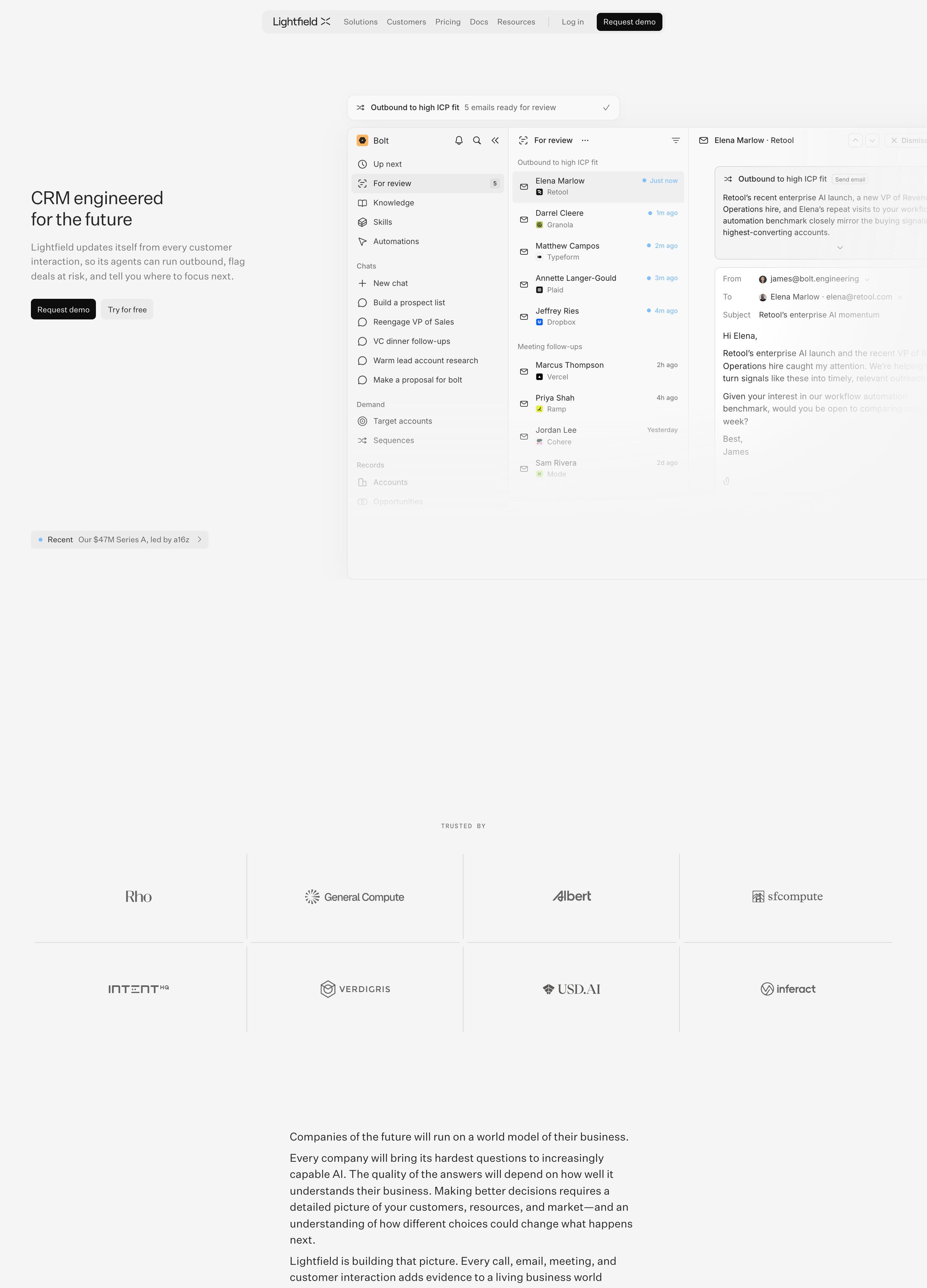
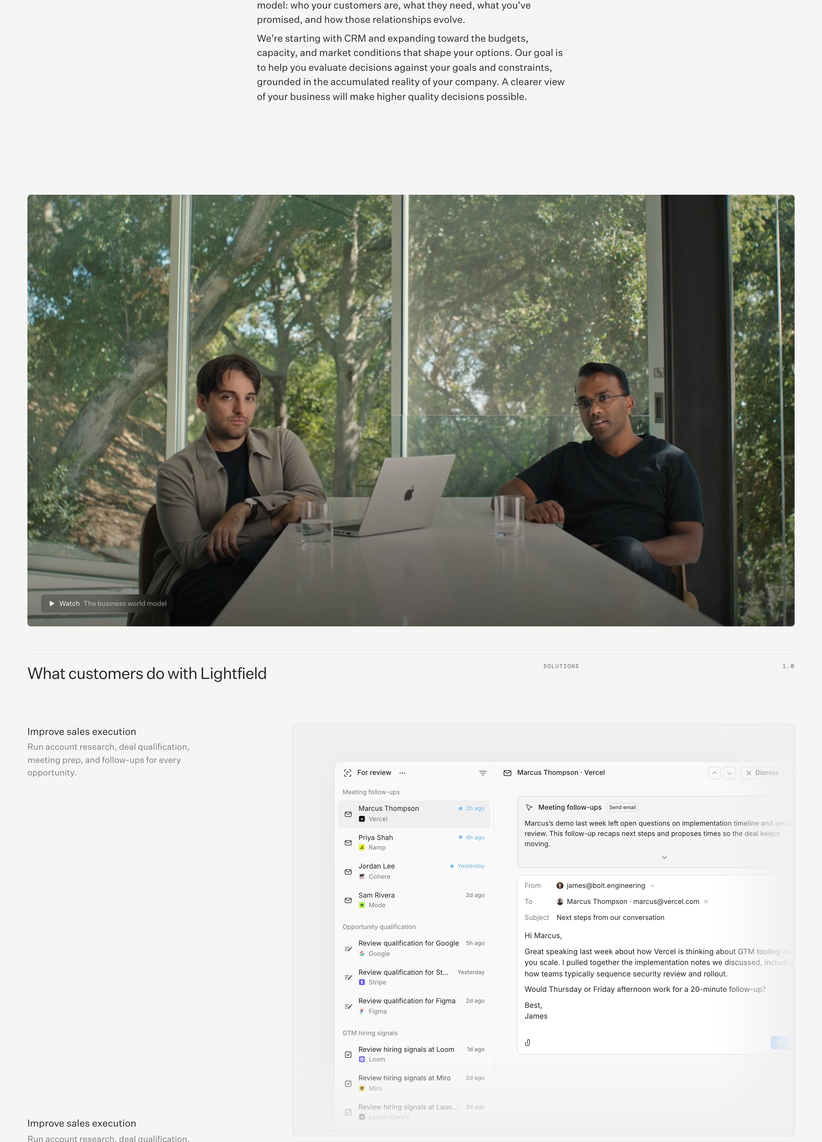
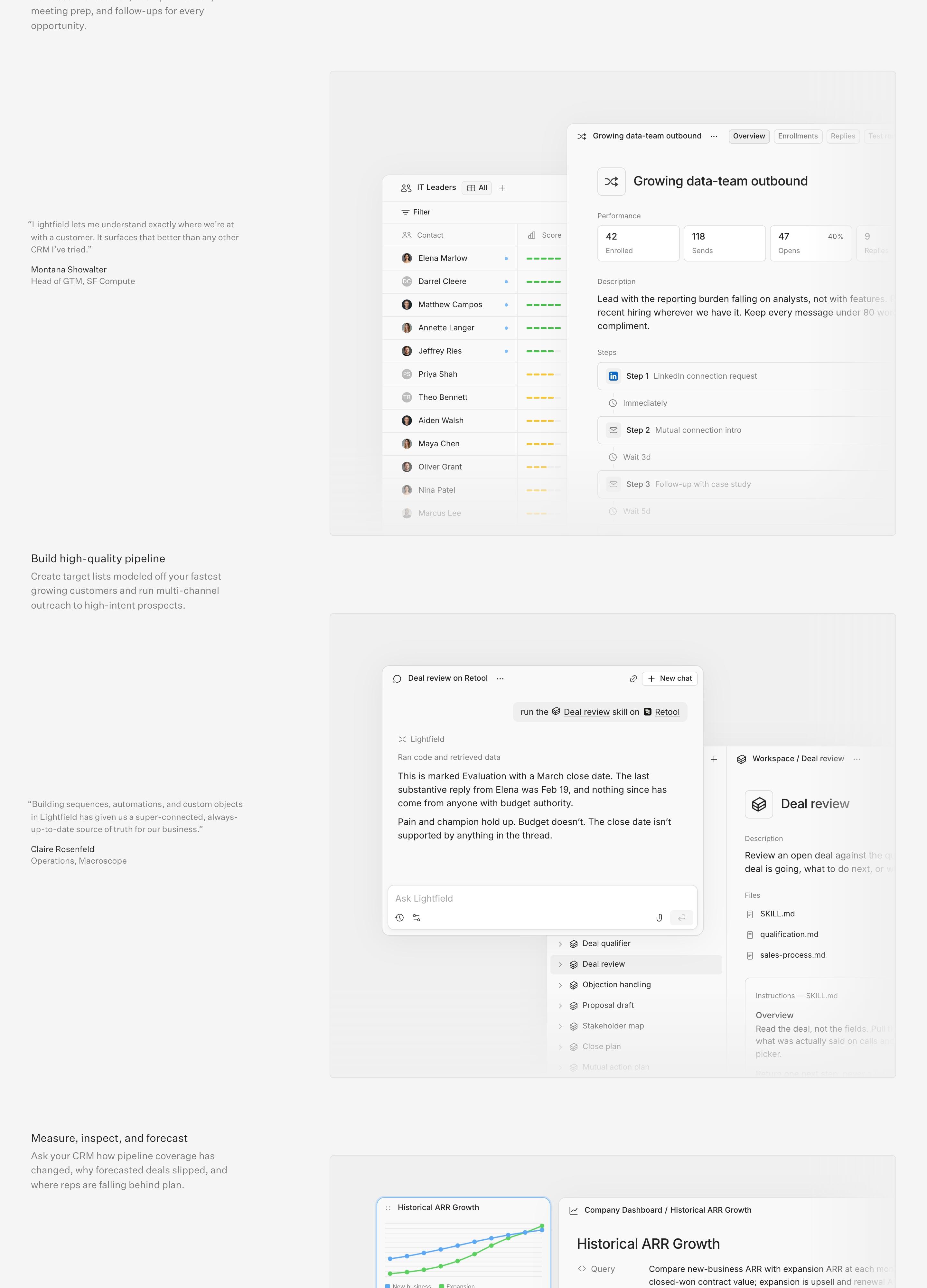
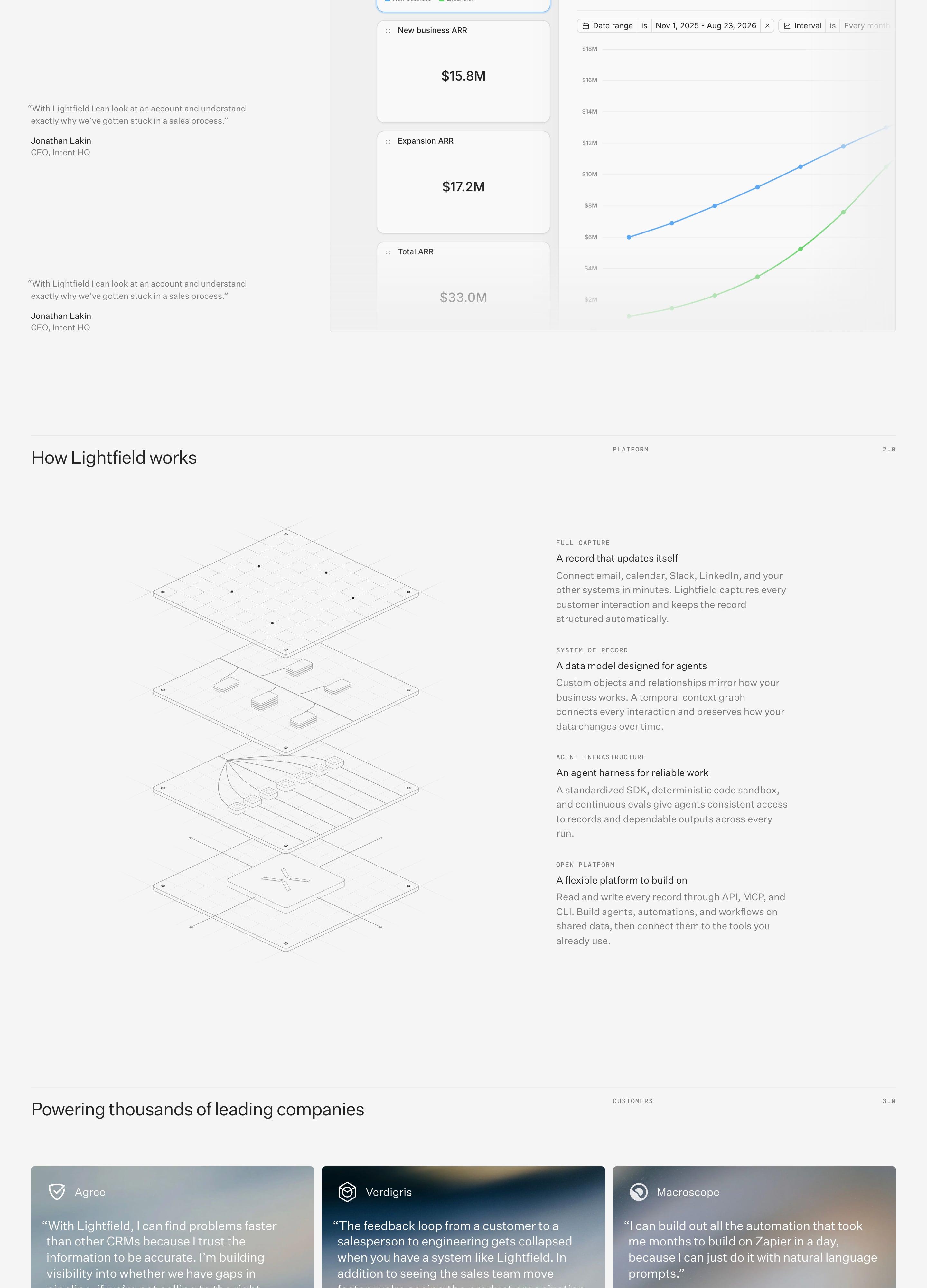
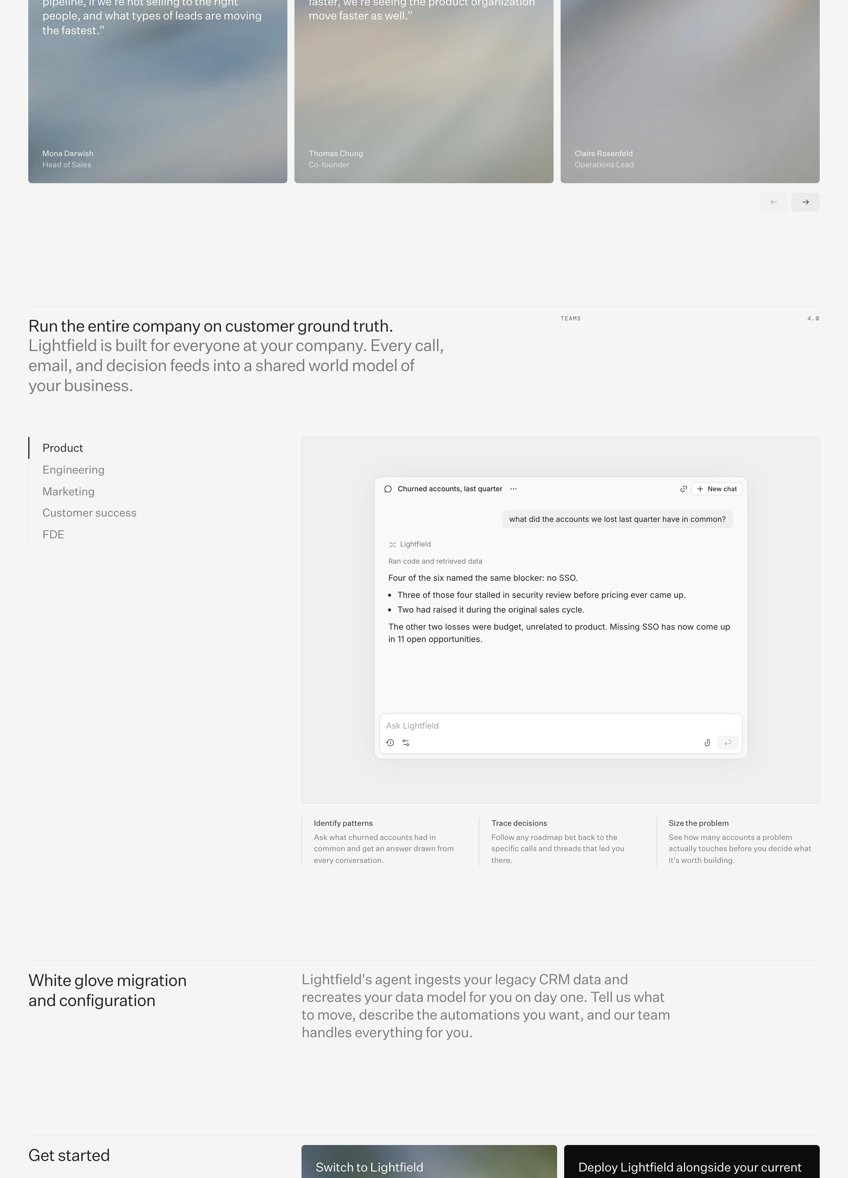
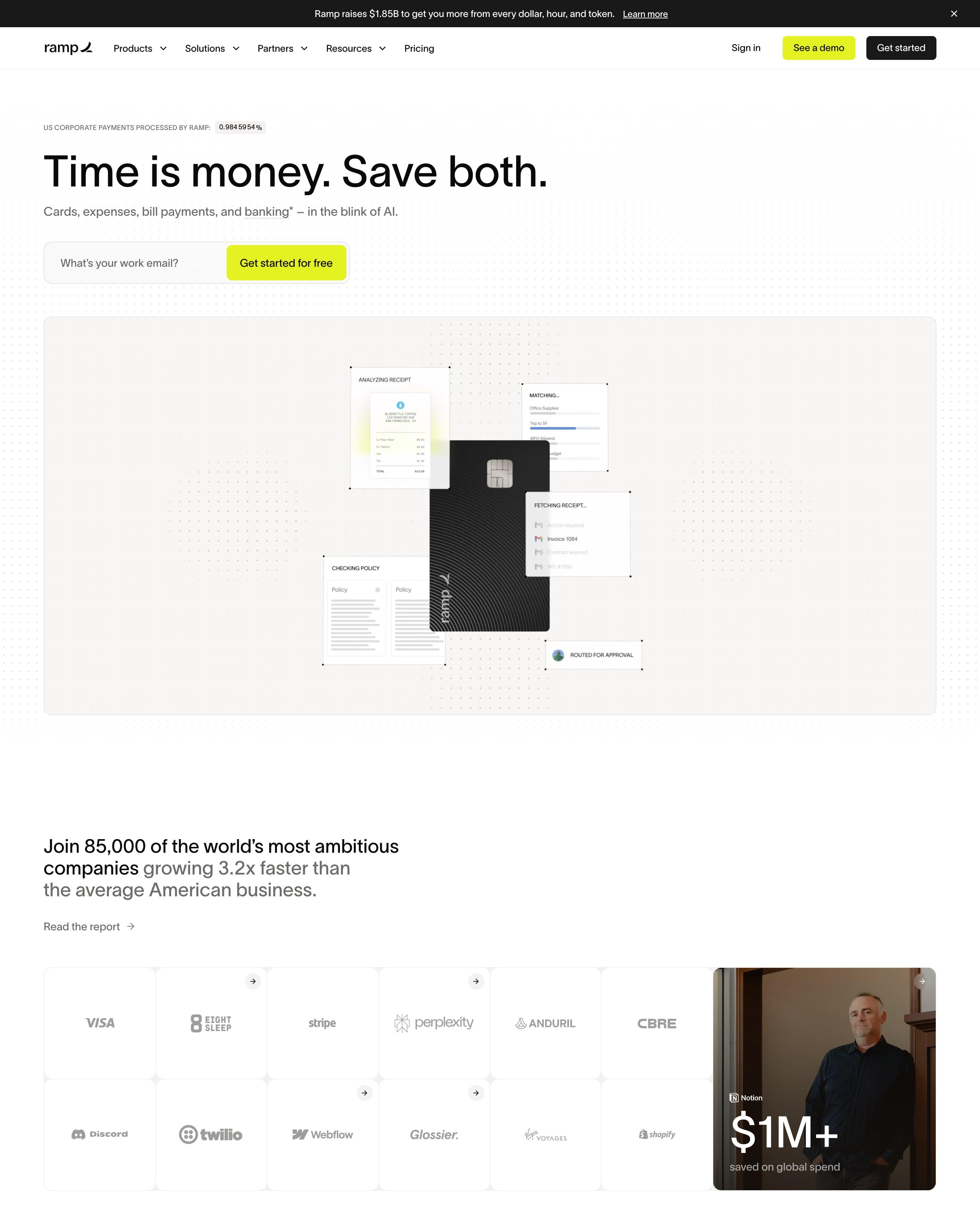
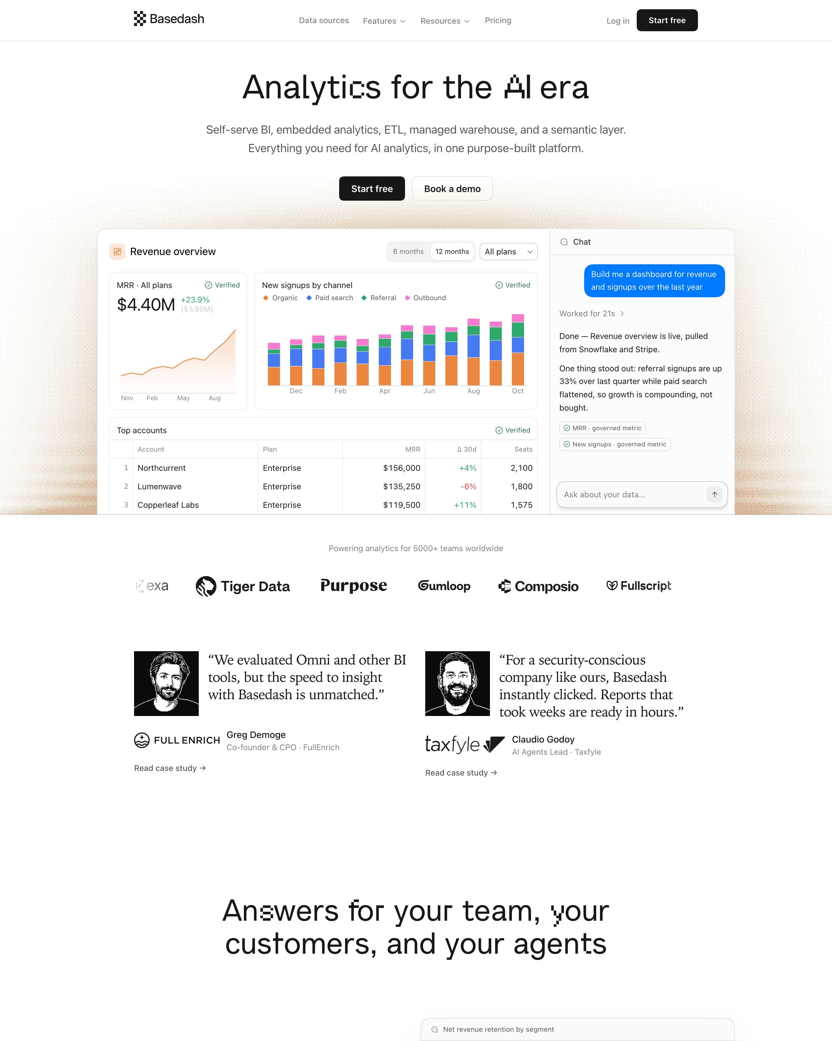
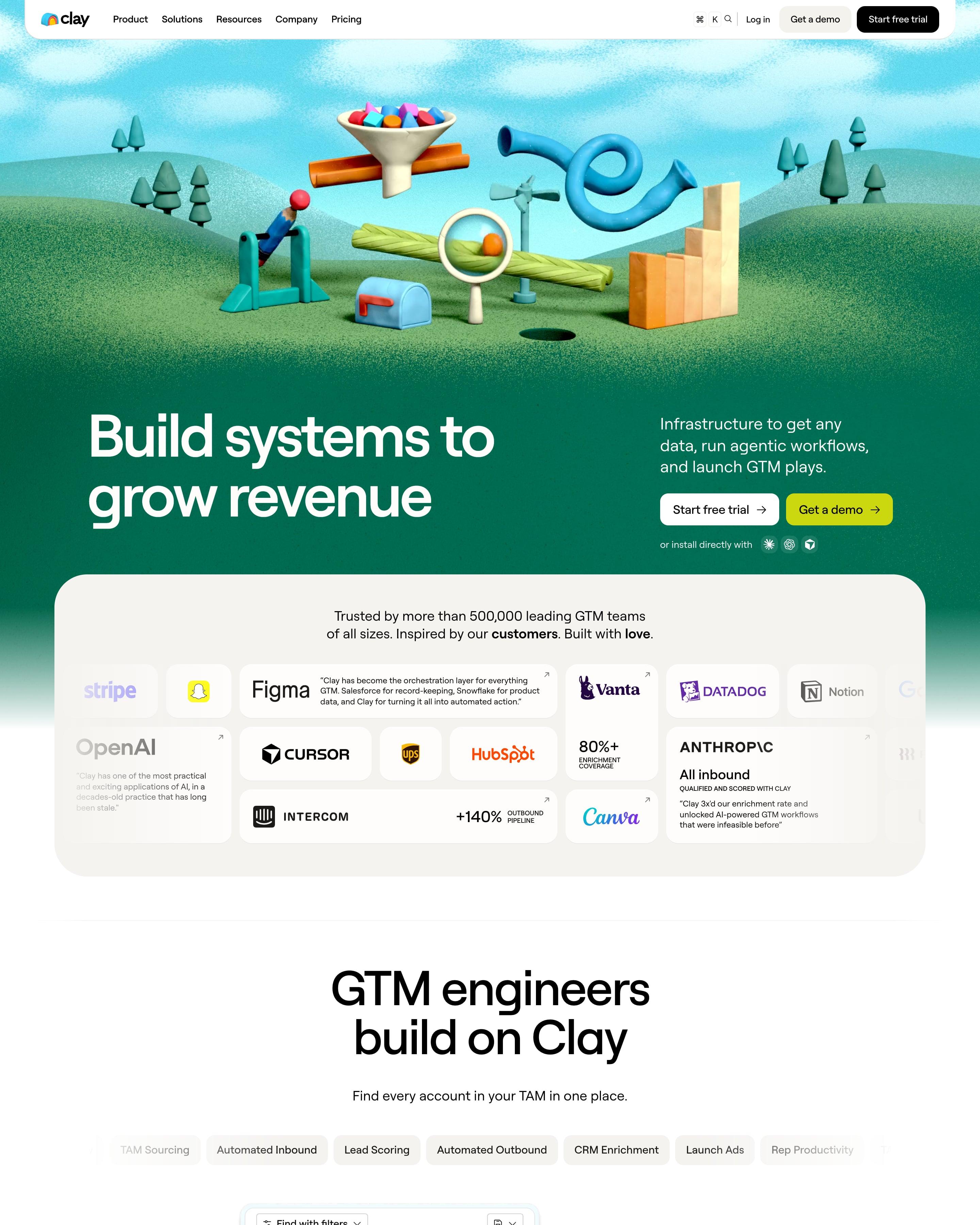
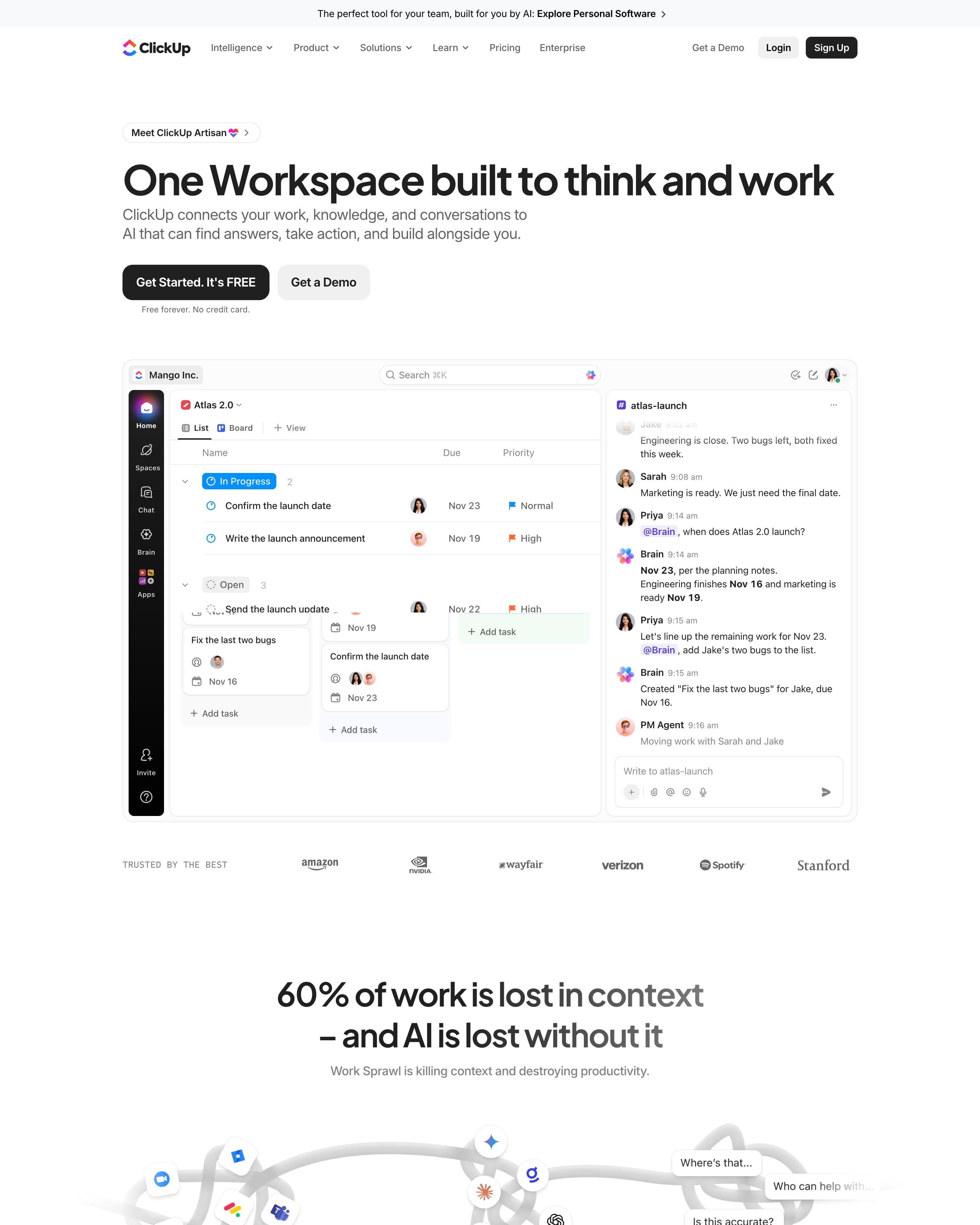
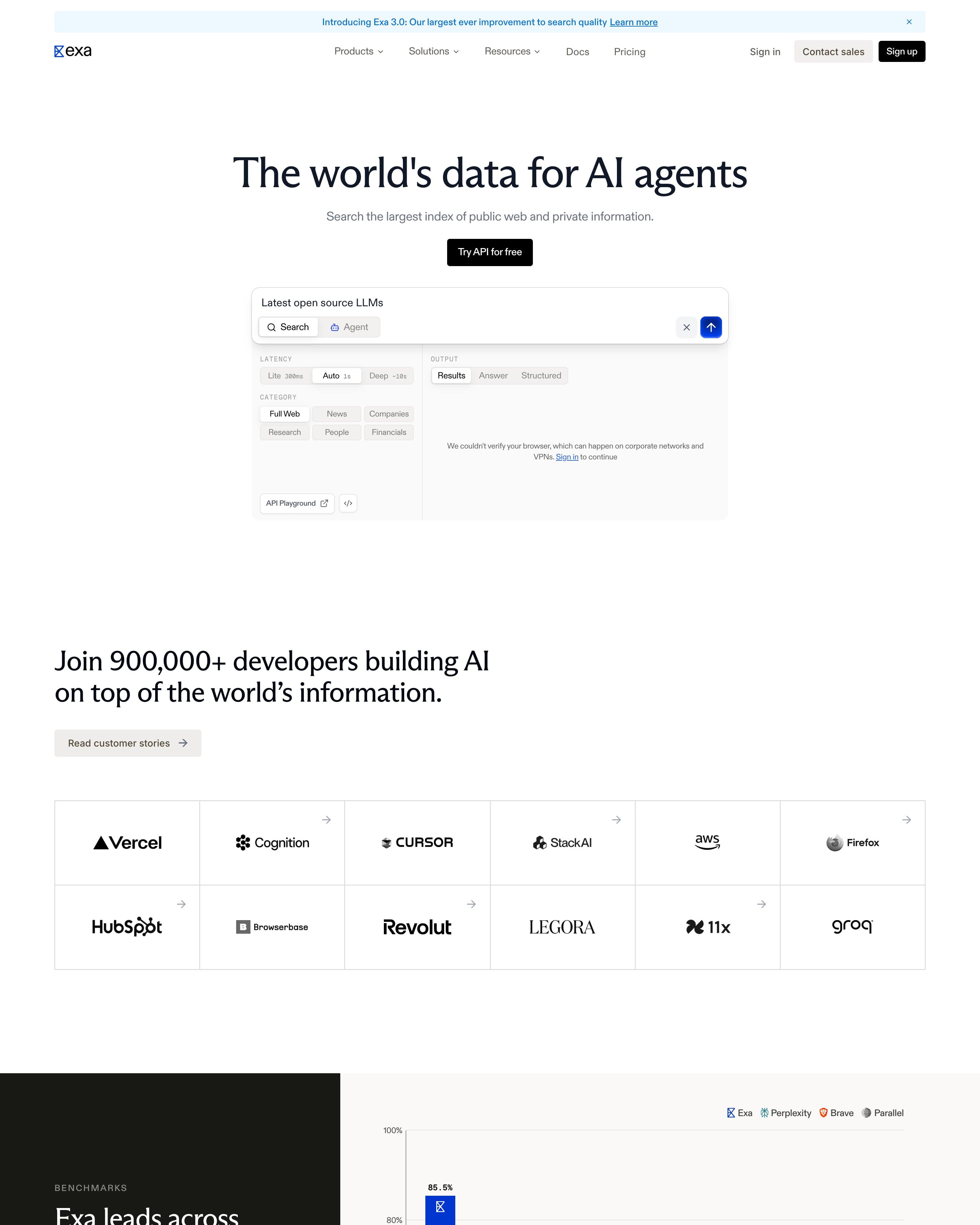
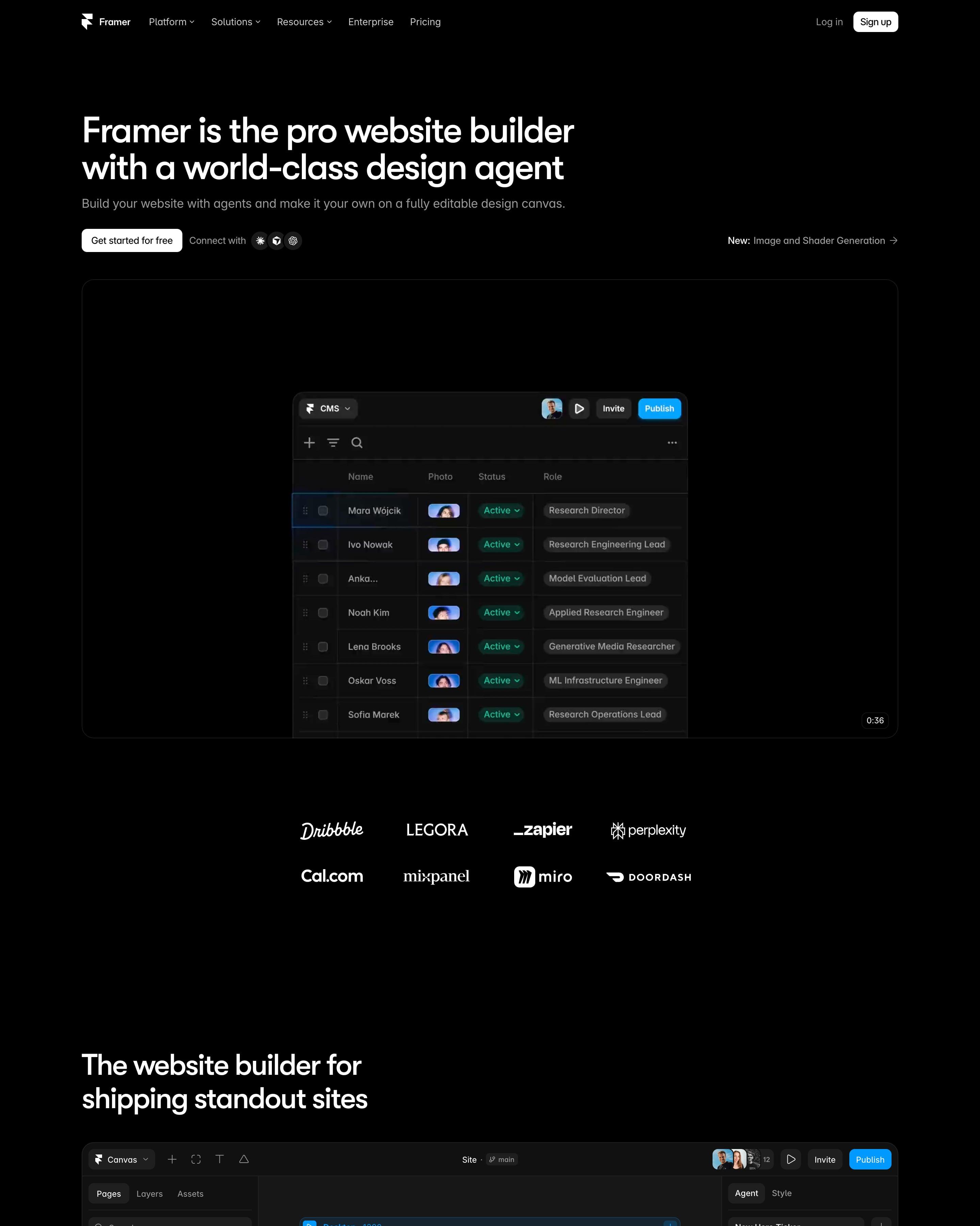
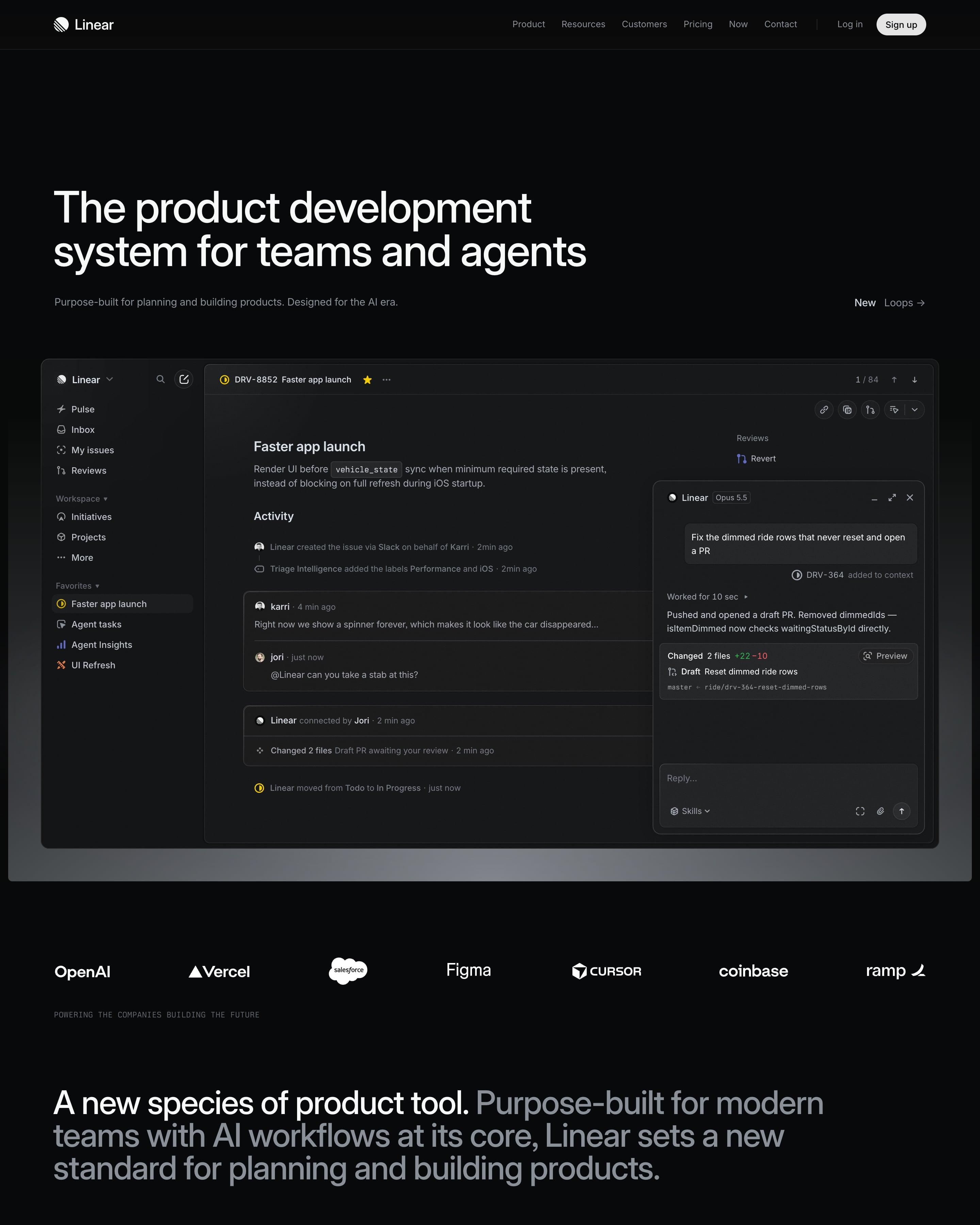
The headline stays small and left-aligned beside a product inbox screen that runs off the right edge. Customer logos fill a grid of bordered cells, and an isometric stack of layers explains how the product works. Worth copying: quote cards over blurred sky photos, nearly the only colour on a grey page.