
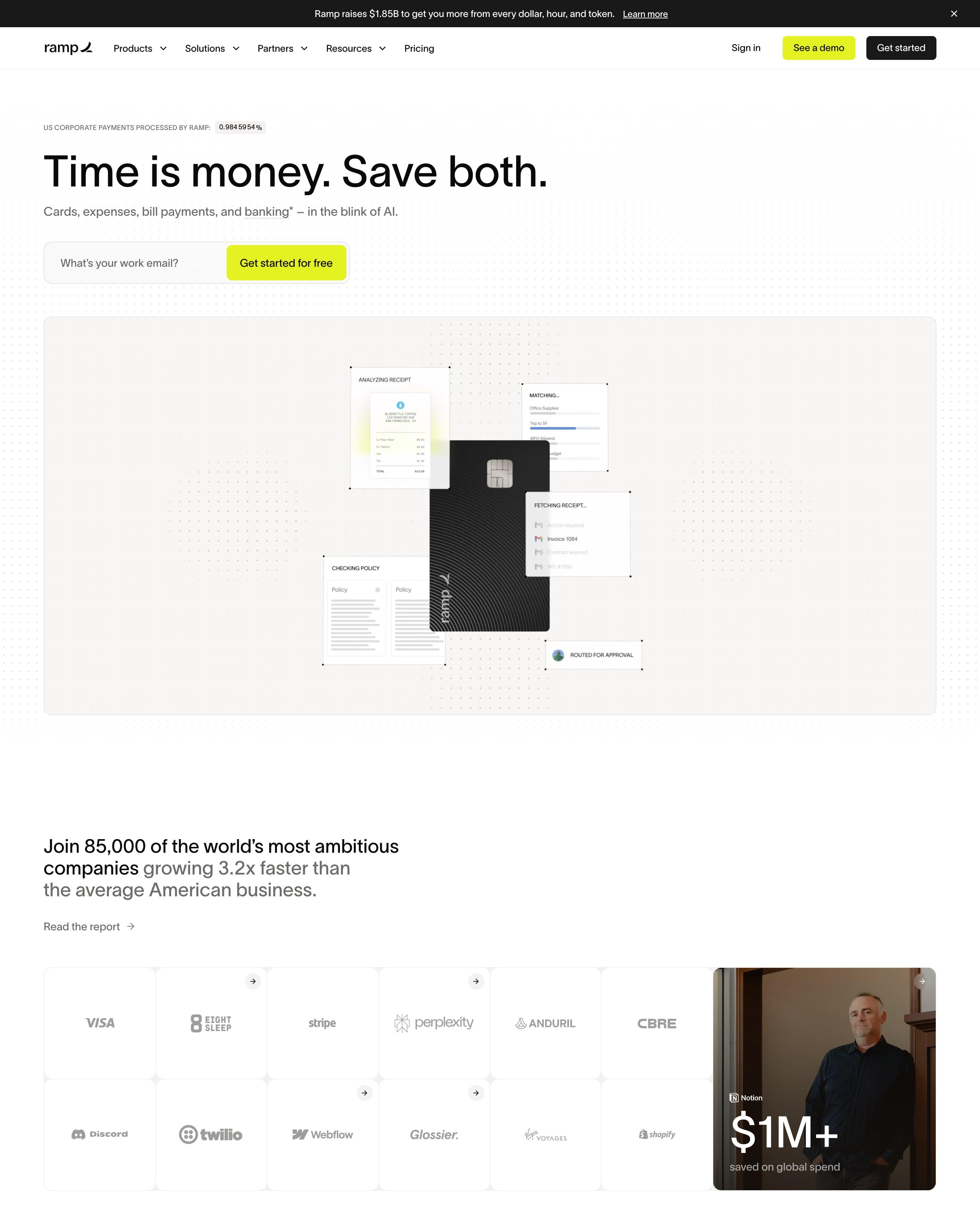

"Time is money. Save both." sits small and left-aligned over a work-email field with a chartreuse button, above a black Ramp card ringed by floating receipt and policy panels on a dotted grey canvas. Headlines run in two tones, black then grey, from "Scale the team. Shrink the paperwork." to "We've got the receipts." Worth copying: the logo grid that ends in a photo tile reading "$1M+ saved on global spend".
37 examples from SaaS companies
Best Minimalist Website Examples
Sites that leave things out: lots of white space, few colours, one idea per section. Here are 37 SaaS websites that do it well, each shot as the whole page, with what stands out on each.
- Dark or light
- 4 dark, 33 light
- of 37 pages
- Heading fonts
- Inter
- Inter 3, Inter Display 3, Oracle 2, Lausanne 1
- Built with
- Next.js
- Next.js 24, Framer 5, Webflow 3, Astro 1
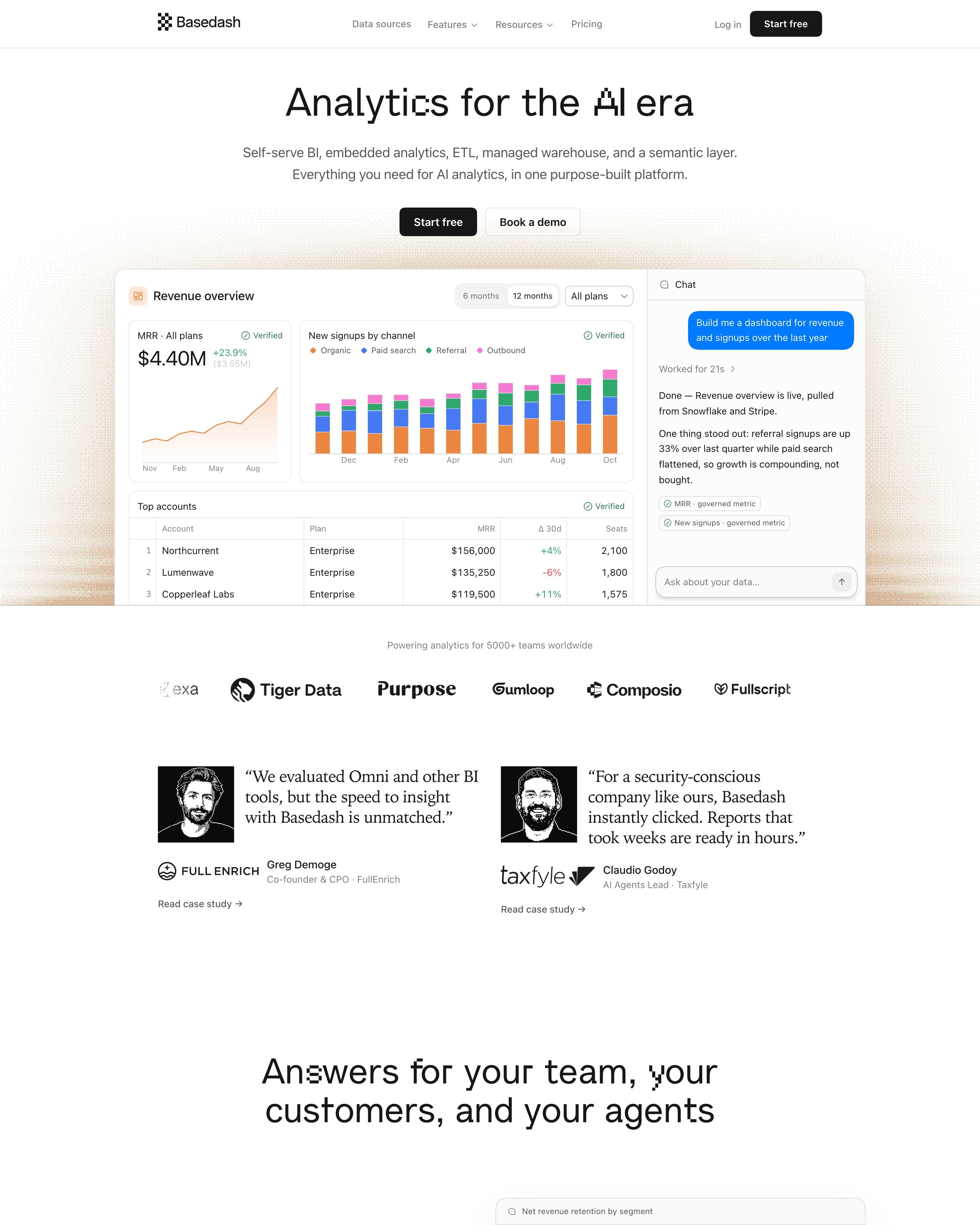
"Analytics for the AI era" sits over a full dashboard mock with an MRR chart, stacked bars and a chat panel answering "Build me a dashboard". Feature sections alternate copy and floating UI cards, each under a small orange eyebrow label. Worth copying: customer quotes in a serif face beside black-and-white engraved portraits, which give a plain grey-and-white page some character.
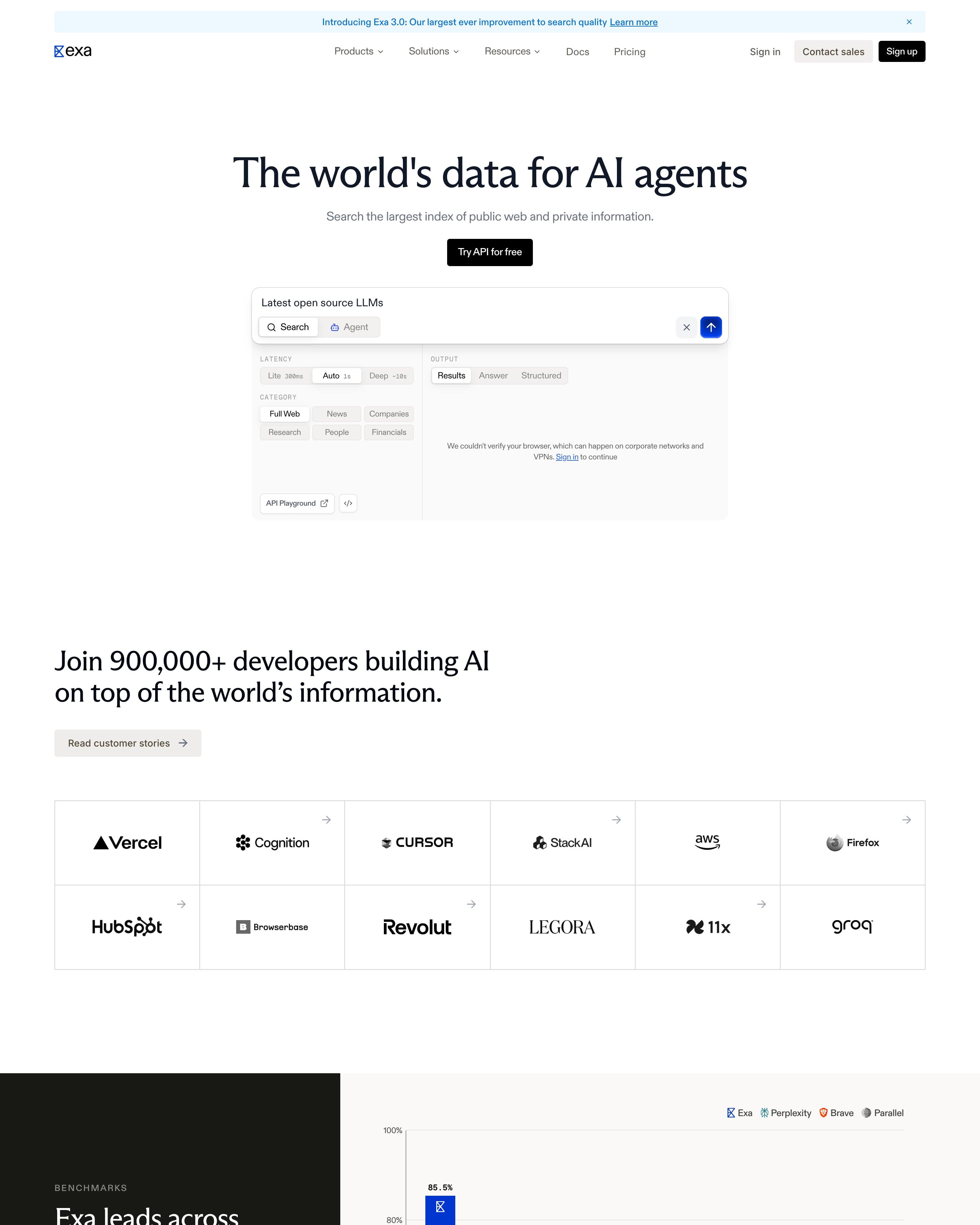
A serif headline, "The world's data for AI agents", sits over a live search box with Search and Agent tabs plus latency and category toggles, then a 12-cell logo grid. A split benchmarks block pairs a near-black menu with blue bars beating grey Perplexity, Brave and Parallel ones. Monospace stat cards count "55,203,690 Searches completed today" next to a blue dot cloud labelled EXA INDEX.
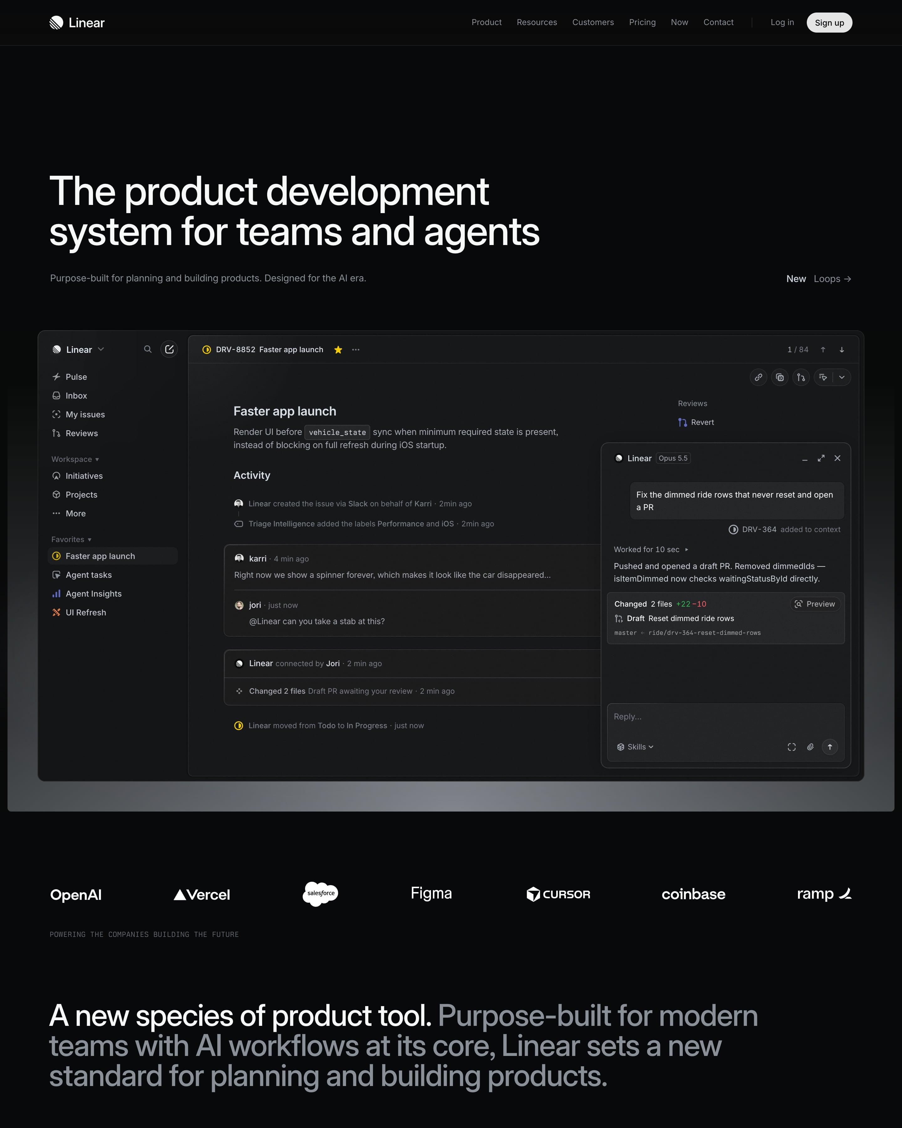
A near-black canvas opens on a full app window: an issue, with an agent chat panel docked beside it. Below a logo strip, four product sections share one pattern of heading left, text right and dimmed interface underneath. Worth copying: the lime quote card that breaks the greyscale near the end.
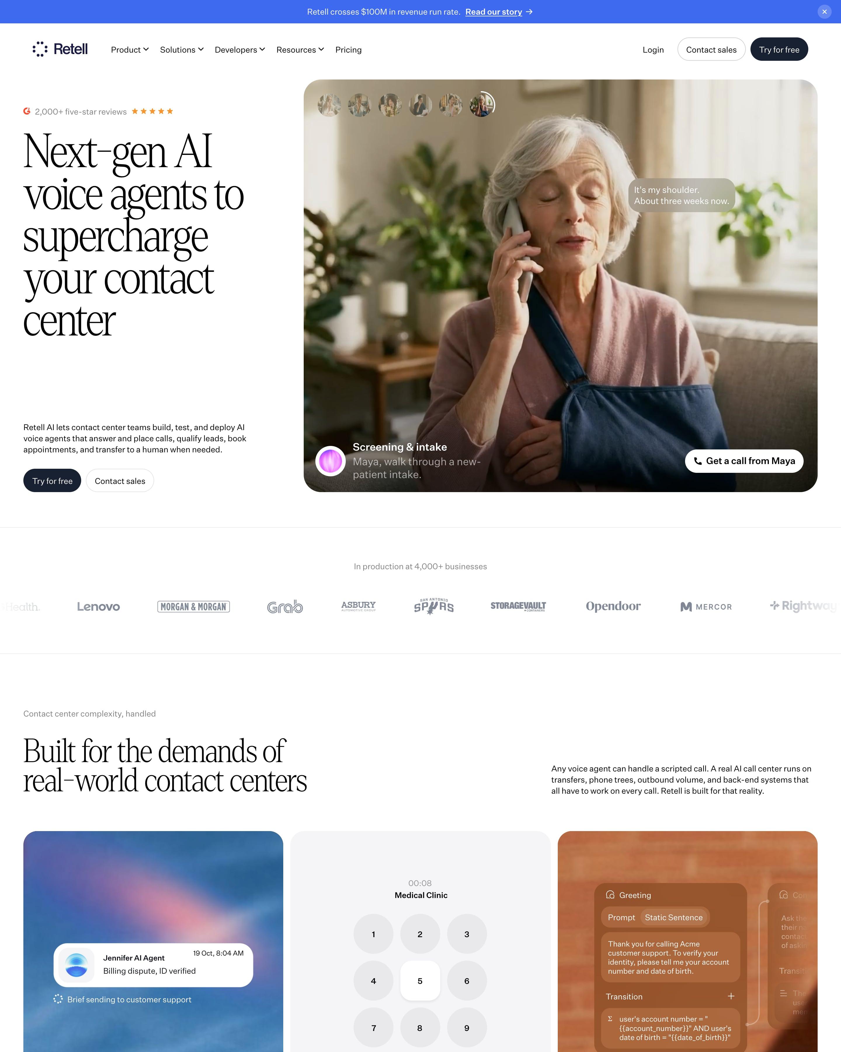
A tall serif headline, "Next-gen AI voice agents to supercharge your contact center", sits beside a photo of a caller with live transcript bubbles and a "Get a call from Kate" button. Feature cards mix a blurred sky, a phone keypad and a call-flow editor, a blue sphere of dots stands for the voice stack, and "CX Engineers build on Retell" sets three round photos inside the headline.
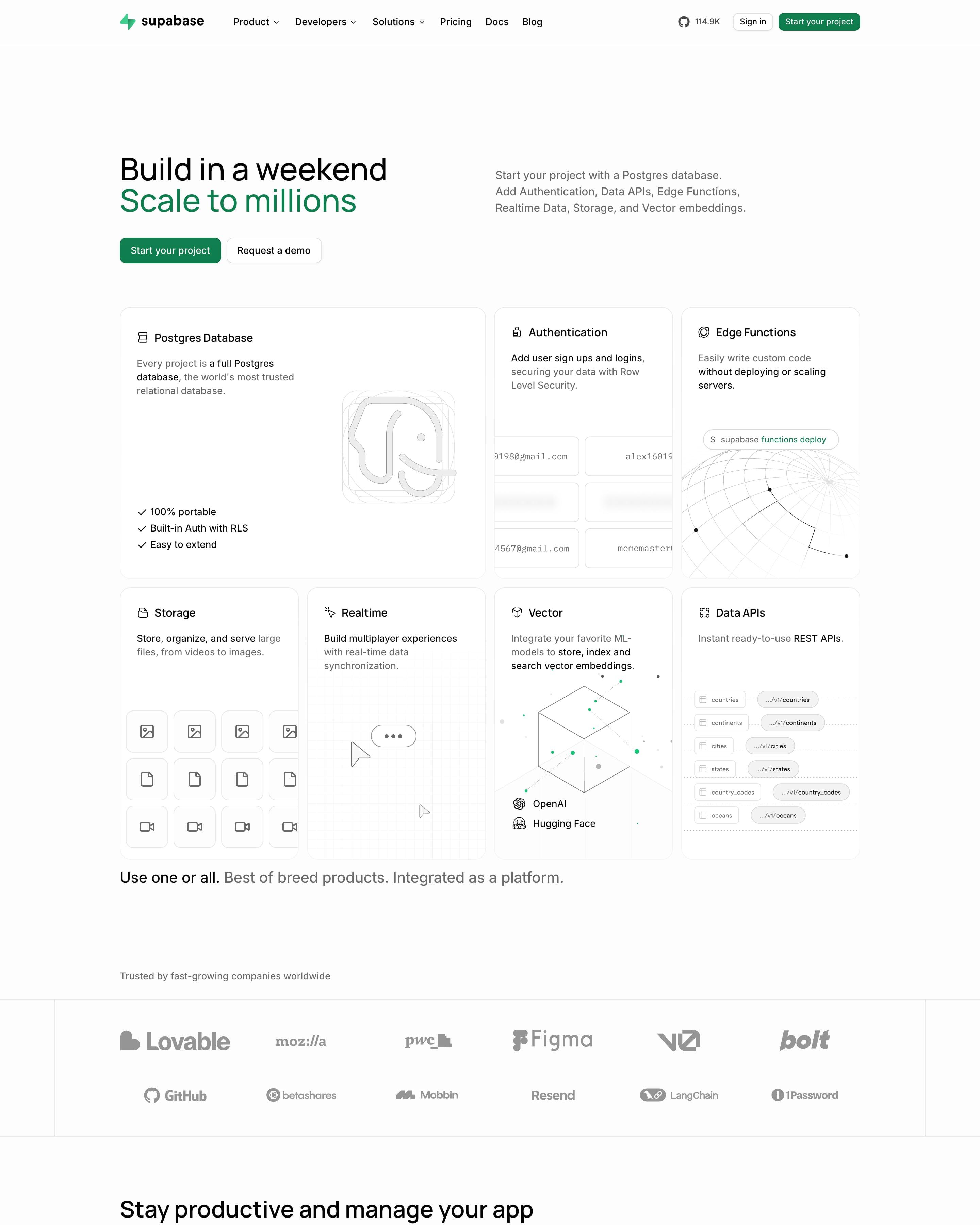
"Build in a weekend" in black sits over "Scale to millions" in Supabase green, with the subhead pushed to the right column. A bento of seven product cards follows, each with a thin grey line drawing: an elephant for Postgres, a globe for Edge Functions, a cube for Vector. Worth copying: the GitHub star count redrawn as a 114.9K matrix of green dots.
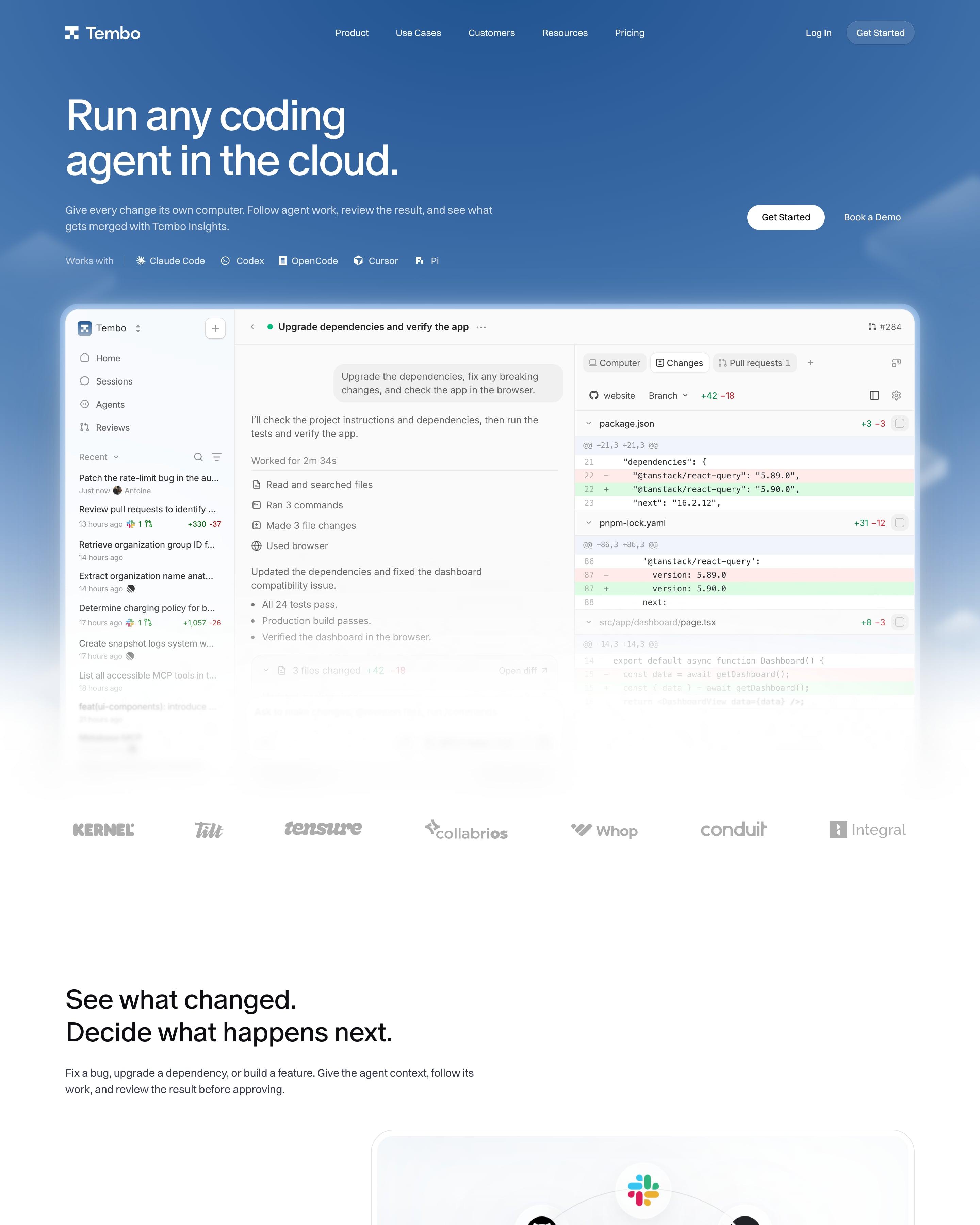
A sky-blue gradient hero with "Run any coding agent in the cloud." fades into a full app screenshot showing a dependency-upgrade diff. Sections then alternate frosted white panels on pale blue: an orbit of integration icons around the Tembo mark, an agent picker dropdown, an Insights dashboard. Worth copying: the line under the customer stats, "Tembo uses Tembo to build Tembo."
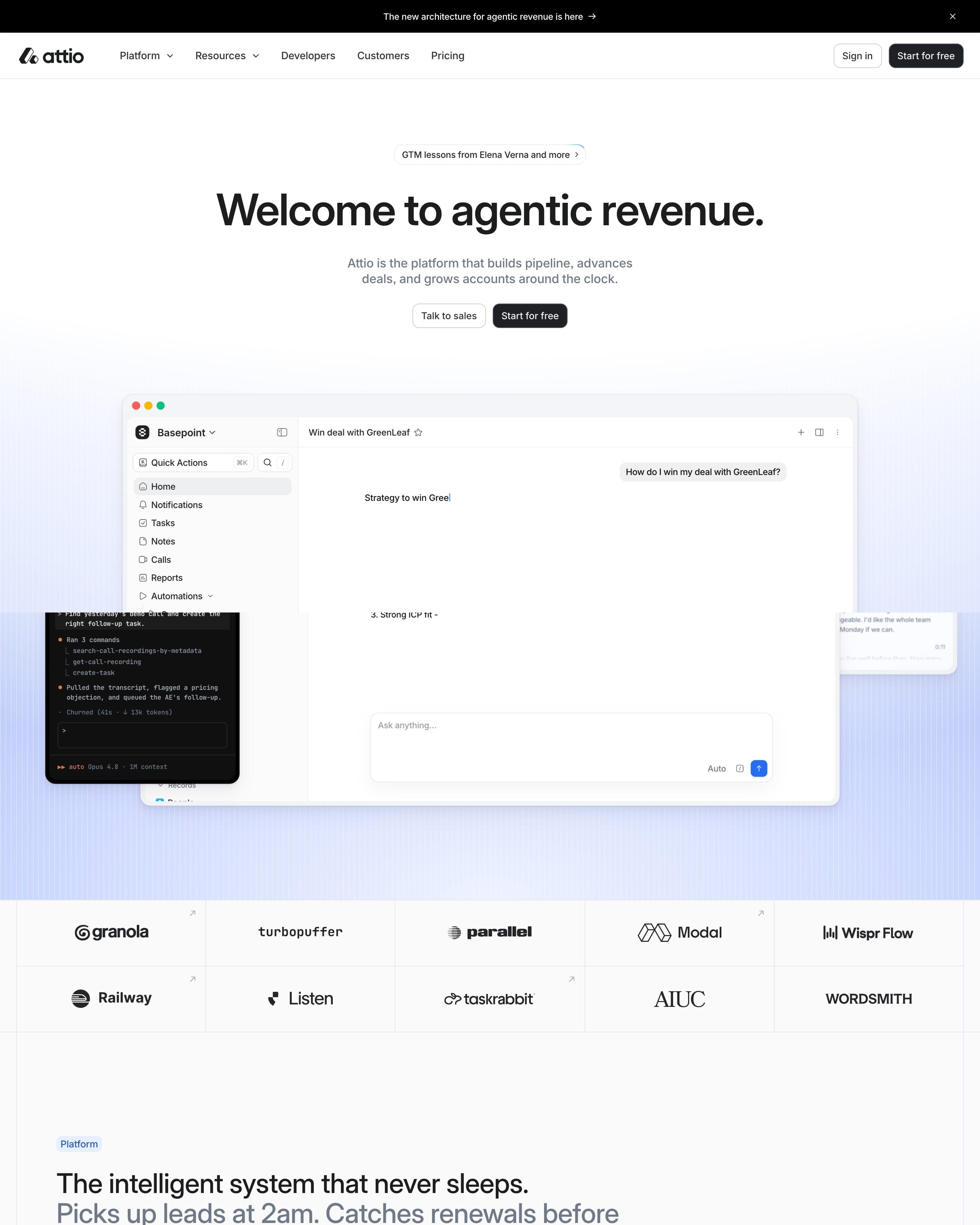
The hero centres its headline above the app's own AI chat window, with a bordered grid of ten customer logos below. Product screens then scroll past a sticky menu of five stages, from Build pipeline to Retain and expand. Reuse that menu, and the black "Universal Context" band with its glowing horizon.
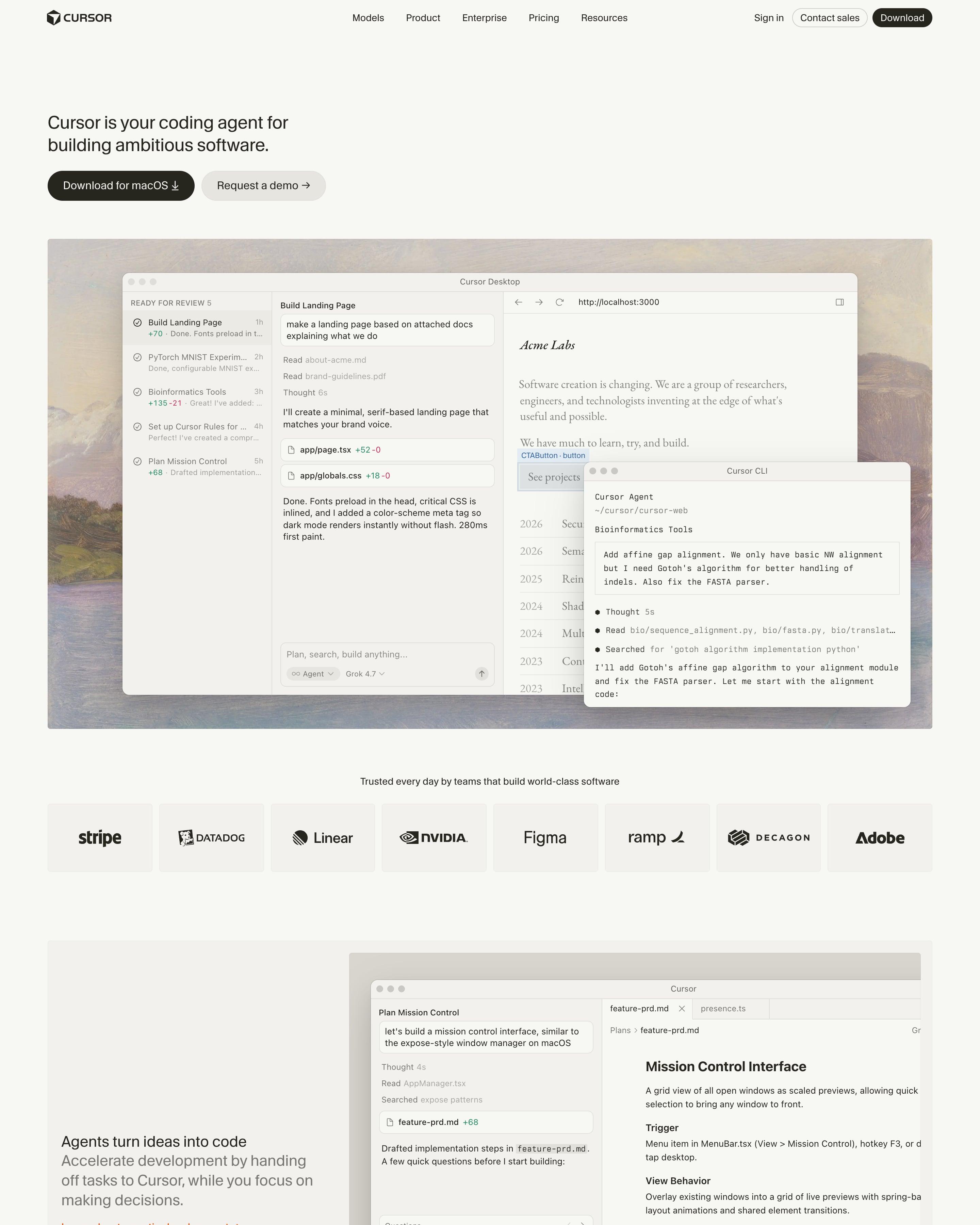
The hero sets the desktop app and a CLI window over an oil-painted landscape, and feature rows alternate sides in soft beige panels with orange text links. Proof is a logo strip and a grid of six named quotes. A homepage changelog row, four dated updates, is a small idea worth taking.
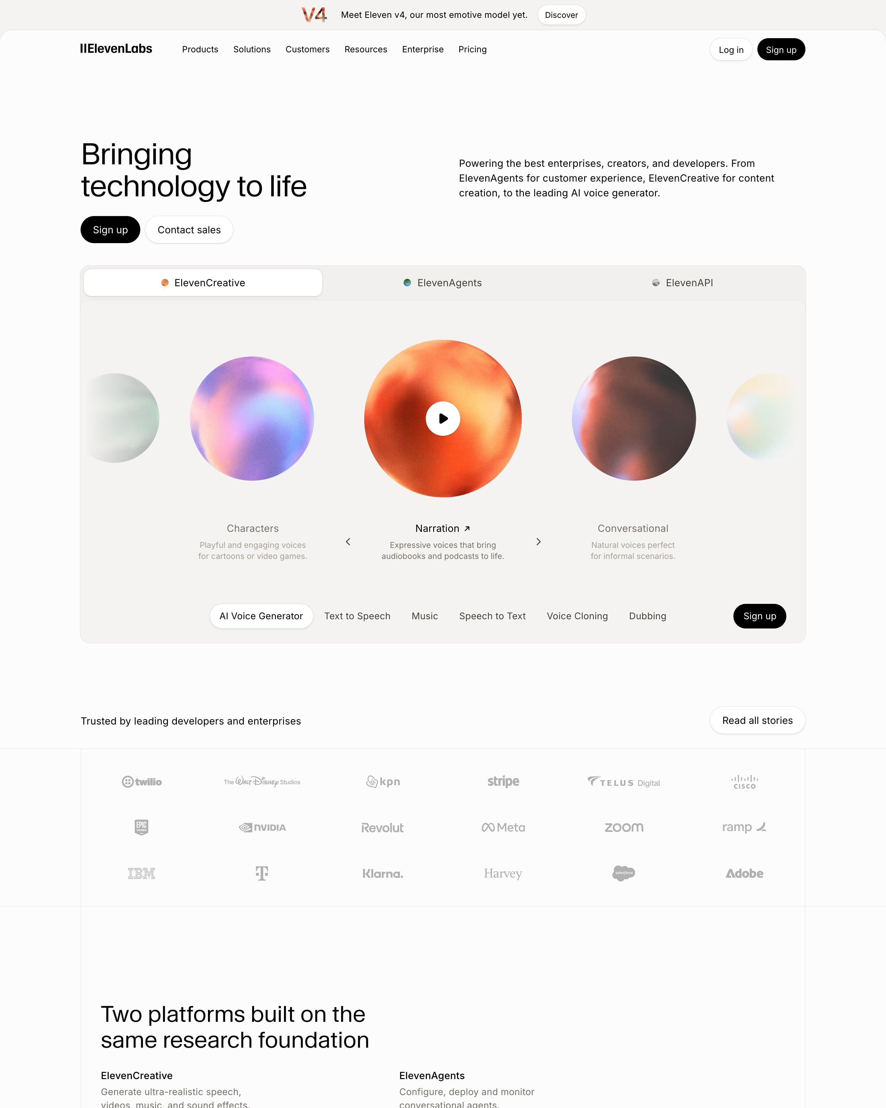
"Bringing technology to life" leads into a tabbed player where grainy colour orbs stand for voices like Narration and Characters. The page then splits into ElevenCreative, ElevenAgents and ElevenAPI, each with a bento of beige cards, chat bubbles and code snippets. Worth copying: line drawings of a cube and concentric circles for the moderation, accountability and provenance cards under "Safety, built in".
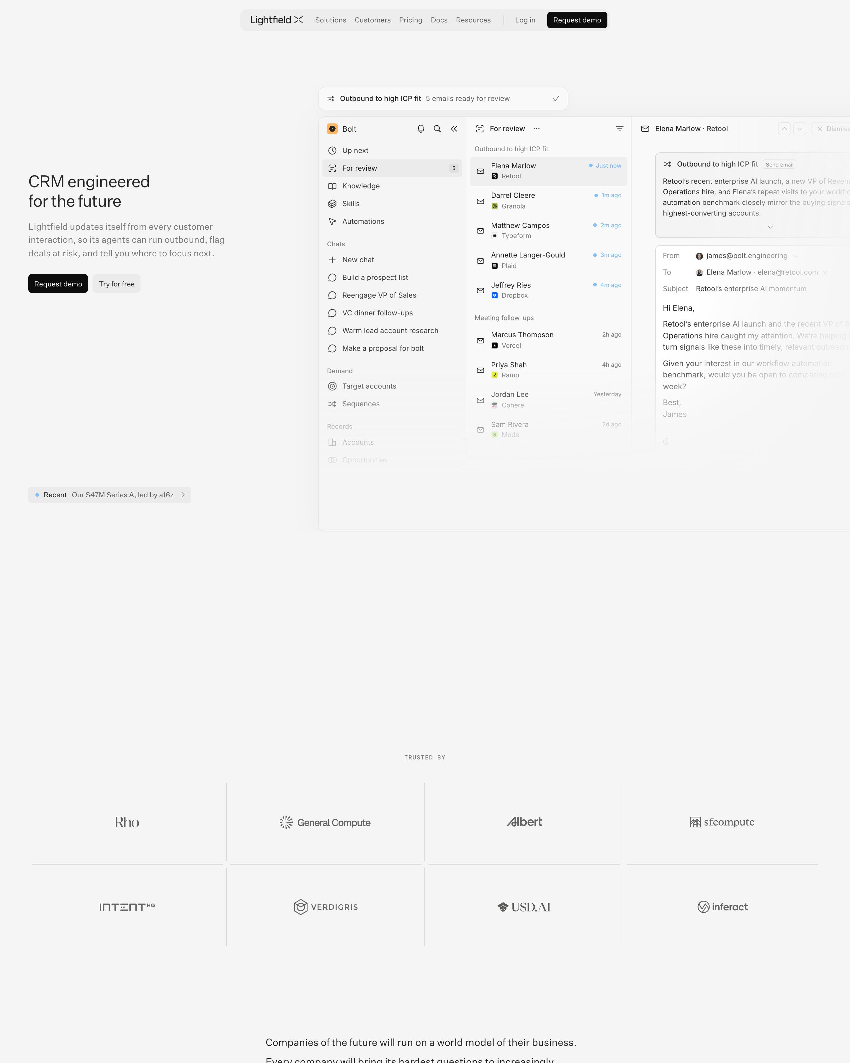
The headline stays small and left-aligned beside a product inbox screen that runs off the right edge. Customer logos fill a grid of bordered cells, and an isometric stack of layers explains how the product works. Worth copying: quote cards over blurred sky photos, nearly the only colour on a grey page.
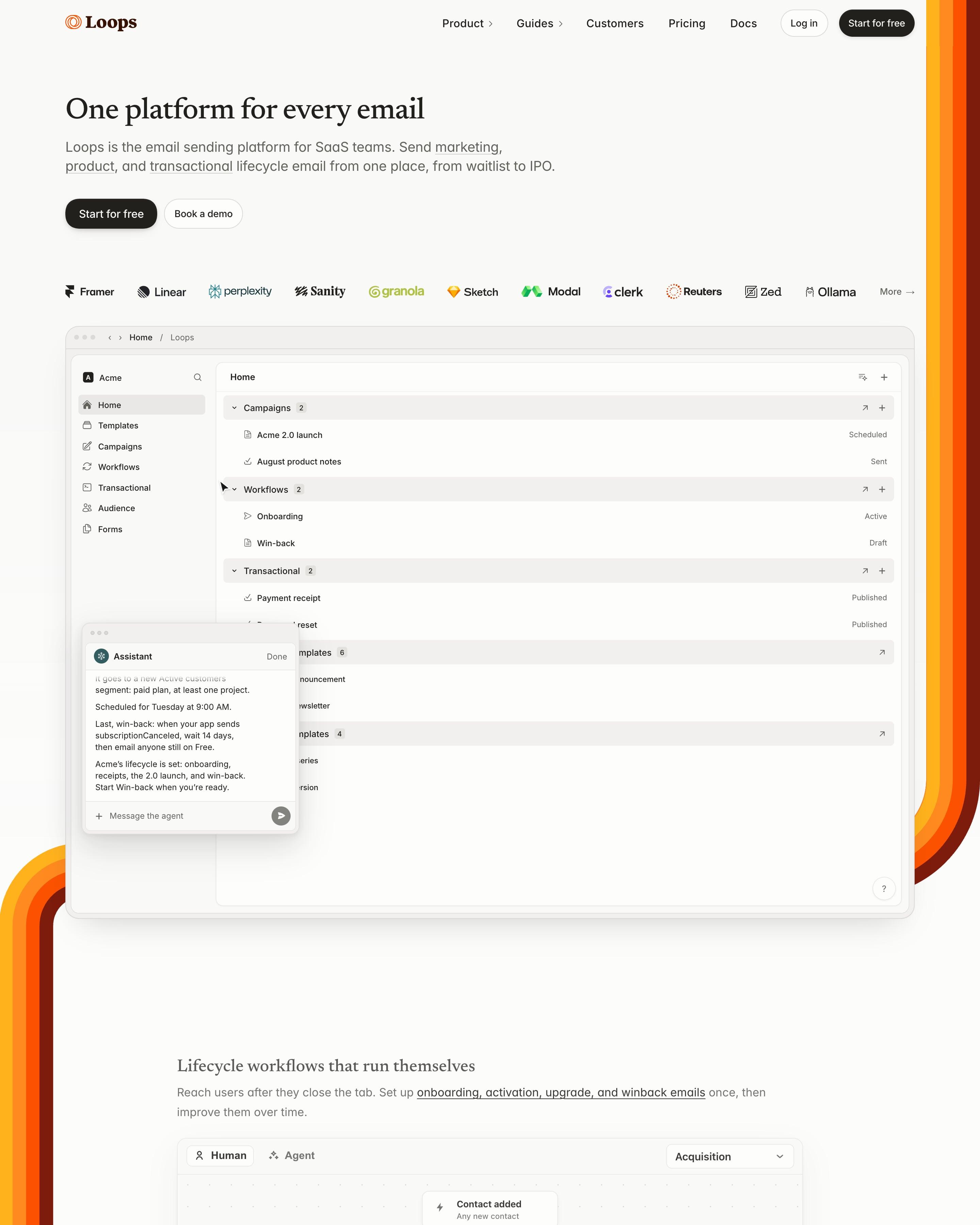
Seventies-style stripes in yellow, orange and rust wrap the cream page like a frame, the only loud colour on the site. "One platform for every email" is set in a small serif over a logo row and an app screenshot with an Assistant chat. Each feature then gets a quiet serif heading, a UI panel with Human and Agent tabs, and a row of "Learn" pills.
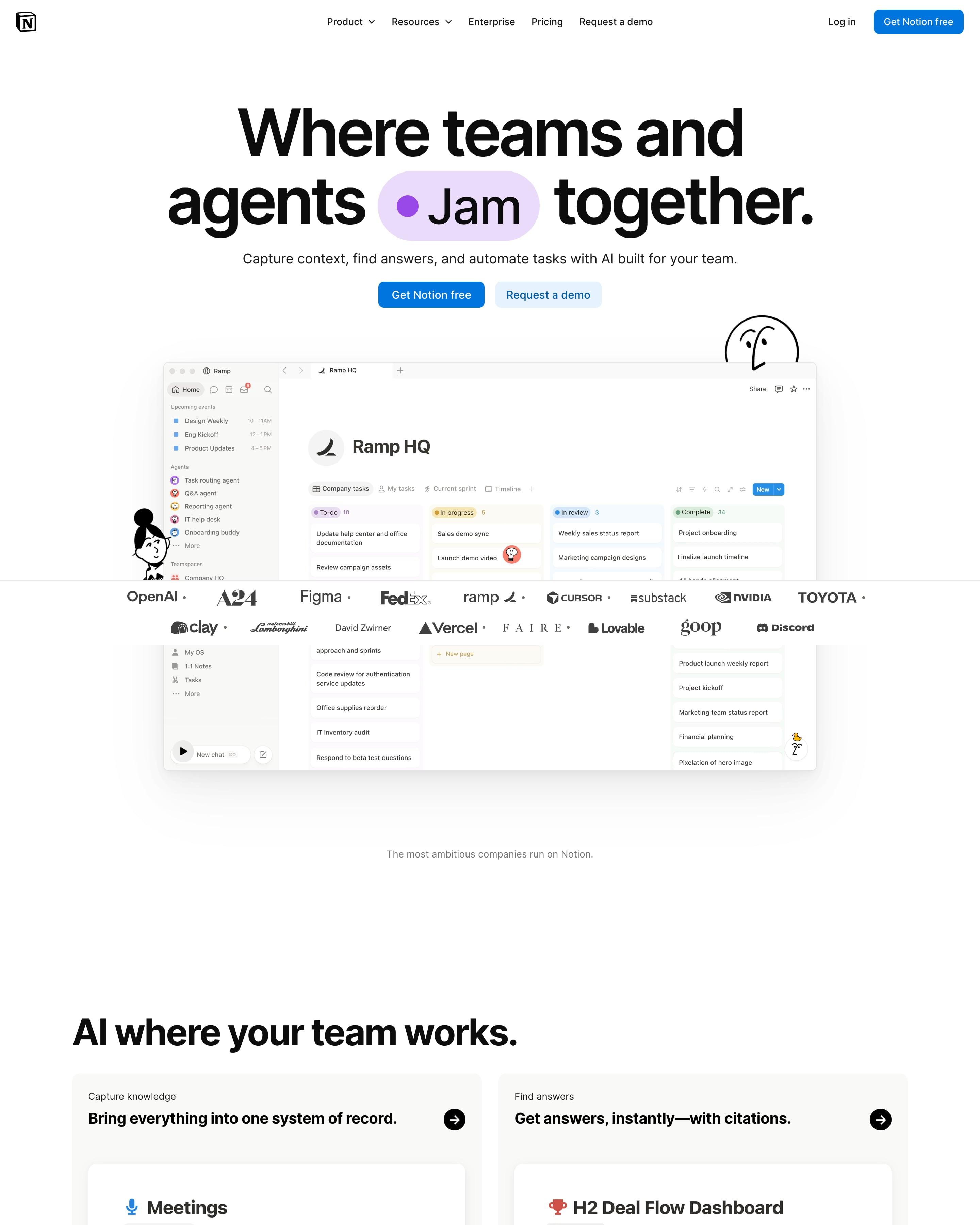
"Where teams and agents Think together." wraps "Think" in a blue pill inside the headline, and Notion's line-drawn characters peek around the Ramp HQ workspace screenshot. "AI where your team works." is a bento of three app scenes (Meetings, H2 Deal Flow Dashboard, Coding Agent) and five small use-case cards. Worth copying: testimonial cards tinted red, blue and yellow for Cursor, Faire and Ramp.
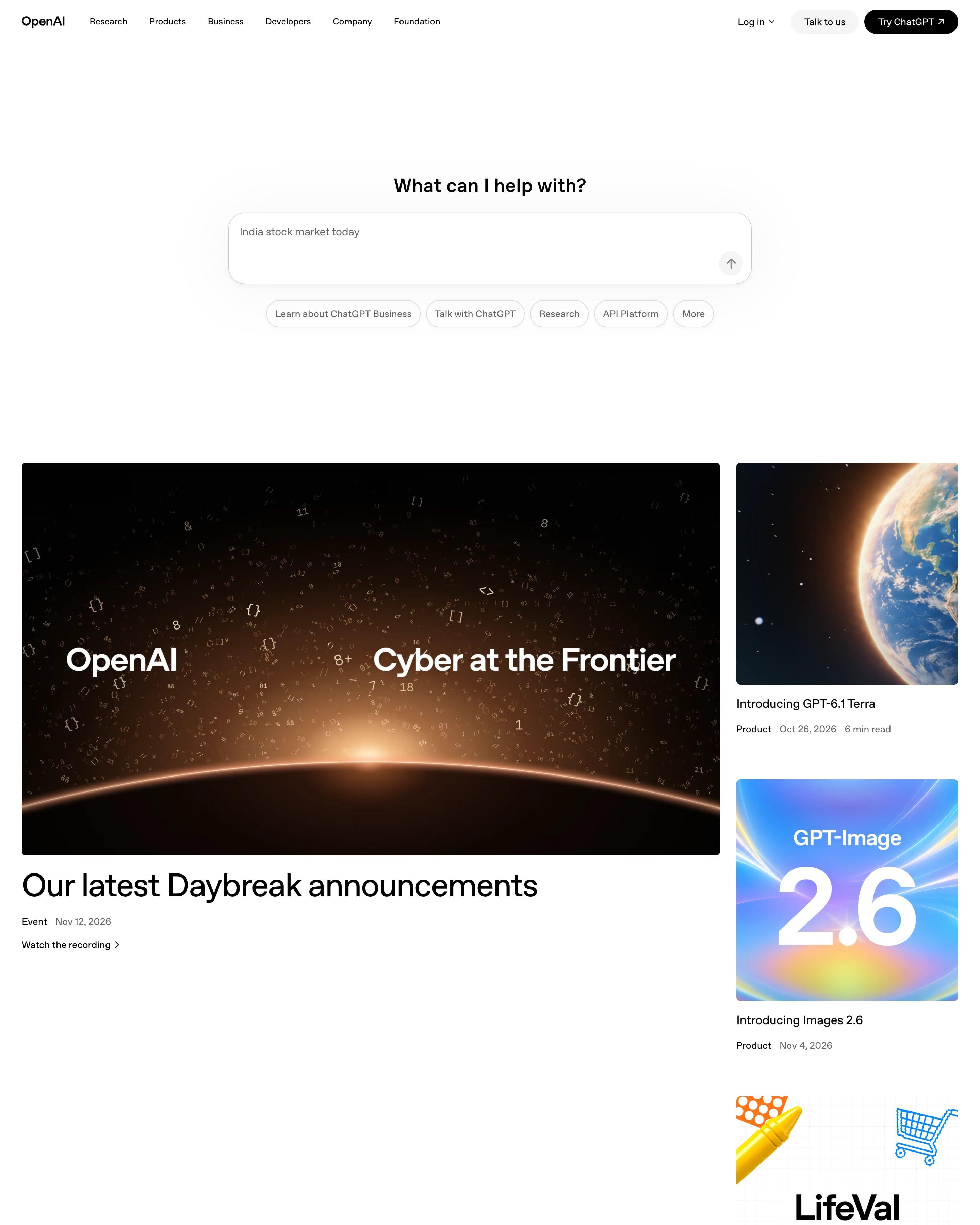
The hero is a ChatGPT prompt box, "What can I help with?", with suggestion pills below instead of a headline. One big Daybreak event card sits beside a column of three product cards, then Recent news runs as a two-column list with small soft gradient squares. Stories, Latest research and OpenAI for business follow as rows of three. Worth copying: brand-coloured material textures behind customer logos, like Zapier's orange.
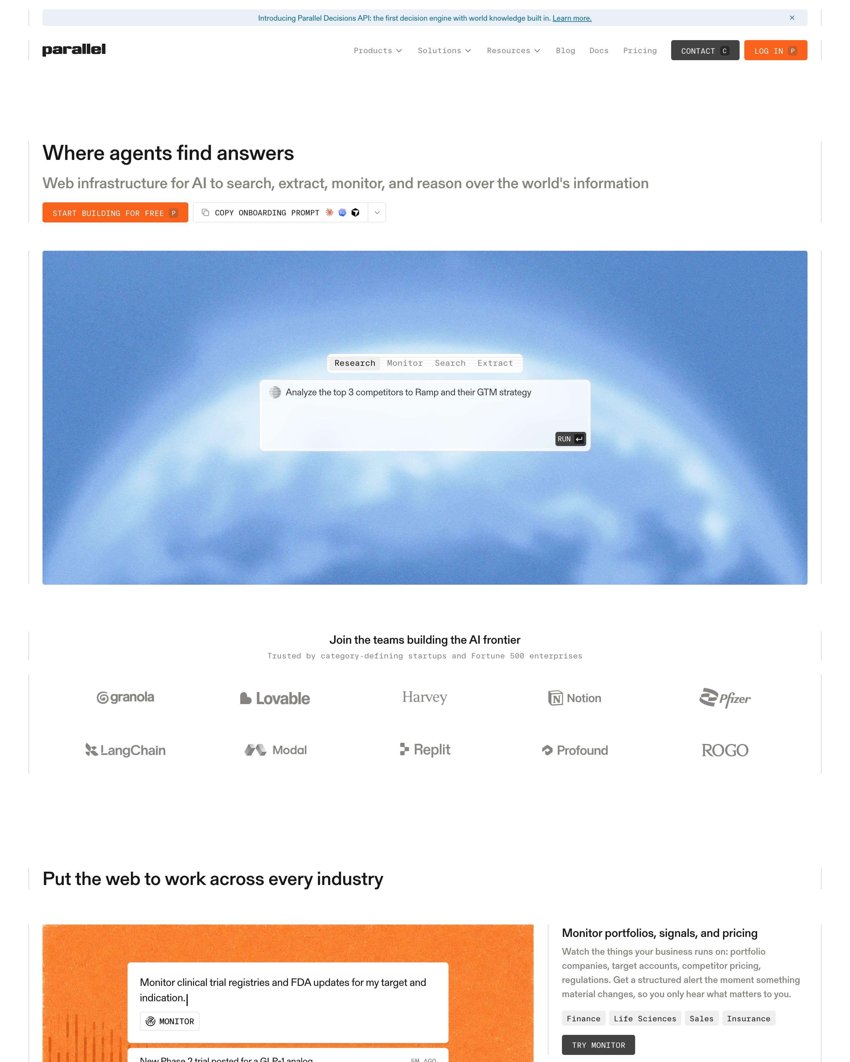
Hairline rules frame the page, and the main buttons are set in uppercase monospace with keyboard-shortcut keys. The hero puts a prompt box, with Research, Monitor, Search and Extract tabs, on a grainy blue sky, and later sections use grainy orange panels and a benchmark chart. Steal those shortcut keys.
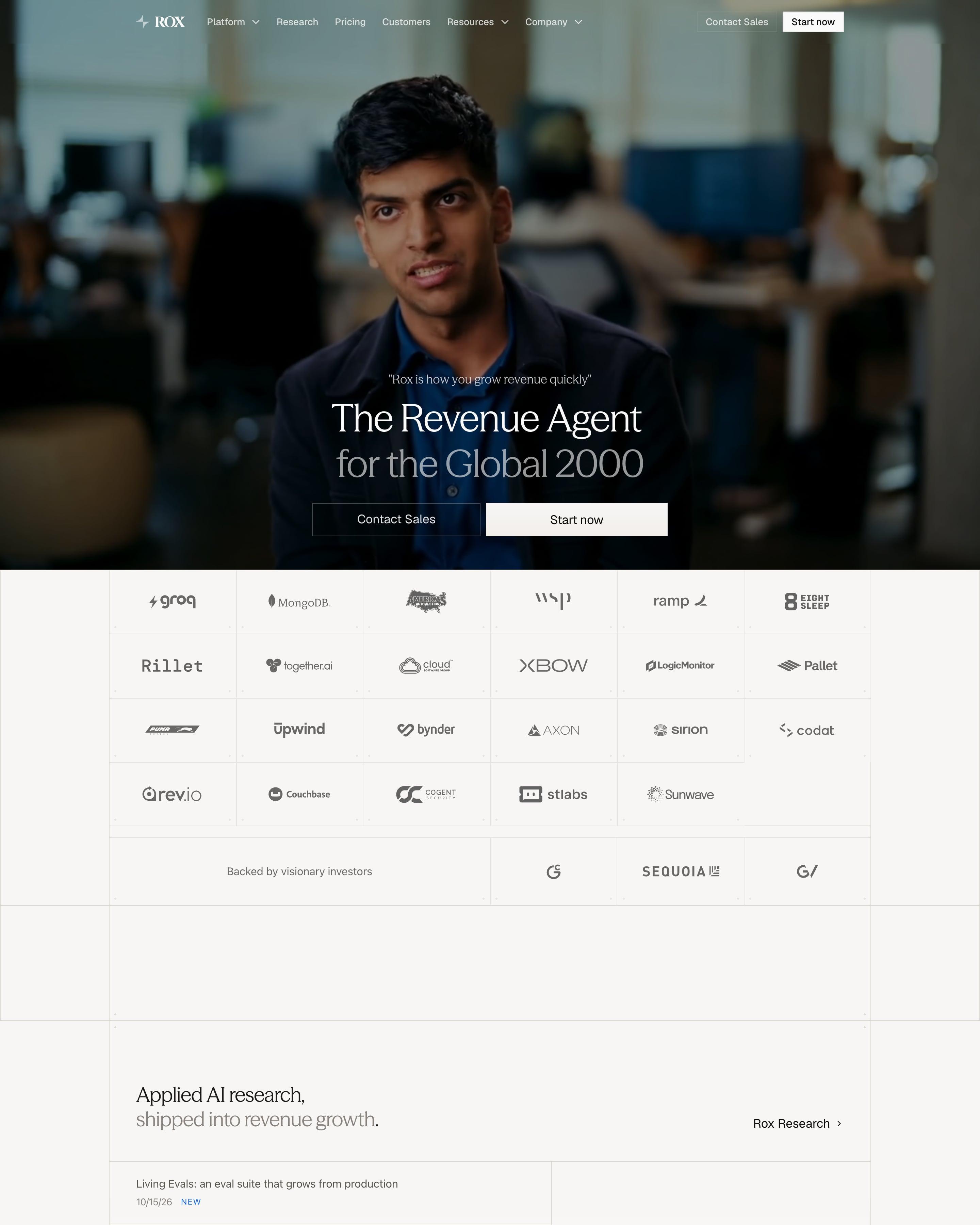
A dimmed video of a speaker fills the hero, with "The Revenue Agent for the Global 2000" in a light serif and two square-cornered buttons. Customer logos sit in a ruled grid with visible corner marks, a motif that returns on every page. Worth copying: a dark carousel of customer portraits, each captioned with a fact like "Raised $270M from Sequoia + Others".
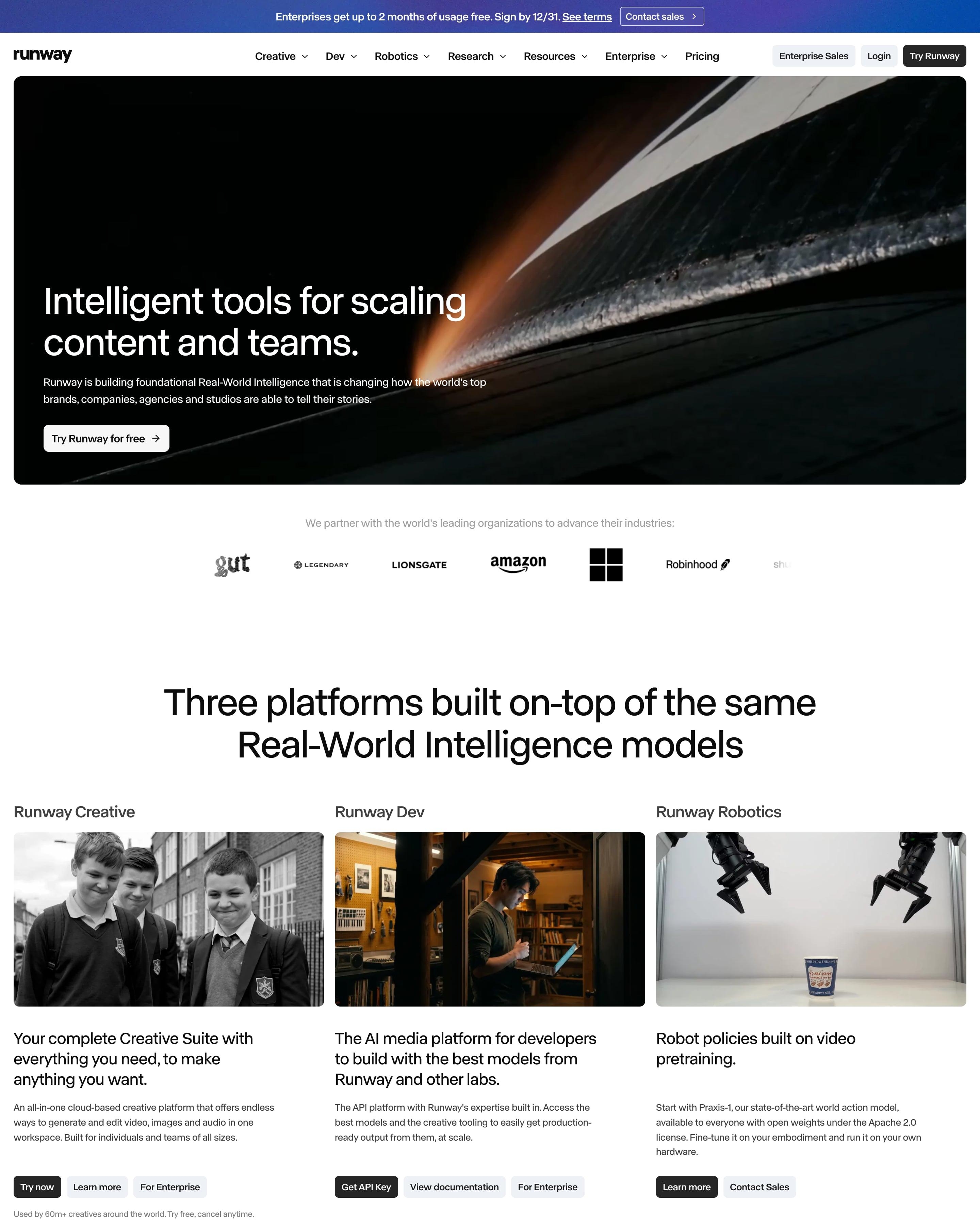
A rounded frame holds the white headline, over a dark close-up with a streak of orange light. Under a logo row, three columns present Creative, Dev and Robotics, each with a photo, a short pitch and its own buttons. Worth copying: buttons matched to each audience, like "Get API Key" for Dev.
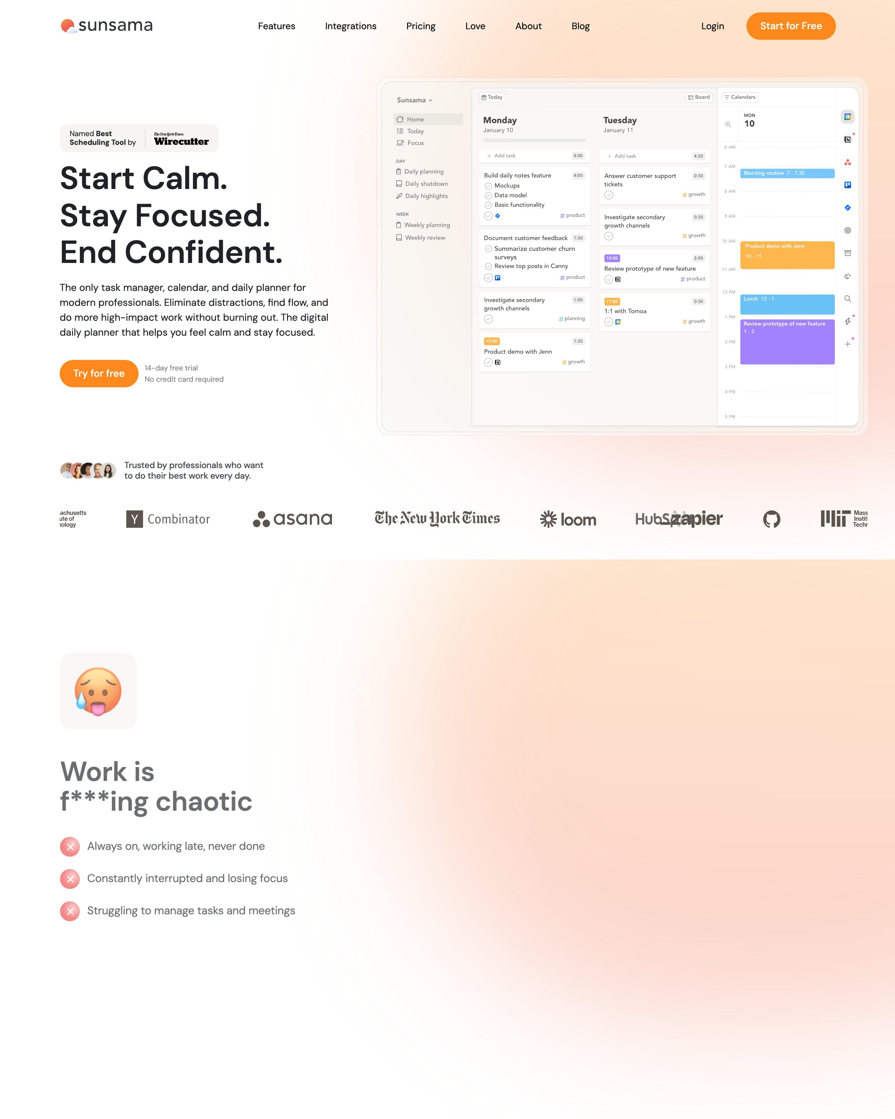
"Start Calm. Stay Focused. End Confident." sits left of the planner screenshot, with a peach glow bleeding in from the top right. Features follow the day: pills for "Start your Day", "Work through your day" and "Make every day count", joined by a thin line down the left edge, each opening a big card and three small ones. Orange marks one word per headline, such as "clarity" and "successful".
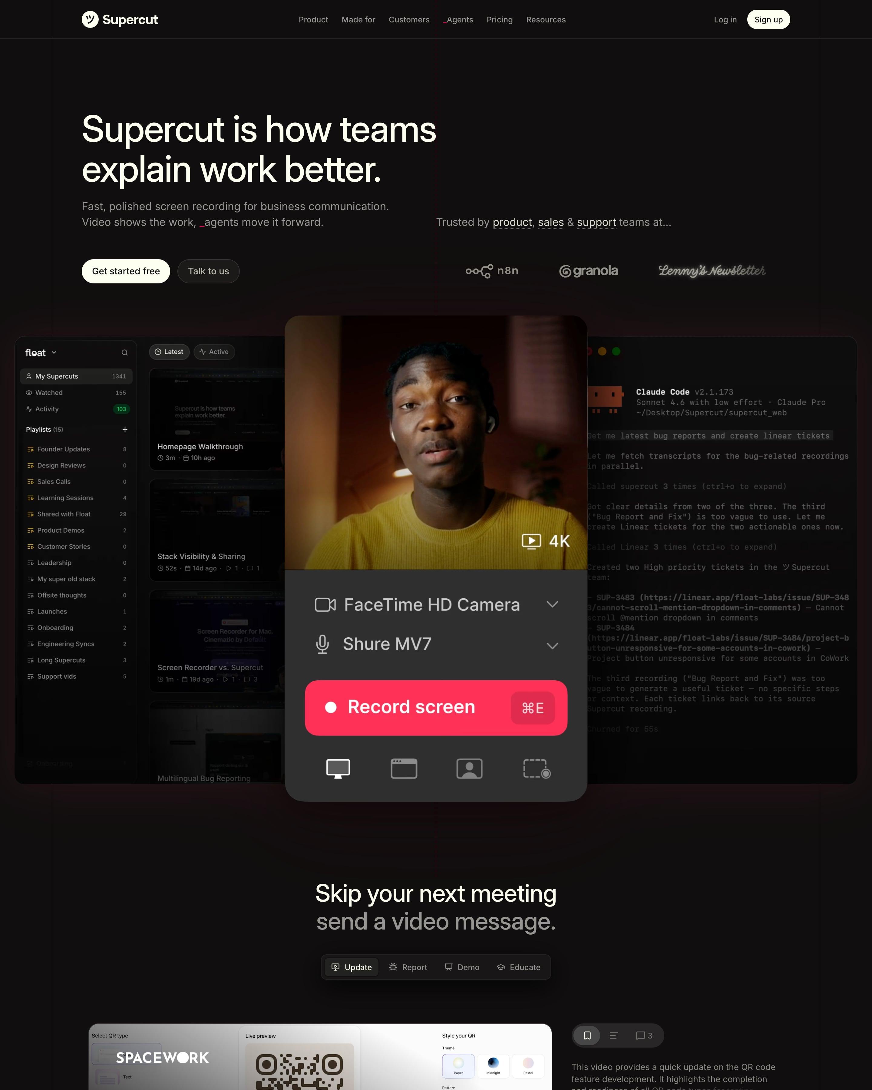
A near-black page laid on visible column lines opens on a recorder panel, with a red "Record screen" button and ⌘E shortcut, in front of a video library and a Claude Code terminal. Sections share one rhythm: two-tone headline in white then grey, short copy, a small red pill CTA, then a full-width demo. Worth copying: the transcript with filler words struck through in red.
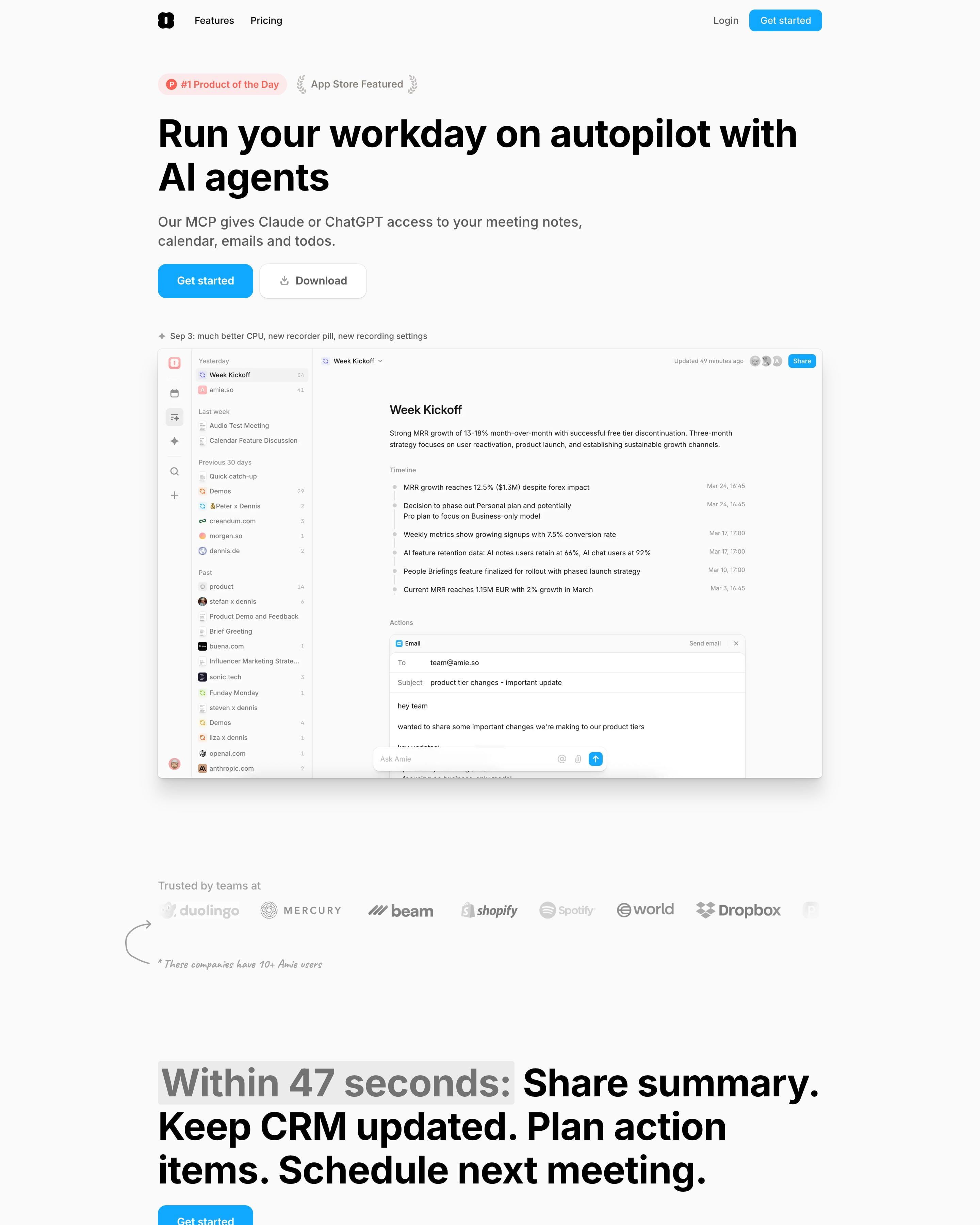
Two award badges and a changelog line frame the hero's product shot. Below, the page reads like a single-column document, with coloured eyebrow labels, "Replaces:" lines that name other apps and screenshots set on desktop wallpapers. Copy the handwritten asides, like "This is a real review we got" beside a customer email.
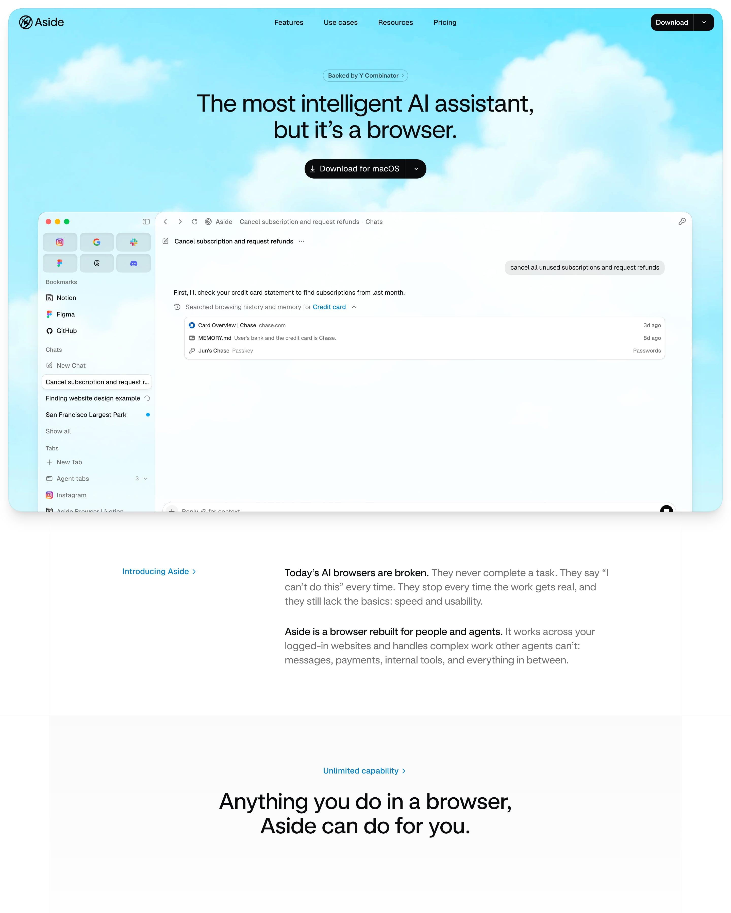
The hero sits in a rounded frame of bright cartoon-sky clouds, and the product shot is the browser itself: bookmark sidebar, an "Ask AI a task" box and recent-task cards. A benchmark bar chart puts Aside at 99.0% in blue against grey bars for Browser Use, GPT-5.4 and others. Small blue eyebrow links like "Password Manager >" label each section, over a wall of tilted app icons.
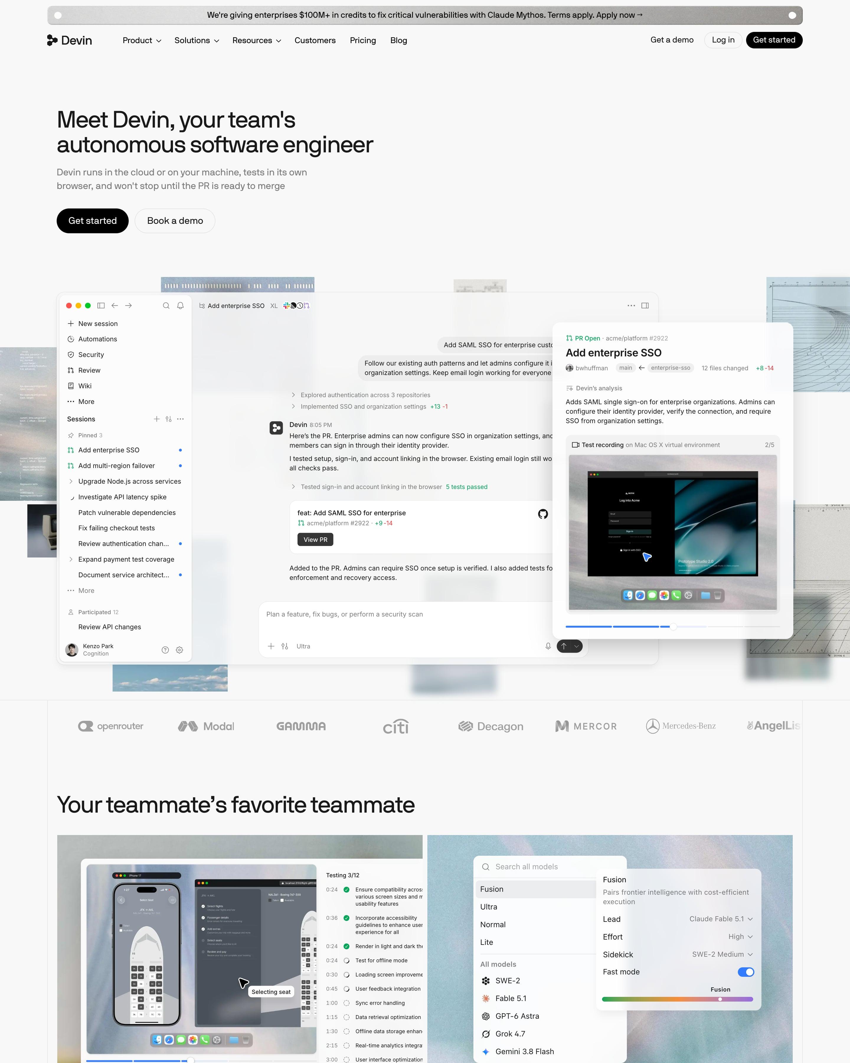
"Meet Devin, your team's autonomous software engineer" sits over a full app window and a PR card with a test recording, set against soft sky and blueprint photo scraps. "From problem to merged PR" walks through four numbered steps, alternating screenshot and copy. Worth copying: a "Recently shipped" changelog with dates like 11.13 right on the homepage.
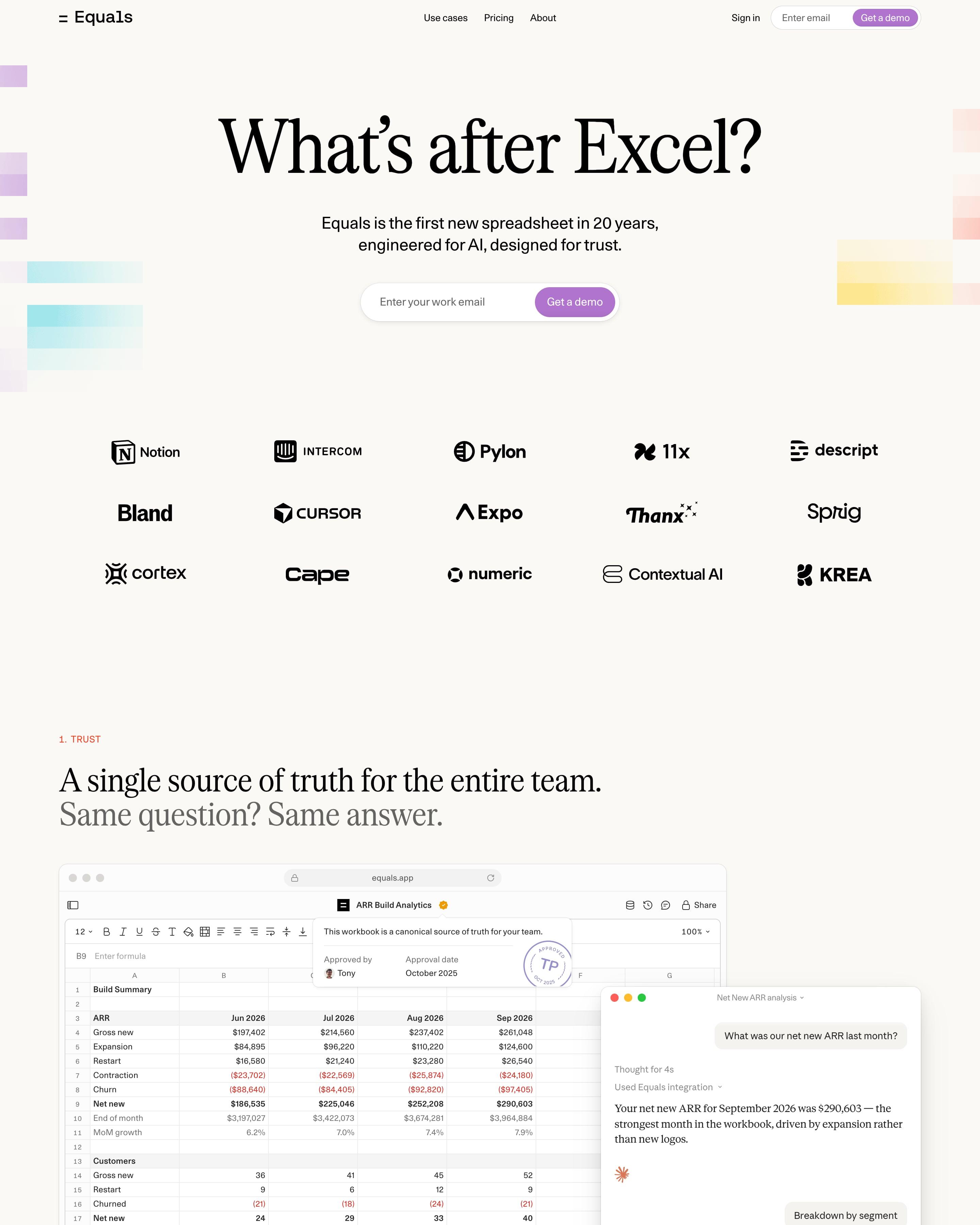
Soft pixel-gradient blocks in lilac, cyan and peach frame a serif "What's after Excel?" above an email field and a logo grid. Five numbered sections, from Trust to Testimonials, pair a serif claim with a grey second line. Worth lifting: the isometric layer diagram and the giant wordmark that fills the footer.
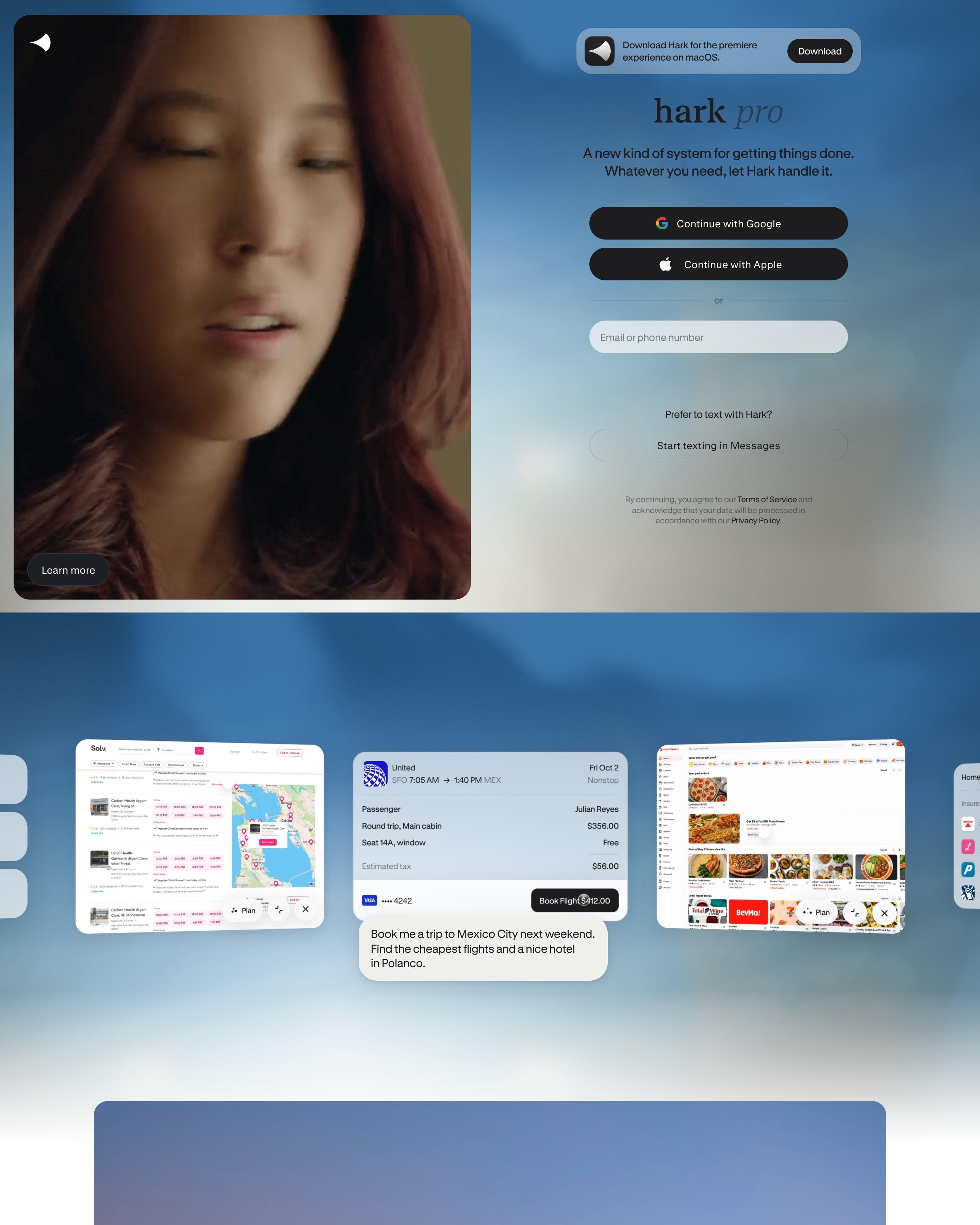
There is no menu: the hero pairs a video portrait with the sign-up form itself, Google and Apple buttons on a cloudy sky. Five features then alternate sides, each on its own gradient panel, from blue sky to coral dusk. Two serif statements lead back to the same form, a bookend worth copying.
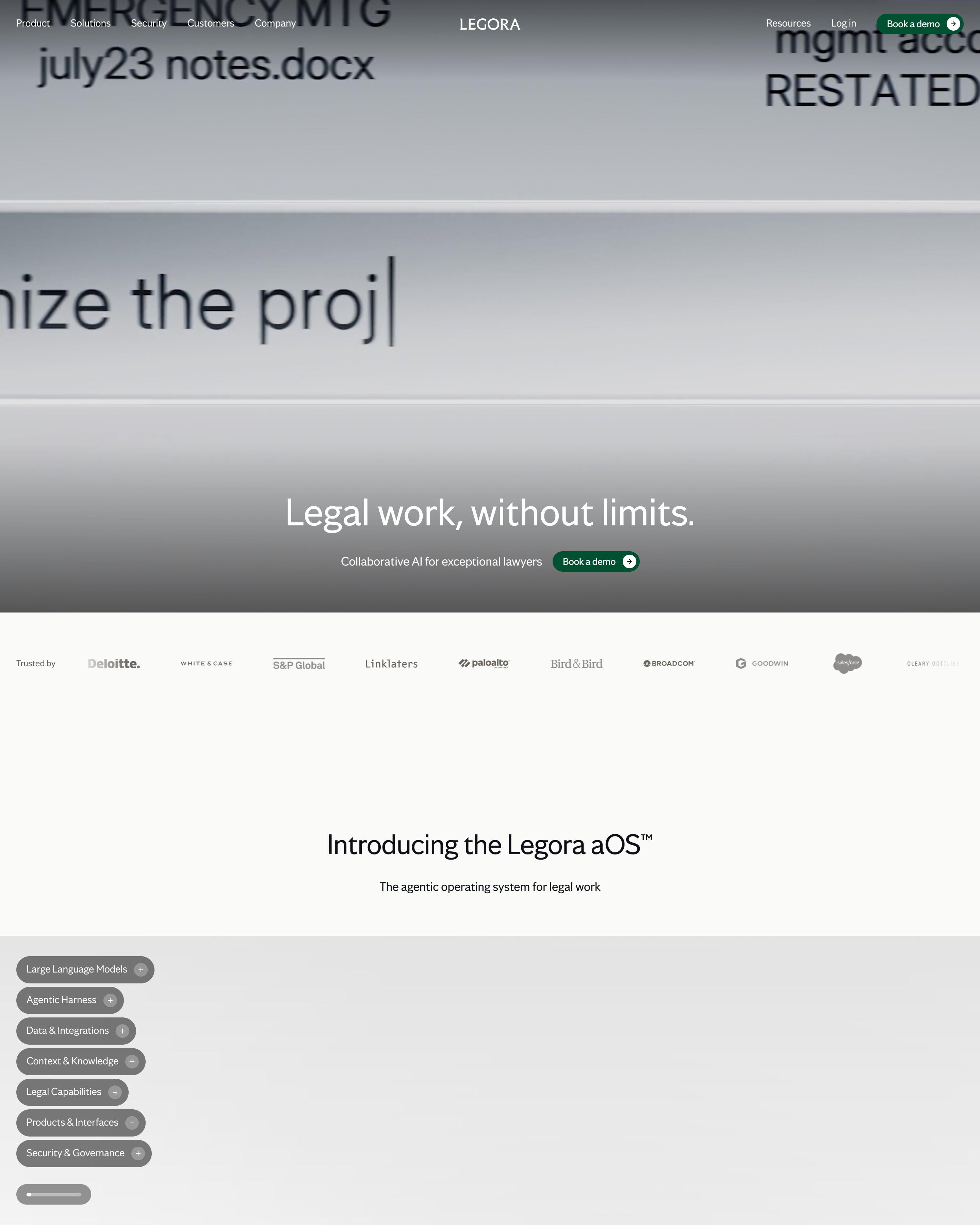
Blurred close-up footage of text being typed fills the hero, with the headline near the bottom. Borrow the aOS section: as you scroll, glass slabs stack layer by layer into a frosted cube, each layer named and explained in a pill list. A navy band later gives five compliance standards a column each.
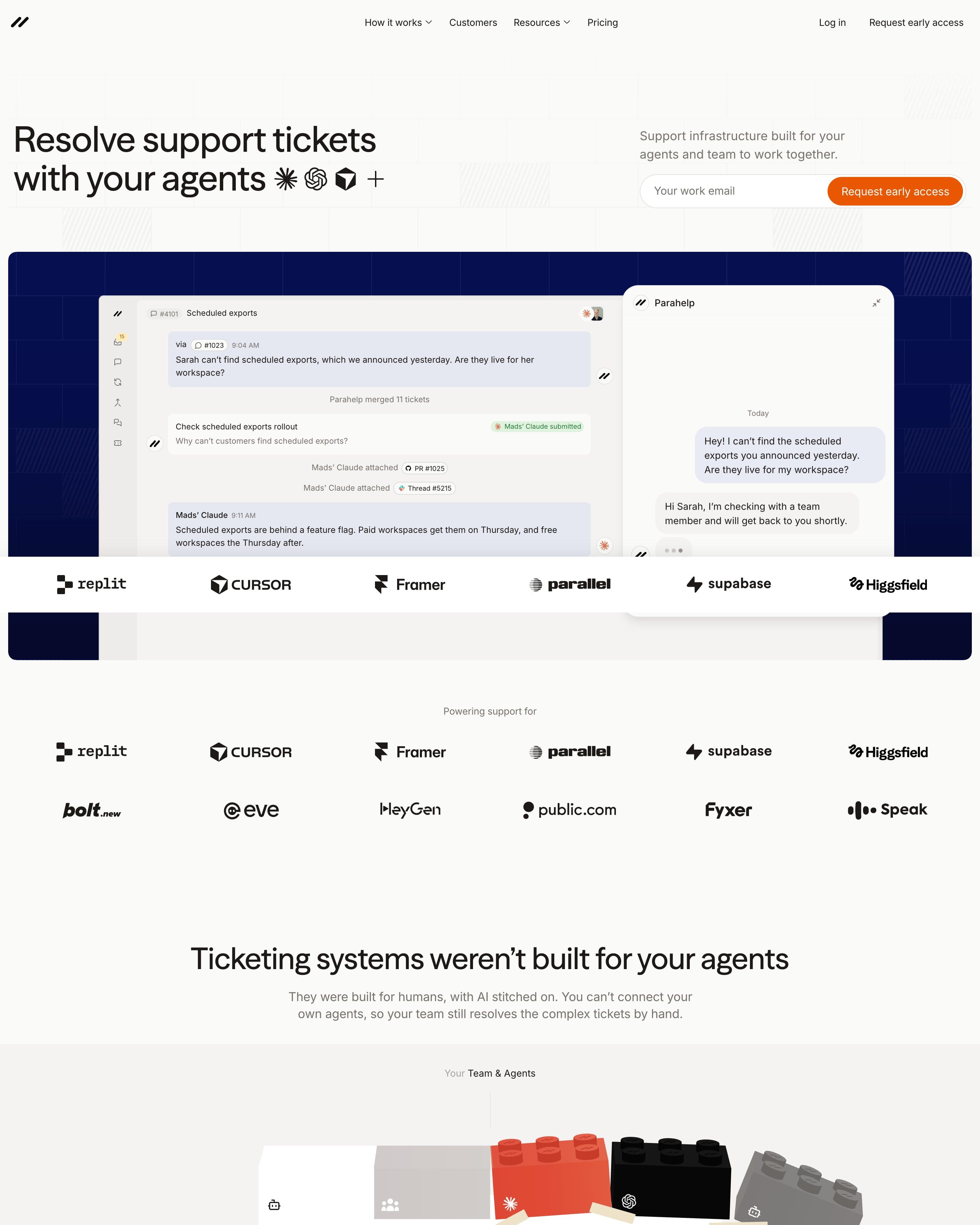
A product window floats over a deep blue grid, showing an agent's ticket thread next to the customer's chat. A strip of AI-company logos follows straight away. Worth copying: the hero shows both sides of a support conversation at once, the team's view and the customer's.
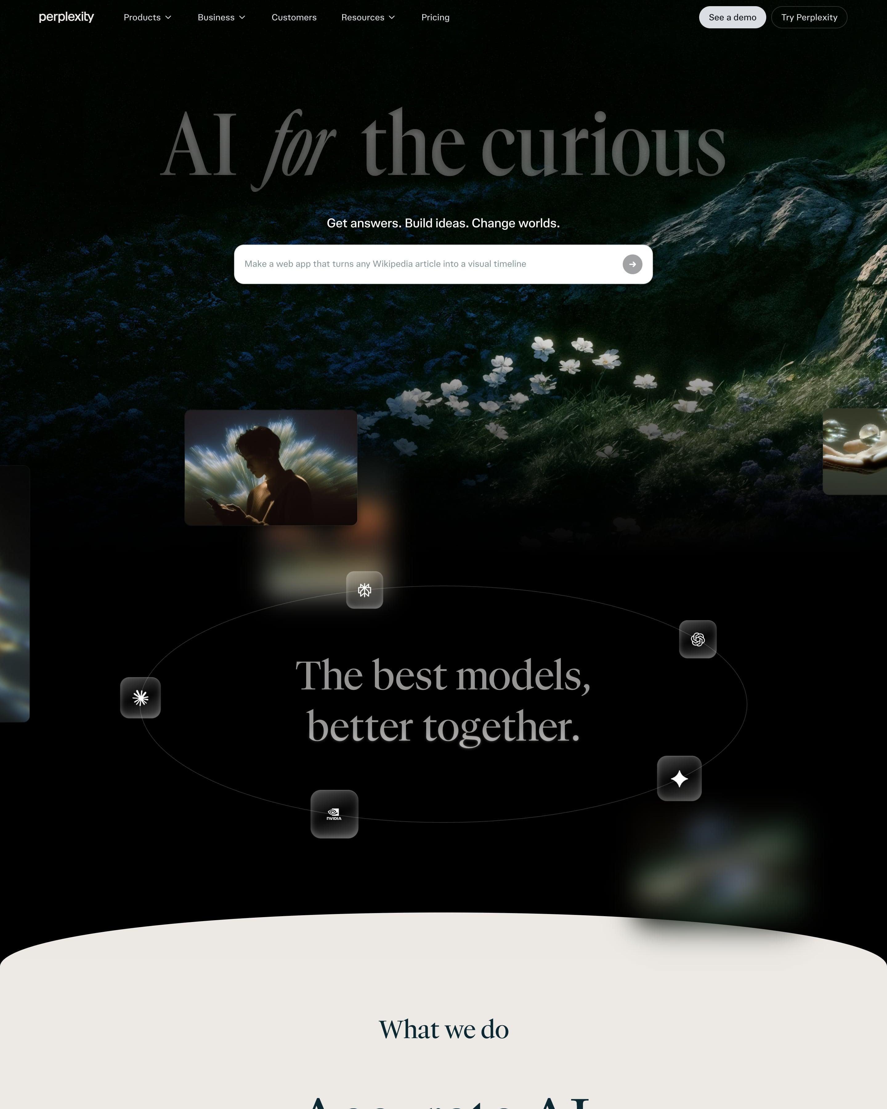
A serif "AI for the curious" in faded grey sits over a dark photo of white flowers on a hillside, with a white prompt box below. Model logos in glassy tiles orbit an ellipse around "The best models, better together." before the page curves into warm off-white for four dark product cards: Answer Engine, Computer, Comet and API Platform. The footer repeats the tagline as giant pale type.
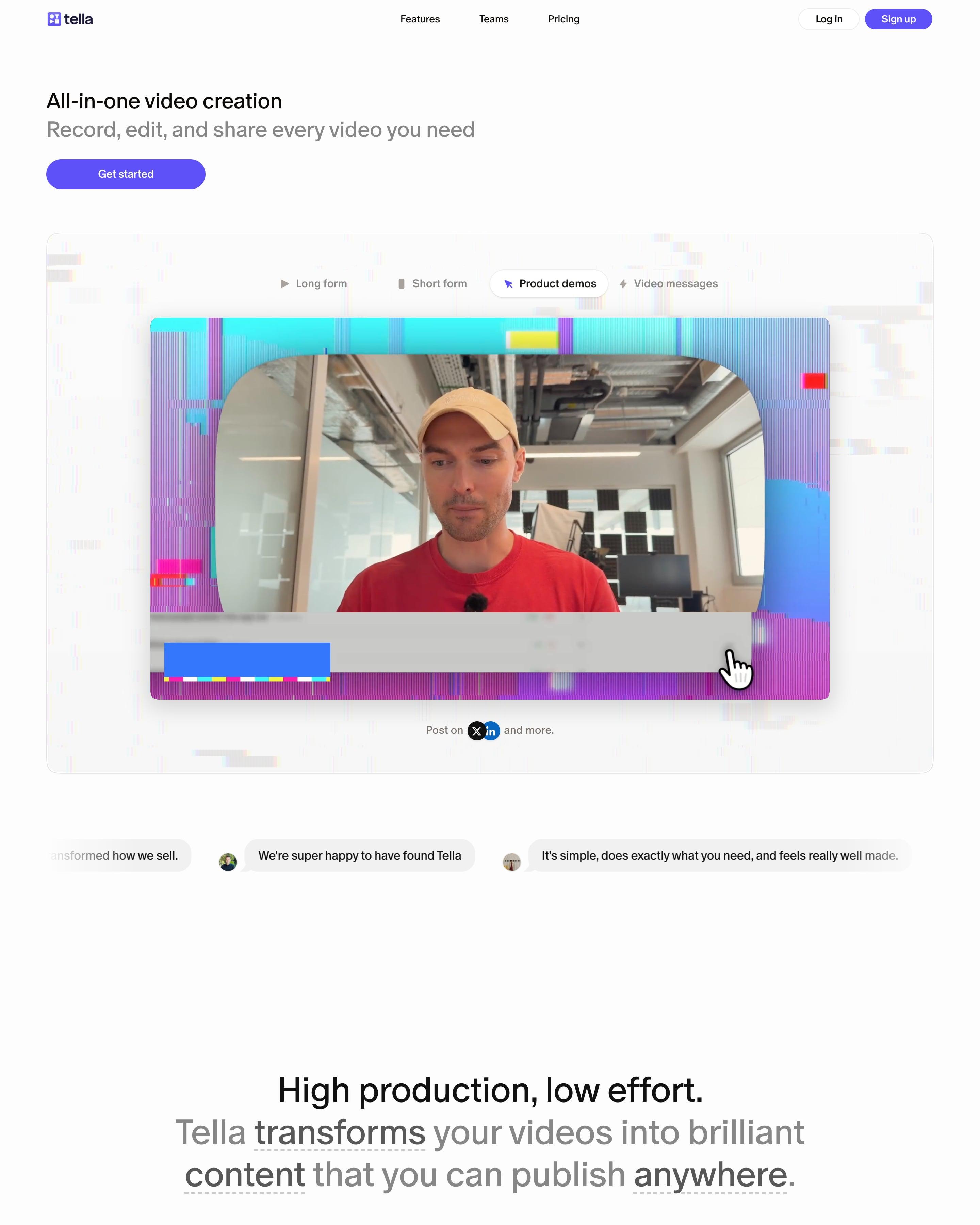
A small left-aligned headline, "All-in-one video creation", sits over a framed player with tabs for Long form, Short form, Product demos and Video messages, edged in a cyan and magenta datamosh glitch. Feature blocks alternate copy and product UI inside pale rounded panels, each followed by a row of grey pill tags. Worth copying: keeping the glitch to frames and the closing CTA so the UI stays clean.
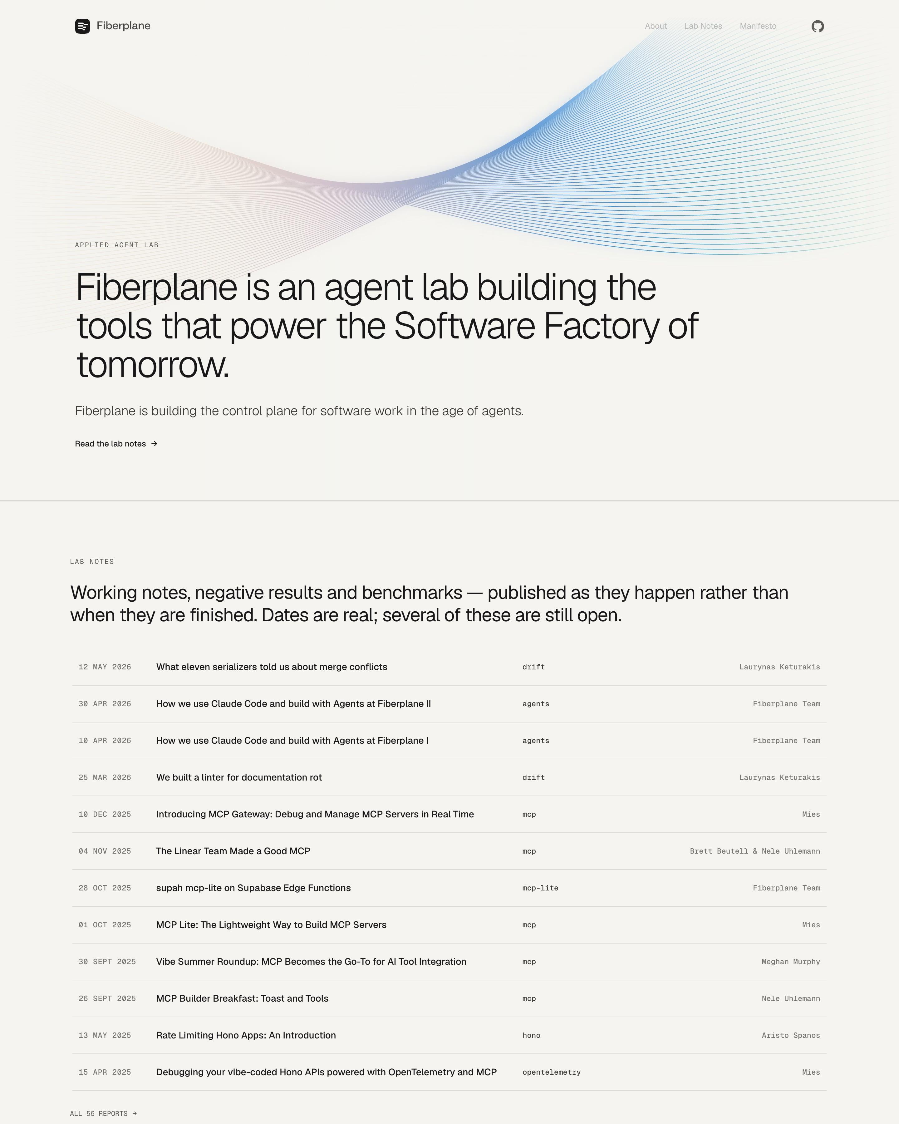
A ribbon of fine lines, shading from pink to blue, arcs over the large headline. Below, the homepage is a lab-notes index: one row per post with a mono date, title, tag and author, introduced as notes "published as they happen". Borrow the idea of a dated research log as the homepage.
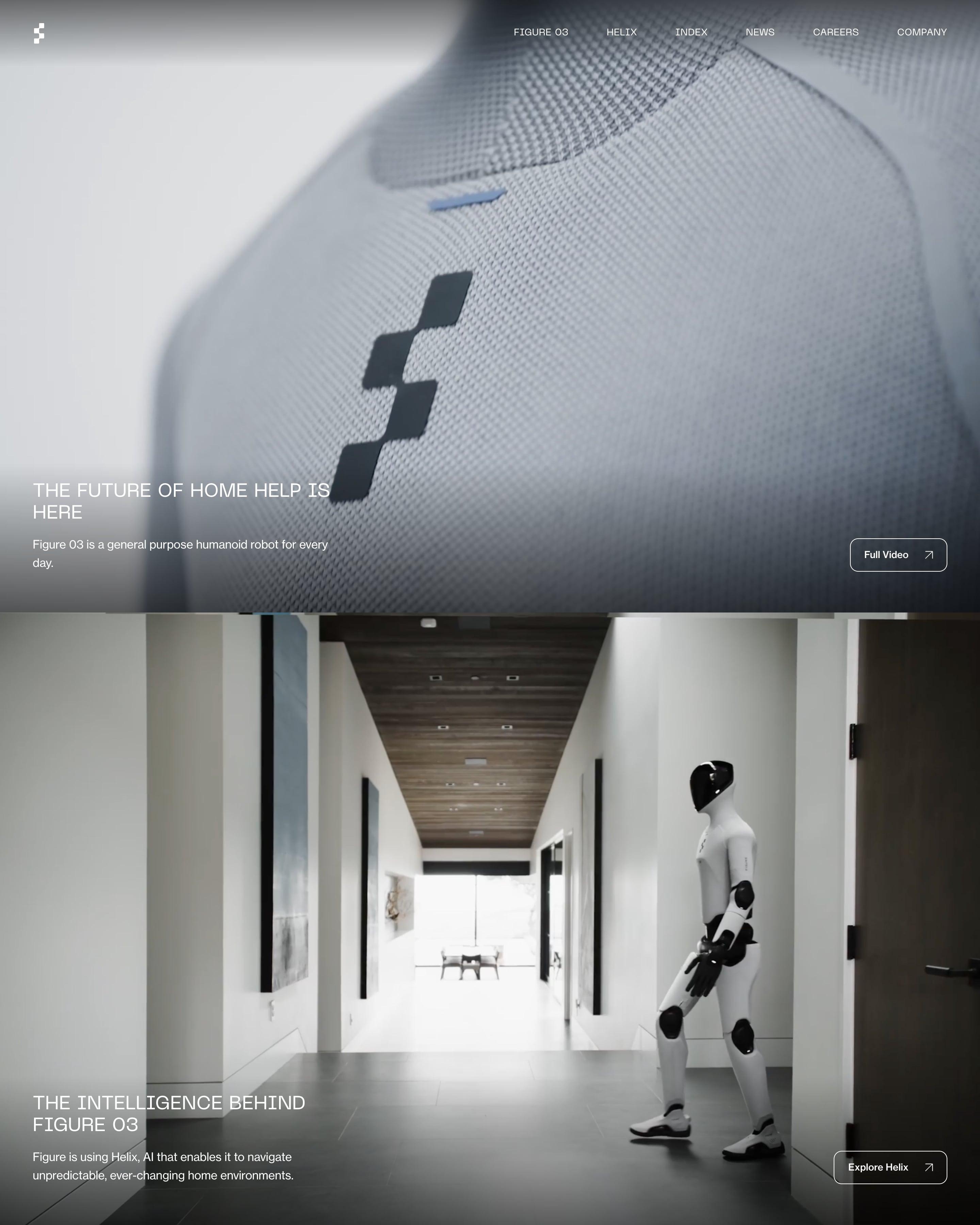
Four full-screen photos of the robot fill the page, including a close-up of its knit chest and a walk down a home hallway. Each panel keeps its text small and low: an uppercase headline, one sentence and an outlined button. Copy the footer's large numbered menu, 01 to 06, set beside a newsletter sign-up.
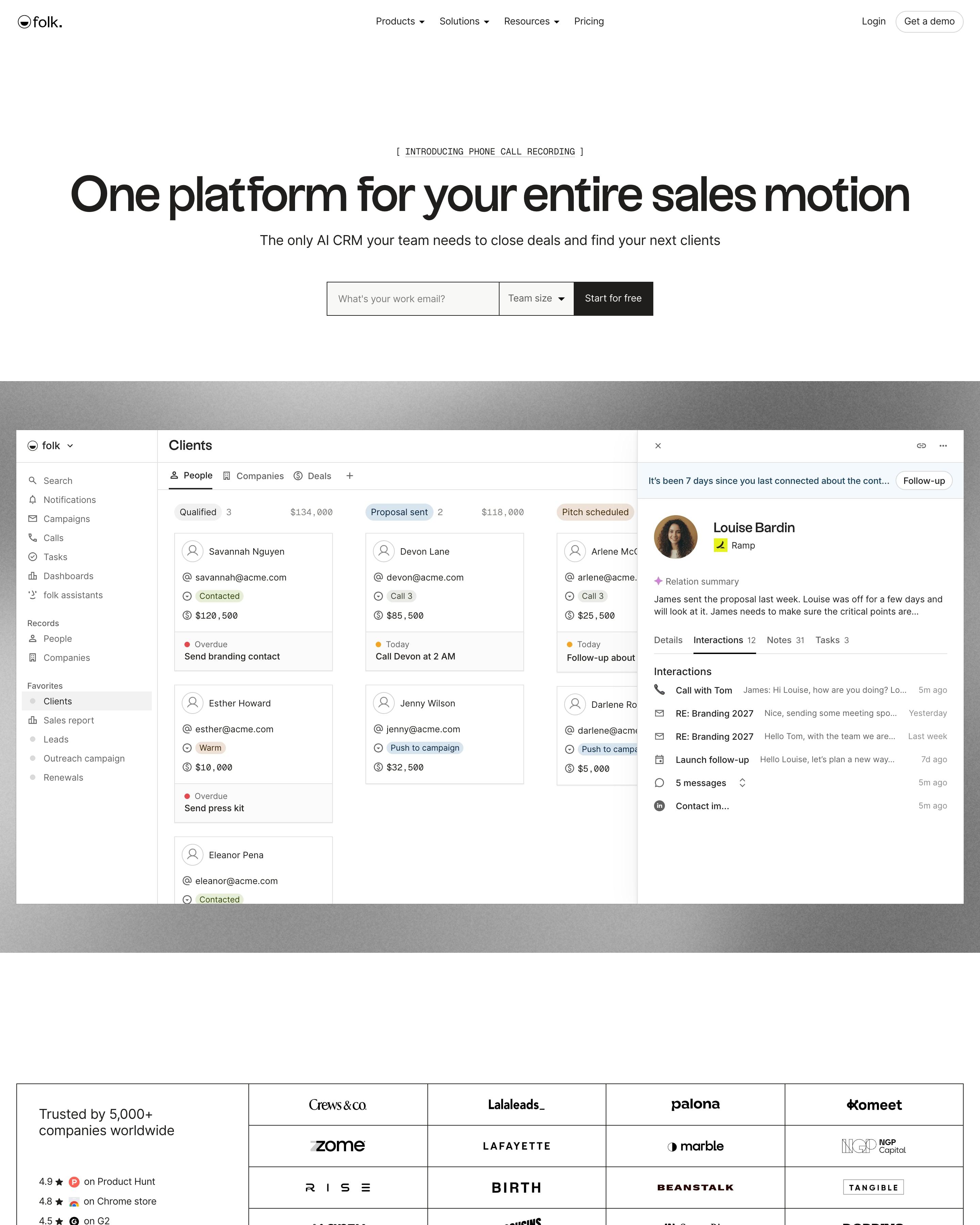
The hero's sign-up form asks for team size beside the work email, above a large CRM screenshot. Five feature rows follow, each a product shot on its own muted panel (blue-grey, khaki, lilac, mauve, olive). Worth copying: the "Consolidate tools" cards that name the apps each feature replaces.
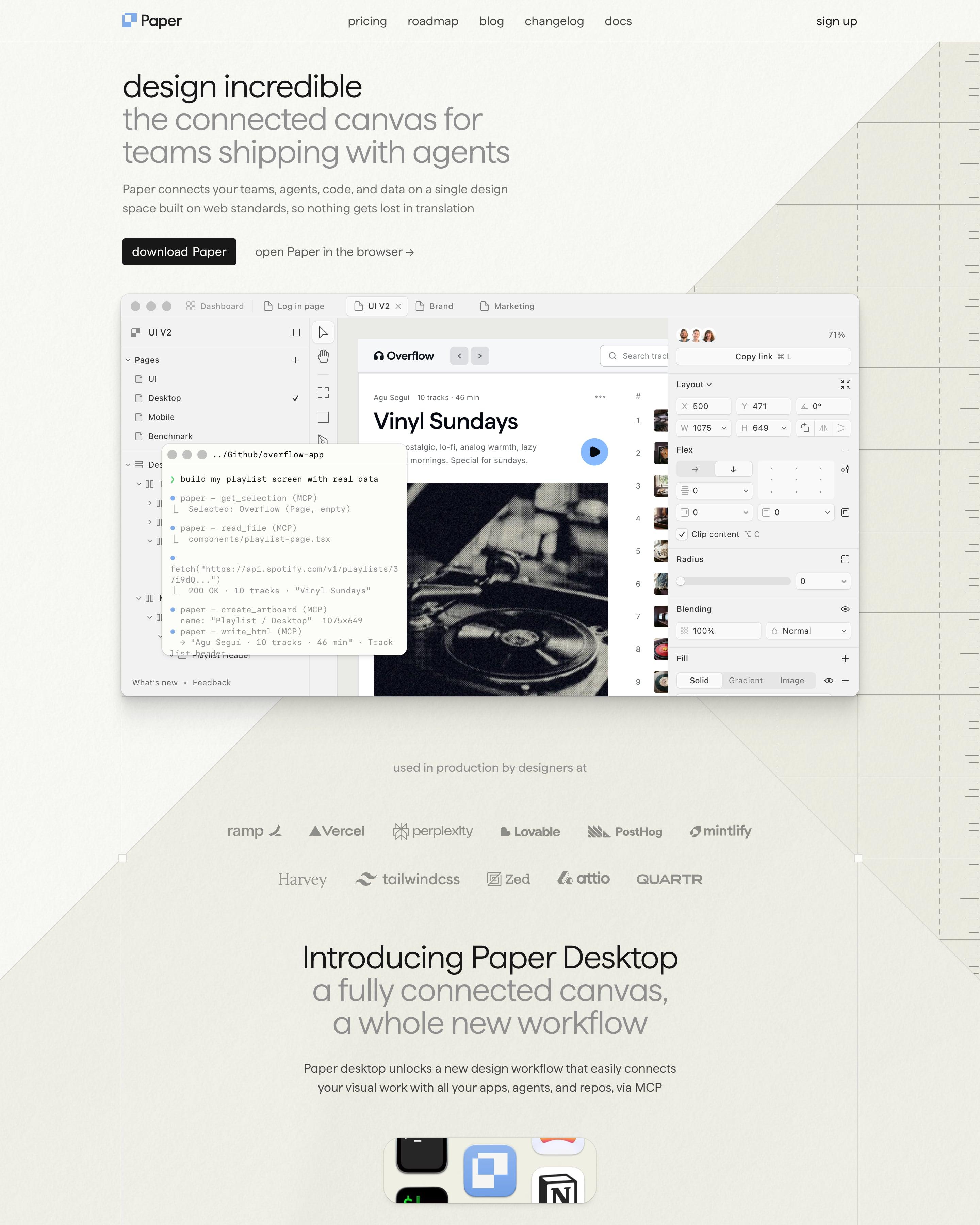
The hero puts a working canvas on screen, with an agent's terminal log laid over the design. Each feature section repeats one pattern: lowercase headline, full app screenshot, two short captions side by side. Worth copying: the ruler marks and paper grain that make the page feel like the canvas itself.
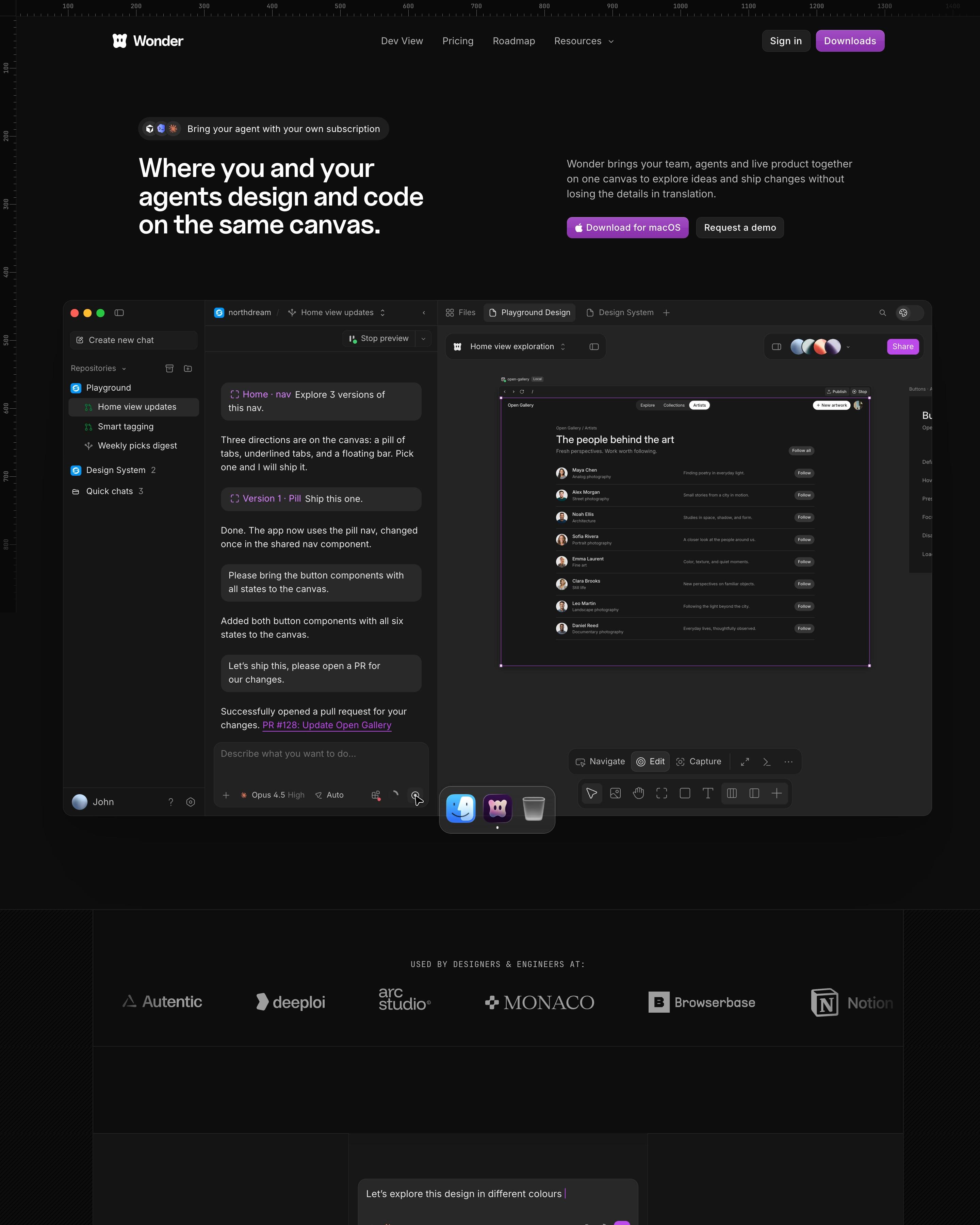
Ruler ticks run along the top and left edges, so the near-black page reads like the canvas the product is. The hero app shot shows a chat with an agent beside a gallery design, ending in "PR #128: Update Open Gallery". Purple is saved for the download buttons and one glow. Worth copying: three handwritten words, Measurements, Gradients and Grid layouts, floating over the roadmap banner.
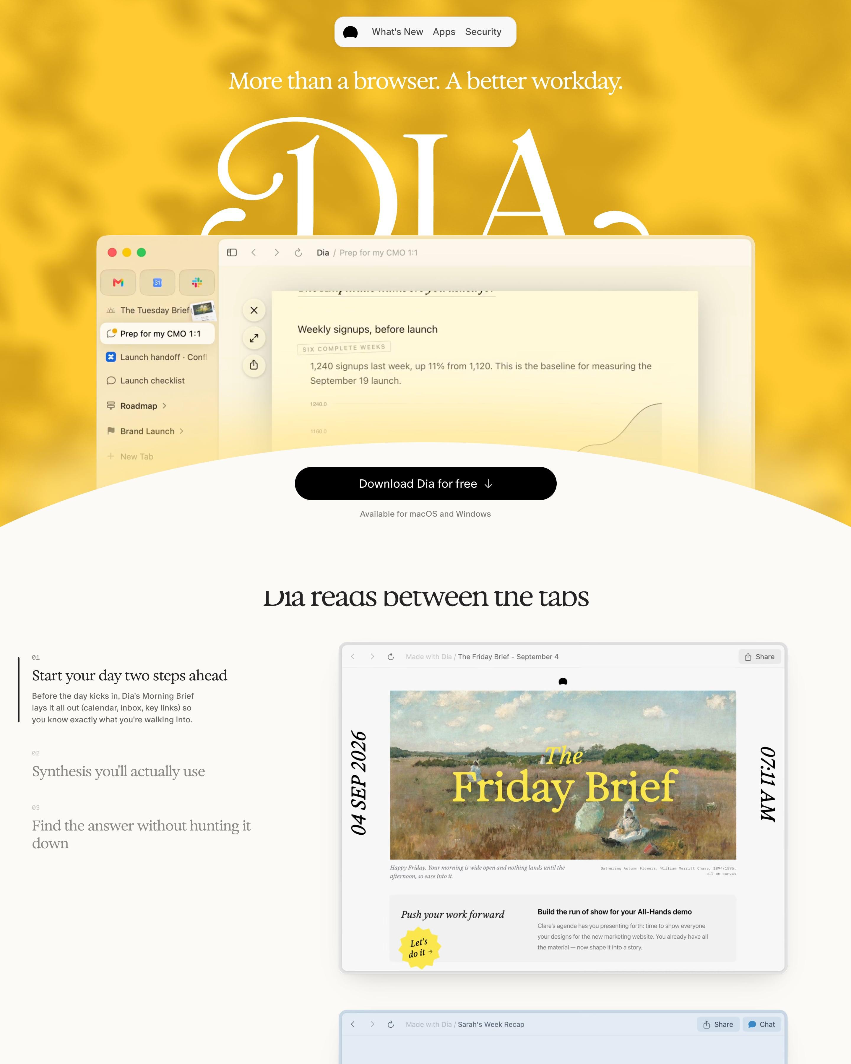
The hero sets an enormous serif "DIA" wordmark in white over a marbled yellow wash, with the browser window rising out of it and a curved cream edge cutting across below. "Dia reads between the tabs" pairs a numbered list on the left with sample outputs like "The Friday Brief", set over a 19th-century painting. Privacy settings run as a strip of monospaced On/Off pills inside a dotted frame.
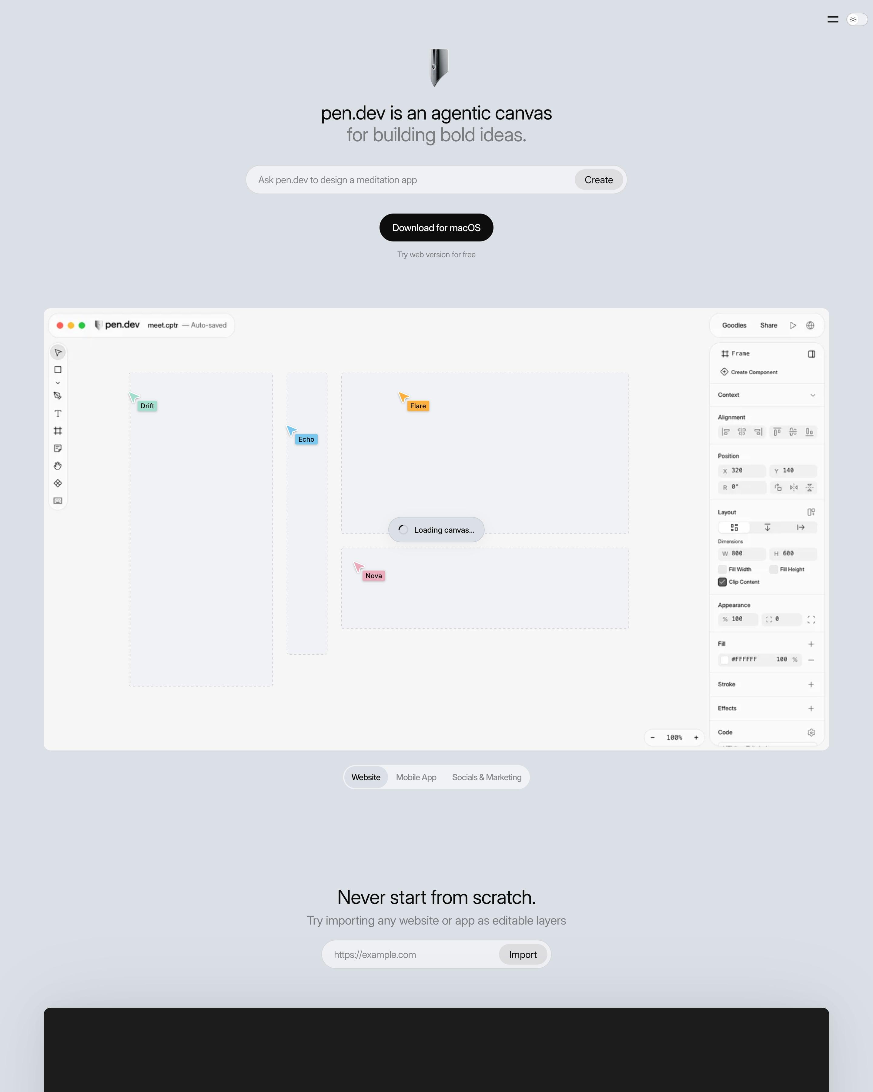
No navigation bar, just a pen-nib icon, a two-line headline with the second line in grey, and a prompt box to design "a website for a coffee shop in San Francisco". Agent cursors carry names like Drift, Nova, Kant and Sartre. Dozens of feature tiles each hold one chrome 3D object, from a command key to a Figma logo, ending on "This list goes on and on and on...".
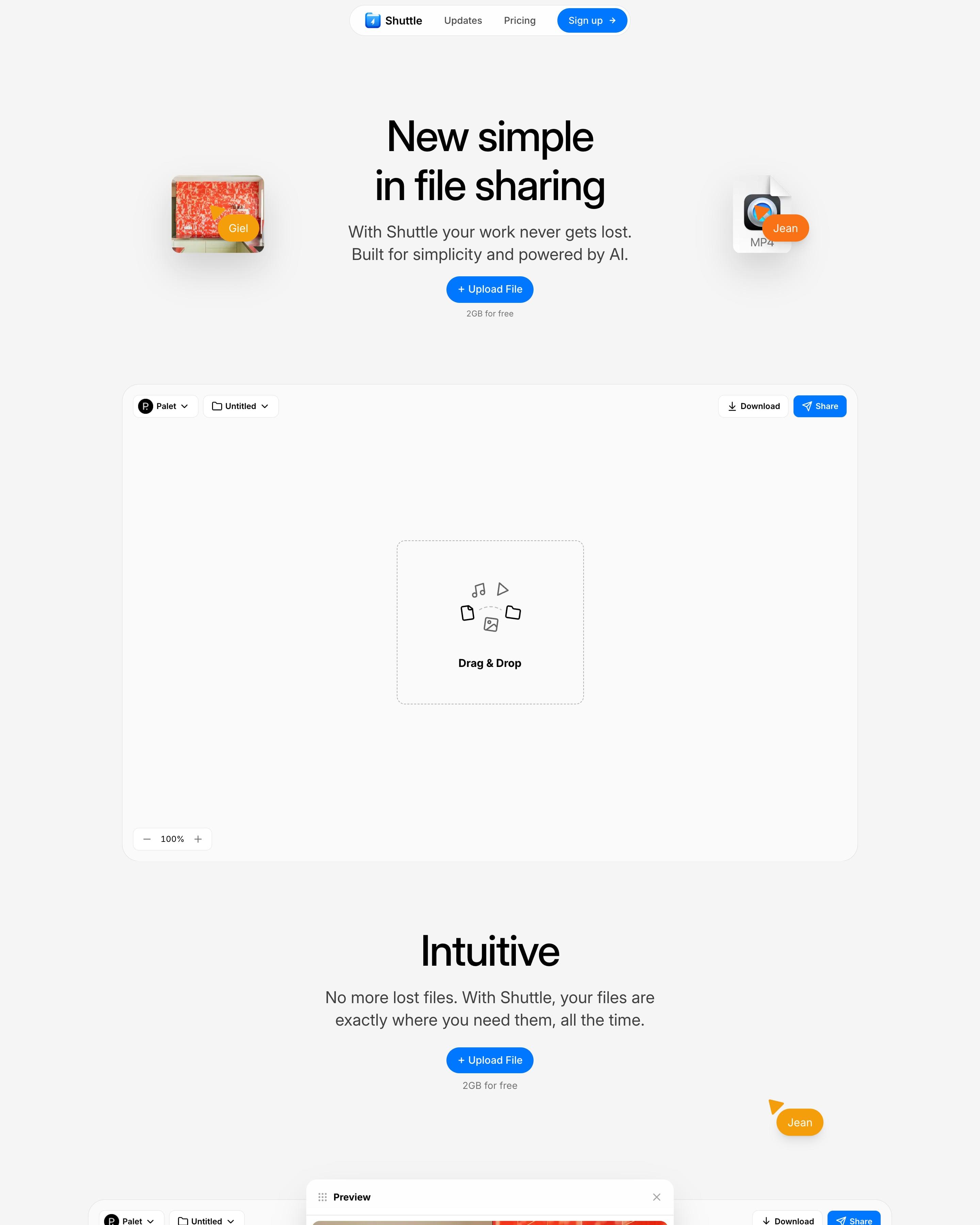
"New simple in file sharing" sits in bold black sans on light grey, flanked by floating file thumbnails with orange name tags, above a near-empty app canvas with a dashed "Drag & Drop" box. The sections "Intuitive", "Smart" and "Safe" each repeat the blue "Upload File" pill and show the canvas again, adding coloured multiplayer cursors, a command menu, a storage picker and a share panel.
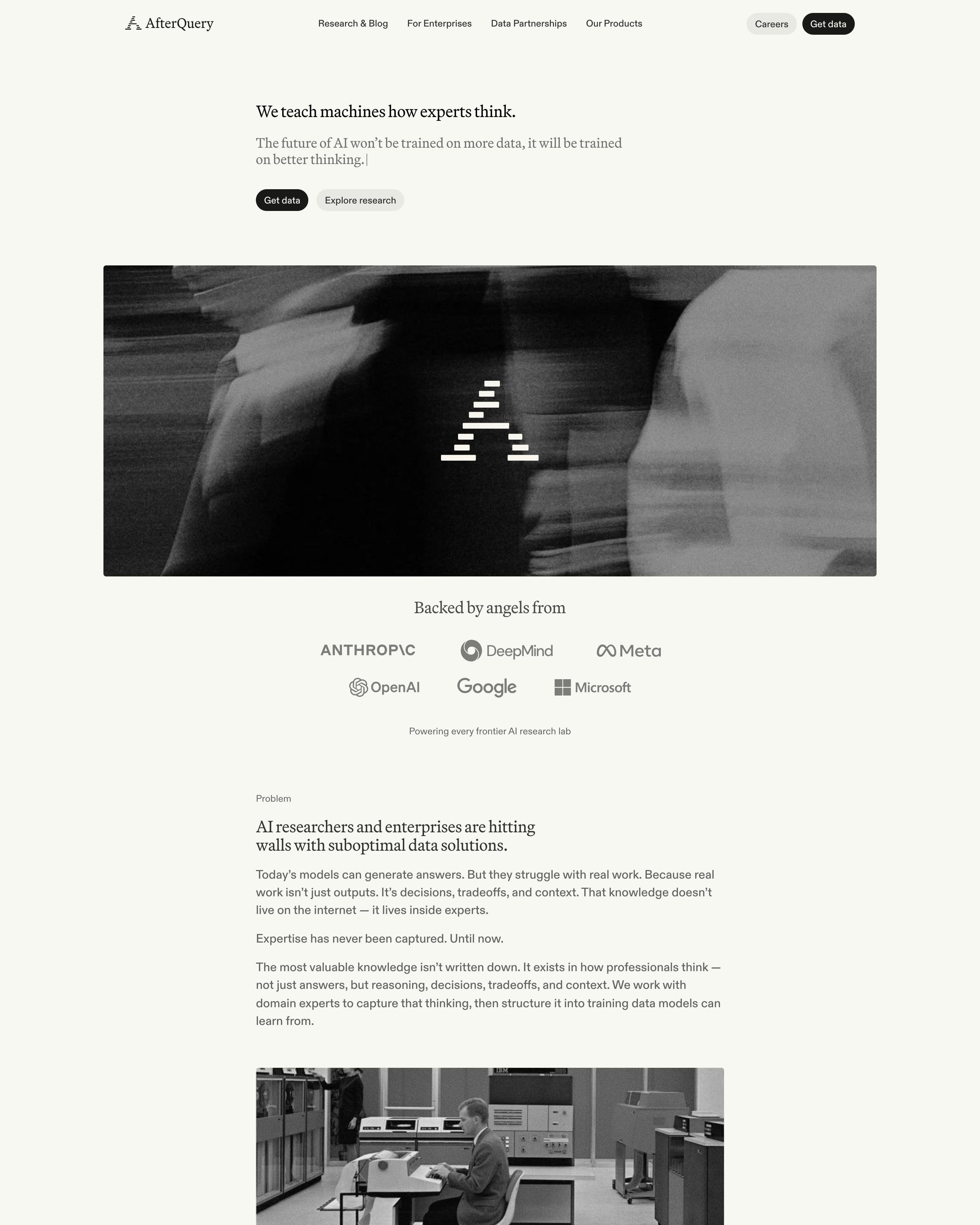
A serif headline and subline, ending in a text cursor, sit above a wide motion-blurred black-and-white photo stamped with the stepped logo. The rest stays greyscale too: a "Backed by angels from" logo row, an archival computer-room photo, dithered icons. Worth copying: colour saved for the grainy research card images and the careers banner.




































How to design a minimalist website
Minimalist sites leave things out: lots of white space, few colours, one idea per section. Each thing that remains gets attention.
- Write less: one clear headline and a short line under it do more than three paragraphs.
- Use space, not lines and boxes, to group things.
- Make the few elements that remain excellent: type, product shots and the main button.
Frequently asked questions
Sites that leave things out: lots of white space, few colours, one idea per section. Minimalist sites leave things out: lots of white space, few colours, one idea per section. Each thing that remains gets attention.
There's no rule either way. Minimal pages work when the message is clear and the next step obvious; they struggle when the product needs explaining and the page leaves it out.
Each page is opened at 1440 pixels wide, like a laptop, and scrolled from top to bottom so every image and section loads. Cookie banners, chat bubbles and popups are left out, and the whole page is saved as one image.