
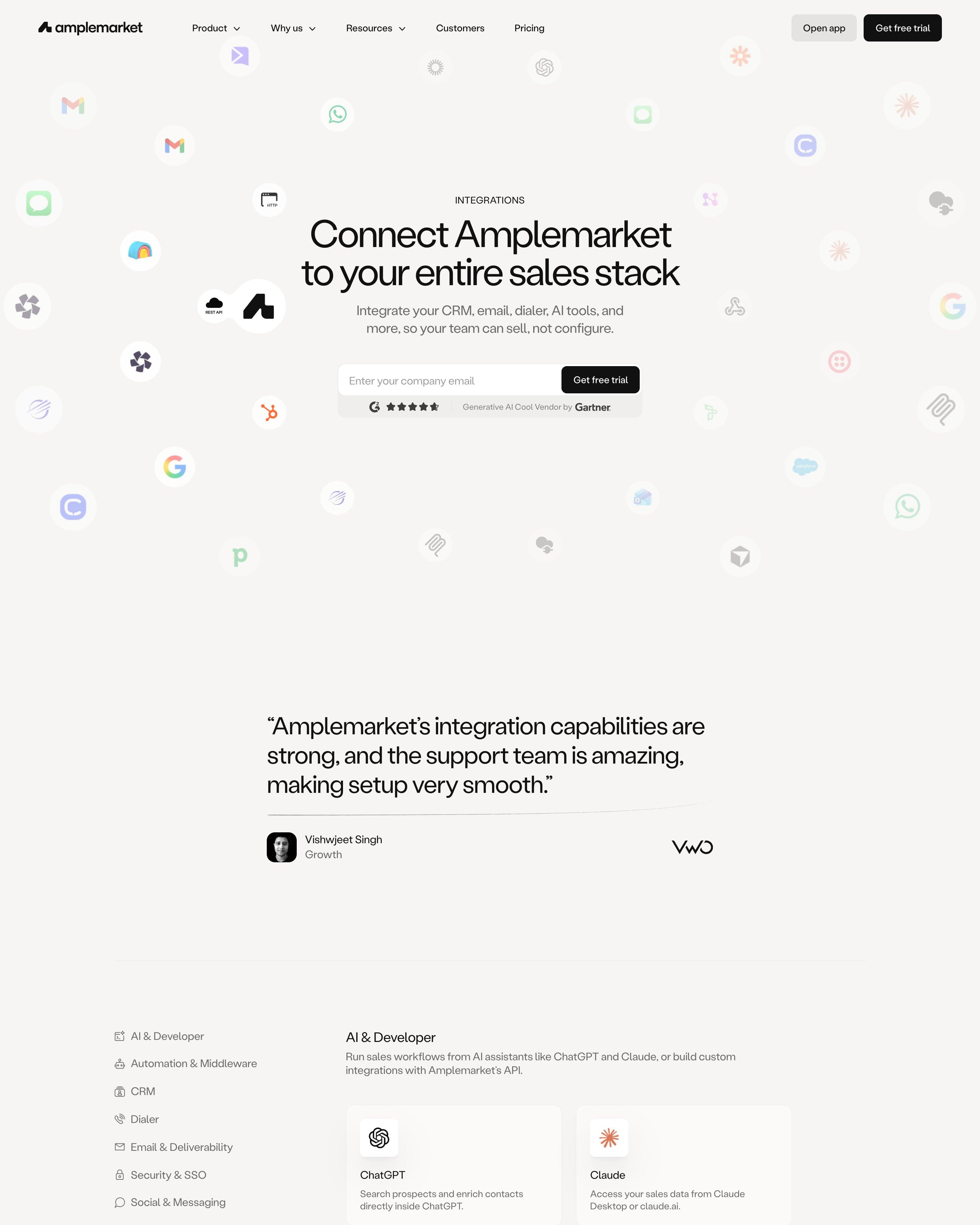

App icons scatter around the headline "Connect Amplemarket to your entire sales stack", some faded as if drifting away. Below, a sidebar of eight categories, from AI & Developer to Video & Gifting, sits beside two-column cards with an icon, a name and one line on what it does. Worth copying: the black "Don't see what you need?" panel pointing to Zapier and the REST API before the FAQ.
35 examples
Best SaaS Integrations Page Examples
Integration directories and app marketplaces from SaaS companies with great websites: search, categories and how each partner gets its card.
- Dark or light
- 7 dark, 28 light
- of 35 pages
- Heading fonts
- Inter
- Inter 5, Britti Sans 2, Labil Grotesk 1, Clash Grotesk 1
- Built with
- Next.js
- Next.js 24, Webflow 6, Framer 2, Hugo 1
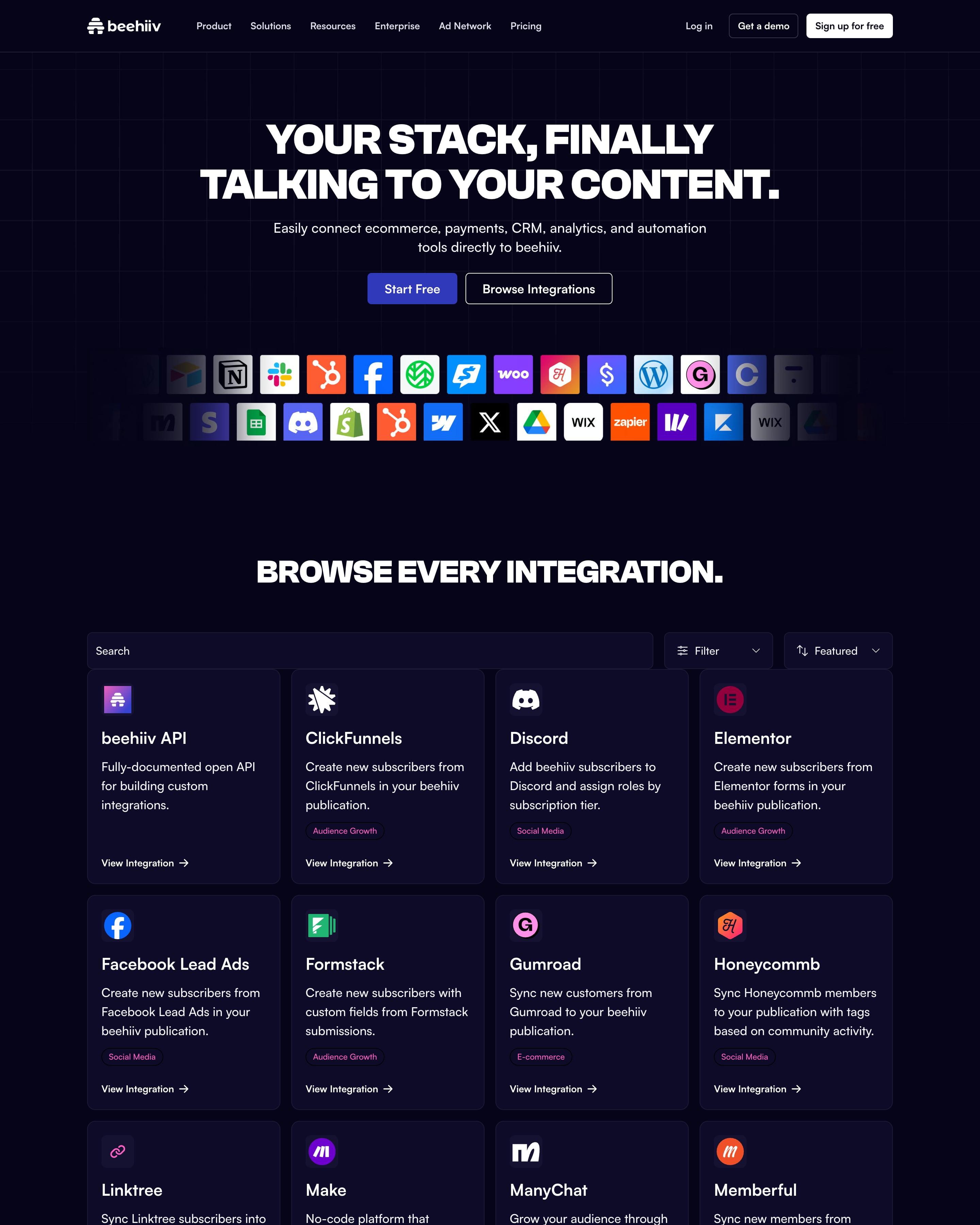
Two rows of app tiles fade out at both edges below the all-caps headline. Below, search and a filter sit over a four-column grid of dark cards, each with a one-line use and a pink category tag. Copy the "Not seeing the integration you need?" banner that points to Zapier and the API.
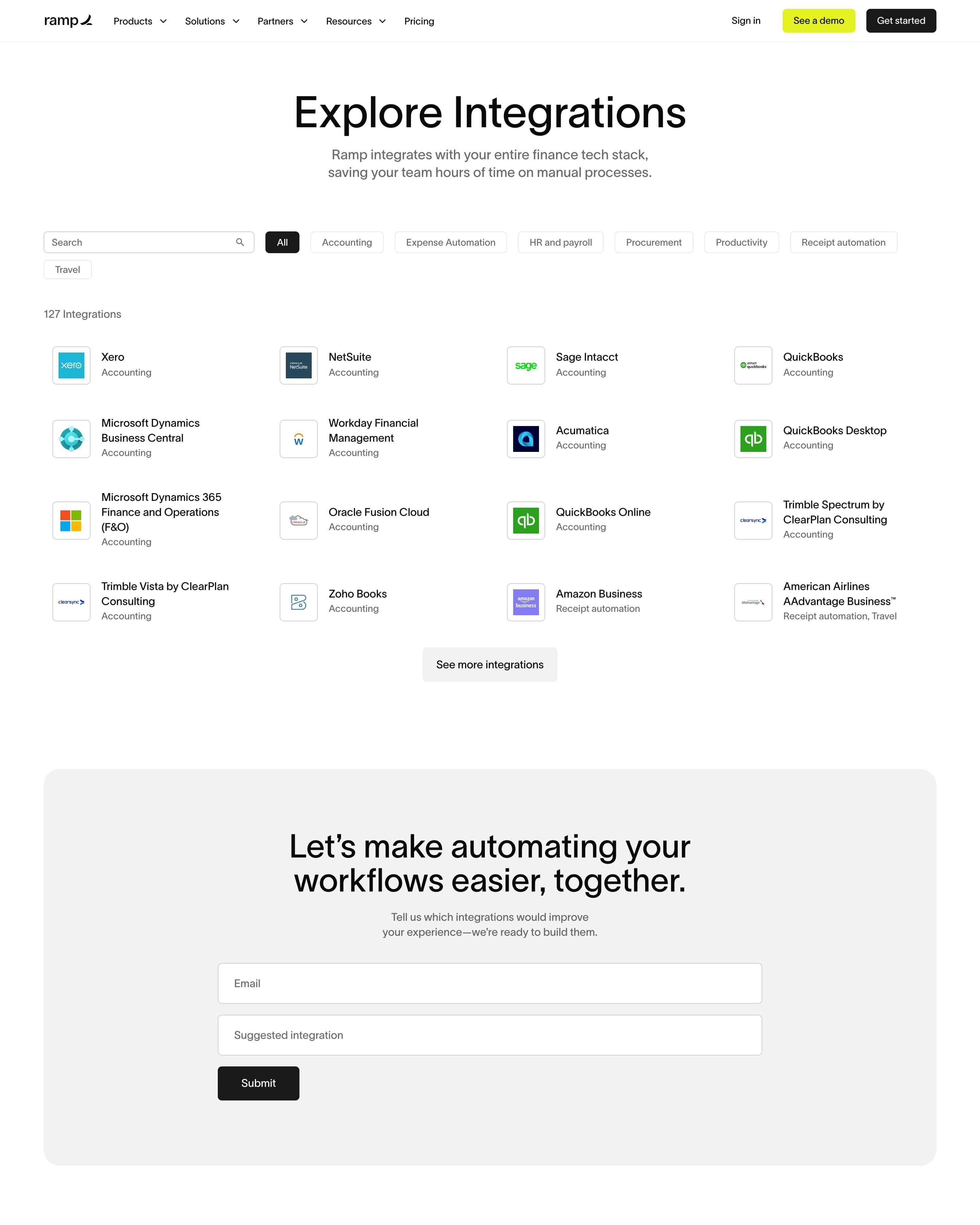
"Explore Integrations" pairs a search box with pill filters for Accounting, Expense Automation, HR and payroll and more, over a count of 127 integrations. Each entry is a small logo tile with name and category in a four-column list, cut off by a "See more integrations" button. A grey request form asks which integration you want, followed by an eight-question FAQ.
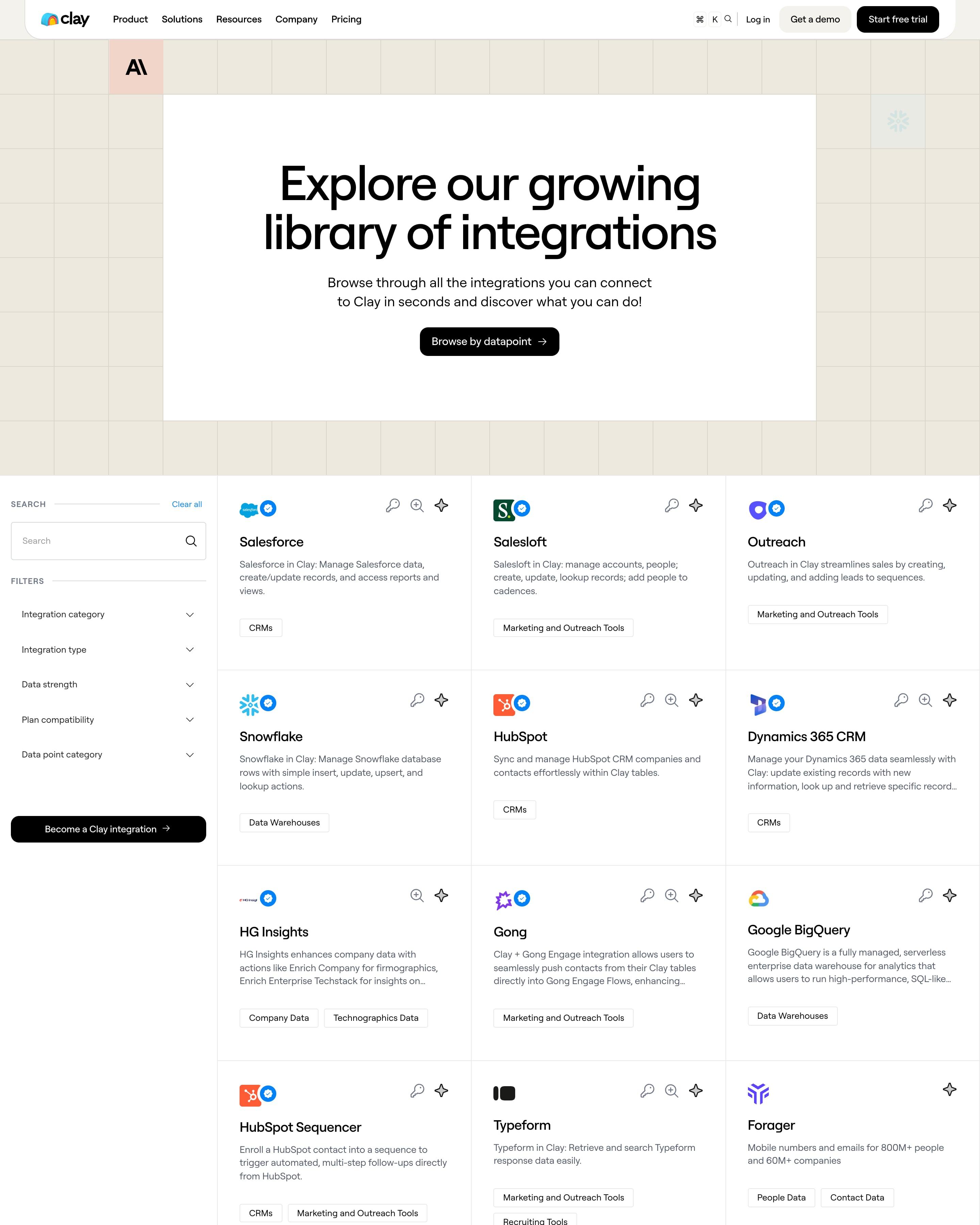
A white hero card sits on a beige grid, with app logos filling a few of the cells, a motif that is simple to reuse. Below, a sidebar with search and five filters, from Integration category to Data point category, sits beside a three-column grid of bordered cards, each with a category tag.
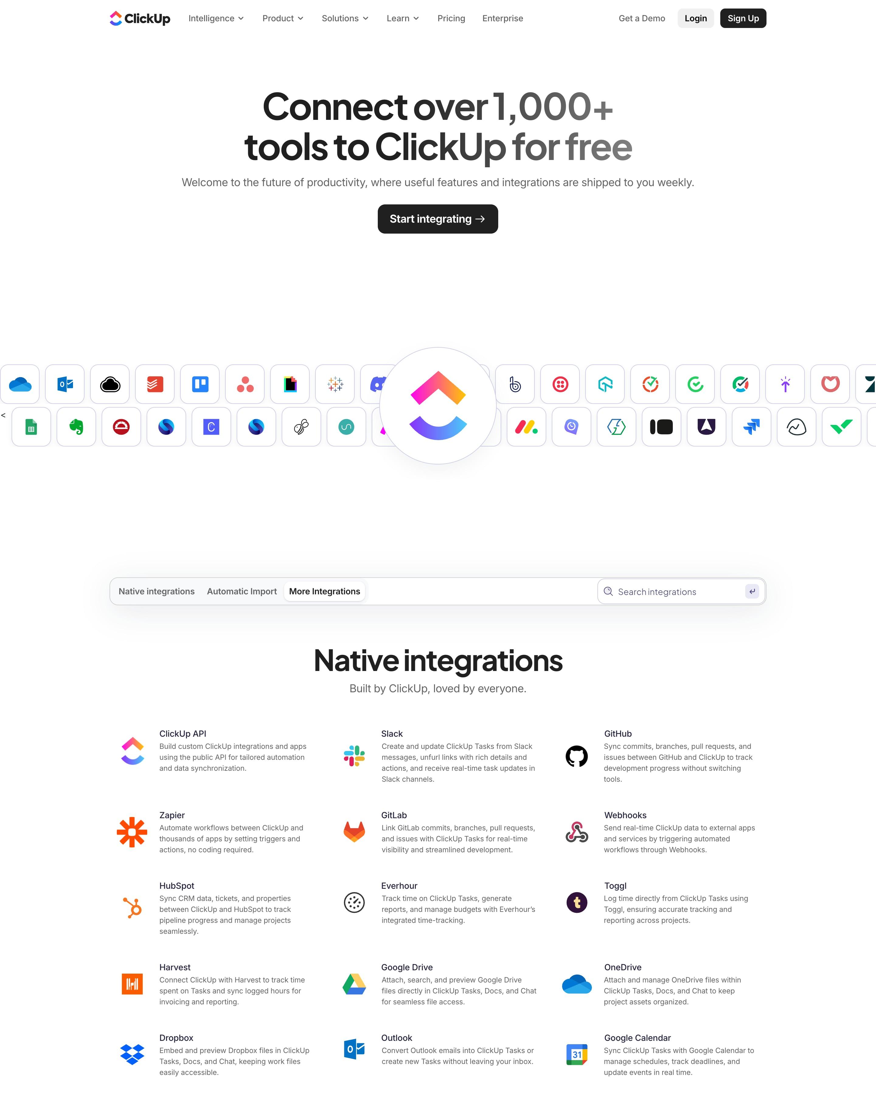
Two rows of app tiles stream behind a large ClickUp logo in a white circle, under "Connect over 1,000+ tools to ClickUp for free". A tab bar with search splits the directory into Native, Automatic Import and third-party, each a plain three-column list of icon, name and one line. The MCP section shows the actual mcp.json snippet, which says more than a feature card would.
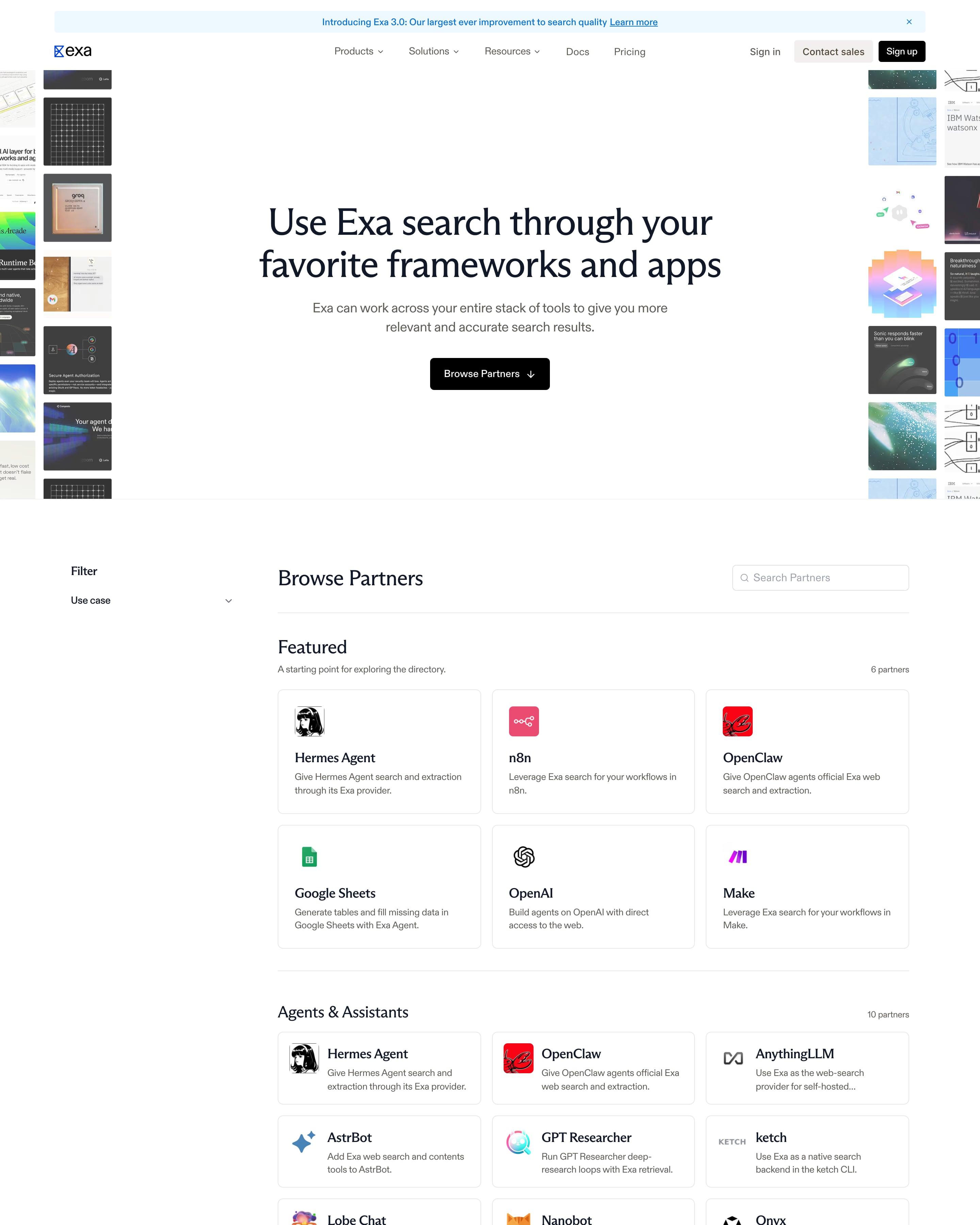
"Use Exa search through your favorite frameworks and apps" sits between two columns of partner screenshot tiles cropped at the page edges. Below, a left filter rail and a "Become a Partner" box sit next to a searchable directory of logo cards grouped into Featured, Agents & Assistants, Automation & No-Code, Voice, Commerce & Payments and more, each heading showing its partner count.
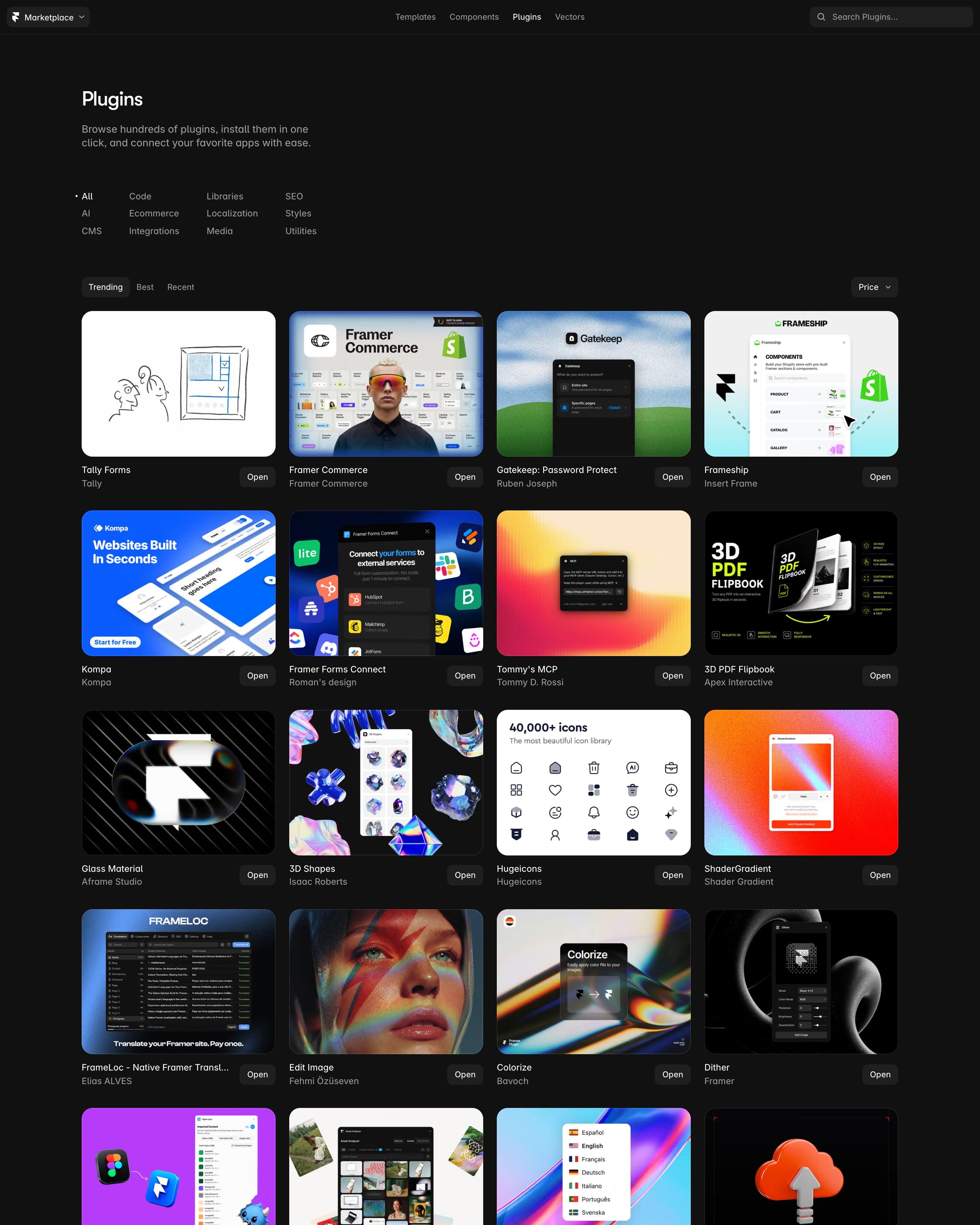
The Plugins tab of Framer's Marketplace is a dense four-column wall of plugin covers on black, with a category index (AI, CMS, Code, SEO, Localization) at the top. Each tile is a bright thumbnail the maker designed, from Tally Forms' line sketch to 3D Shapes, with the author's name and an Open button below. Letting makers design their own covers turns a directory into a gallery.
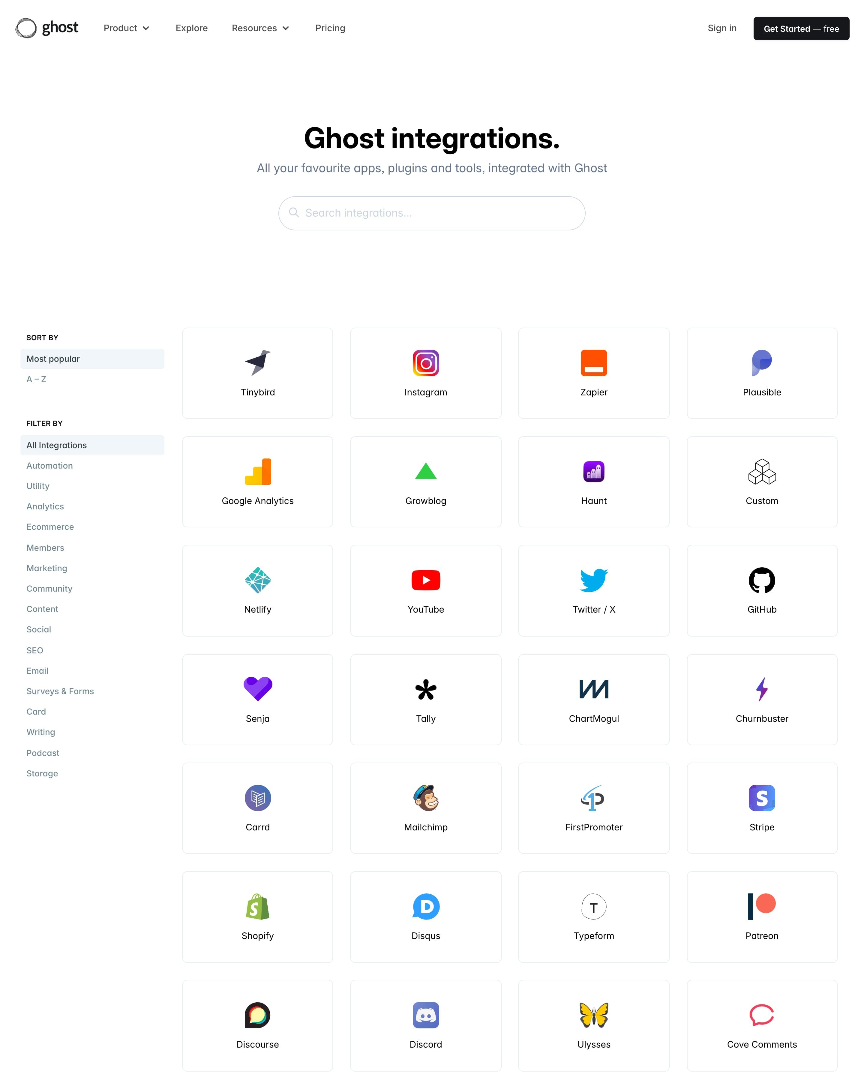
Search sits centred under the heading, filters run down a left sidebar, and apps fill a four-column grid of equal tiles showing only a logo and name. An FAQ below covers what integrations are and how to build one. Worth copying: the simple Most popular / A–Z sort above the categories.
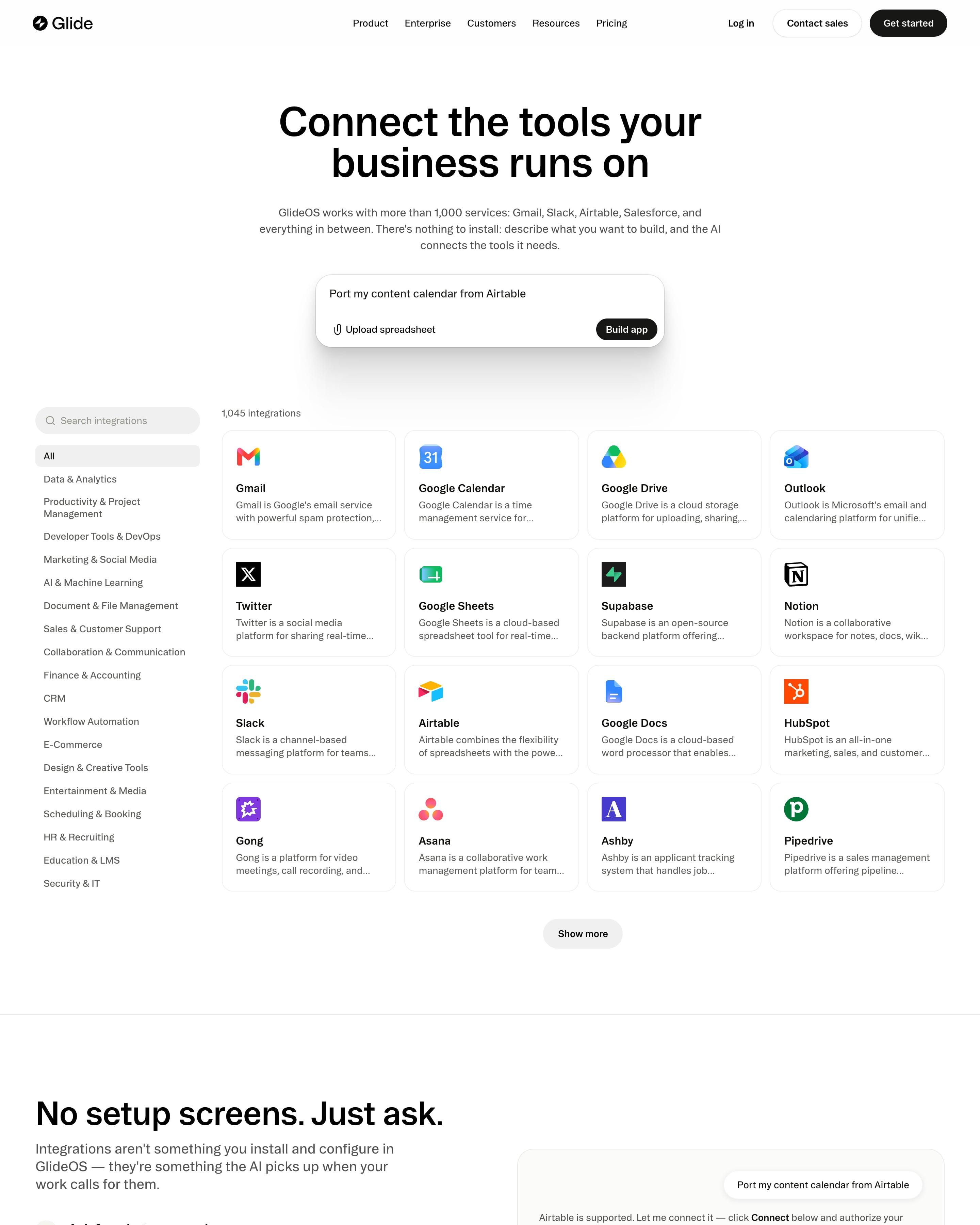
"Connect the tools your business runs on" sits over a prompt box prefilled with "Port my content calendar from Airtable". A left sidebar lists about 20 categories next to a four-column grid of 1,045 integrations, each tile a logo, name and two-line description. "No setup screens. Just ask." shows the connect flow as a chat card beside three numbered steps.
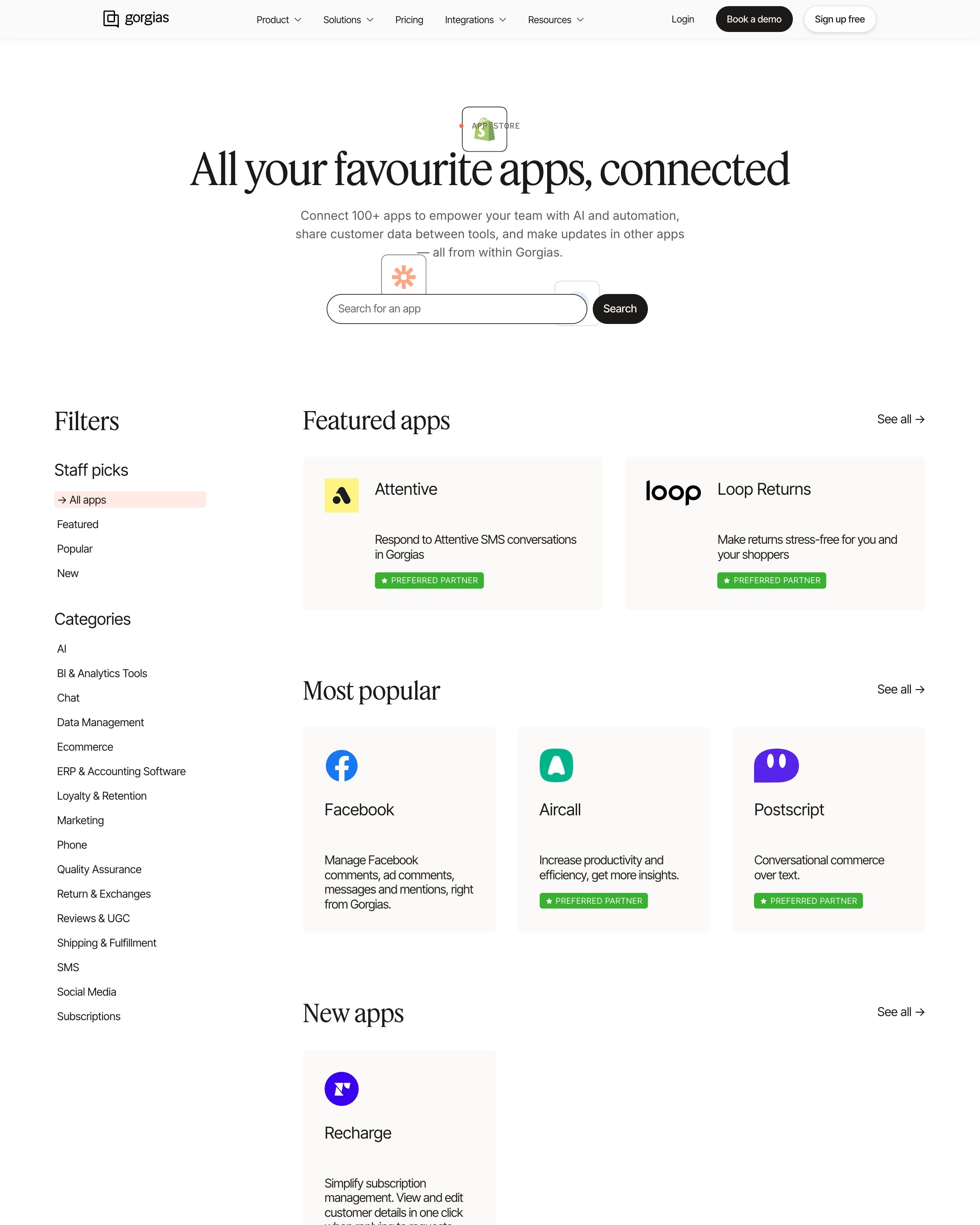
Before the full three-column list, apps are grouped into shelves: Featured, Most popular and New, each with a "See all" link. A left sidebar mixes staff picks with categories, and partner apps carry a green "Preferred partner" badge. Worth copying: the shelves, which give a big directory a starting point.
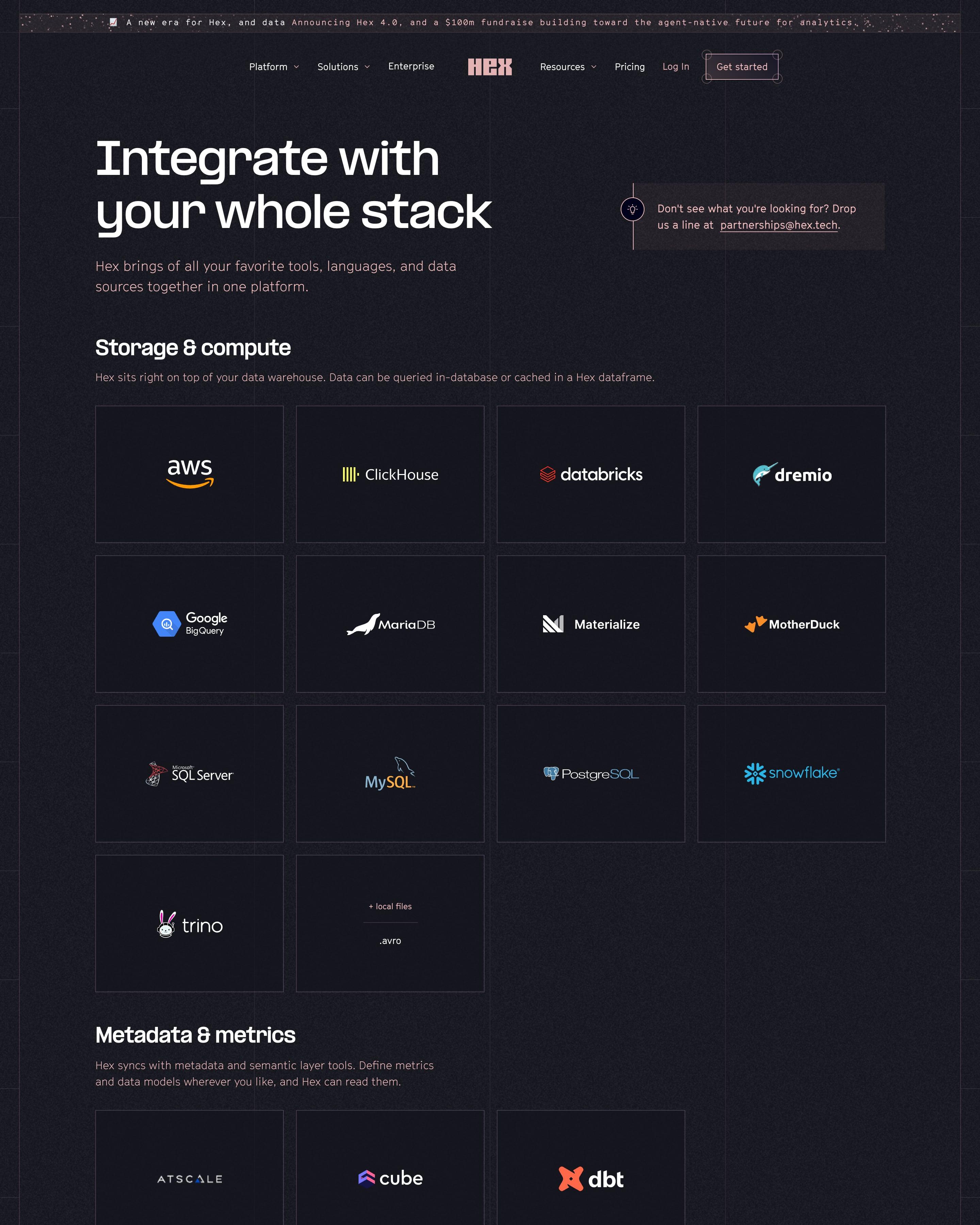
On a dark plum page, "Integrate with your whole stack" sits beside a small note pointing to a partnerships email. Integrations come in plain sections, from Storage & compute to Orchestration & workflows, each a grid of square tiles holding only a logo. Worth copying: the one-line description under every section heading, saying what that kind of tool does with Hex.
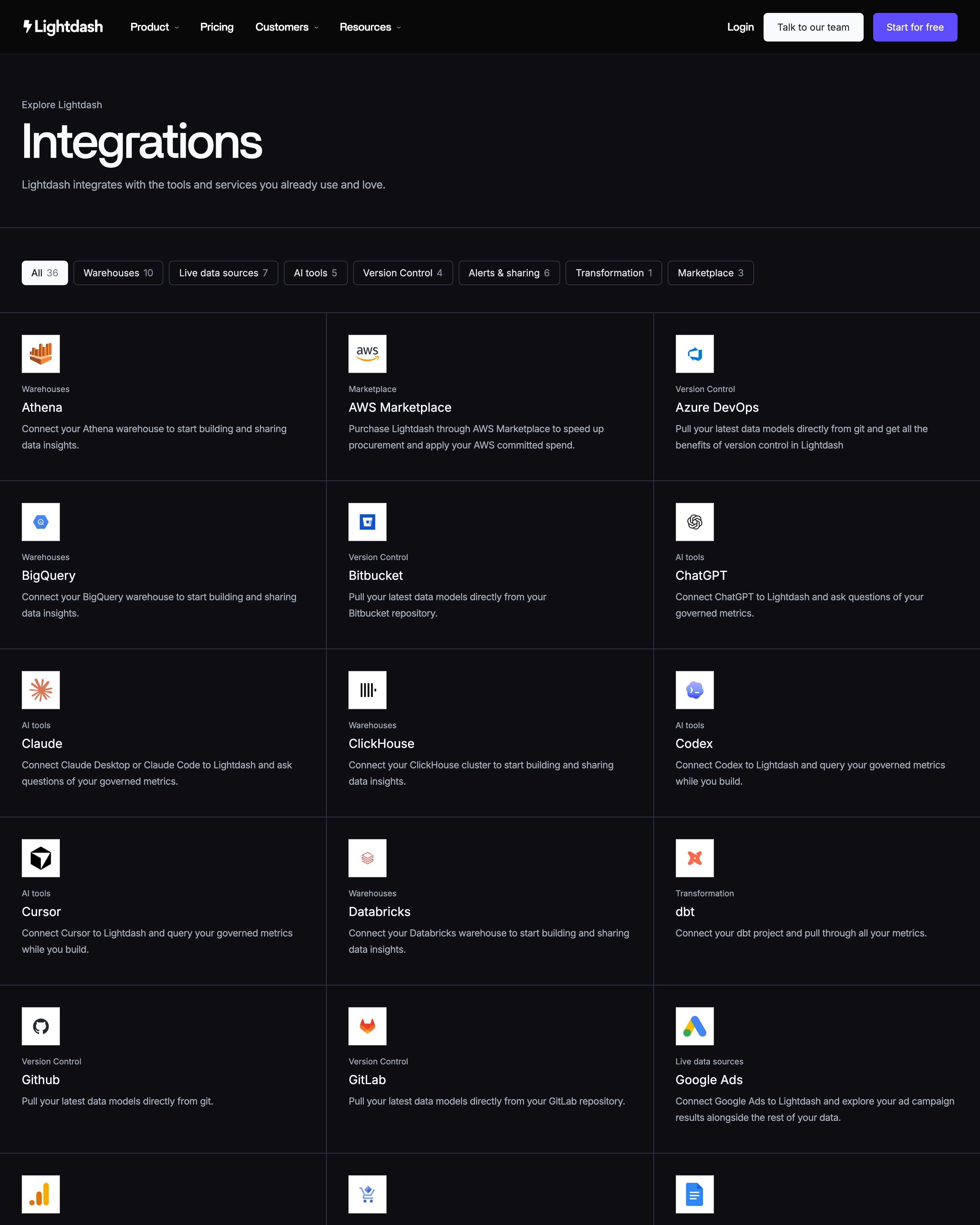
Category buttons with counts, from Warehouses 10 to Marketplace 3, filter 36 integrations listed A to Z in a lined three-column grid. Each entry pairs a logo on a white square with a small category label and a one-line description. Those white logo tiles are worth trying on any dark page.
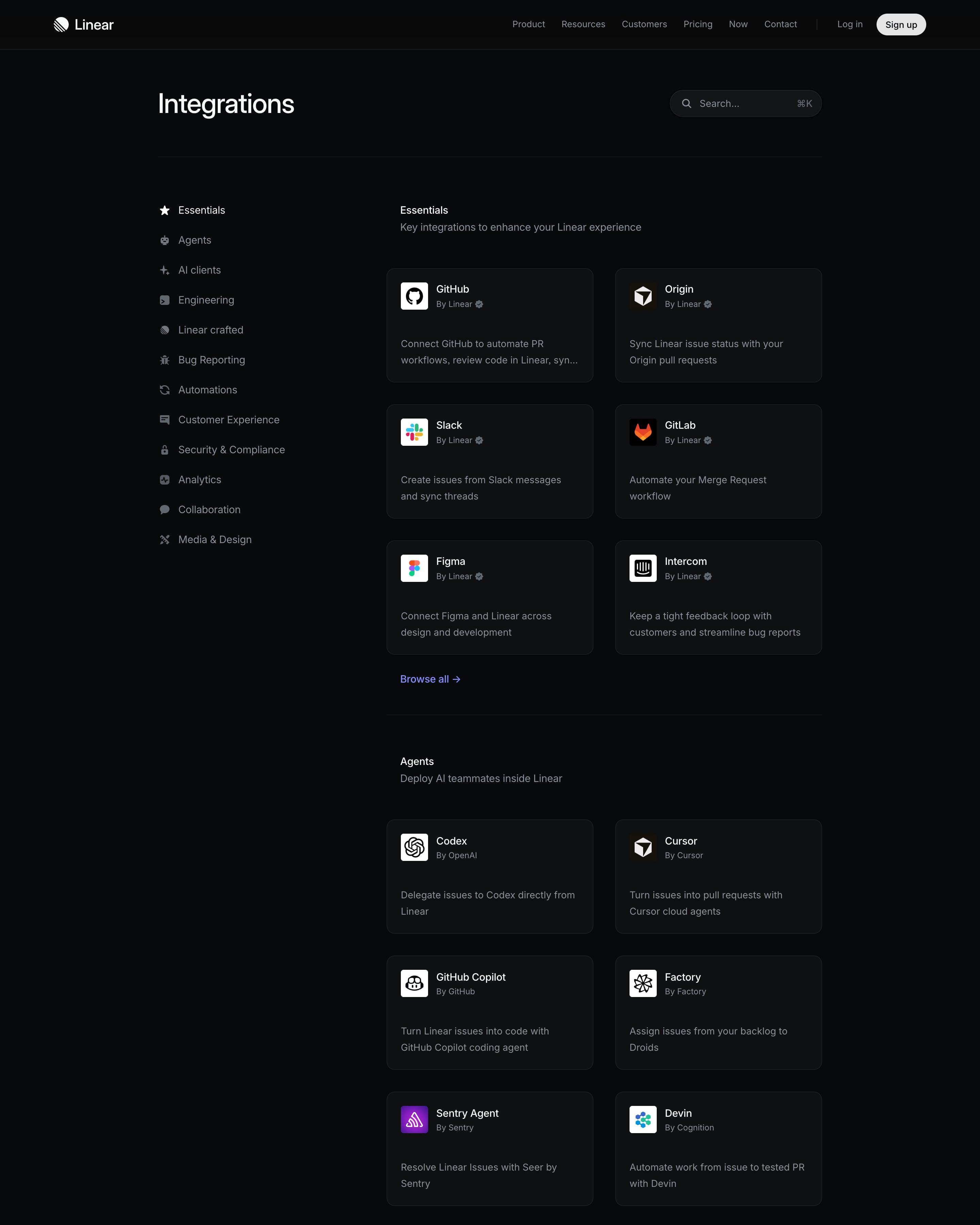
A category sidebar runs beside twelve sections, each showing six picks in two columns and ending in a "Browse all" link. Every card says who built the integration, with a check badge, and the search box shows a ⌘K shortcut. Capping each category at six cards, instead of one endless grid, is worth stealing.
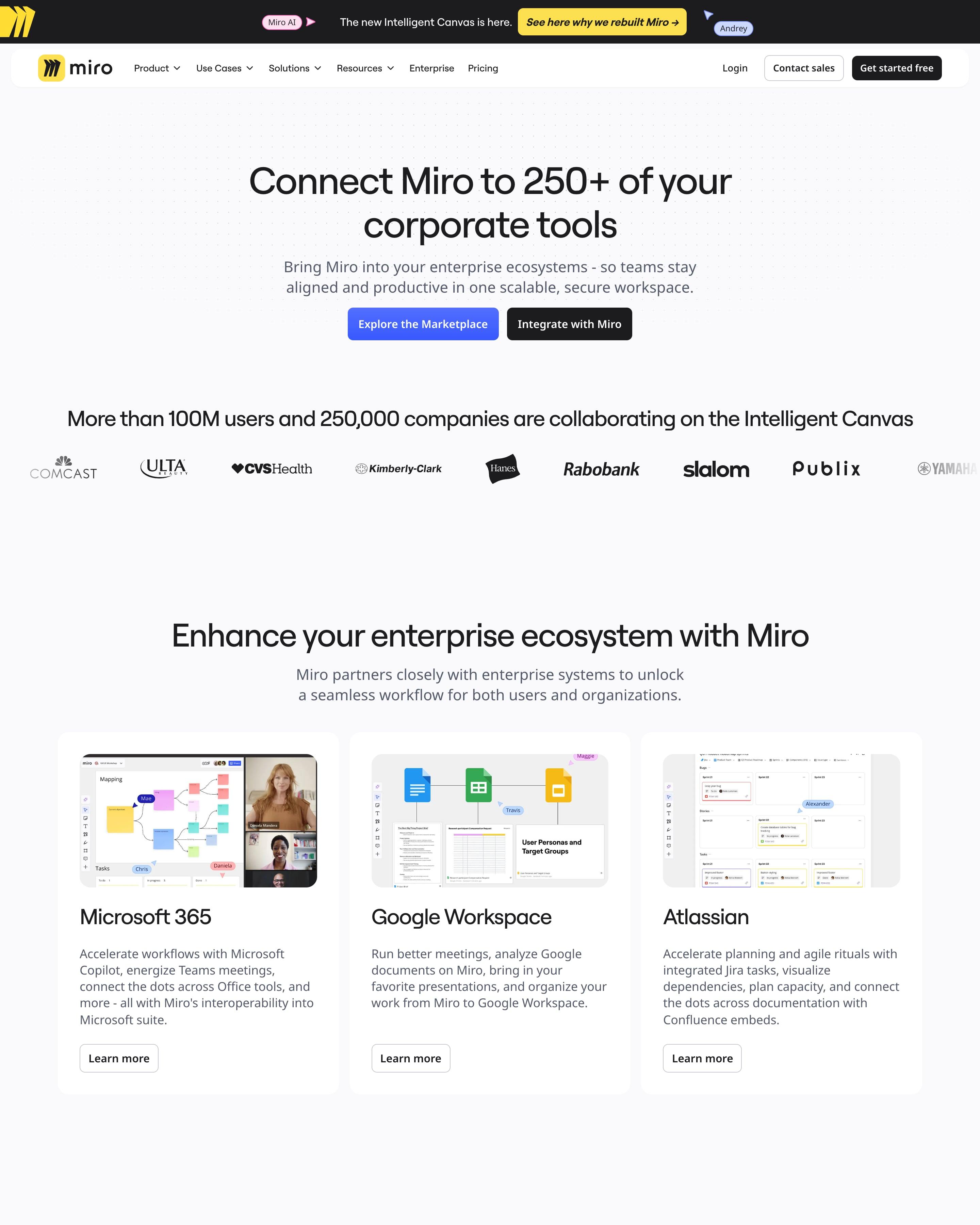
Rather than a full directory, the page groups partners by job: Microsoft 365, Google Workspace and Atlassian as screenshot cards, ten AI tools as logo tiles, then developer and admin sections. A separate block just for AI tools, plus an "Explore the Marketplace" button at the top, is a pattern to reuse.
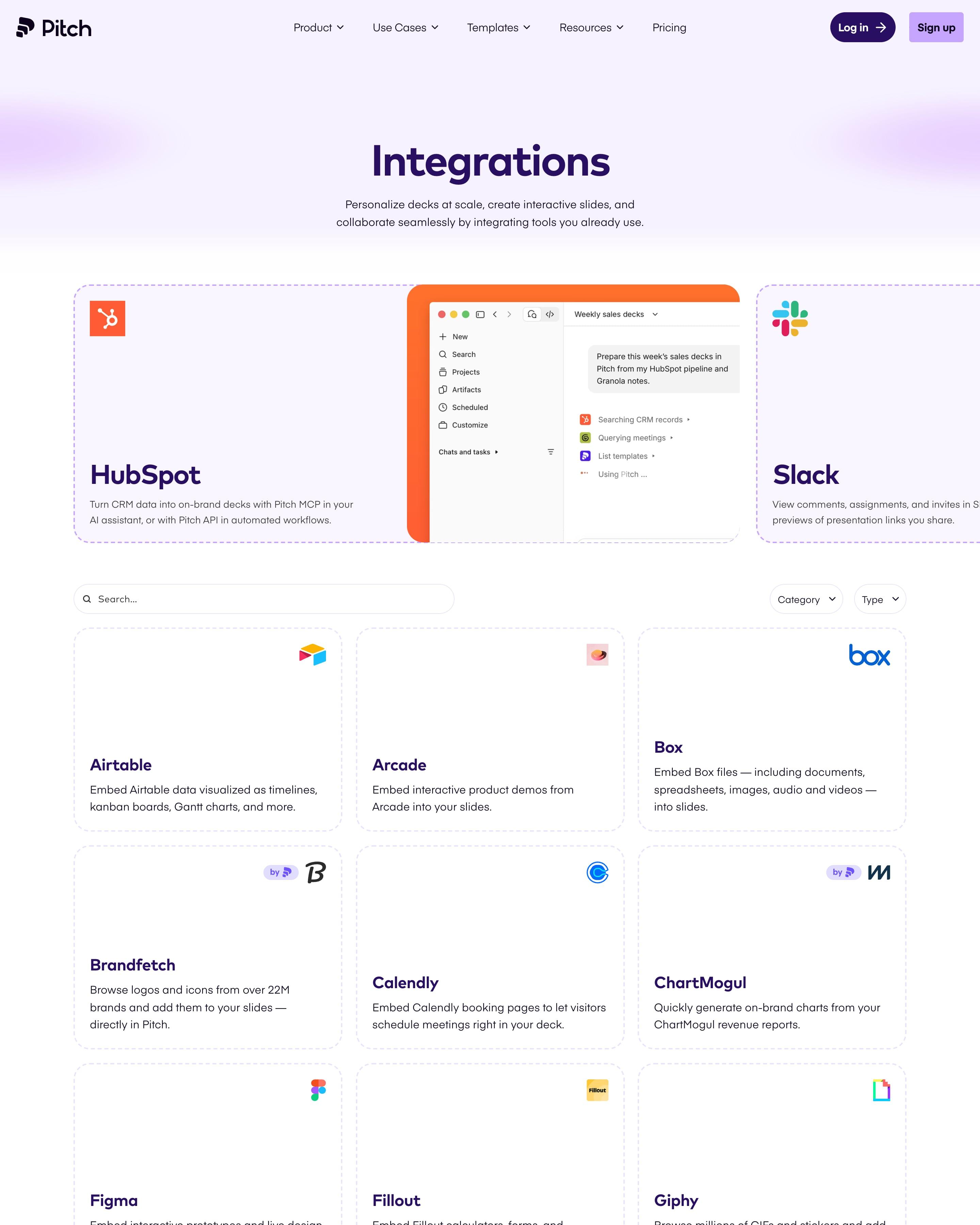
Featured integrations run in a carousel of wide cards with dashed borders, the HubSpot one showing an assistant drafting decks from CRM data. Below, a search field and Category and Type menus sit over a three-column grid with each logo in the top-right corner. Worth copying: featured cards that show the integration at work.
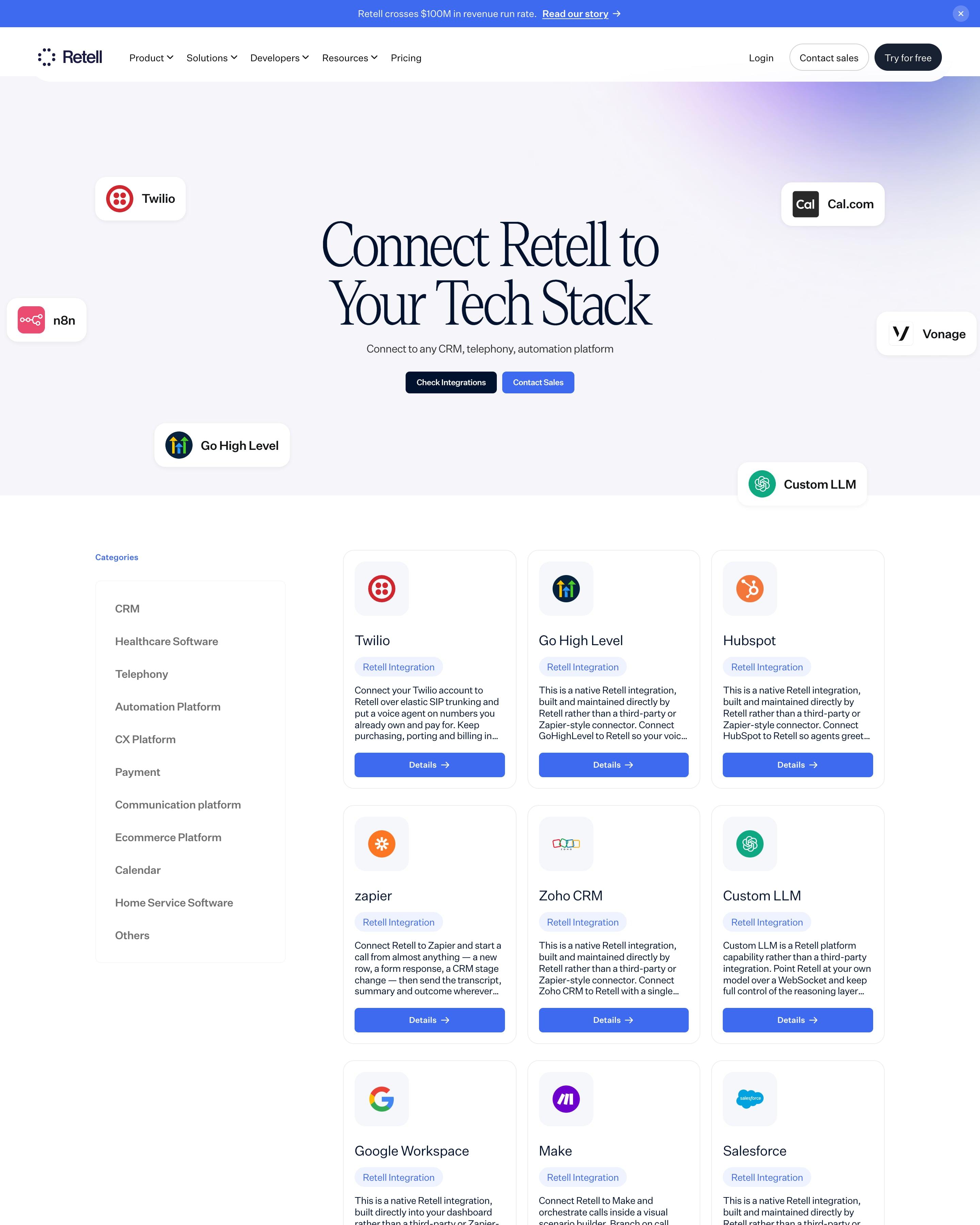
"Connect Retell to Your Tech Stack" floats between logo chips for Twilio, n8n, Go High Level, Cal.com, Vonage and Custom LLM on a faint lilac wash. Below, a category rail (CRM, Healthcare Software, Telephony, Payment and more) sits beside a grid of matching white cards, each with a logo tile, a "Retell Integration" pill, a short paragraph and a solid blue Details button.
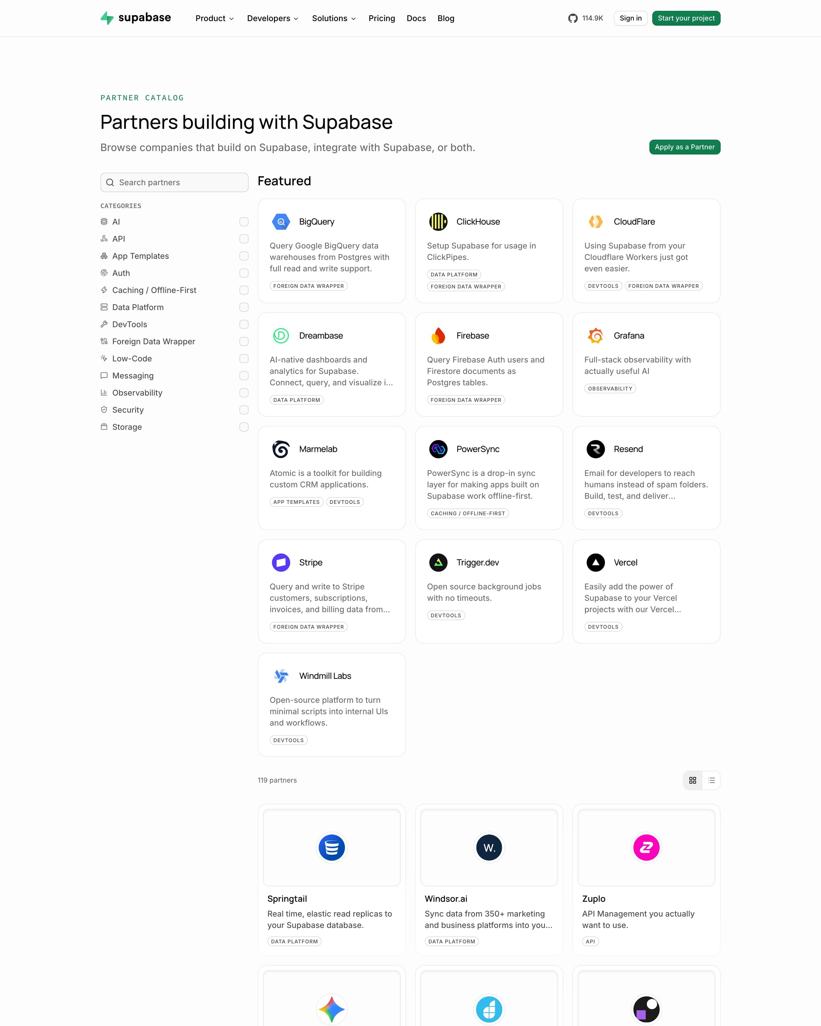
Under a green monospace "PARTNER CATALOG" label, a left sidebar lists 14 categories with checkboxes beneath a search box. Thirteen featured partners get compact text cards, then all 119 follow in a three-column grid: centred logo tile, two-line description and a small uppercase category tag. An "Apply as a Partner" button waits top right.
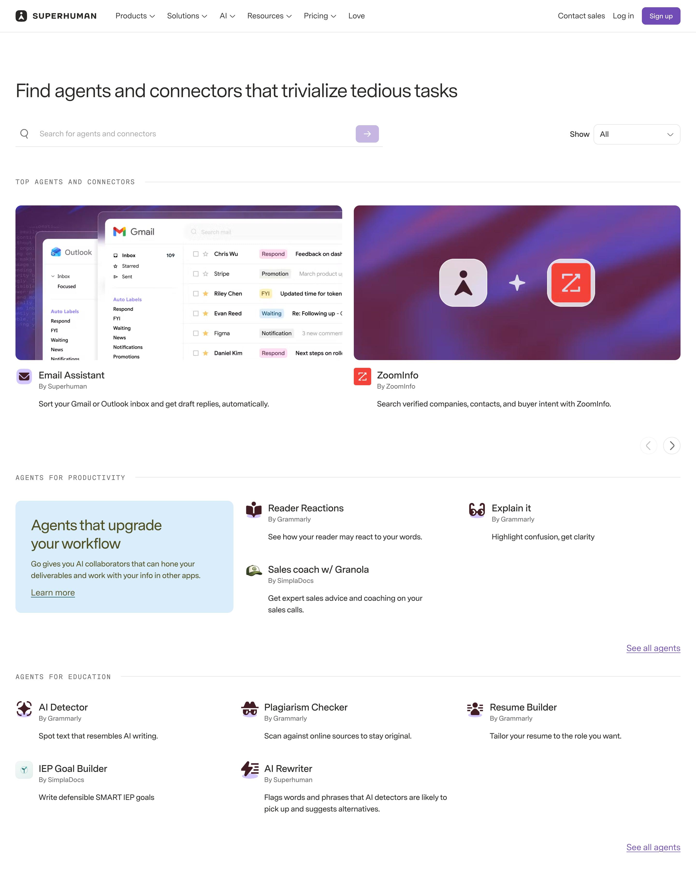
Spaced capital labels split the store into shelves: top picks, productivity agents, education agents, then connectors, most ending in a 'See all' link. Large image cards mostly pair the Superhuman icon with a partner's, while compact rows show an icon, a 'By …' maker line and one sentence. The shelf structure is worth borrowing.
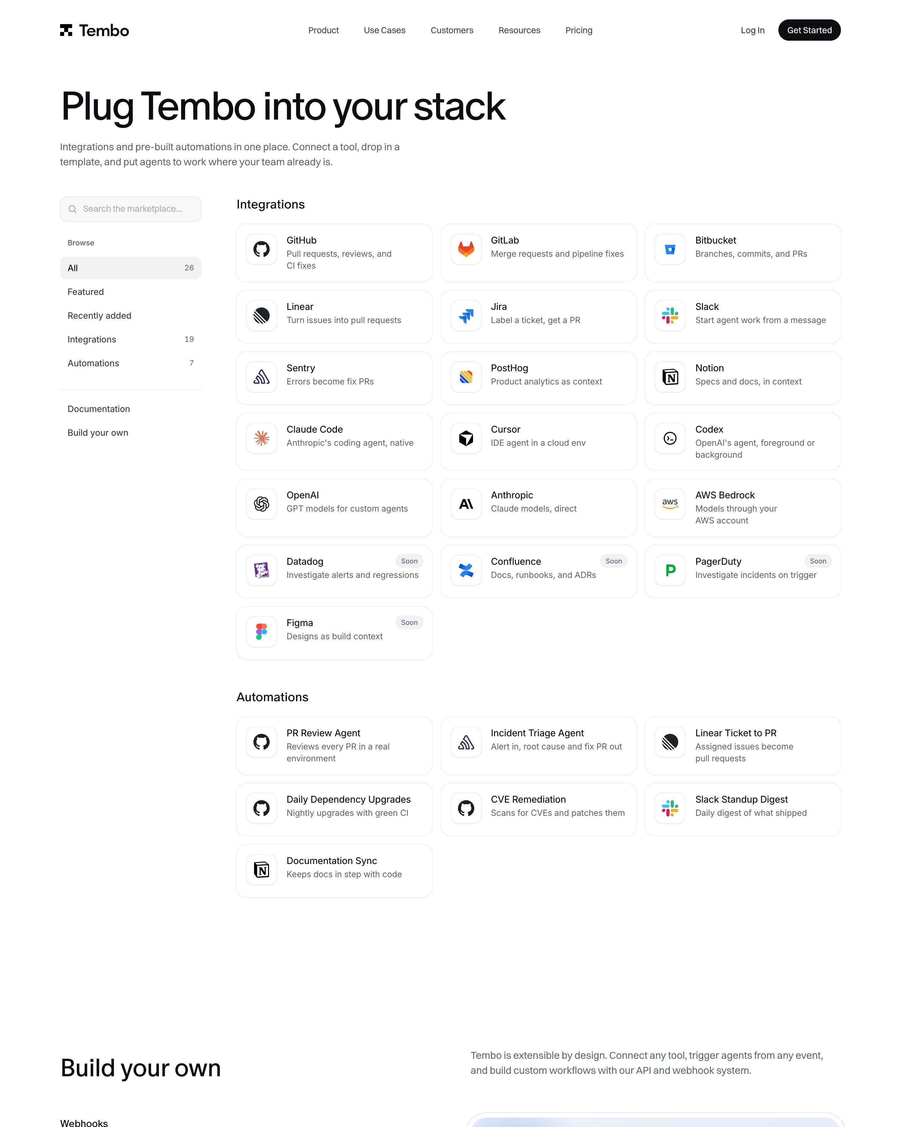
"Plug Tembo into your stack" works like a small marketplace: a search box and Browse filters on the left (All 26, Integrations 19, Automations 7), a three-column grid of icon cards on the right. Datadog, Confluence, PagerDuty and Figma carry grey "Soon" pills. Below, "Build your own" lists webhooks, REST API and custom agents beside a mock table of active API keys.
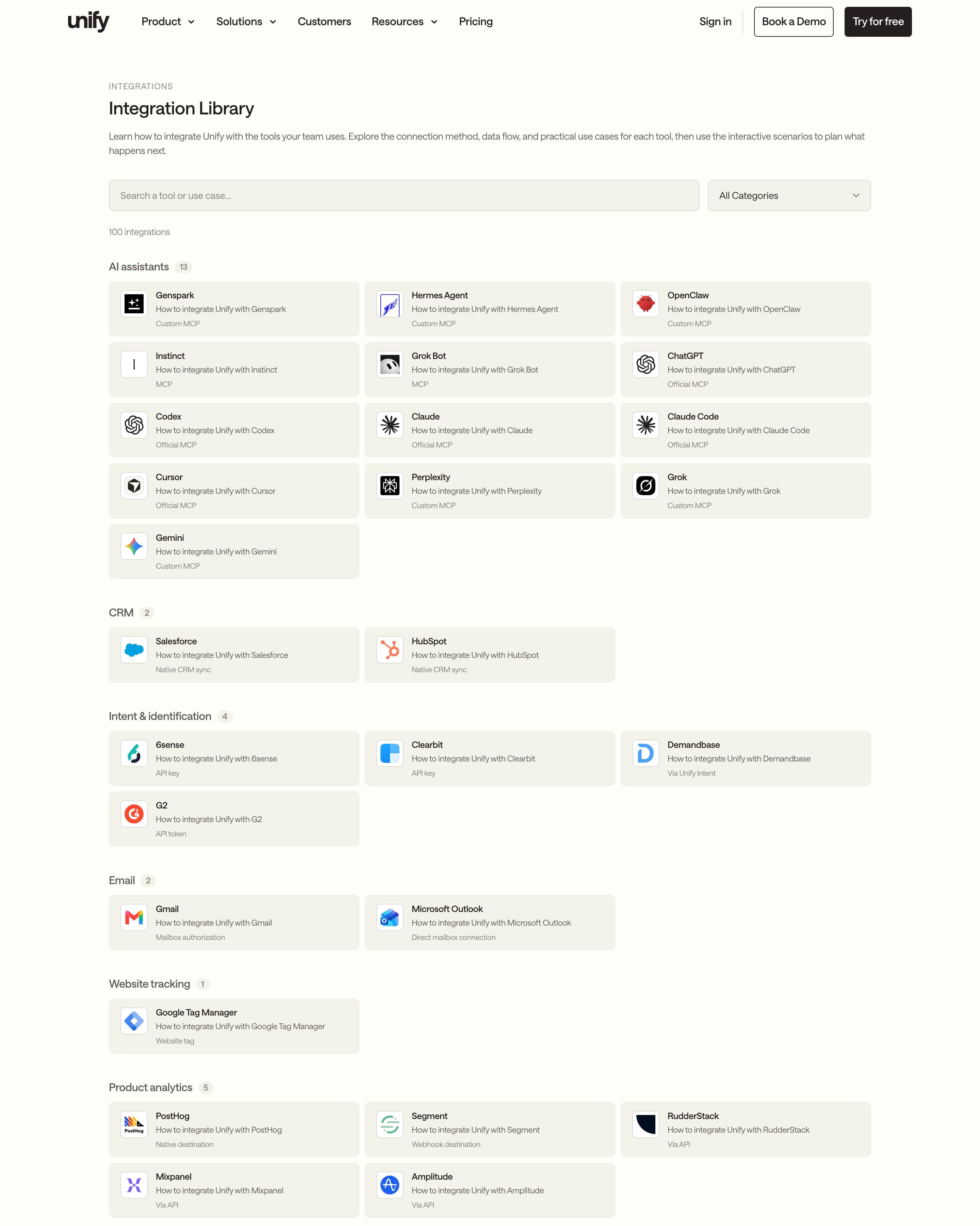
Unlike the rest of the site, the heading is small sans type: "Integration Library", a search bar, a category dropdown and "100 integrations". Tools are grouped under labels with count badges, from AI assistants (13) to Automation (19), and each grey card ends with its connection method, such as Official MCP, Via webhook or Via API. That third line answers the real question before anyone clicks.
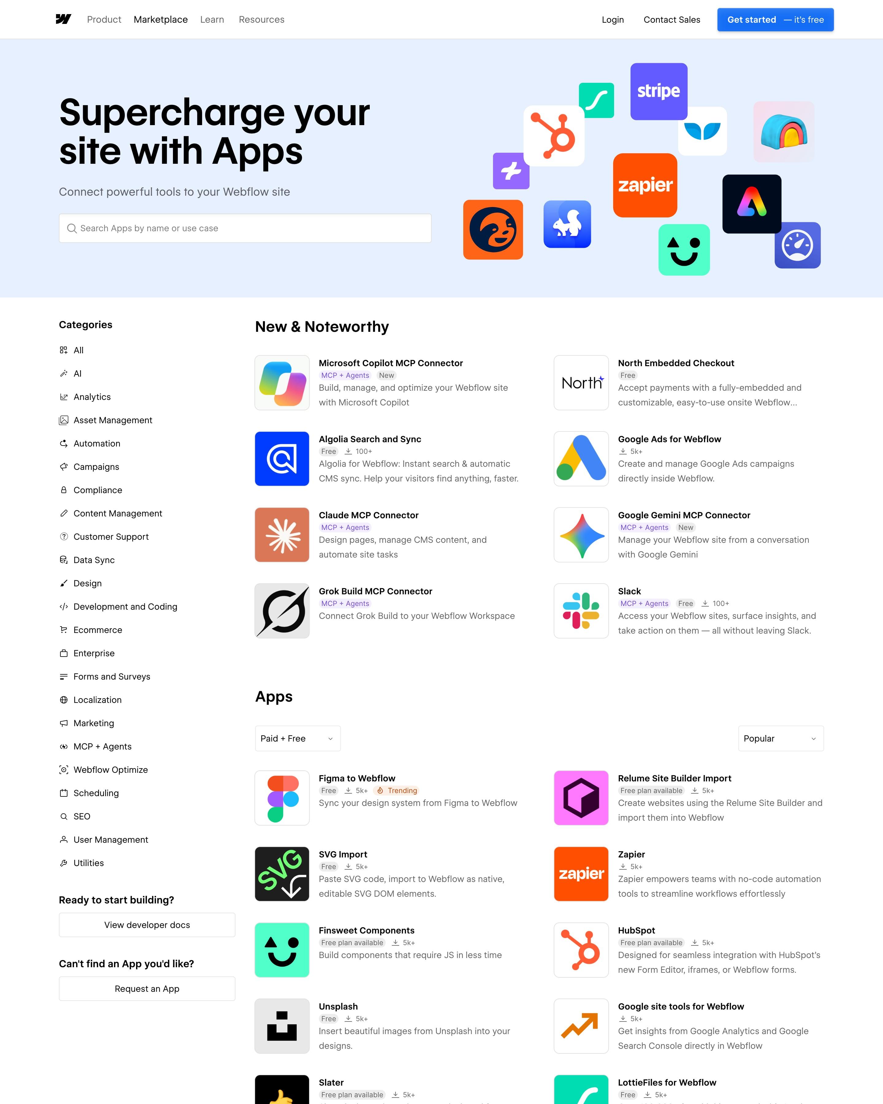
App icons of mixed sizes float on a pale blue hero beside a search box for apps "by name or use case". A category sidebar runs beside two-column app lists whose rows carry an icon, a short description and tags such as "MCP + Agents". Prompting search by use case is worth reusing.
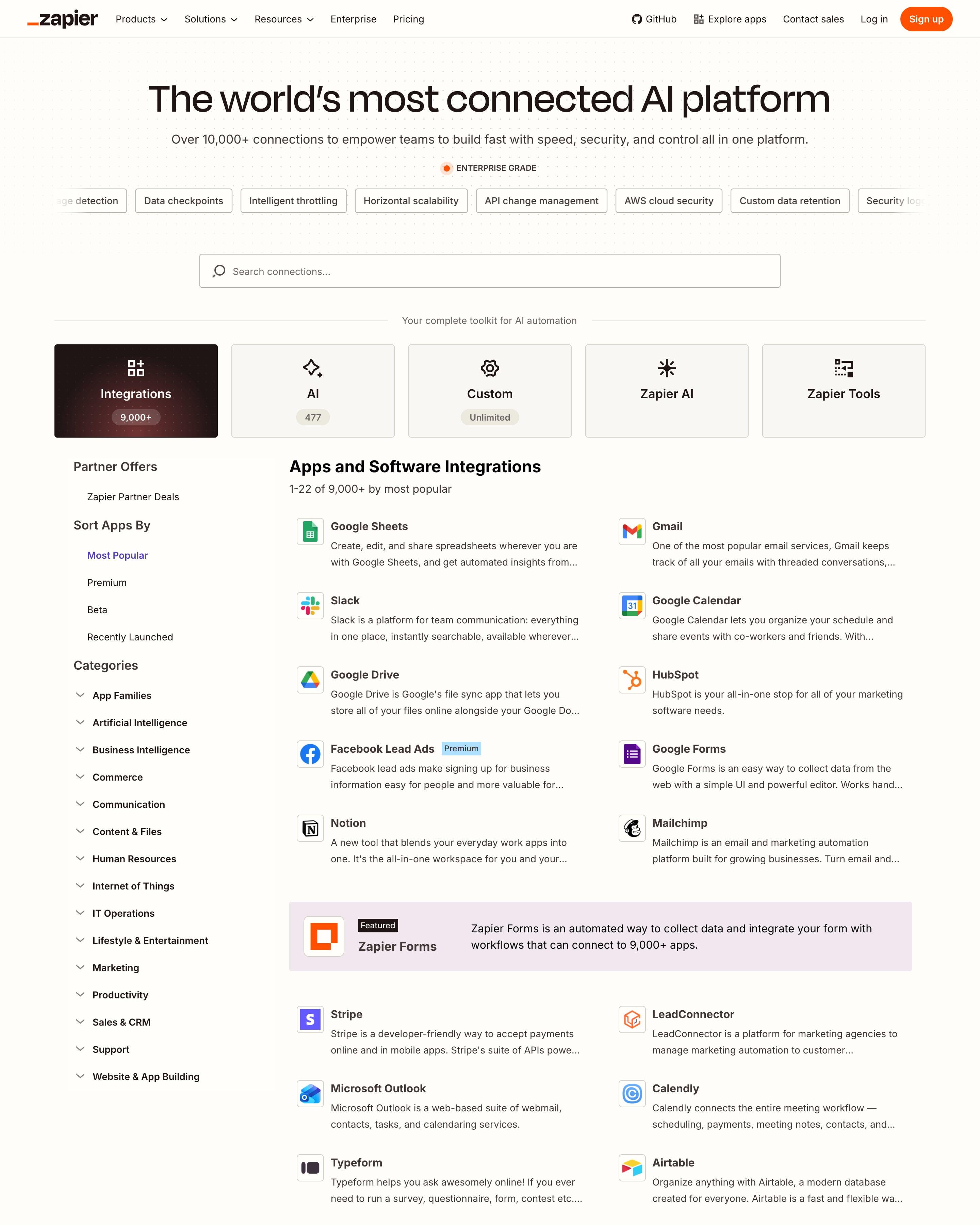
Below the search field, five tiles act as tabs, with counts such as Integrations 9,000+ and AI 477, a pattern worth copying. A sidebar sorts by Most Popular, Premium or Beta and lists categories, and apps fill a two-column list of icon, name and description under a '1–22 of 9,000+' counter.
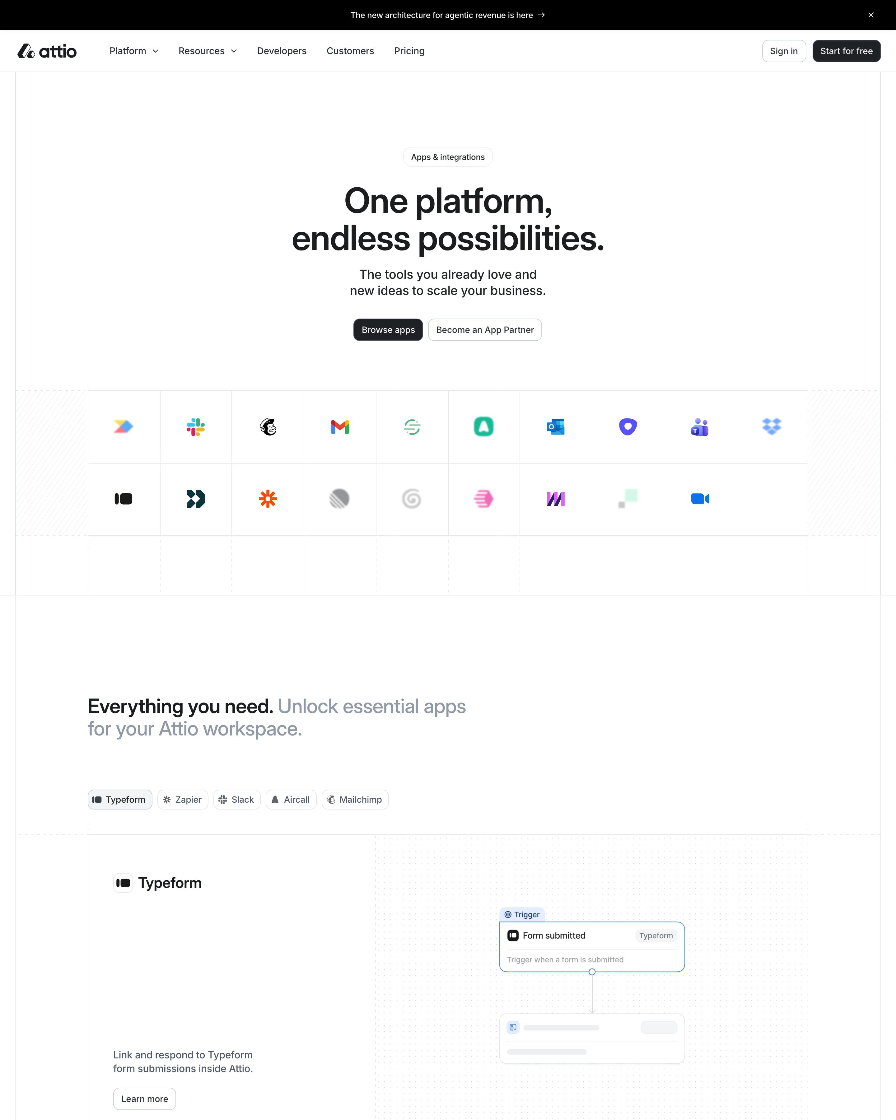
Under the hero, a grid of app logos leads to a tabbed showcase, where the Typeform tab shows a small workflow diagram. The directory below pairs a search bar and a category sidebar with two-column cards. Steal the green tick and the "By Attio" or "By Fibbler" maker line on each card.
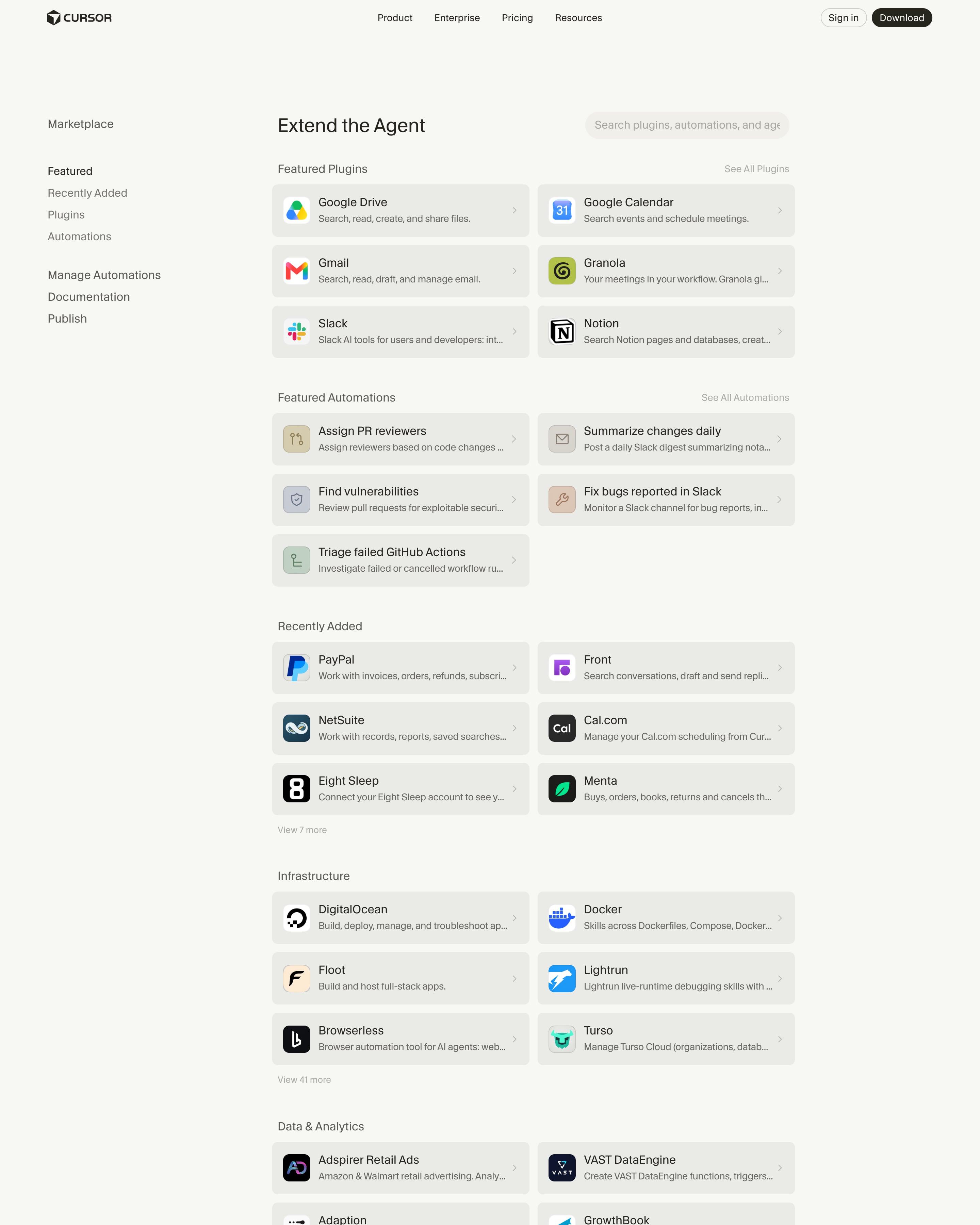
The page works like a small app store: a section sidebar, a search field, and two-column rows of icon, name, one-line description and chevron. Plugins are grouped by category, each with a "Show more" link. Giving automations tinted line icons, while plugins keep brand logos, is a tidy distinction to copy.
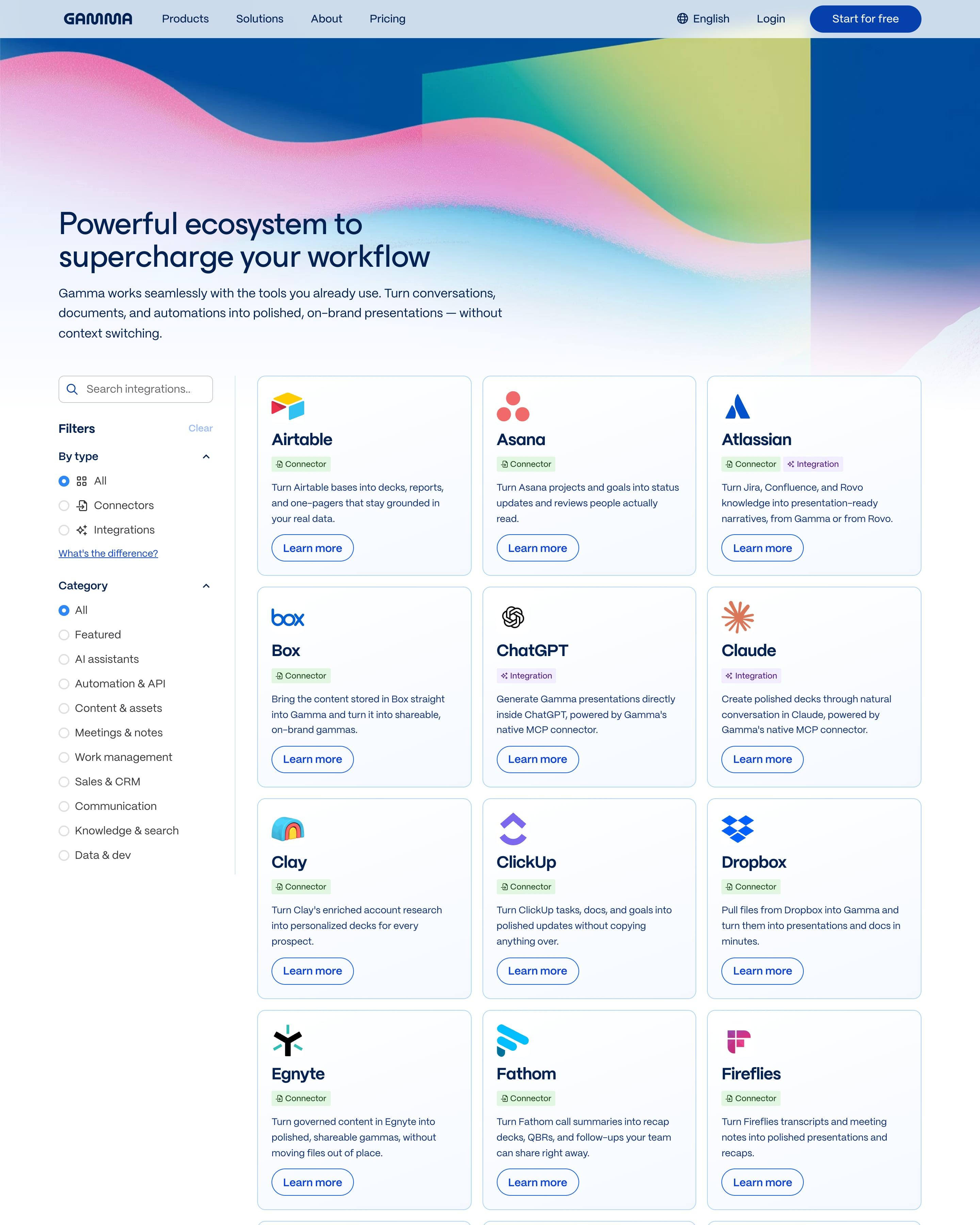
Grainy ribbons of pink, lime and blue sit behind the headline. The directory pairs a sidebar of search and filters with a three-column grid of cards, each carrying a green "Connector" tag, a purple "Integration" tag or both. Copy the "What's the difference?" link under the type filter, answered by two explainer cards below.
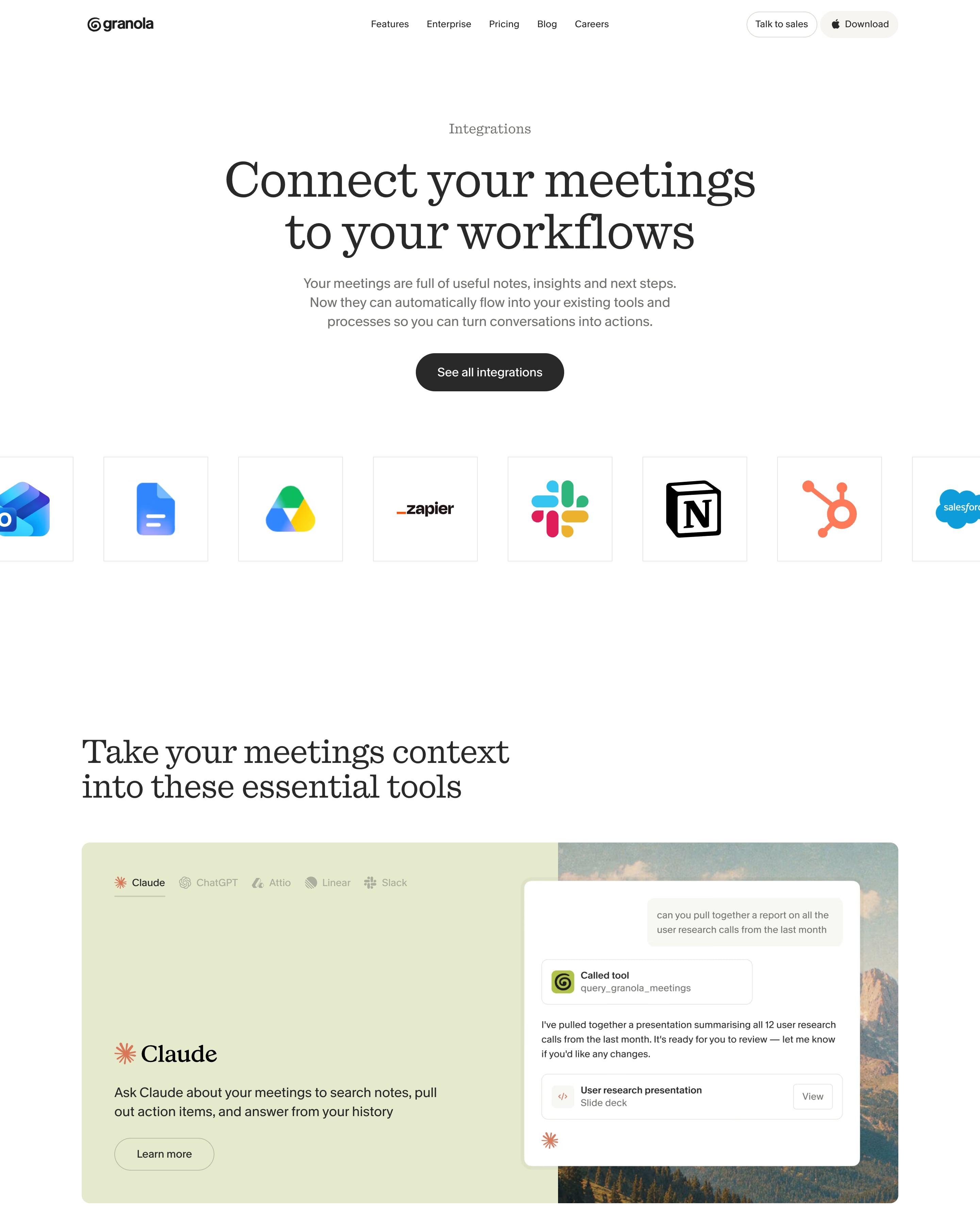
A row of large app-icon tiles runs off both screen edges under the headline. Next, a tabbed panel shows one tool at a time, starting with a Claude chat. The full list is grouped by category with search, and the closing "Want to request an integration?" box is easy to lift.
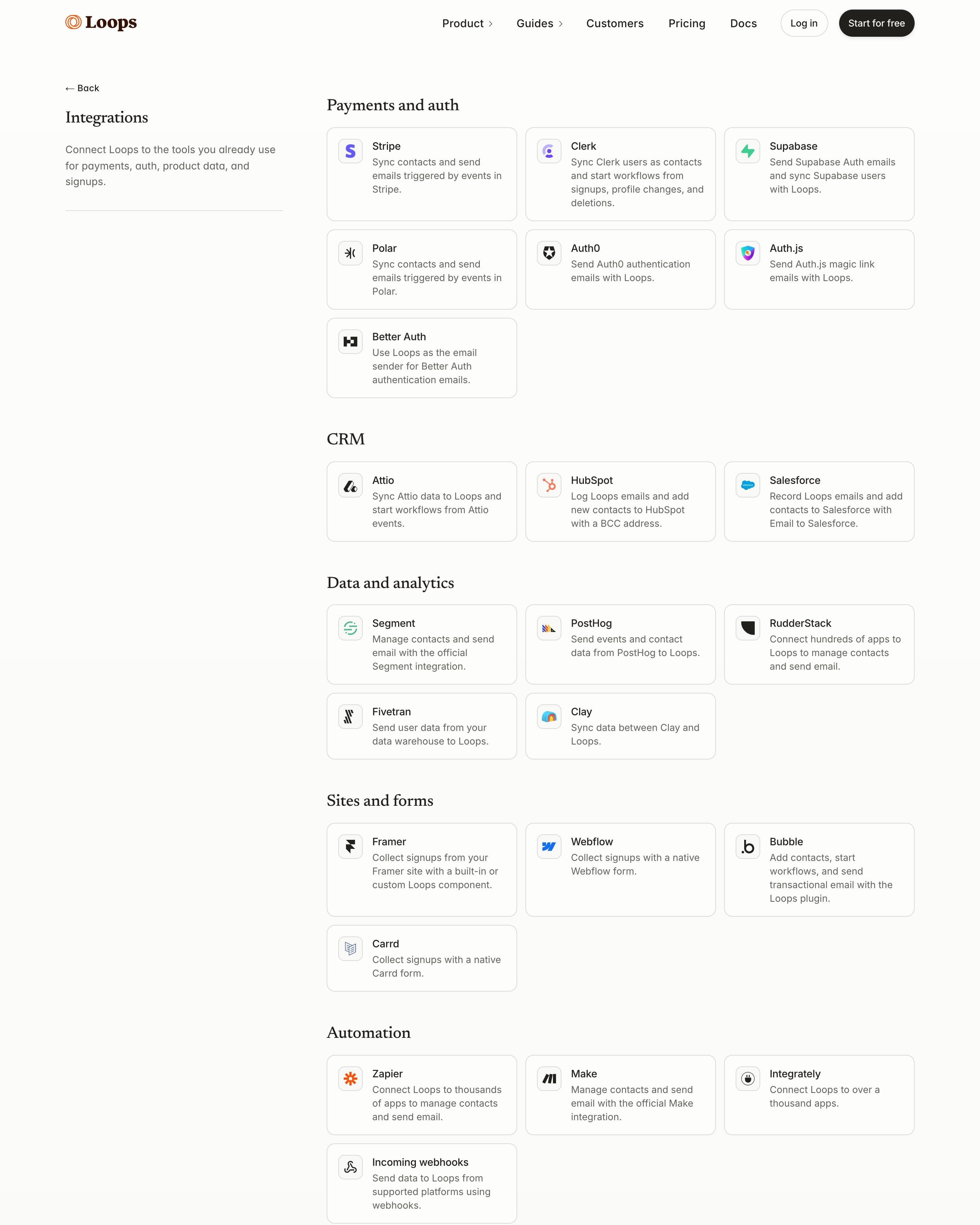
A left column holds the "Integrations" title and one sentence, while the right column groups bordered cards under serif headings: Payments and auth, CRM, Data and analytics, Sites and forms, Automation, Email tools. Each card has an icon, a name and one line on what the sync does. The page ends by pointing anything not listed to the Loops API.
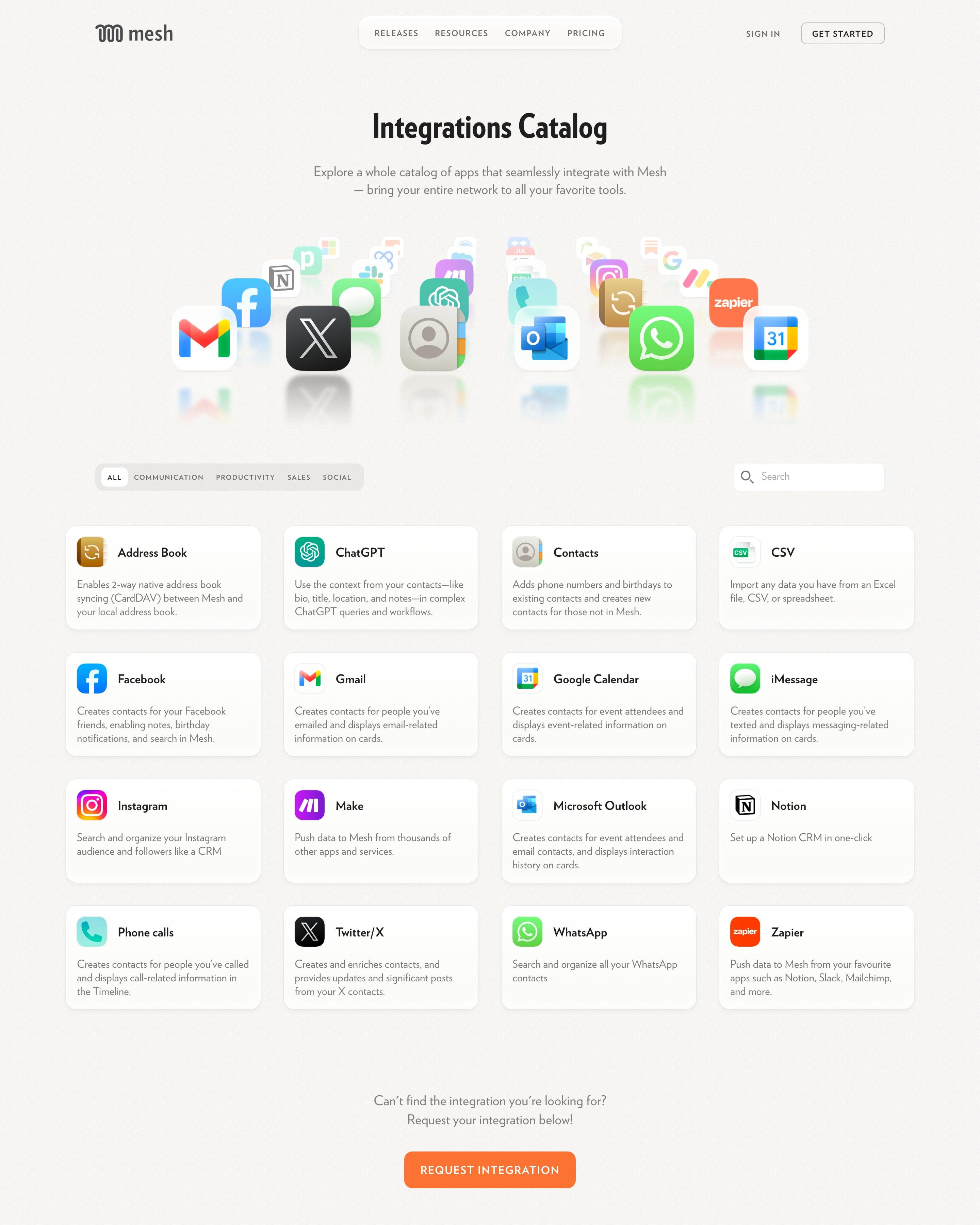
App icons fan out in an arc, with mirror reflections, under the "Integrations Catalog" headline. Category pills and a search box sit over a four-column grid of cards, each with an icon and a short description. The "Coming soon!" section, with upcoming integrations handwritten on sticky notes, is a touch worth borrowing.
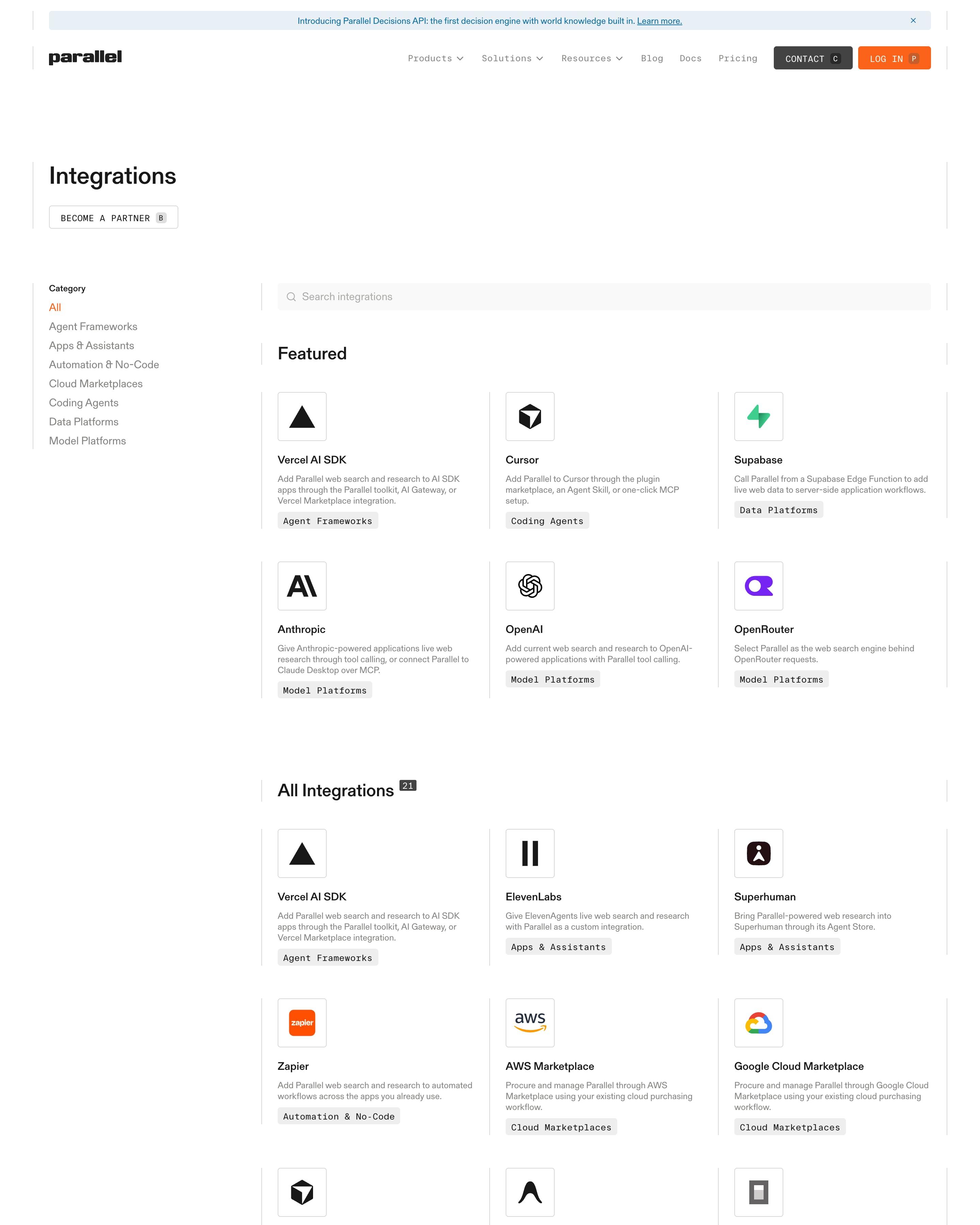
A left-hand category list and a search bar frame six featured tools, then all 21 in a ruled three-column grid. Each entry has a boxed logo and a monospace category tag. Worth borrowing: one sentence per card on how the connection works, not what the partner does.
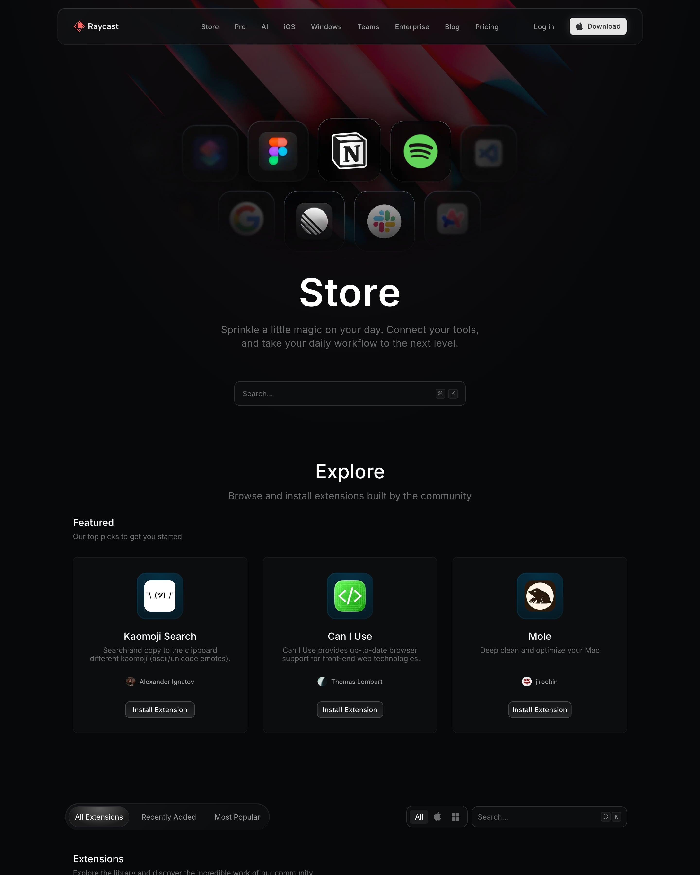
App icons float over the red beams up top, the outer ones blurred, above a search box with a ⌘K hint. Three featured extensions get large cards, then tabs (All, Recently Added, Most Popular) sort a two-column list where each row has its own Install button, author and download count, a detail to copy.
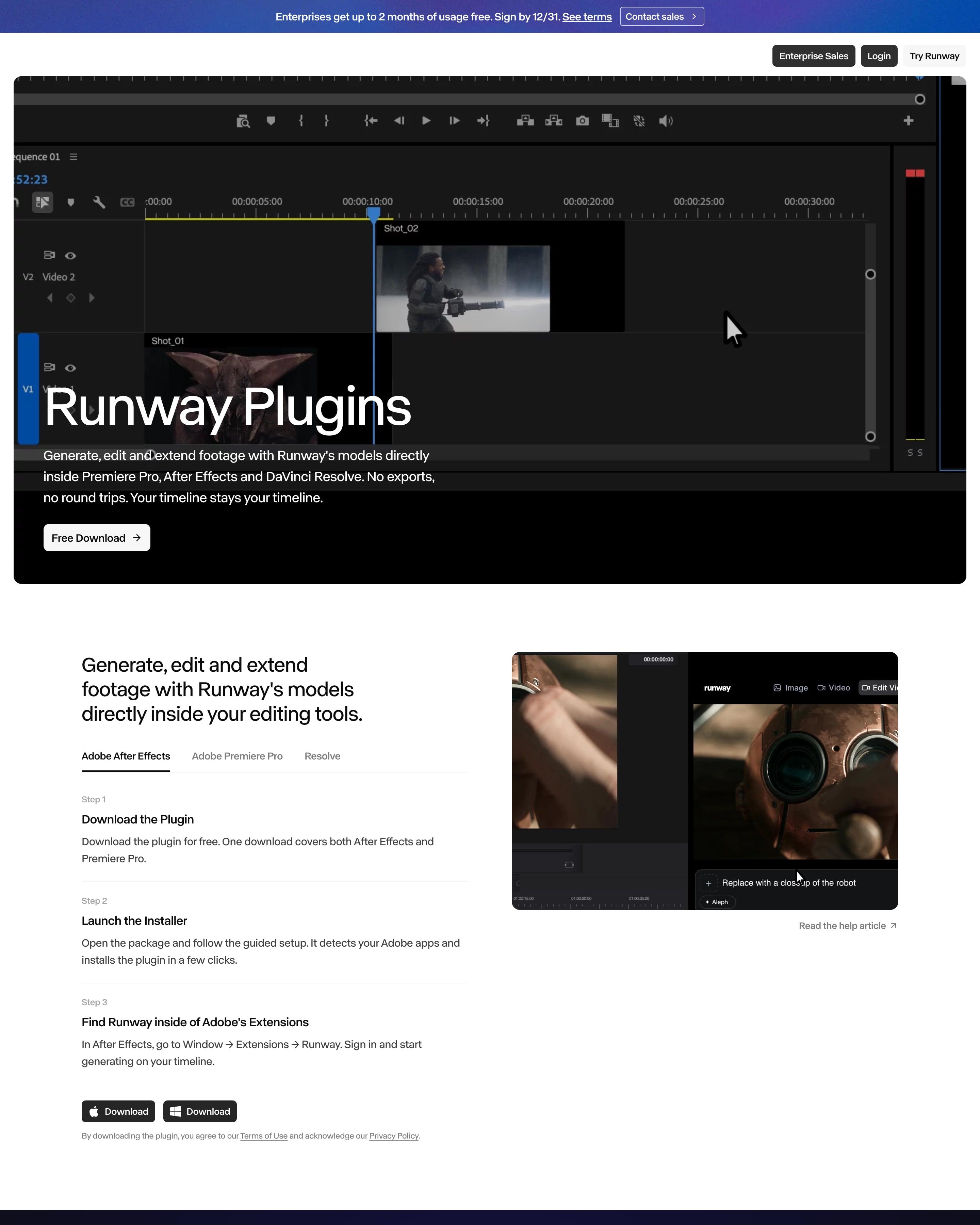
An editing timeline fills the hero behind the headline and a single "Free Download" button. Tabs for After Effects, Premiere Pro and Resolve sit above three numbered install steps, plus Mac and Windows download buttons. Worth copying: each feature's panel mockup set on its own pastel tint, such as pale blue, mint or peach.
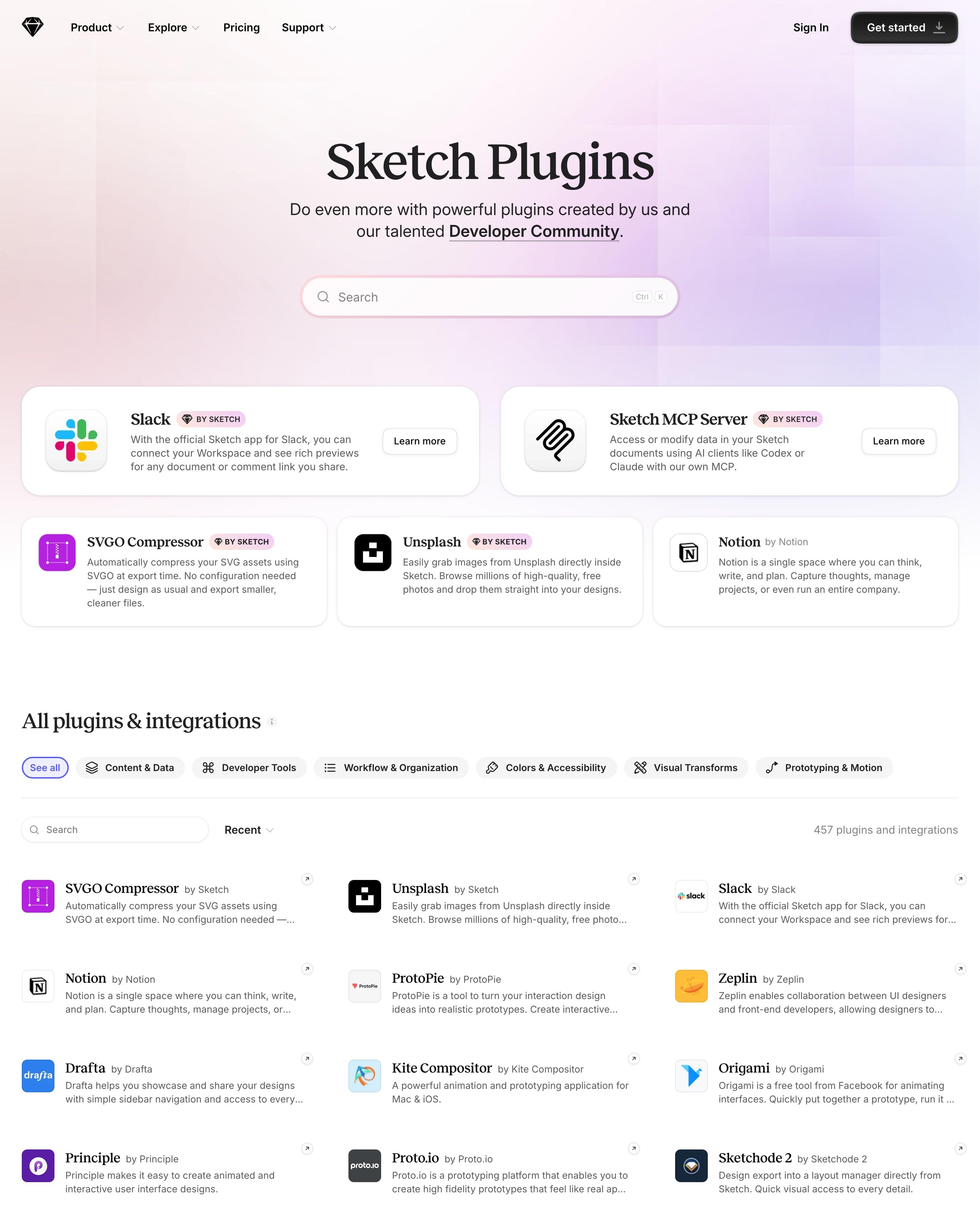
Five featured plugins lead in large cards, with pink "BY SKETCH" badges marking Sketch's own, like the MCP Server and SVGO Compressor. Below, filter chips with line icons sort 457 plugins and integrations into a three-column list of icon, serif name and two-line blurb. Worth copying: the "Build your own plugin" banner, which mocks up the settings panel with "Your Next Plugin by {author}" selected.
Eleven white cards on a lavender wash make up the directory, each with a logo, a grey category line such as 'Customer Relationship Management (CRM)' and one sentence on what the integration does. There's no search; a request link for missing integrations ends the grid. The category line is worth copying.
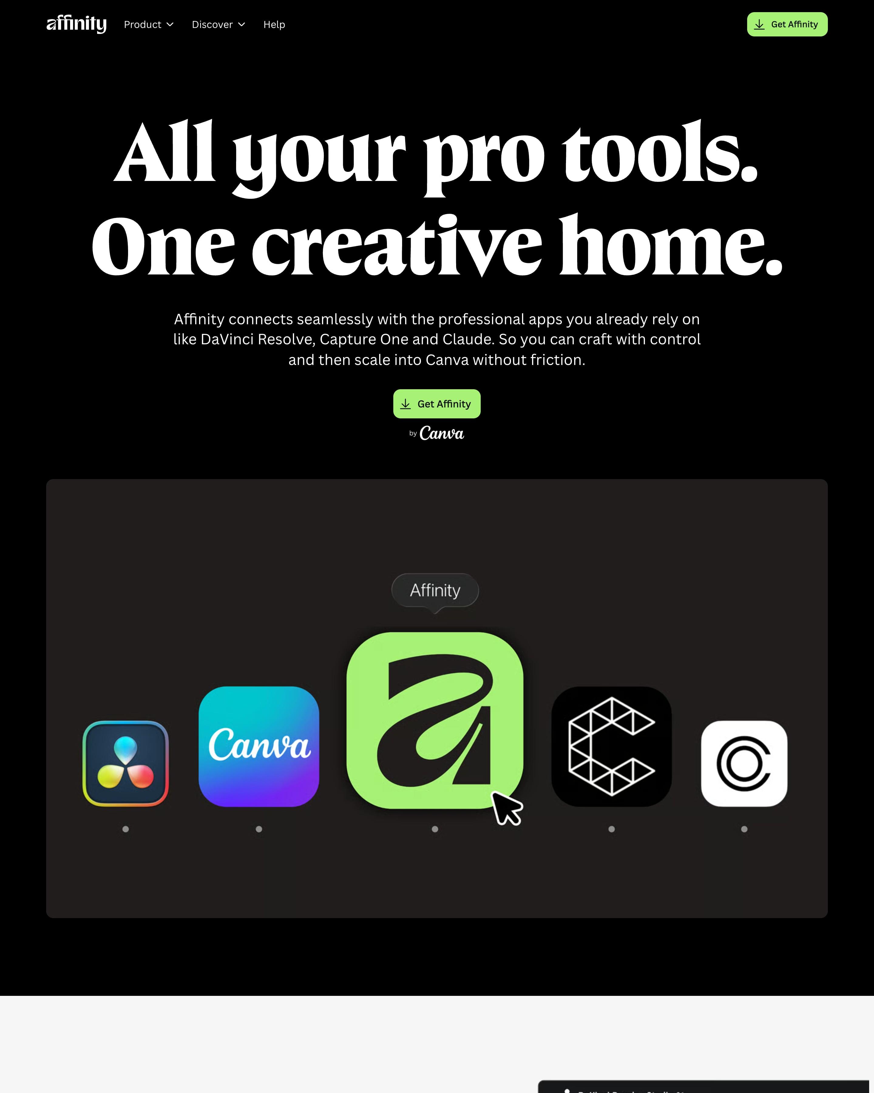
"All your pro tools. One creative home." sits above a dock of app icons, Affinity's lime icon magnified between DaVinci Resolve, Canva, Cavalry and Capture One. Each integration then gets a split row, alternating light grey and black, pairing a serif headline with a real app screenshot, down to Claude renaming 95 layers. Worth copying: that dock, which explains the hub idea before anyone reads a word.
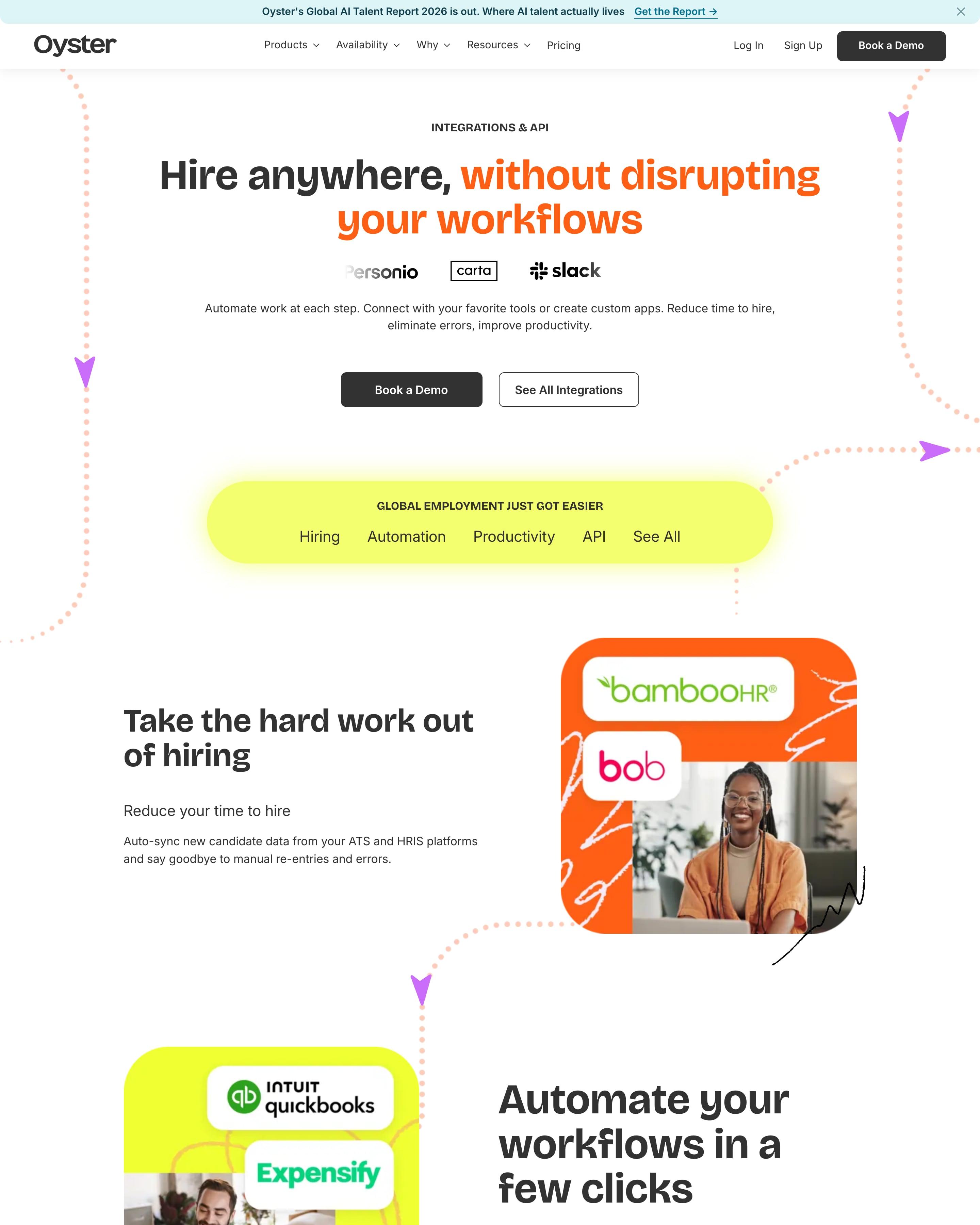
Dotted paths with arrowheads wind down the page, past rows of photos topped with partner-logo stickers, and a lime bar of section links sits under the hero. The full directory comes last, with search, a category sidebar and three-column cards. Those logo stickers, which tie each workflow to a named tool, are worth copying.



































By page type
Frequently asked questions
Search and categories, a card per integration with its logo and one line on what it does, and a page for each integration with the details.
Each page is opened at 1440 pixels wide, like a laptop, and scrolled from top to bottom so every image and section loads. Cookie banners, chat bubbles and popups are left out, and the whole page is saved as one image.