
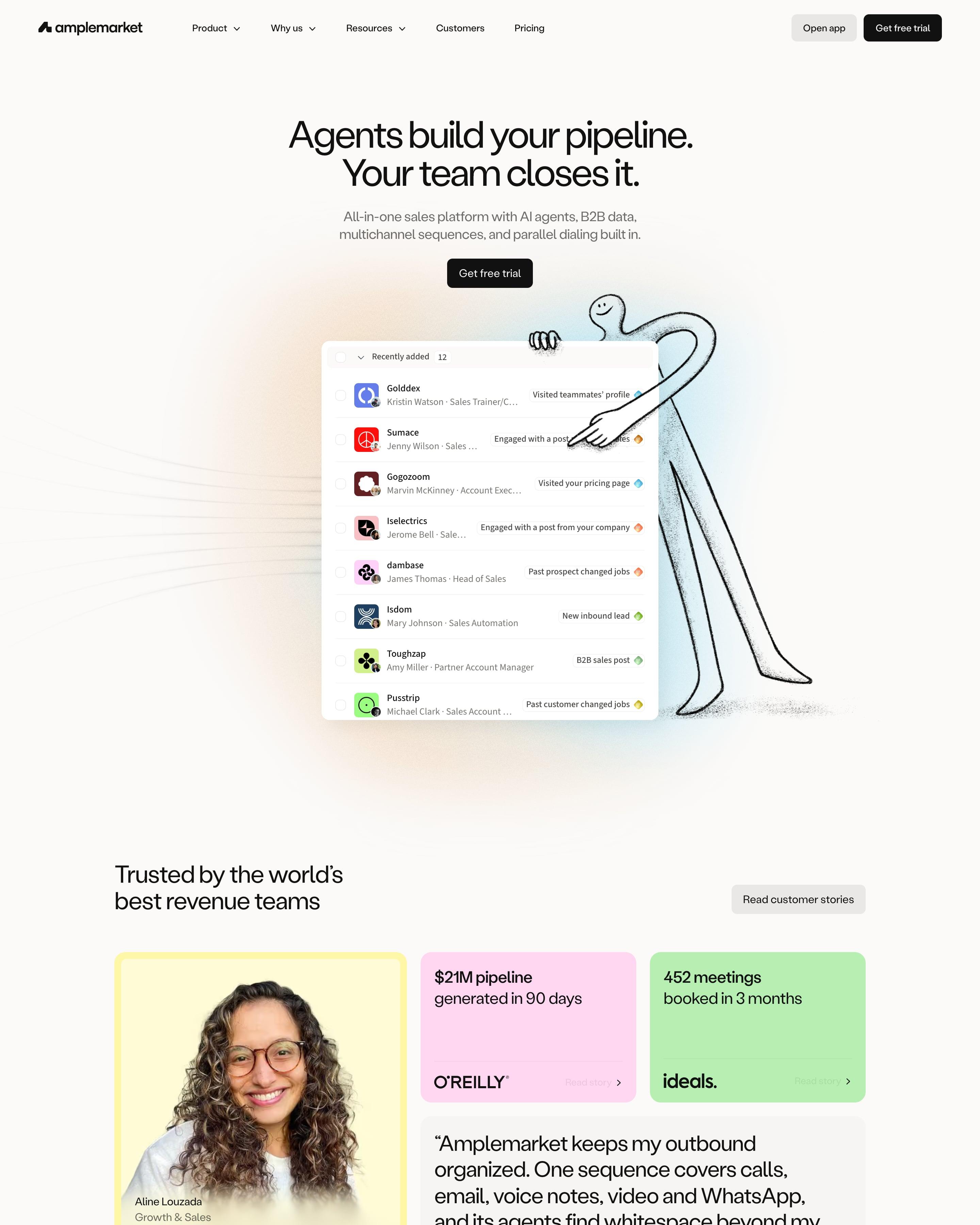

A thin hand-drawn figure leans on the hero's lead list, beside the line "Agents build your pipeline. Your team closes it." Each product area, from Duo Intelligence to Optimization, repeats one module: small caps label, headline with two stats, a soft gradient panel holding the app, then feature cards. Worth copying: proof that pairs photo quotes with flat yellow, pink and green stat tiles like "$21M pipeline generated in 90 days".
24 examples from SaaS companies
Best Gradient Website Examples
Sites built around colour gradients: washes behind the hero, glowing shapes, and buttons or text that blend from one colour into another. Here are 24 SaaS websites that do it well, each shot as the whole page, with what stands out on each.
- Dark or light
- 5 dark, 19 light
- of 24 pages
- Heading fonts
- Inter
- Inter 2, Labil Grotesk 1, Plus Jakarta Sans 1, GT Walsheim 1
- Built with
- Next.js
- Next.js 13, Webflow 4, Framer 4, Astro 1
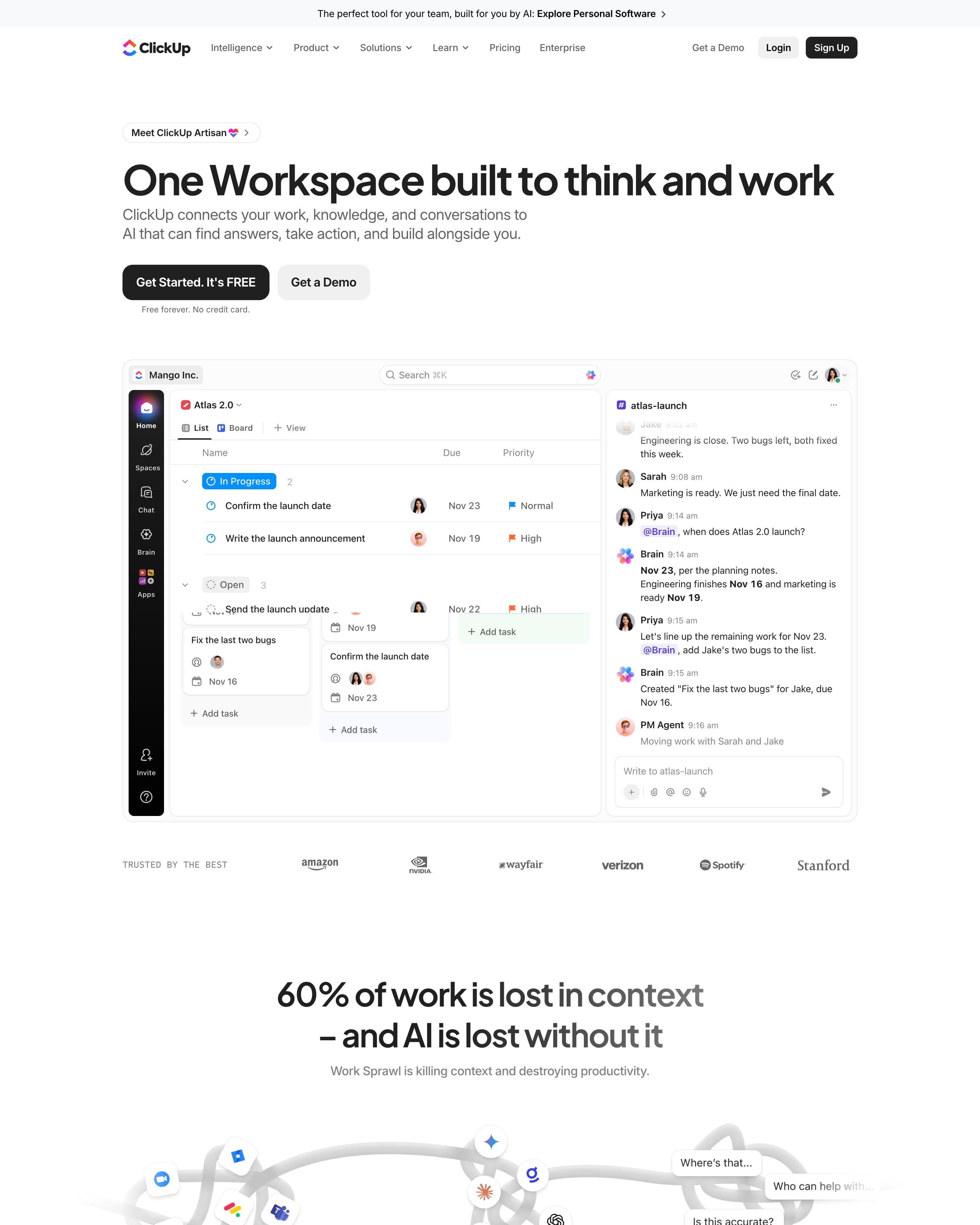
"One Workspace built to think and work" sits over a live app mock: a board beside a chat where Brain answers a teammate. The page then changes mood twice: a glossy orange-to-blue Super Agent mask over a grainy orange silhouette, then a black Brain² panel with monospaced labels. Worth copying: the icon grid of 100+ products, with Projects, Docs, Brain and Chat as large centre tiles and the edges fading out.
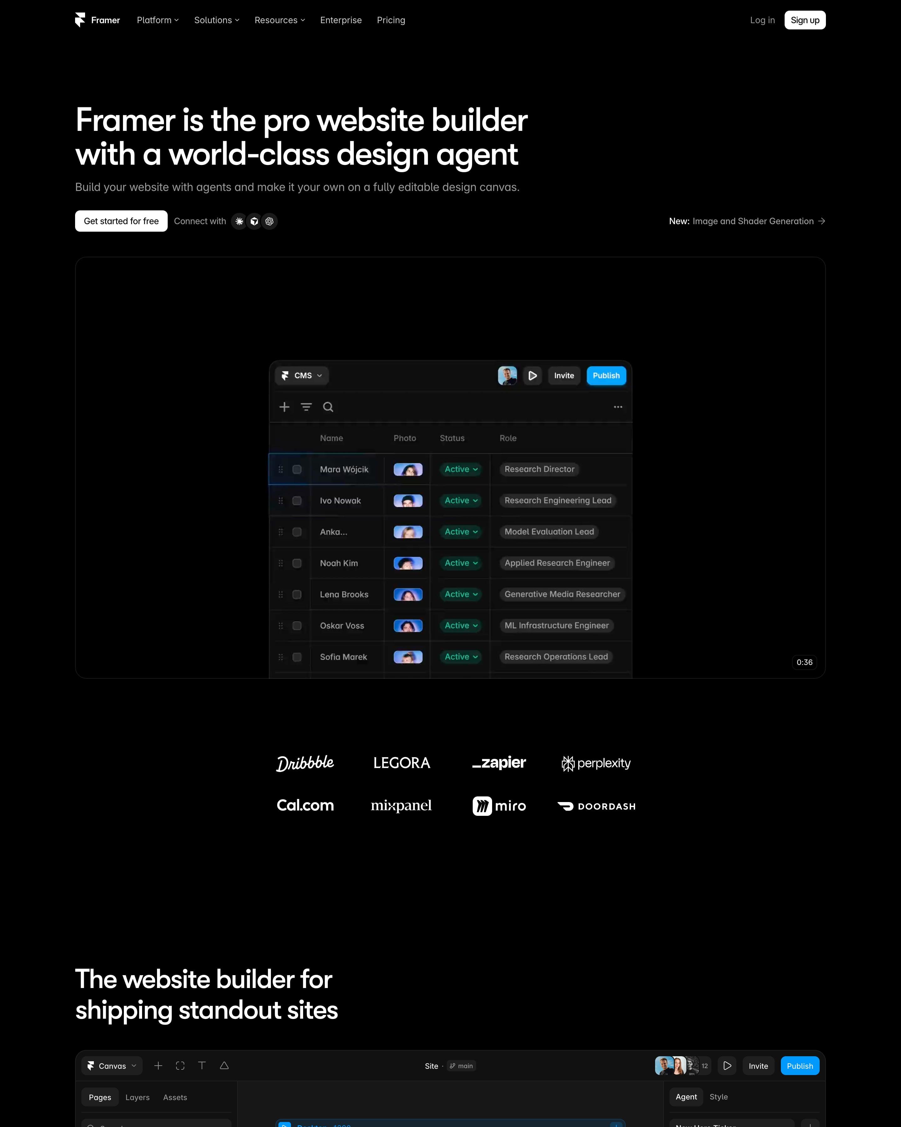
"Framer is the pro website builder with a world-class design agent" sits left on pure black above a canvas frame labelled InteractivePointSphere, a dot sphere selected in a purple box. A full editor screenshot follows, then "Not just vibes, a full platform" as a bordered bento of Performance, CMS, SEO, Hosting and Analytics tiles. The page ends on a prompt box with preset chips like "Build startup site".
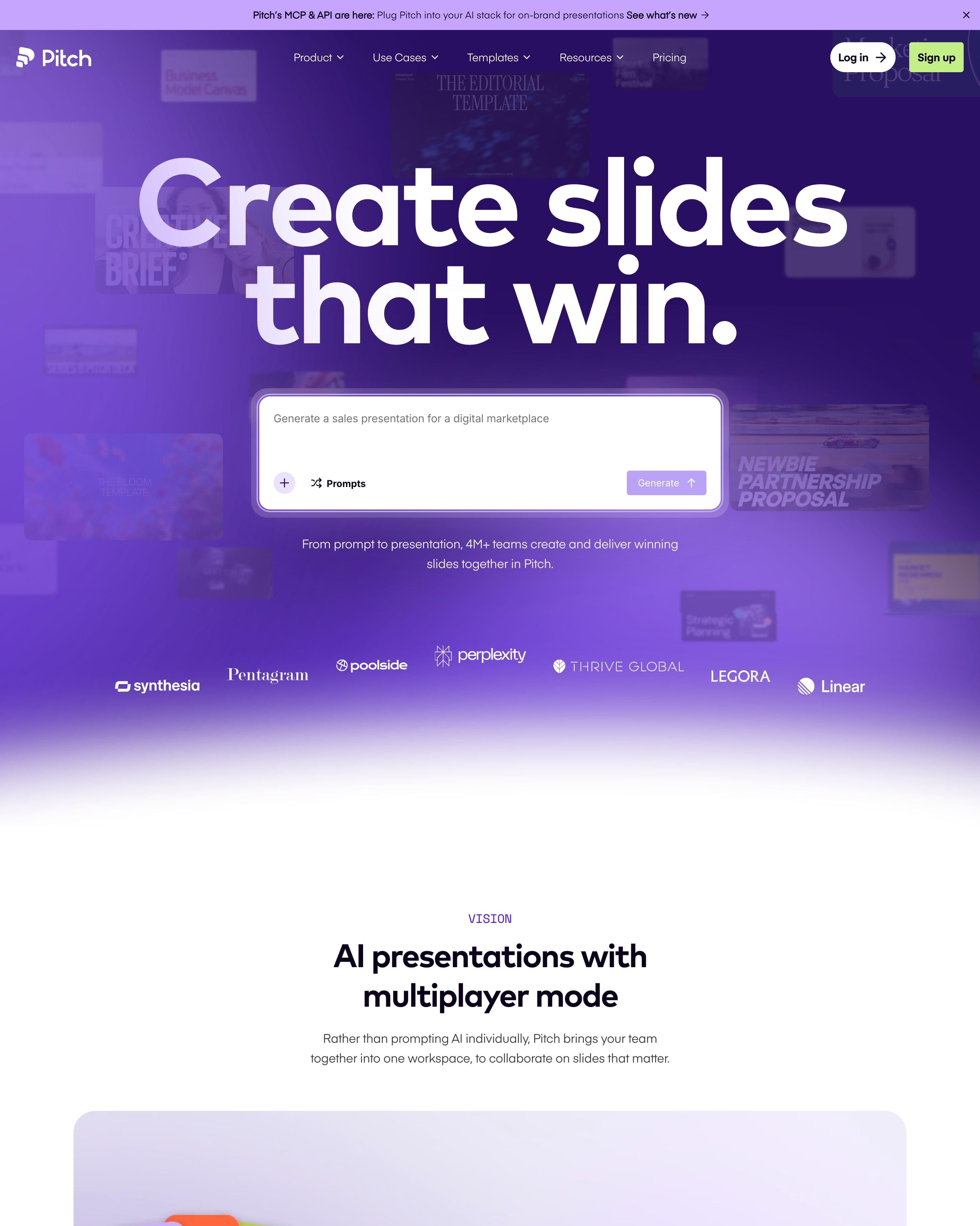
Dimmed template covers drift behind a giant white headline and prompt box on violet. Proof comes as a wall of quote cards around "Trusted by 4M+ teams", then a bento grid of seven tools. The template index is the part to borrow: huge faded category names, one lit up with its templates beside it.
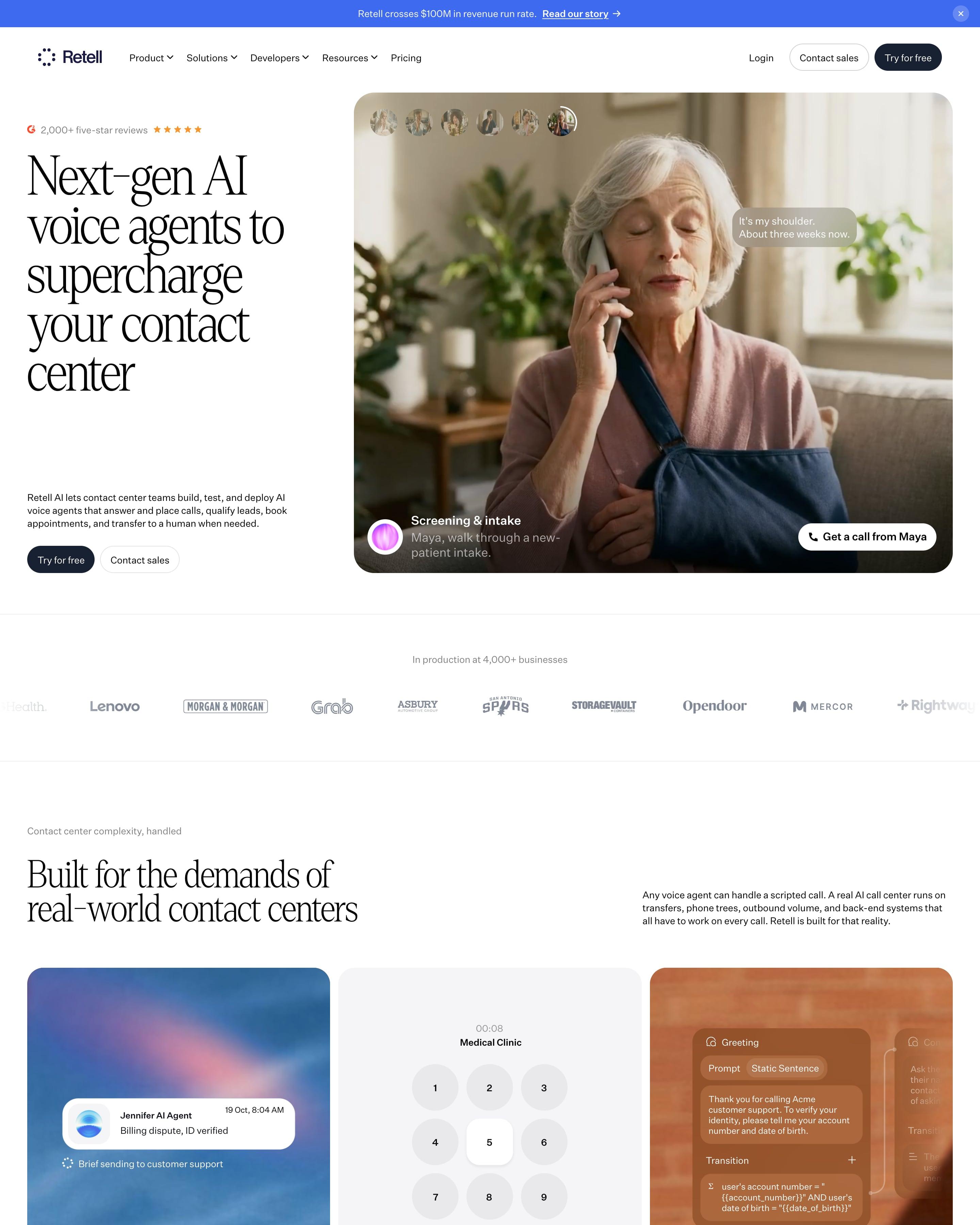
A tall serif headline, "Next-gen AI voice agents to supercharge your contact center", sits beside a photo of a caller with live transcript bubbles and a "Get a call from Kate" button. Feature cards mix a blurred sky, a phone keypad and a call-flow editor, a blue sphere of dots stands for the voice stack, and "CX Engineers build on Retell" sets three round photos inside the headline.
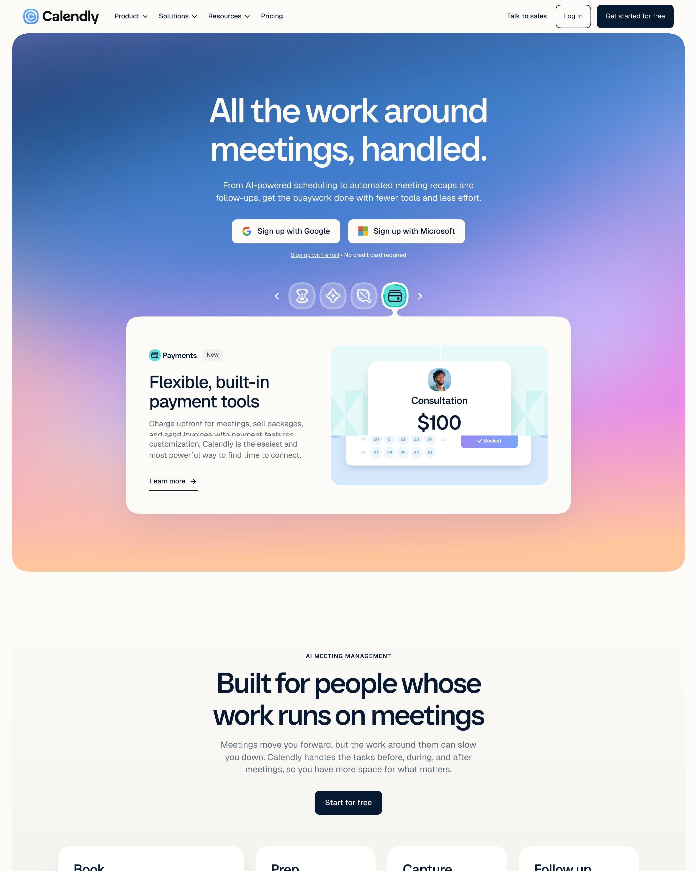
A blue-to-violet-to-peach gradient frame holds the hero, "All the work around meetings, handled.", with Google and Microsoft sign-up buttons and a carousel of feature cards such as a $100 consultation booking. Four columns, Book, Prep, Capture and Follow up, map the meeting lifecycle. Features then pair serif headlines with gradient panels holding one small UI card each, a pattern worth copying.
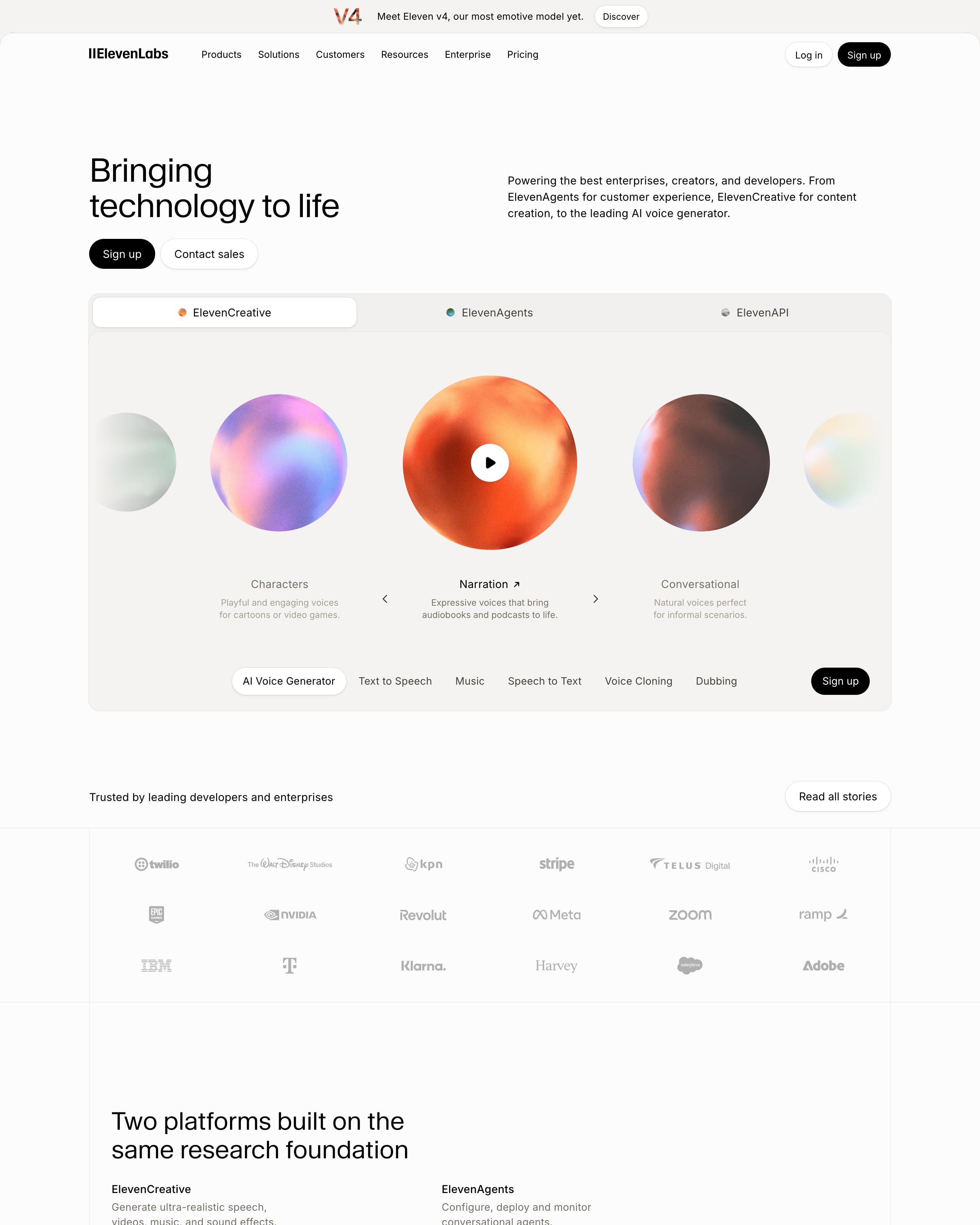
"Bringing technology to life" leads into a tabbed player where grainy colour orbs stand for voices like Narration and Characters. The page then splits into ElevenCreative, ElevenAgents and ElevenAPI, each with a bento of beige cards, chat bubbles and code snippets. Worth copying: line drawings of a cube and concentric circles for the moderation, accountability and provenance cards under "Safety, built in".
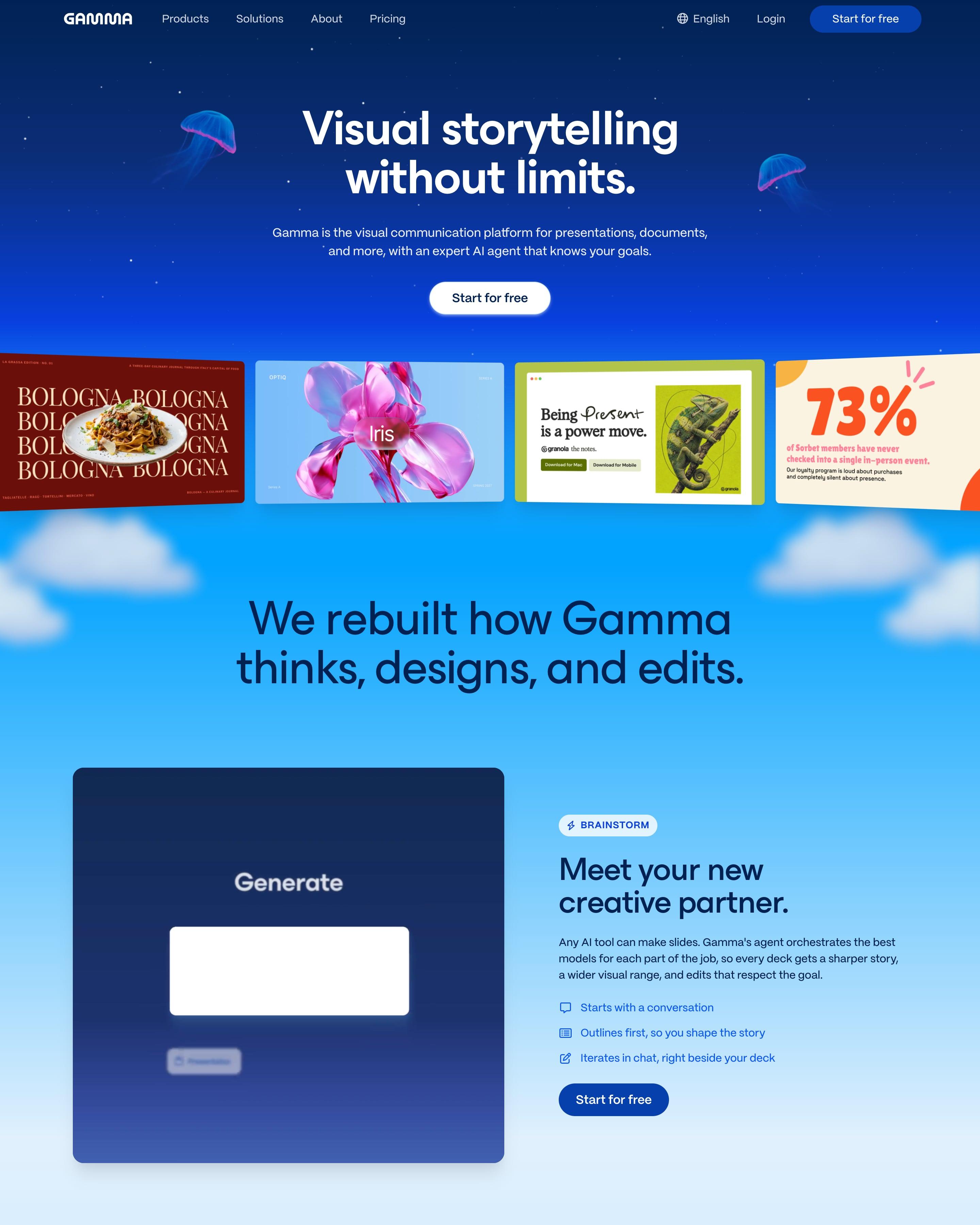
Glowing jellyfish flank the headline in a night-blue sky, and further down the sky turns to day over clouds and green hills. Four sample designs, from a food magazine page to a 73% stat slide, sit under the button. Borrow the portrait carousel of customer leaders, each labelled with company, name and title.
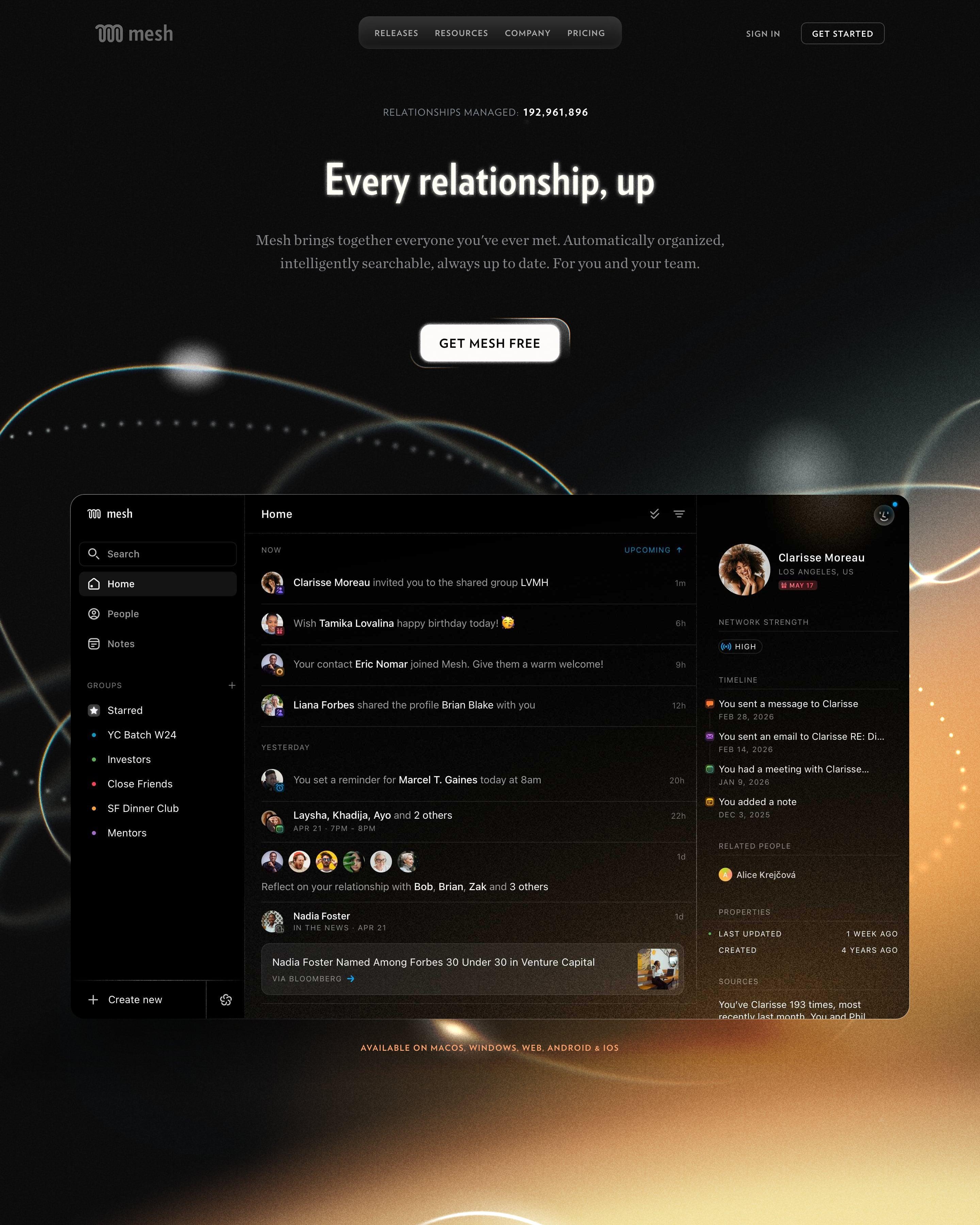
Above the headline, a counter reads "Relationships managed: 192,961,896", and golden light flares glow behind most sections on black. Lift the team section's constellation, where avatars are linked like stars. Proof then floats portraits and App Store icons around one heading, above press logos and three award laurels.
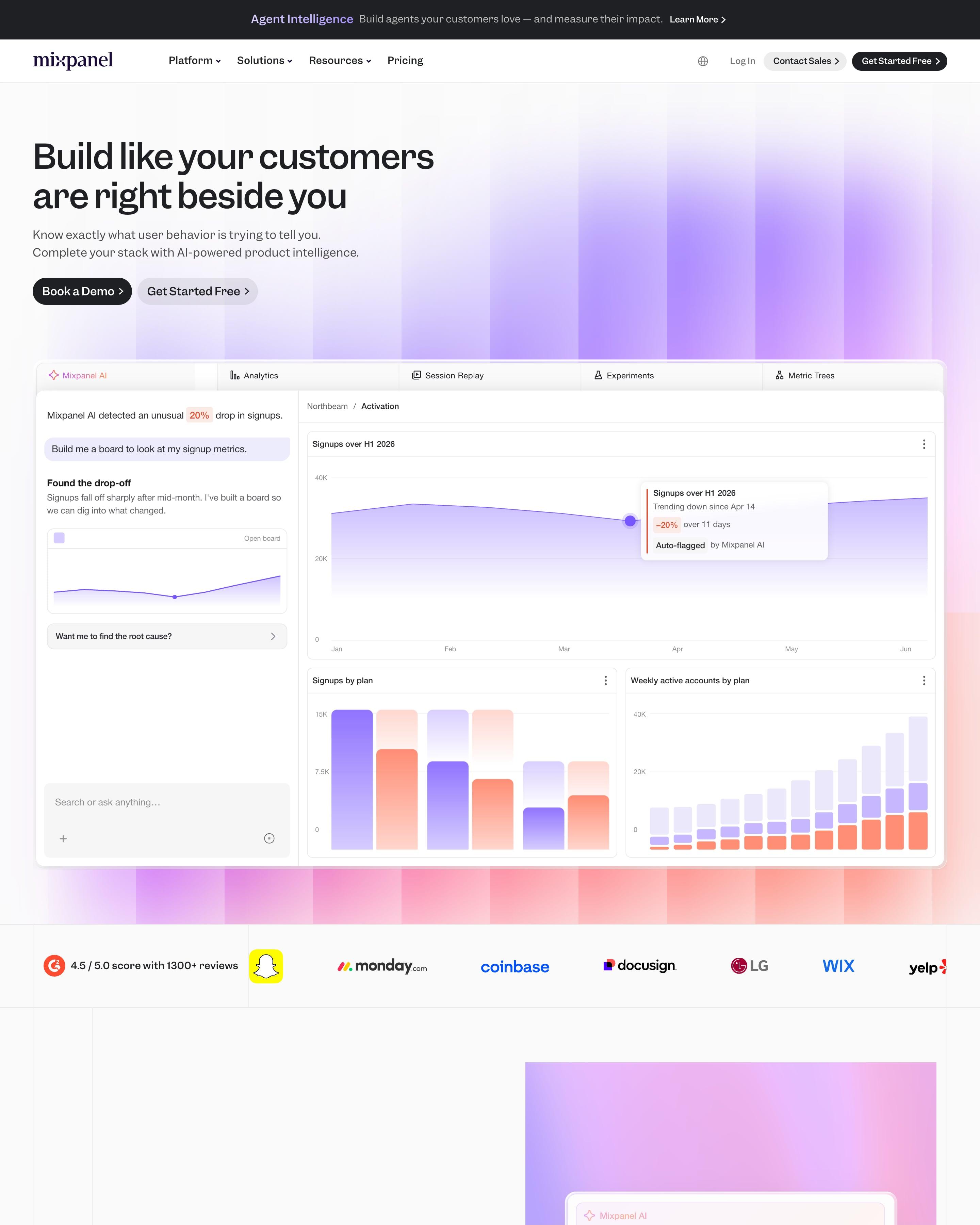
Blurred violet columns glow behind the headline, above a tabbed product panel in which an AI assistant spots a 20% drop in sign-ups. Five features follow, each with a screen on its own gradient, from violet through blue and green to orange. That colour per feature is the idea to take.
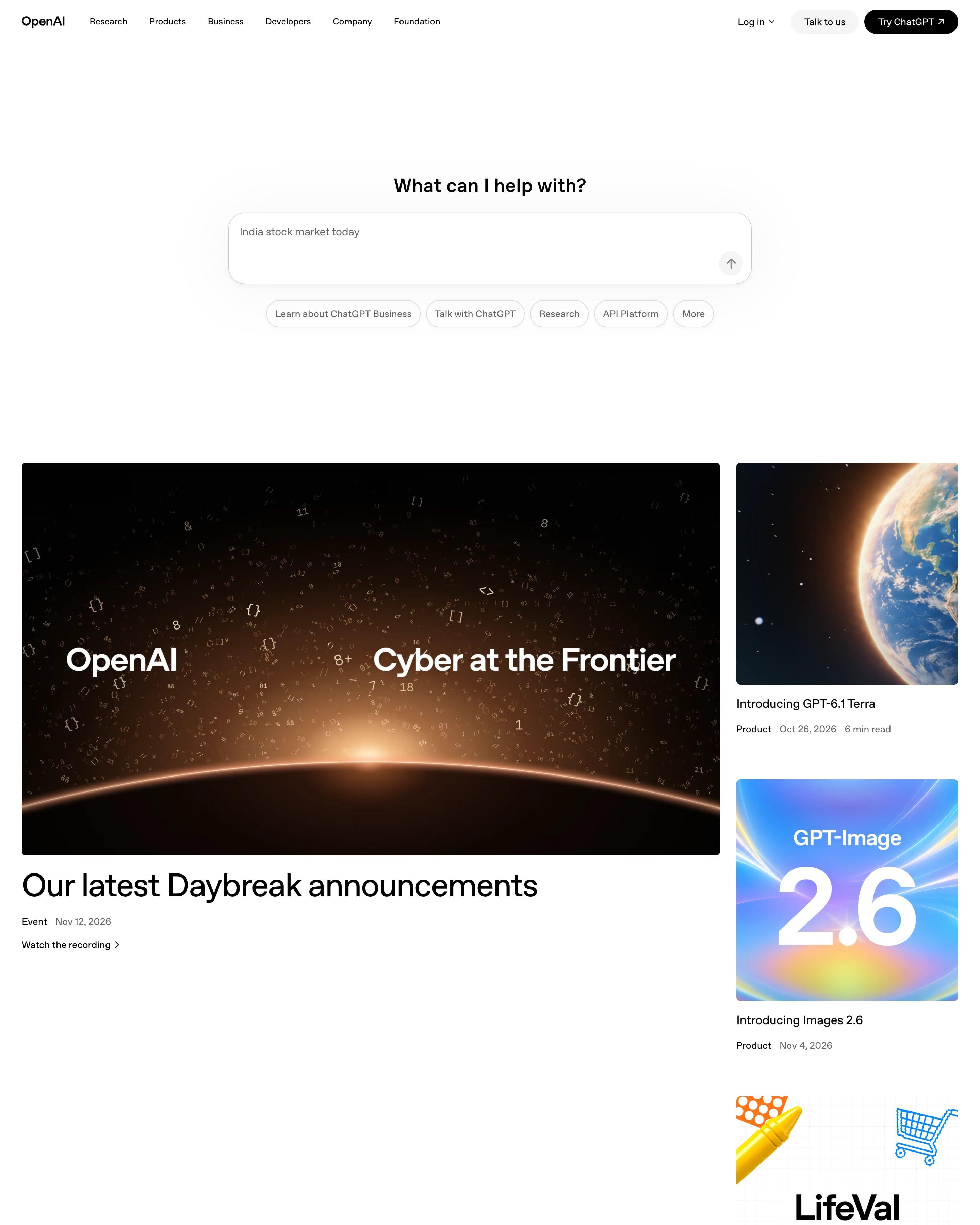
The hero is a ChatGPT prompt box, "What can I help with?", with suggestion pills below instead of a headline. One big Daybreak event card sits beside a column of three product cards, then Recent news runs as a two-column list with small soft gradient squares. Stories, Latest research and OpenAI for business follow as rows of three. Worth copying: brand-coloured material textures behind customer logos, like Zapier's orange.
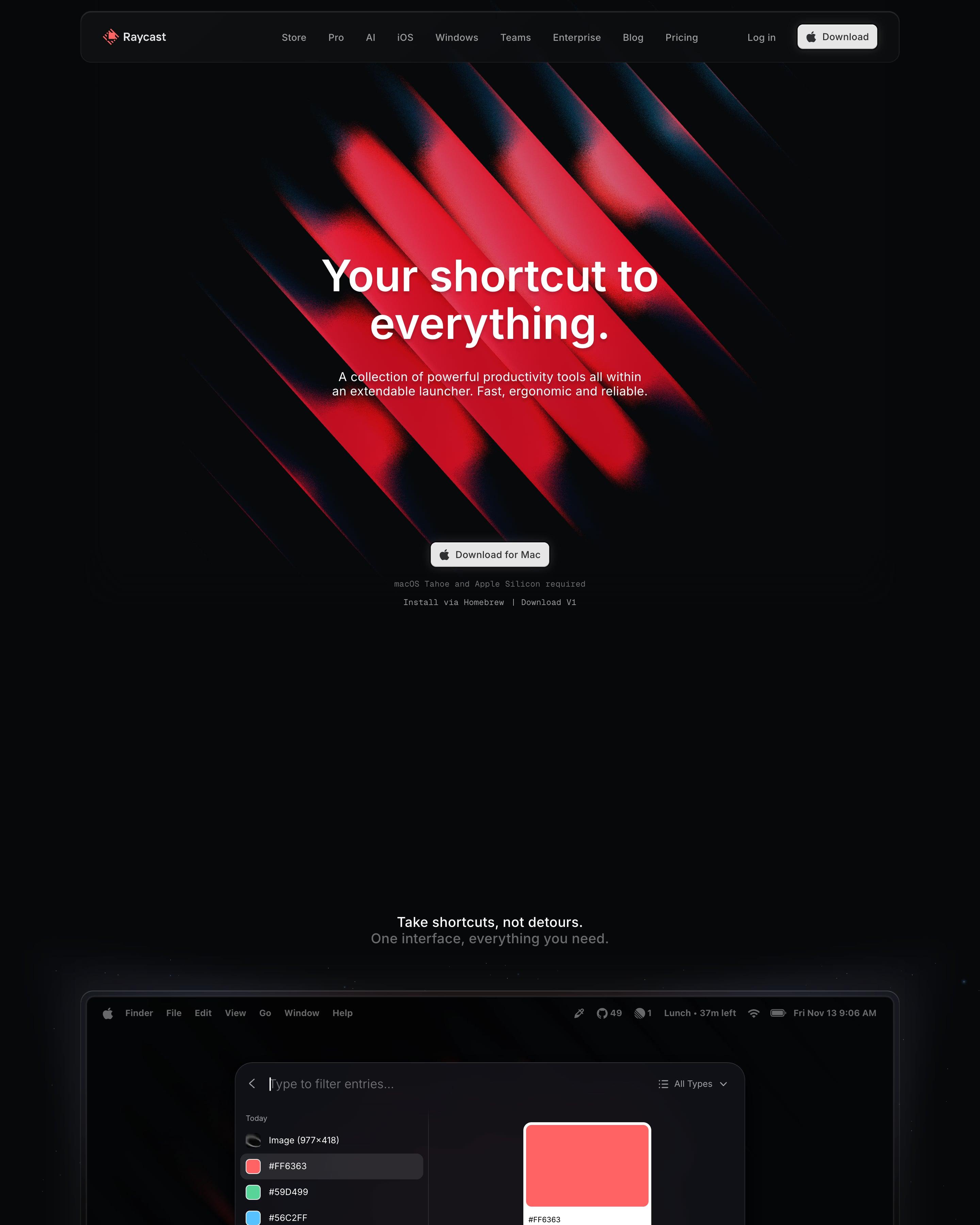
Red diagonal beams glow on black behind the hero, and the next section shows the launcher window on a Mac desktop. Extensions follow in a tabbed carousel, shortcuts in a tile grid, and 3D renders of blocks and a keyboard sit near the end. Worth borrowing: the real product window straight after the hero.
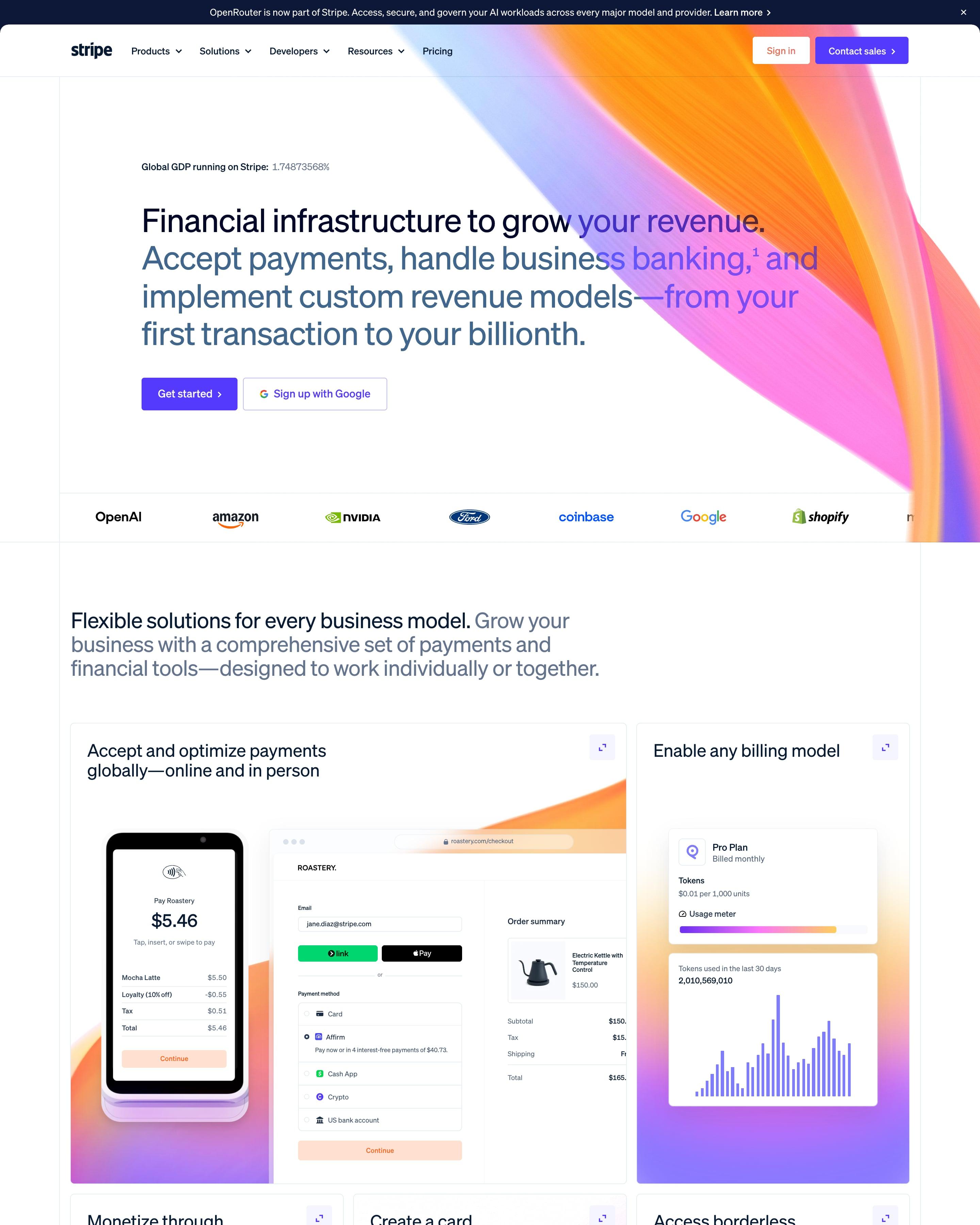
A gradient ribbon in orange, pink and violet sweeps across the white hero, beside an eight-decimal 'Global GDP running on Stripe' figure. Product UI fills a bento grid of tiles, followed by headline numbers, customer stories by company size and a navy developer section. That precise counter is a small idea worth borrowing.
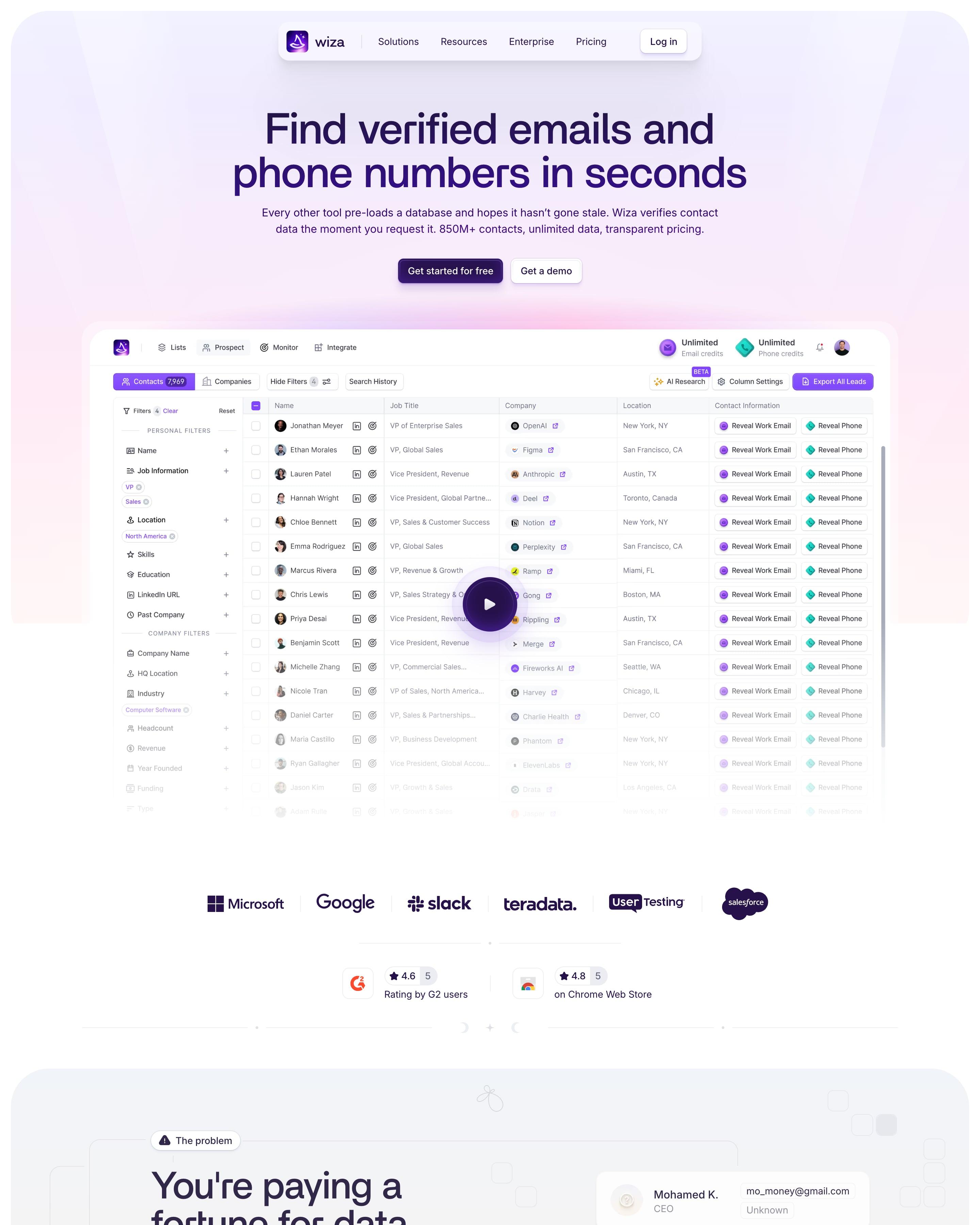
Soft lavender, pink and mint washes fill a stack of rounded panels, opening on the product's contact table with a Reveal button for every email and phone. Headings keep up a magic theme ('waving a magic wand', 'works like a charm'), and a running theme like that is worth borrowing.
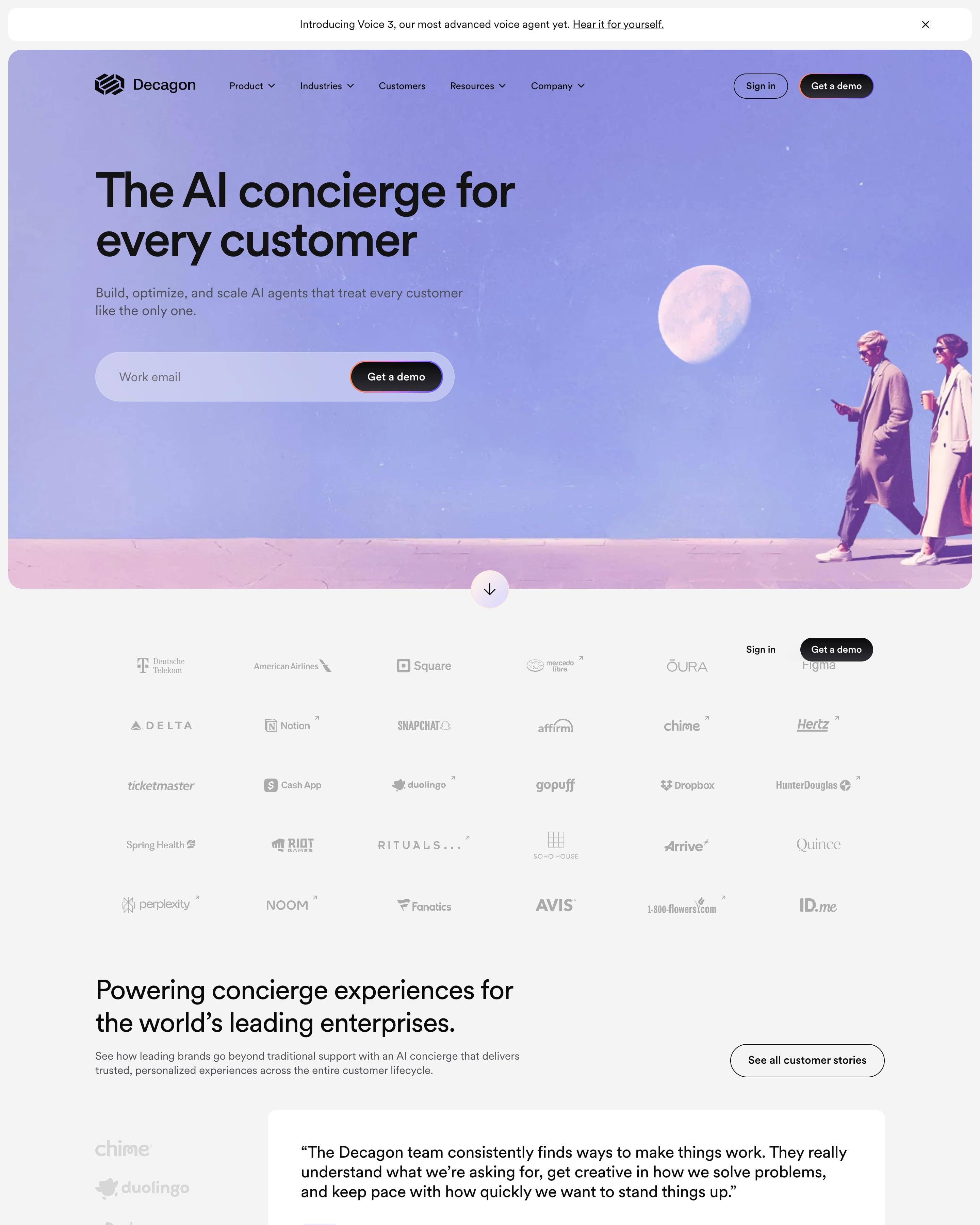
In the hero, two people walk under a big moon in a violet-tinted photo, and the email field and demo button share one pill. A dark band then lays out Build, Optimize and Scale along a vertical line. Steal the results carousel, where each card takes the customer's brand colour, like Chime's green 70%.
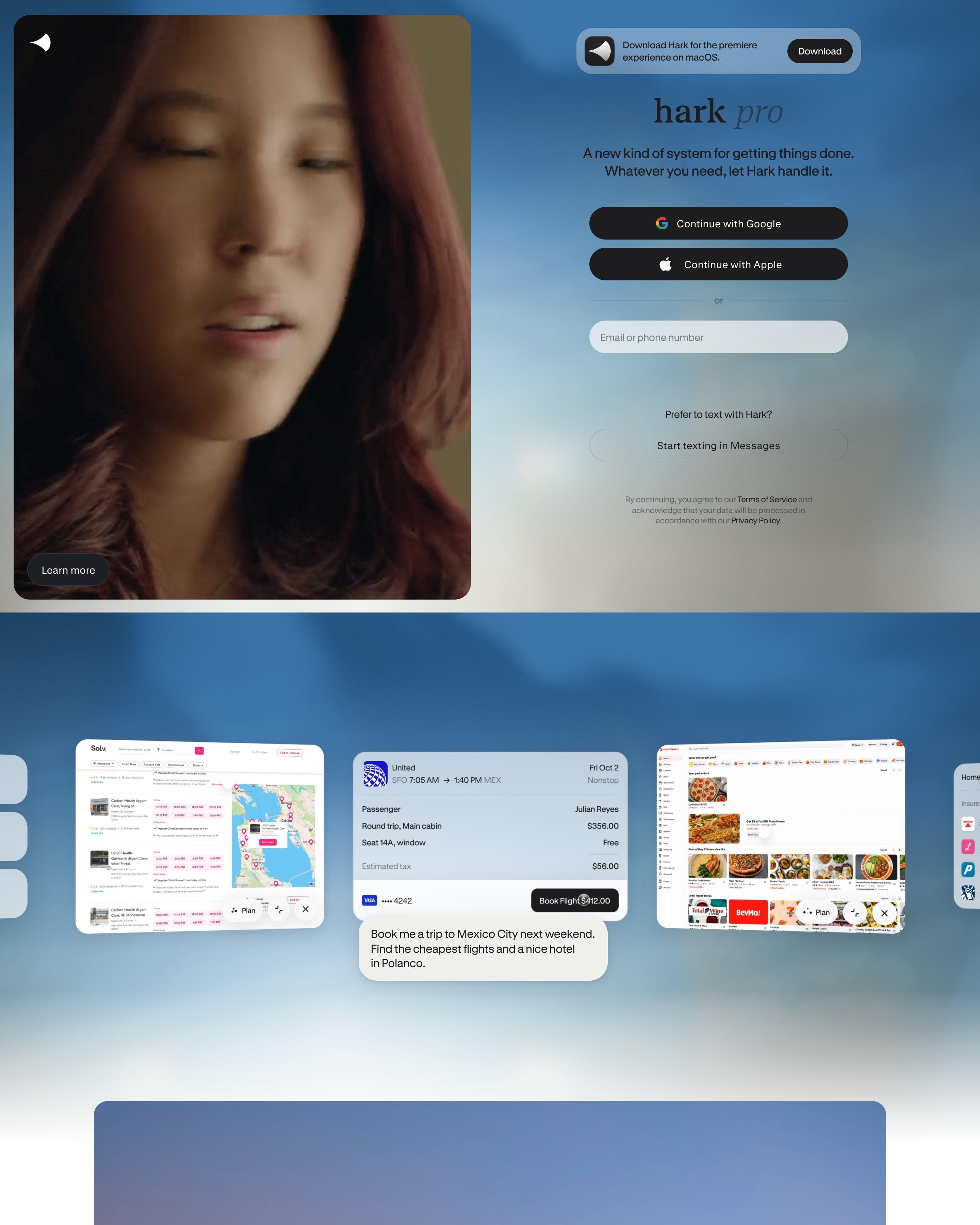
There is no menu: the hero pairs a video portrait with the sign-up form itself, Google and Apple buttons on a cloudy sky. Five features then alternate sides, each on its own gradient panel, from blue sky to coral dusk. Two serif statements lead back to the same form, a bookend worth copying.
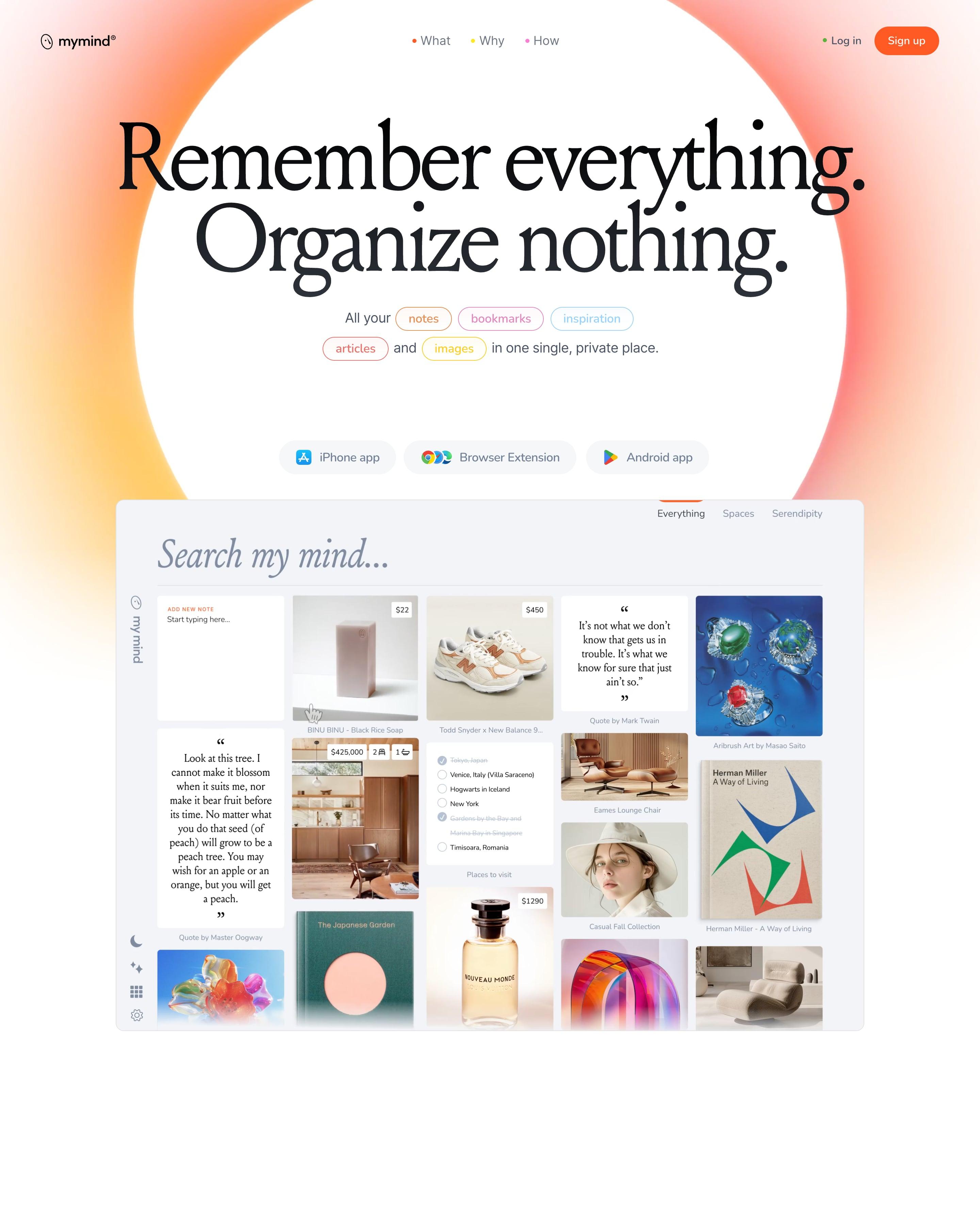
The serif headline sits inside a white disc ringed by an orange glow, with outlined word pills in different colours for notes, bookmarks and more. A full orange band breaks the white further down, and features fill a bento grid of photo and app tiles. Those coloured word pills are easy to lift.
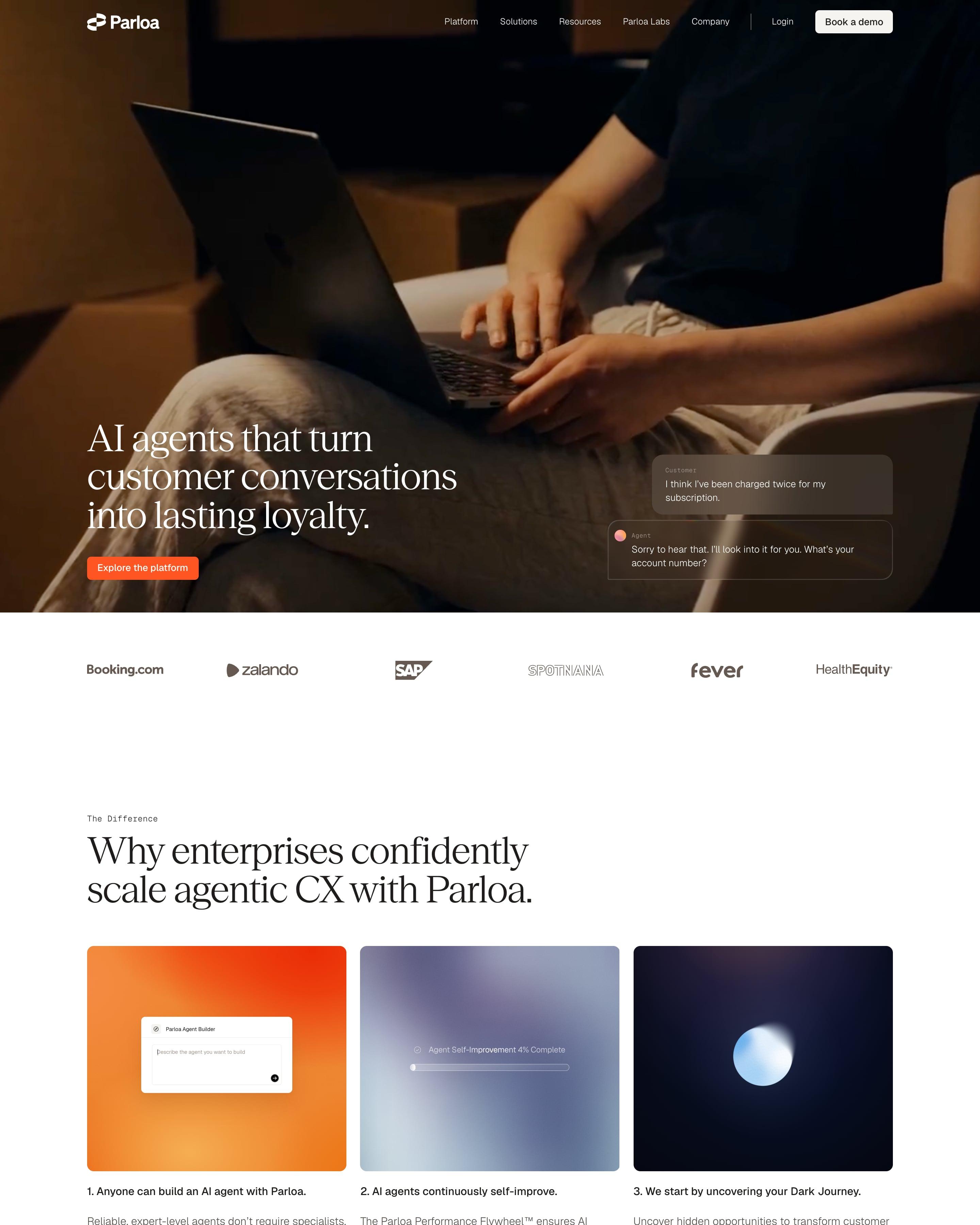
A dim photo of someone typing on a laptop carries the serif headline "AI agents that turn customer conversations into lasting loyalty." and a two-bubble customer and agent exchange. Small monospace eyebrows like "The Difference" sit over large serif headings throughout. The three difference cards use blurred orange, lilac and navy gradients, and "Results teams see with Parloa." fills a full orange gradient band with 70%, 3X and 24/7.
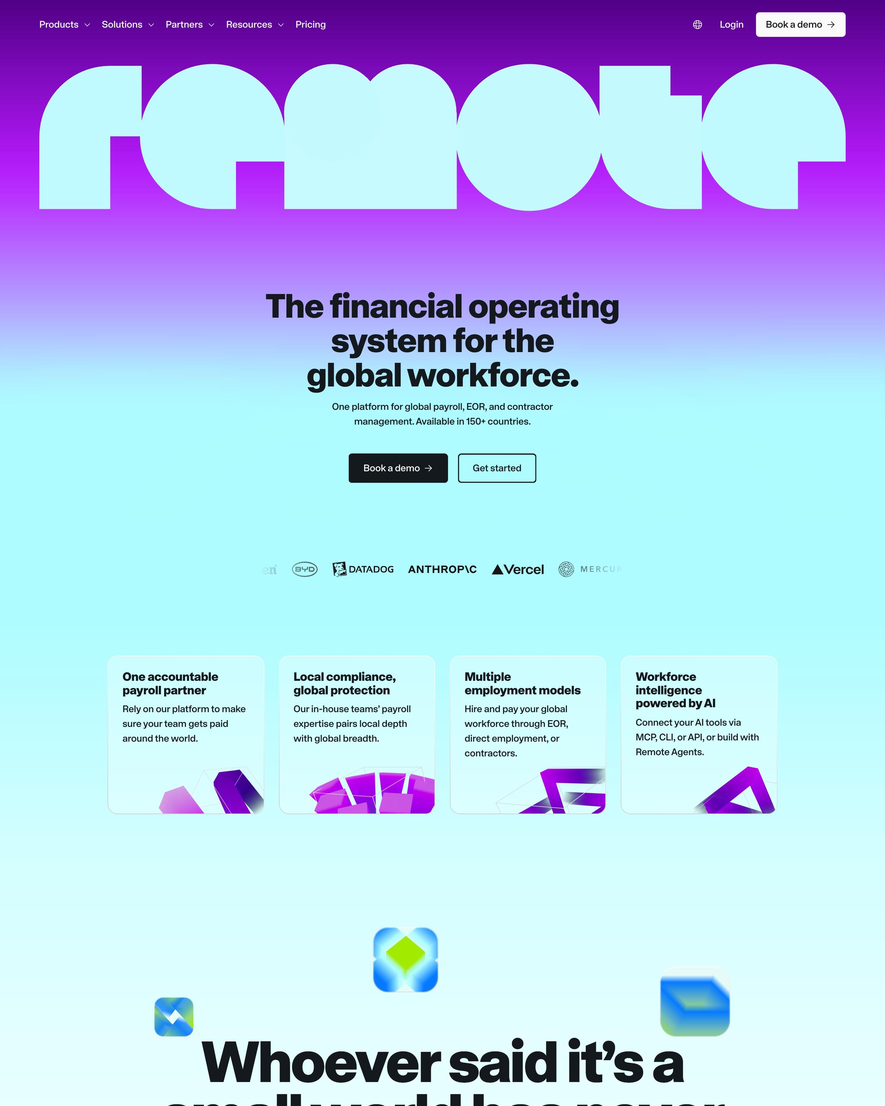
The wordmark runs edge to edge across a purple-to-aqua gradient, above a centred headline in a heavy grotesque. Product cards carry bright mini UI shots of payslips in USD, BRL and EUR, and stats like 150+ and 99% climb a stepped line graphic on lime. Worth copying: "Whoever said it's a small world has never paid a global team." set huge among floating 3D app icons.
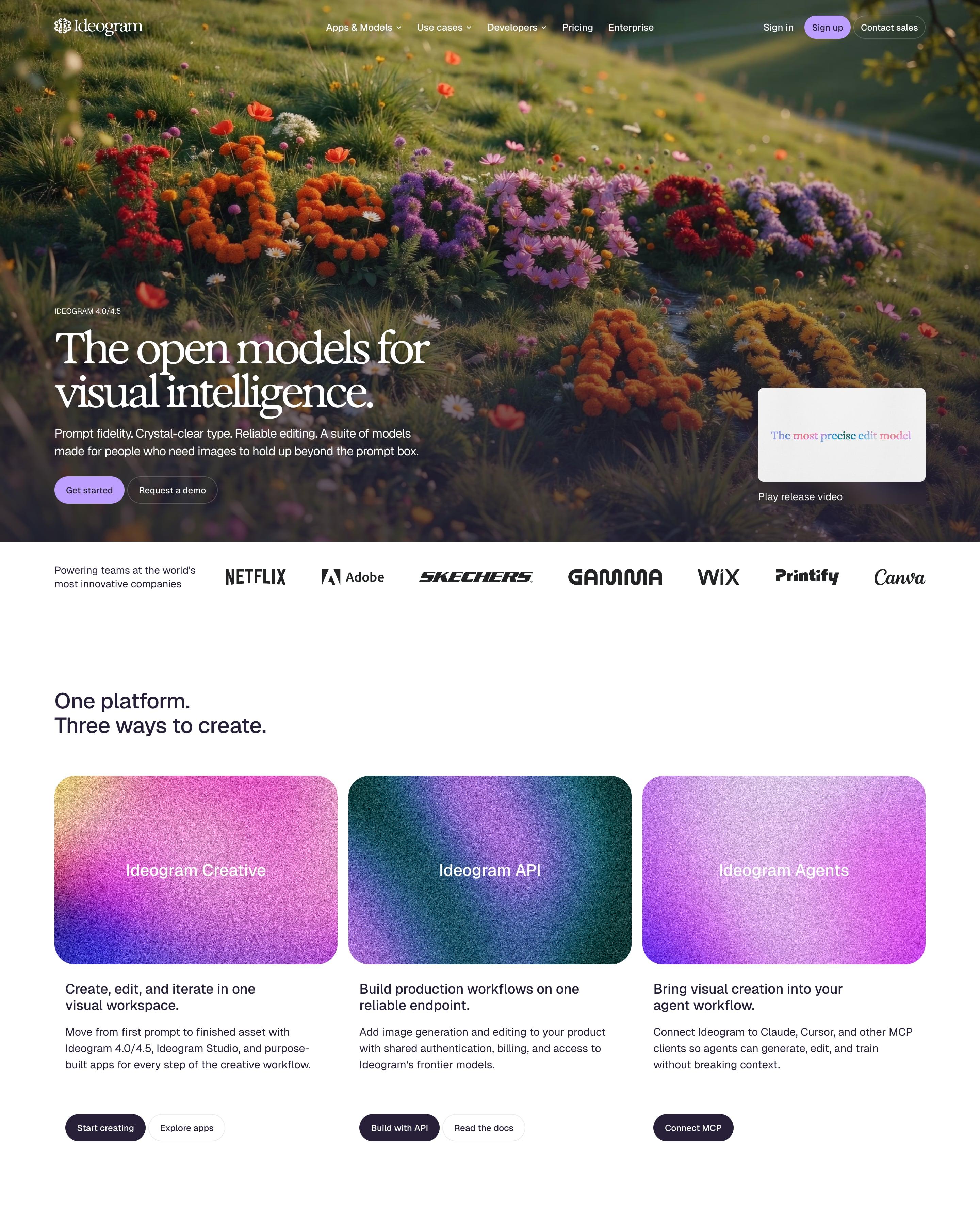
The word Ideogram is spelled out in wildflowers on a hillside, behind a serif "The open models for visual intelligence." and a lilac Get started button. Three grainy gradient cards name the products: Creative, API and Agents. A full lilac band then holds a dark Python snippet, a near-black Enterprise band shows red-print shirts, and a masonry wall of community images fades out behind "Try Ideogram".
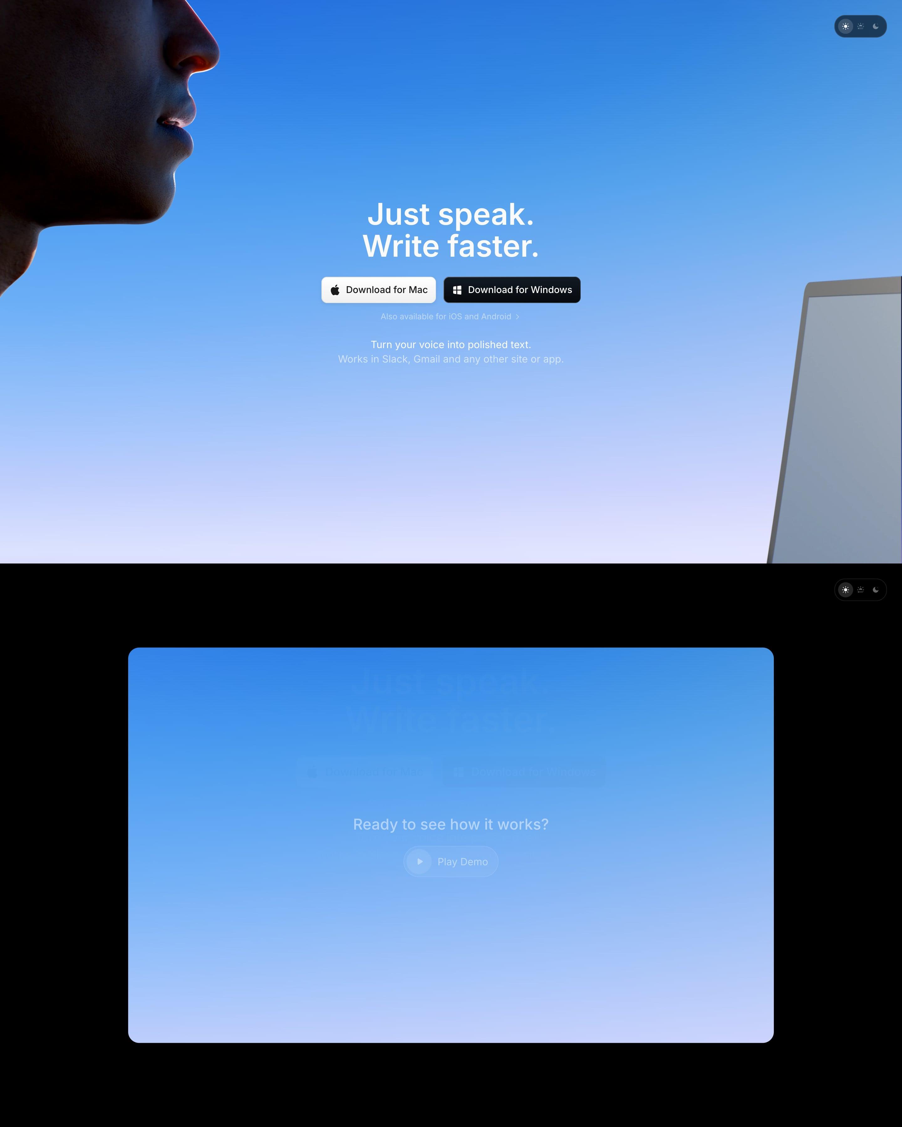
A face in profile fills the top-left corner of a blue-to-lilac sky, with the headline and Mac and Windows buttons centred. Below, on black, a blue video card builds up while scrolling, a keyboard has app icons for keys, and reviews sit in a stacked deck. The app-icon keyboard is the idea to lift.
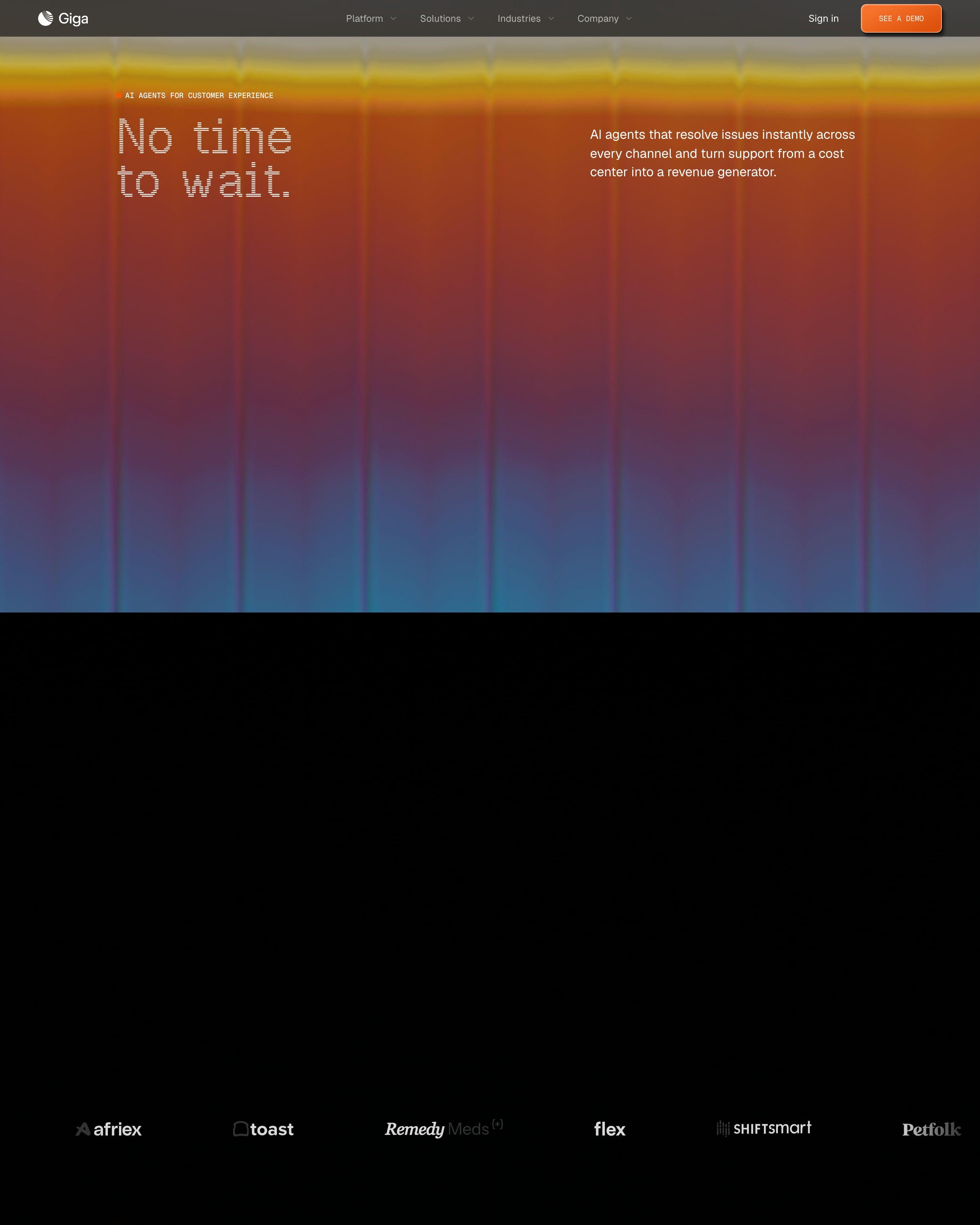
A blurred orange-to-blue gradient fills the hero behind the monospaced line 'No time to wait.' Further down, a support chat plays out step by step as the page scrolls, from 'waiting' to 'working', with each step listed beside it. A DoorDash story pairs a photo with a short quote.
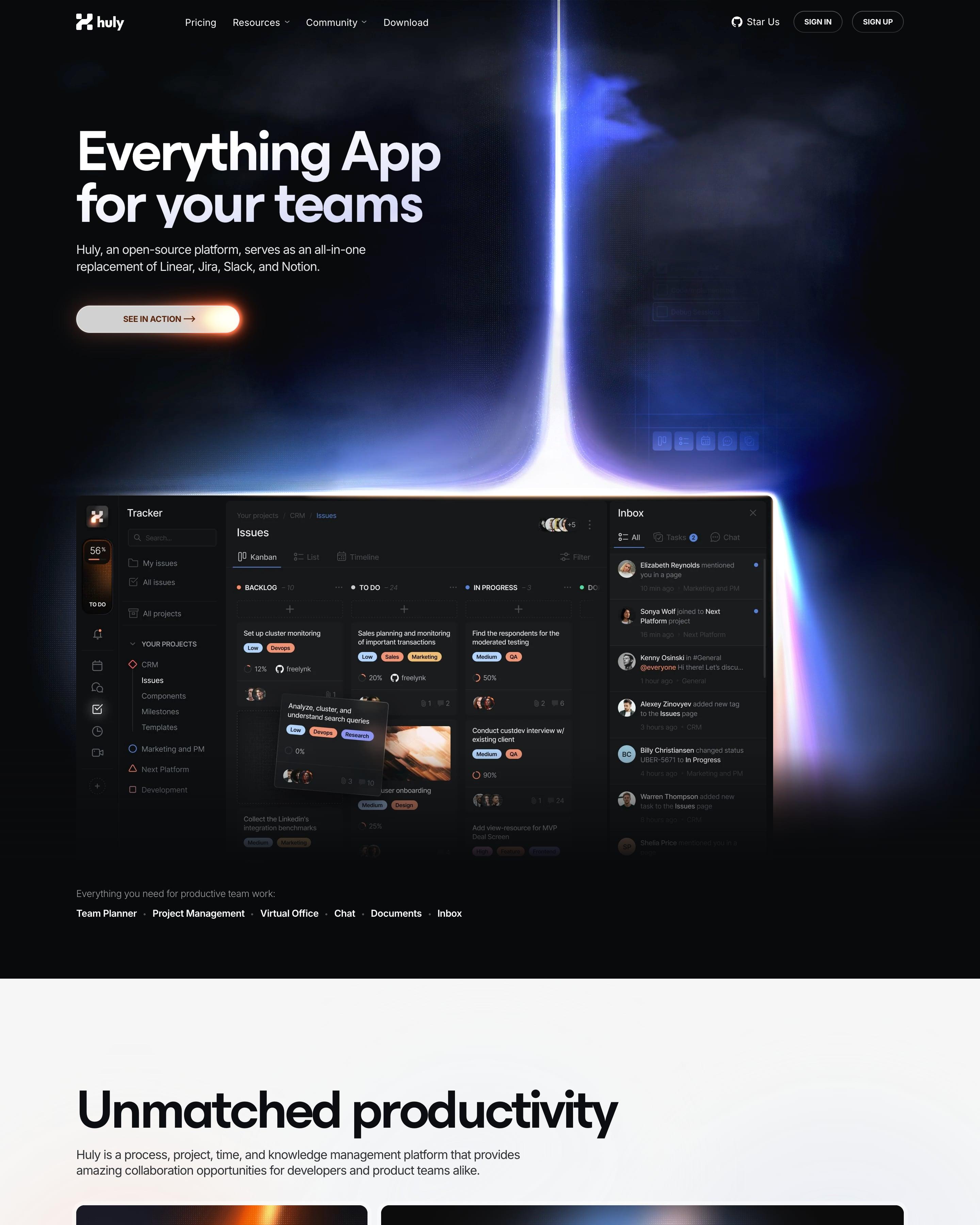
A beam of light drops onto the hero's dark product screenshot, and the glow returns on the edges of later product frames. Dark and white sections alternate, with features in bento grids of dark tiles and a document editor shown with collaborator cursors. The glowing screenshot edges are the detail to borrow.
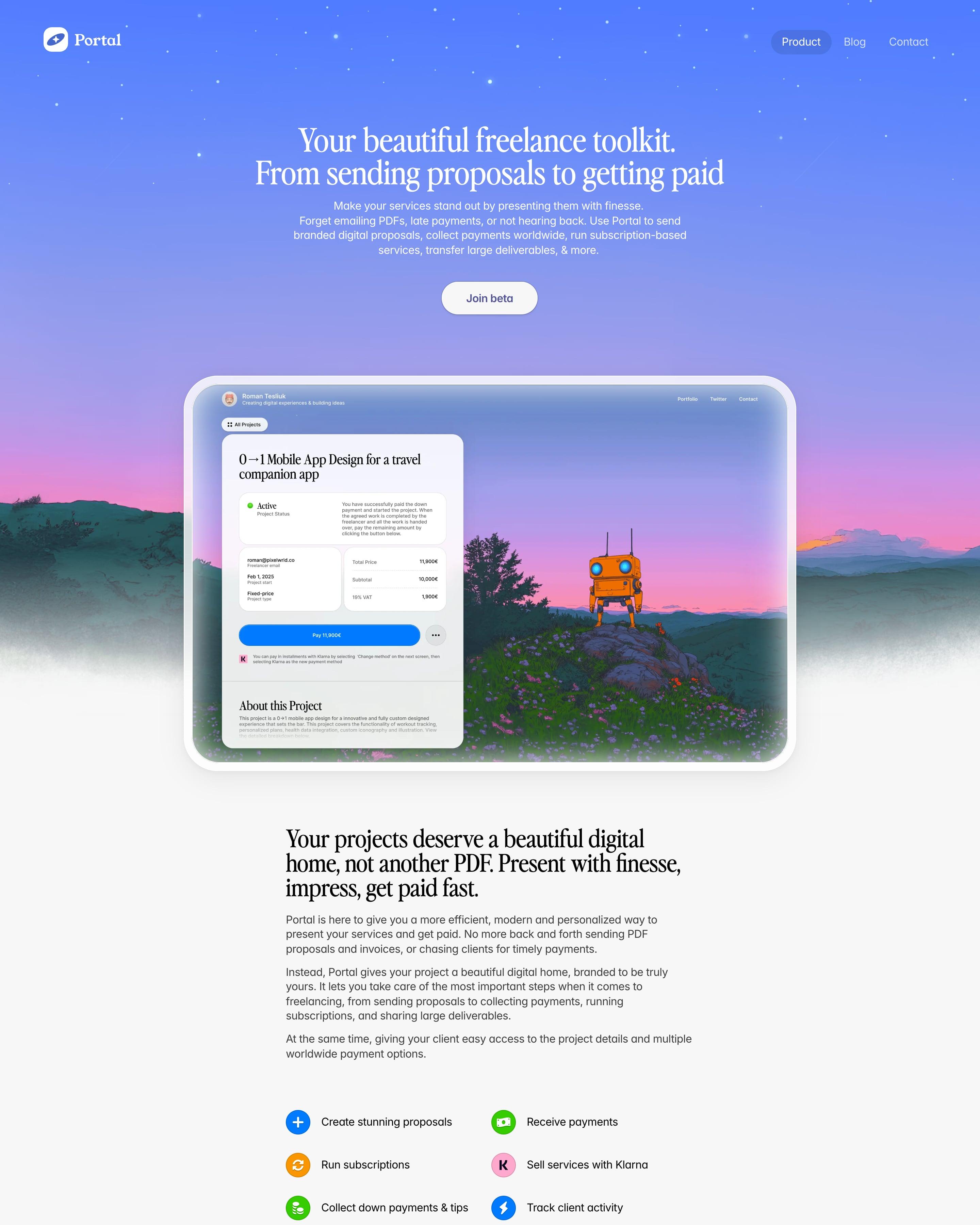
A periwinkle-to-pink starry sky over painted mountains and an orange robot frames the serif "Your beautiful freelance toolkit. From sending proposals to getting paid". Below, a narrow light column mixes serif statements, colourful icon lists and tilted UI cards: a "New Payment Received" toast, a signature field and a 3D blue Pay key. Pricing is a blue "1%" badge, then a slightly rotated founder memo signed "With love, Roman".























How to design a gradient website
Gradients bring colour and movement without illustration: a wash behind the hero, a glow behind a product shot, a button that shifts from one colour to the next.
- Build gradients from neighbouring hues (blue to violet, orange to pink) so they stay smooth and avoid a muddy middle.
- Keep text on solid ground: put copy beside a gradient or on a calm part of it, not over its busiest stretch.
- Use one gradient system across the site, so the hero, cards and buttons feel related.
Frequently asked questions
Sites built around colour gradients: washes behind the hero, glowing shapes, and buttons or text that blend from one colour into another. Gradients bring colour and movement without illustration: a wash behind the hero, a glow behind a product shot, a button that shifts from one colour to the next.
Yes, in a quieter form than a few years ago: soft glows, mesh gradients and colour that fades into a dark or white page, rather than loud two-colour backgrounds everywhere.
Each page is opened at 1440 pixels wide, like a laptop, and scrolled from top to bottom so every image and section loads. Cookie banners, chat bubbles and popups are left out, and the whole page is saved as one image.