
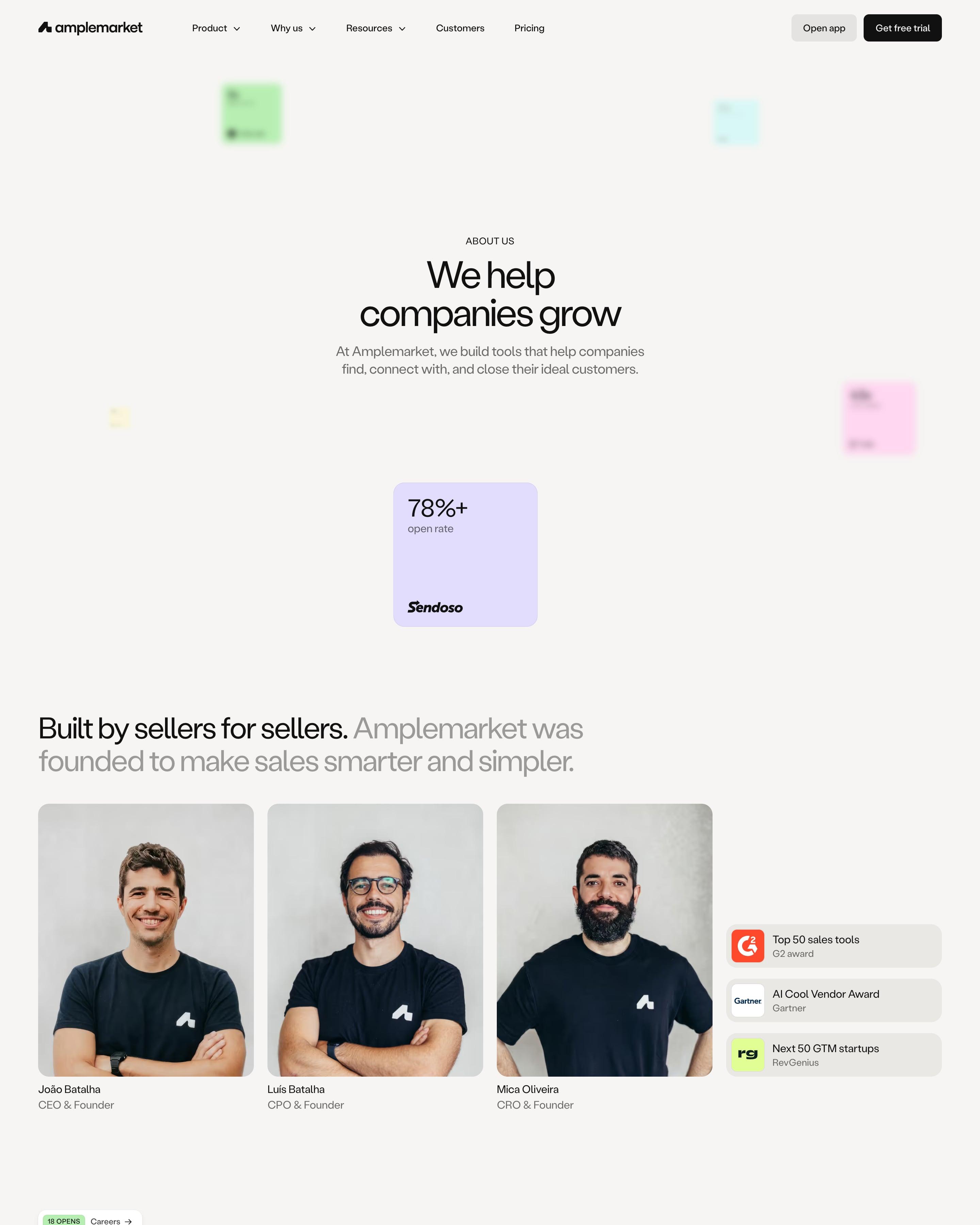

Three founder portraits in matching black T-shirts sit beside small award chips from G2, Gartner and RevGenius, then the whole team is listed by name with tiny avatars in six columns. A co-founder video glows on a soft colour halo before the page turns dark for quotes. Worth copying: headlines split into black and grey, as in "Built by sellers for sellers."
60 examples
Best SaaS About Us Page Examples
About, company and manifesto pages from SaaS companies with great websites: how they tell their story, show their team and say what they believe.
- Dark or light
- 14 dark, 46 light
- of 60 pages
- Heading fonts
- Inter
- Inter 3, Reckless 2, Labil Grotesk 1, Clash Grotesk 1
- Built with
- Next.js
- Next.js 32, Webflow 9, Framer 9, Astro 2
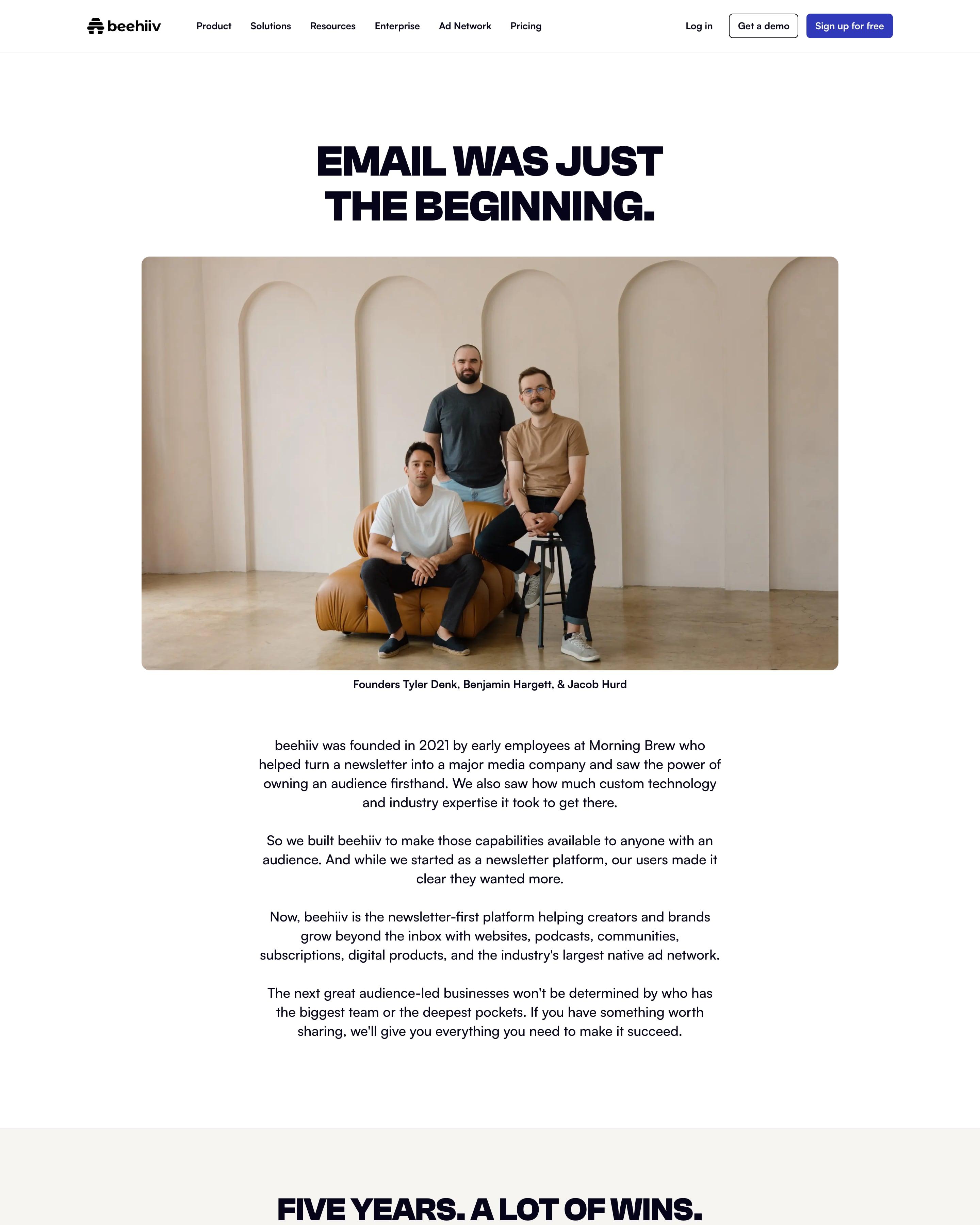
A founders photo with a name caption sits under the uppercase headline, then a short centred story. Two rows of four stat cards bookend a mosaic of team photos: product numbers like 450M+ unique readers first, then team facts like 12 countries. Giving the team its own stats is worth copying.
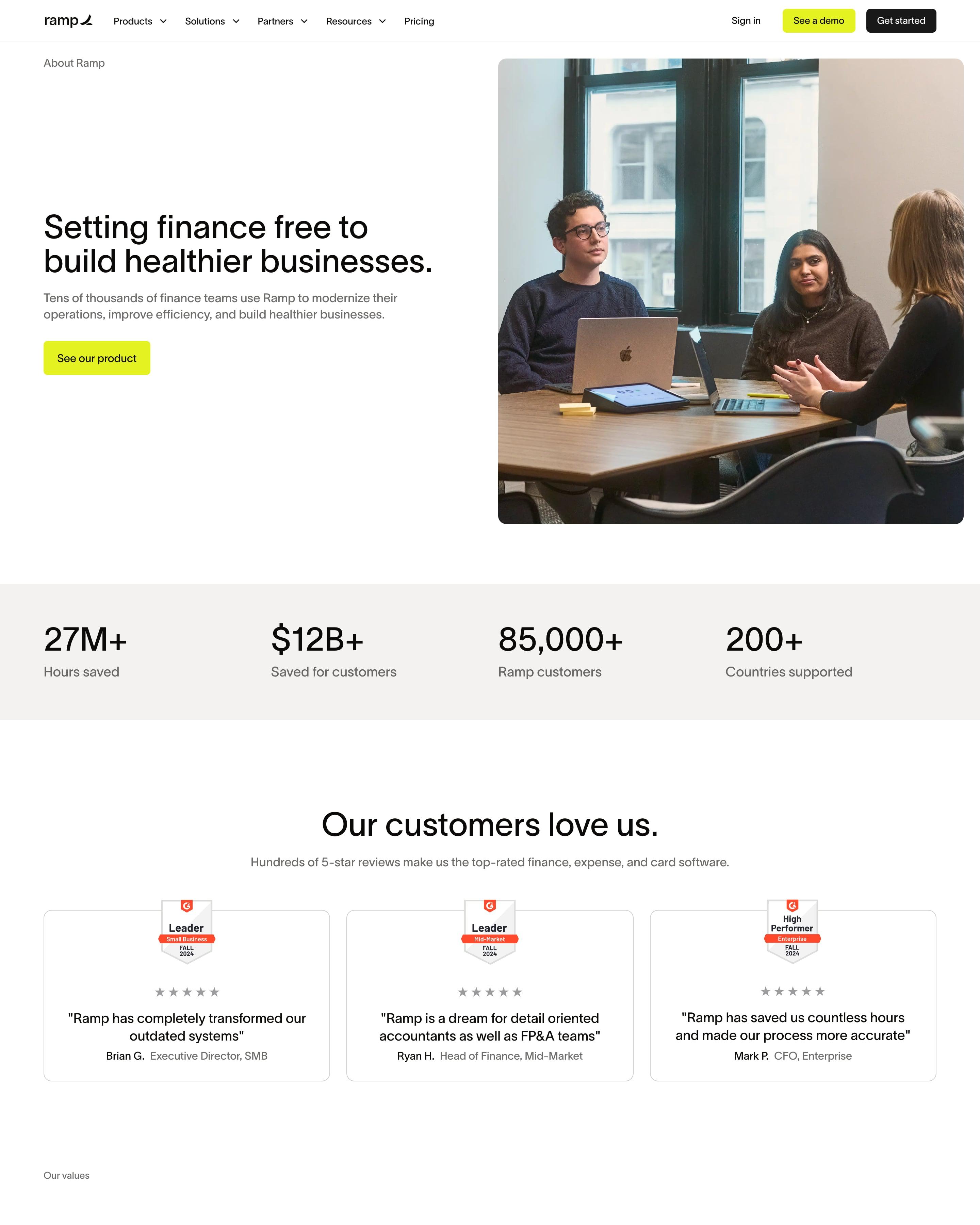
"Setting finance free to build healthier businesses." sits beside an office photo, then a grey band of four big stats: 27M+ hours saved, $12B+ saved, 85,000+ customers, 200+ countries. Values work as an accordion of large grey headlines ("Grow without fear", "Amp it up") next to a team photo. Press clippings get plain grey cards with the outlet and date in small capitals.
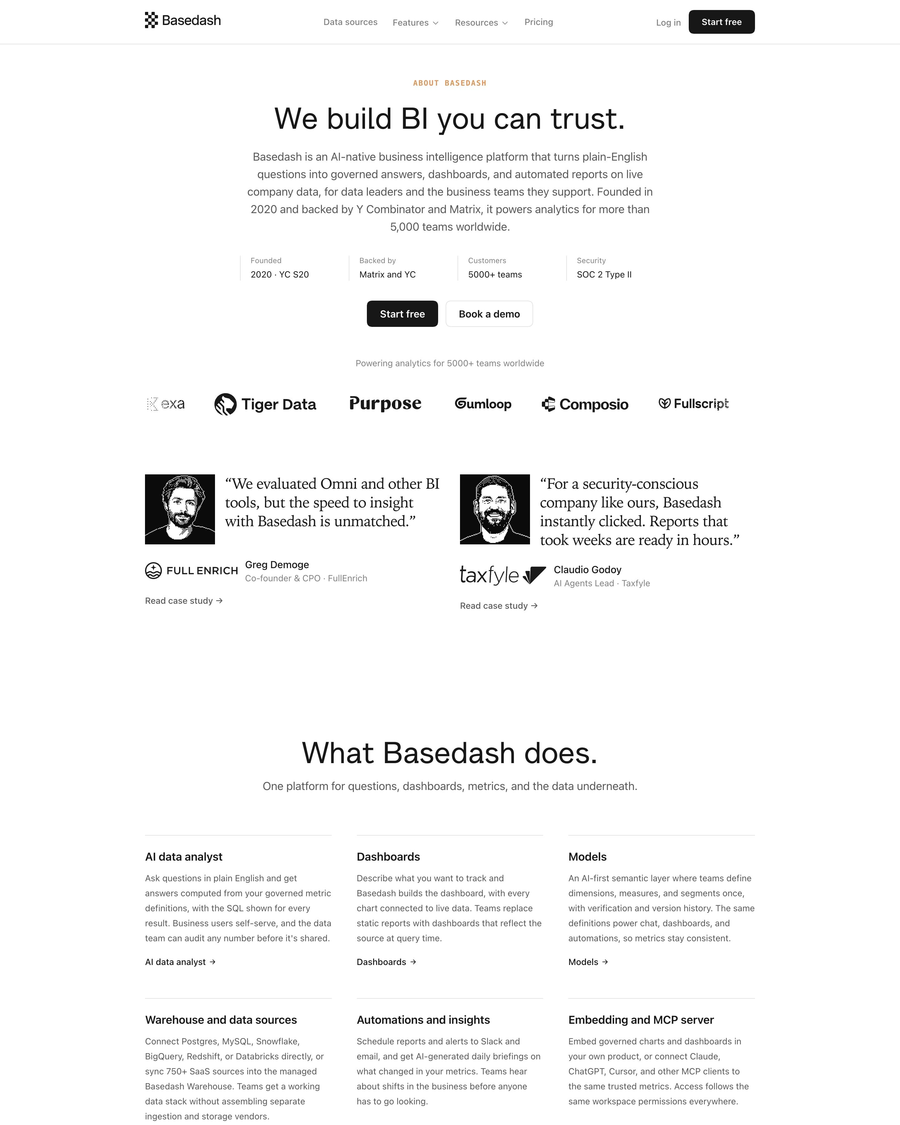
"We build BI you can trust." comes with a four-cell facts strip: founded 2020, YC S20, 5000+ teams, SOC 2 Type II. "What makes Basedash different" pairs a big figure like 95.8% or $1,000 with a paragraph, row after row. Worth copying: a "Key facts" table listing founders, HQ, funding and competitors for quick reading.
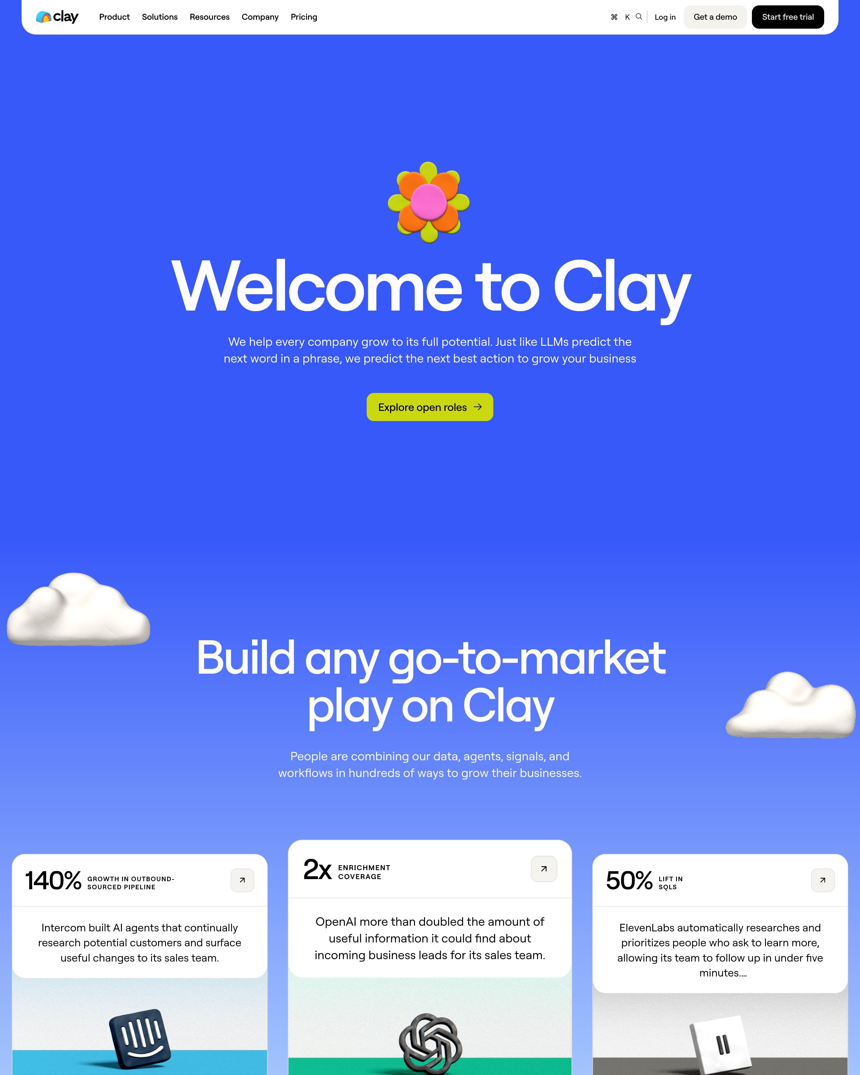
An electric-blue hero with a clay flower leads to stat cards and a fanned row of "Promoted" cards about GTM engineers. "Our story" draws the company's history as tick marks from 2017 to 2027, labelled Exploring, Building, Official launch and $100M. Copy that timeline for any founding story.
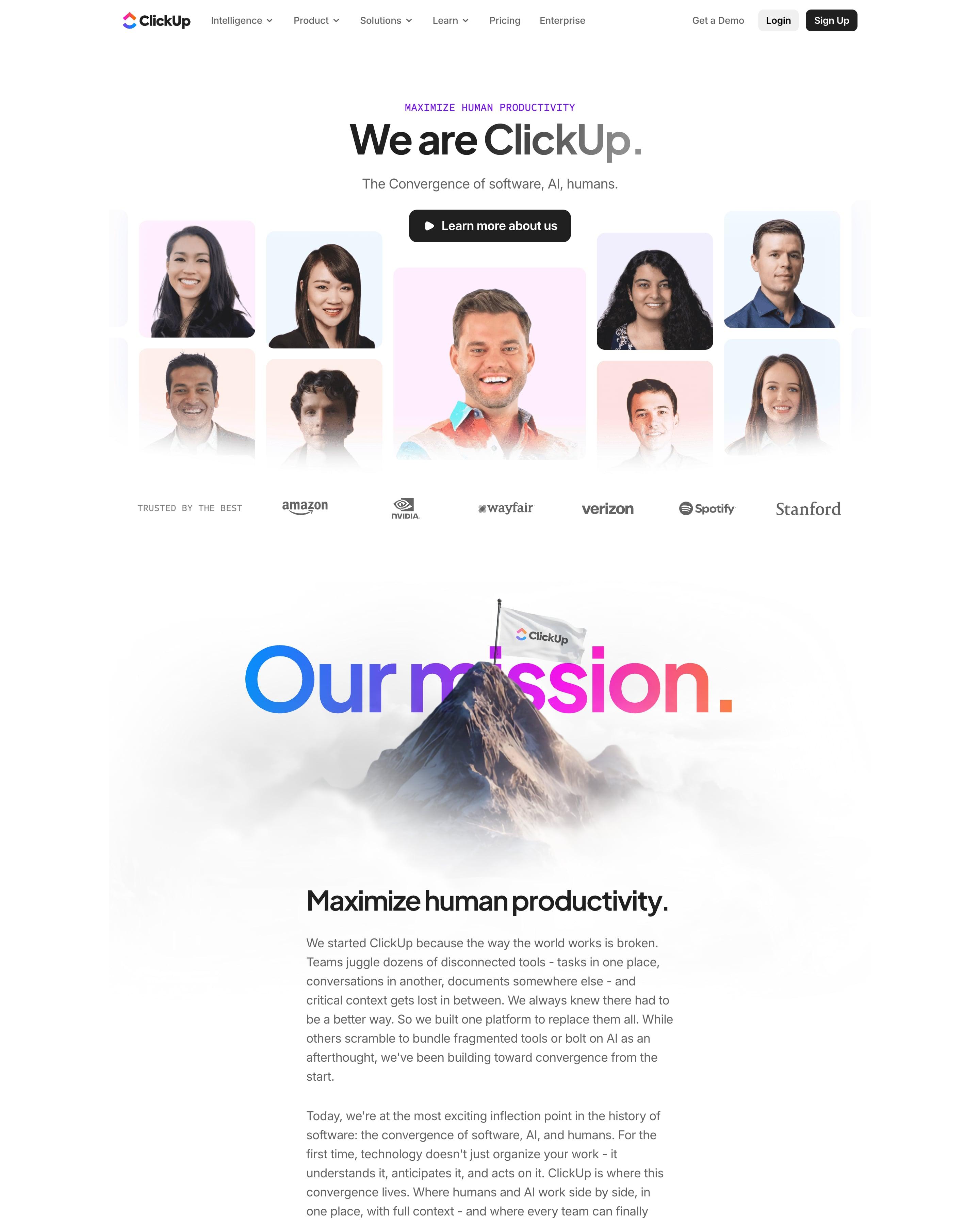
"Our mission." is set in blue-to-orange gradient type, with a snowy peak and a ClickUp flag rising through the letters. The motto "Save one day, Every week." becomes a date strip with Thursday lifted out and glowing. The core values sit in a bordered 4×3 grid, each a short line plus a monospaced hashtag like #SCRAPPY, around a gradient centre cell.
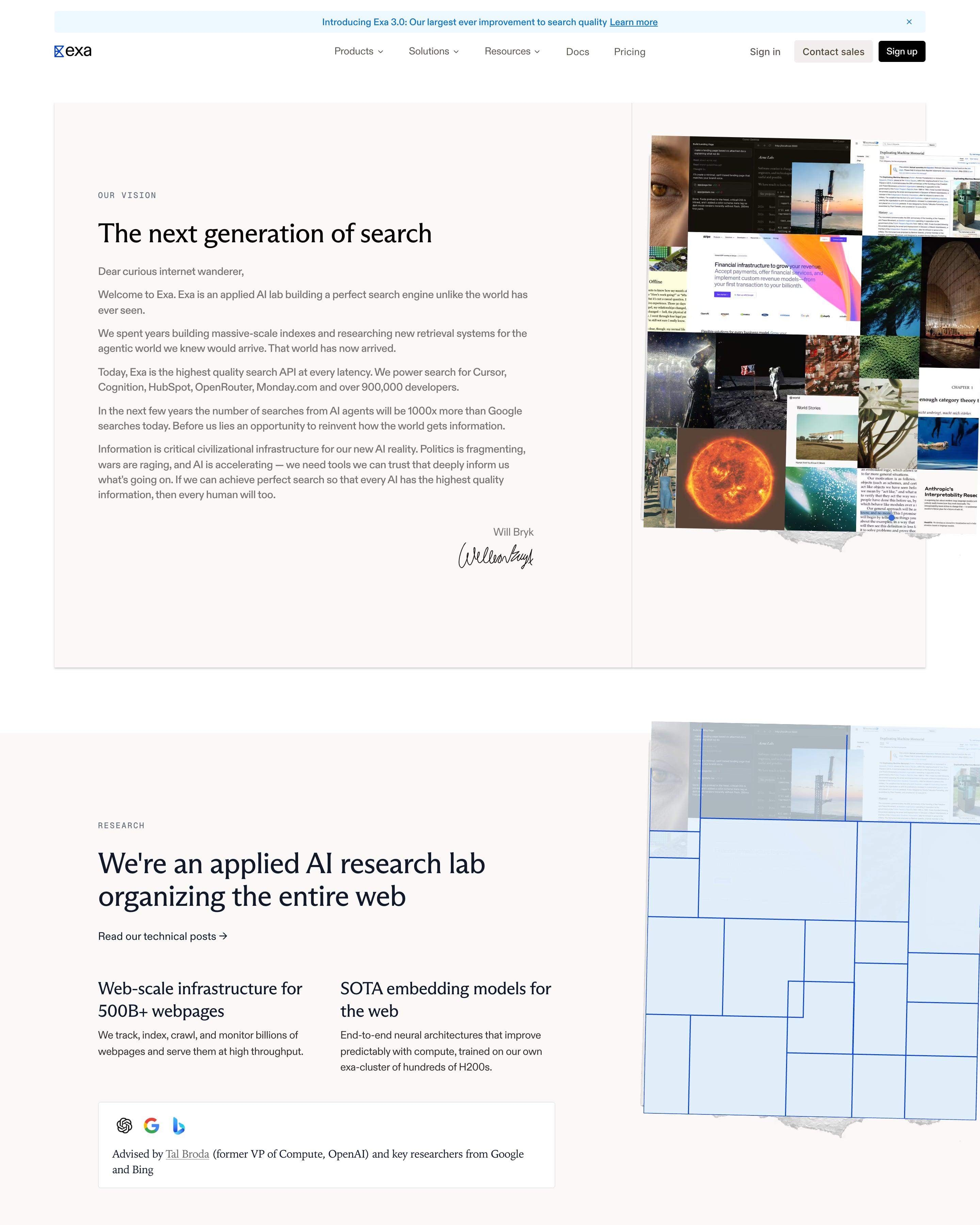
The story is told as a signed letter: "The next generation of search" opens with "Dear curious internet wanderer," and ends in Will Bryk's handwritten signature beside a collage of web clippings and photos. Team members sit on tilted grey cards with italic serif names and jokey bios, and the investors block cites a "$2.2B valuation" over five square brand-coloured tiles.
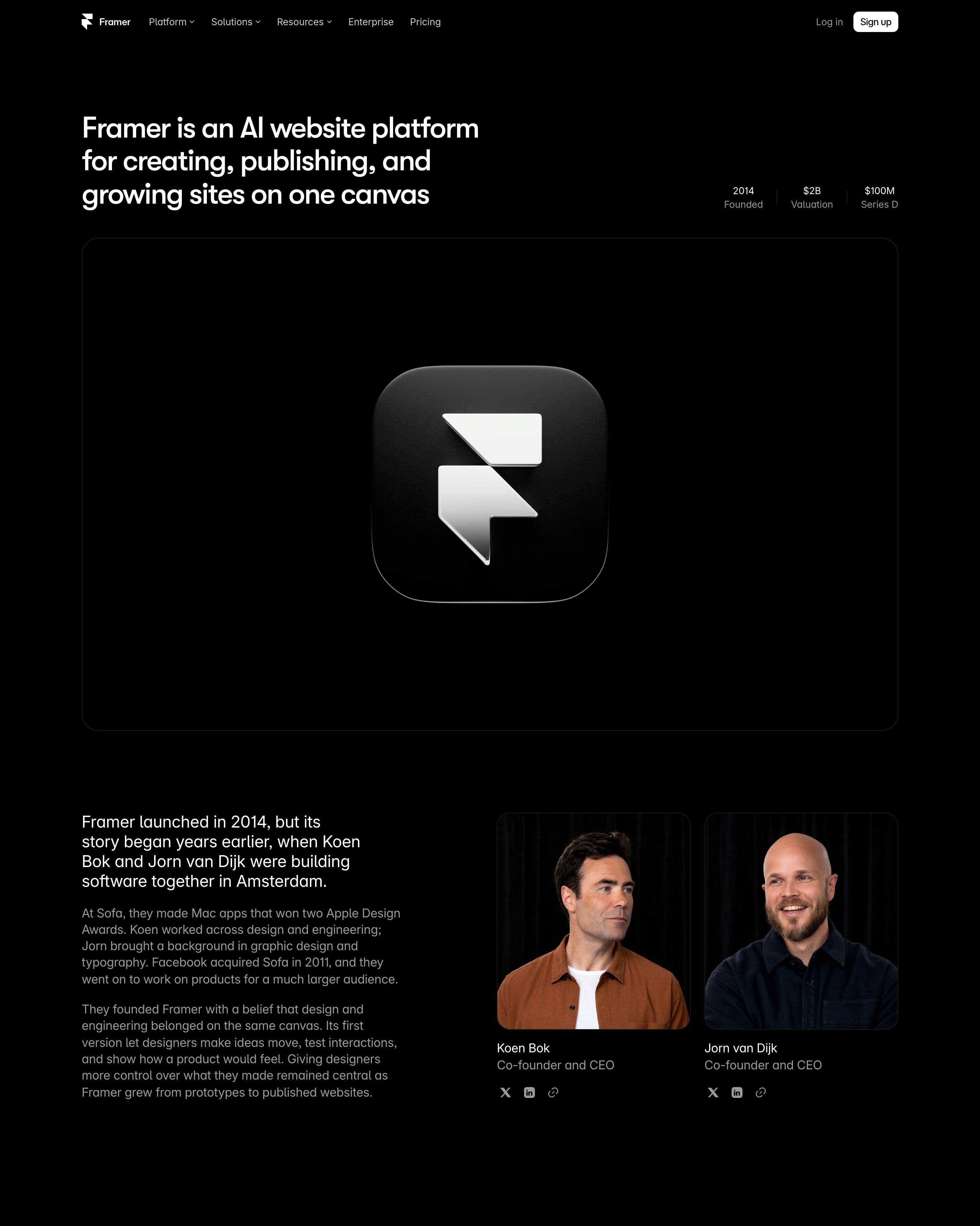
Framer's app icon sits alone in a large dark frame under "Framer is an AI website platform for creating, publishing, and growing sites on one canvas", with 2014, $2B and $100M tucked at the right. The founders' story runs beside two studio portraits, then the years 2014, 22 and 26 are set huge as a timeline. Open roles close the page as a plain table.
After a short founding story, a dark panel charts the company's annual run rate, with figures like active customers and installs beneath. A circle diagram explains the open source funding model, and each team headshot carries a role and start date. The public metrics panel is the part to copy.
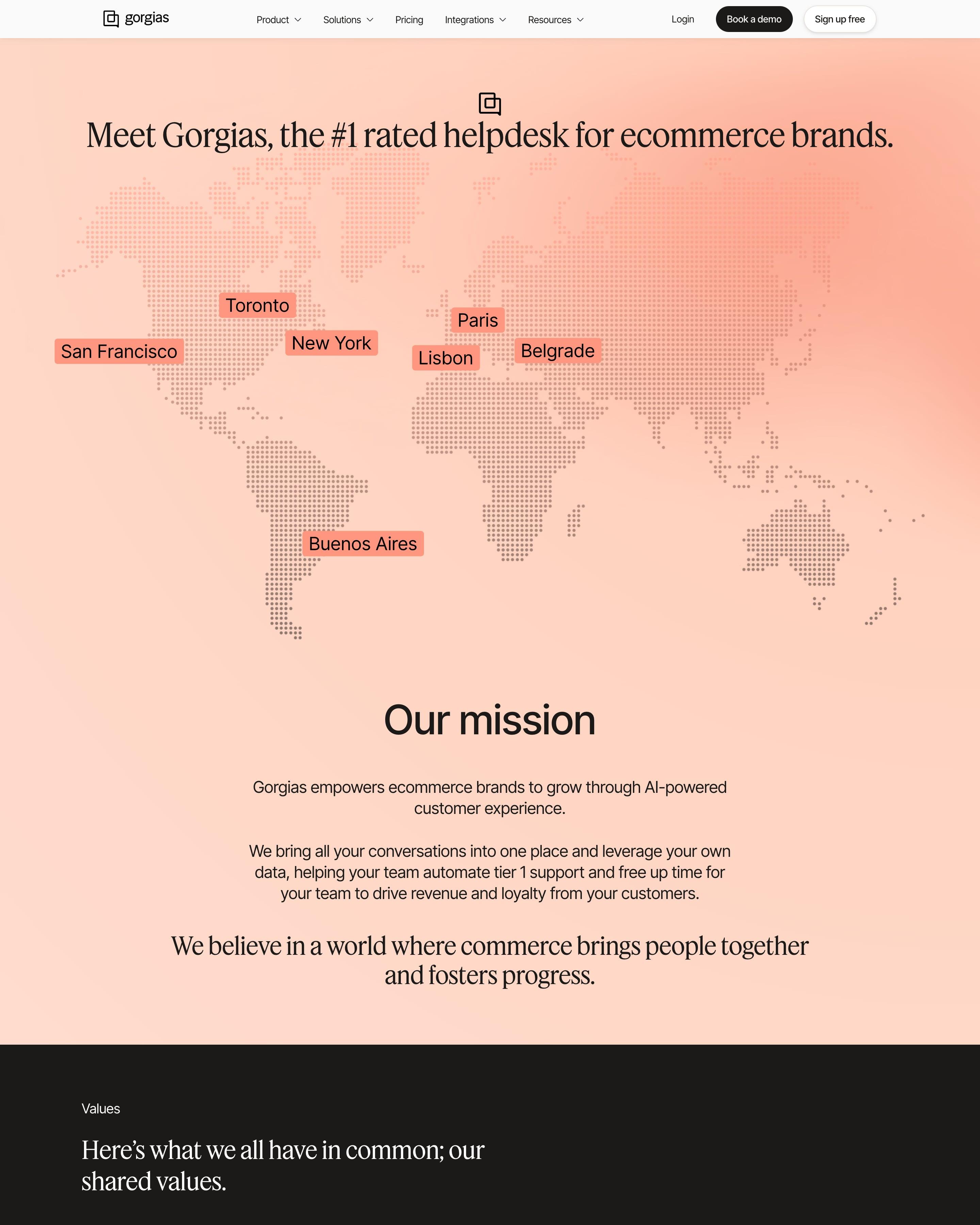
A dotted world map in peach opens the page, with tags on seven cities. Five icon cards on a dark band hold the values, and four stat tiles cover funding, founding year, merchants and rating. The labelled map is an easy opener to copy for an about page.
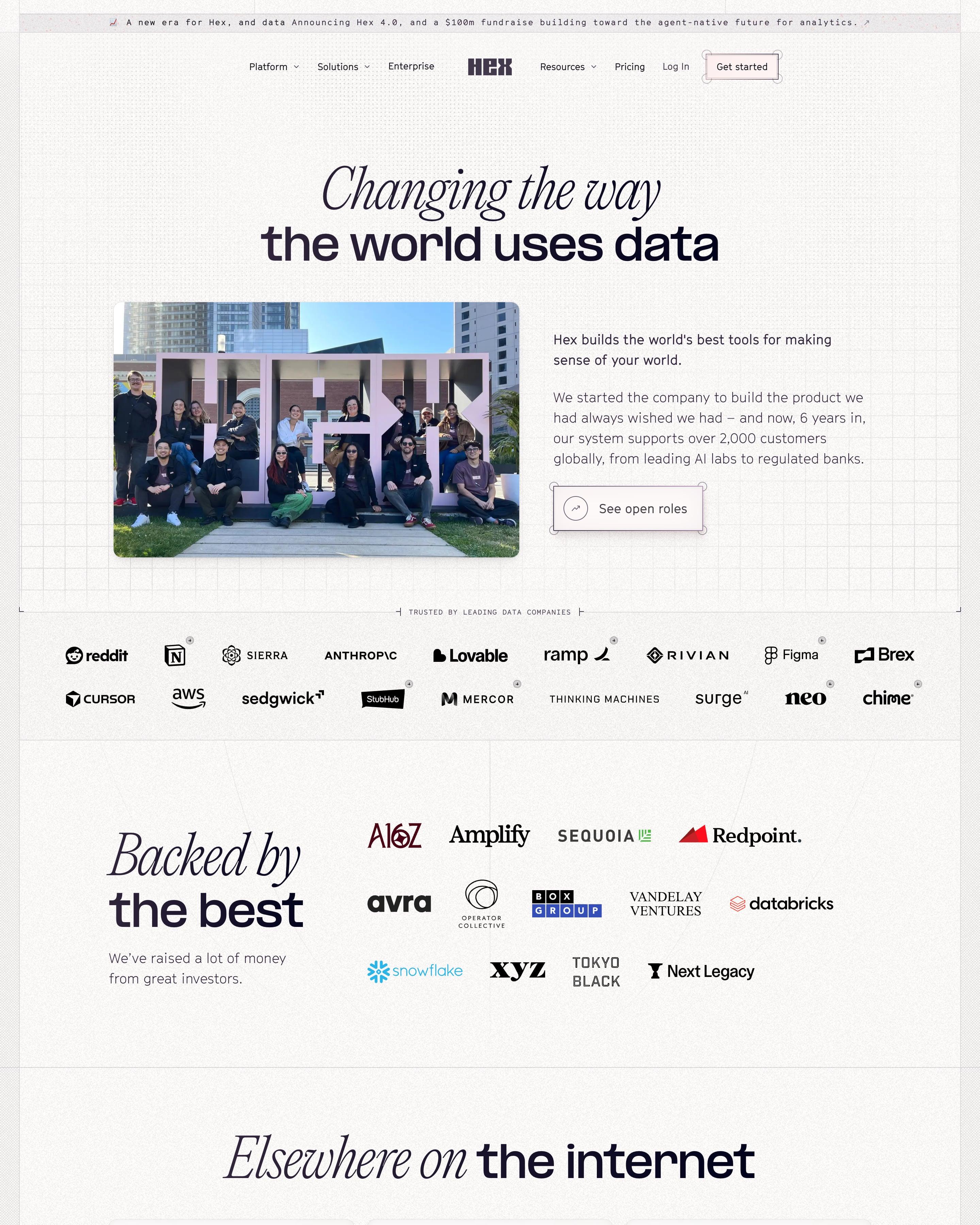
The headline sets "Changing the way" in italic serif above "the world uses data" in bold sans, next to a photo of the team sitting on a giant HEX sign. "Backed by the best" lays investor wordmarks in a loose grid, and press cards from Forbes to a podcast follow. Worth copying: the scattered collage of team snapshots beside "A team of data nerds".
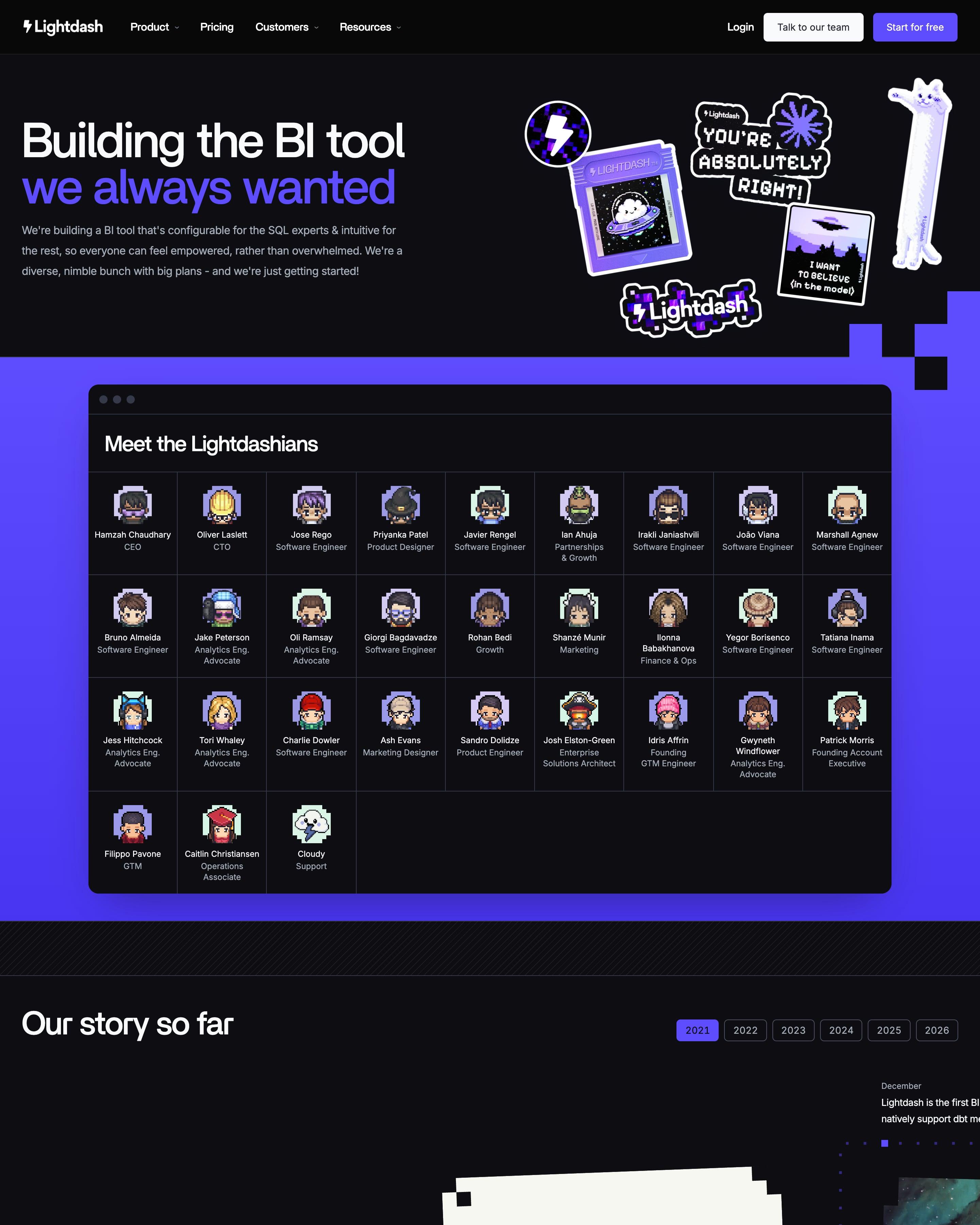
Beside the headline sit pixel-art stickers, and each teammate in "Meet the Lightdashians" gets a pixel avatar, name and role. "Our story so far" pans sideways from 2021 to 2026 as you scroll, with year tabs, tilted photos and a pixel Pac-Man eating dots between milestones. That timeline is the piece to borrow.
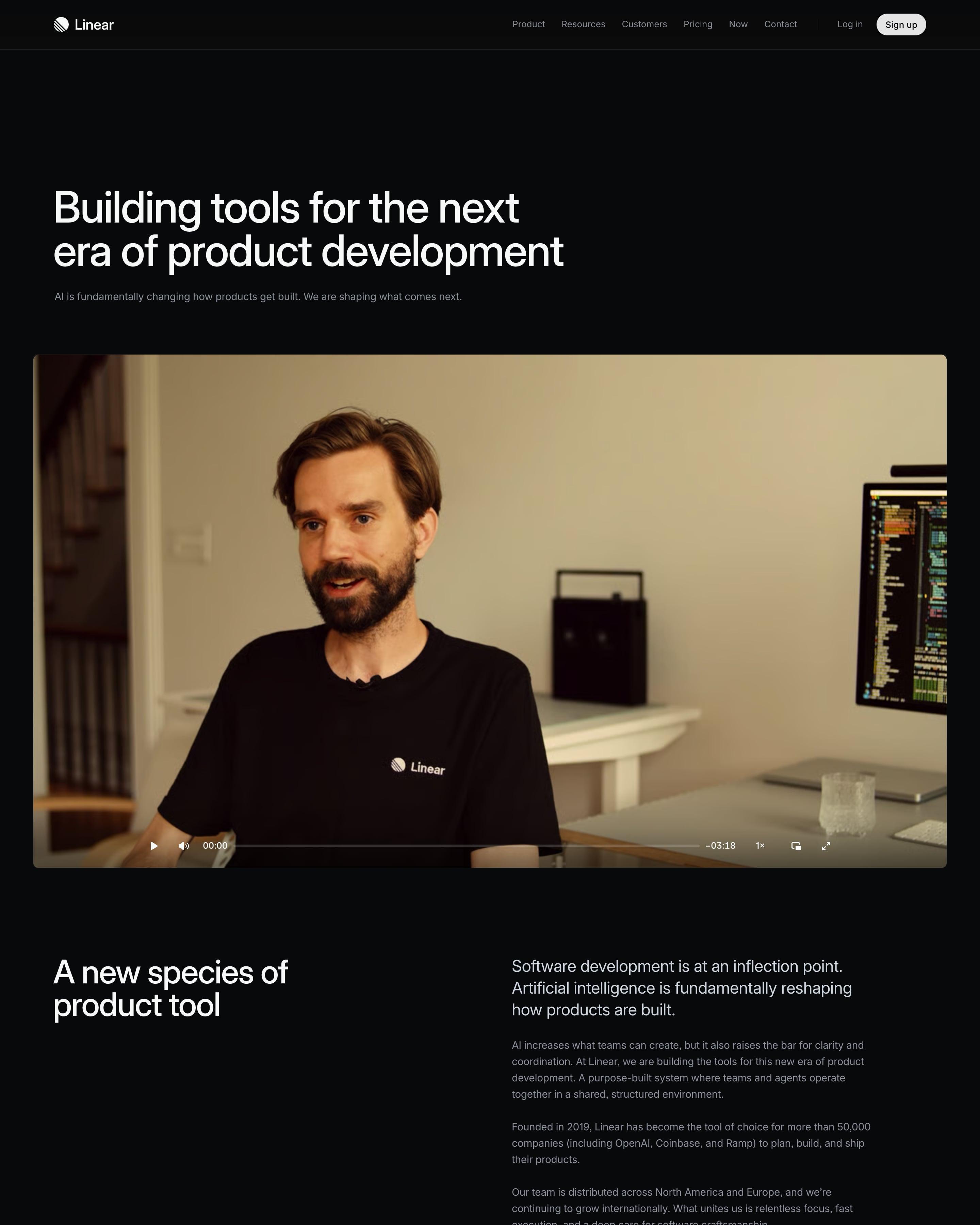
A talking-head video with player controls takes the place of a hero image. Eight leaders get black-and-white portraits, then everyone else is listed by name in four plain columns. Borrow that full-team list, and the investor block: two firm tiles followed by angels with their roles.
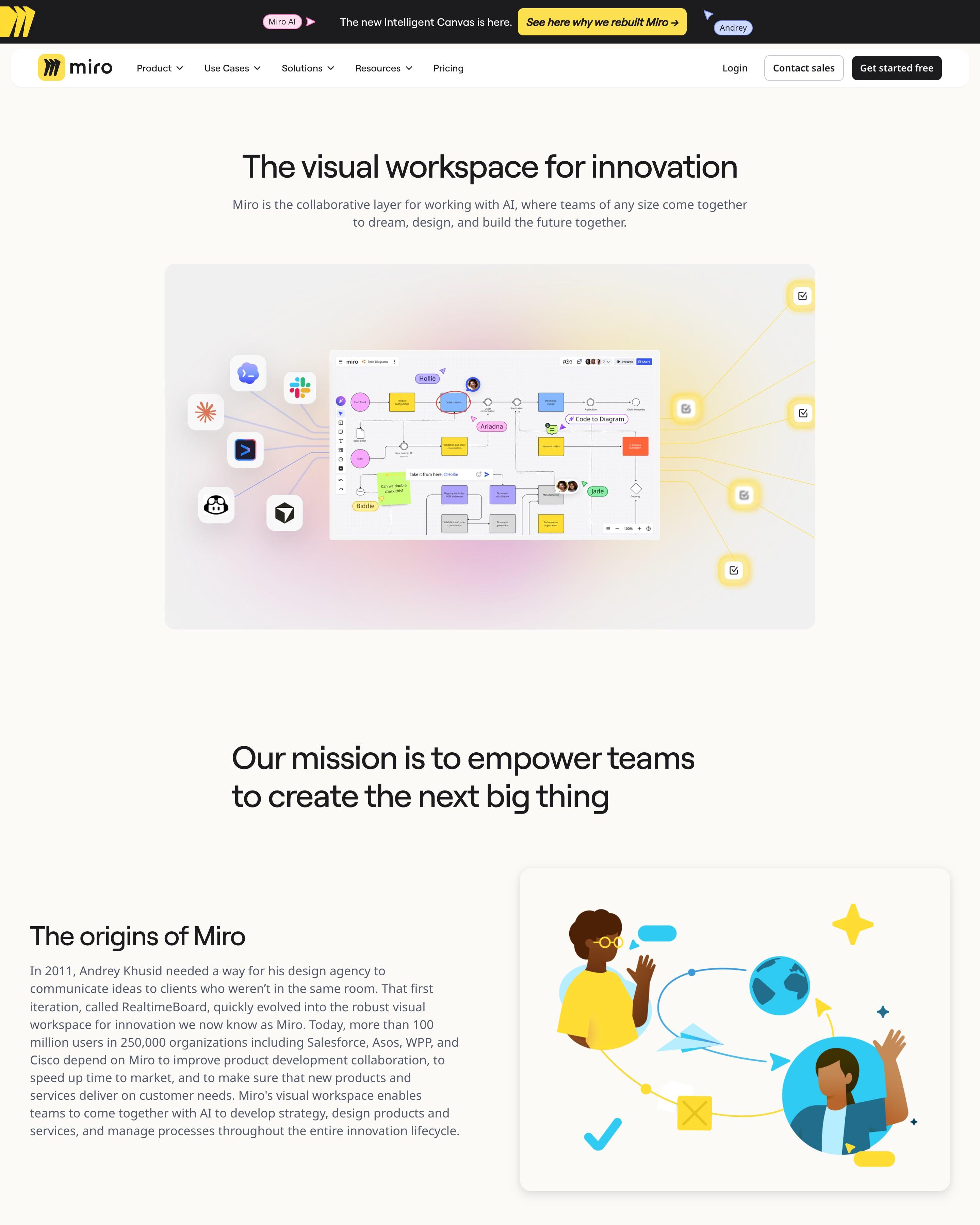
Under a hero that wires a board mock-up to tool icons, leaders appear on solid blocks of yellow, lilac, pink and orange. Individual backers get round headshots, and firms get bordered logo tiles. The office list, where each of 13 cities is a small yellow-and-grey skyline drawing, is the part to copy.
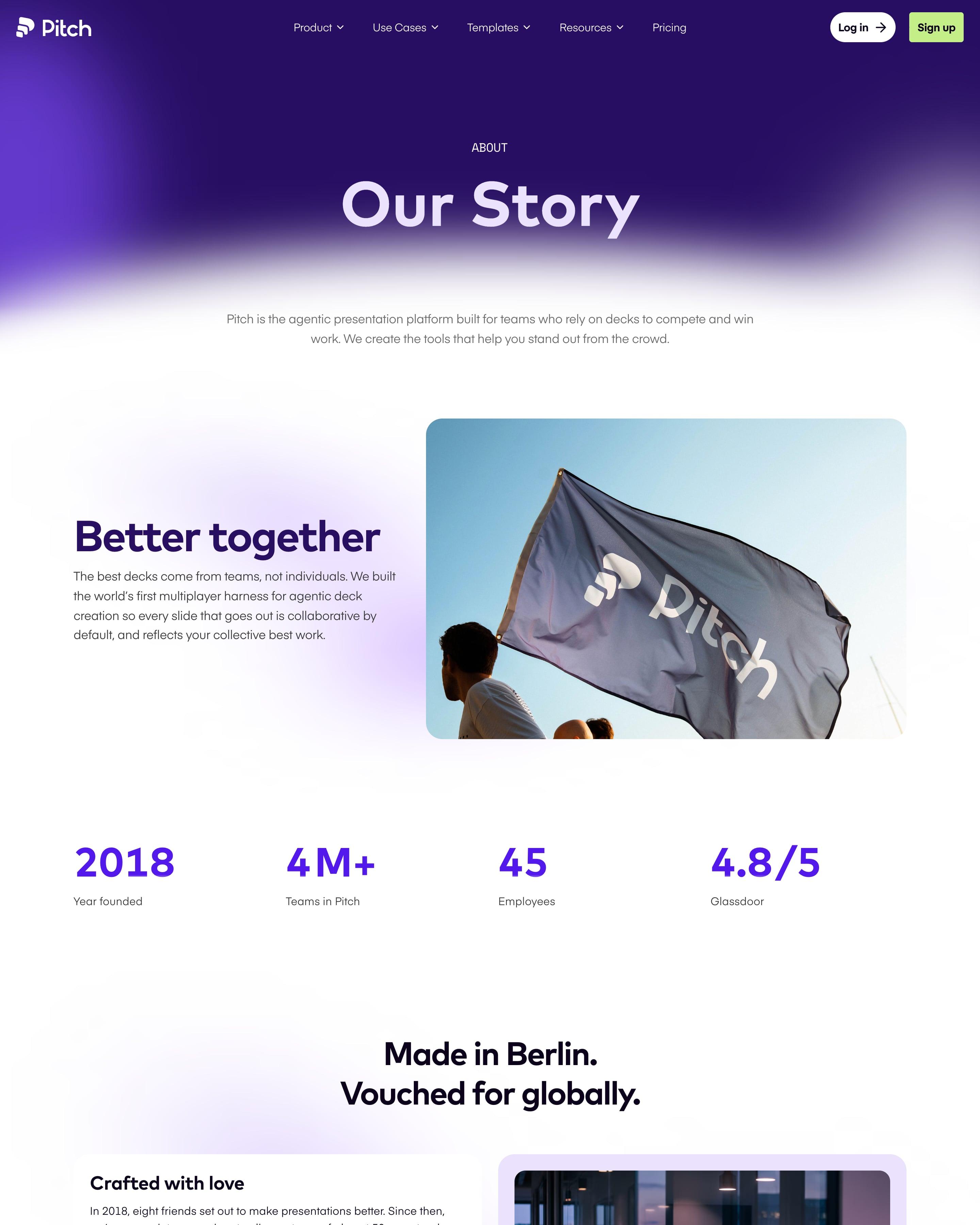
"Our Story" sits in white over a deep purple glow, followed by a flag photo and four facts in a row, from the founding year to a Glassdoor score. A boxed quote from the CEO carries a small name tag. The plain fact row, headcount included, is a simple idea to copy.
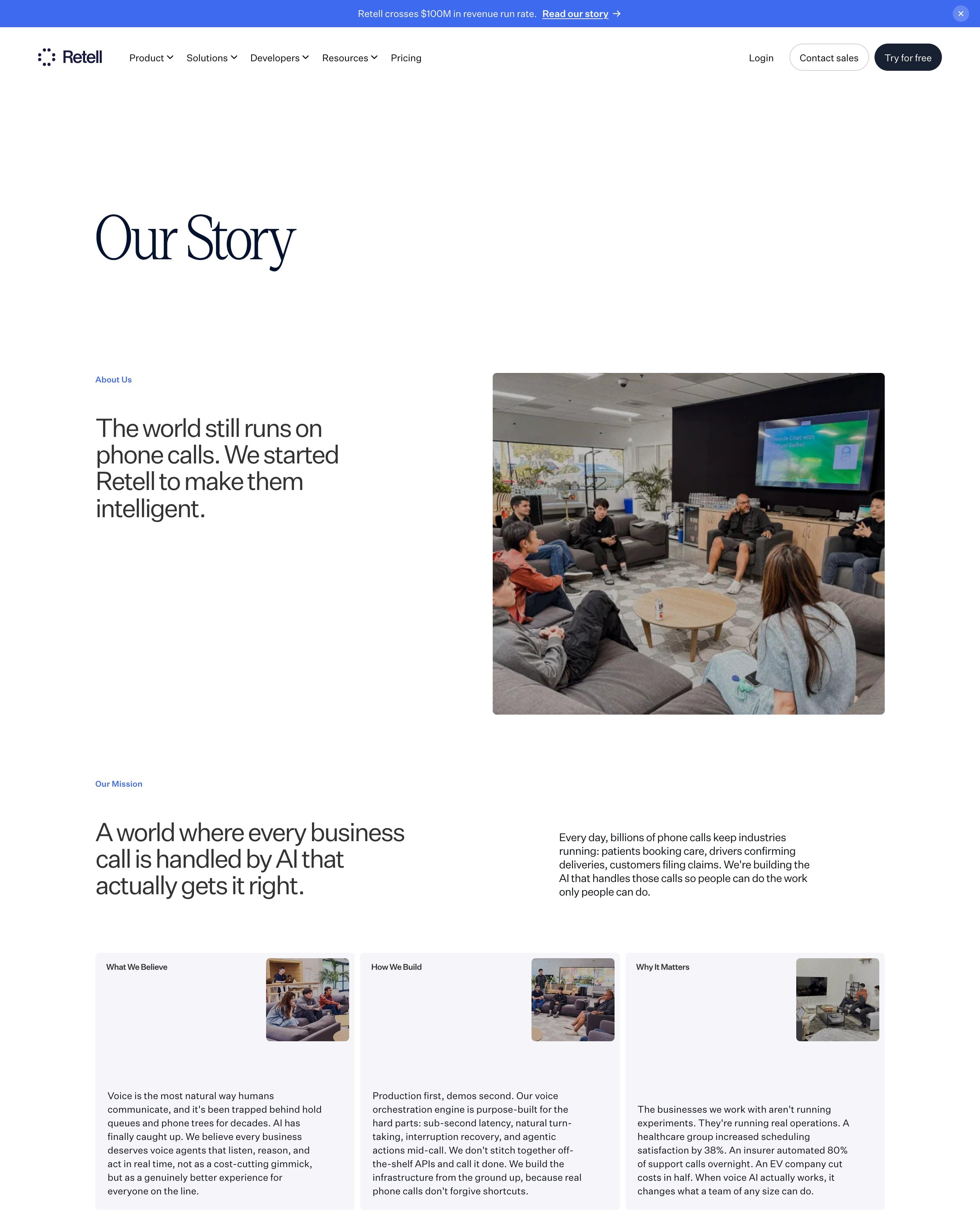
"Our Story" opens with a team photo and the line "The world still runs on phone calls." The manifesto sets "Consciousness Shouldn't Wait on Hold." in huge staggered serif type over a starfield video of hold music. A timeline runs from Y Combinator in 2023 to a $100M run rate, and the founders are listed by name in large serif type beside a fanned strip of team photos.
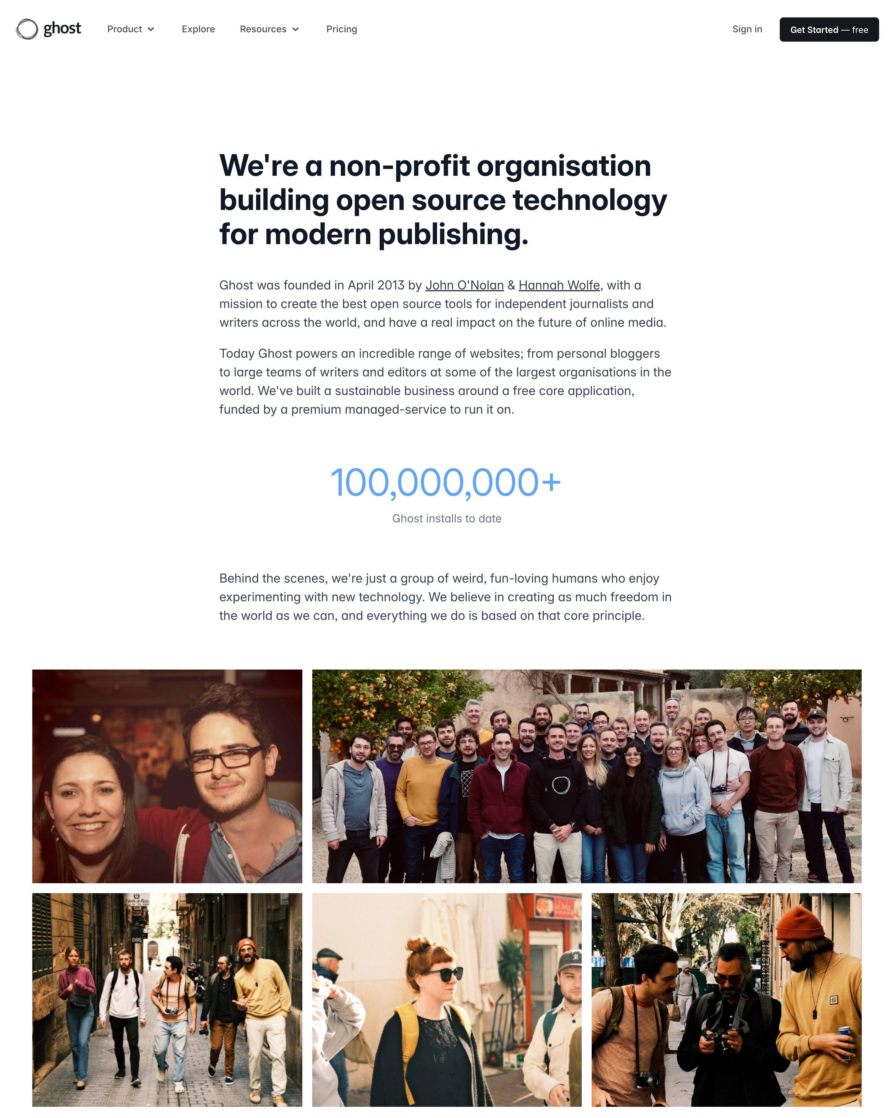
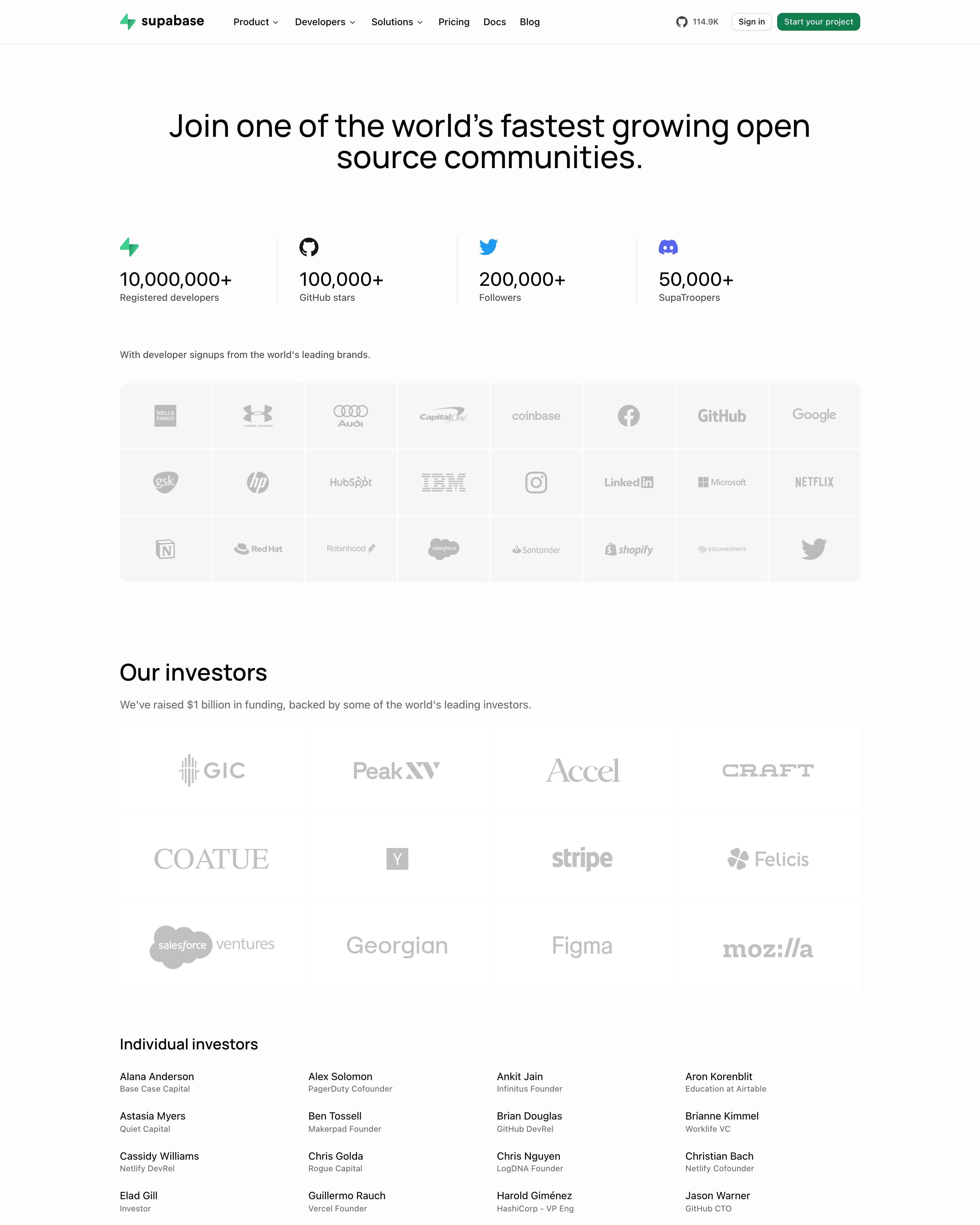
"Join one of the world's fastest growing open source communities" leads into four stat columns with brand icons, from 10,000,000+ developers to 100,000+ GitHub stars. Signup brands and investors sit in grey logo tiles, then about 35 angel investors as a plain four-column name list. Press and podcasts get small text-only cards labelled ARTICLE and PODCAST.
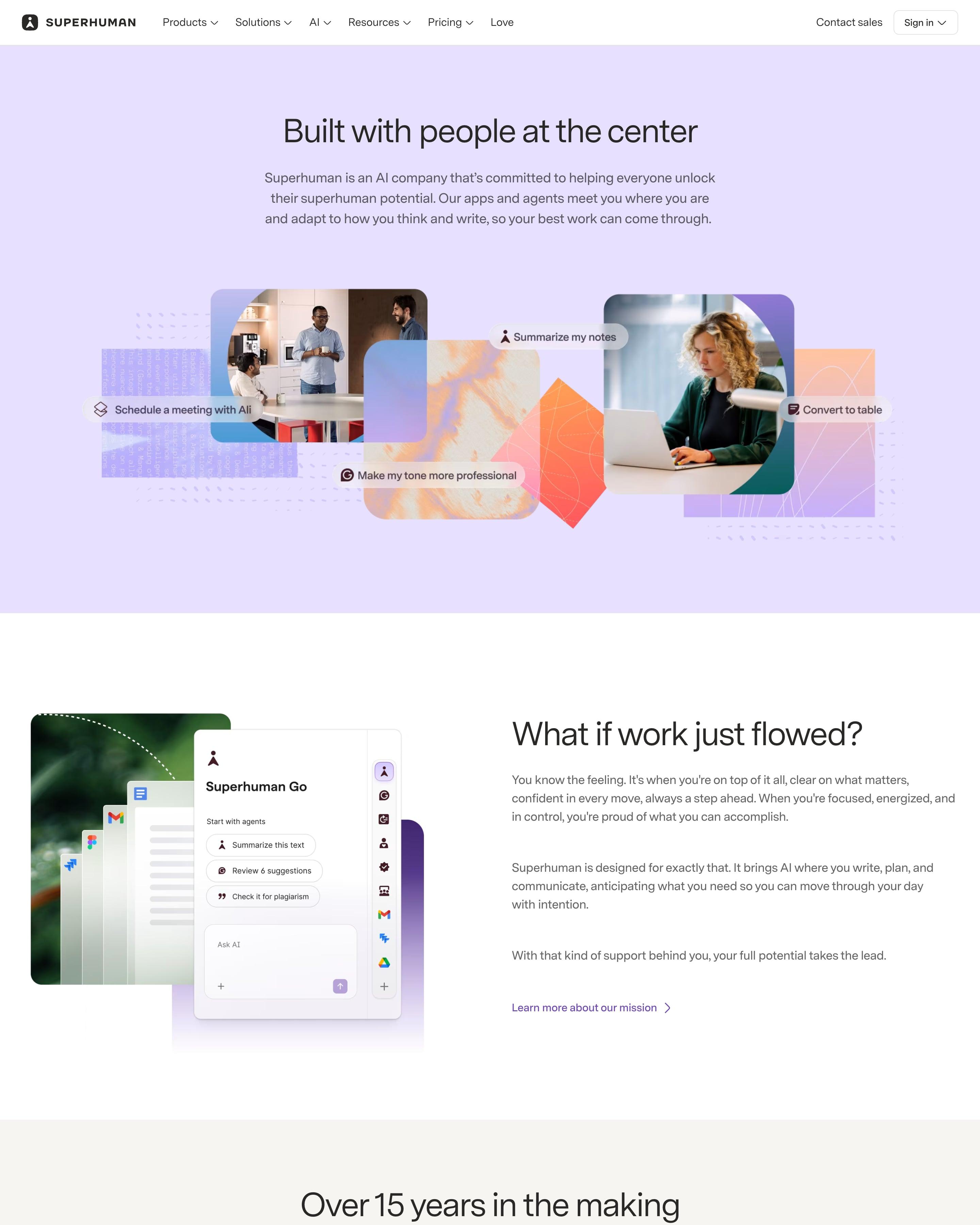
History is told as six dated cards, from '2009: Grammarly is founded' to '2025: Becoming Superhuman', with founder photos or product shots on colour-washed backgrounds, a format worth copying. The lavender hero mixes office photos with AI command chips like 'Summarize my notes', and four large figures sit below a dark suite section.
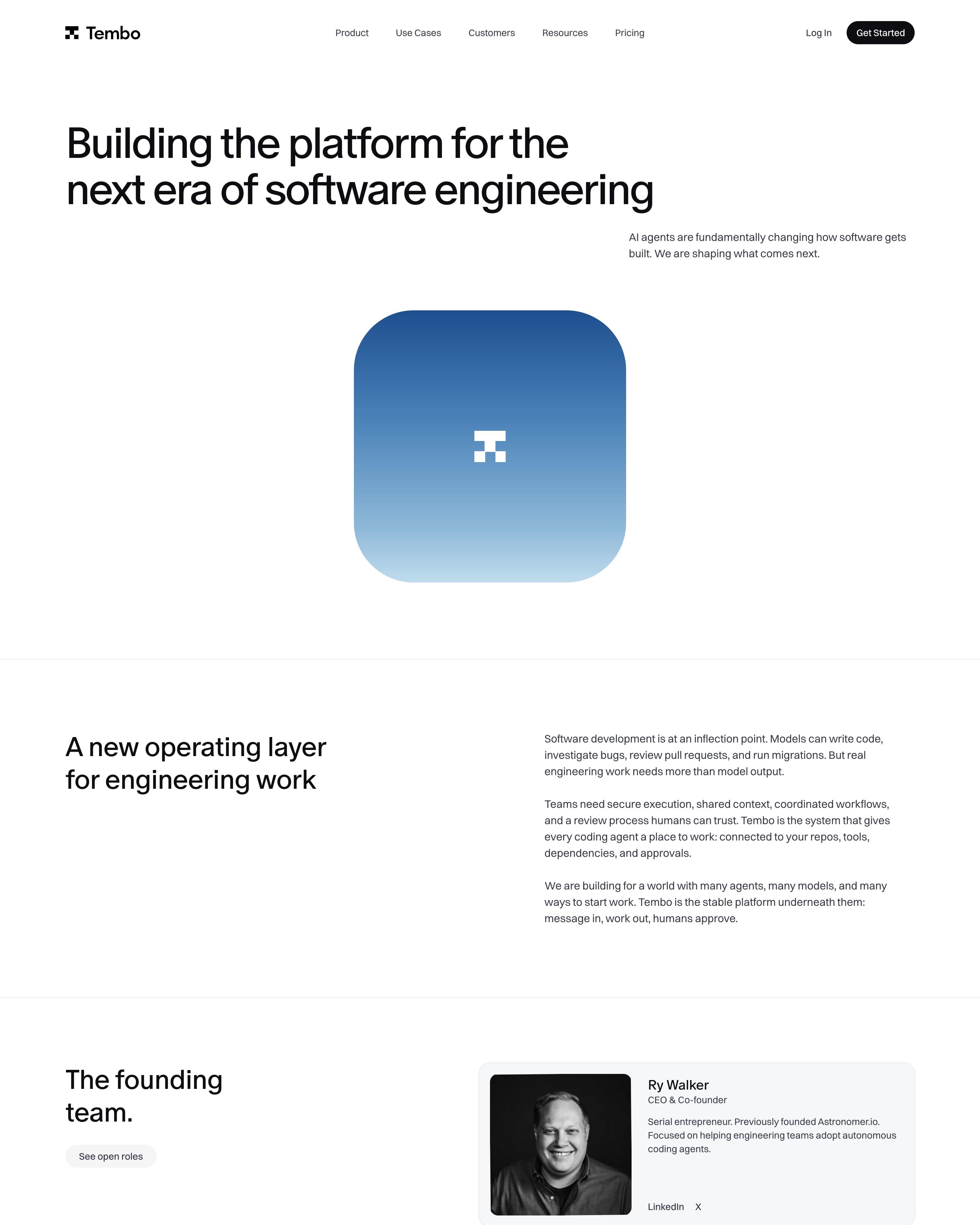
"Building the platform for the next era of software engineering" sits above a single rounded blue-gradient tile carrying the pixel logo. Four founders follow in grey cards with black-and-white portraits, a two-line background each and LinkedIn and X links. Investors get six small cards, GreatPoint Ventures tagged "Lead investor" in blue, next to the $20M raised line.
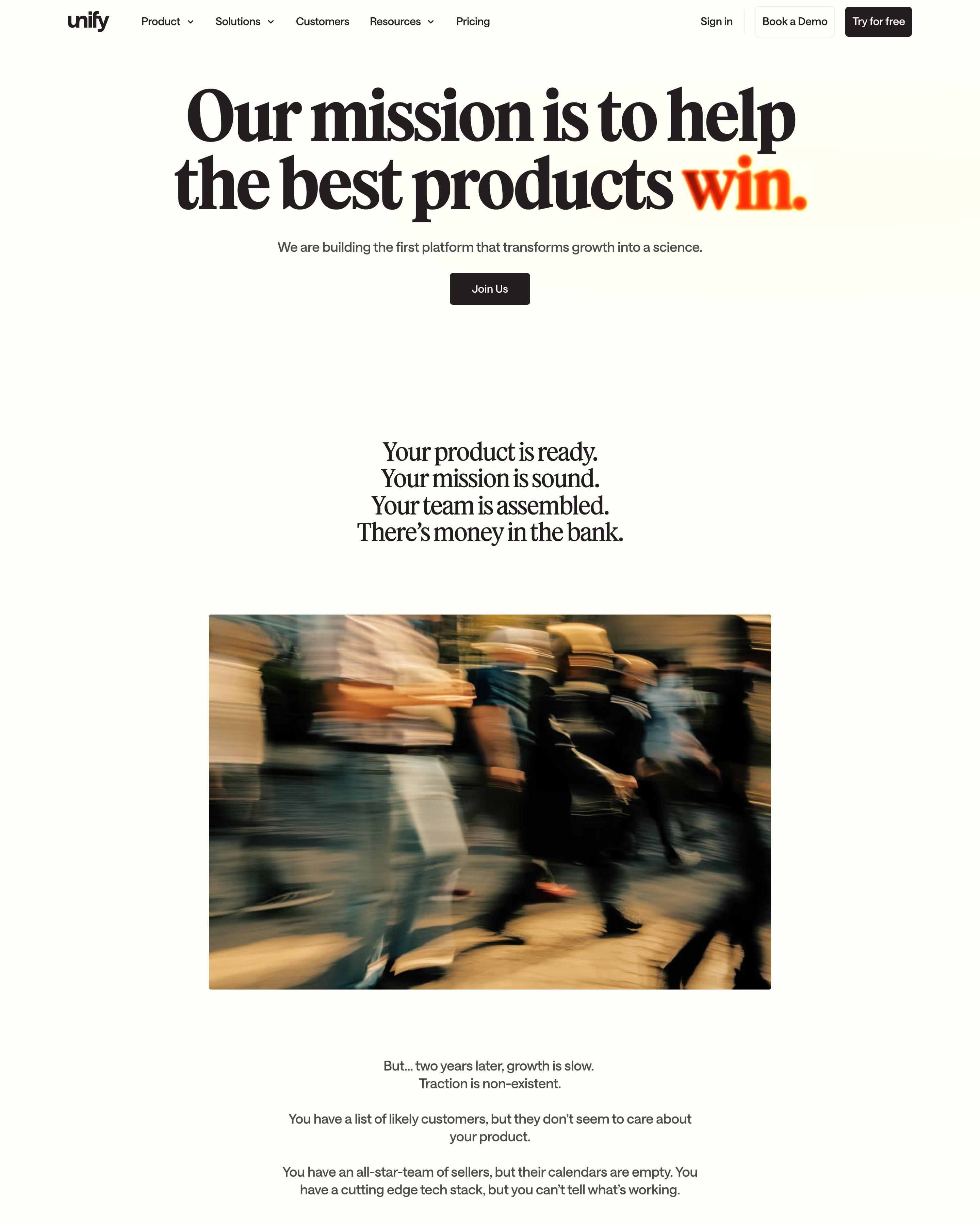
Reads like an essay: "Our mission is to help the best products win." with "win." glowing in blurred orange, then short centred paragraphs between motion-blurred photos of a crowd, typing hands and the New York skyline. Pull quotes turn from grey to black on the key phrase. Worth borrowing: team snapshots fanned out in a tilted arc under "Thank you for all of your support along the way."
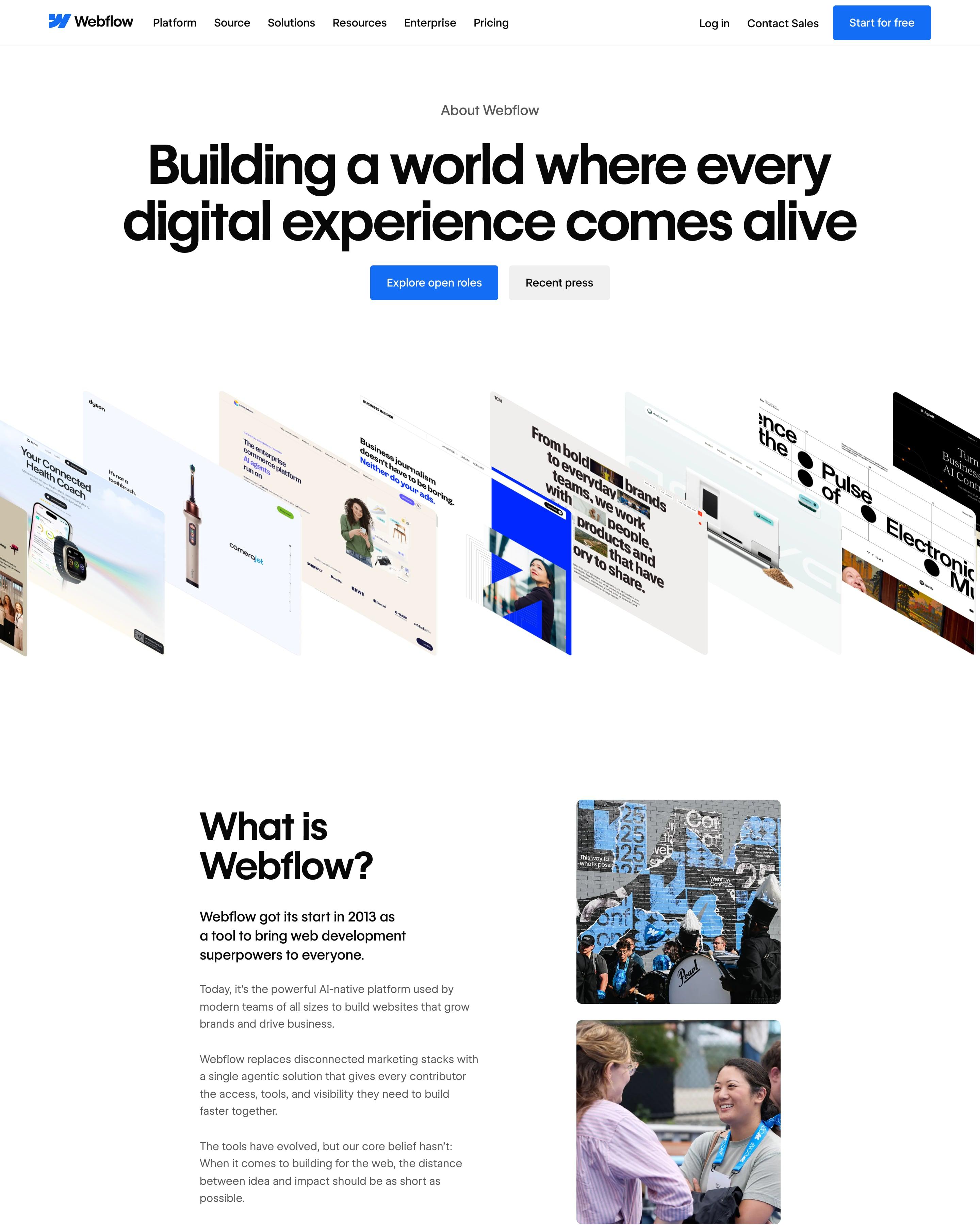
Website screenshots fan out in a slanted row below the centred headline. "Core values behaviors" strikes through "values" above four bright tiles, followed by a numbers block led by 300k, a press list with outlet logos and portraits of the leaders. The crossed-out word is a small idea to steal.
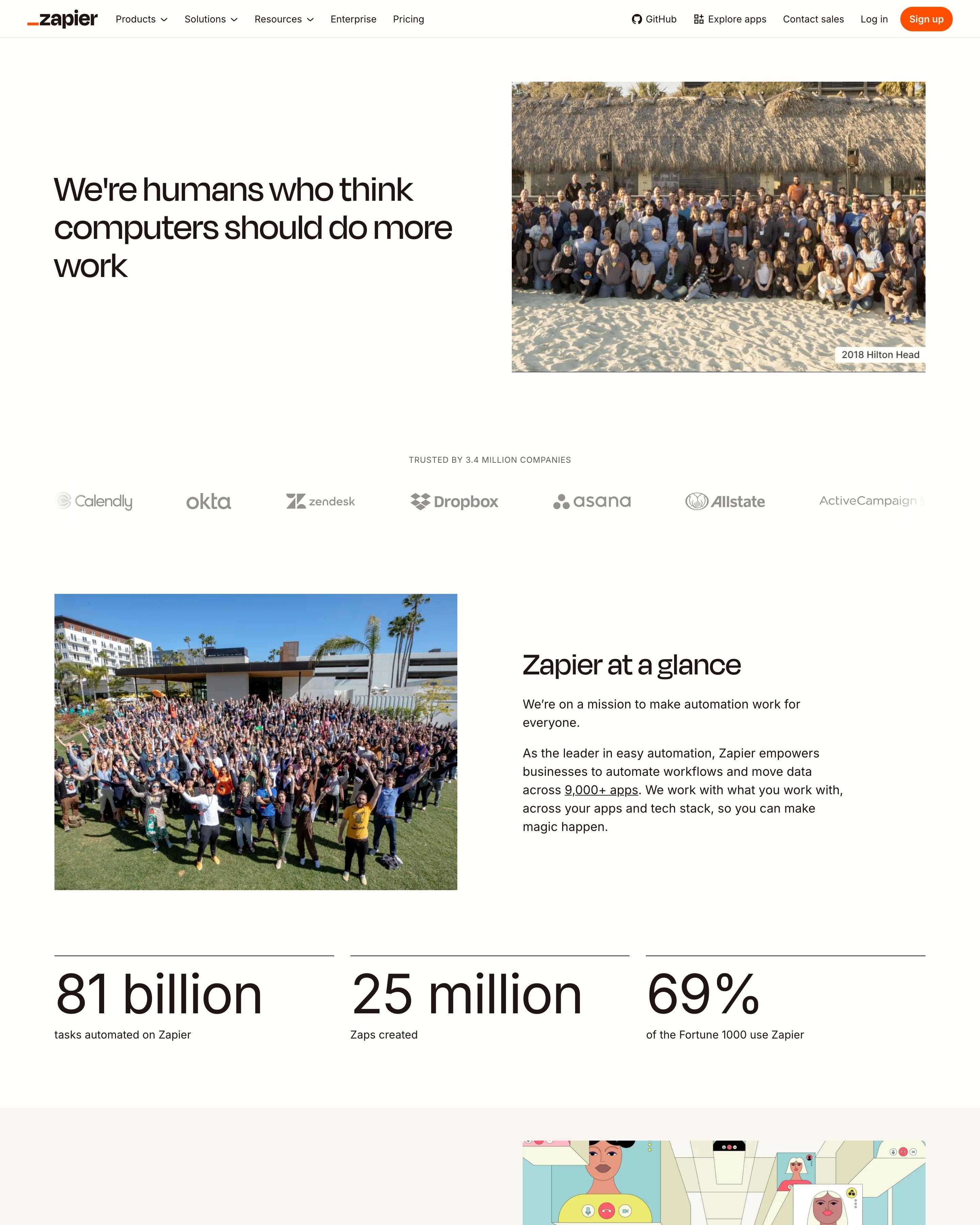
Team photos lead: a big group shot on a beach, captioned '2018 Hilton Head', sits beside the headline, and a second crowd photo opens 'Zapier at a glance' with three large figures. An illustrated video-call grid stands for remote work, and five values sit on plain cards. Captioned photos are worth copying.
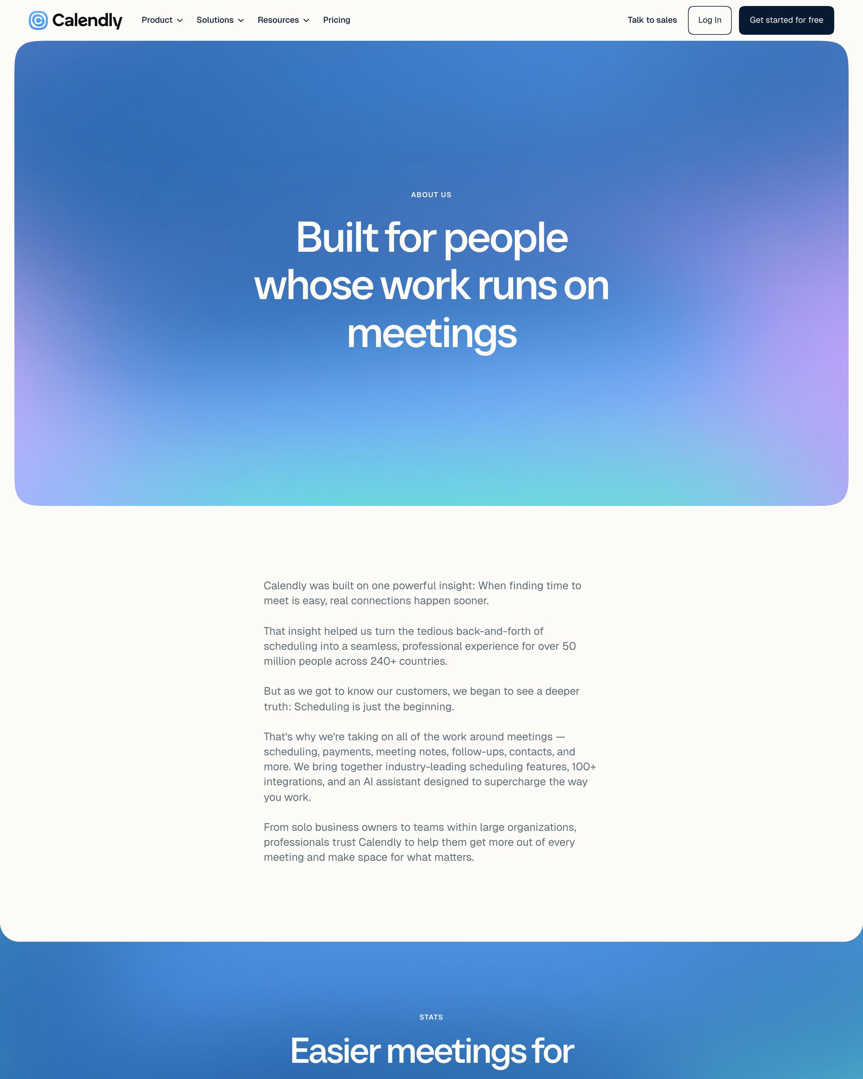
The hero is a gradient panel reading "Built for people whose work runs on meetings", followed by a short plain-text story. Three slightly tilted white cards show 50M+, 240+ and 1.3B+ in gradient numerals, a detail worth copying. Leaders get studio portraits with expandable bios and LinkedIn icons, and "Our team" runs as large rounded event photos.
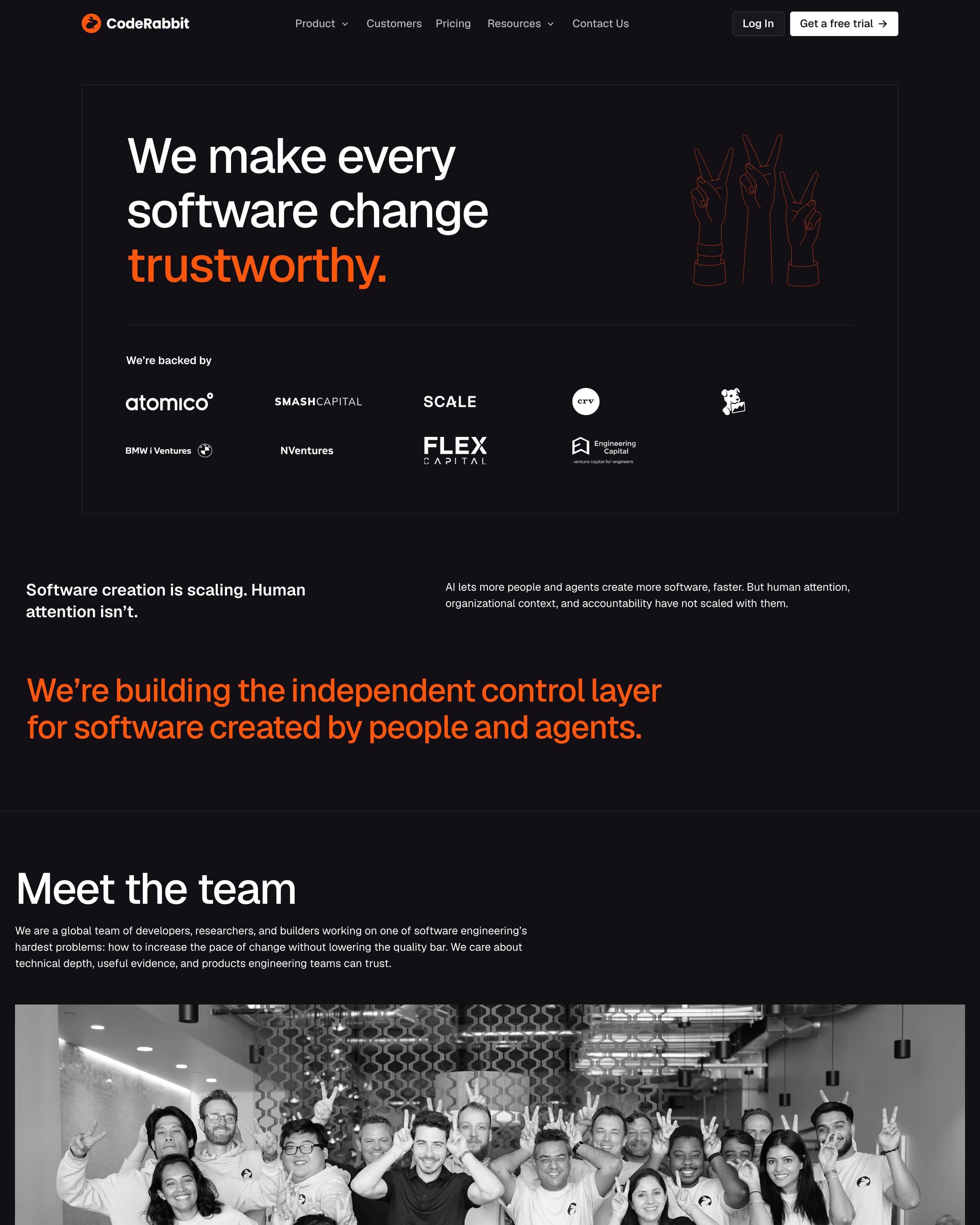
"We make every software change trustworthy." sits in a thin-bordered box, "trustworthy" in orange, beside a line drawing of three hands making peace signs. Investor logos share the box, then one orange statement and a full-width black-and-white team photo with everyone throwing bunny ears. The page ends, like every page here, on a giant outlined "CodeRabbit" wordmark drawn in thin orange strokes.
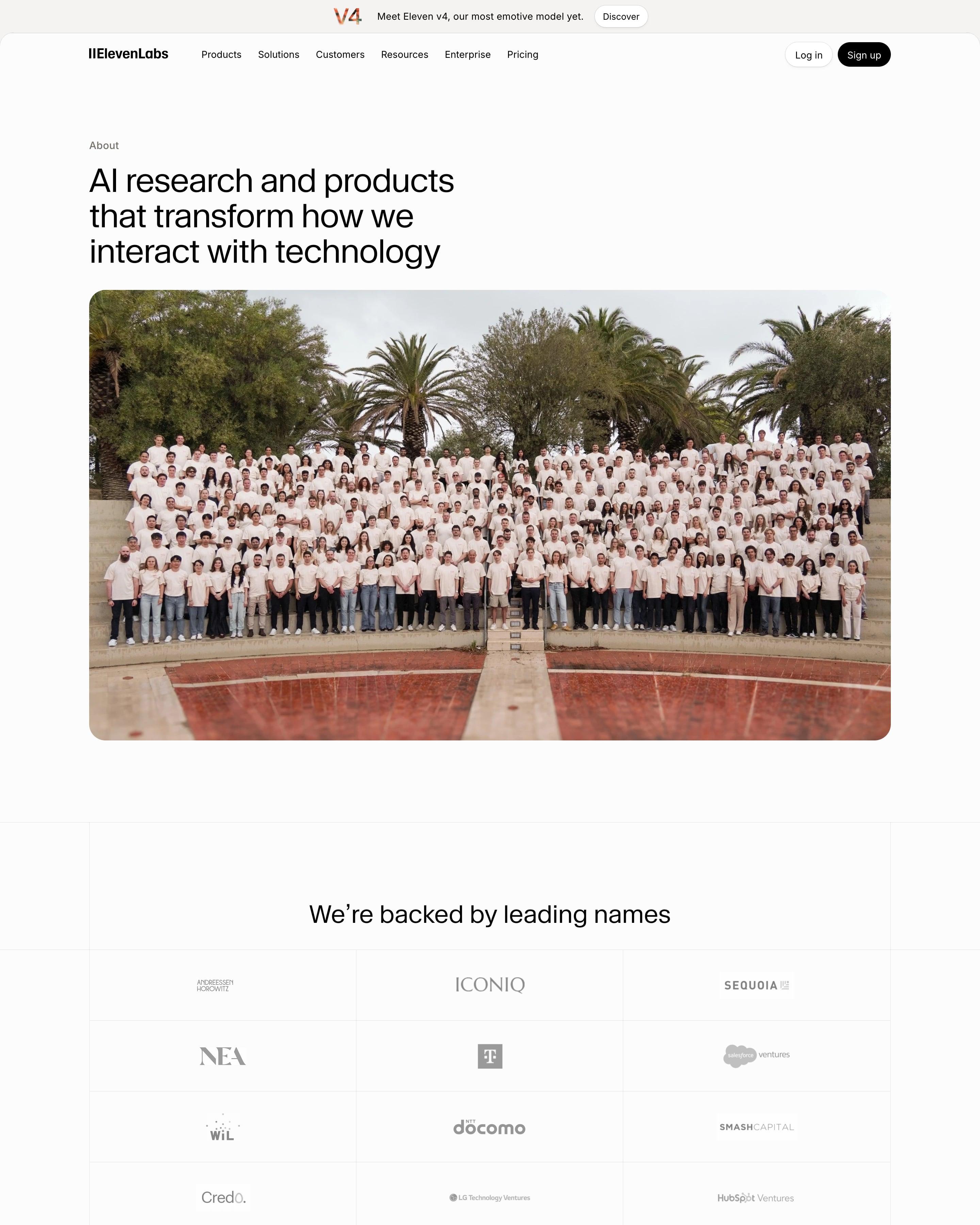
A wide group photo of hundreds of staff in matching cream T-shirts carries the hero under "AI research and products that transform how we interact with technology". Investors sit in a ruled 3×6 grid of grey logos, then the story runs as one narrow column of plain paragraphs. Careers ends on a loose collage of team photos and video-call grids.
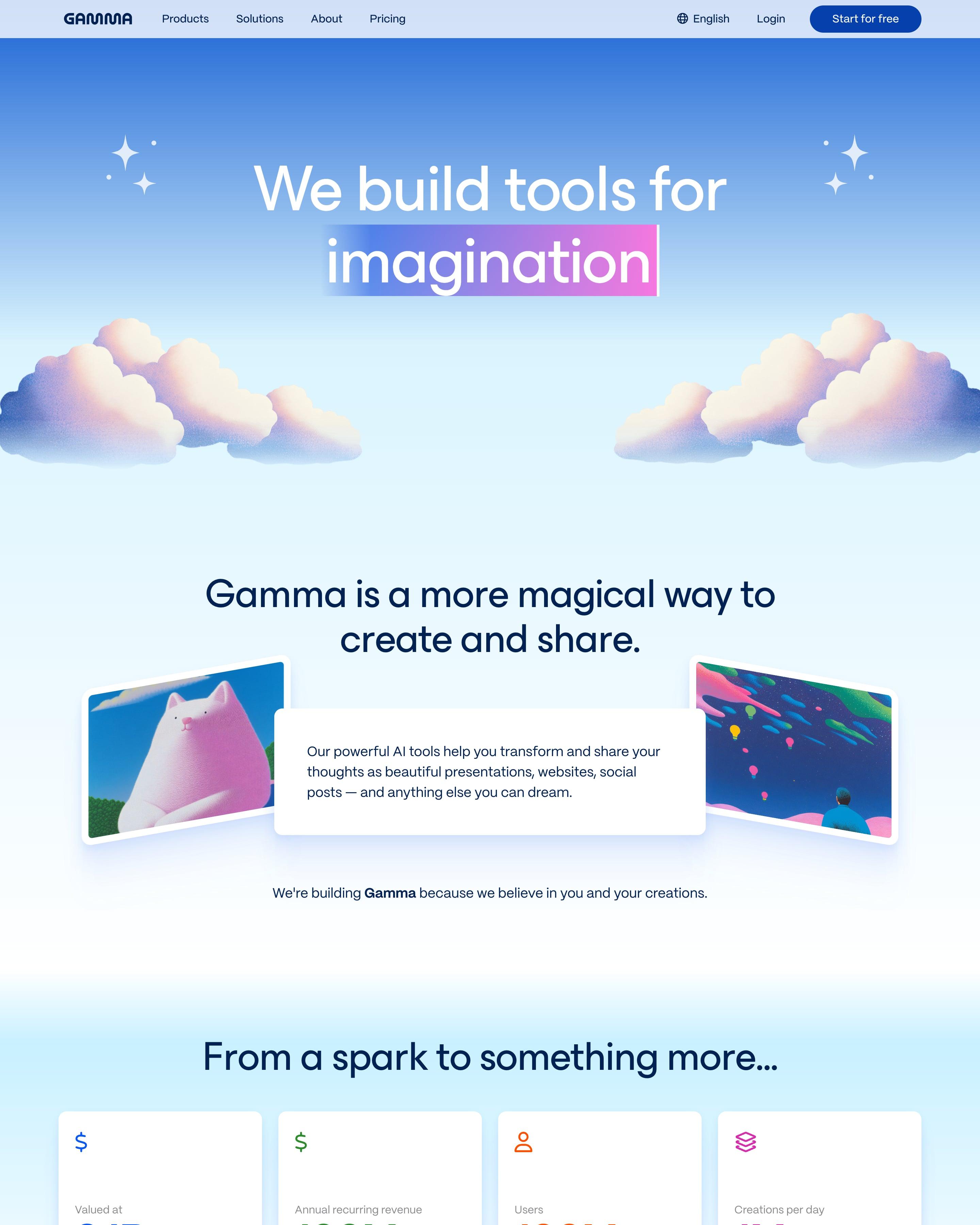
The headline ends on "imagination", set in a blue-to-pink highlight with a cursor like selected text, above grainy clouds. Four stat cards each show their figure in a different colour, and the principles become colour-coded rows. Worth copying: the team described by a cloud of colourful personal tags, beside a mosaic of team photos.
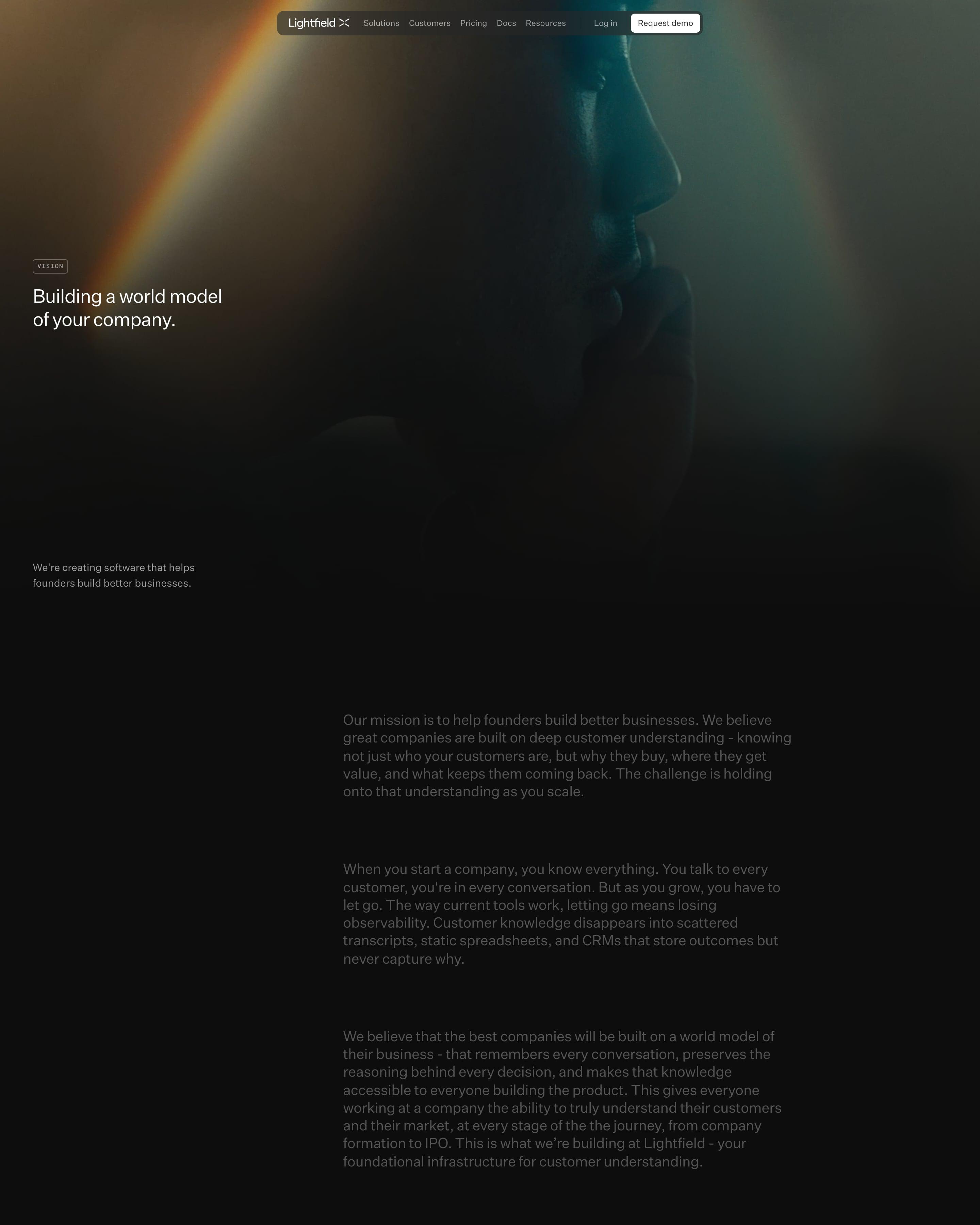
The page goes dark, opening on a close-up face crossed by a rainbow light leak, with a small monospaced "VISION" tag above the headline. The mission follows as long muted-grey paragraphs. Worth copying: letting one photo carry the hero, then a black-and-white shot for the careers card.
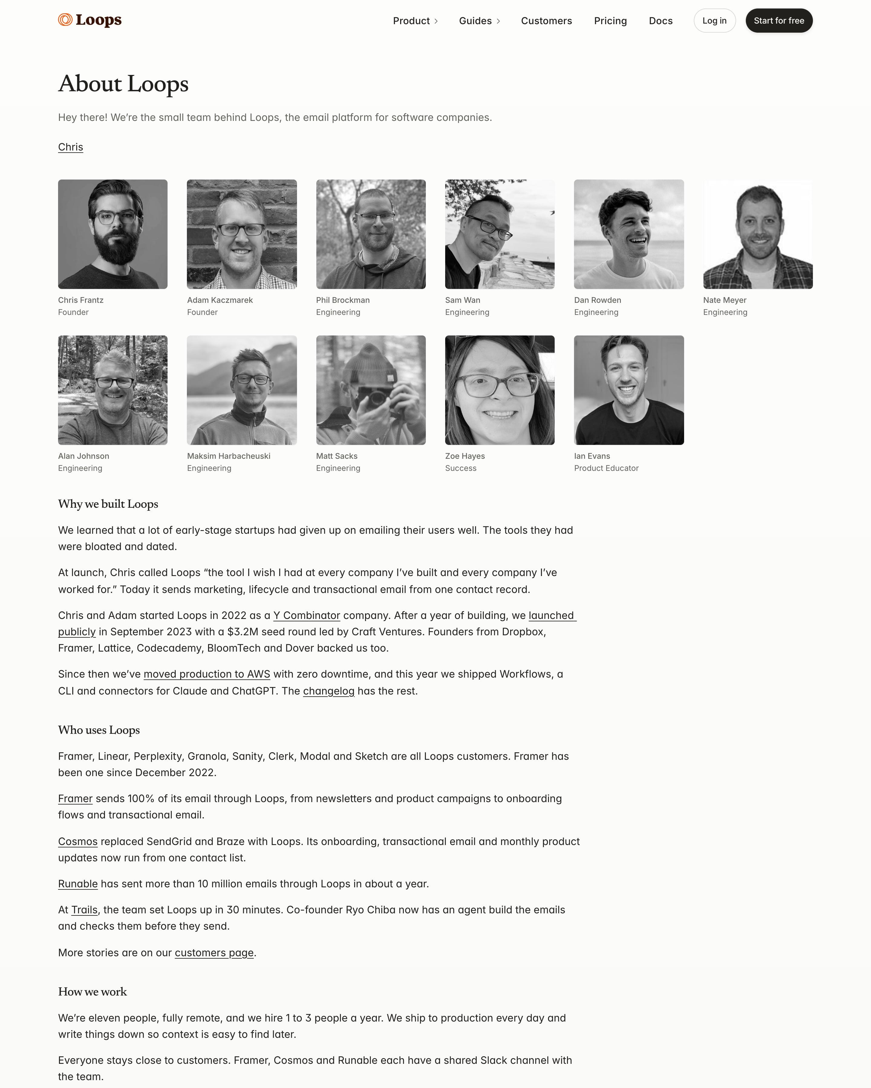
"About Loops" reads like a letter: a one-line hello, a grid of eleven black-and-white headshots with names and roles, then plain paragraphs. Short serif subheads ("Why we built Loops", "Who uses Loops", "How we work") break up linked prose about the $3.2M seed and the fully remote team. It signs off with "Have a great day" and a wave emoji.
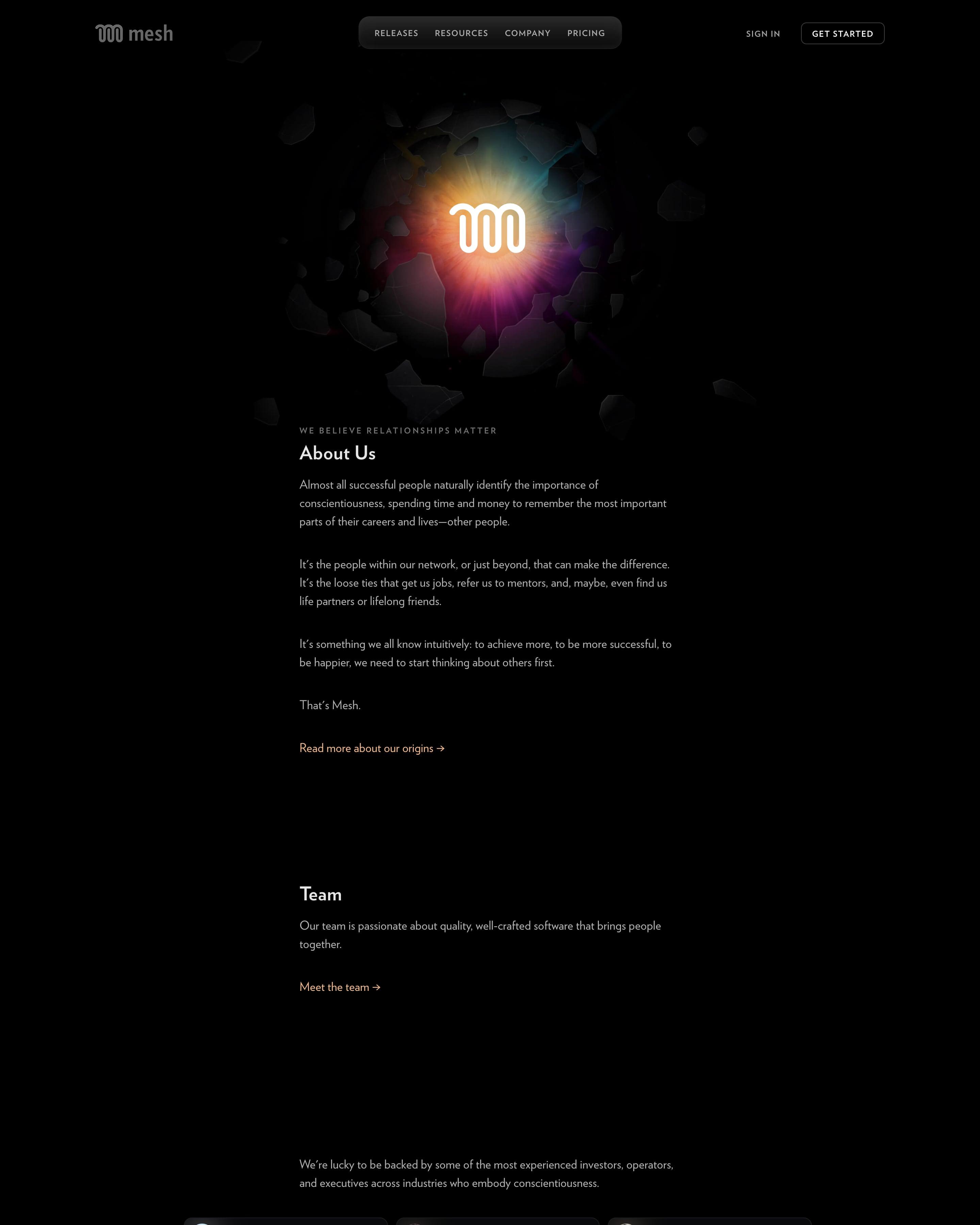
A rainbow burst behind the logo, with dark shards flying outward, opens a single narrow column of text on black. Backers appear as a three-column grid of small cards with headshots, names and roles, and a press card sits at the end. Listing investors as people rather than logos is the idea to take.
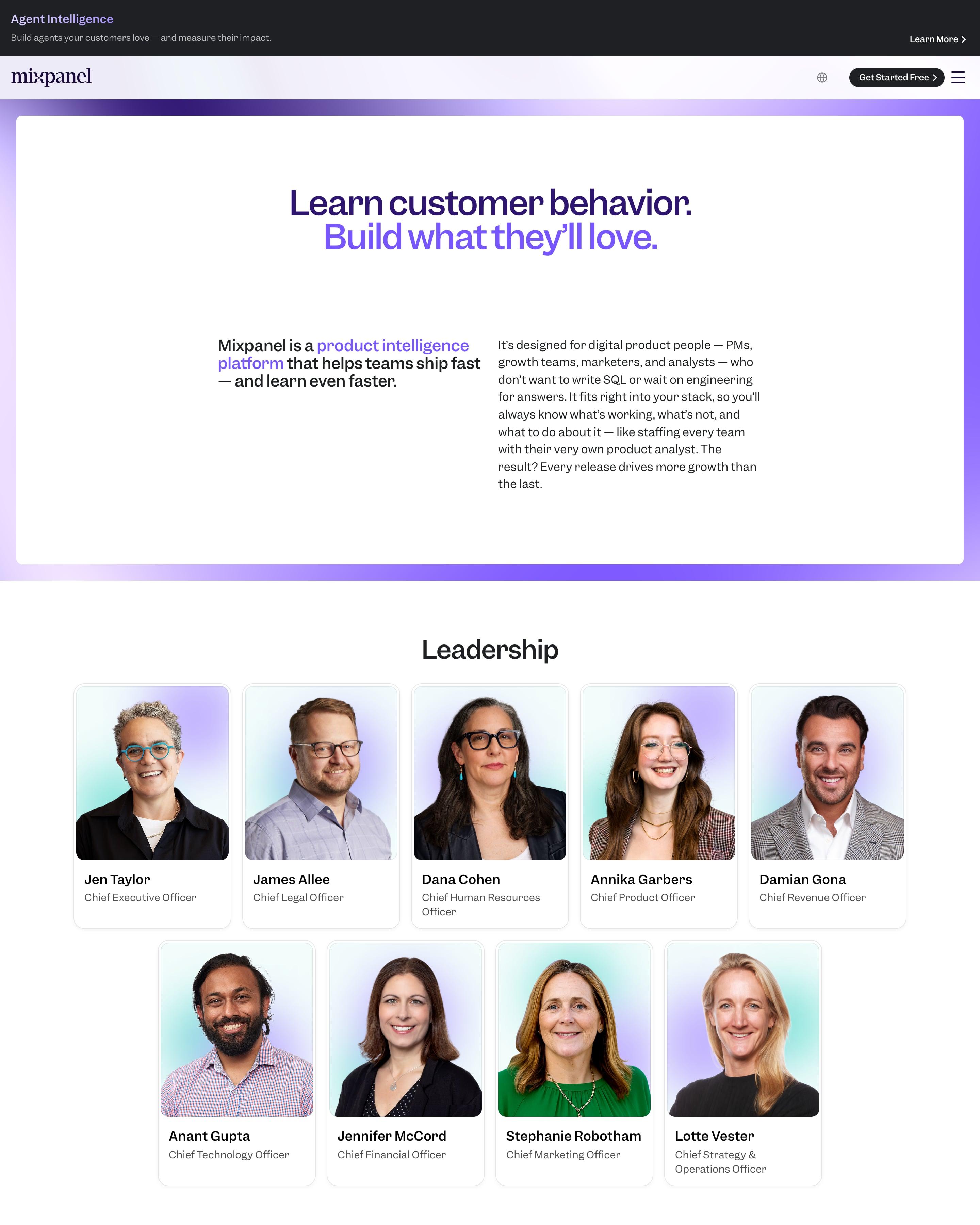
A white card framed by violet glow holds a two-tone headline: dark indigo, then bright violet. Leaders and board members get portrait cards on soft colour washes, and a dotted world map on a violet panel sits above six office addresses. That map block is a simple device worth lifting.
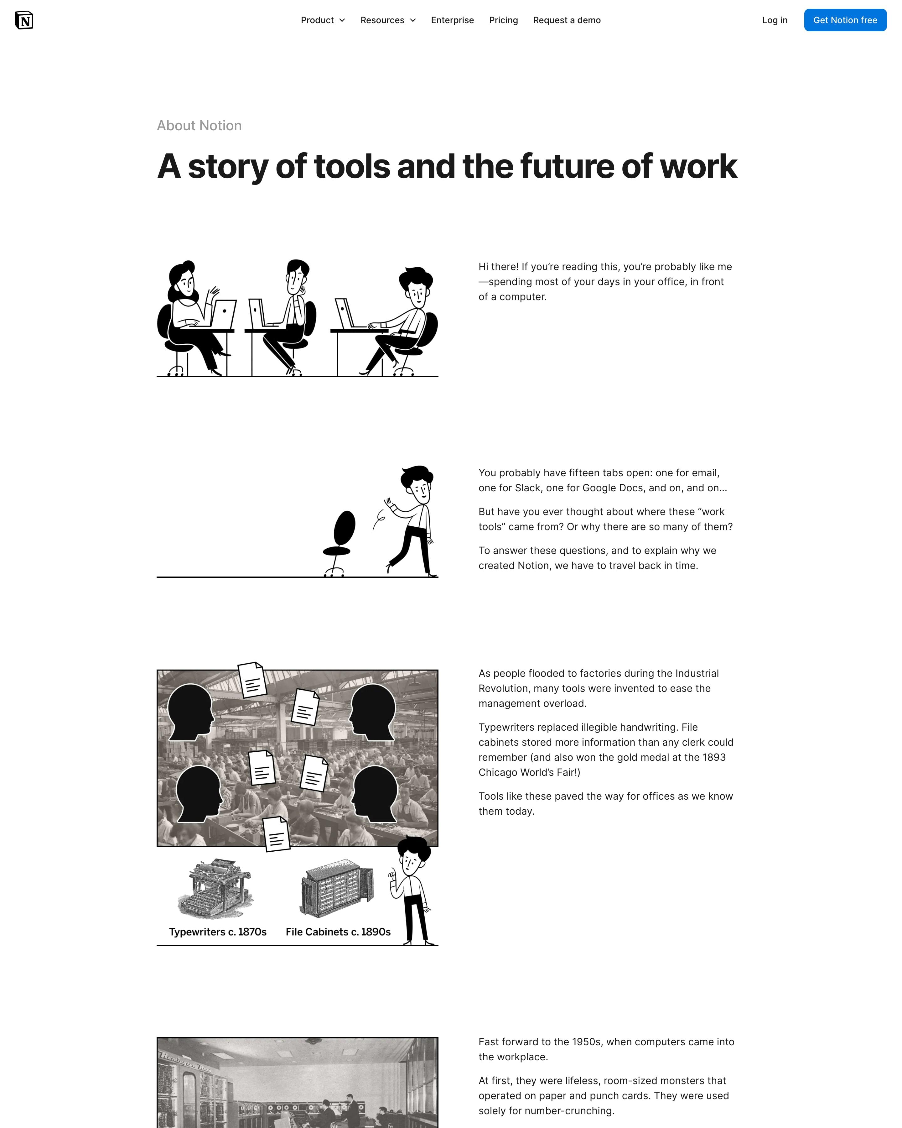
"A story of tools and the future of work" is told as an illustrated essay, each paragraph beside a black ink drawing, some cut into old photos of factories and mainframes. The same cartoon figure travels from 1870s typewriters and file cabinets to an all-in-one workspace. It ends with an Alan Kay quote, press logos in grey boxes and a single email signup.
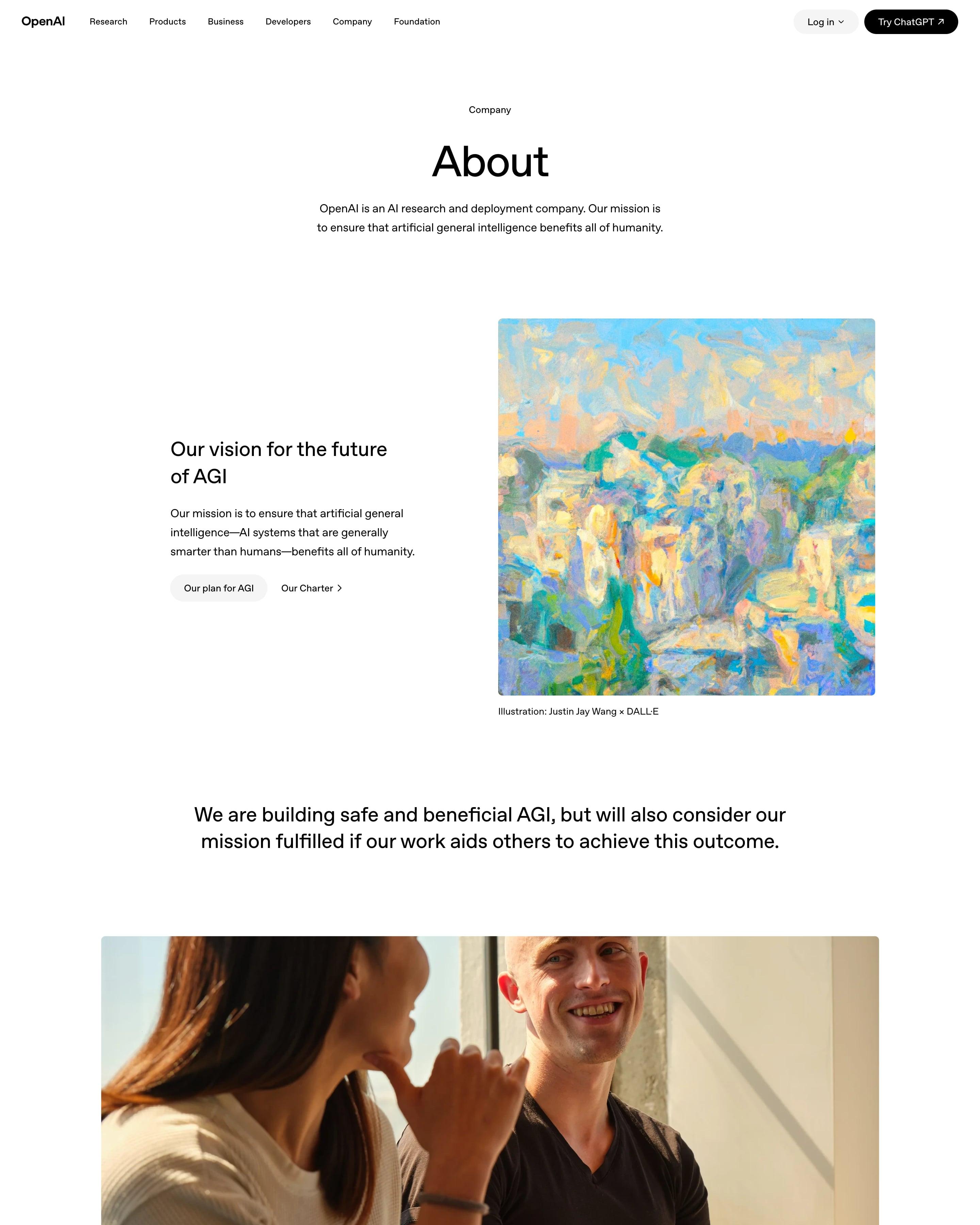
A large centred "About" and a two-line mission open a calm white page. Text-and-image rows alternate with wide office photos: a painted DALL·E cityscape beside the AGI vision, then a lone tree on a hillside beside Our structure. Worth copying: the illustration credit, "Justin Jay Wang × DALL·E", set right under the image.
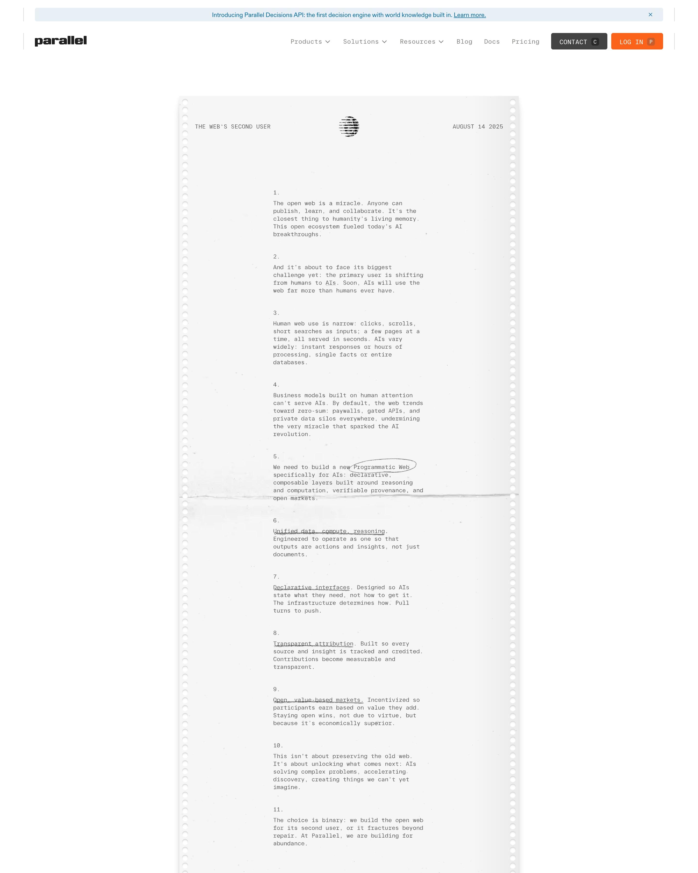
The about page is a single typed letter on perforated printer paper, with tractor-feed holes down both edges and a crease across the middle. Numbered points carry pen circles and underlines, and the letter closes with a signature. Any about page could swap its team grid for a dated memo like this.
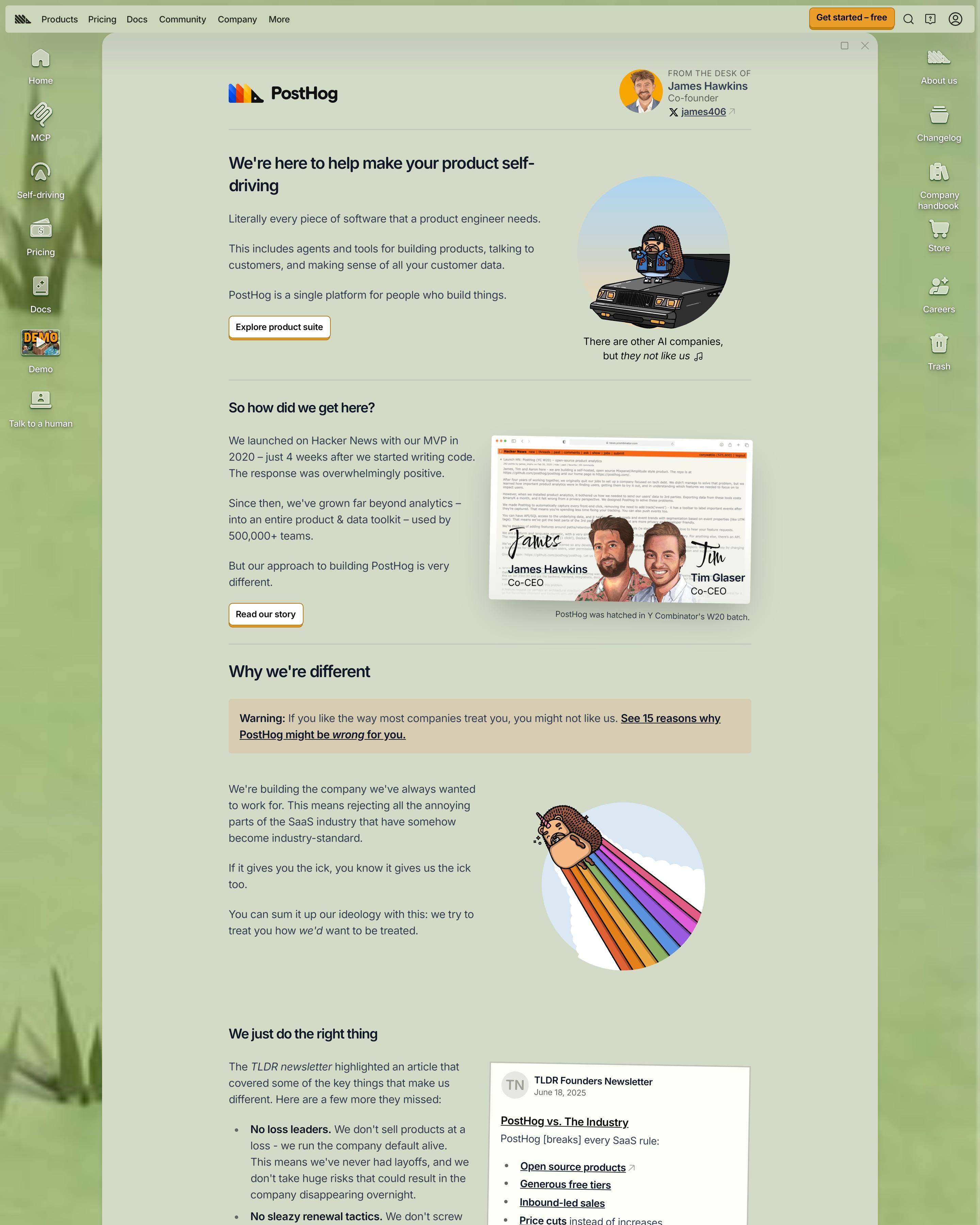
Written as a letter "from the desk of" a co-founder, the page runs in one column broken up by drawn hedgehogs, cartoon portraits of the co-CEOs and a Hacker News screenshot. A warning box links to reasons the product might be wrong for you. The struck-through "Value-based pricing" heading is a joke worth borrowing.
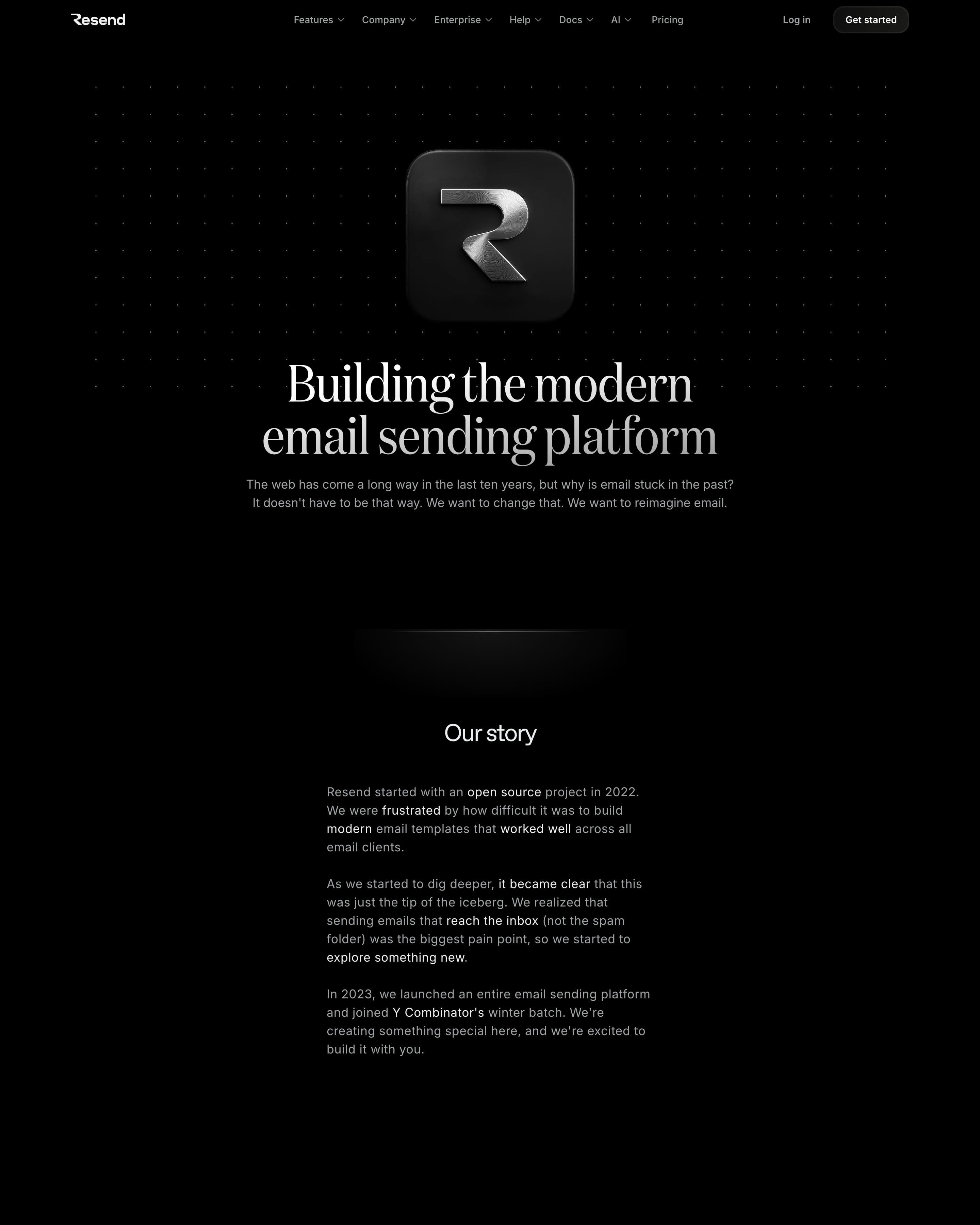
A brushed-metal 3D logo tile sits over a dot grid above the serif headline. Worth copying: each value is written as a dated email from a founder, shown in staggered window cards. Large founder and team photos, an investor grid with faces and a row of blog posts follow.
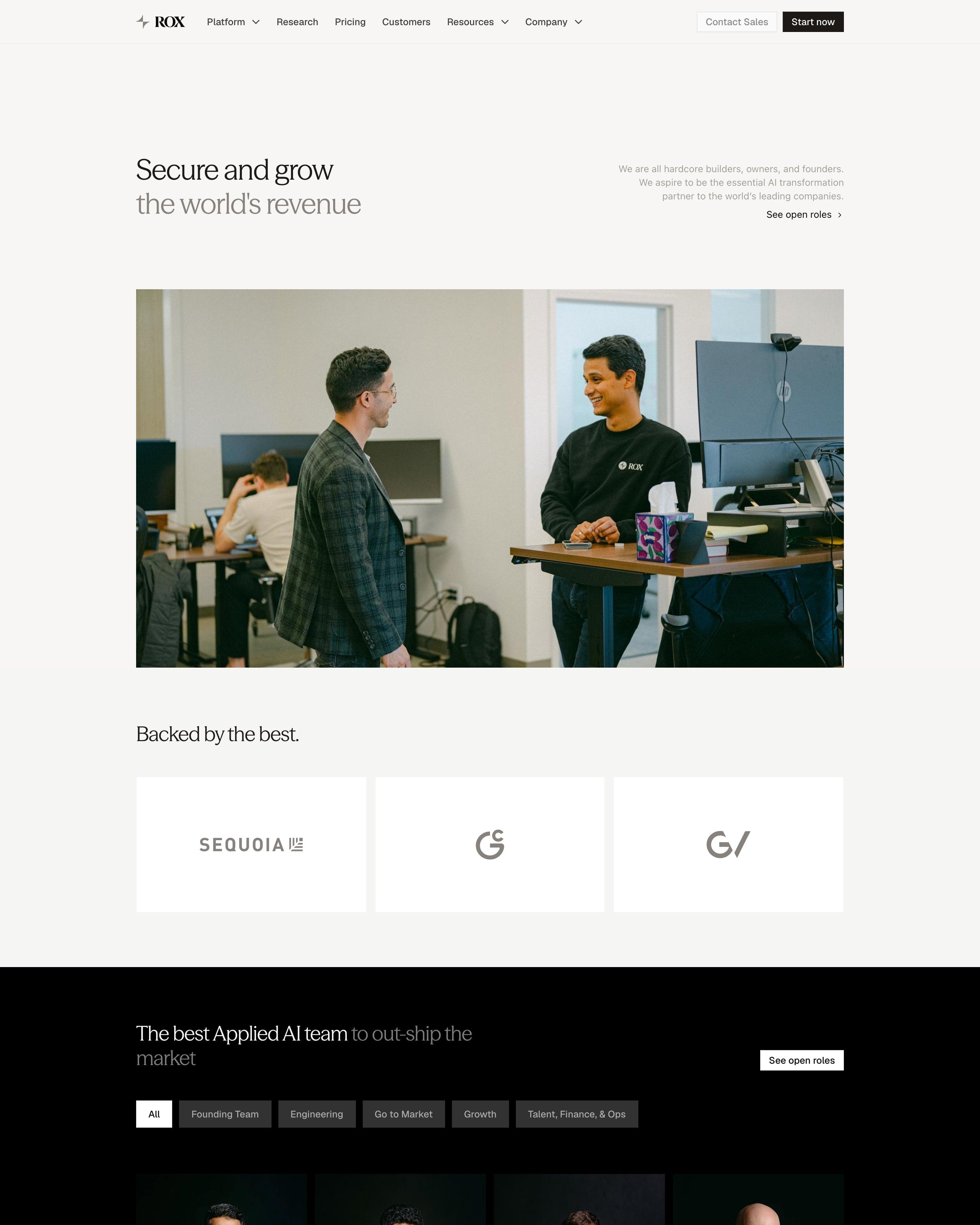
"Secure and grow the world's revenue" sits above one office photo and three investor tiles, then the page turns black. Close to 100 team portraits are shot alike on a dark backdrop in branded jackets, filterable by Founding Team, Engineering and Go to Market. Rox Advisors follow on white cards with each person's title and company.
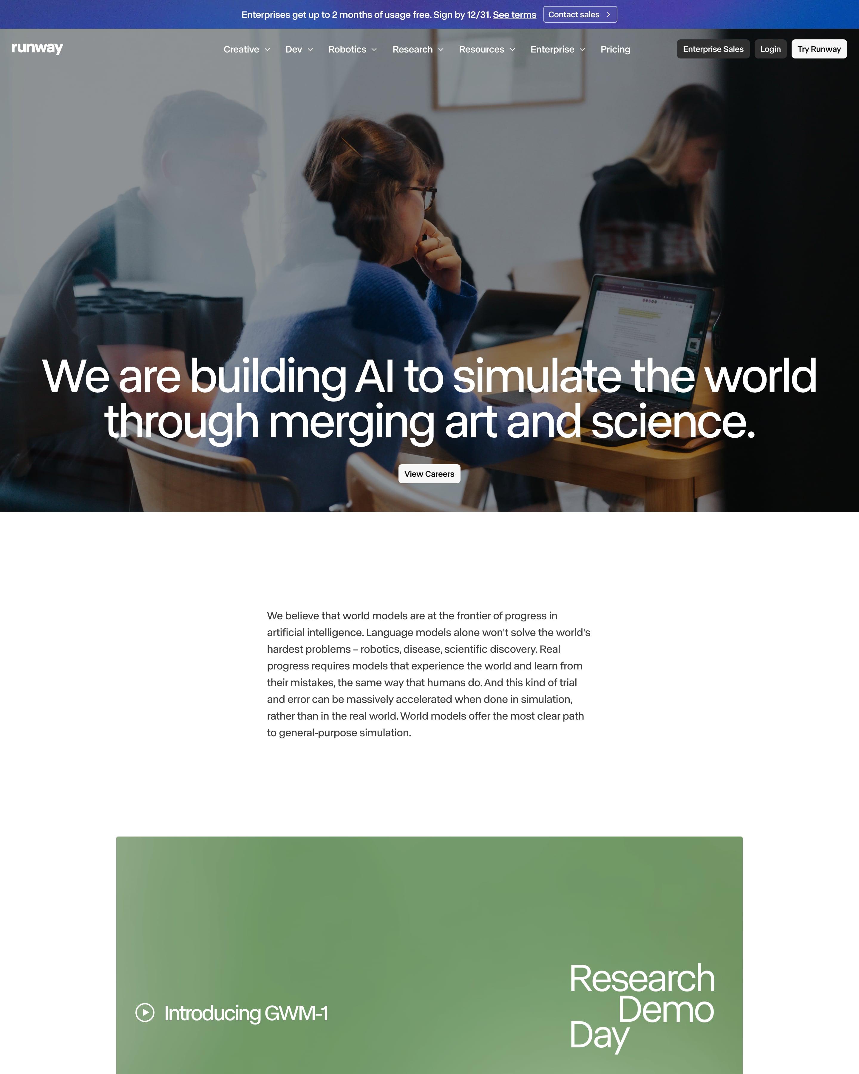
Behind the mission line and a "View Careers" button sits a full-bleed photo of people at laptops. One large-type paragraph names the seven office cities, followed by a strip of team photos. Worth copying: open roles as a plain table of role, team and location, its last row fading out above "View all openings".
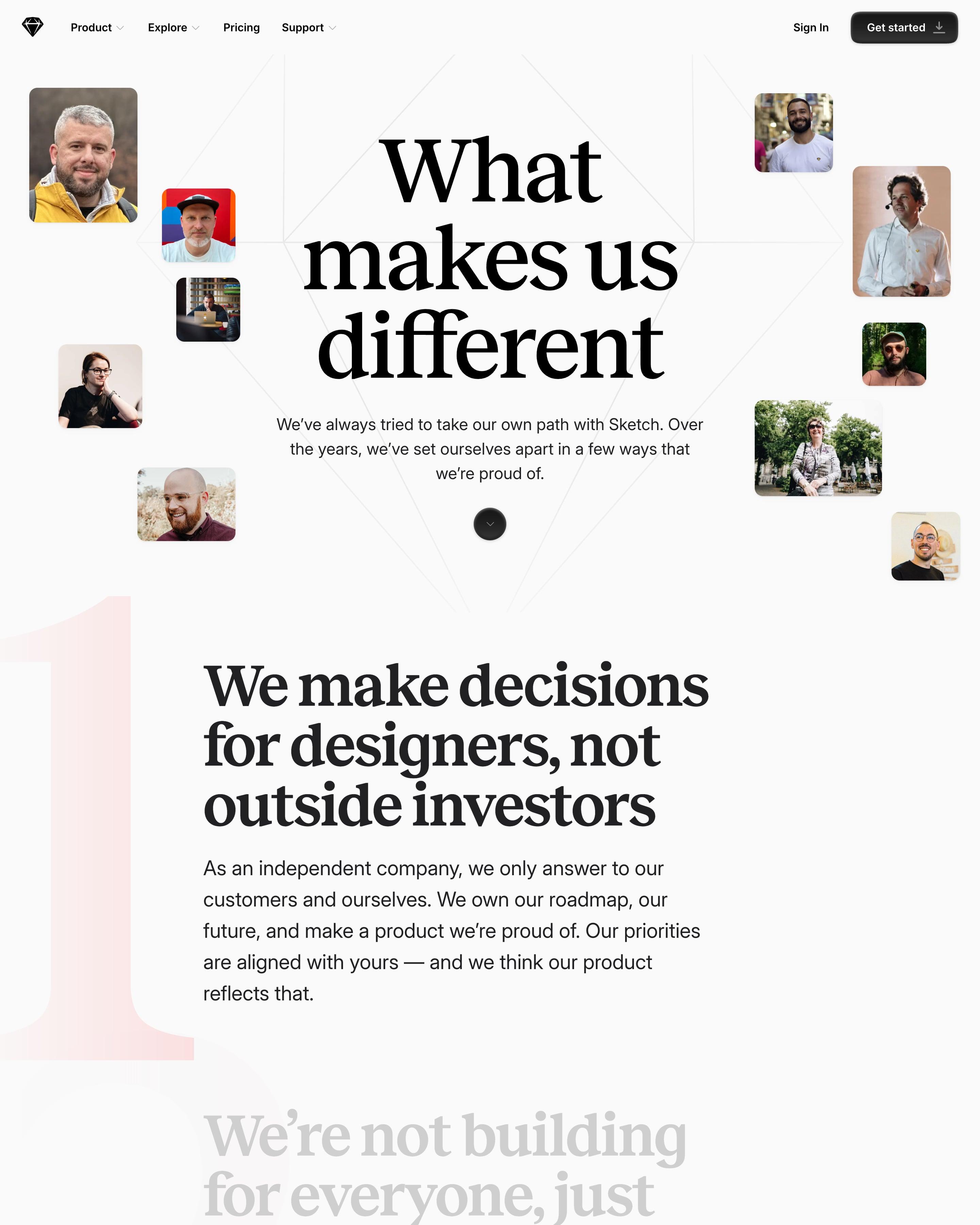
"What makes us different" sits in a heavy serif inside a faint diamond outline, ringed by small team photos. Seven statements follow, each beside a giant pastel numeral bleeding off the left edge, from a pink 1 to a peach 7. The manifesto voice does the work, with lines like "We make decisions for designers, not outside investors", and the page ends on a press kit download picker.
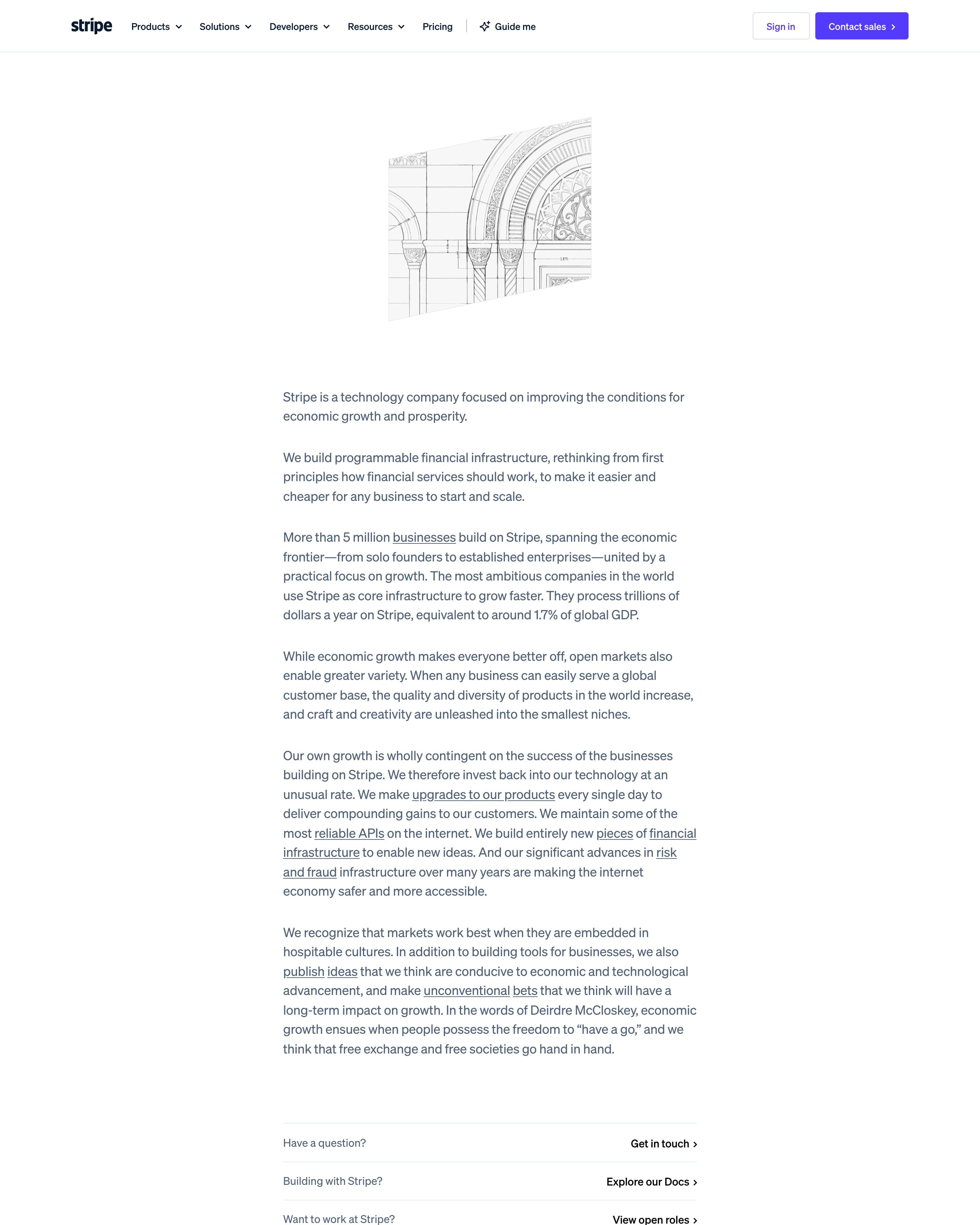
This about page is an essay, not a set of sections: one narrow column of text under a line drawing of a classical arch, with links set inside the sentences. Three plain rows at the end point to contact, the docs and open roles. It's worth copying if you'd rather explain than decorate.
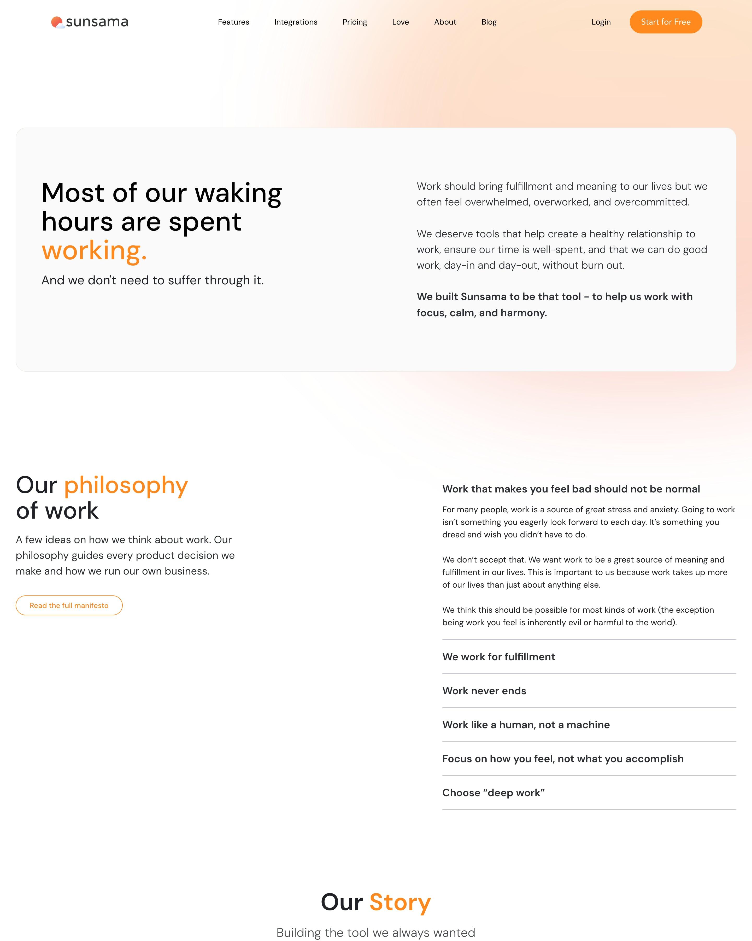
"Most of our waking hours are spent working." opens in a soft grey panel, with "working." in orange and the mission on the right. "Our philosophy of work" is an accordion of beliefs like "Work like a human, not a machine". The story is a one-slide carousel on a 2013 to Present timeline, signed by the two cofounders, so the page stays short.
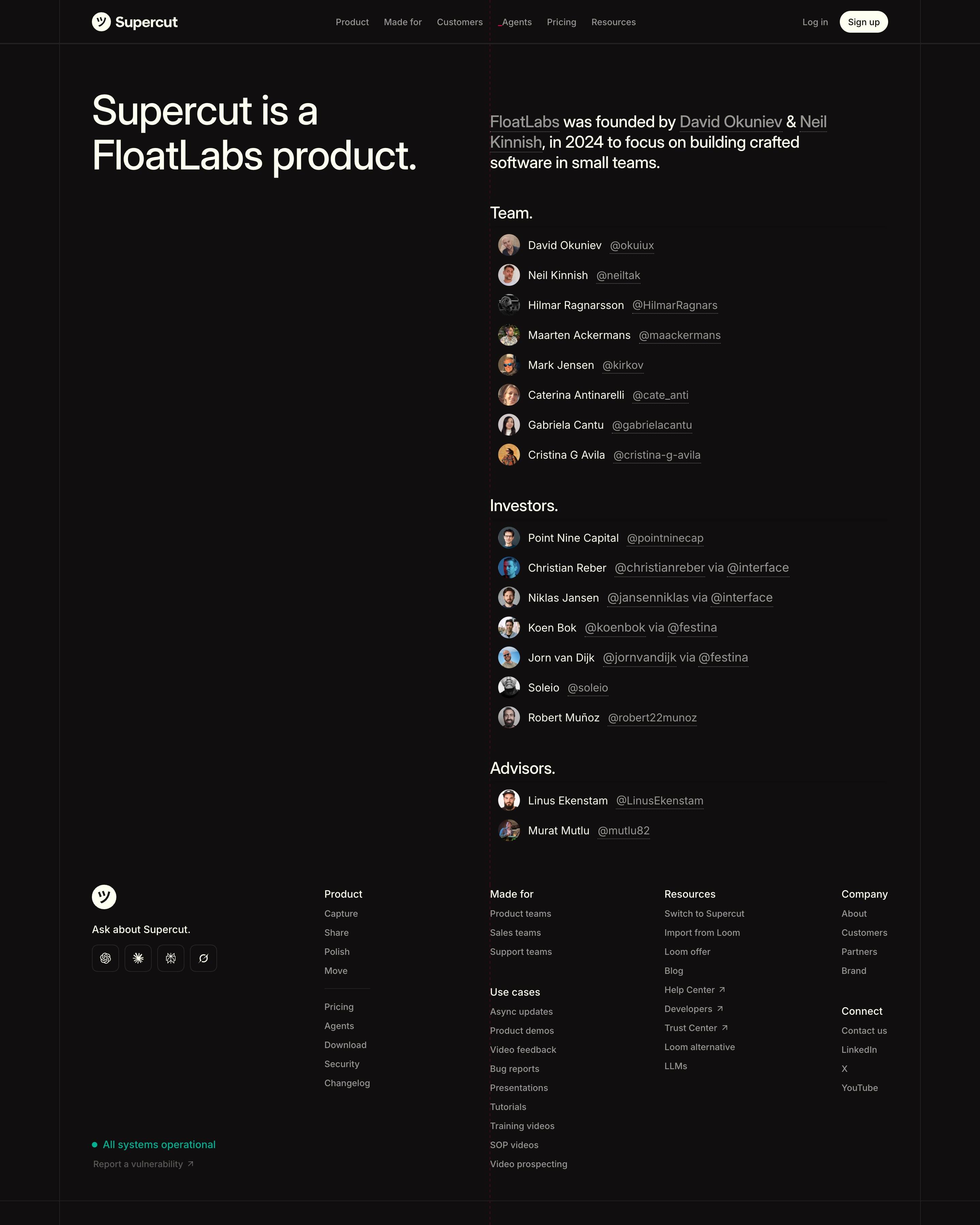
No hero image, just "Supercut is a FloatLabs product." on the left and a founding line on the right with the founders' names in grey. Team, Investors and Advisors follow as plain lists of small avatars, names and underlined X handles, with angels shown "via" their funds. Worth copying: an about page that fits on one screen and links every person.
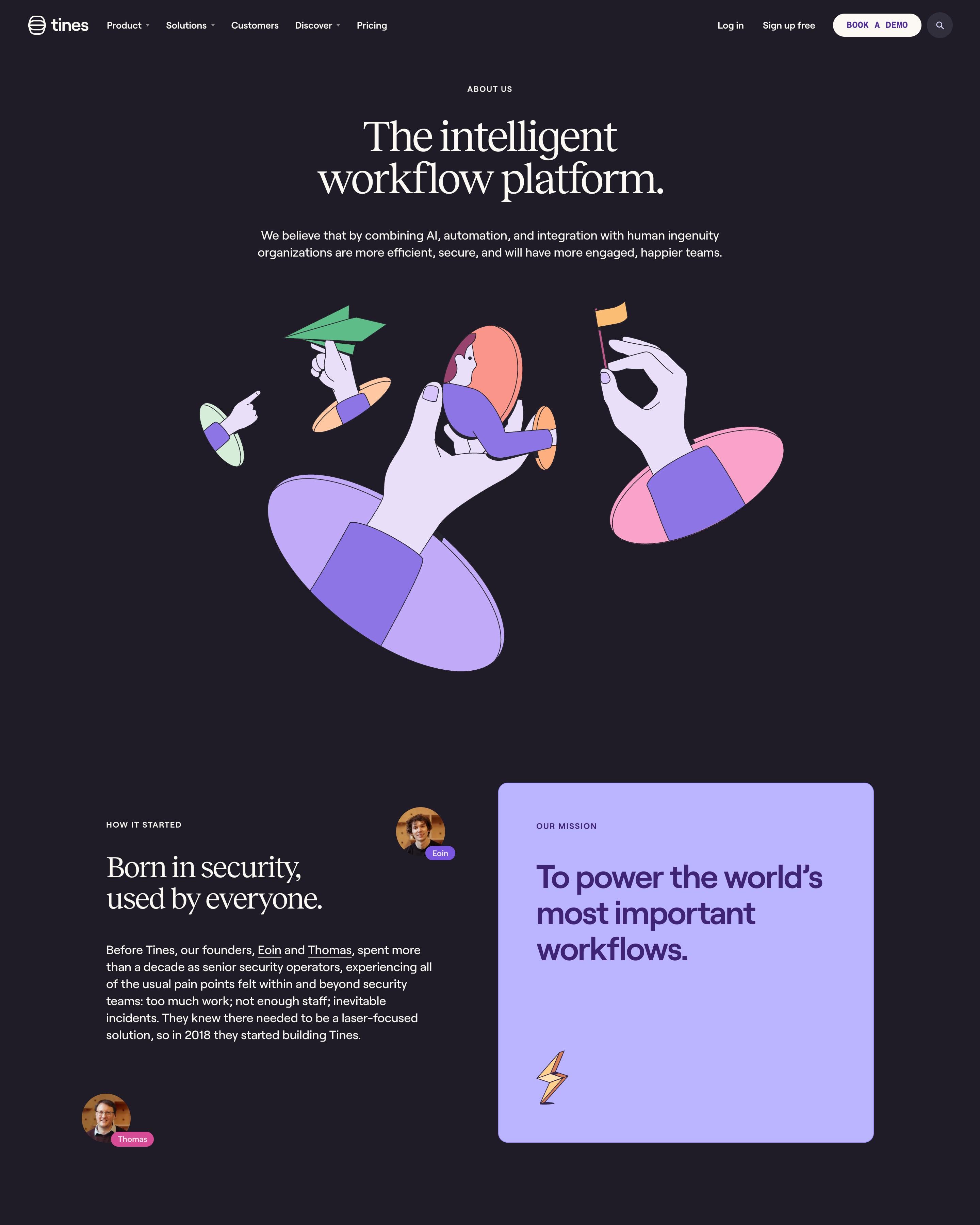
A serif headline sits on charcoal above a flat drawing of hands reaching out of portals with a paper plane, a person and a flag. Eight leaders are photographed against the same warm wooden backdrop, a detail worth copying, and the values sit on three pastel cards in mint, pink and peach.
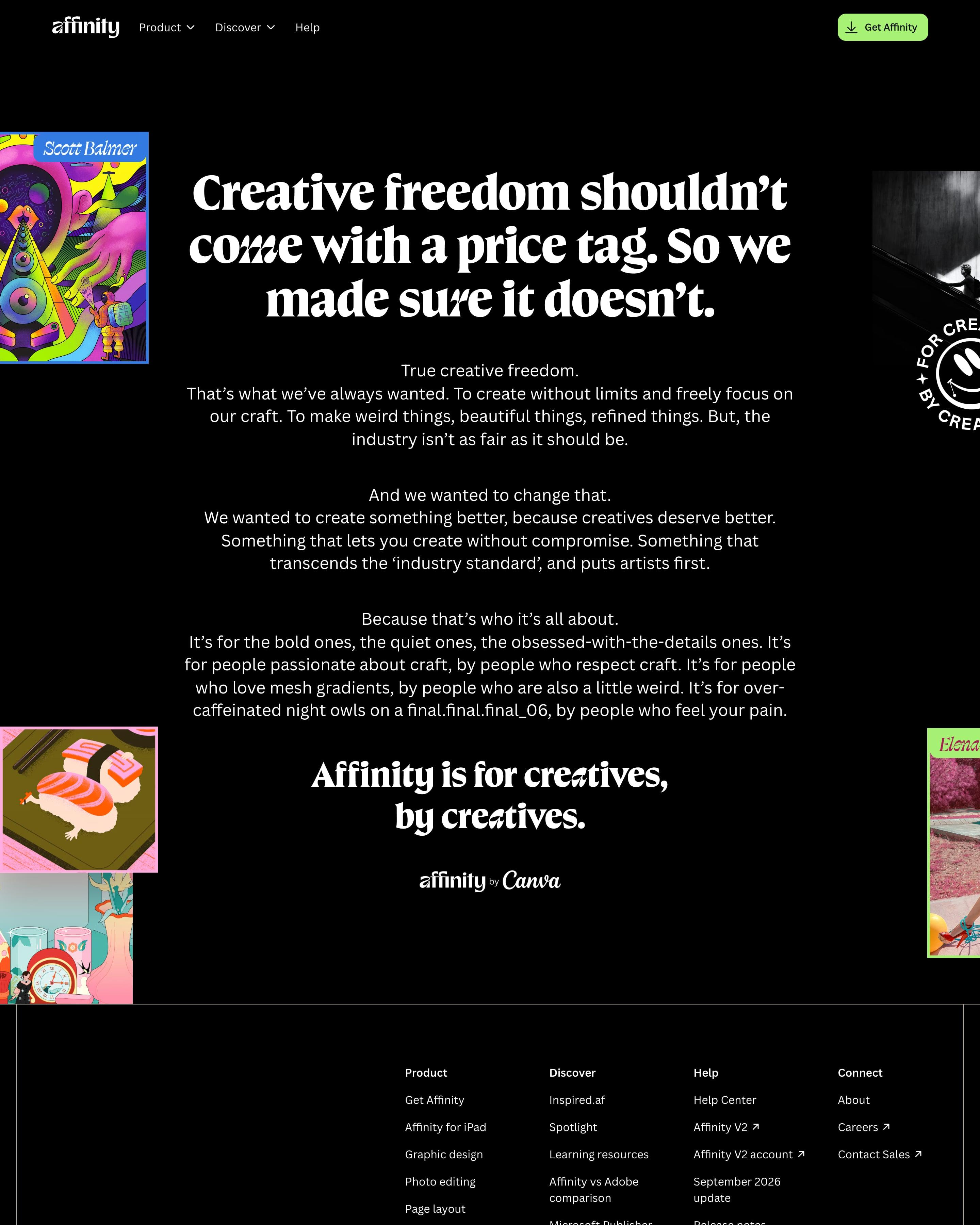
A single manifesto on black: a three-line serif headline, "Creative freedom shouldn't come with a price tag", then short centred paragraphs, each led by one line set apart. Commissioned illustrations, from a sushi plate to a psychedelic portrait, peek in from both edges, cropped by the viewport. Worth copying: closing on "for creatives, by creatives" and letting the giant footer wordmark end the page.
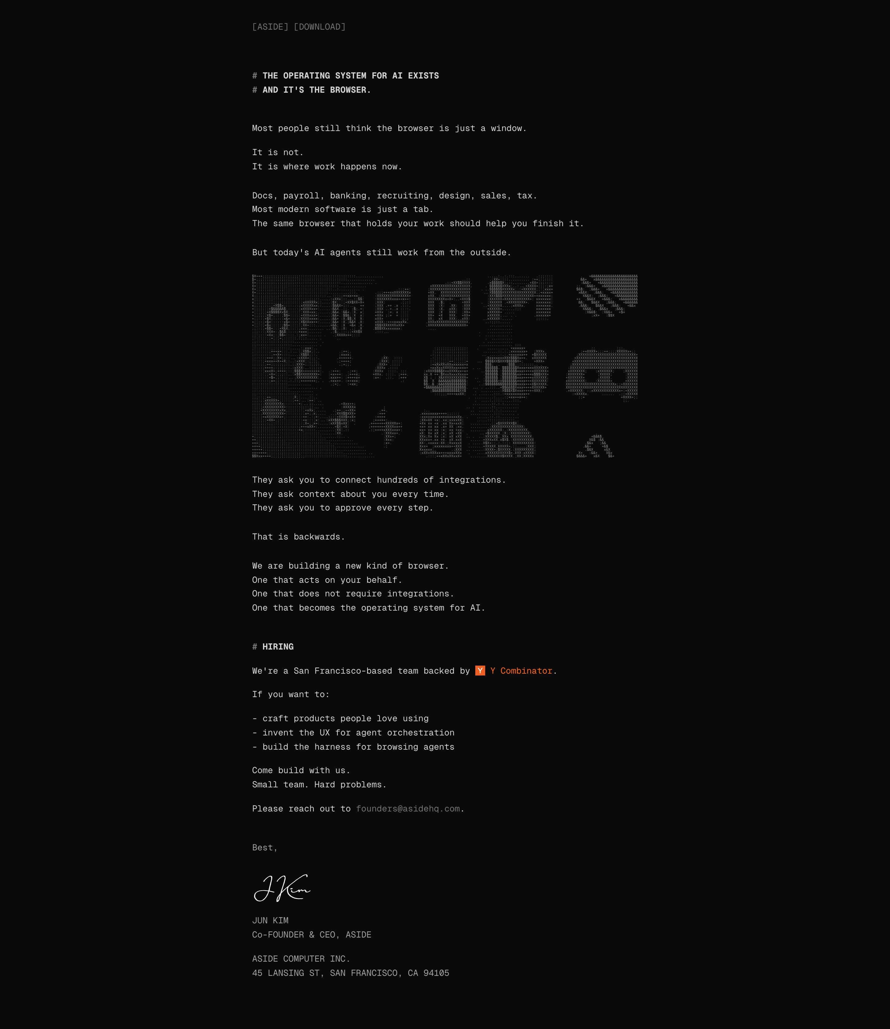
The manifesto drops the site design entirely: white monospace text on black, markdown-style "#" headings and short lines like "It is not. It is where work happens now." A grid of app logos rendered in ASCII characters breaks up the text. It closes with a hiring note, an orange Y Combinator mention and the CEO's handwritten signature, so it reads like a letter.
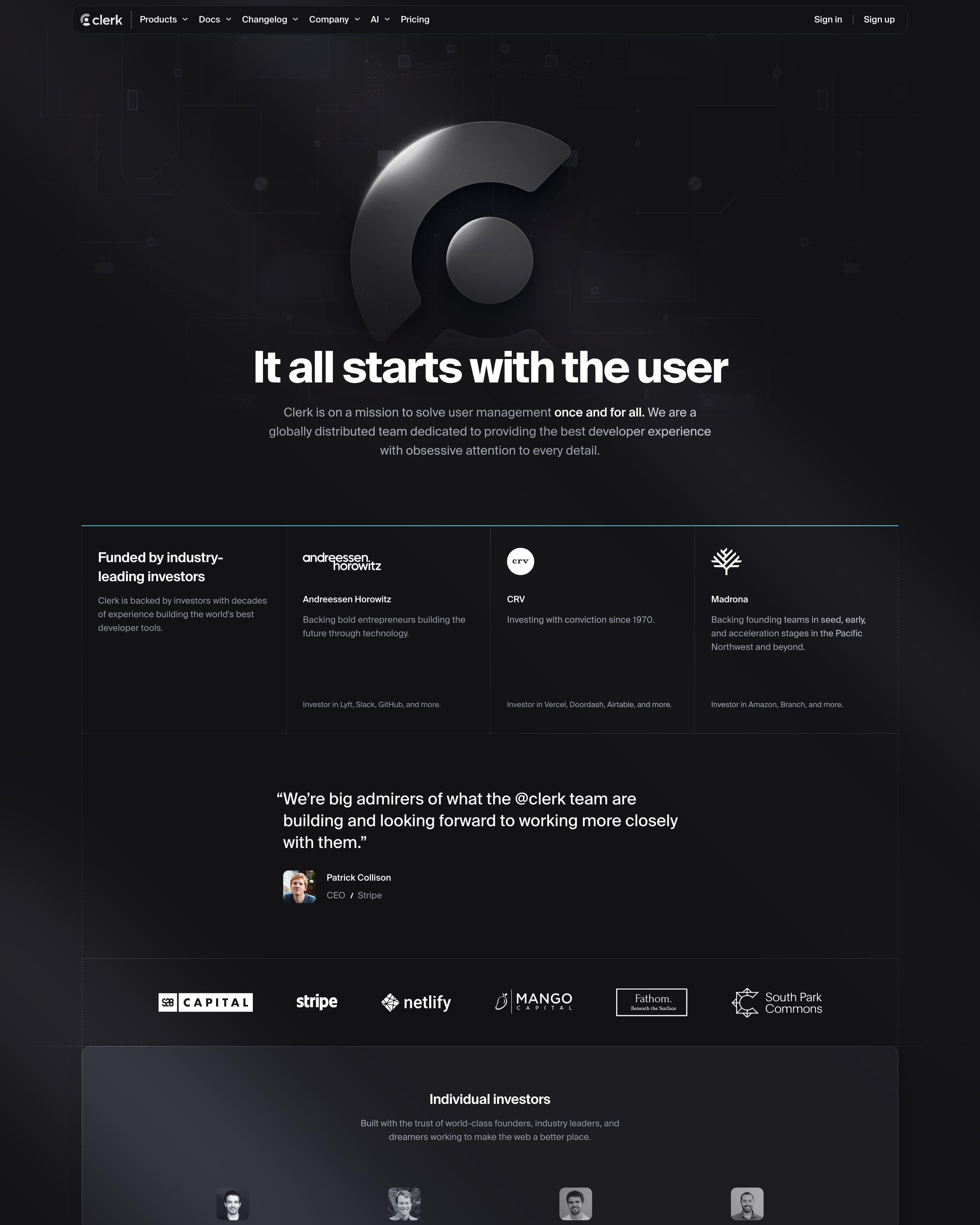
A large chrome Clerk mark floats over a faint circuit-board pattern above "It all starts with the user". Investors get a bordered grid of a16z, CRV and Madrona cards, a Patrick Collison quote, then a panel of angel investors with greyscale avatars and their companies. The page closes on two side-by-side cards, one for starting free and one for careers.
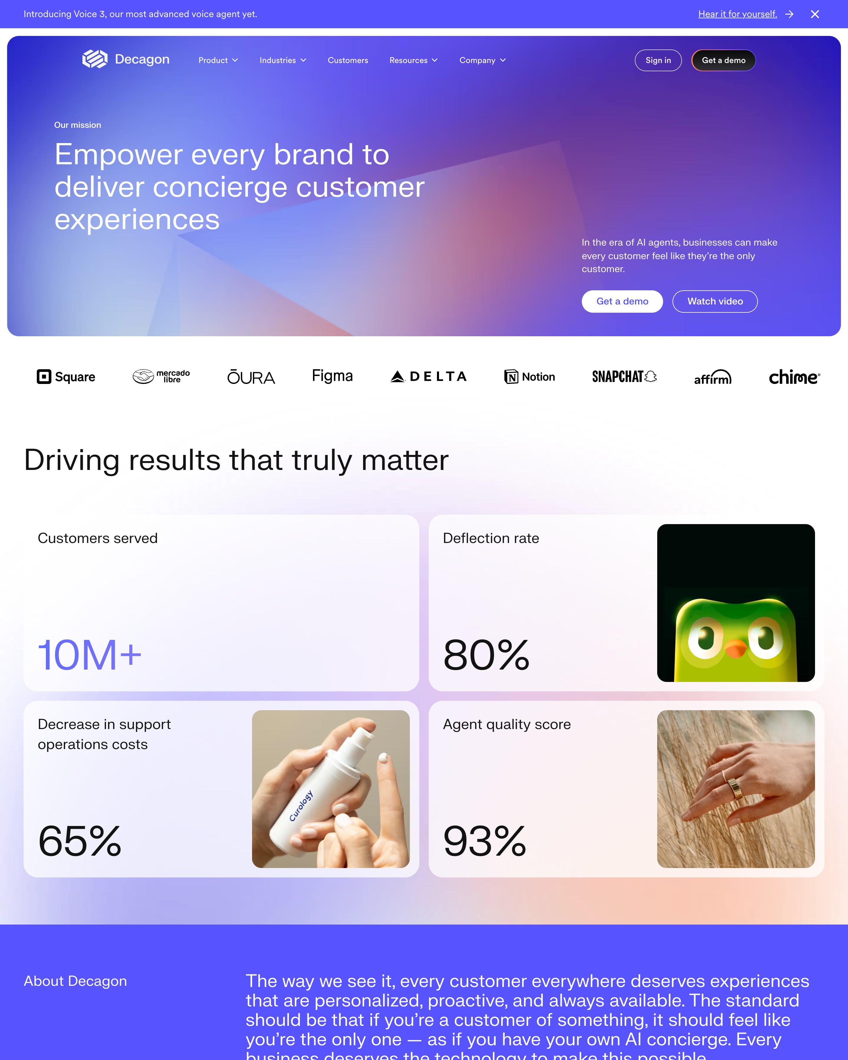
A violet gradient hero with soft light shards states the mission. Results follow as a two-by-two grid of stat cards, three of which set a big figure like 80% beside a photo; borrow that pairing. A solid violet block carries the story before a founders photo and an investor logo panel.
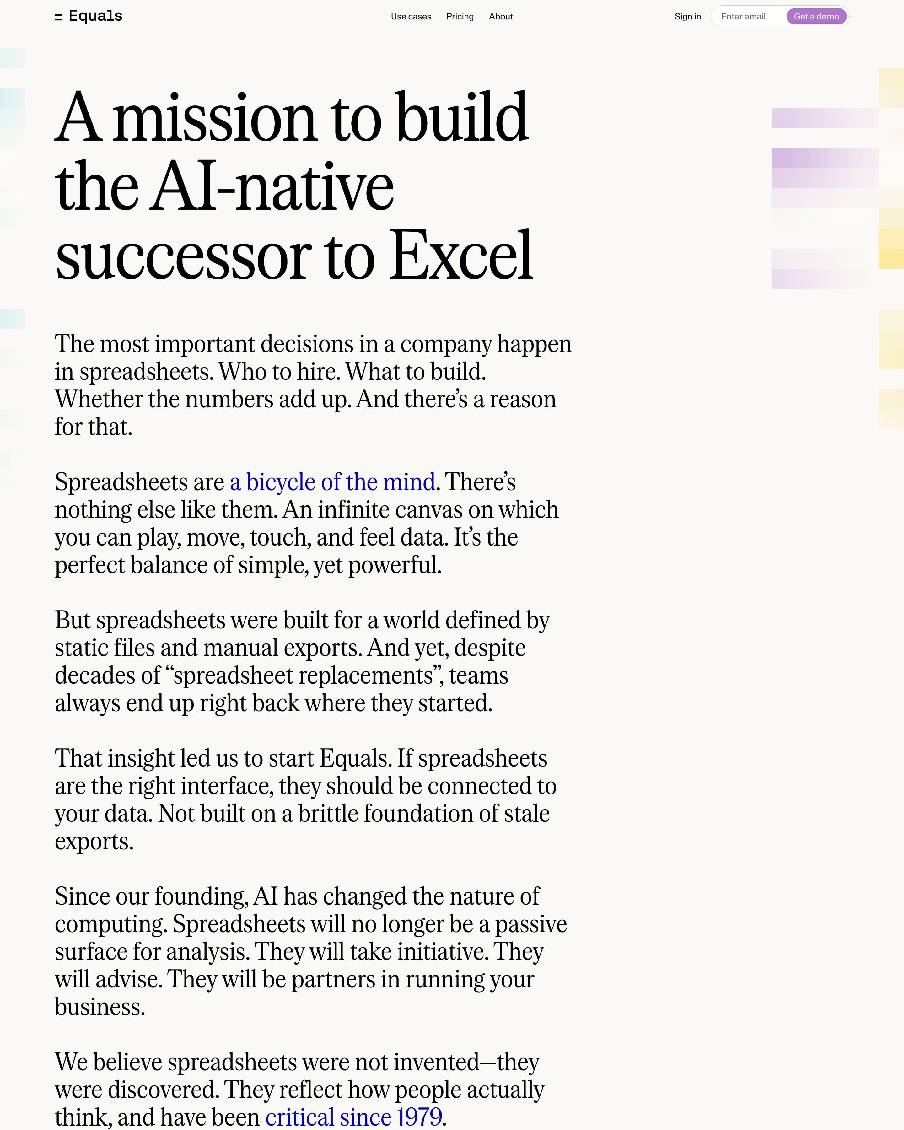
Most of the page is a manifesto in large serif type, with two blue inline links and a sign-off from "Team Equals". A three-column team list follows, each person a small headshot, a name and a role, then three investor logos. Setting the whole story as one large-type letter is worth borrowing.
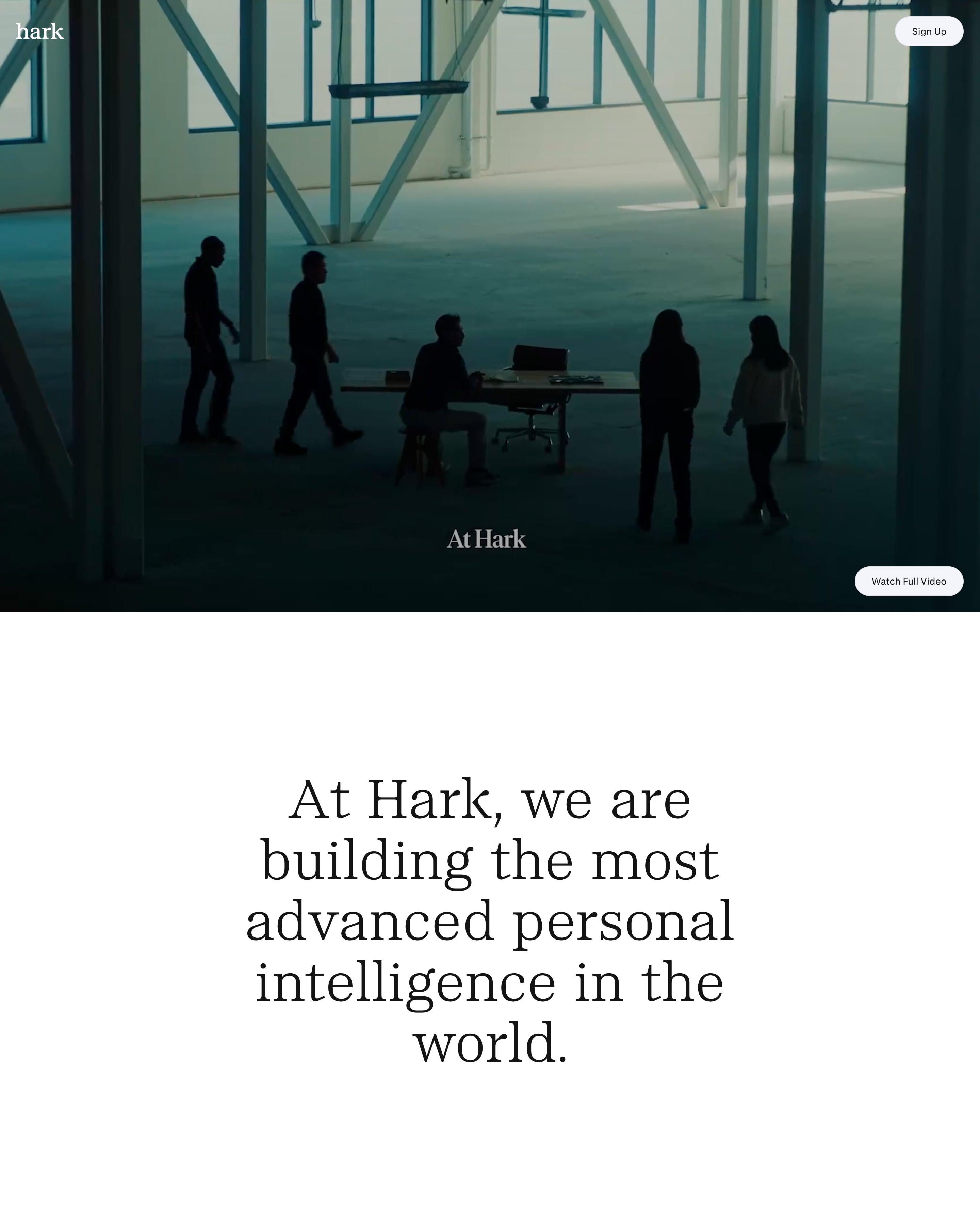
A full-screen video opens the page: silhouetted people in an empty warehouse, with a "Watch Full Video" button in the corner. One large centred statement follows, then the manifesto as a narrow centred column of short paragraphs and the sign-up form. Leading with film instead of a headline is worth trying.
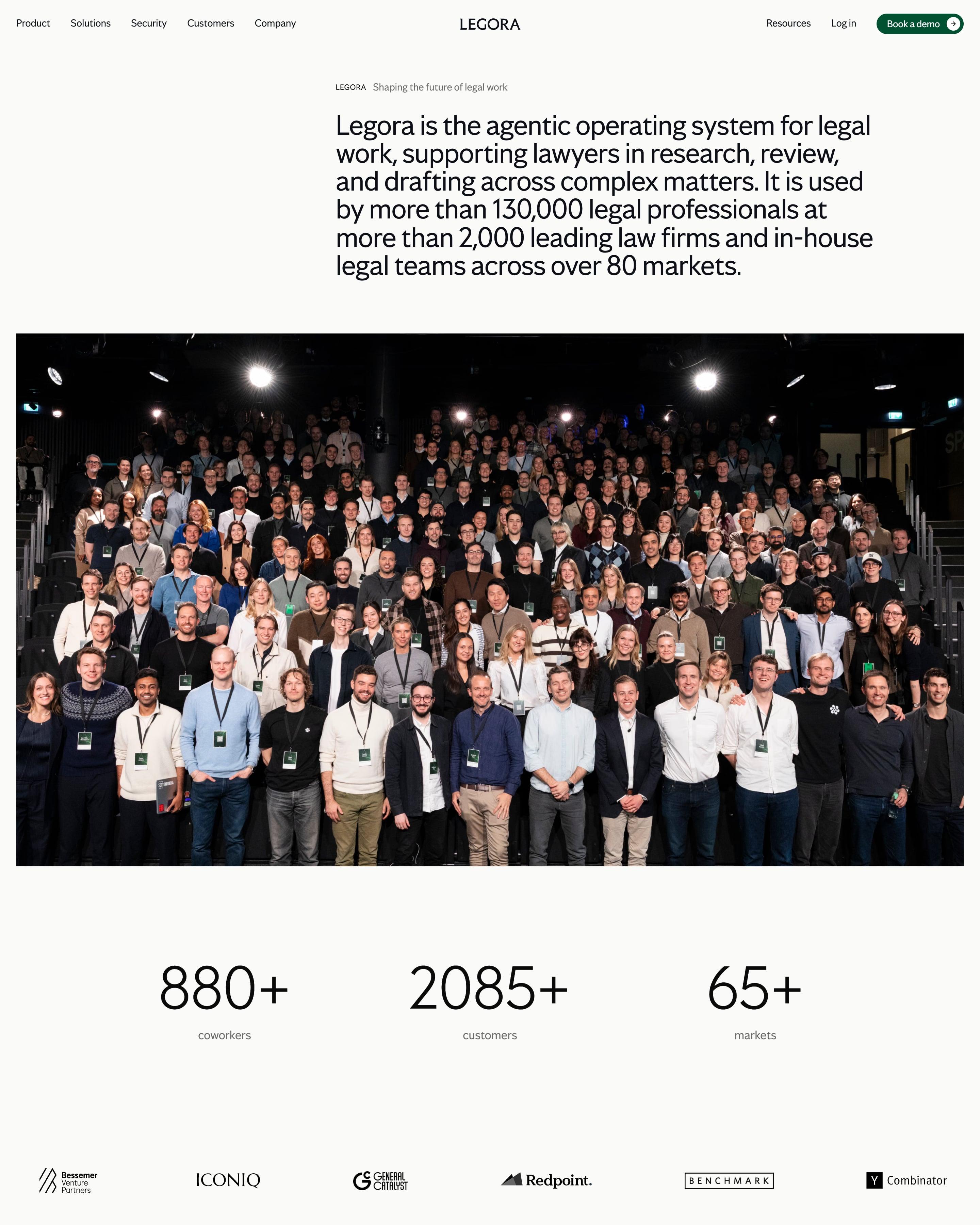
The headline is a whole paragraph of plain facts, followed by a full-width group photo and three big counts (880+ coworkers, 2085+ customers, 65+ markets). Values sit in an offset column between two photos, and a green hiring card with a line drawing closes the page. The paragraph-length headline is worth copying.
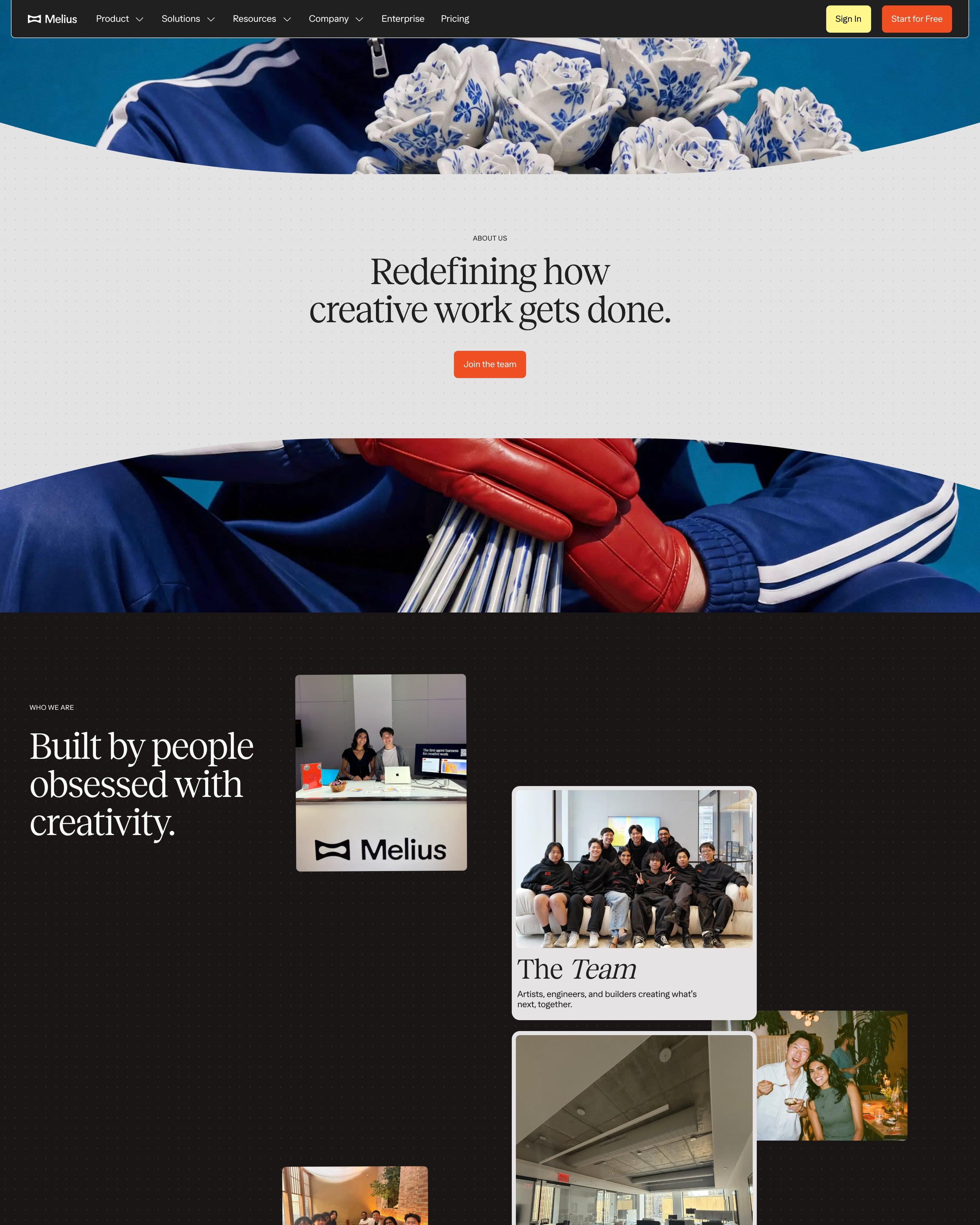
A cutout grey band carrying the serif "Redefining how creative work gets done." splits a photo of blue tracksuits, ceramic roses and a red leather glove. Team, office and ski-trip photos follow as scattered polaroid-style cards with italic serif labels like "The Office", then a halftone panel with a hand-drawn squiggle. An orange-framed "Built in the open." carousel, open roles and a pale-yellow wall of investor cards close it.
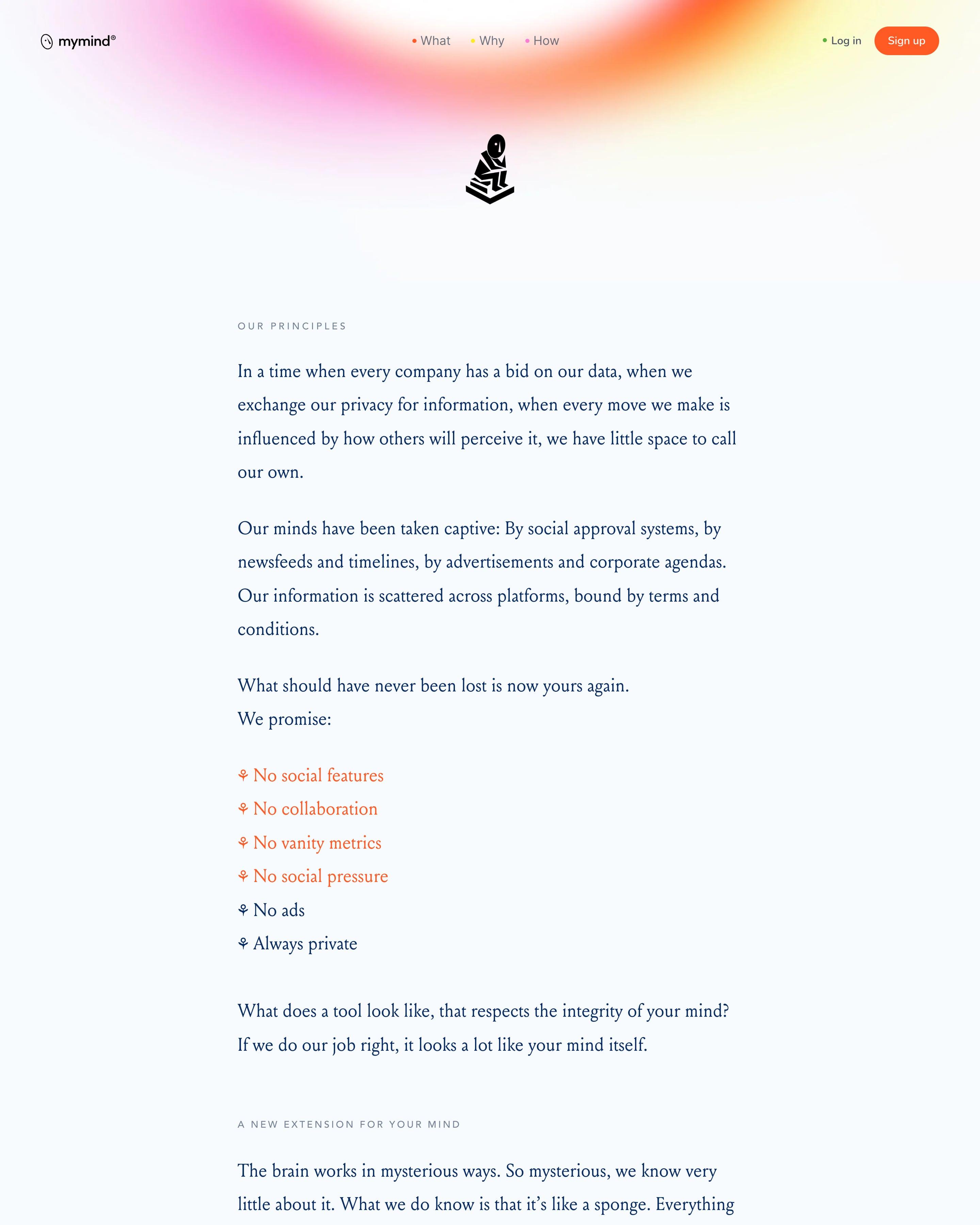
A manifesto in one narrow serif column sits under a small statue icon and a soft gradient glow, with no product shots. Its promises read as a run of "No" lines, from social features to ads. An about page built around what the product leaves out is an idea worth stealing.
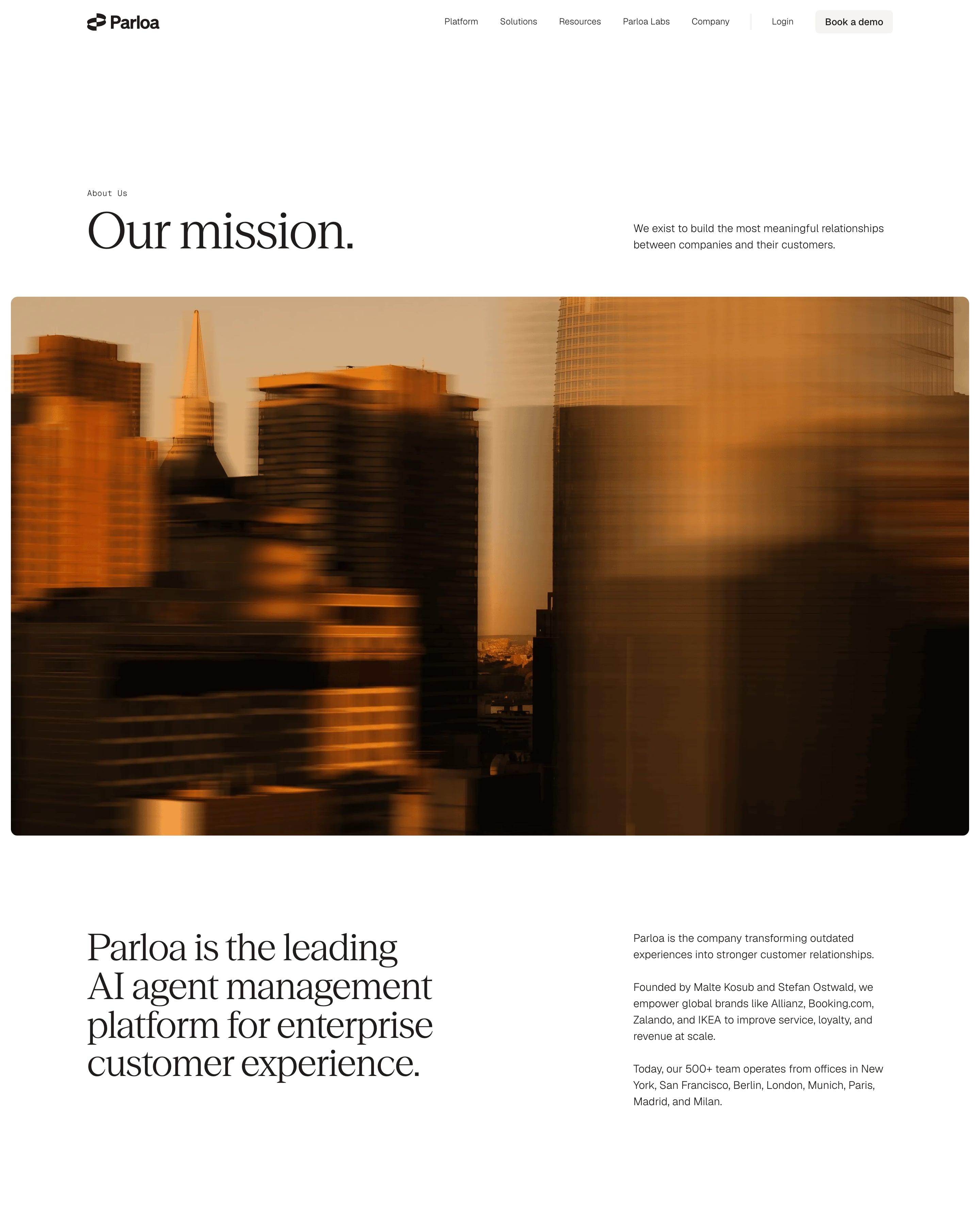
"Our mission." opens over a wide motion-blurred photo of skyscrapers in amber light. Six core values sit in beige cards, each with a thin geometric line icon. The orange gradient band returns for the numbers (500+, $560M+, 127+, 2.1 billion+), and the leadership portraits carry a faint rainbow light leak at the edges, a small touch that keeps corporate headshots on brand.
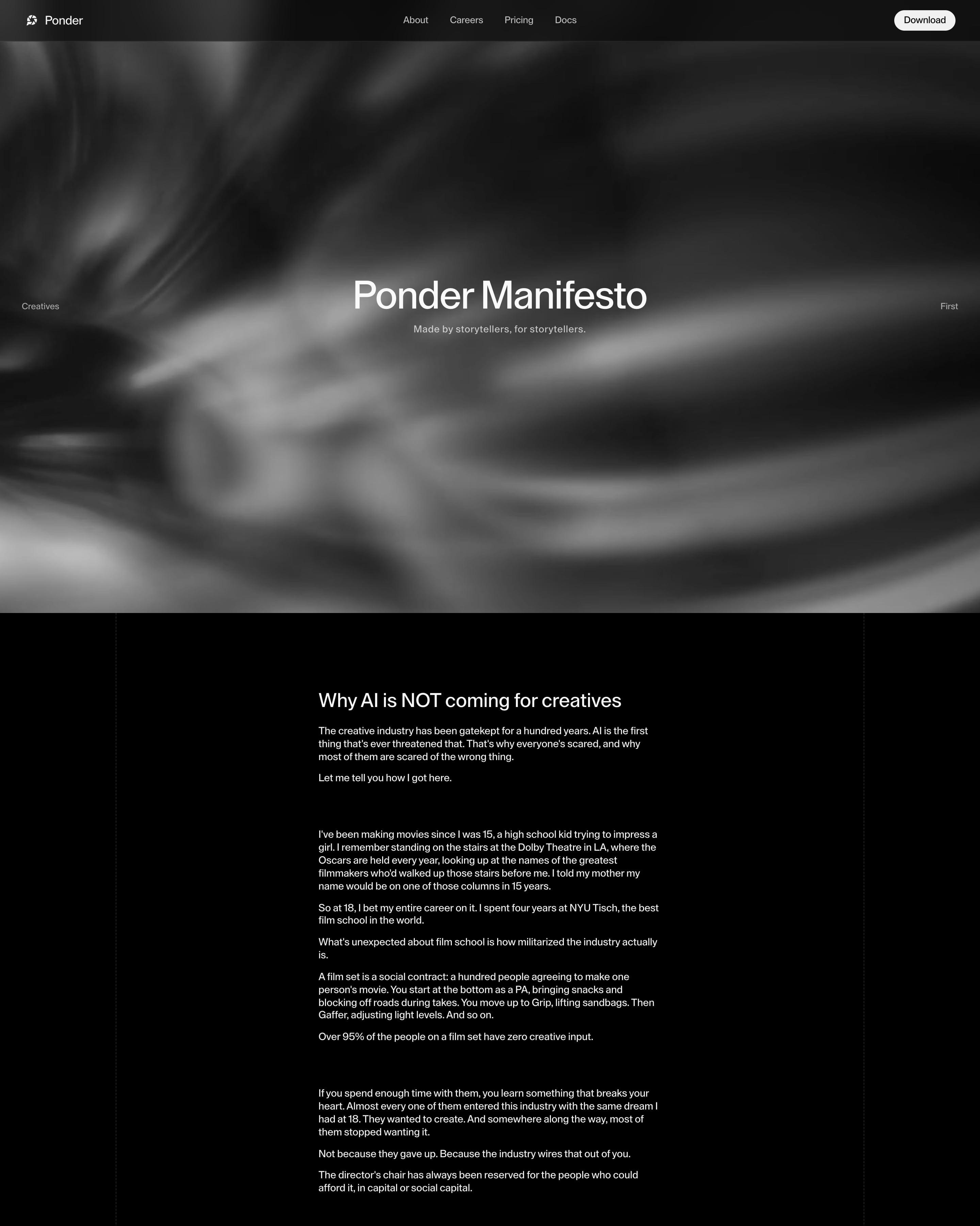
A blurred black-and-white swirl fills the hero behind "Ponder Manifesto" and "Made by storytellers, for storytellers." The rest is a single narrow column of white text on black between faint dashed rails, headed "Why AI is NOT coming for creatives" and told as the CEO's story, from film school to the "95%" who never get a creative say. It closes with a sign-off from Timothy, Co-founder & CEO.
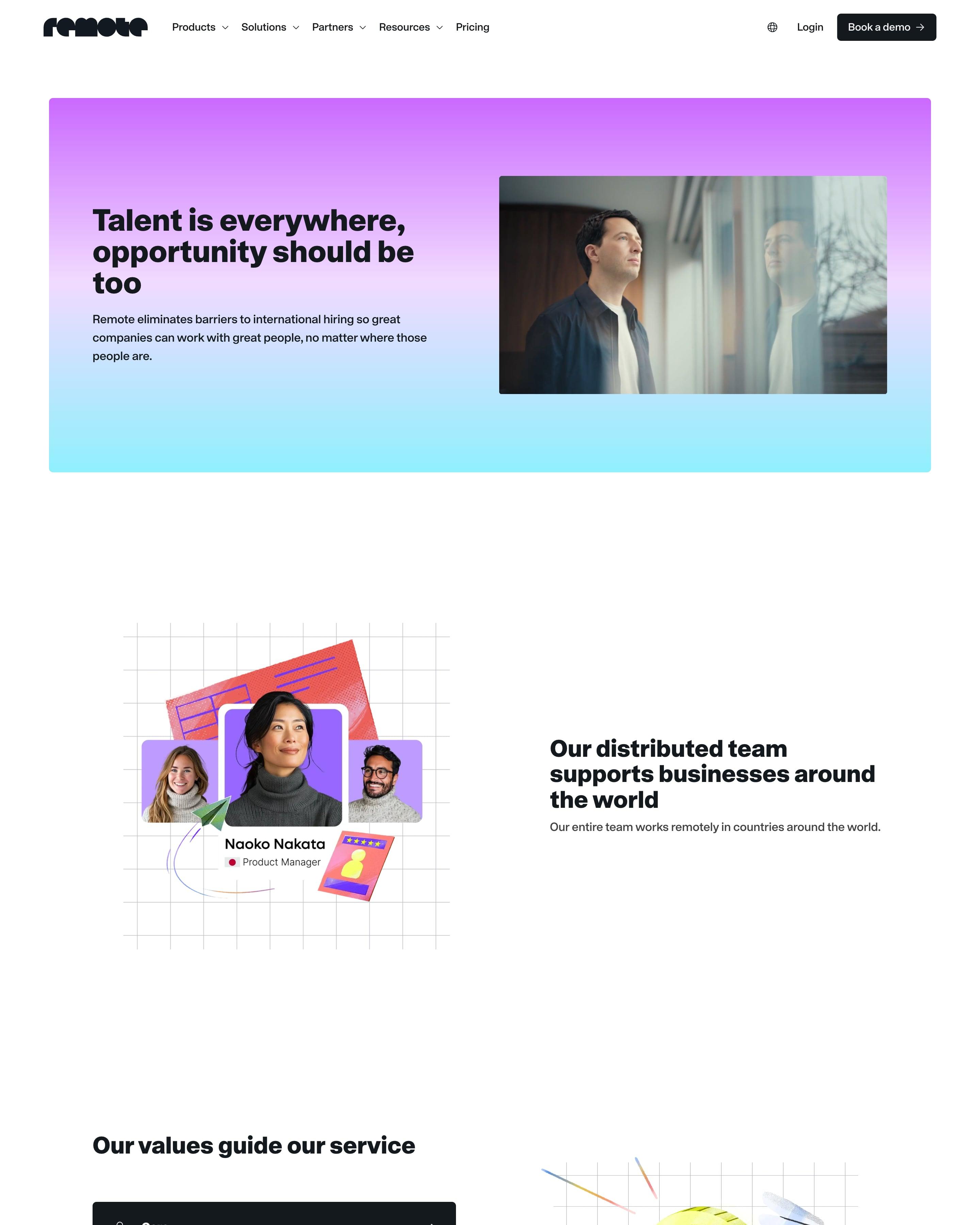
A purple-to-aqua hero card pairs "Talent is everywhere, opportunity should be too" with a photo of a man at a window. Collage illustrations on grid paper show a team card and a coin held by sketched hands. The leadership grid cuts black-and-white portraits into purple arch shapes on lilac, and job links sit under small lilac icons by department.
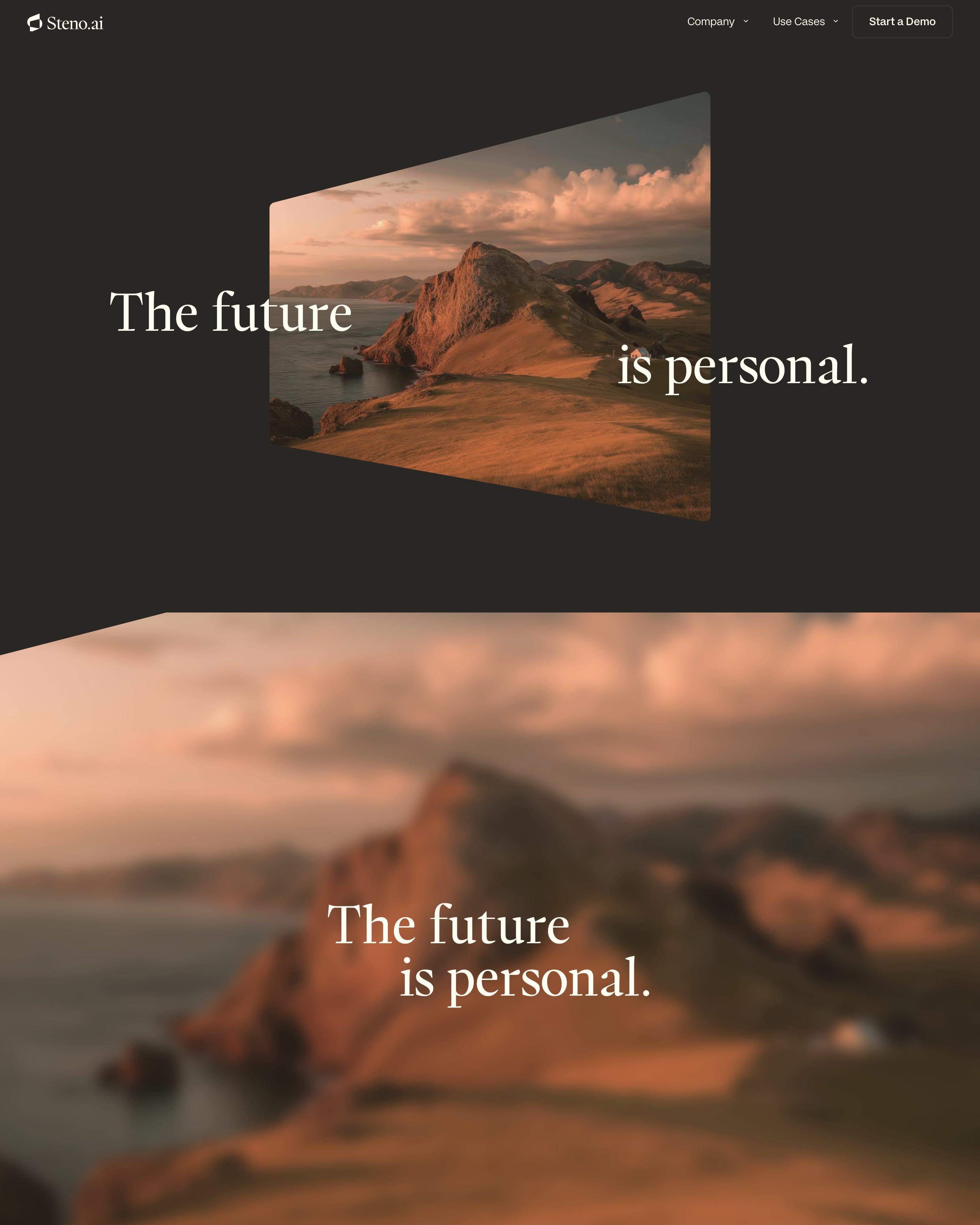
The founder's letter runs in large serif type over a blurred coastal photo, signed by hand by Arman Assadi. Three big serif numbers follow, 3.5M messages, 5.8M voice minutes and 47 all-nighters, the last one a small joke worth stealing. Seven values sit in a ruled list with grey numerals, and the press section pairs outlet logos like Entrepreneur and ElevenLabs with headlines.
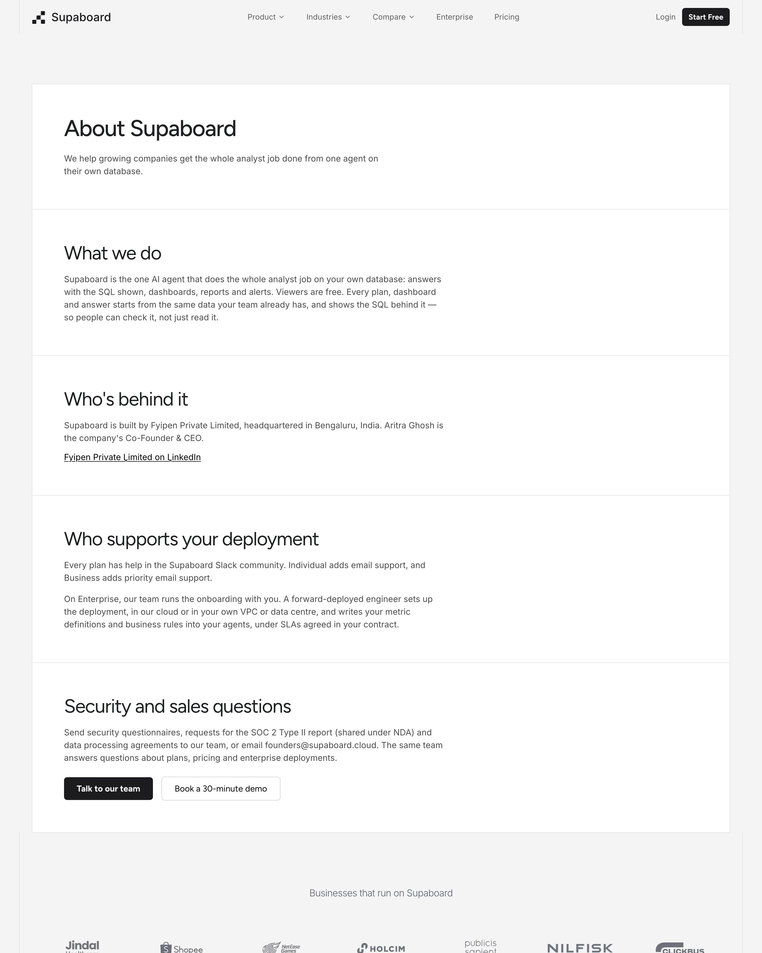
Five white panels stacked on grey read like a fact sheet: what the company does, who is behind it (with the legal entity and city), who supports a deployment and who answers security questions. A customer logo grid and the pixel-lettered 'ASK NOW' band close it; the plain, factual tone is worth borrowing.
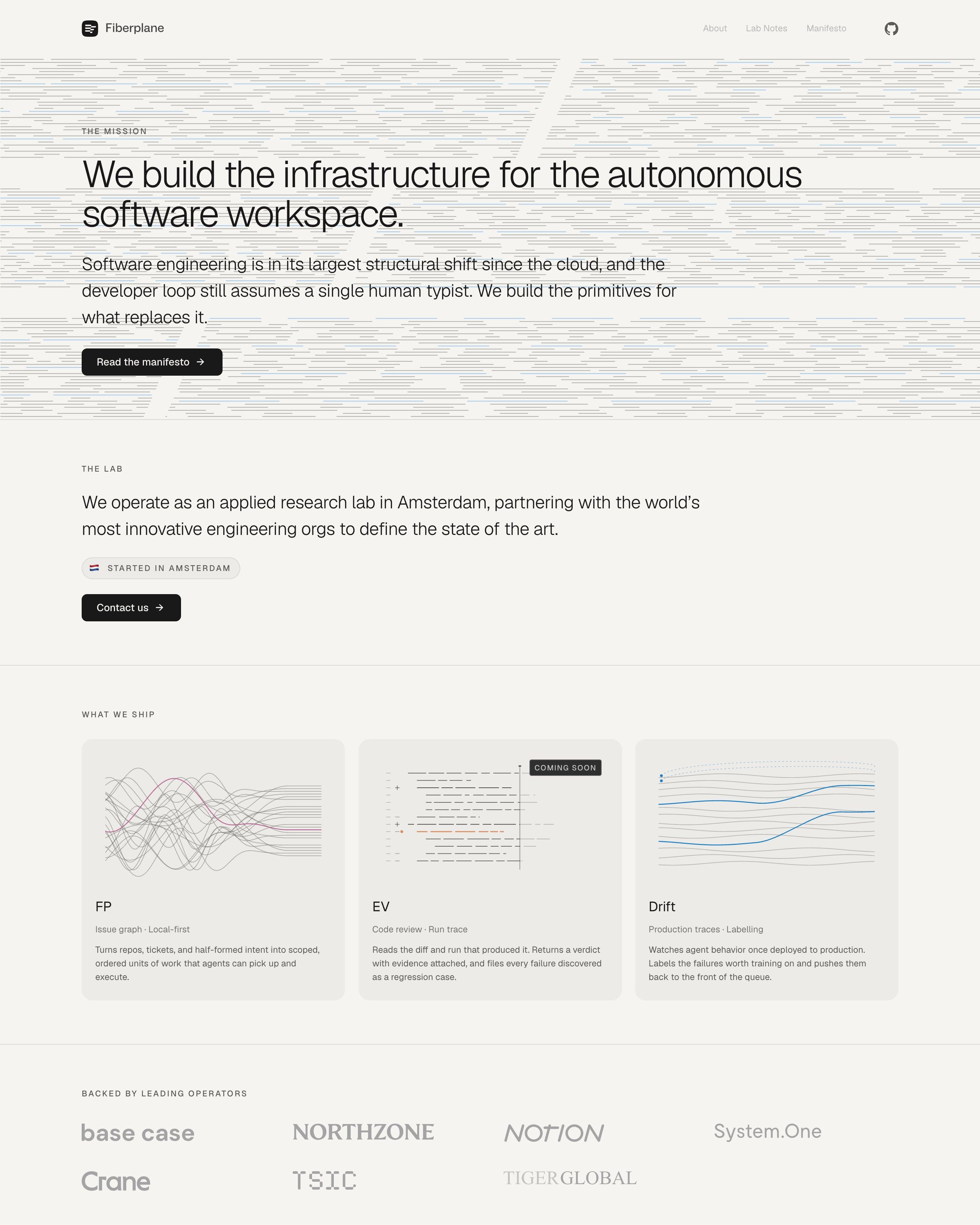
Dashed horizontal lines, like rows of code, fill the background behind the mission statement. A "Started in Amsterdam" pill with a small flag follows, then three product cards, FP, EV and Drift, each with a fine-line diagram and one tagged "Coming soon". Drawing products as simple line plots is worth borrowing.
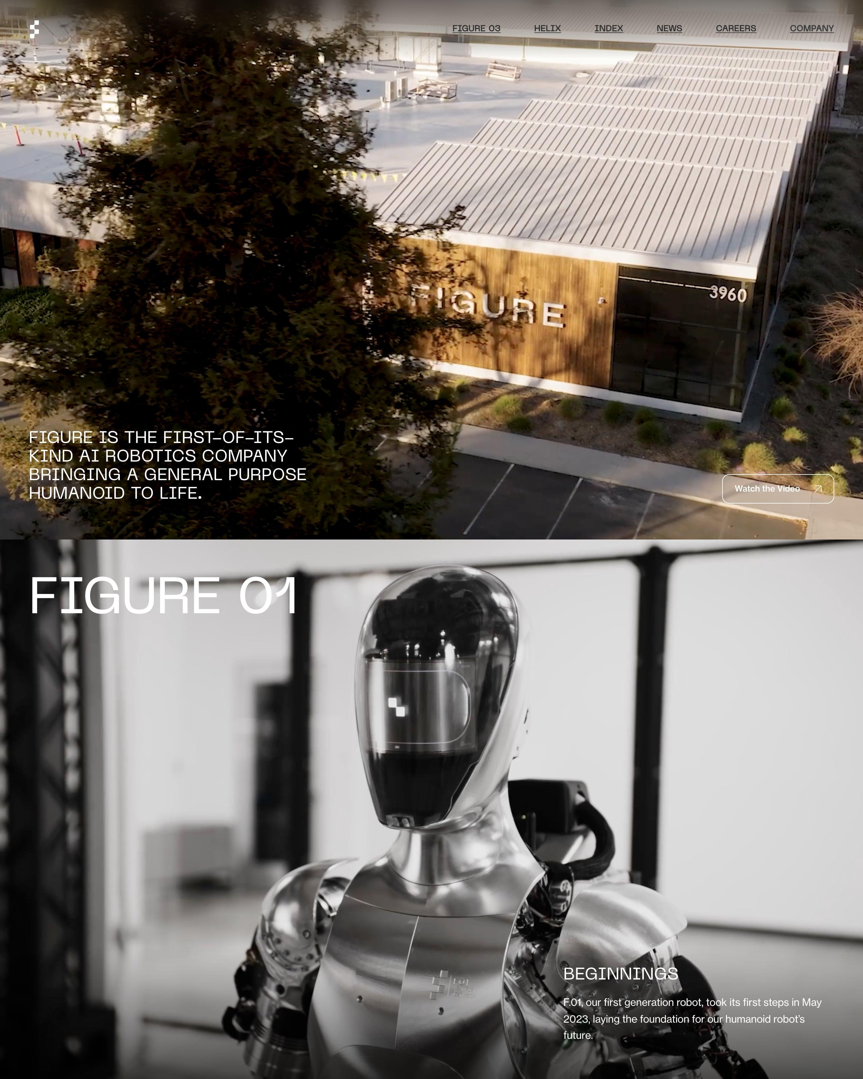
An aerial photo of a building with FIGURE on its wood-clad wall opens the page. Three full-screen panels then show one robot each, FIGURE 01 to 03, with captions from Beginnings to Figure at home. Worth copying: five values set beside giant numerals, 01 to 05.
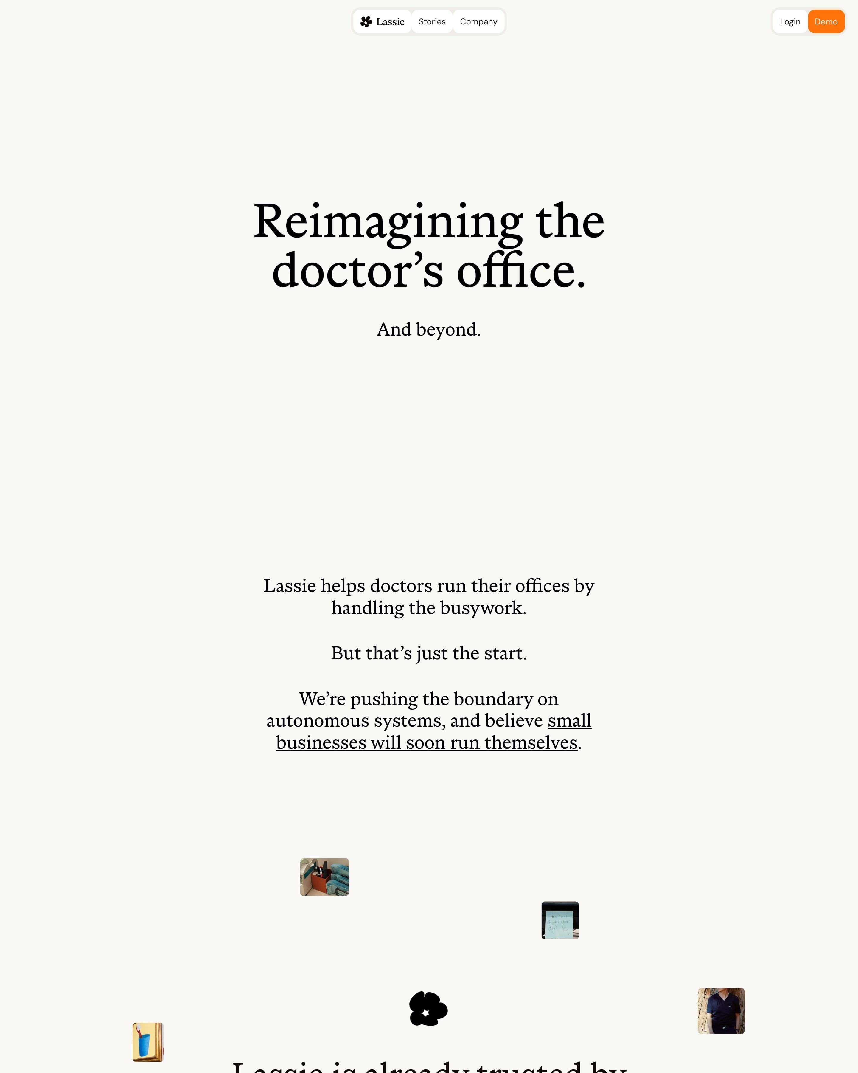
Serif type on cream carries most of the page, opening with "Reimagining the doctor’s office." and a quiet "And beyond." Small photos of office staff drift in around the "700+ doctors’ offices" line as you scroll. Worth copying: open roles in a white list over a photo of an orange poppy field.
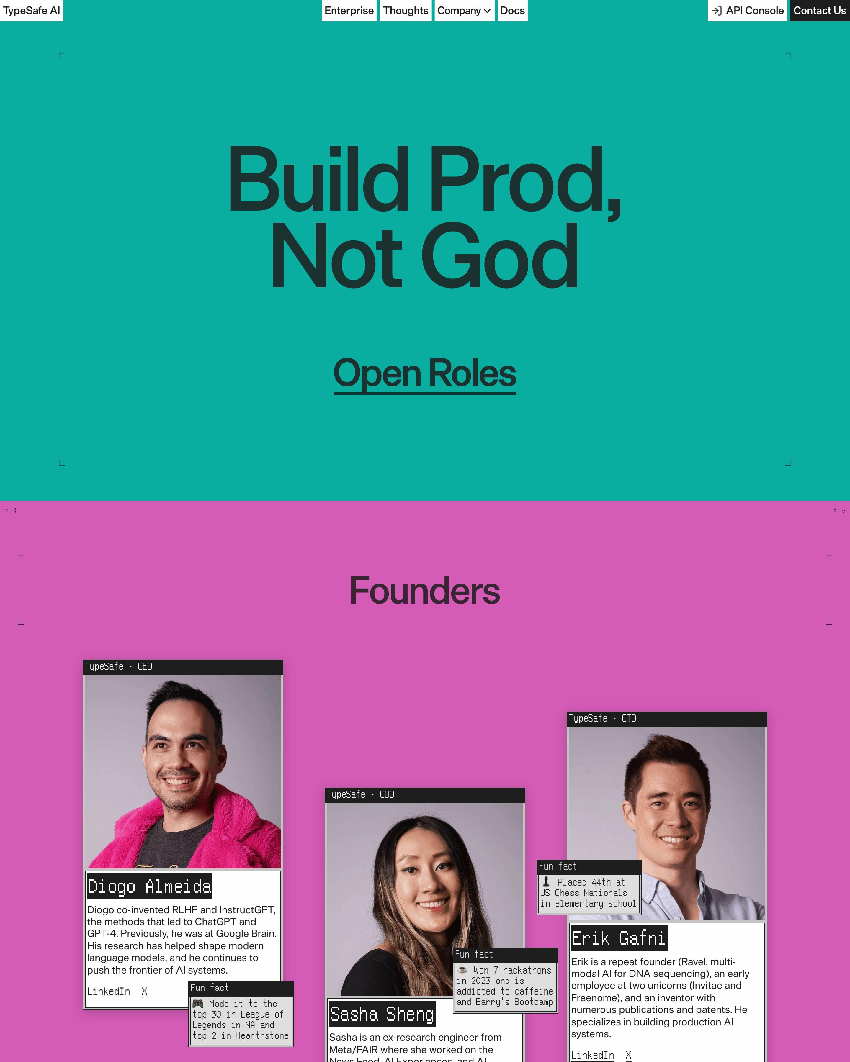
"Build Prod, Not God" fills a teal screen, then each section takes a new solid colour: magenta for Founders, pink for Culture, white for Values. Founder photos sit in staggered retro window frames, each with a small "Fun fact" window overlapping it, and values are signed off with meme stickers like a surprised Pikachu. Worth copying: the closing grid of office photos posterised into two-tone dithered prints.



























































By page type
Frequently asked questions
A story with a point: why the company exists, what it believes and who's behind it. The good ones show real people and real numbers instead of stock photos and adjectives.
Each page is opened at 1440 pixels wide, like a laptop, and scrolled from top to bottom so every image and section loads. Cookie banners, chat bubbles and popups are left out, and the whole page is saved as one image.