
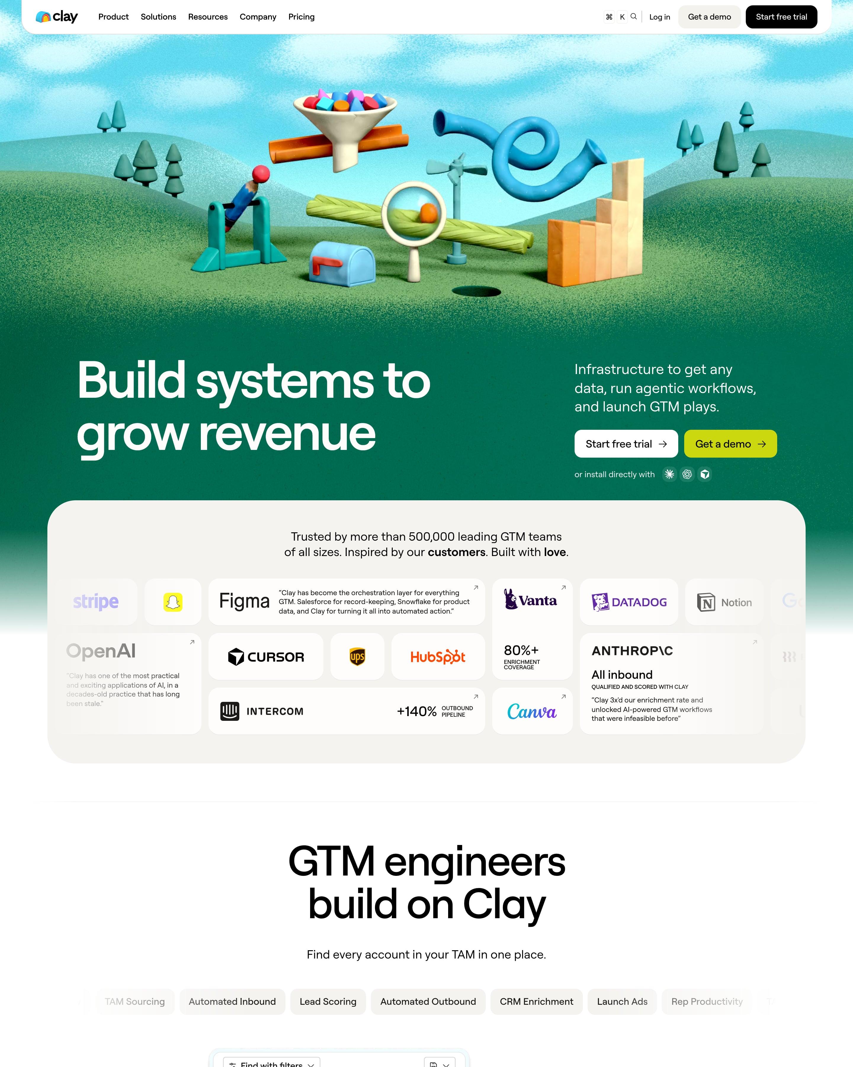

A 3D clay scene of a funnel, pipes and a magnifying glass on green hills opens the page, and the footer sits in a ball pit. Between them, proof is a bento of logos, quotes and stats. Each pastel feature card is colour-coded from label to button, a system worth copying.
10 examples from SaaS companies
Best Colorful Website Examples
Sites that use bold, contrasting colours with confidence: bright blocks, saturated illustrations and sections that each get their own colour. Here are 10 SaaS websites that do it well, each shot as the whole page, with what stands out on each.
- Dark or light
- 1 dark, 9 light
- of 10 pages
- Heading fonts
- Roobert
- Roobert 1, Plus Jakarta Sans 1, Inter 1, Apris 1
- Built with
- Next.js
- Next.js 3, Framer 3, Webflow 2, Hugo 1
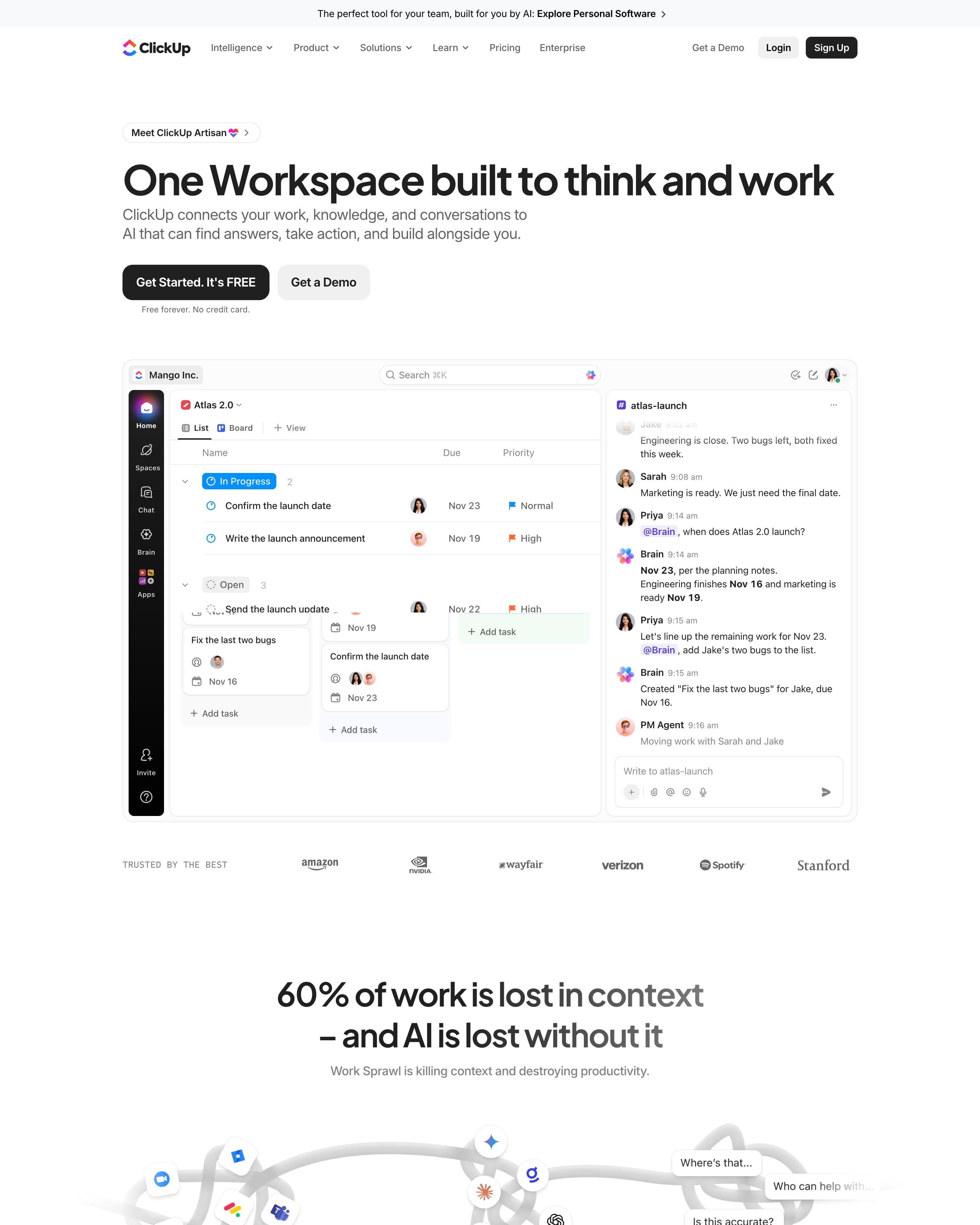
"One Workspace built to think and work" sits over a live app mock: a board beside a chat where Brain answers a teammate. The page then changes mood twice: a glossy orange-to-blue Super Agent mask over a grainy orange silhouette, then a black Brain² panel with monospaced labels. Worth copying: the icon grid of 100+ products, with Projects, Docs, Brain and Chat as large centre tiles and the edges fading out.
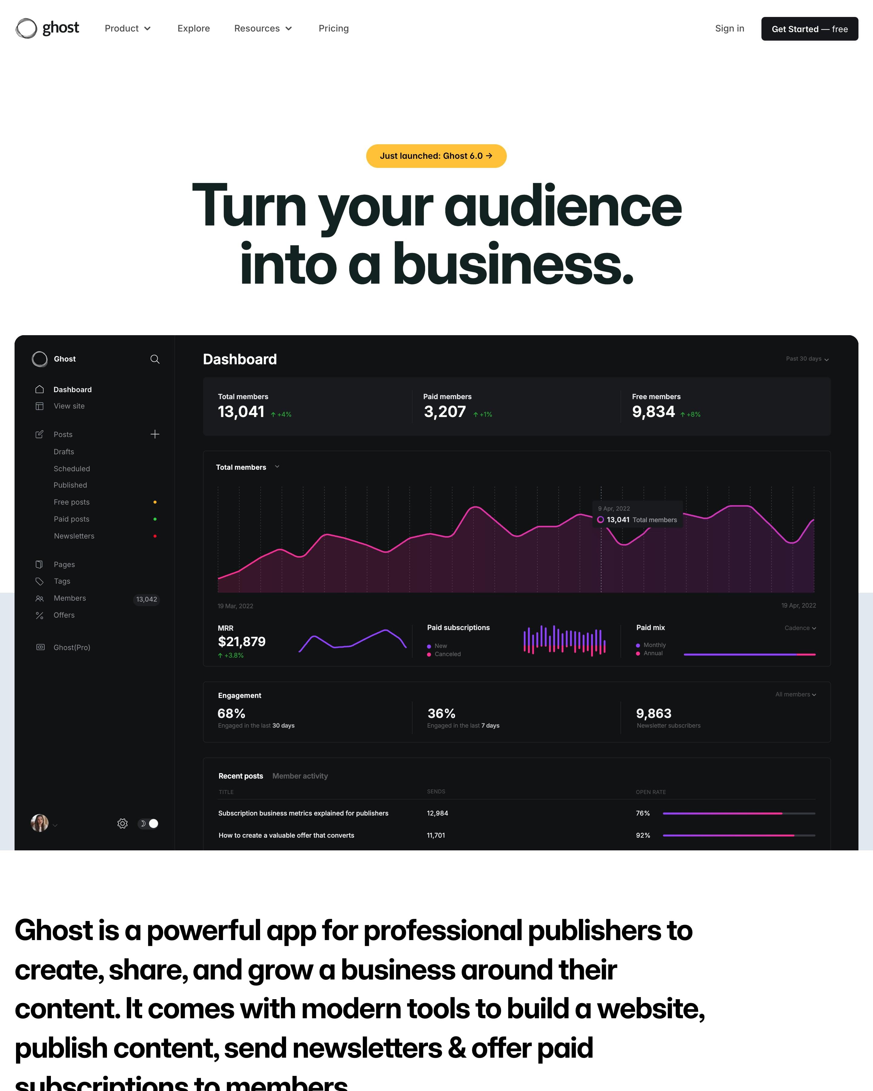
A dark dashboard screenshot sits right under the headline, and the page then switches between white and navy sections. Proof comes as a revenue figure, $100,000,000+, above rows of publication cards sorted into Publishers, Creators and Businesses. The closing call to action counts last week's new publications, a detail worth borrowing.
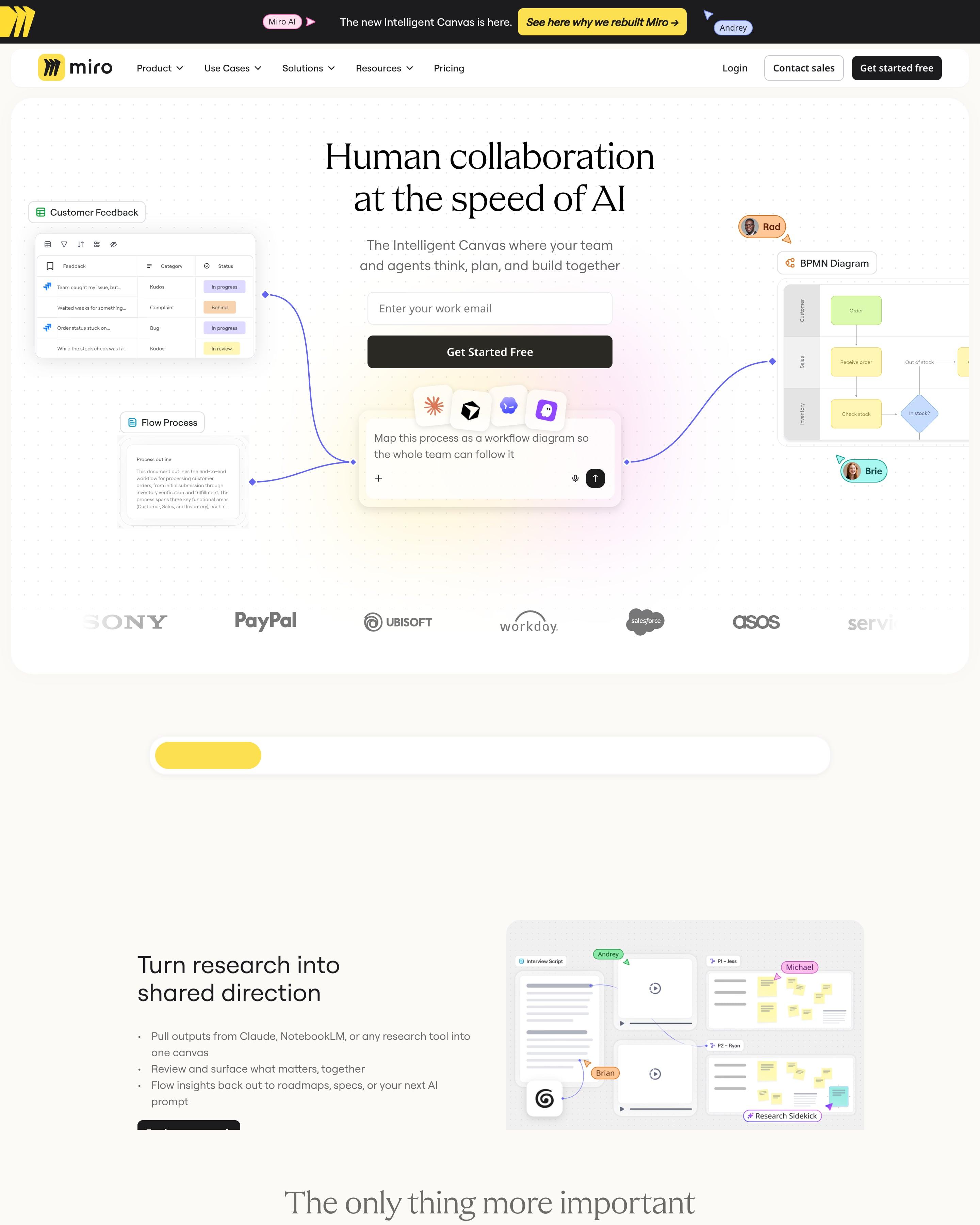
The prompt box sits at the centre of the hero, surrounded by live boards, flow diagrams and teammates' cursors, so the product is the backdrop. Three customer photos carry big outcomes (3.6x, 50%, 2x) printed over them. A dark band with a 'NEW Miro' video closes the page.
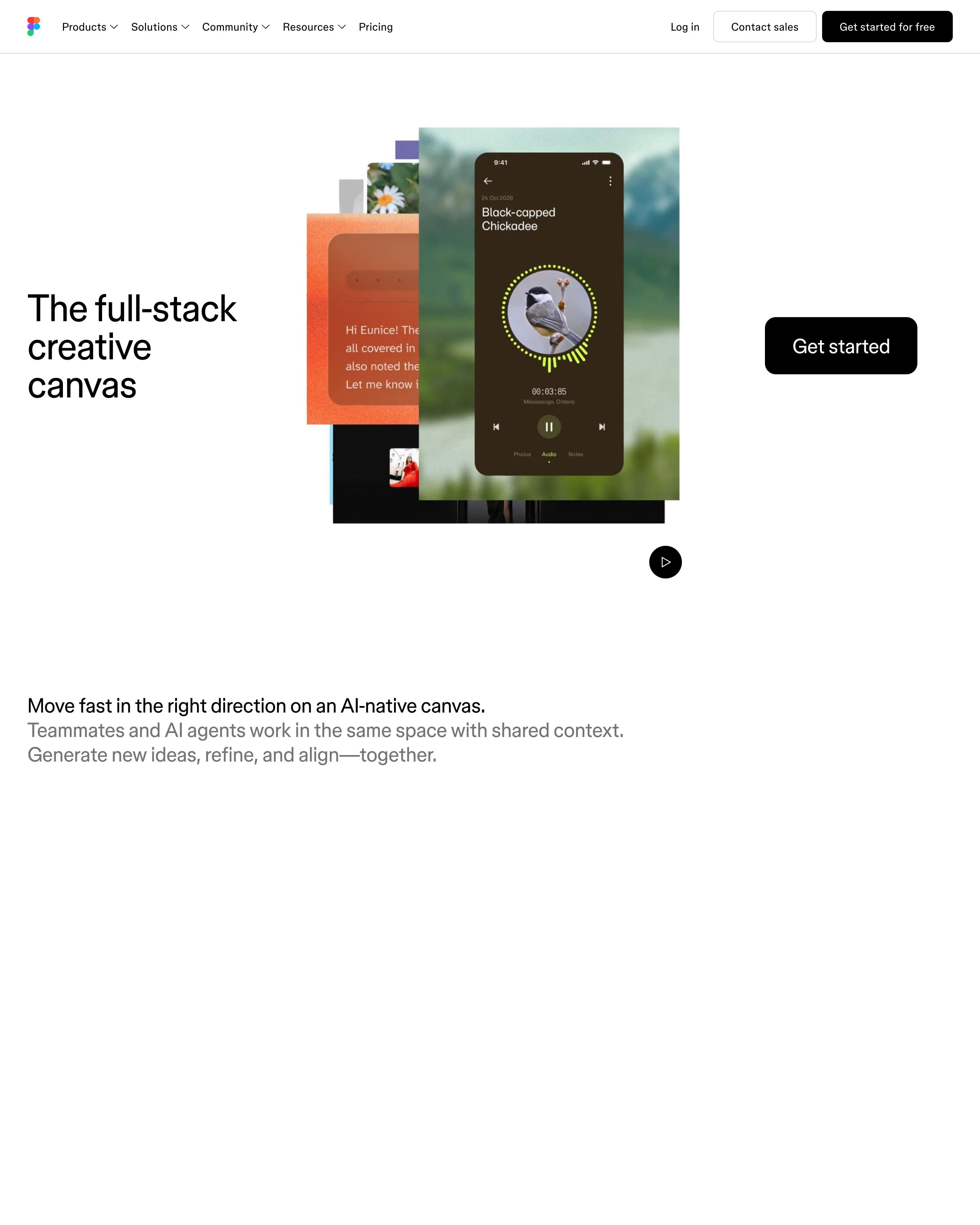
A phone mock-up and app screens stack beside a short headline, with one dark 'Get started' button. A grid of twelve tiles shows work made in Figma, each in a different visual style, and a customer quote sits beside a '95%' stat. The full-width black 'Get started' bar near the end is easy to borrow.
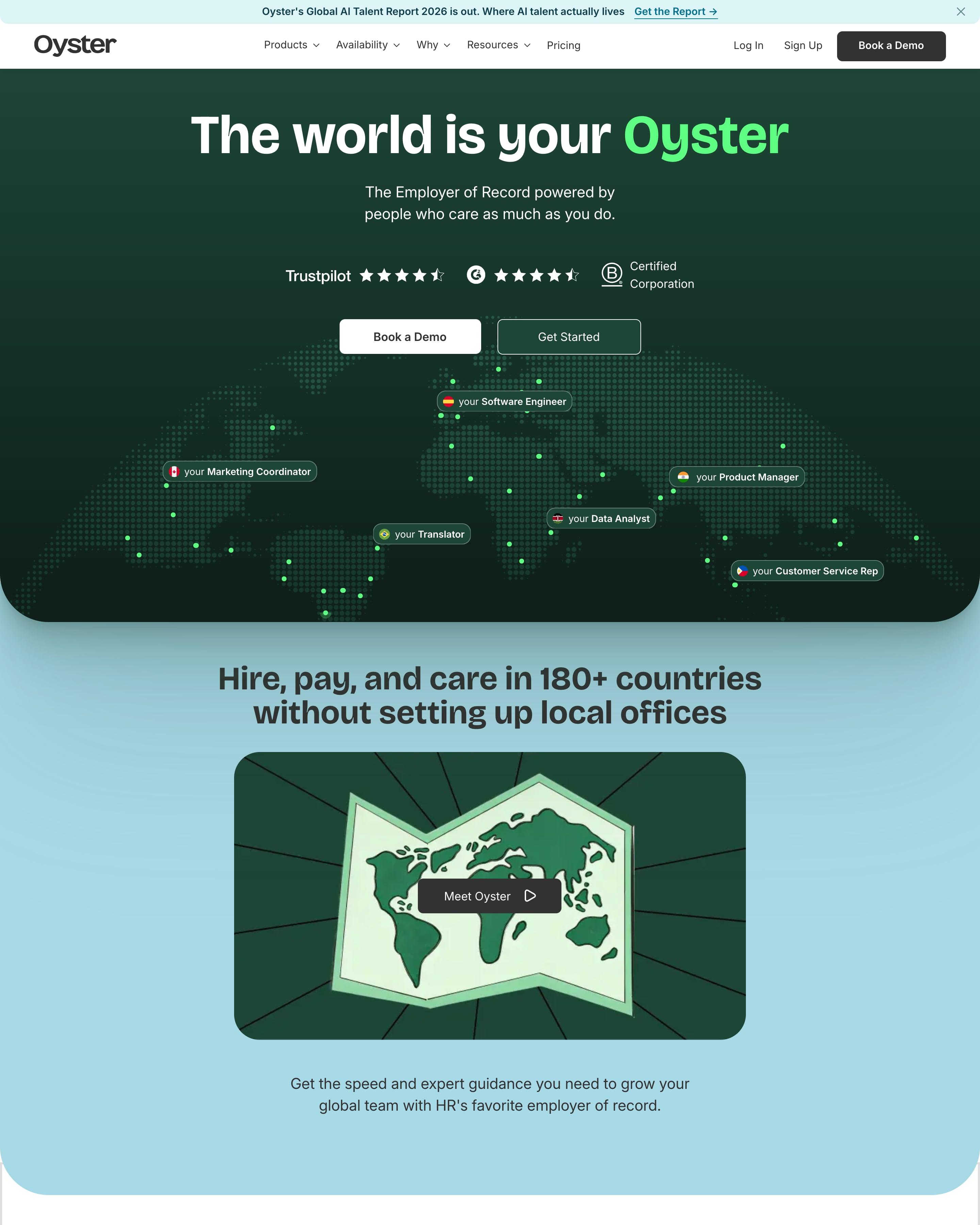
A dotted world map spreads across the dark green hero, with flag-tagged pills such as "your Software Engineer" placed over countries. Pink, blue, green and lilac cards then stack up while scrolling, each pairing a promise like "Expert guidance" with a photo. The job-title pills on the map are the touch to steal.
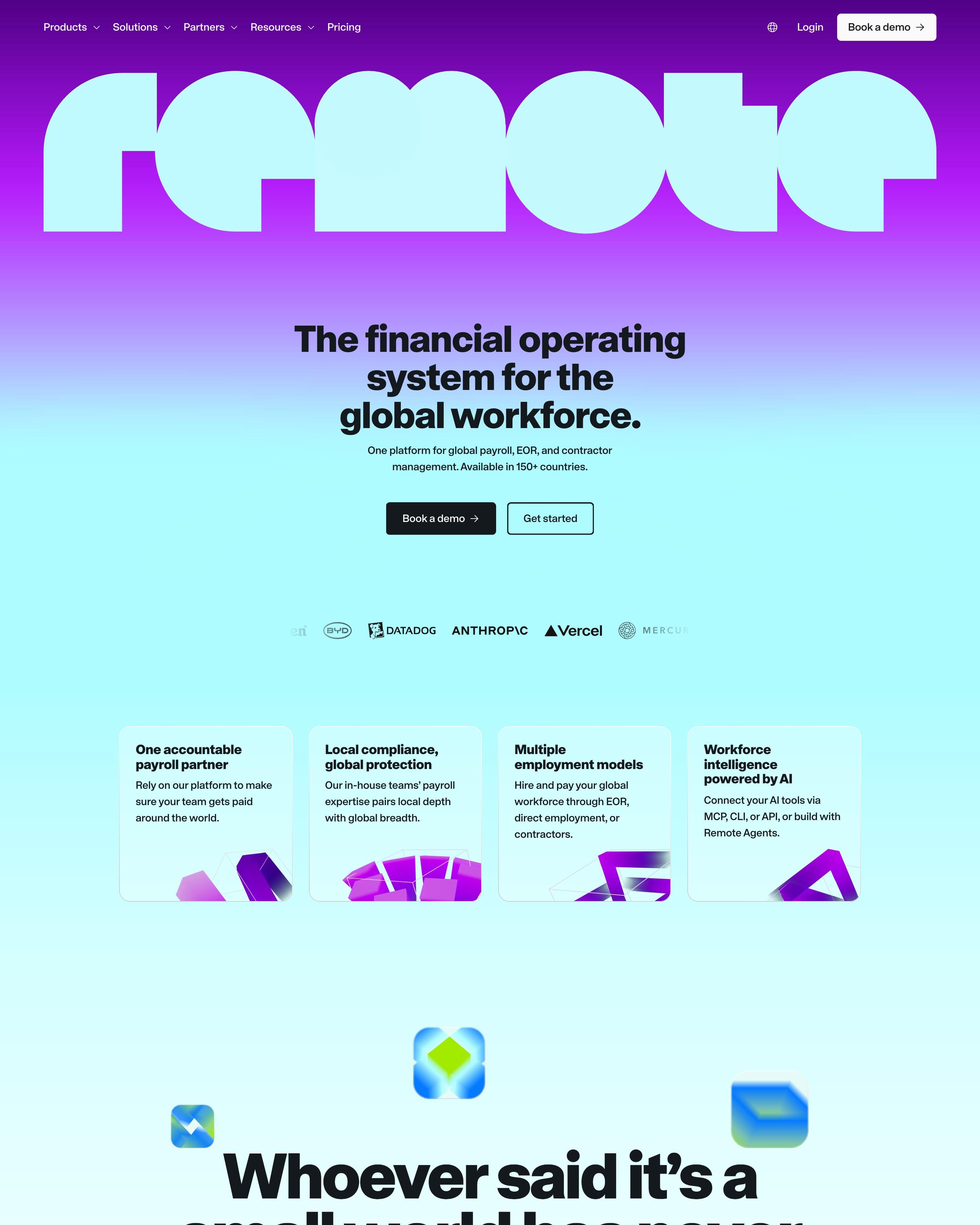
The wordmark runs edge to edge across a purple-to-aqua gradient, above a centred headline in a heavy grotesque. Product cards carry bright mini UI shots of payslips in USD, BRL and EUR, and stats like 150+ and 99% climb a stepped line graphic on lime. Worth copying: "Whoever said it's a small world has never paid a global team." set huge among floating 3D app icons.
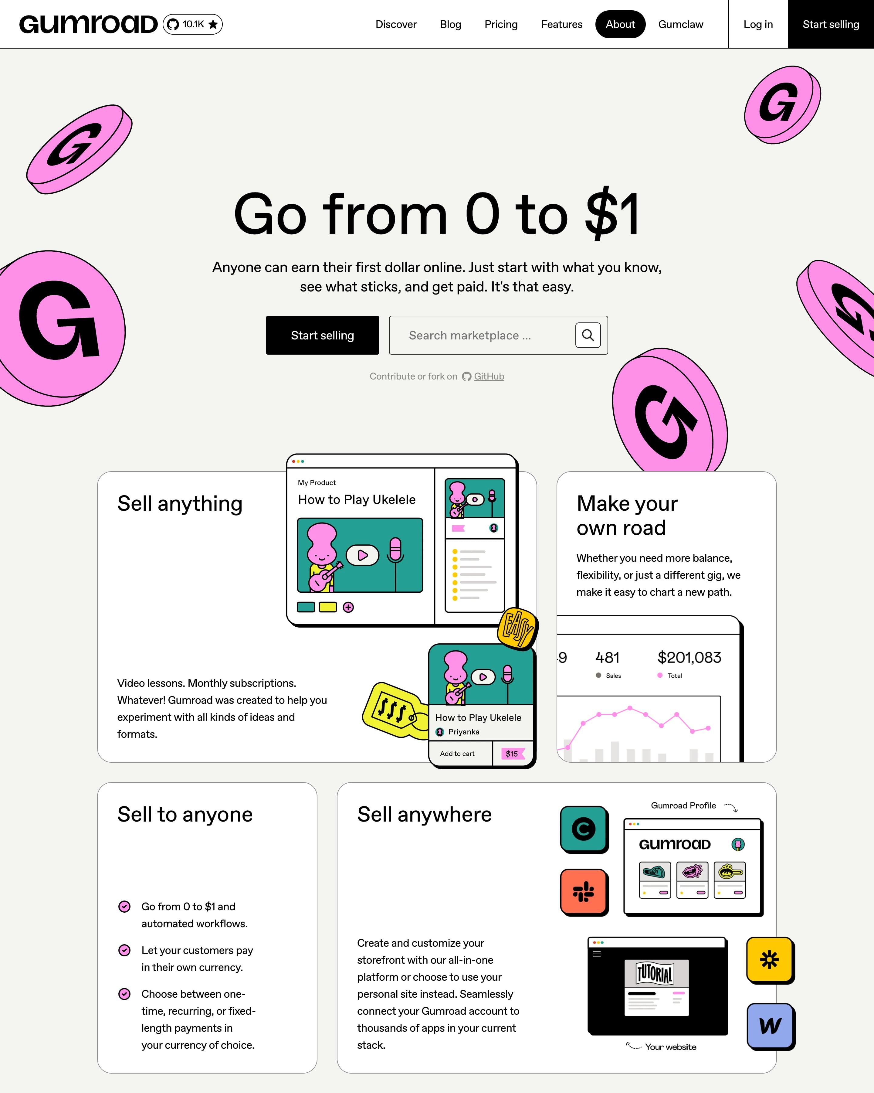
Pink G coins float around the hero, where a black Start selling button sits beside a marketplace search. Bordered cards of different sizes mix product UI with drawn characters, and a yellow loop diagram sums up the approach. One huge number, $2,004,370 earned by creators last week, is the proof worth copying.
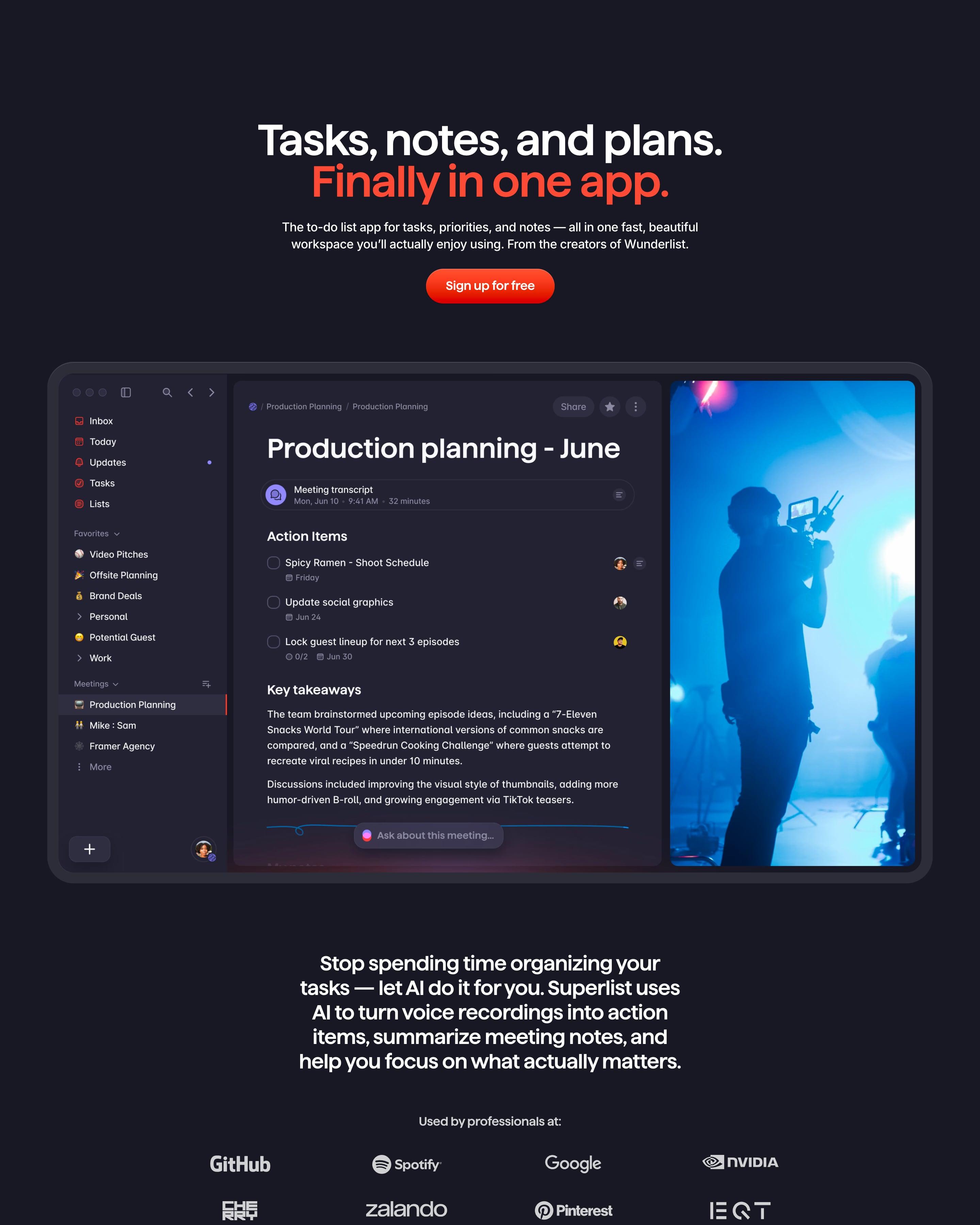
On a dark navy canvas, the headline's second line and the sign-up button are red-orange, with the full app window below. Feature tiles in saturated blue, red and purple hold app screens, and hand-drawn doodles top each heading. One to copy: a fading stack of feature names in large type instead of a grid.
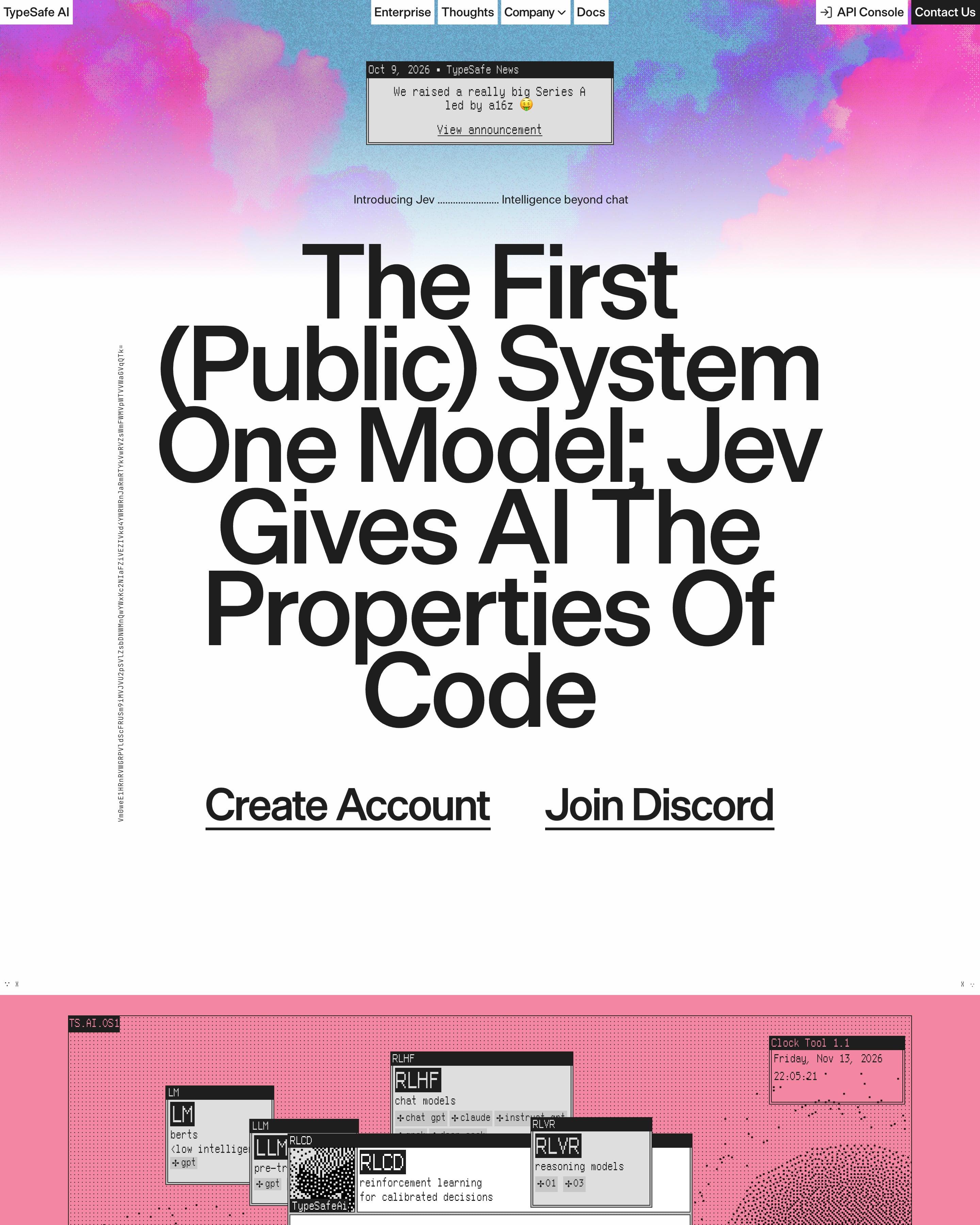
A huge headline, "The First (Public) System One Model; Jev Gives AI The Properties Of Code", sits under a pink and blue watercolour sky. The page then turns pink and fills with retro Mac-style windows on a dithered dot field: benchmark tables, a pareto chart, a "Clock Tool 1.1" and a Game of Life widget. Each section switches background, pink to green to charcoal, framed by corner crop marks.









How to design a colorful website
Colourful sites use bold, contrasting colours with confidence: a different colour per section or product, saturated illustrations, bright blocks. It signals energy and approachability.
- Give the colours jobs: one per product, feature or section, so they help people find their way.
- Hold the system together with consistent type, spacing and shapes, so many colours still read as one brand.
- Check contrast for text on every colour you use, not just the main one.
Frequently asked questions
Sites that use bold, contrasting colours with confidence: bright blocks, saturated illustrations and sections that each get their own colour. Colourful sites use bold, contrasting colours with confidence: a different colour per section or product, saturated illustrations, bright blocks. It signals energy and approachability.
It depends less on the count than on whether each colour has a role. The sites here use five or six bright colours and stay clear because each one marks a product, a section or a type of content.
Each page is opened at 1440 pixels wide, like a laptop, and scrolled from top to bottom so every image and section loads. Cookie banners, chat bubbles and popups are left out, and the whole page is saved as one image.