


A street photo fills the hero, with an AI agent's conversation laid over it: a shopper asks about a jacket and gets product cards back. Below, serif headlines sit on soft peach panels in a bento grid. Worth copying: showing the agent at work in the hero image instead of describing it.
7 examples from SaaS companies
Best Bento Grid Website Examples
Sites that show features in a bento grid: tiles of different sizes fitted into one block, each with its own visual. Here are 7 SaaS websites that do it well, each shot as the whole page, with what stands out on each.
- Dark or light
- 1 dark, 6 light
- of 7 pages
- Heading fonts
- Featuredeck
- Featuredeck 1, Mark Pro 1, Super Sans 1, Reckless 1
- Built with
- Next.js
- Next.js 3, Webflow 1, Framer 1
Dimmed template covers drift behind a giant white headline and prompt box on violet. Proof comes as a wall of quote cards around "Trusted by 4M+ teams", then a bento grid of seven tools. The template index is the part to borrow: huge faded category names, one lit up with its templates beside it.
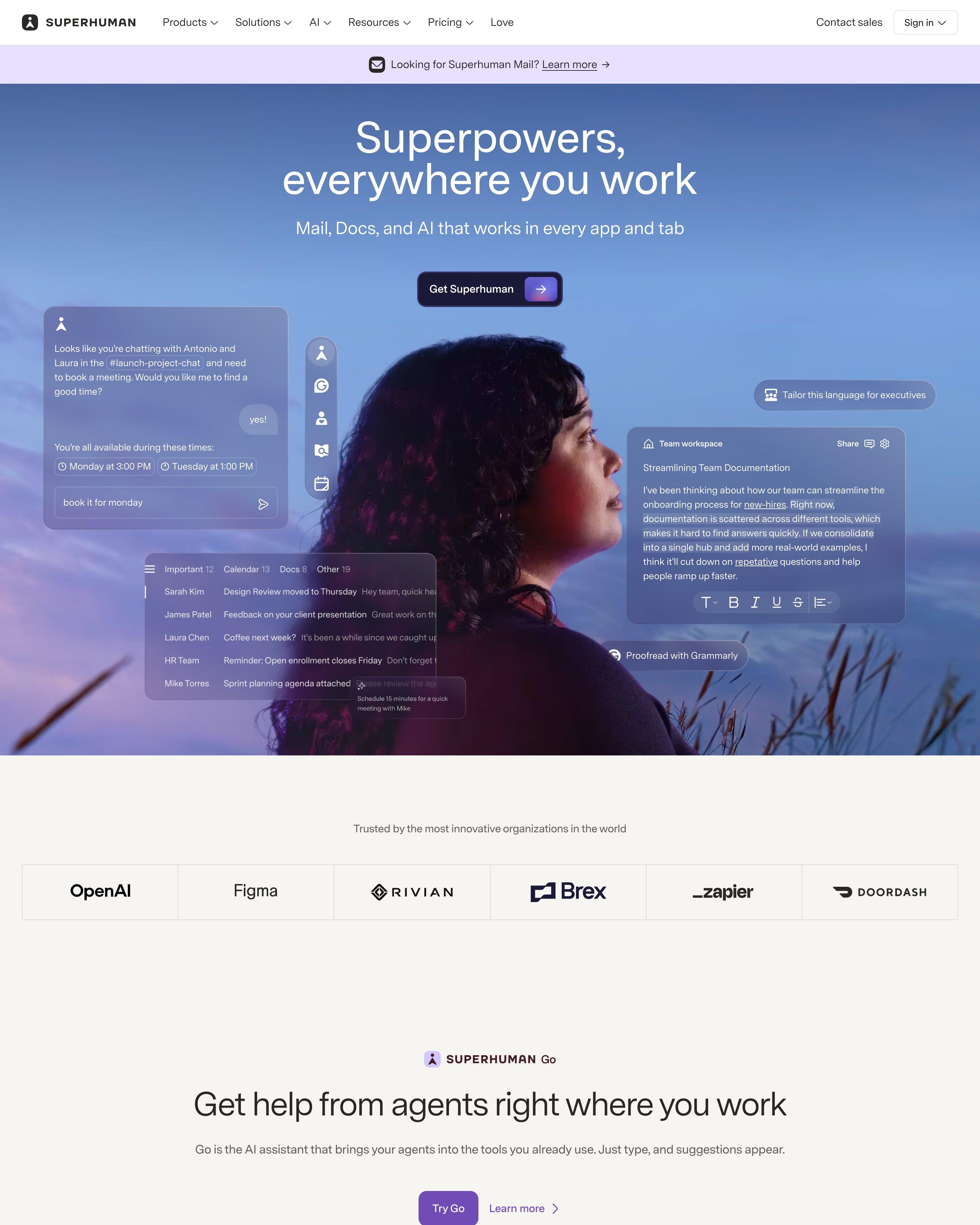
Frosted product panels (an assistant chat, a doc being rewritten, an inbox) float over a photo of a person in profile against a dusk sky. Go, Mail and Docs each get a labelled section of mixed-size tiles in teal, plum and lavender. Real UI over a human photo is the idea to copy.
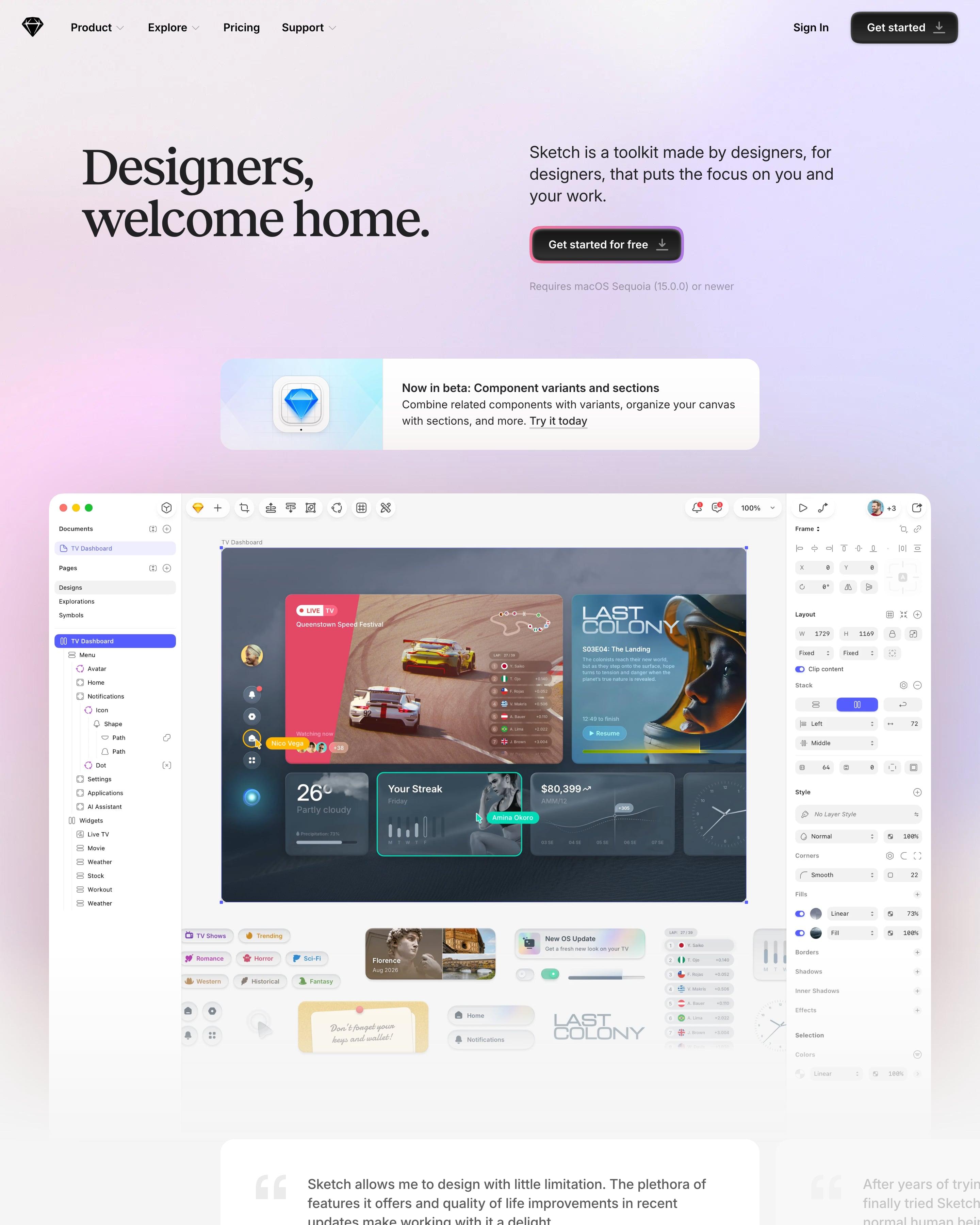
"Designers, welcome home." sits in a heavy serif over a pink-to-lavender haze, beside a black CTA wrapped in a gradient ring. Each section (Design, Prototype, Collaborate) gets a small coloured pill, a big serif headline and a bento grid mixing black, white and pastel cards. One card worth copying is "No shady pricing", drawn as a receipt that crosses out Dark Patterns and Hidden Costs.
A gradient ribbon in orange, pink and violet sweeps across the white hero, beside an eight-decimal 'Global GDP running on Stripe' figure. Product UI fills a bento grid of tiles, followed by headline numbers, customer stories by company size and a navy developer section. That precise counter is a small idea worth borrowing.
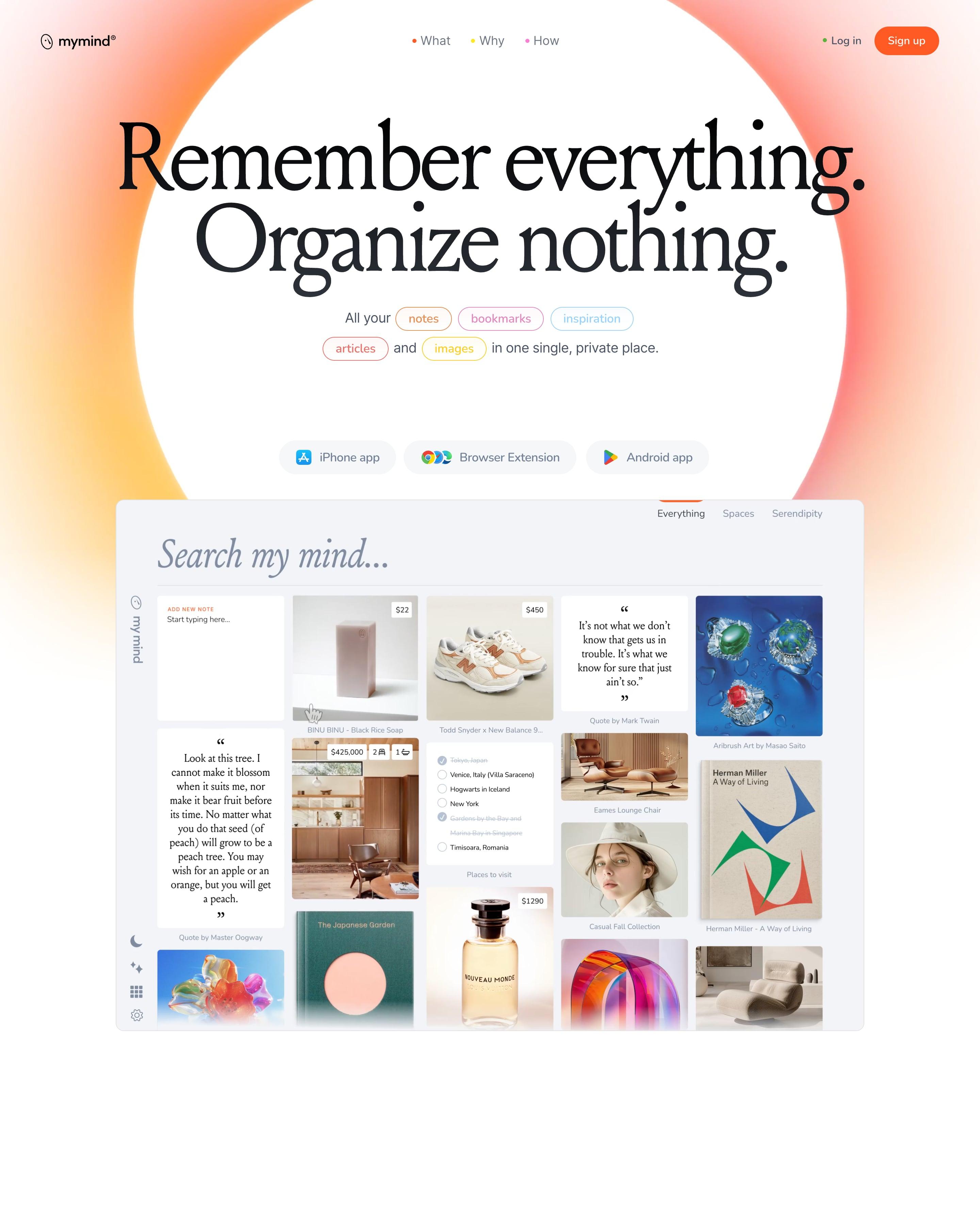
The serif headline sits inside a white disc ringed by an orange glow, with outlined word pills in different colours for notes, bookmarks and more. A full orange band breaks the white further down, and features fill a bento grid of photo and app tiles. Those coloured word pills are easy to lift.
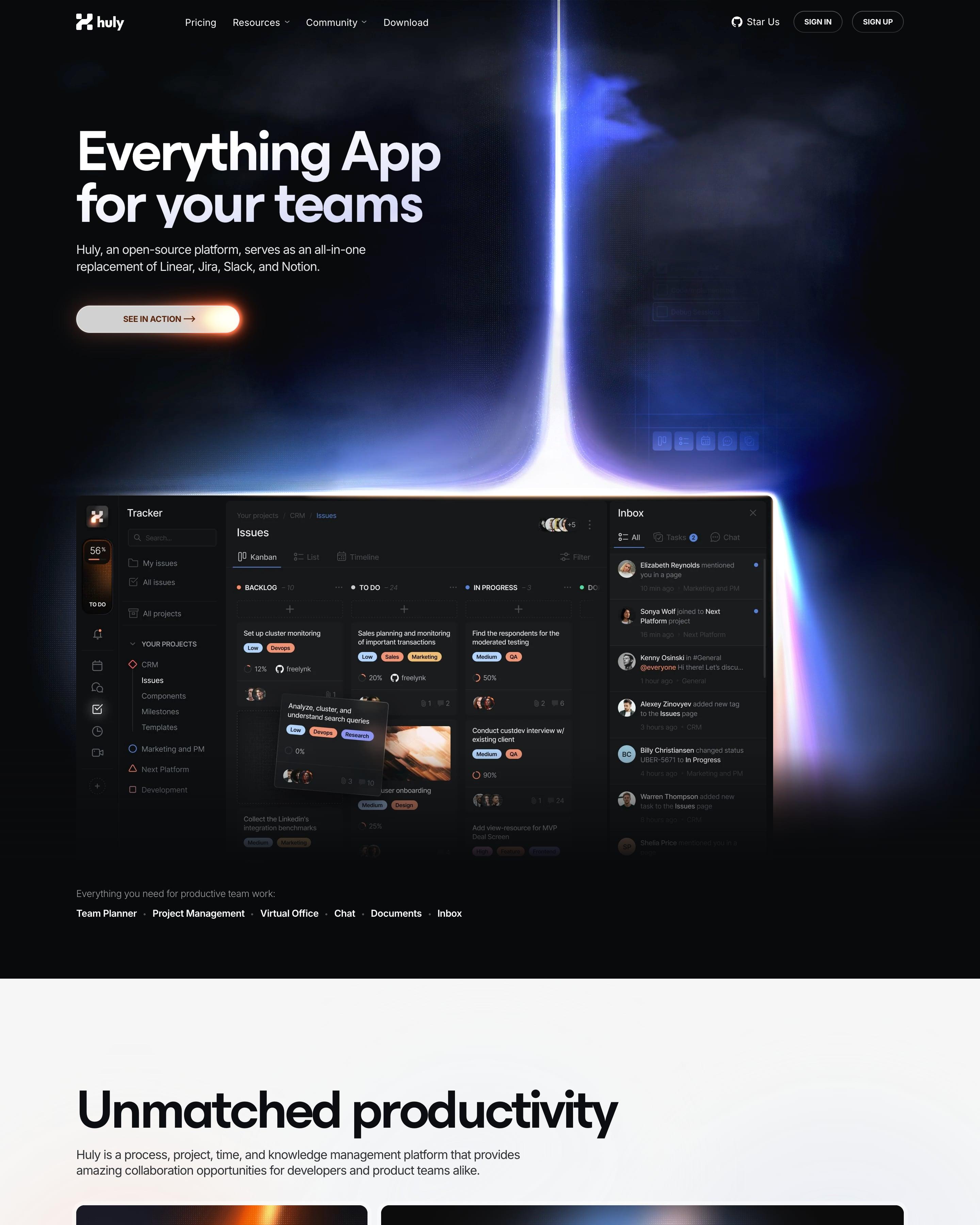
A beam of light drops onto the hero's dark product screenshot, and the glow returns on the edges of later product frames. Dark and white sections alternate, with features in bento grids of dark tiles and a document editor shown with collaborator cursors. The glowing screenshot edges are the detail to borrow.








How to design a bento grid website
A bento grid shows several features at once as tiles of different sizes fitted into one block, each with its own small visual. It packs a lot into one screen and stays easy to scan.
- Give the most important feature the biggest tile, and keep the rest to one idea each.
- Use a consistent corner radius, padding and gap across the tiles.
- Put a real visual in each tile (a UI crop, an icon, a number), not just text.
Frequently asked questions
Sites that show features in a bento grid: tiles of different sizes fitted into one block, each with its own visual. A bento grid shows several features at once as tiles of different sizes fitted into one block, each with its own small visual. It packs a lot into one screen and stays easy to scan.
A layout of rectangular tiles of different sizes arranged into a tidy block, like a bento box. SaaS sites use it to show many features or benefits in one section.
Each page is opened at 1440 pixels wide, like a laptop, and scrolled from top to bottom so every image and section loads. Cookie banners, chat bubbles and popups are left out, and the whole page is saved as one image.