
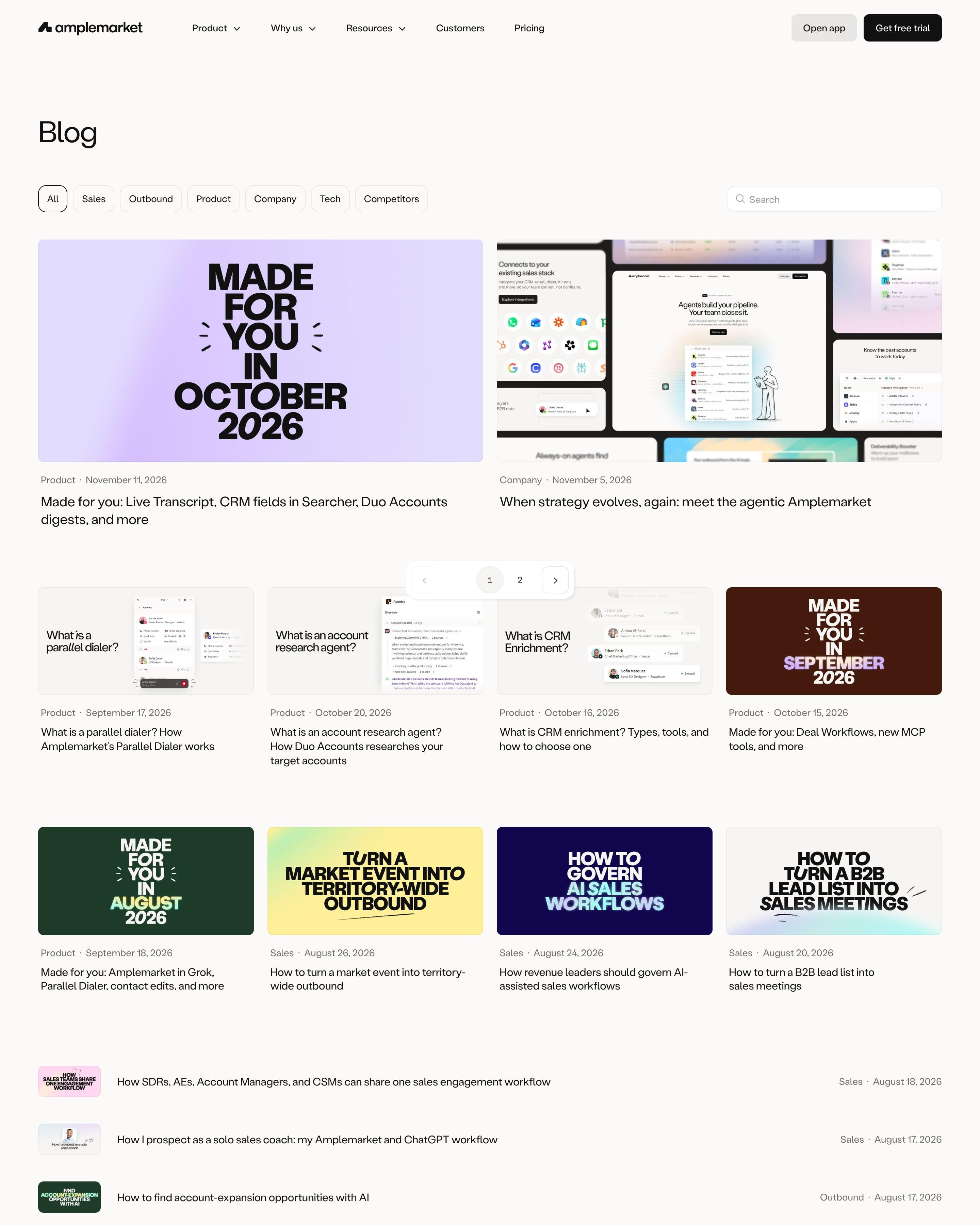

A plain "Blog" title sits over topic pills from Sales to Competitors and a search box. Two big featured posts lead, then a row of four cards, then a compact list with tiny thumbnails, category and date. The monthly "Made for you" release notes get bold stacked type on a colour that changes each month, lilac, brown, green, a cover system worth copying.
80 examples
Best SaaS Blog Design Examples
The blog home pages of SaaS companies known for their design: how they feature posts, sort them and make a company blog worth reading.
- Dark or light
- 17 dark, 63 light
- of 80 pages
- Heading fonts
- Inter
- Inter 7, Oracle 2, Geist 2, Labil Grotesk 1
- Built with
- Next.js
- Next.js 46, Webflow 10, Framer 7, Astro 3
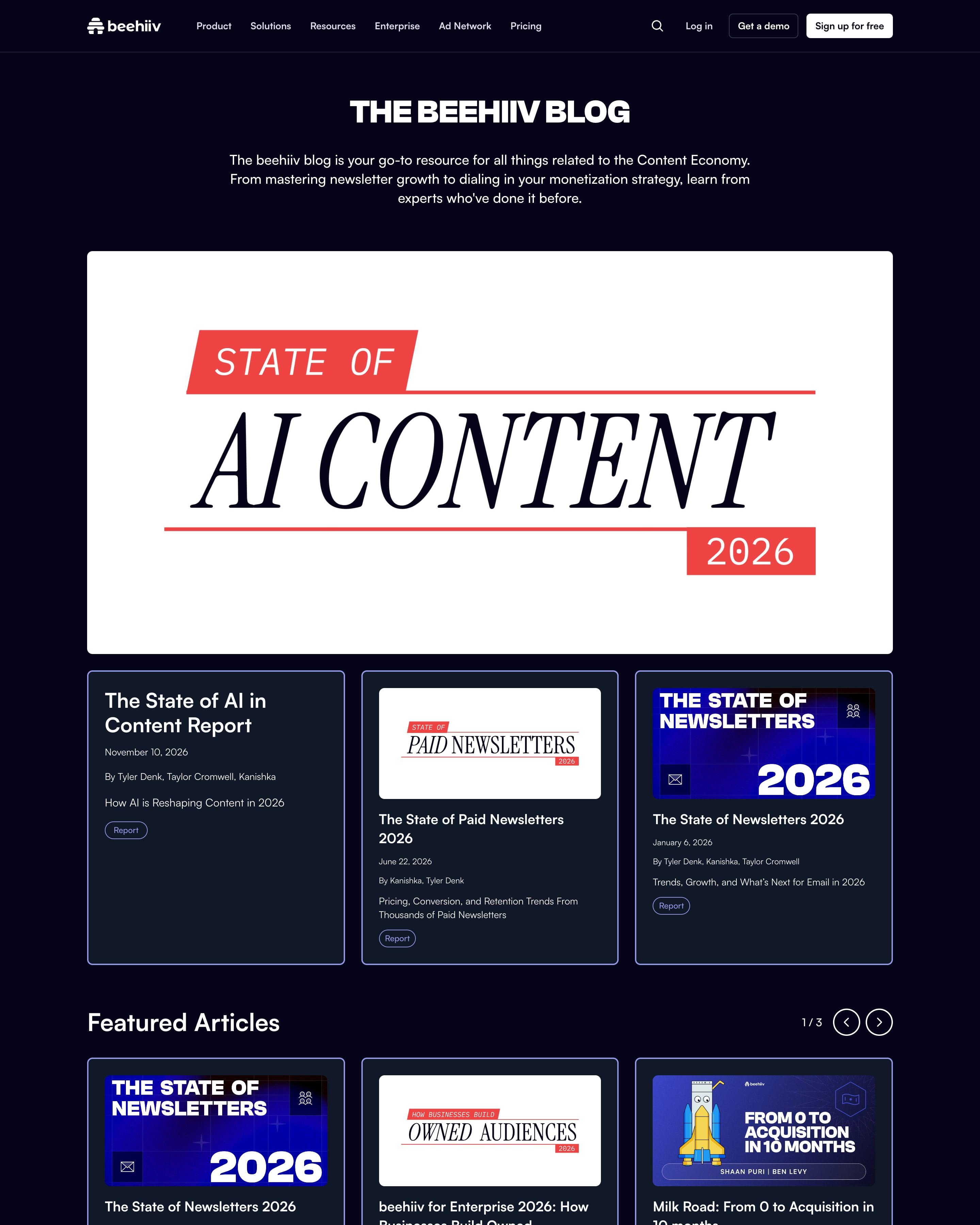
A large report cover tops the page, then four category rows (Featured, How To, Growth, Templates) page sideways with arrows and a 1/6 counter. Below them, the full archive has search, a sort menu and a sidebar of tag and author checkboxes with counts. That browse-then-filter split is a model for any large archive.
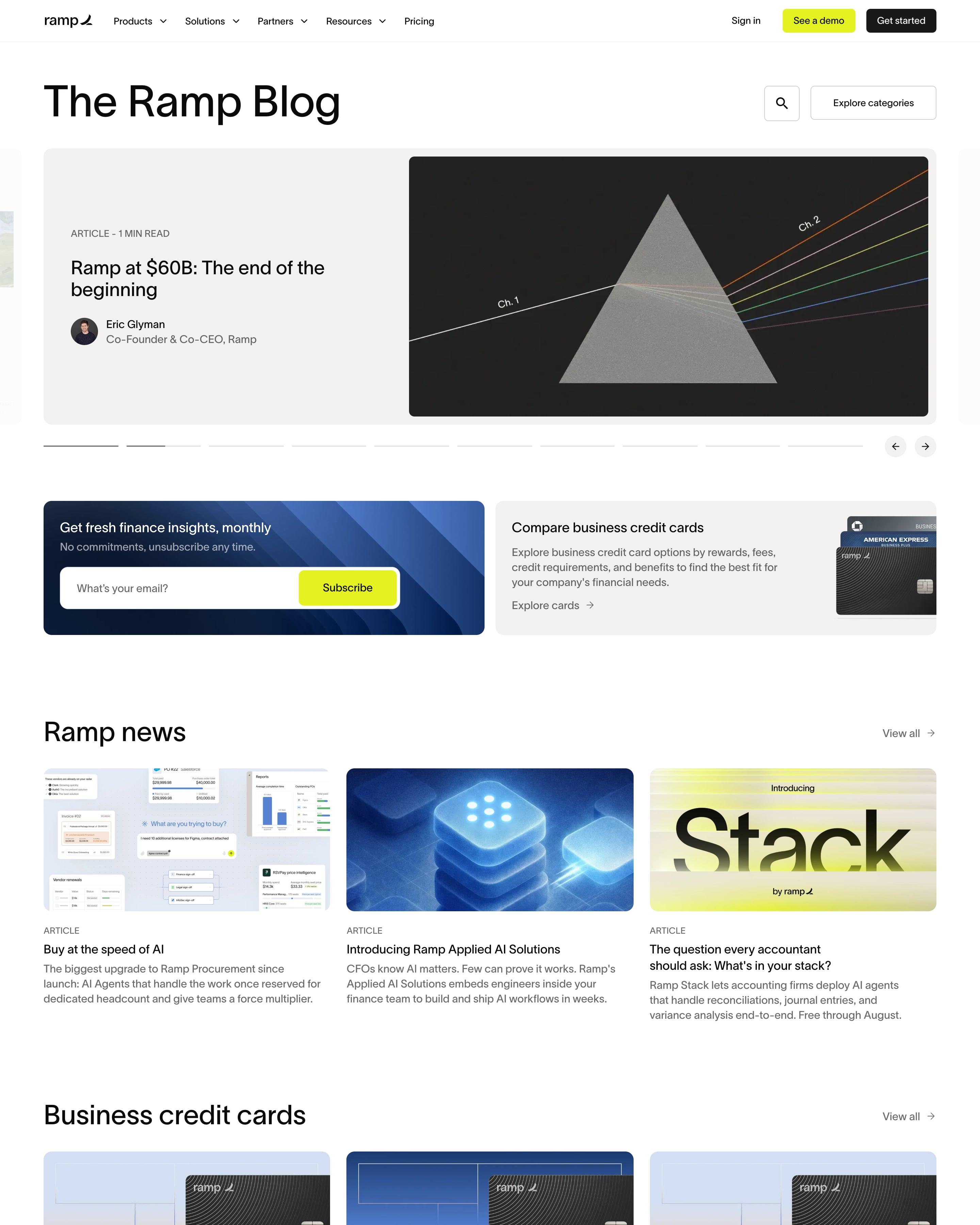
"The Ramp Blog" opens on a carousel led by Eric Glyman's "Ramp at $60B" post with a prism graphic, then a blue newsletter card beside a credit card comparison card. Topic rows of three follow: Business credit cards, Expense management, AI, Procurement. Every cover mixes photo, black card and thin chartreuse line work, so hundreds of posts still look like one set.
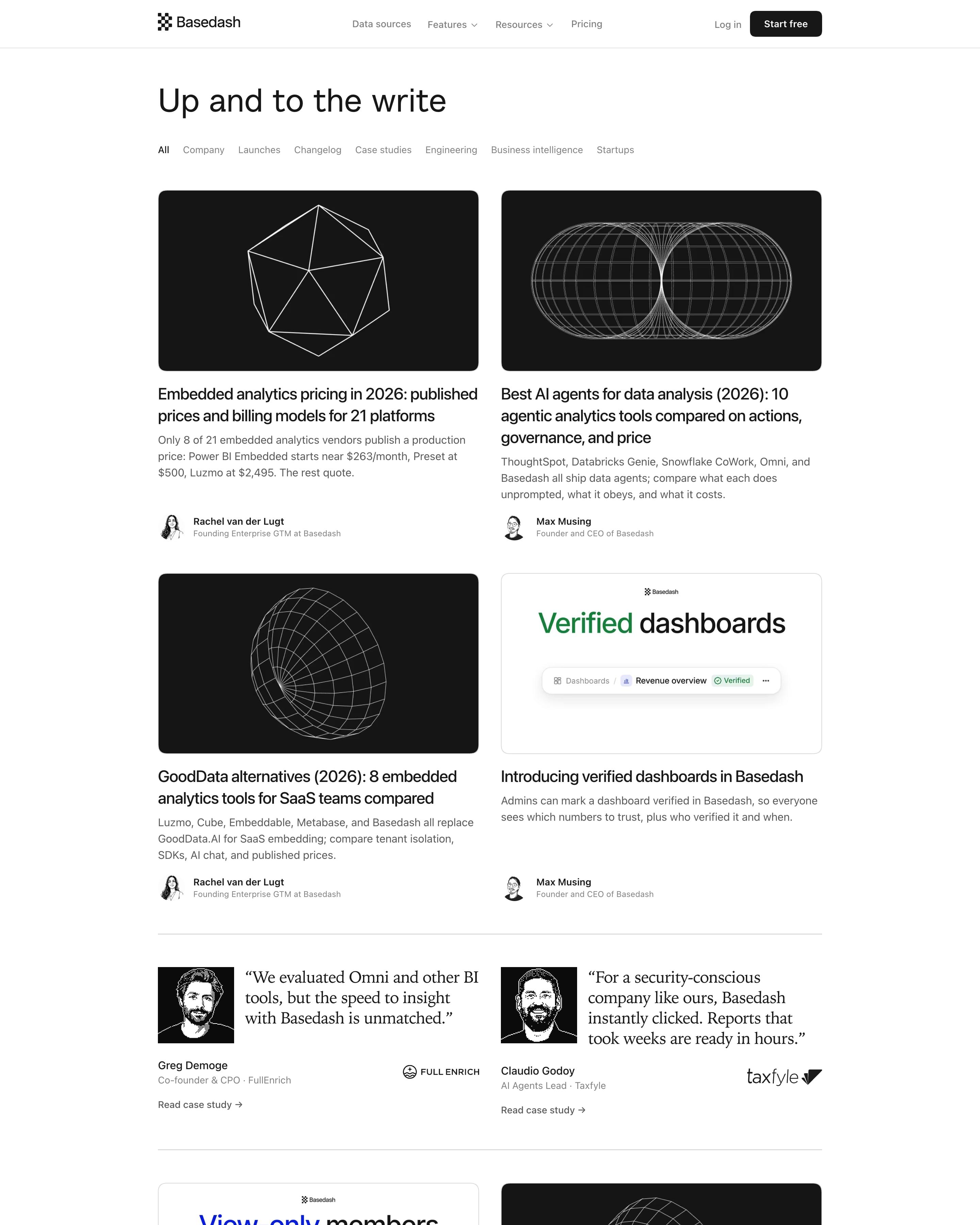
"Up and to the write" heads a two-column grid where most covers are white wireframe shapes, a torus or a polyhedron, on near-black. Product launches break the pattern with light cards such as "Verified dashboards" in green and "View-only members" in blue. A pair of customer quotes is dropped into the middle of the feed.
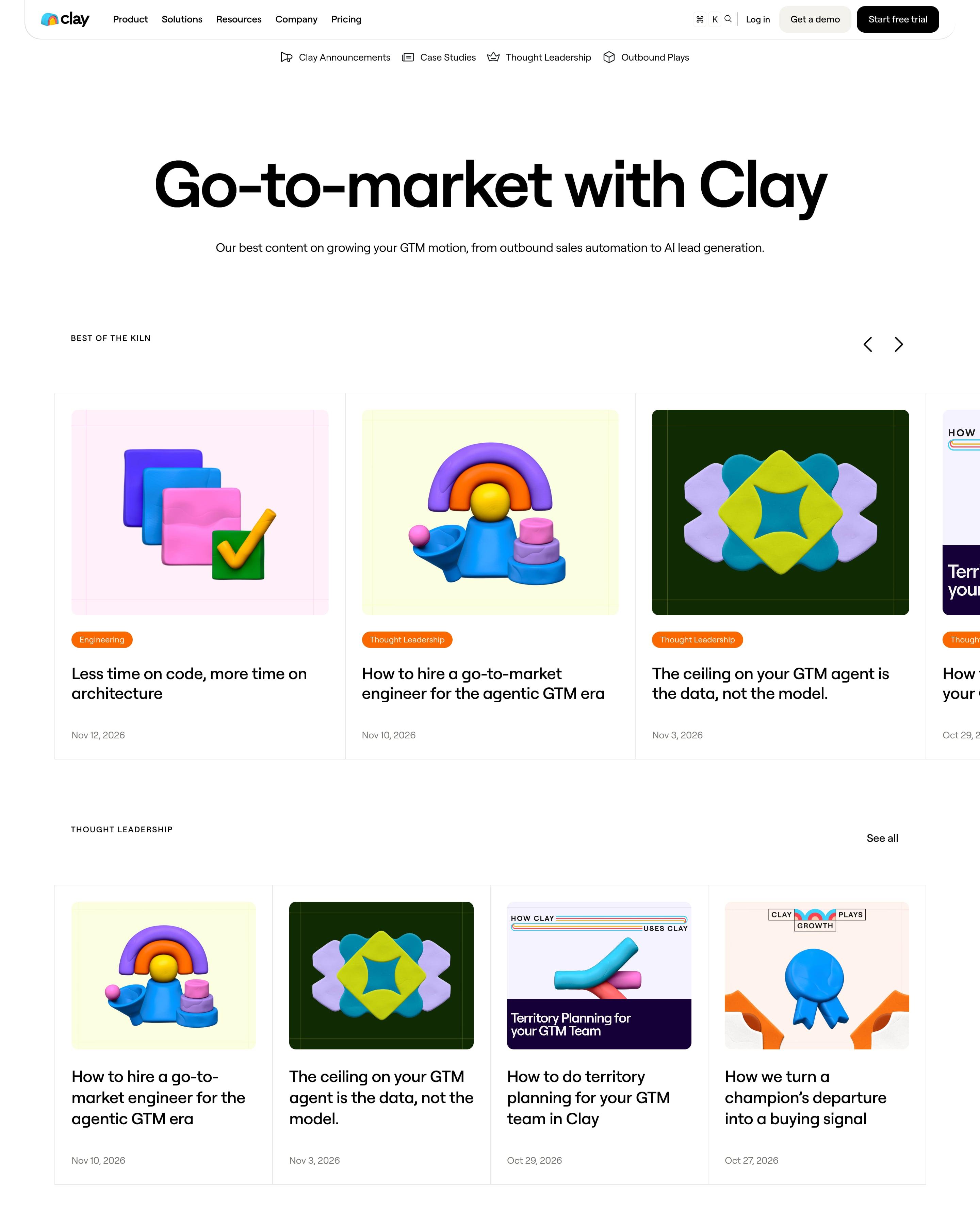
Under the headline, a "Best of the KILN" carousel leads into rows for Thought Leadership, Case Studies and Outbound Plays, each with a "See all" link. Borrow the case study covers, which model each customer's logo in clay. The "Latest" feed then runs as one searchable column between two slim sidebars.
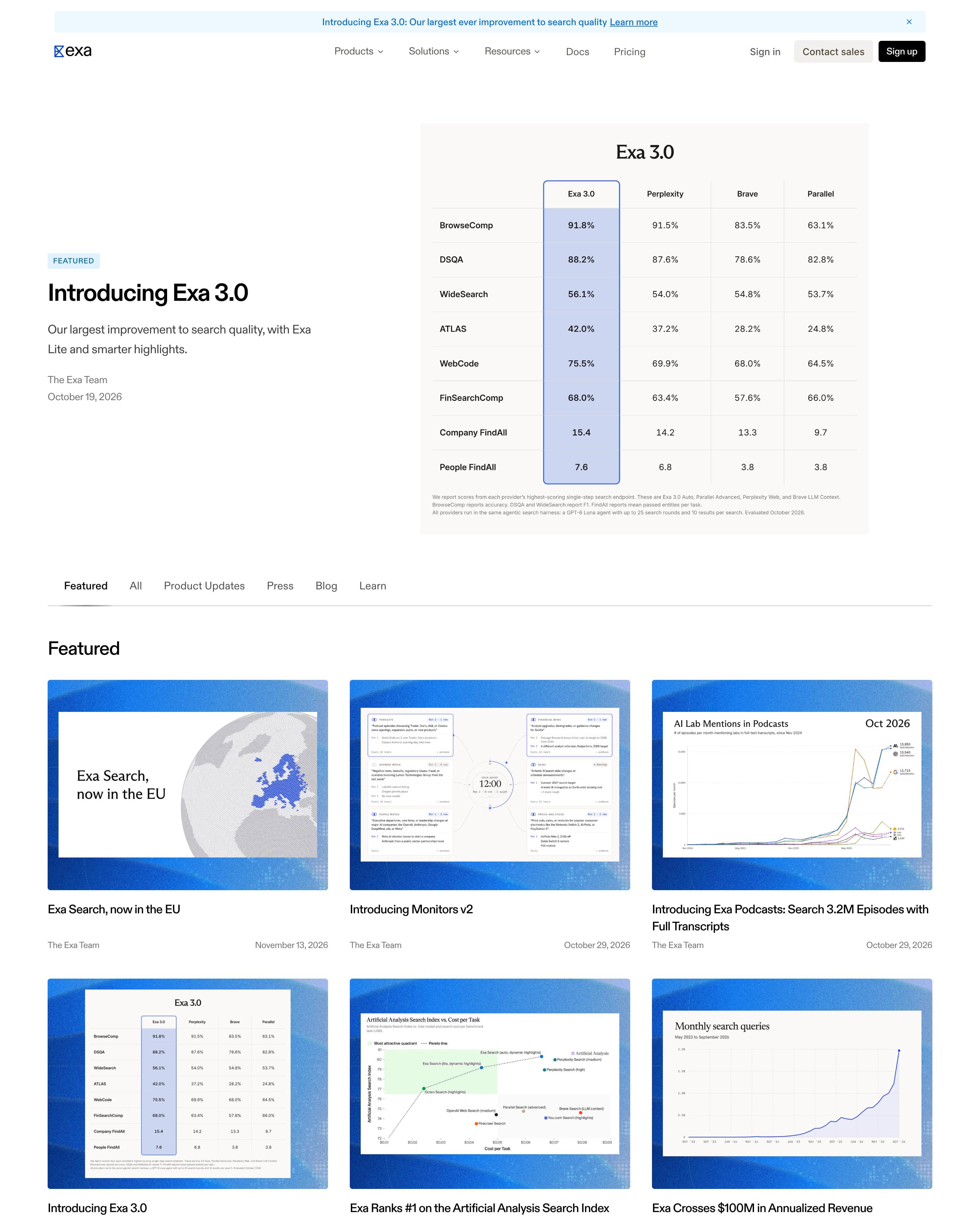
The blog leads with "Introducing Exa 3.0" beside a full benchmark table, the Exa column outlined in blue, then filter tabs for Featured, All, Product Updates, Press, Blog and Learn. Most cards frame a chart or table inside the same blue gradient border, so an archive going back to 2023 reads as one set. Press items from Wired, TechCrunch and MIT carry small source badges.
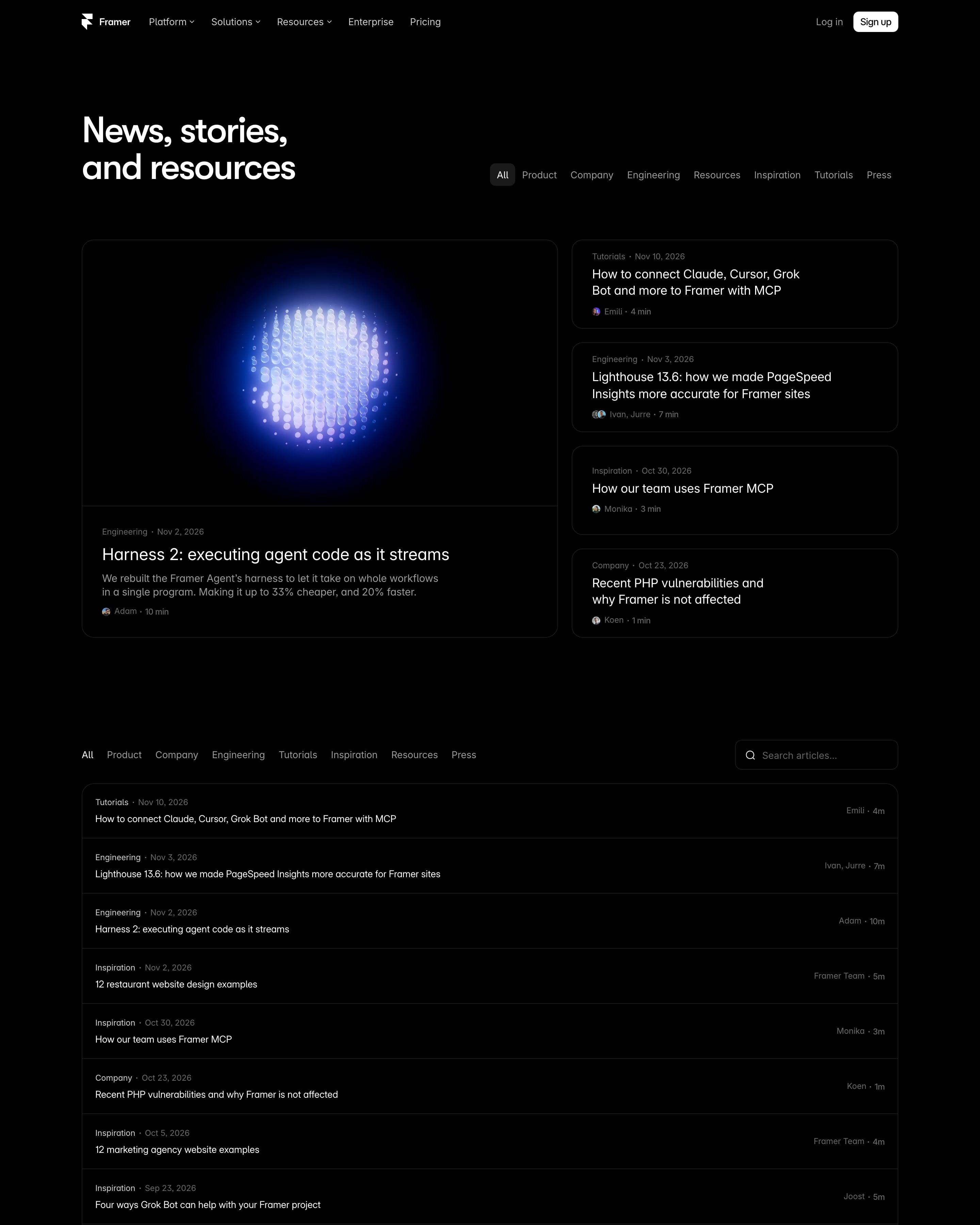
"News, stories, and resources" puts a glowing blue particle sphere on the lead post, with four compact cards stacked to its right. Below, the whole archive back to 2023 is one long bordered list: category and date in grey, title in white, author and read time on the right. An Updates grid and customer story cards close it off.
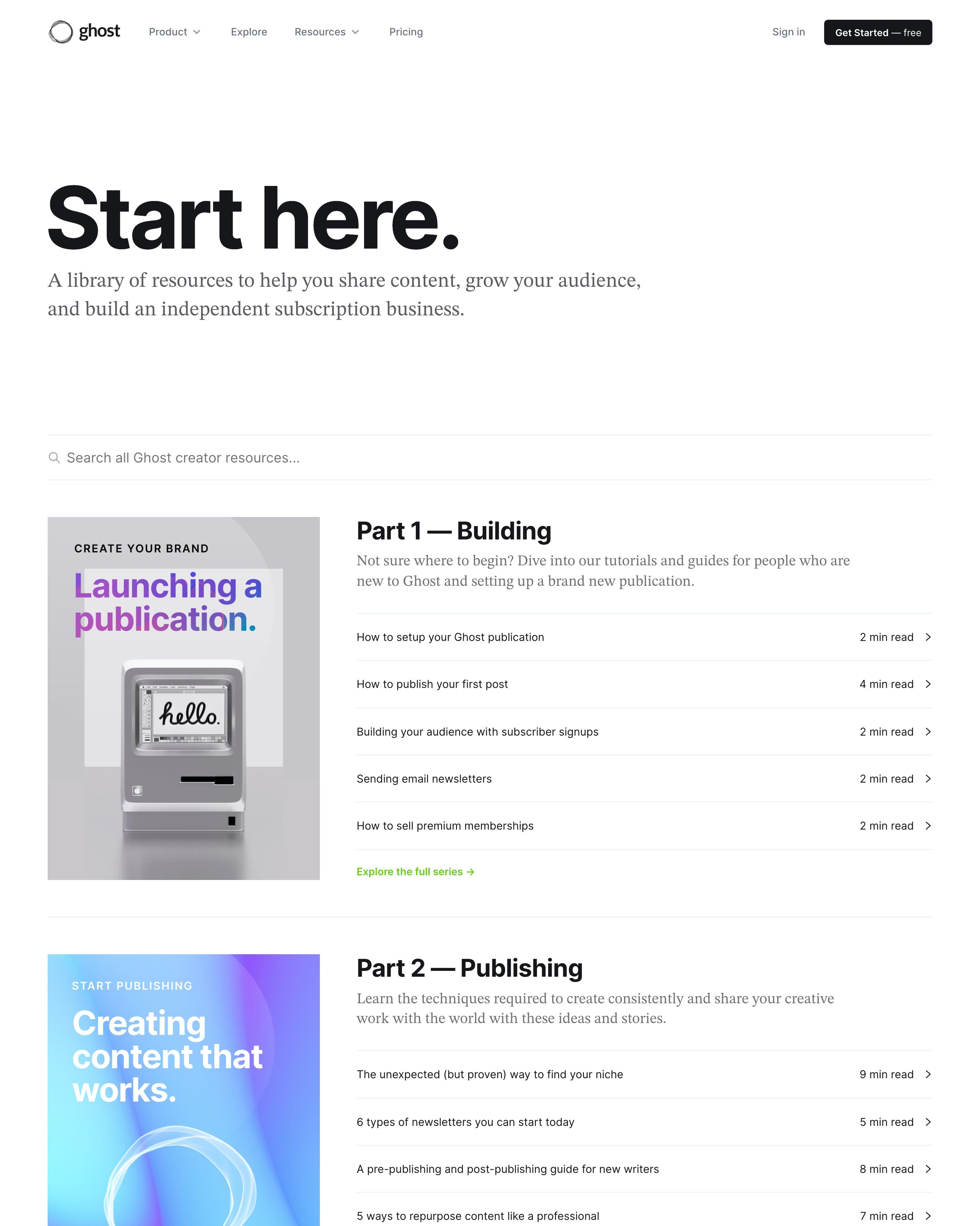
Rather than a feed, the library is set out as a four-part path: Building, Publishing, Growth and Business. Each part pairs a tall cover card with five article links and read times, all under one search bar. Grouping posts into numbered parts is the idea to borrow.
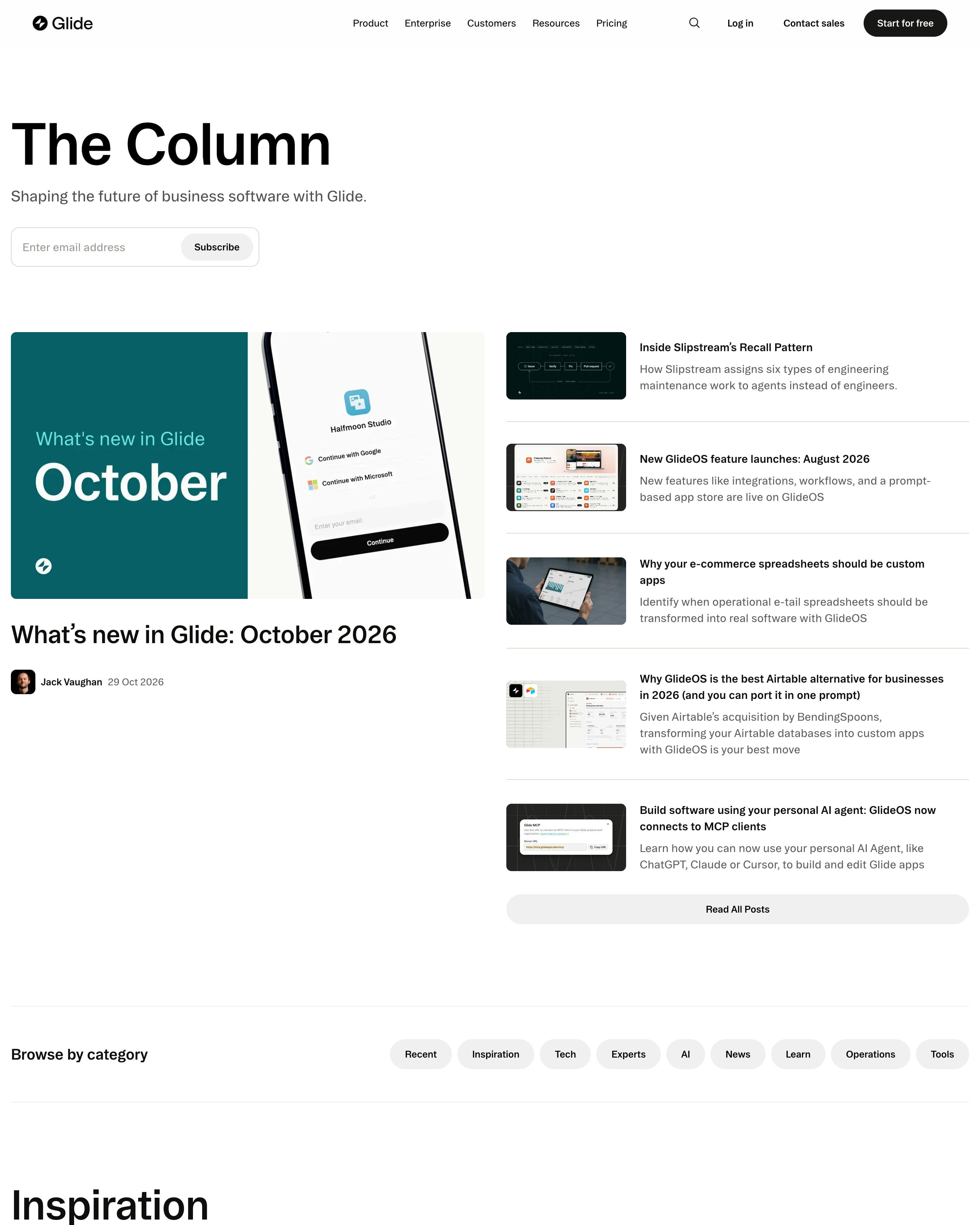
"The Column" opens with a subscribe field and a teal "What's new in Glide: October" cover beside five headline rows. Category pills lead into topic sections (Inspiration, Tech, Experts, AI) that alternate white and warm grey backgrounds, each with a large lead post and a "Read All Posts" button. Covers mix product shots with moody photography.
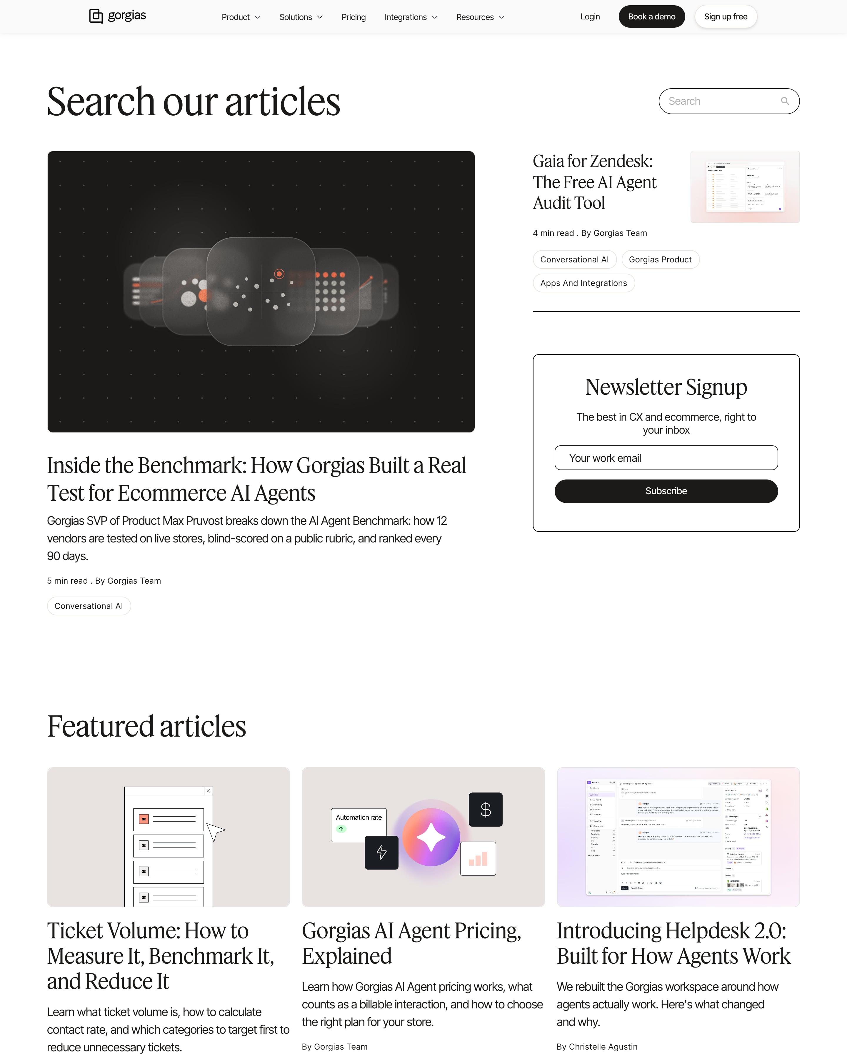
Next to the heading "Search our articles" sits a search field, and the first screen also fits the lead story, a second pick and a boxed newsletter form. Featured cards, a black slogan band and a tagged four-column grid follow. Placing the newsletter box beside the lead story is a move worth borrowing.
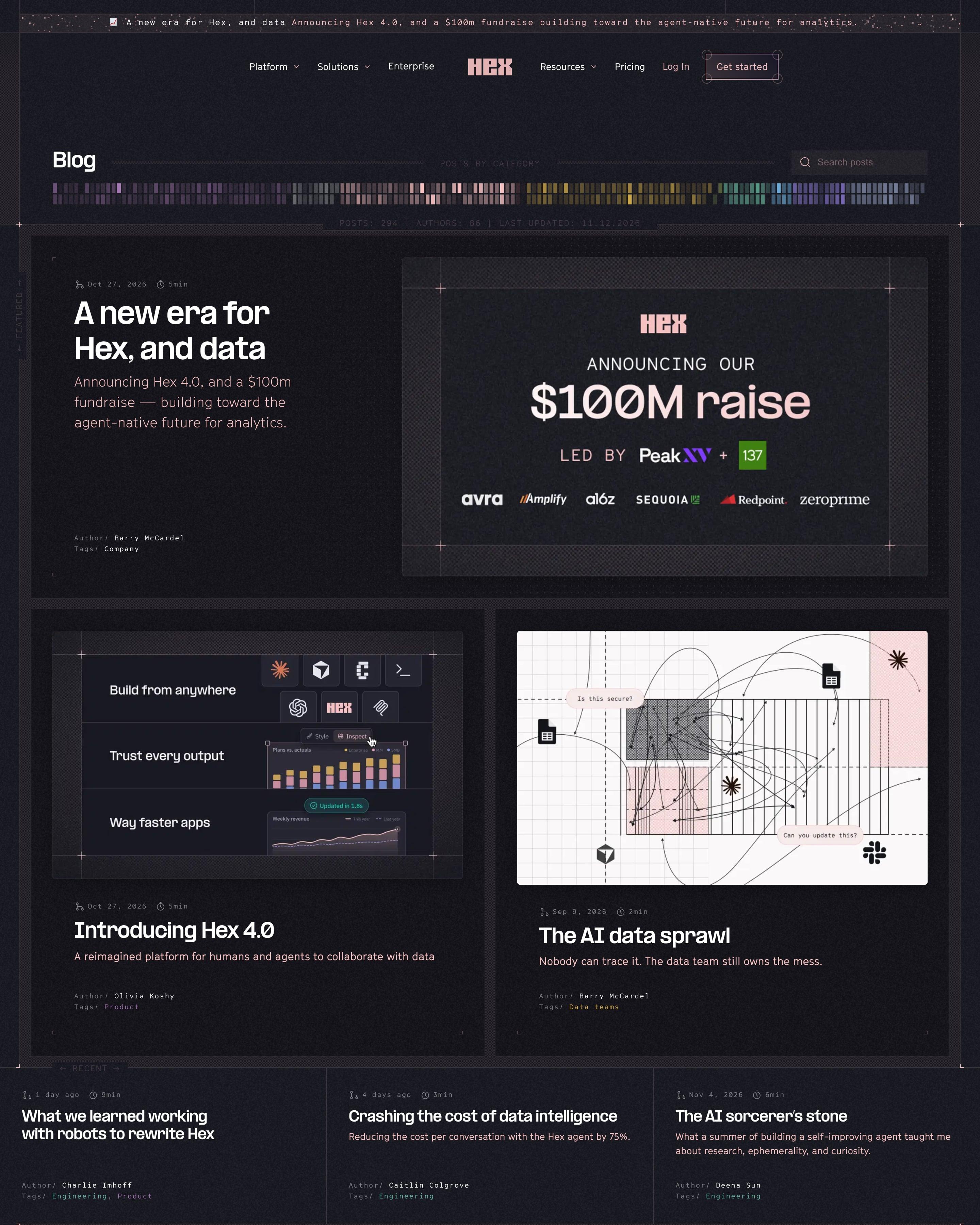
Dark and dense: under "Blog", a barcode-like strip of coloured bars maps every post by category, with counts of 294 posts and 84 authors. The $100M raise gets a large card with crosshair corners, then a "Feed" lists each post with date, read time, author and a colour-coded tag. The category sidebar, with counts in brackets, is worth copying.
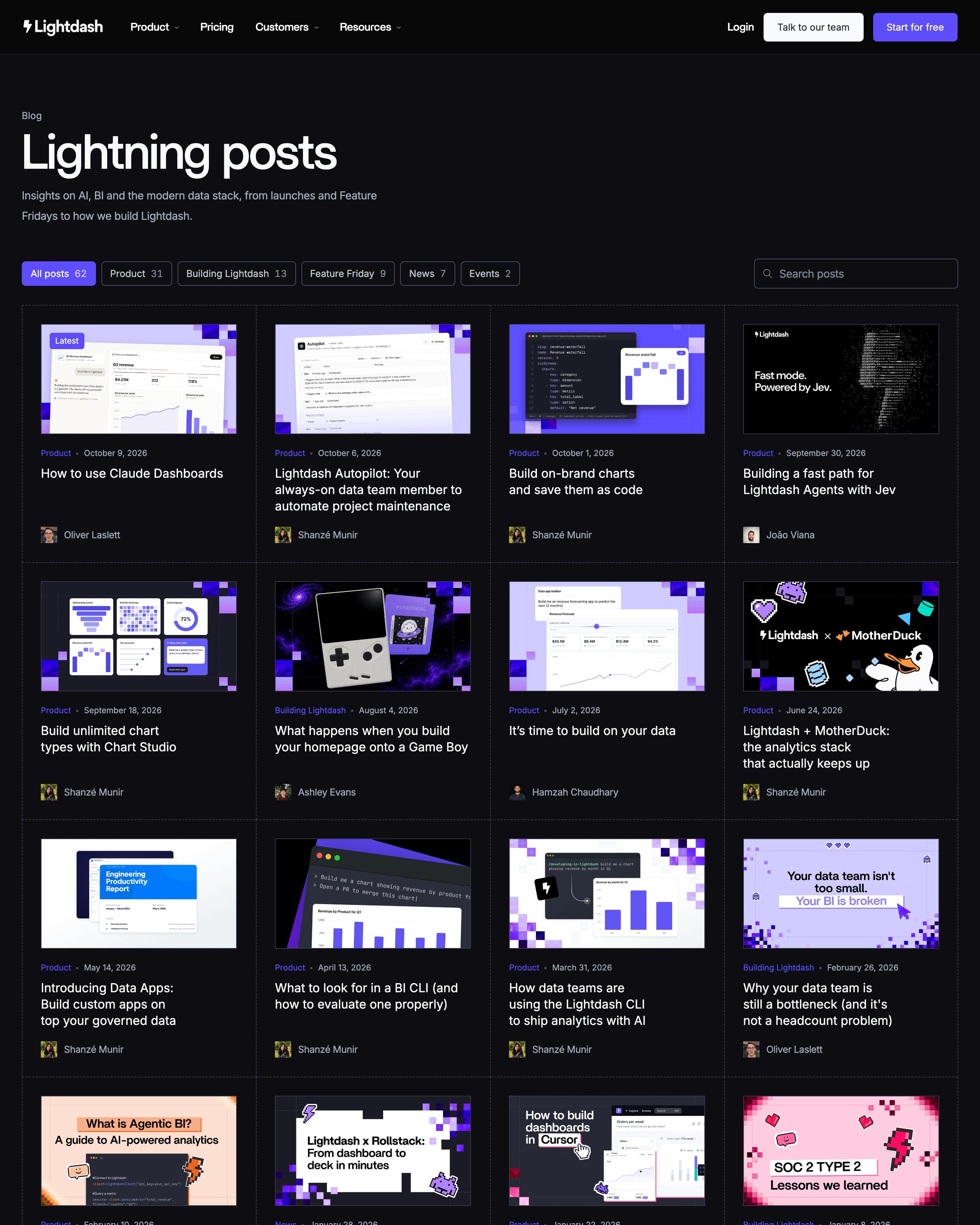
Under the name "Lightning posts", filter pills show each category's count, from All posts 62 to Events 2, beside a search box. All 62 posts share a single grid, four across, the newest tagged "Latest". Older covers fall back to one icon on lilac or mint, a quick cover system to adopt.
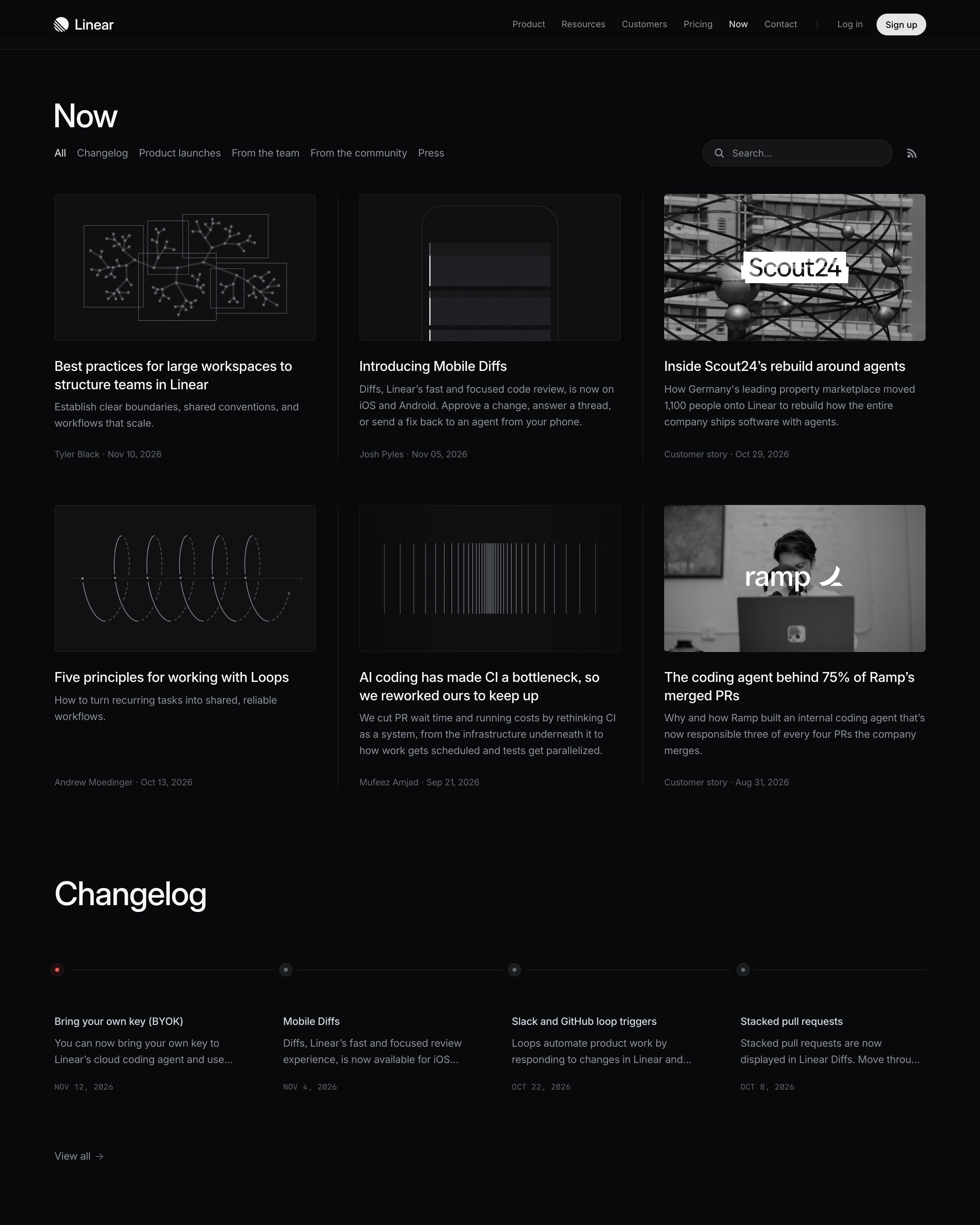
Posts, changelog entries and press mentions share one feed, with filter tabs, a search box and an RSS link at the top. The card grid uses white line drawings or black-and-white photos, broken up by a four-item changelog row and a press row. The plain text archive at the end is easy to lift.
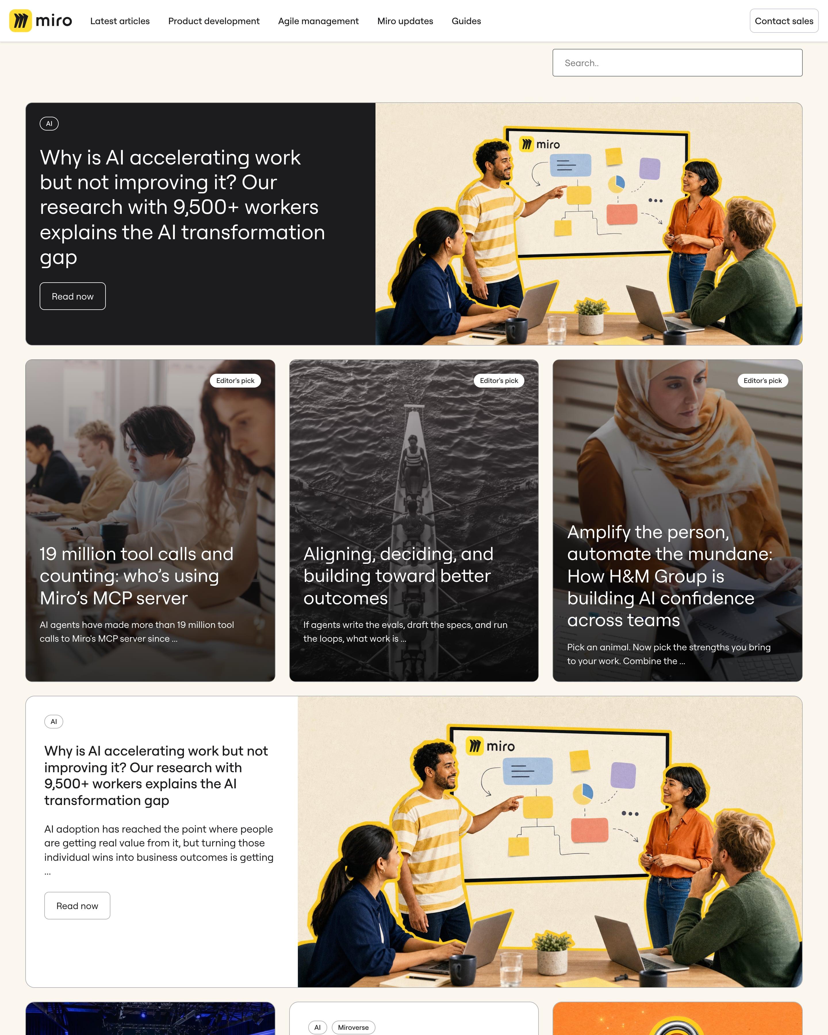
On a cream backdrop, the lead story pairs a dark text panel with a yellow-outlined photo of a team at a board. Three "Editor's pick" cards follow, then a grid that mixes wide and stacked cards, some with cut-out collages on bright colour blocks. Worth borrowing: the mix of card shapes within one feed.
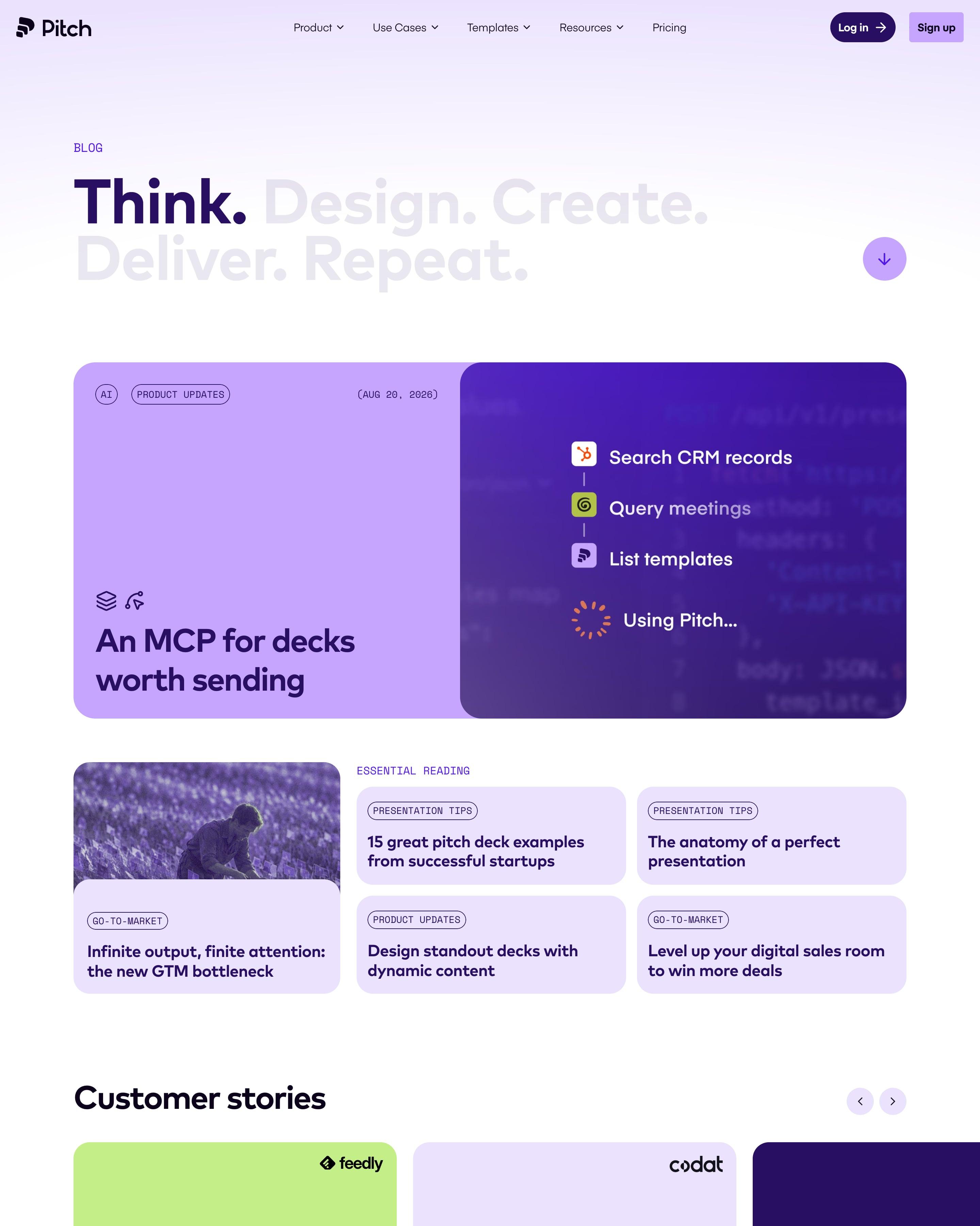
Only "Think." is dark in the five-word headline; the rest fades to grey. A featured post splits into a lilac panel and a purple step-by-step graphic, followed by an "Essential reading" block, a customer-story carousel and a filterable grid with search. Monospace tags and read times on the cards are small touches to lift.
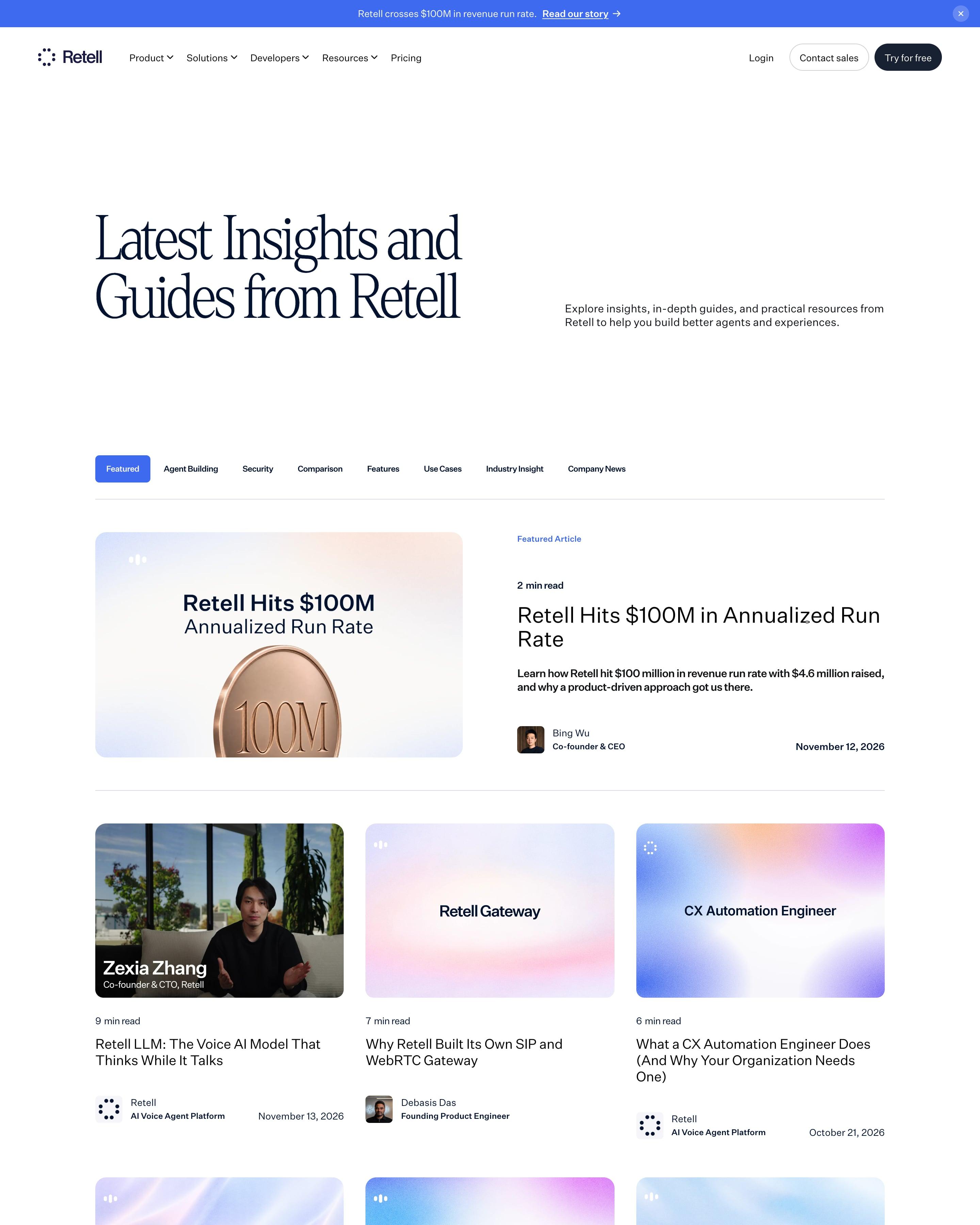
"Latest Insights and Guides from Retell" leads into topic tabs (Agent Building, Security, Comparison and more) and a featured post on reaching $100M in annualized run rate, drawn as a bronze coin. Most cards share one cover style, the post's title in dark type on a soft pastel gradient, broken up now and then by a video still of a founder.
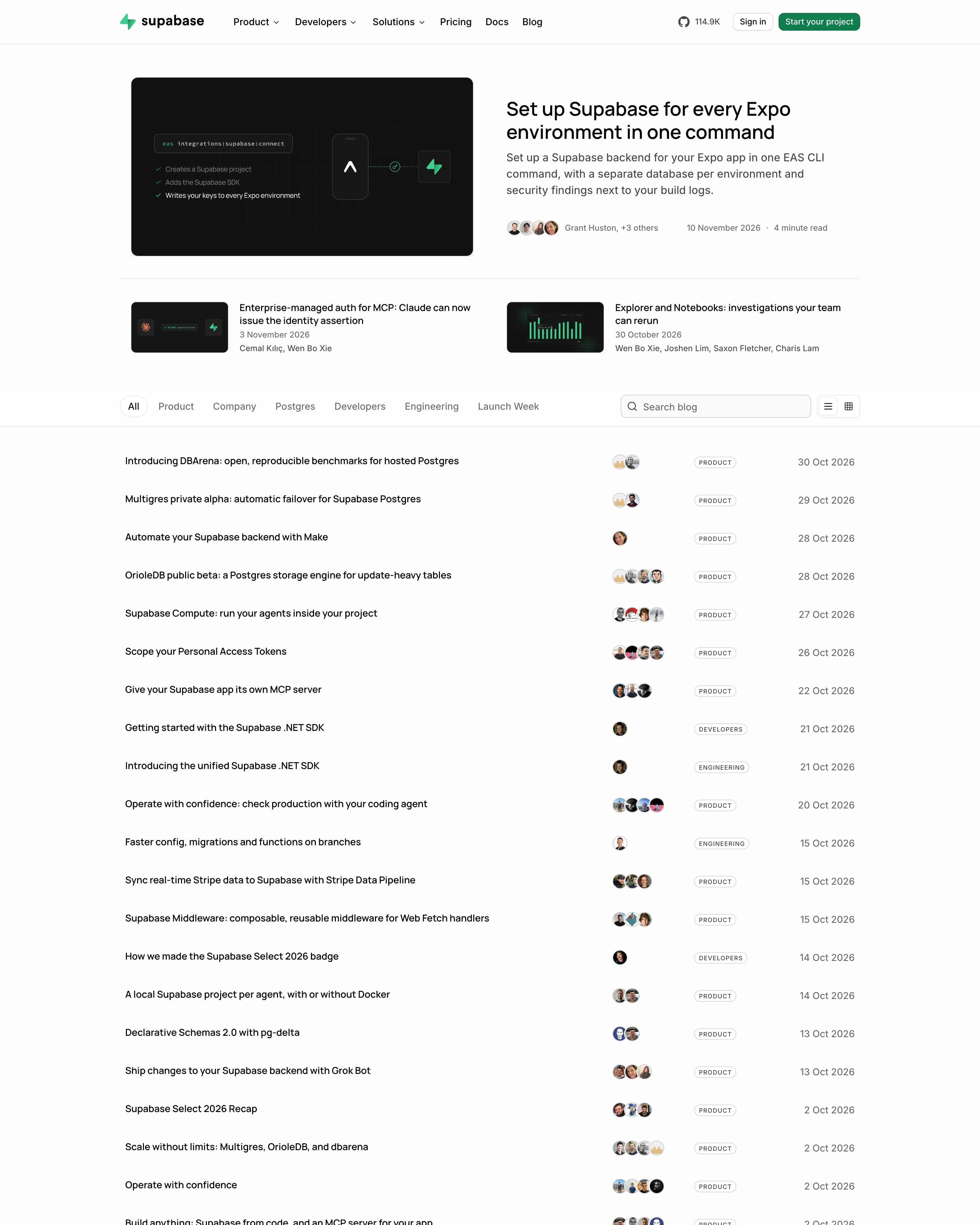
One featured post with a dark product-style cover and two smaller ones beside it, then the archive drops images entirely. Every post since May 2020 is a single row of title, author avatars, a small outlined category tag and the date, under category tabs and a search box. A list/grid toggle lets readers bring thumbnails back.
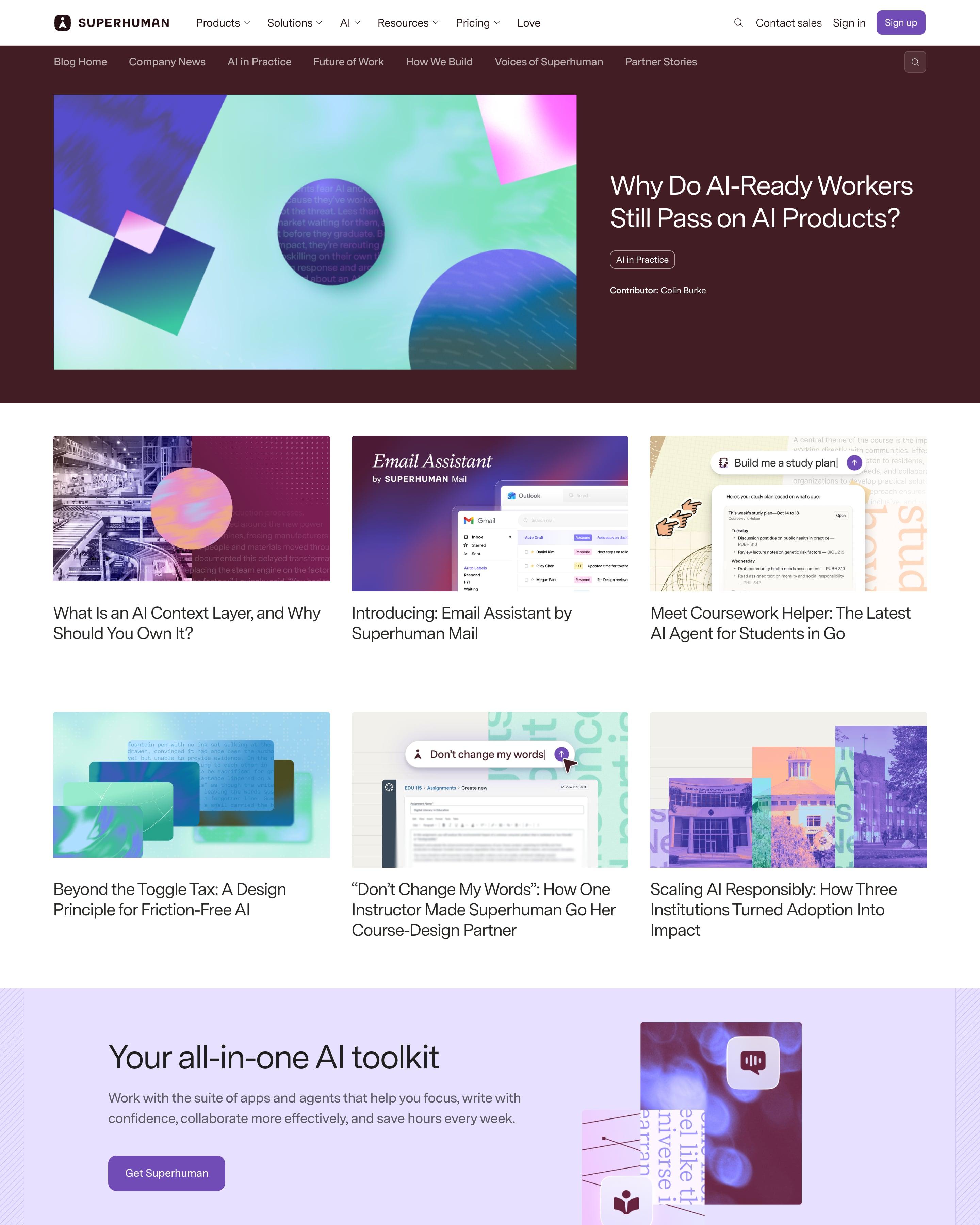
Topic links and a featured post share a maroon band, the post's abstract cover set beside a large title and category pill. Below, a three-column grid of covers uses one palette of violet, mint and pink shapes mixed with product screens, broken once by a lavender promo. That consistent cover style is the takeaway.
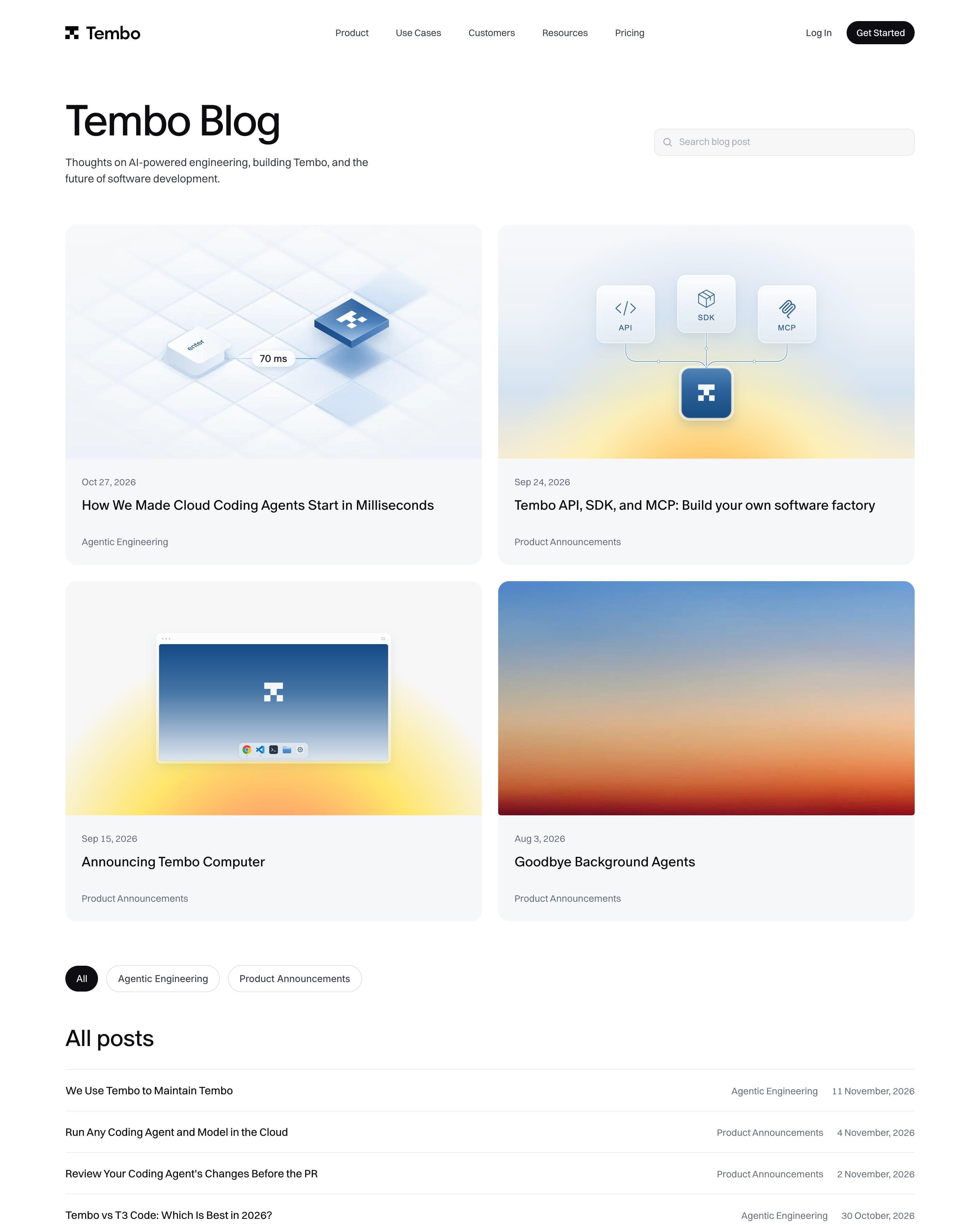
Four featured posts in two rows use soft 3D renders, glassy tiles and app windows on pale blue with a yellow glow, plus one plain sunset gradient. Everything else is a single long text list, title on the left, category and date in grey on the right, running back to February 2025. That list keeps well over a hundred comparison and guide posts scannable without thumbnails.
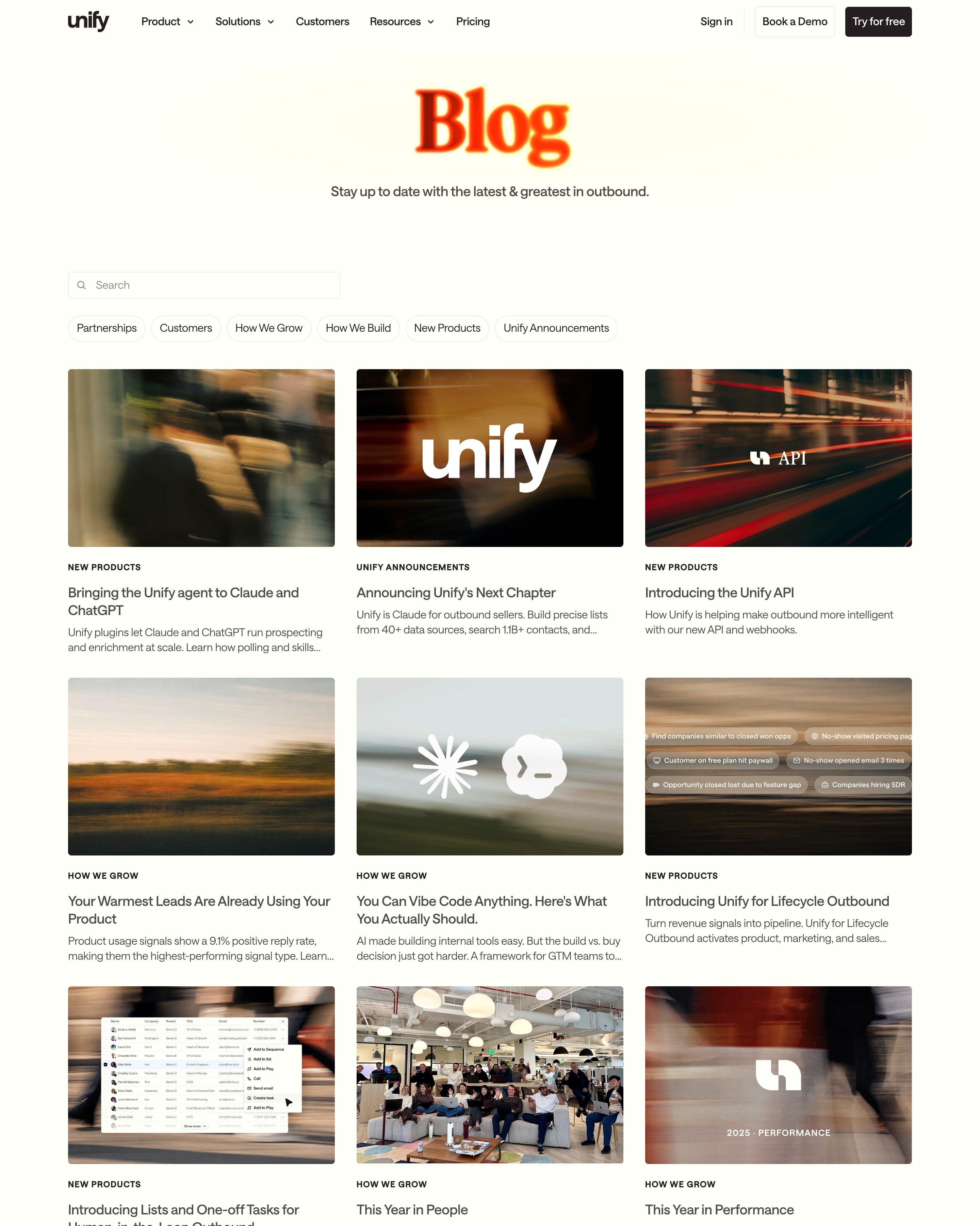
The title is one word, "Blog", in the same glowing orange serif as the about page's "win.". Below a search box and six category pills, a plain three-column grid runs every post with an uppercase category label. Covers share one motion-blurred photo style, and funding posts set the amount, "$40M", "$12M", "$6.6M", in huge serif digits that fade into the picture.
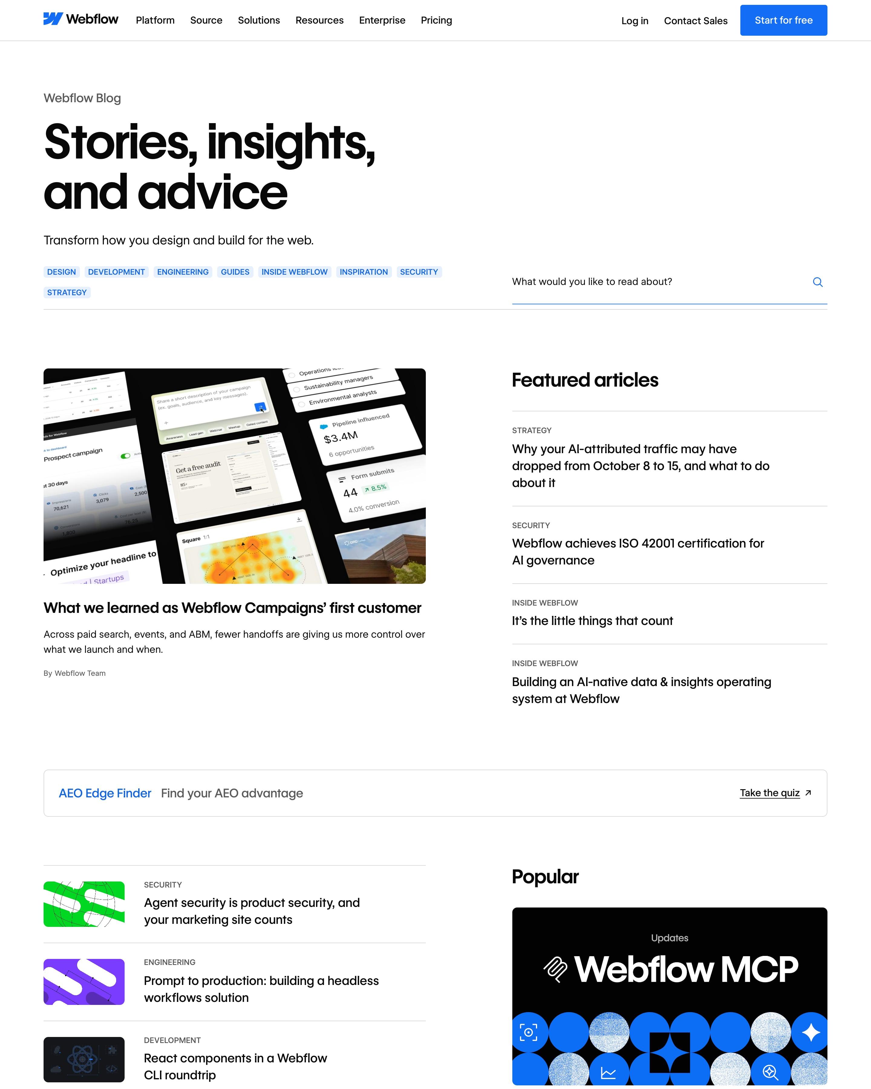
Blue category chips and a search field sit under the headline, then a lead post faces a list of featured articles. A large quote with a portrait breaks up the page before a four-column "Browse all" grid of bold flat covers in green, purple, red and pink. That quote block is worth lifting.
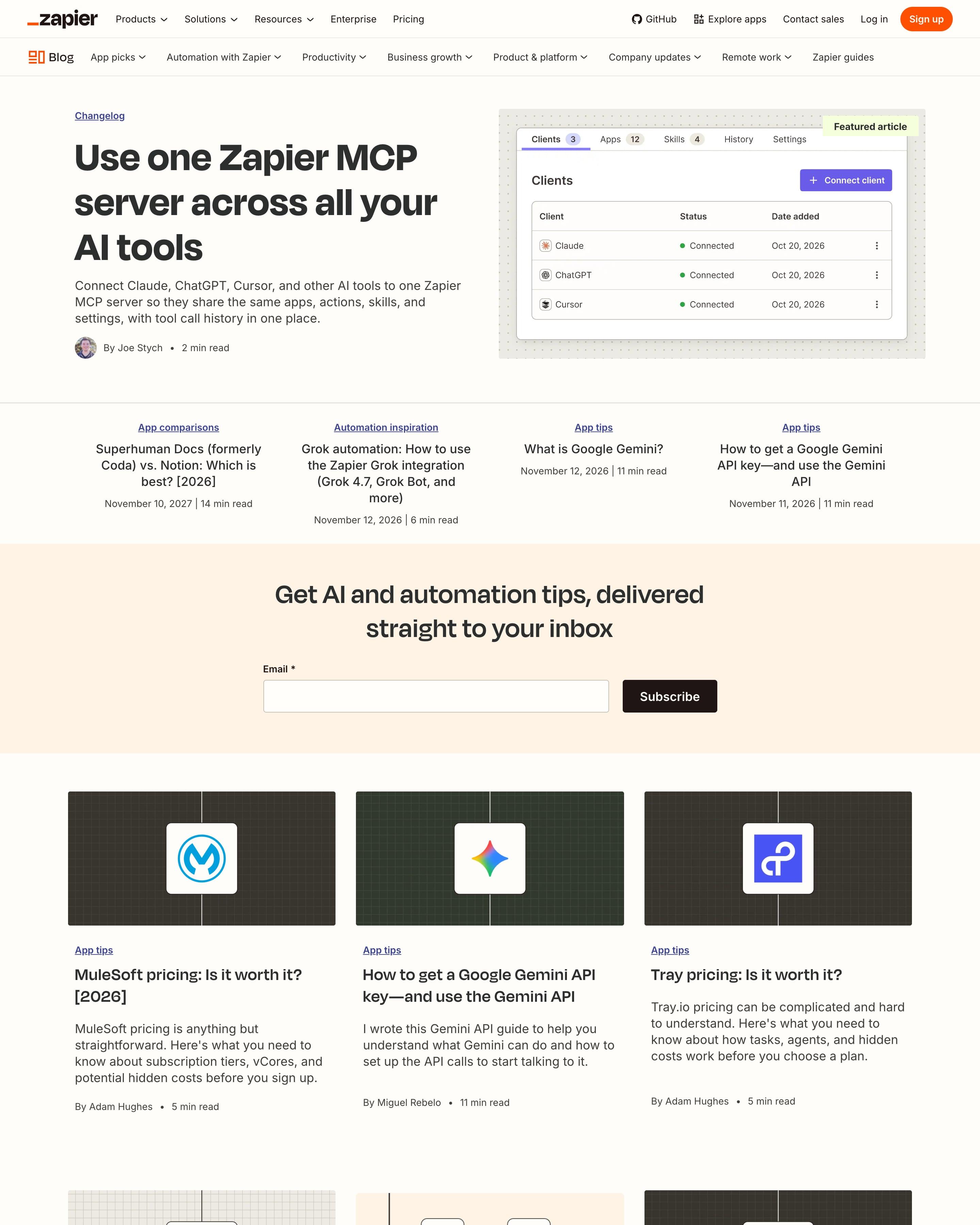
Most covers follow one template worth copying: the app's logo centred on a dark grid. The newsletter form appears three times, as a peach band, a card in the grid and near the end, and the closing band sketches a Zap as two steps: 'When I get a new lead', 'Notify my team'.
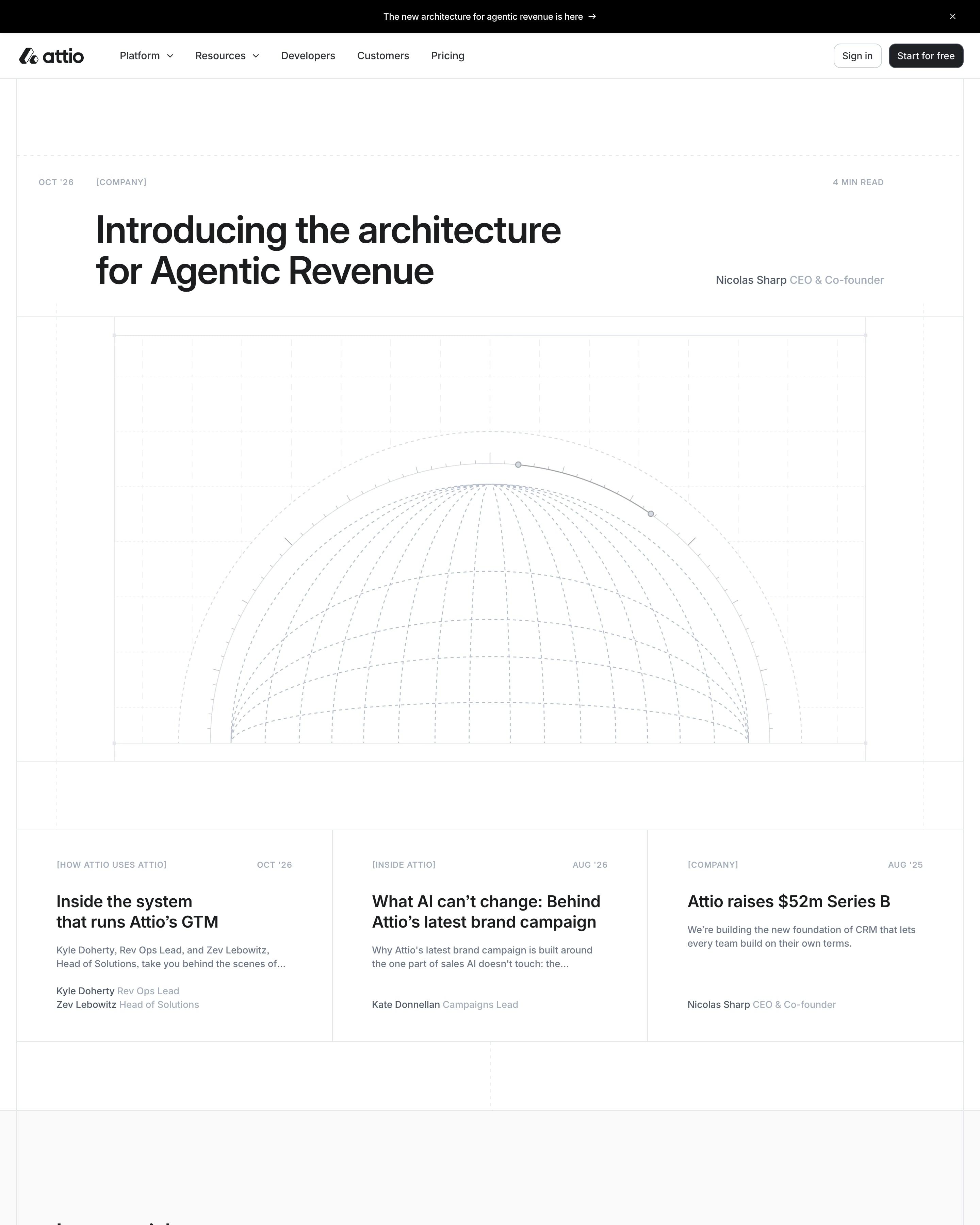
A featured post opens with a wireframe globe on a blueprint-style grid and an uppercase meta line: date, [COMPANY], read time. Below three text cards, every article sits in a single list, with categories and post counts in a sidebar. Bracketed tags like [PERSPECTIVES] give the rows a technical feel worth borrowing.
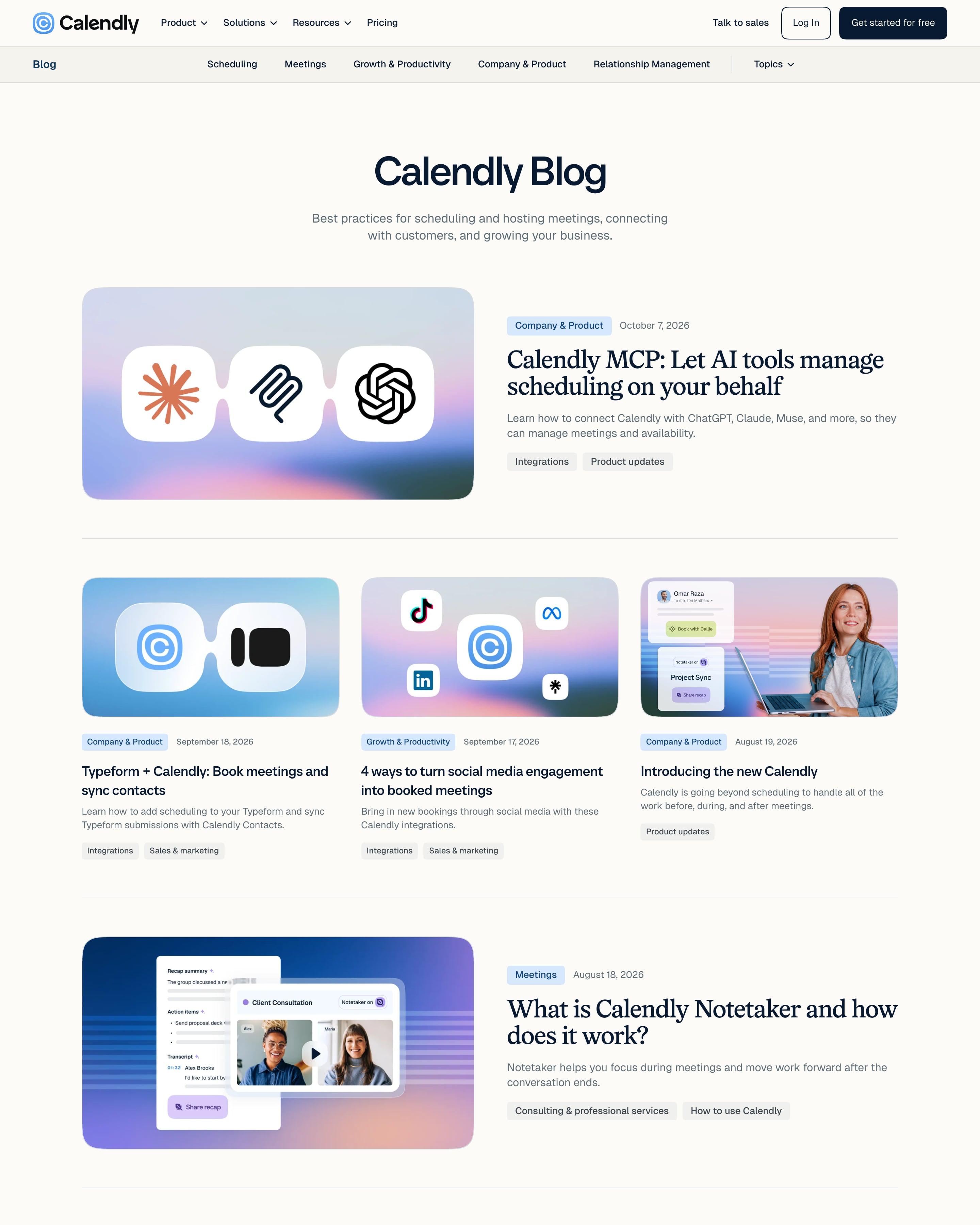
A topic bar runs under the main nav, from Scheduling to Relationship Management. Posts alternate between rows of three cards and single wide features with serif headlines, like "Calendly MCP: Let AI tools manage scheduling on your behalf". Worth copying: the cover system, which pairs the Calendly icon with a partner's logo in rounded white tiles on a gradient.
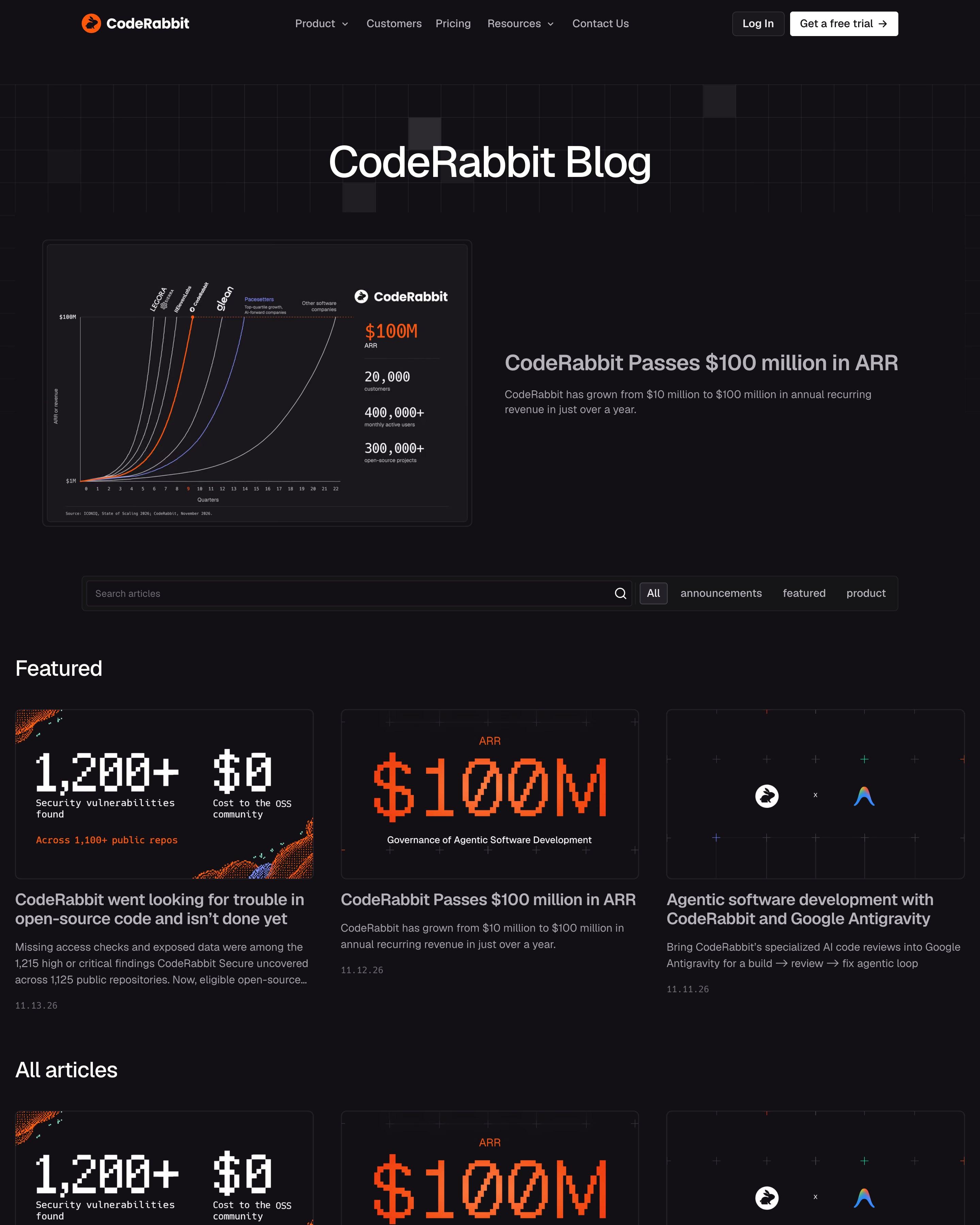
The featured post is a dark chart card plotting CodeRabbit's climb to $100M ARR against other fast growers. Covers stick to orange-on-black pixel and dot art: "$100M" in a blocky digital font, binary strings spelling out "SECURITY", particle-cloud renders. Search and category tabs share one bar, with pages numbered to 21. One cover language like this makes a long archive look like a series.
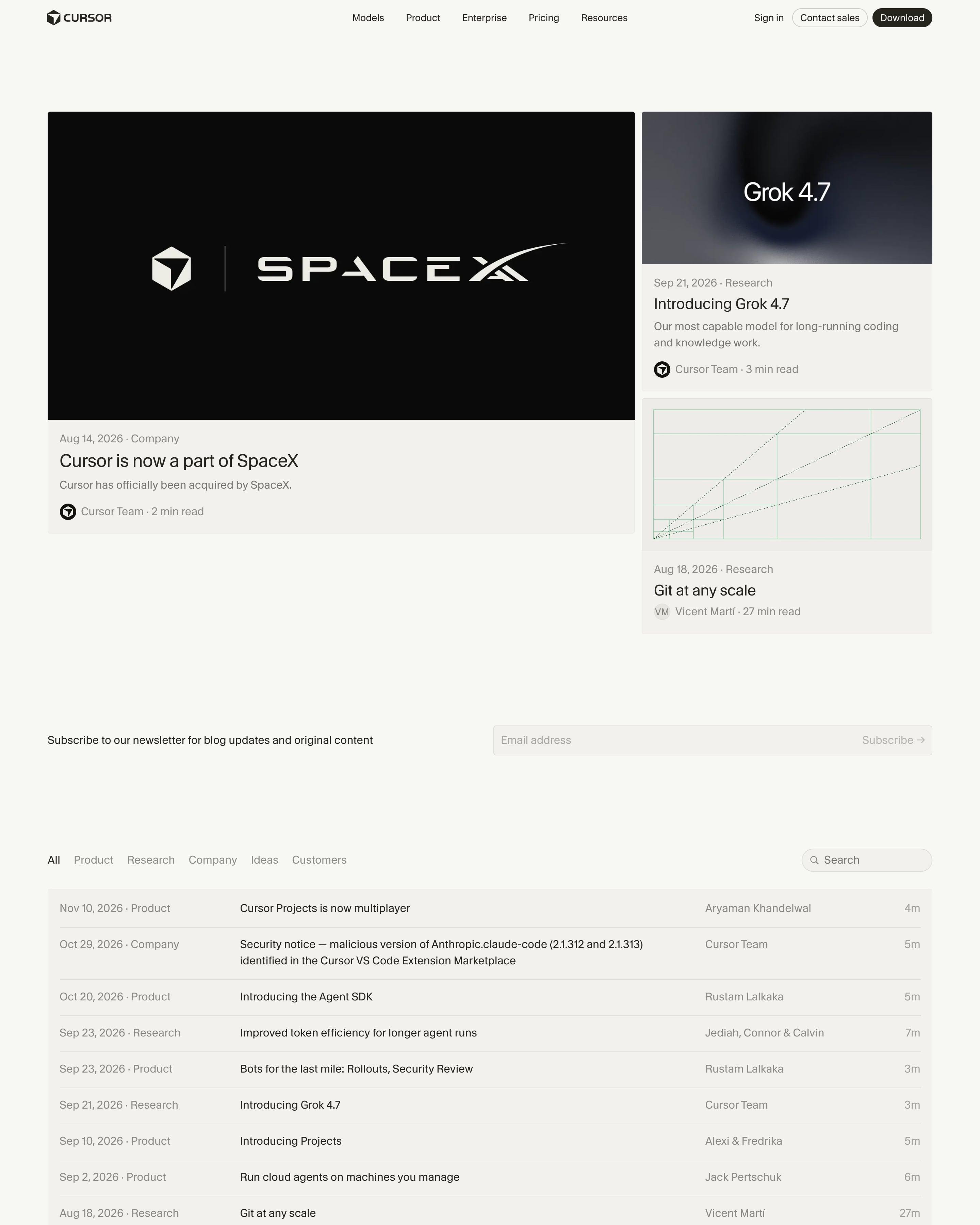
One big featured post and two stacked ones lead into an index set out as a table, one post per row with date, category, title, authors and read time, plus category tabs and search. Below, rows of four cards cover customer stories, press, videos and the changelog. Copy the table-style index.
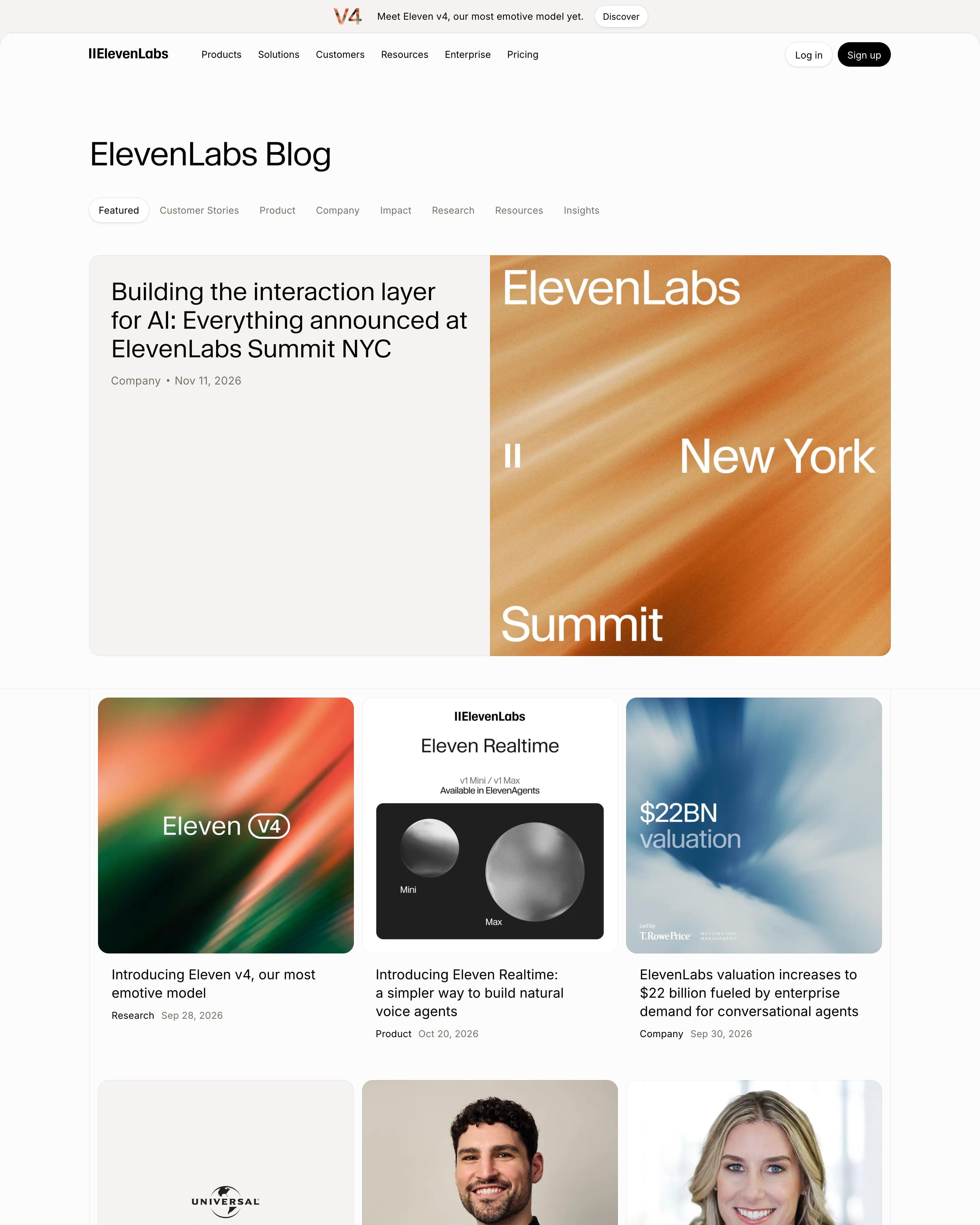
The Summit post leads as a split card, headline on beige beside a streaked orange "New York Summit" cover. Below, a three-column grid mixes grainy gradient covers carrying big figures like "$22BN valuation" and "$11B", portraits of new hires and plain logo cards. Category tabs from Customer Stories to Insights sit under the "ElevenLabs Blog" heading.
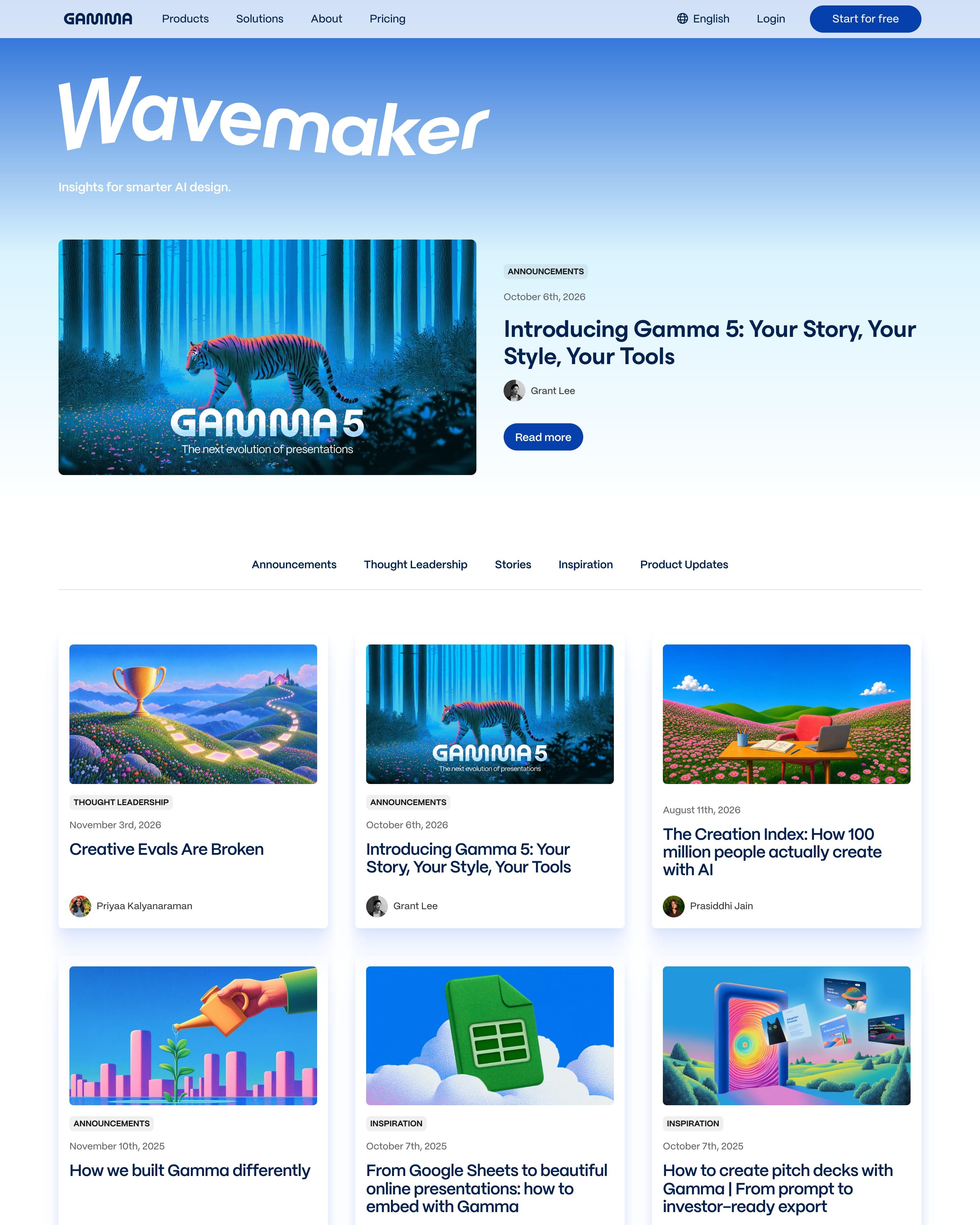
The insights page has its own masthead, "Wavemaker", in large slanted type on the sky gradient. A featured post with a tiger crossing a blue forest leads into category tabs and a three-column grid of 21 posts. Almost every cover is a surreal scene in matching pinks and blues, a consistent look worth copying.
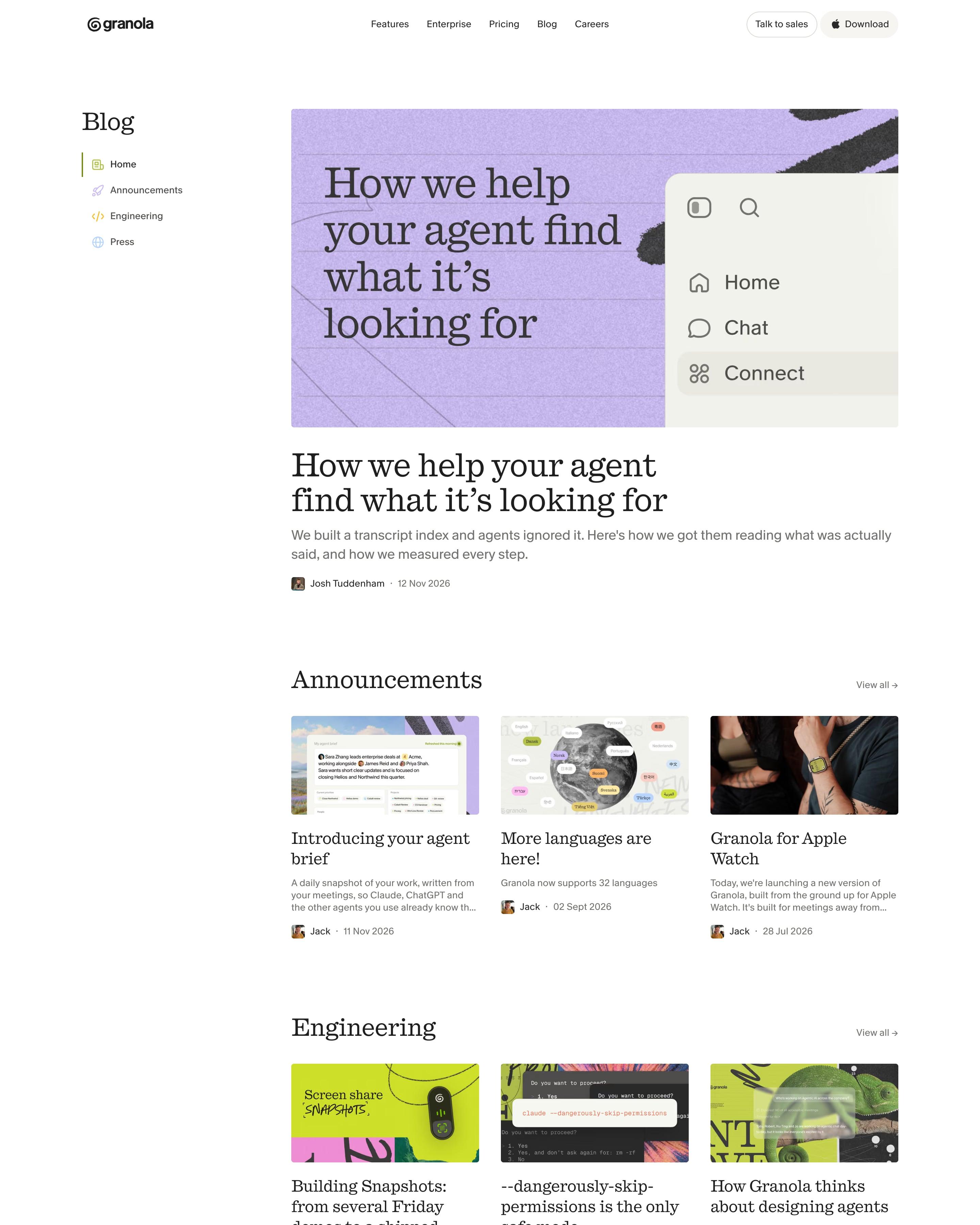
Sections live in a left sidebar (Home, Announcements, Engineering, Press), and the lead post's cover sets its title on lilac lined paper. Three-card rows for Announcements and Engineering come next, then every post in a compact list with thumbnails. The mix of curated rows and a full list is a pattern to reuse.
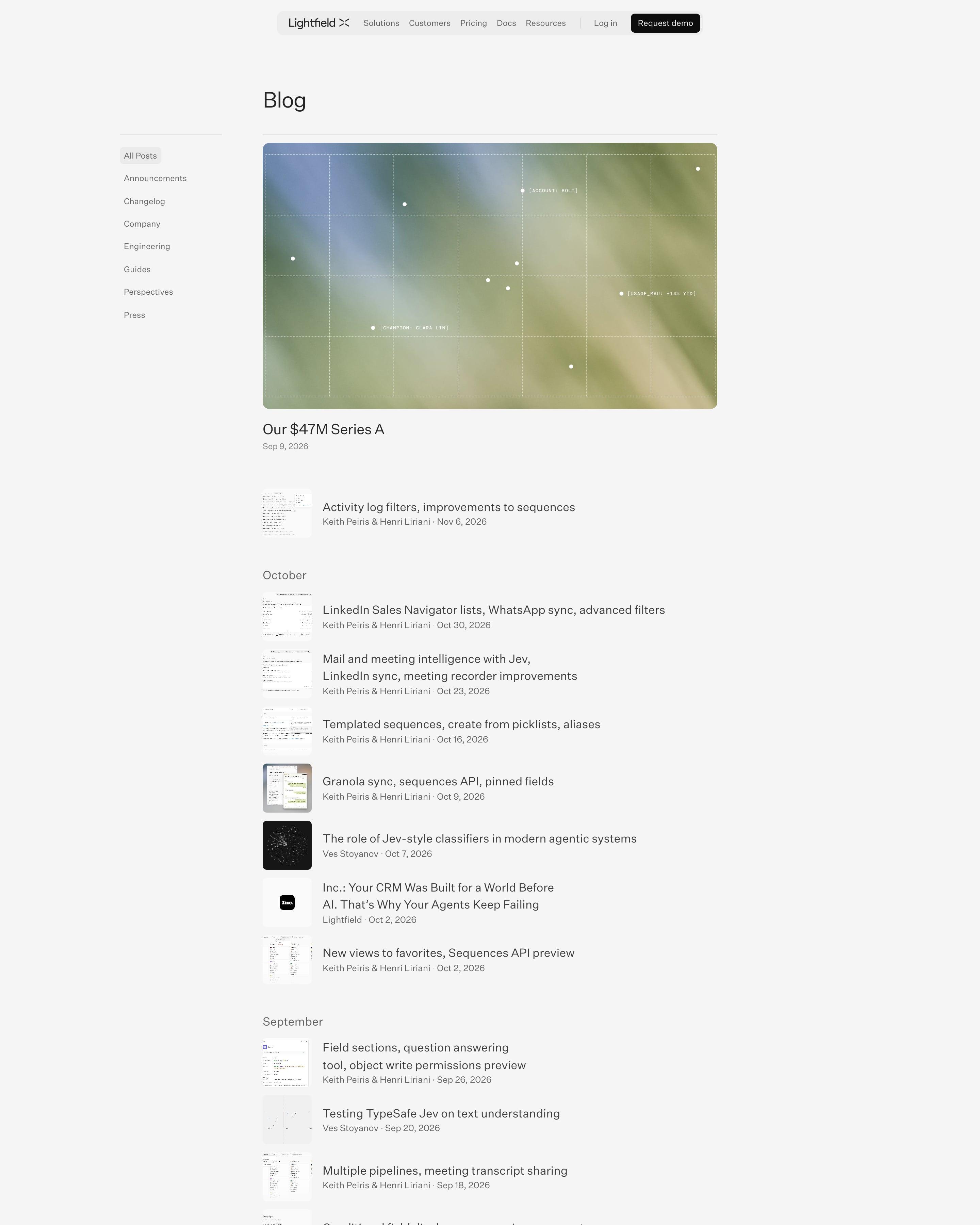
A category sidebar sits on the left, and the featured Series A post gets a blurred image with a grid and monospaced data labels like "account: bolt". Everything else is a compact list grouped by month, with thumbnails, mixing changelog notes, press and essays. Grouping by month keeps a busy log easy to scan.
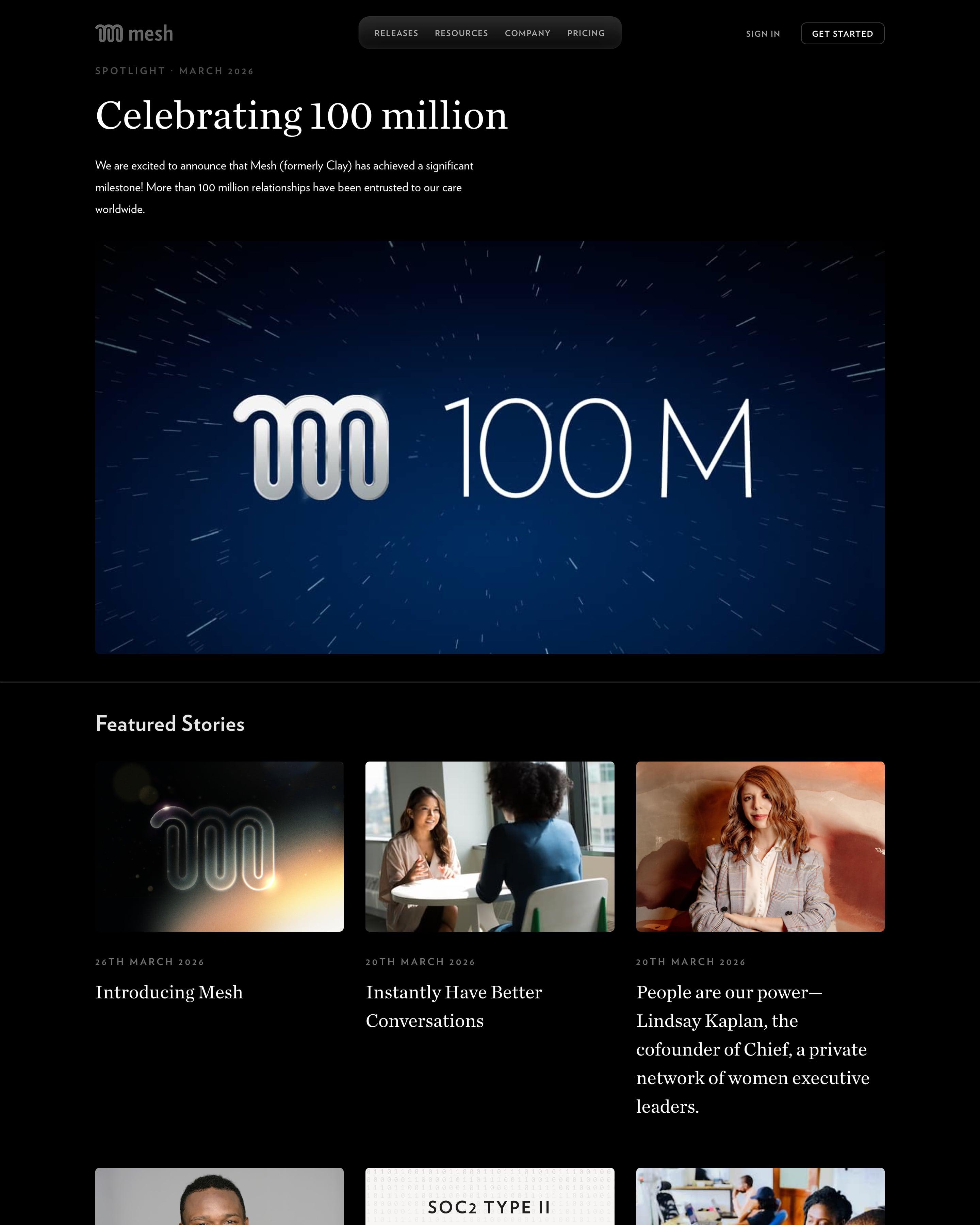
Serif headlines on black give the page a magazine feel, led by a "Spotlight" story on reaching 100 million relationships with a wide starfield image. Nine featured stories follow as photo cards in three columns. It closes on a short manifesto and a large black-and-white photo, an ending worth stealing for any blog.
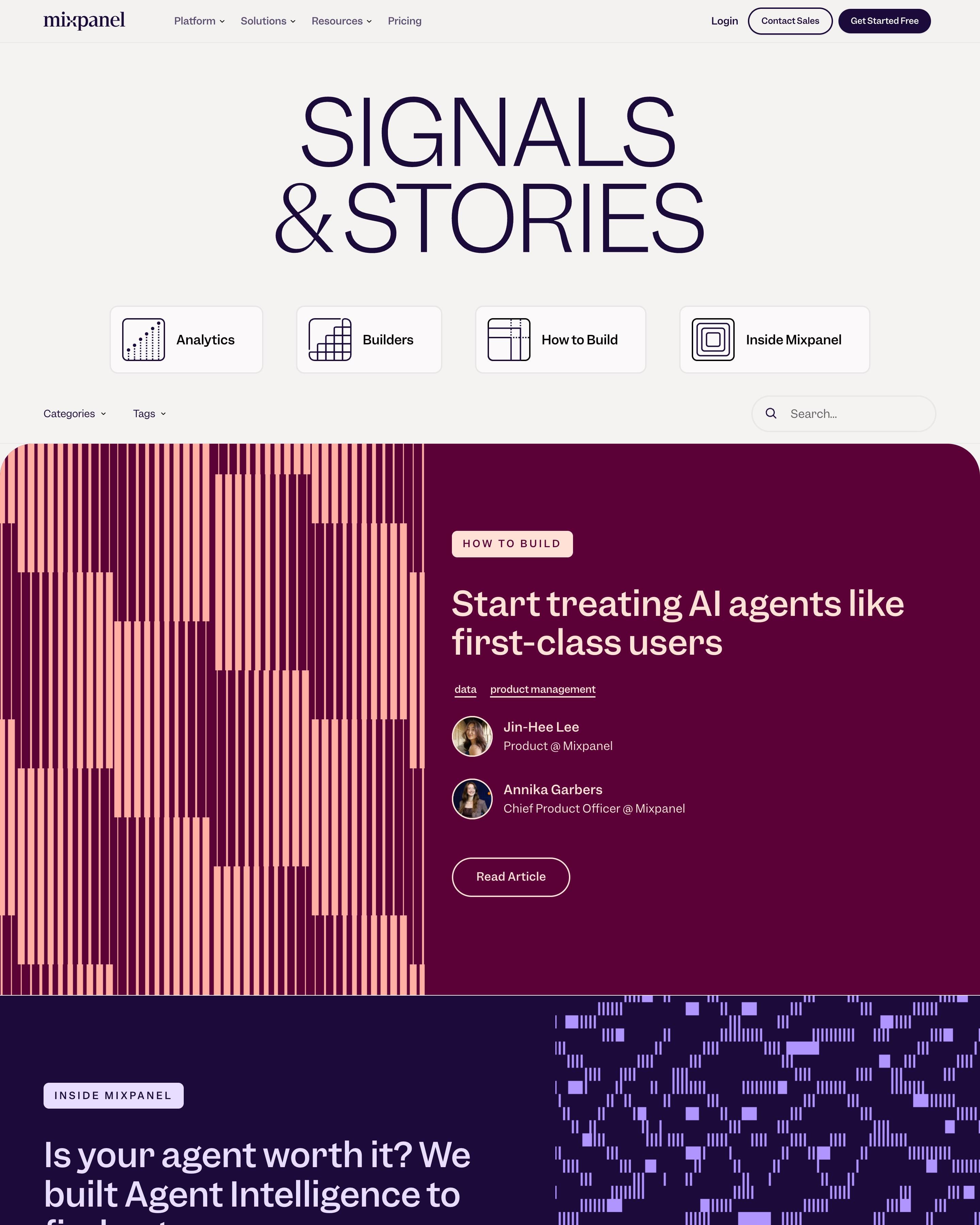
Each post fills a full-width band of plum, indigo or burnt orange, with abstract pattern art that switches sides from post to post. A giant "Signals & Stories" masthead sits over four topic tiles with line icons. Note the email sign-up bar that turns up twice between posts; it is easy to reuse.
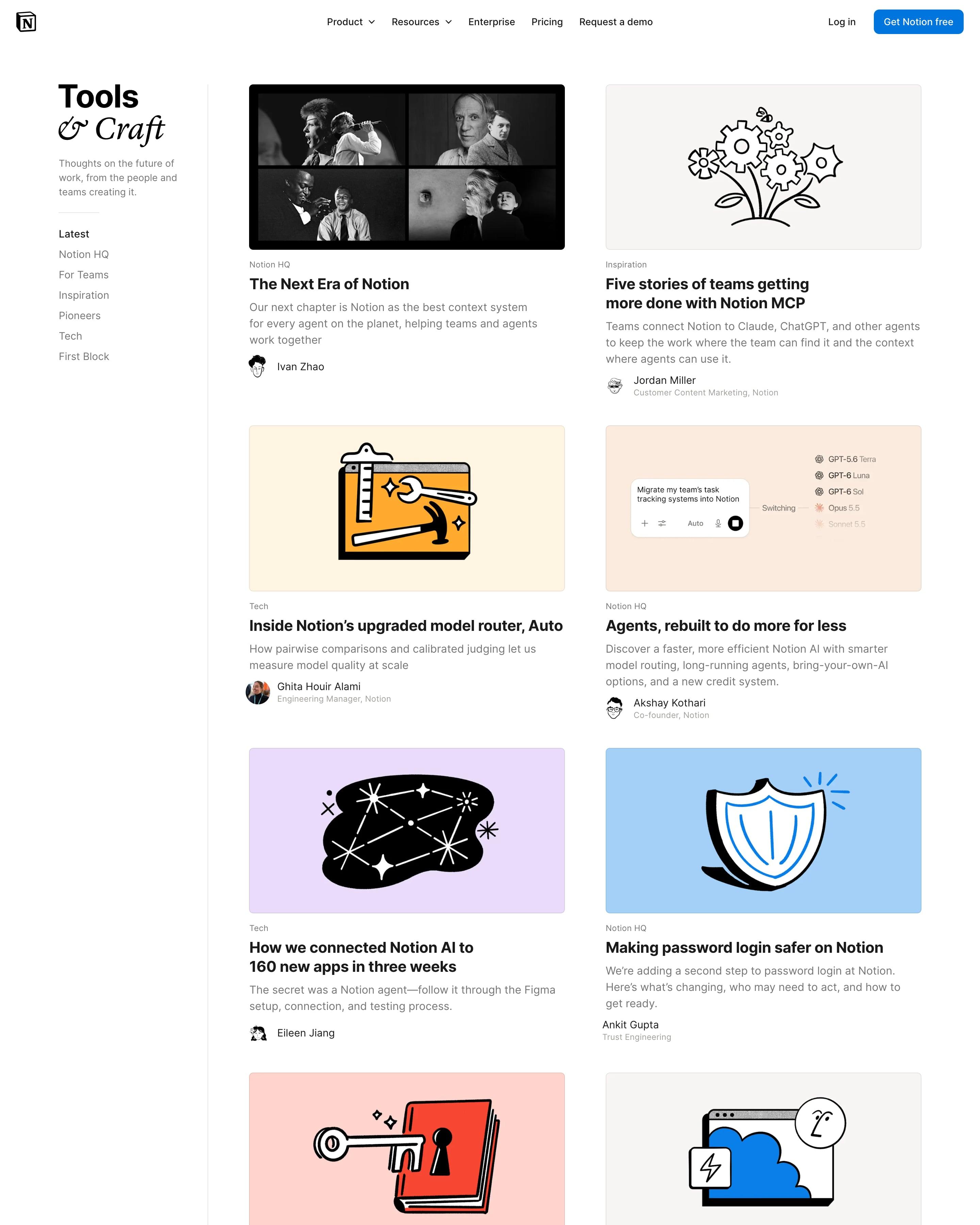
"Tools & Craft" pairs a bold sans "Tools" with an italic serif "& Craft", over a sidebar of categories like Notion HQ, Tech and Pioneers. Posts sit in a two-column grid, each cover a bold ink spot illustration on a flat pastel ground, with author avatars drawn in the same style. Pagination is five plain numbers at the bottom.
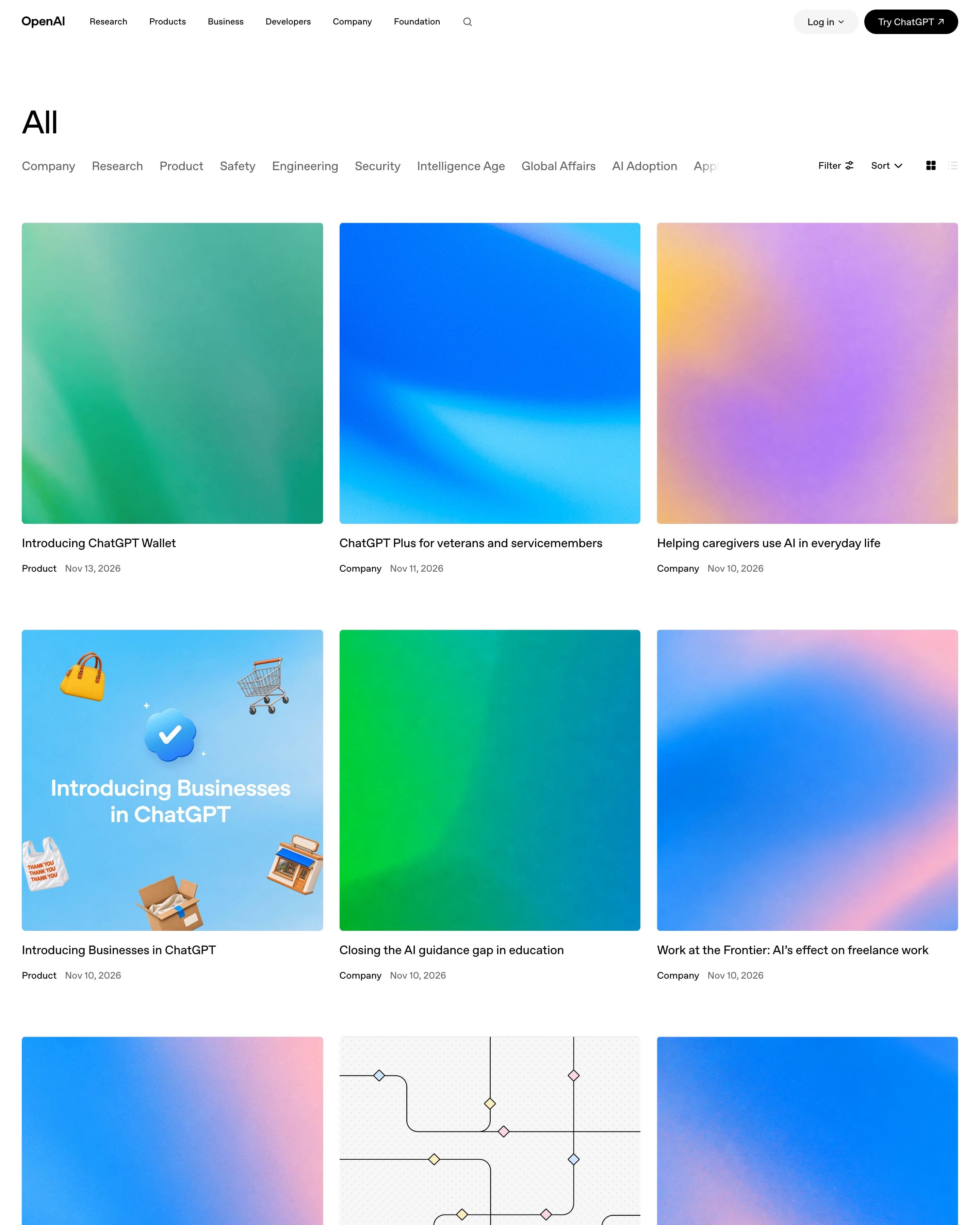
The news index is a three-column grid headed "All", with a scrolling category row from Company to Global Affairs and the same Filter, Sort and view controls as Stories. Most covers are soft blurred gradients in blue, green and pink with no text, a few with simple illustrations. Worth copying: one cover system that keeps a daily feed consistent without per-post design work.
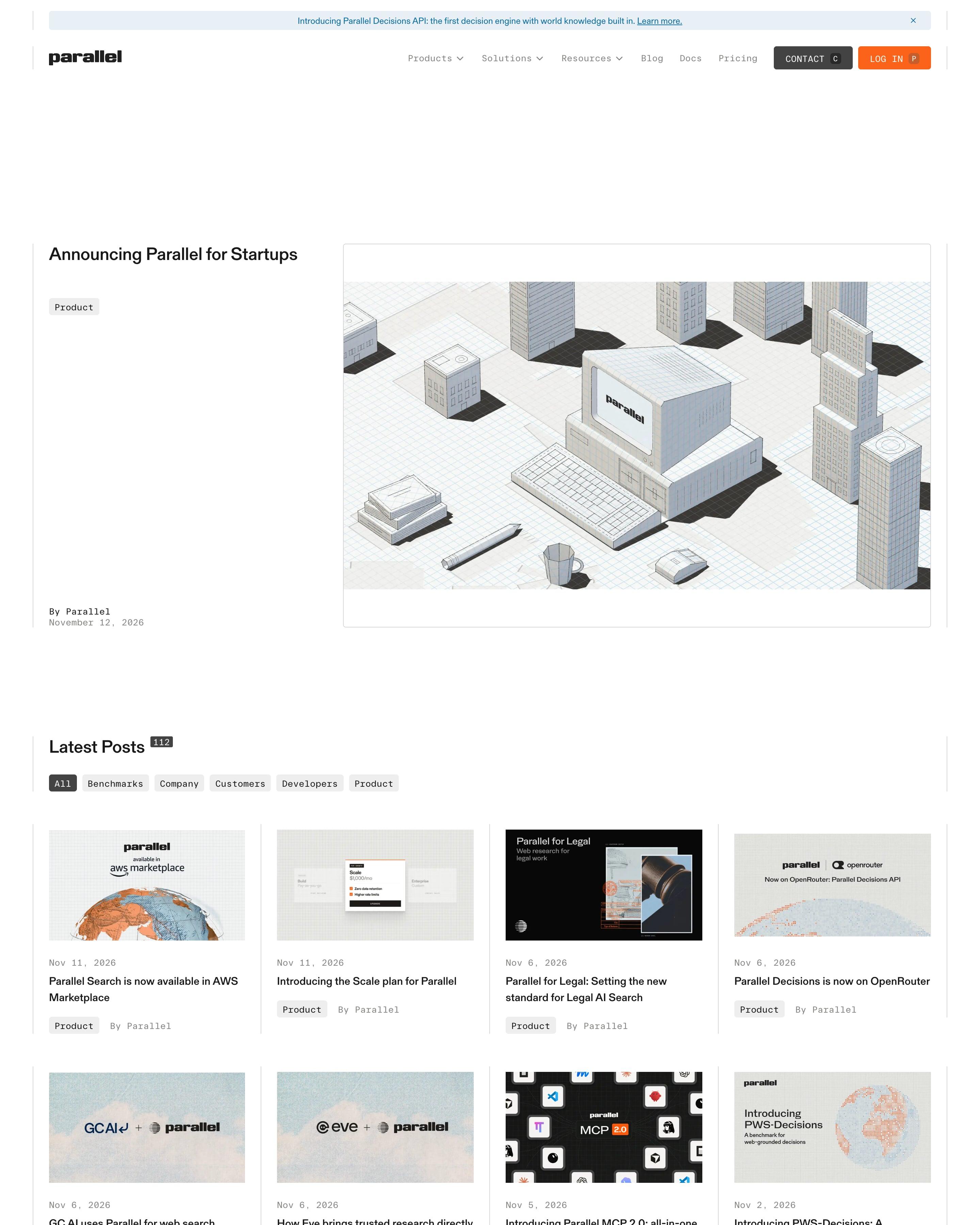
A featured post opens with an isometric line drawing of an old desktop computer among white tower blocks. Below, "Latest Posts" and "Customer Stories" each run as a four-column grid, many covers pairing two logos on a sky backdrop, with full-width bars to load more. Copy the post count printed beside each heading.
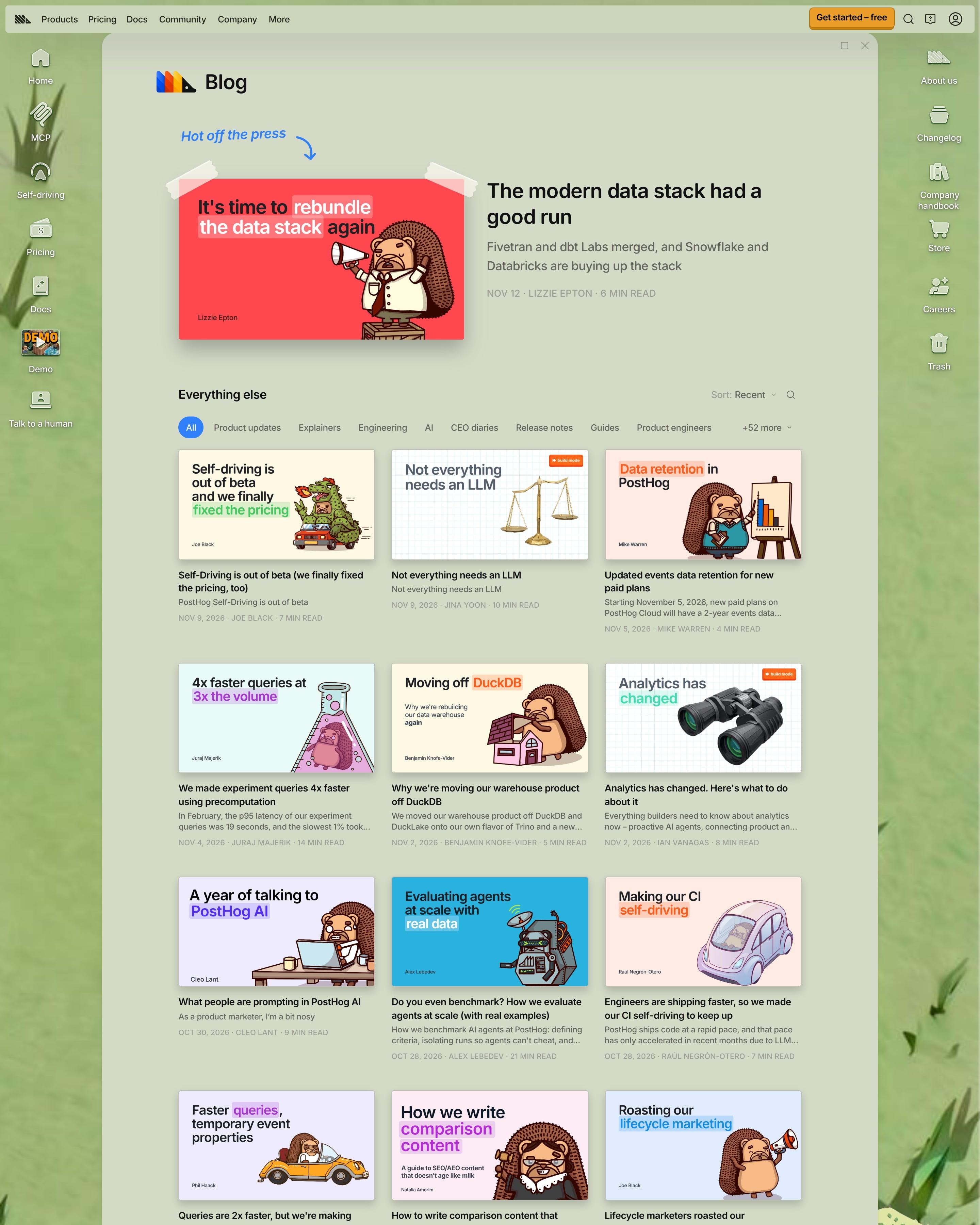
Each cover pairs a big headline, with highlighted words, and a drawing, often a hedgehog acting out the topic. The newest is taped up under a handwritten "Hot off the press" label, above topic chips with "+52 more" and a paged three-column grid. Copy the single drawing style used on every cover.
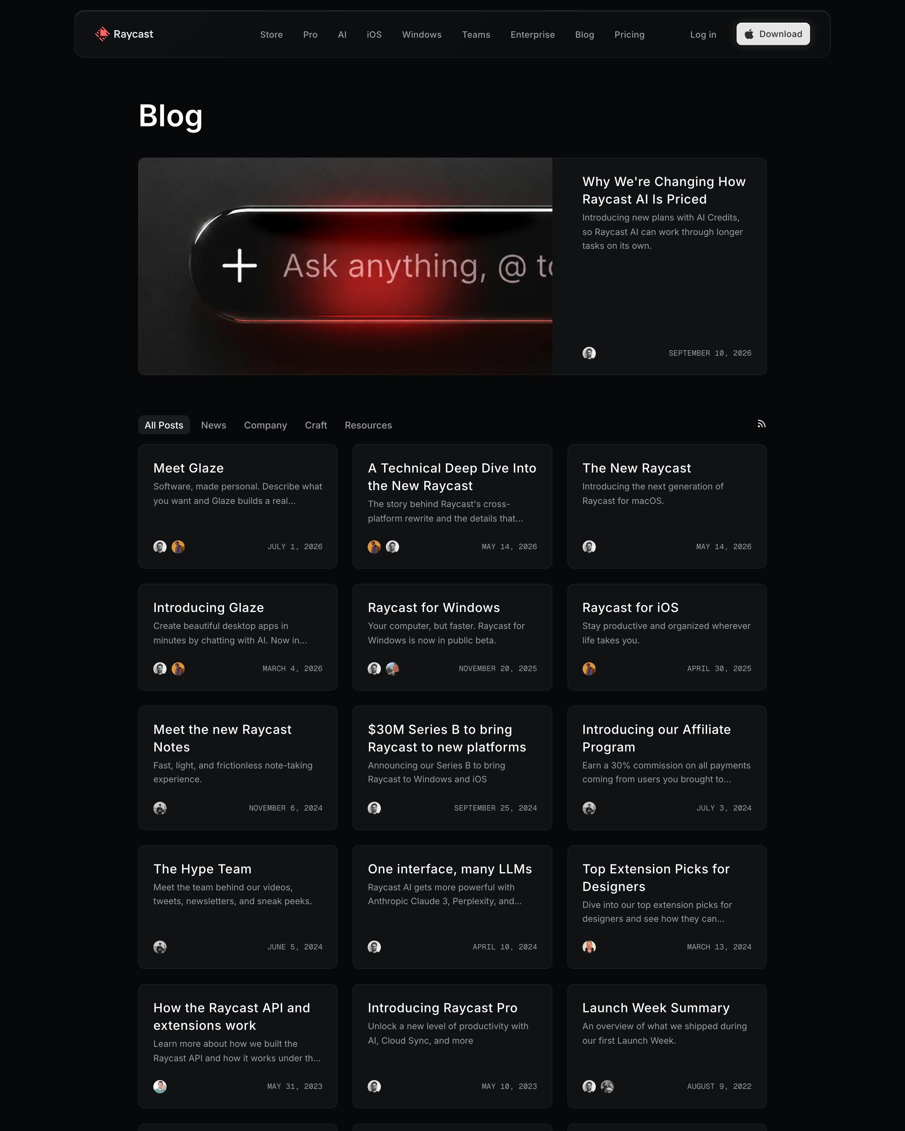
One post gets a wide card with a red-lit image of the AI prompt bar; every other post is a text-only card with title, summary, avatars and a monospaced date. Tabs (News, Company, Craft, Resources) and an RSS icon sit above the three-column grid. Copy the text-only cards when posts lack cover art.
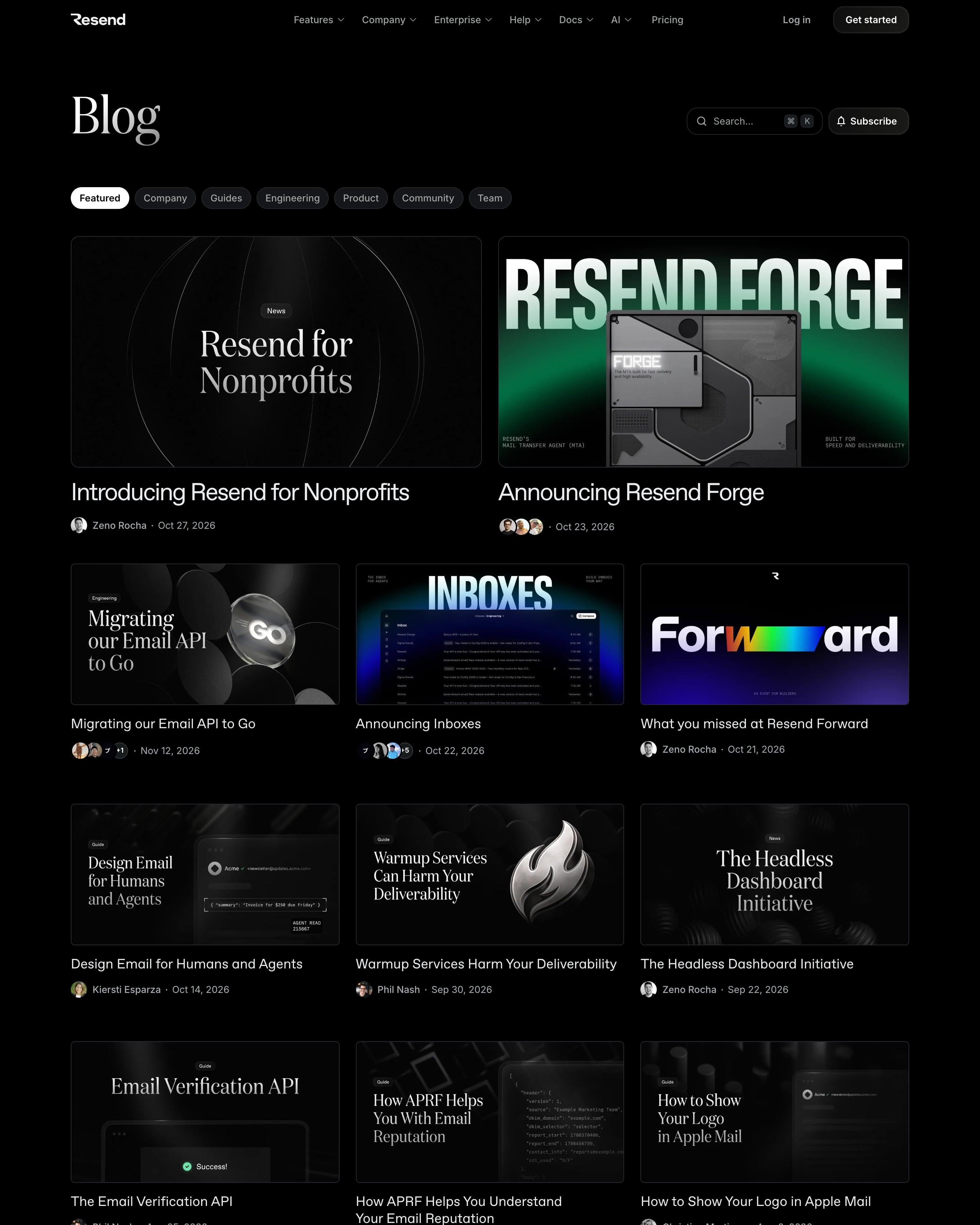
Under a serif Blog heading sit topic pills, a search box with a ⌘K hint and a Subscribe button. Two large featured posts lead into a three-column grid where every cover is a designed image with its own title type. Worth copying: a separate Humans behind Resend section that welcomes new hires with portrait covers.
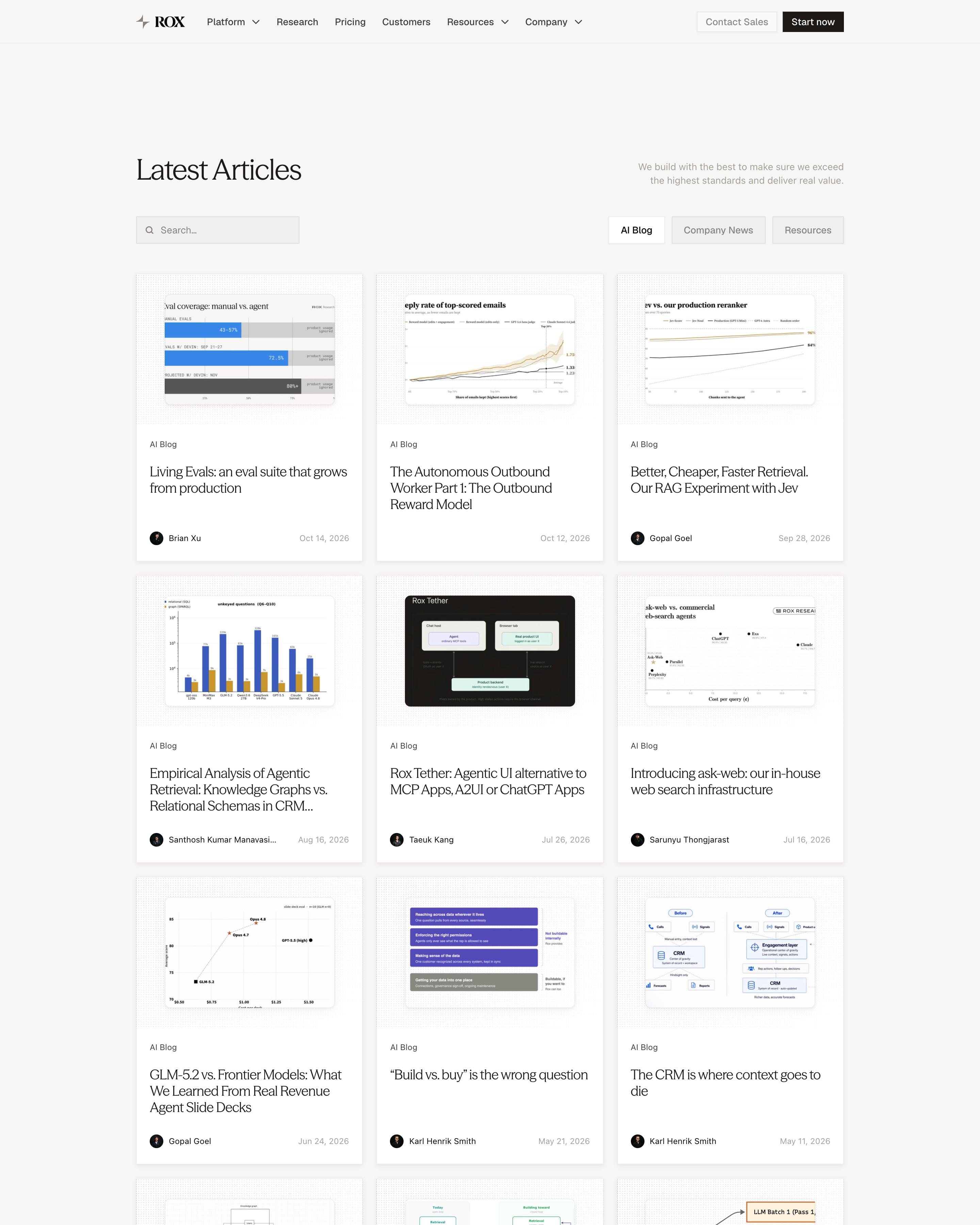
"Latest Articles" has a search box and three tabs, AI Blog, Company News and Resources, above a three-column card grid. Nearly every cover is a chart or diagram from the post itself, such as reward model curves, retrieval benchmarks or architecture boxes, framed on a dotted grid. Using real figures as covers suits a research-heavy engineering blog.
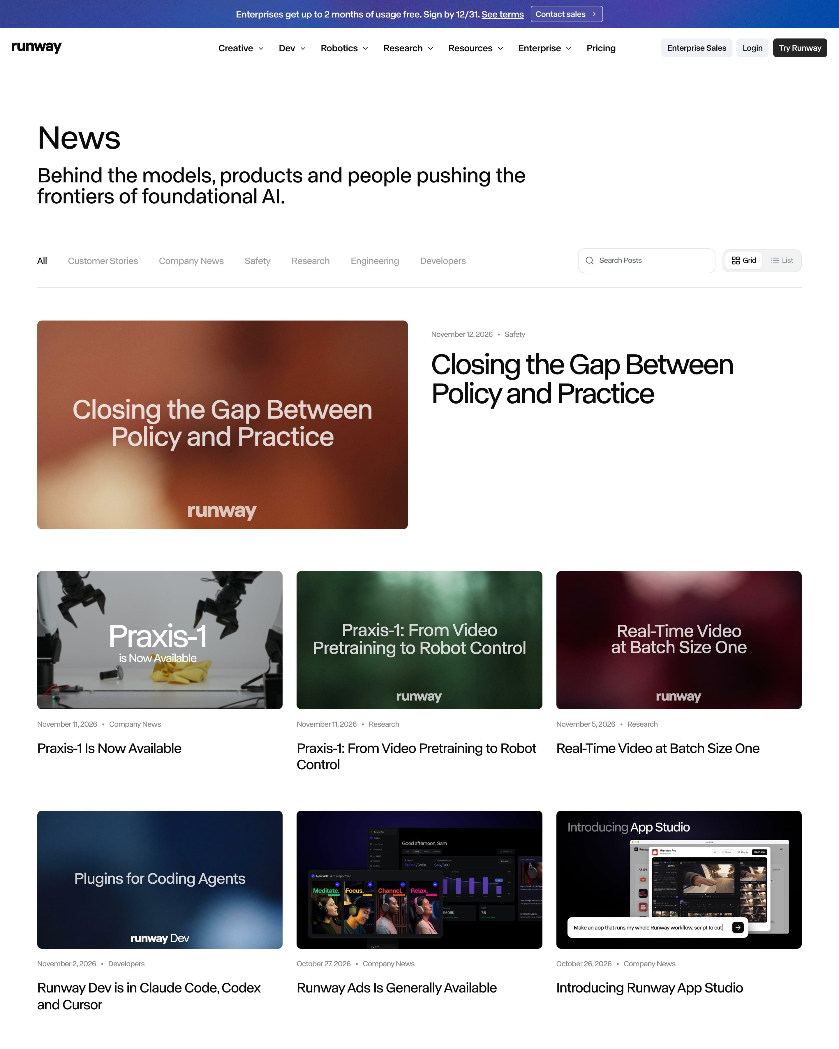
Under the "News" heading, category tabs, a search field and a Grid/List switch share one row. Most covers are a blurred field of colour with the Runway wordmark on top, plus either the post title or a partner's logo, like Claude's or OpenAI's. That cover template is the idea to copy.
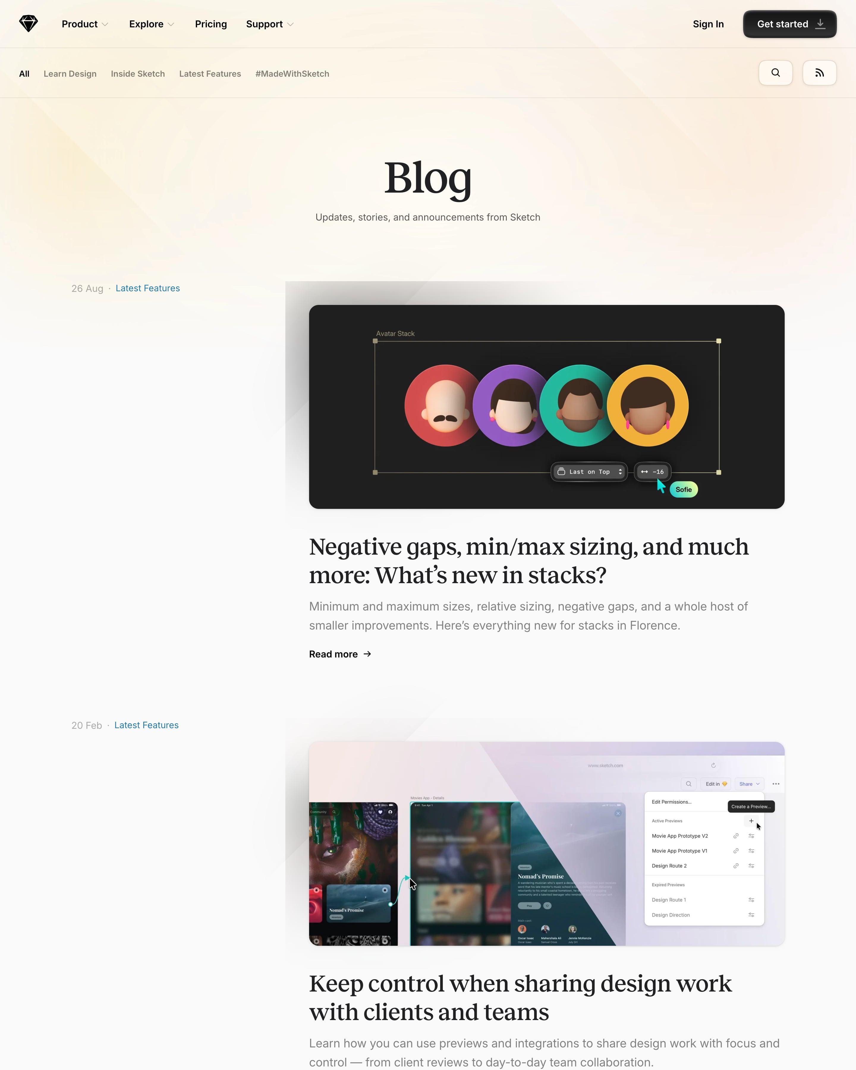
A single column of posts, each with its date and a coloured category on the left and a large cover image on the right. Covers are mostly product art: a 3D avatar stack, a retro "Copenhagen" postcard, gold line drawings for the 2025 recap. A three-card Changelog strip breaks up the feed, and pagination runs to 32 pages.
Posts run as wide rows, not a grid: category, title and summary on the left, date and authors in the middle, a square cover on the right. Several covers worth copying centre on one big figure, such as '57%' or '100+'. A strip of blue 'Recent highlights' cards breaks up the list.
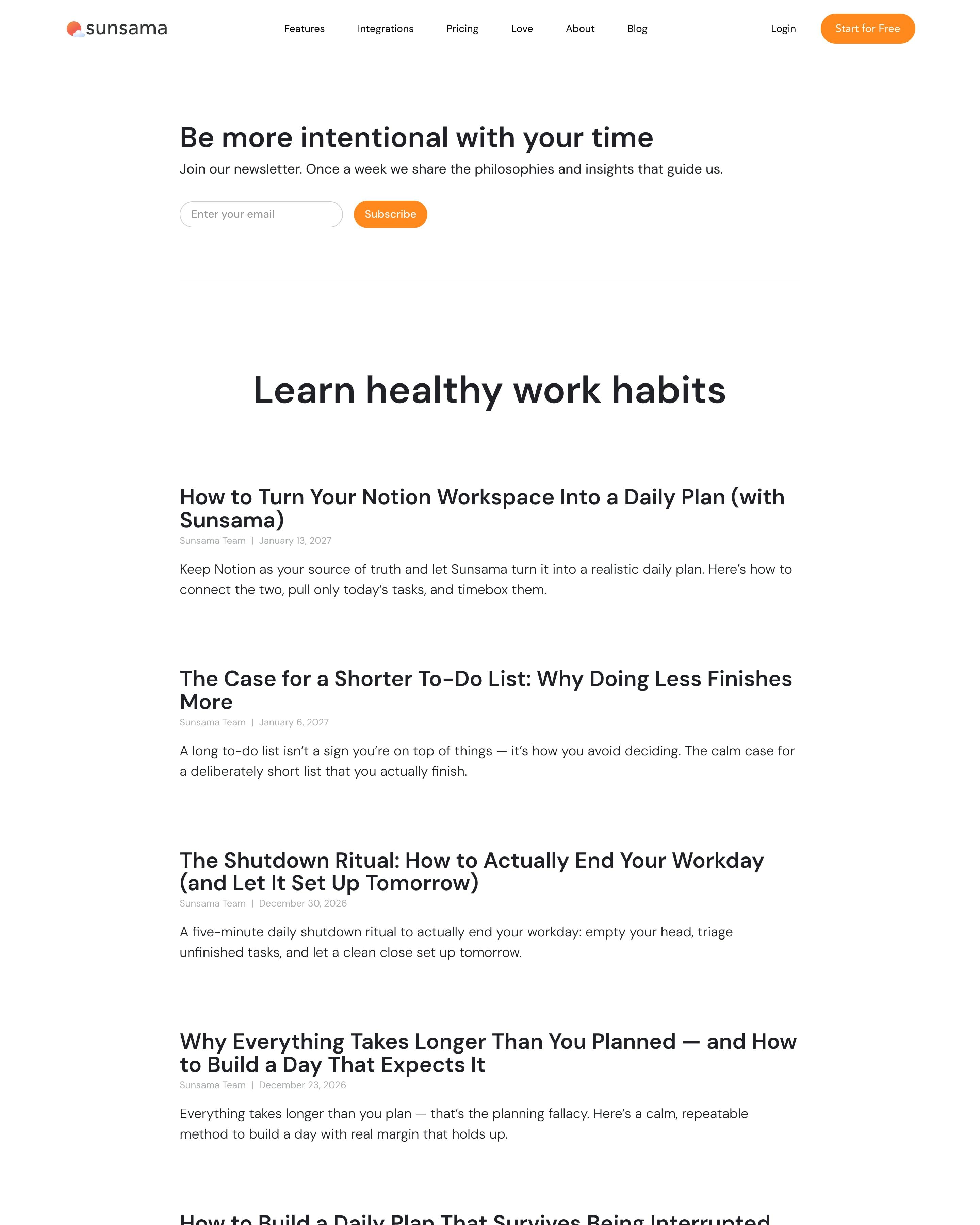
No images at all: a newsletter box ("Be more intentional with your time") comes first, then "Learn healthy work habits" lists posts in one narrow centred column. Each entry is a large title, a tiny grey "Sunsama Team" byline with date, and a two-line summary. Comparison posts like "ClickUp vs. Sunsama" sit in the same calm format as the habit essays.
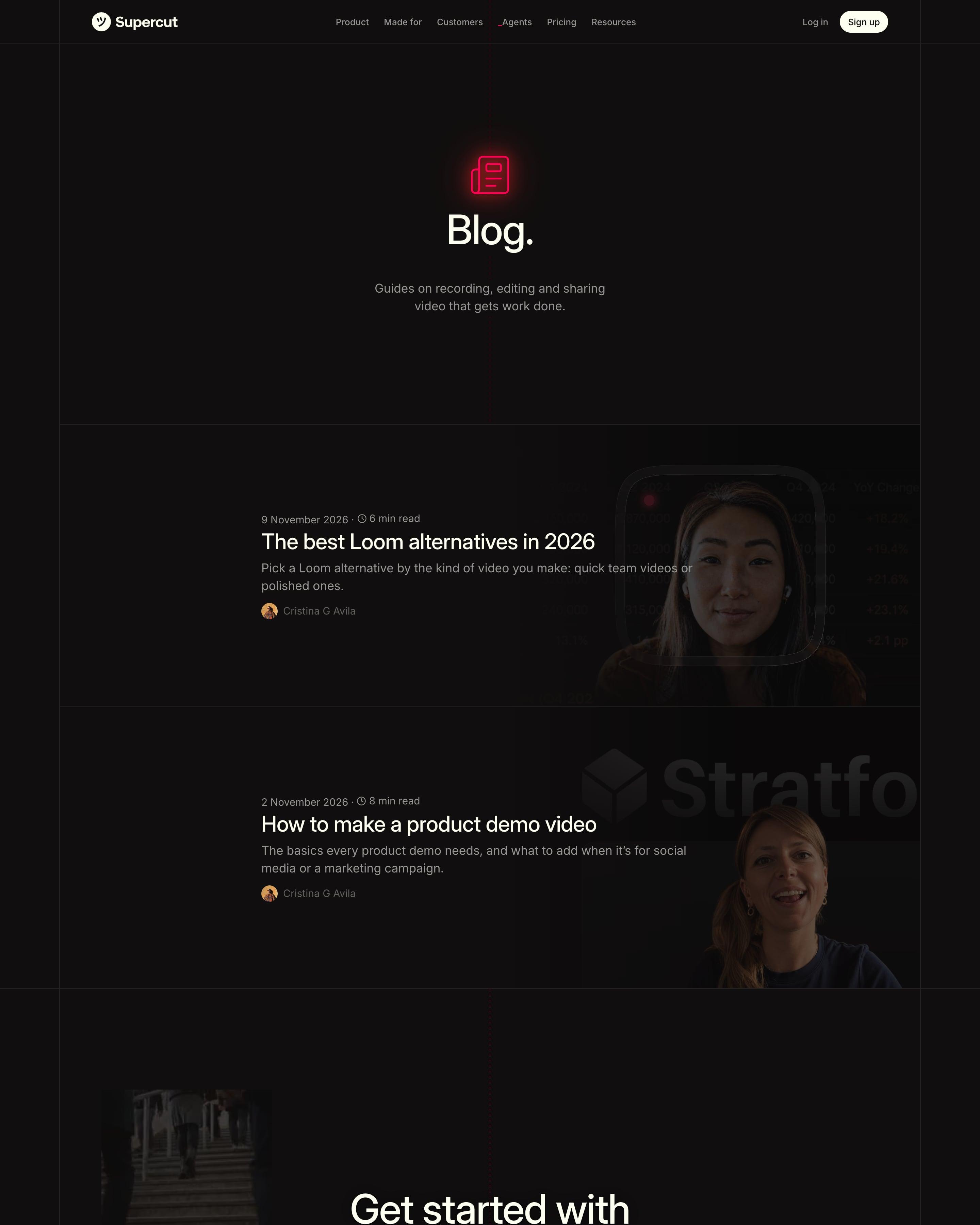
Just two posts sit under a glowing red icon and a centred "Blog." heading, each a full-width row with date, read time, title, summary and author avatar. Covers sit on the right and fade into the dark behind the text, showing a webcam frame over a product shot. Worth copying: those faded covers, which keep a short archive looking designed rather than empty.
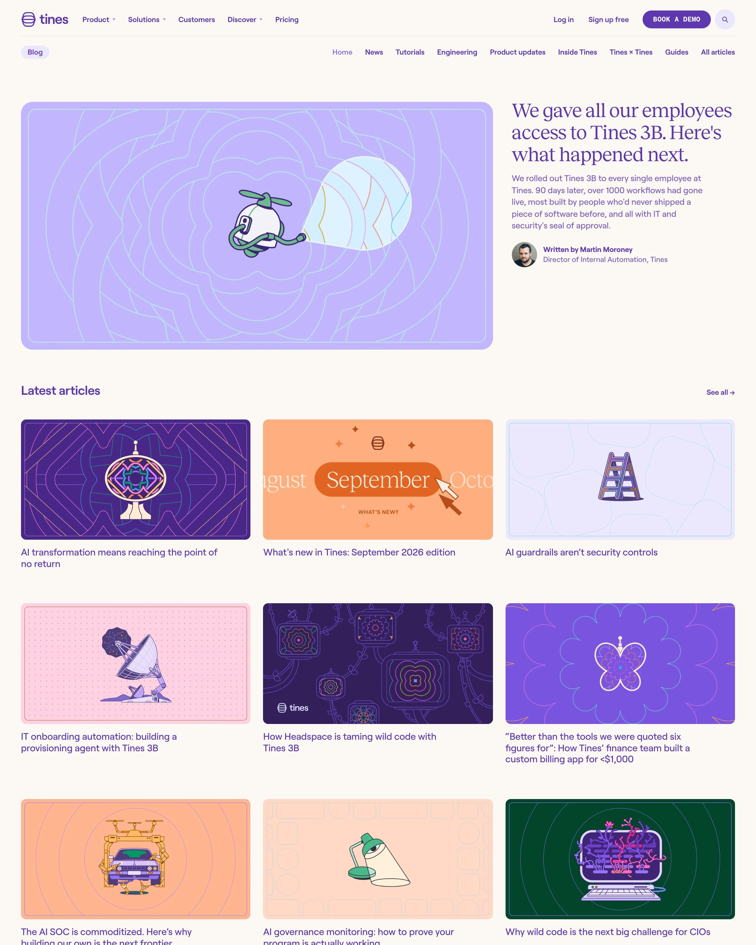
Every post gets its own drawn cover in one shared style, across a large featured story, a 3×3 grid of latest articles, tutorials and tall report covers for guides. Product updates use an easy idea to copy: the month's name on an orange cover. A pulled quote and a newsletter form split the shelves.
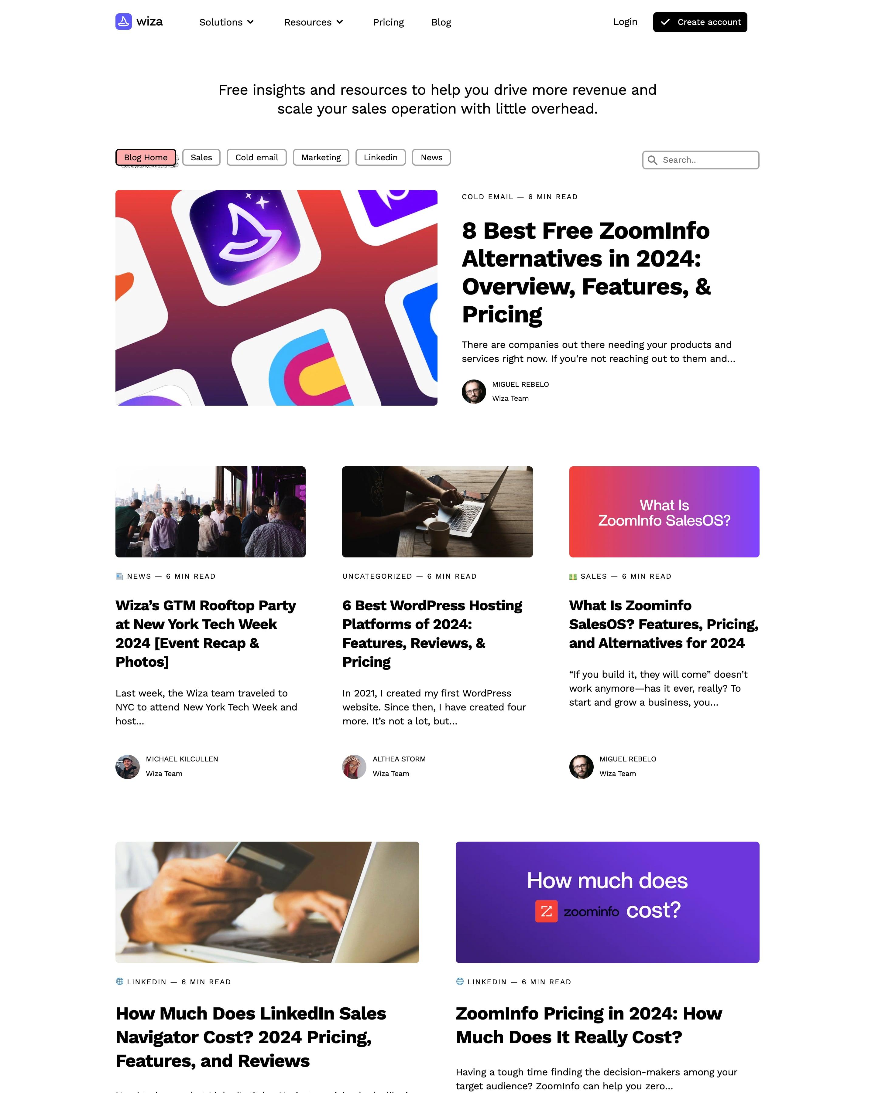
Unlike the rest of the site, the blog uses black-outlined category pills (the active one pink), a featured post under a 'COLD EMAIL — 6 MIN READ' label and a salmon newsletter box with hand-drawn squiggles. Every card repeats that category-and-read-time line, a small habit worth copying.
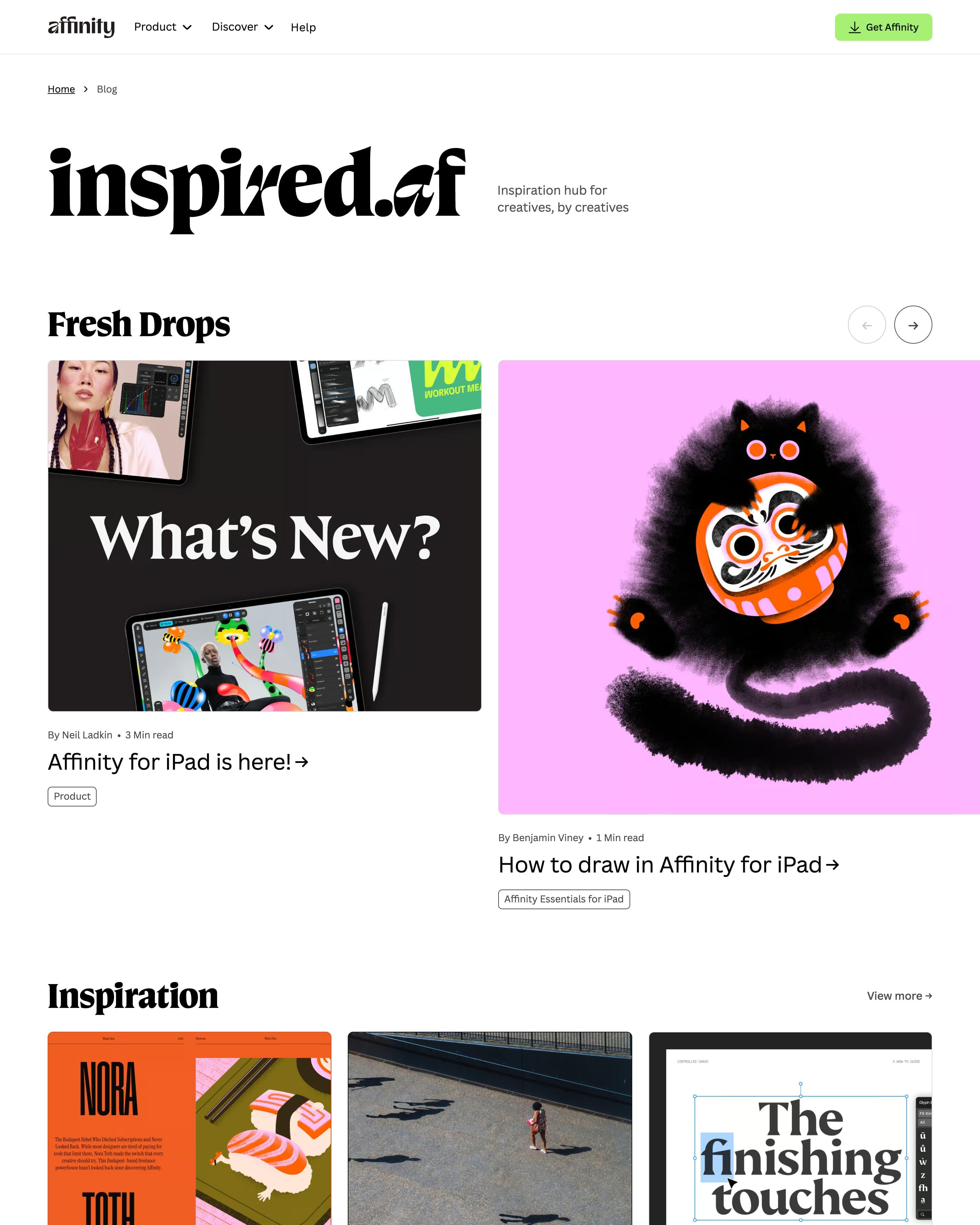
Branded "inspired.af" in a heavy serif, the blog runs as white shelves of three cards: Fresh Drops, Inspiration, Switching to Affinity, Essentials for Desktop and iPad, Stories, Community. Each card has author, read time and an outlined tag pill, and a dark "Pixel-perfect worlds" interview banner breaks the run. Worth copying: lime selection handles drawn around tutorial thumbnails, tying posts back to the app.
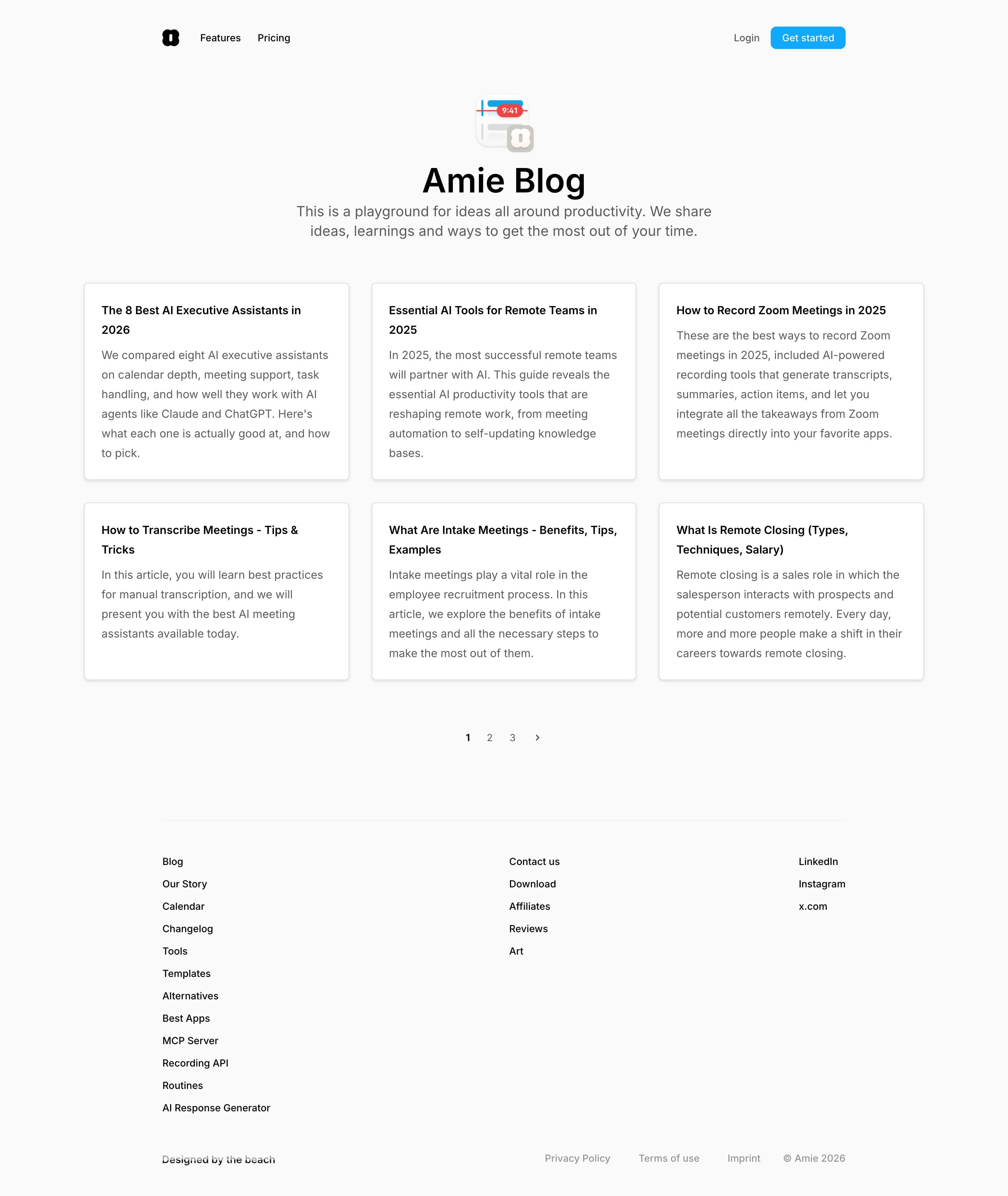
Six text-only cards, each a bold title and a short excerpt, fill a three-by-two grid above numbered pages. There are no covers, dates or tags, so the post titles do all the work. The small app-icon illustration over the heading, a calendar reading 9:41, is an easy touch to borrow.
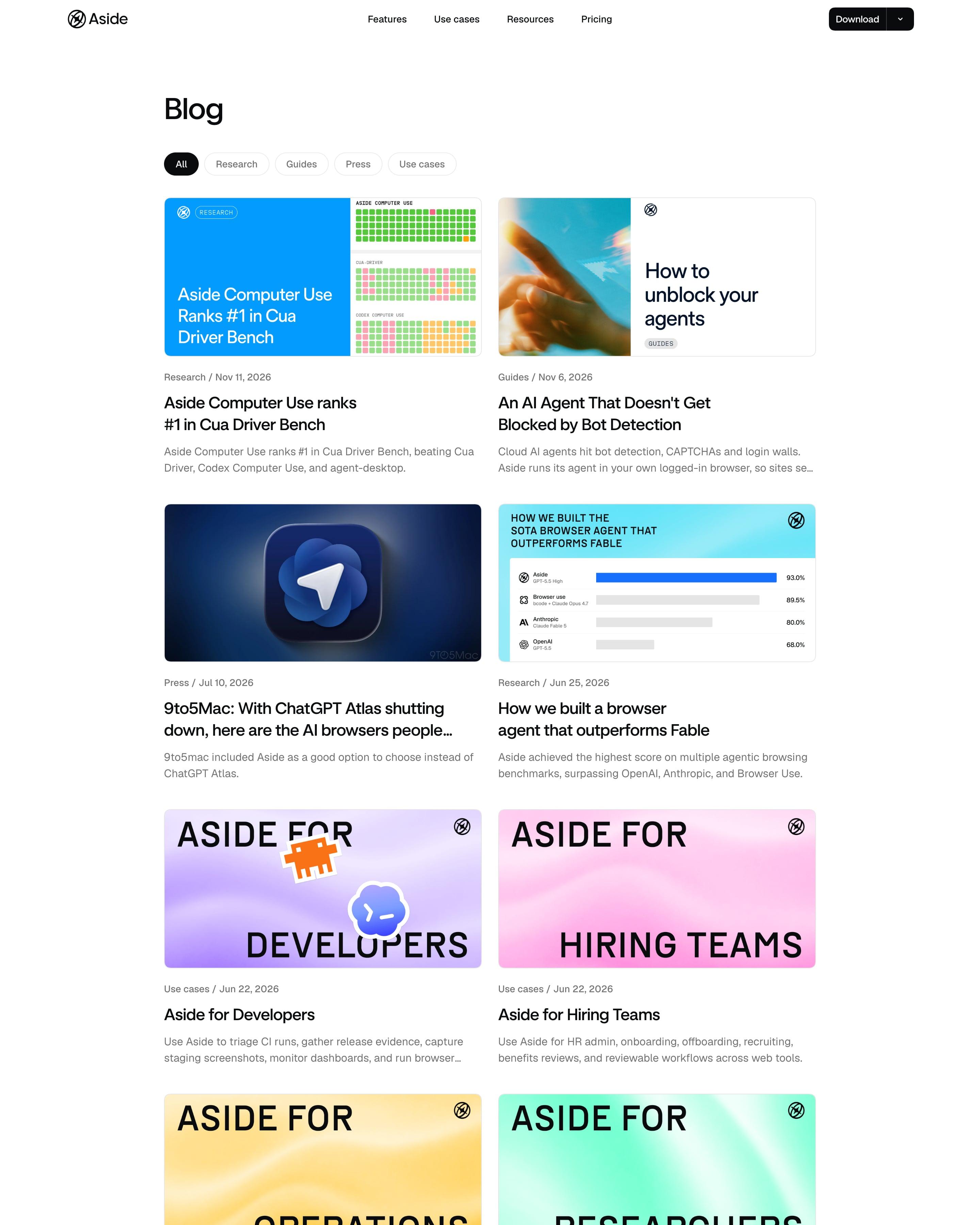
Ten posts in a two-column grid under filter pills for Research, Guides, Press and Use cases. The use-case posts share one cover template, "ASIDE FOR" above "DEVELOPERS" or "SALES" in heavy monospace caps, each on a different pastel gradient. Worth copying: that template, which turns a set of landing-page posts into a visible series with almost no design work per cover.
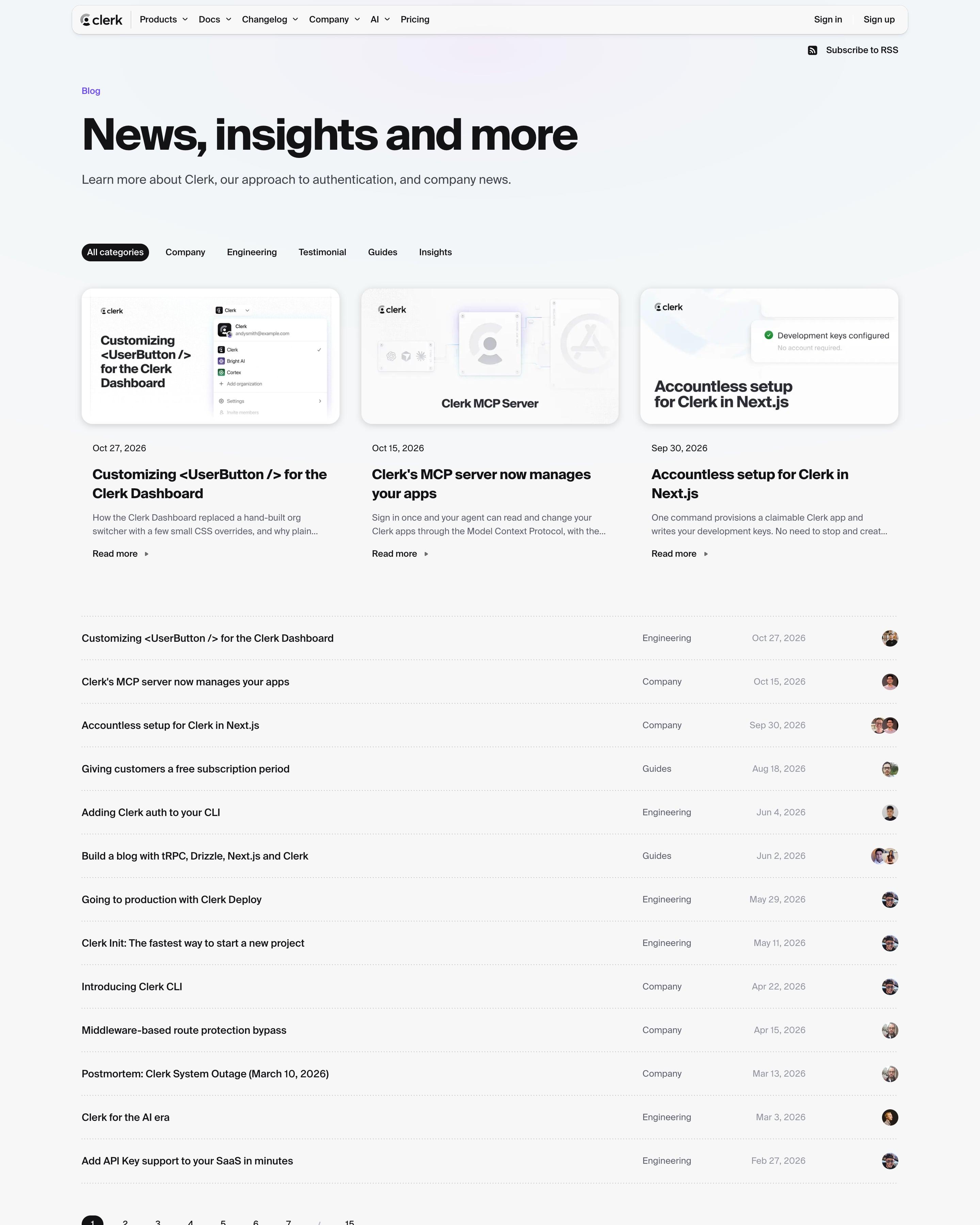
A light page titled "News, insights and more" puts the three latest posts in cards whose covers are miniature product UI, like the UserButton menu. Everything else is a plain table row of title, category, date and author avatar, across 15 pages. Category pills (Company, Engineering, Guides) sit above the cards, with an RSS link tucked top right.
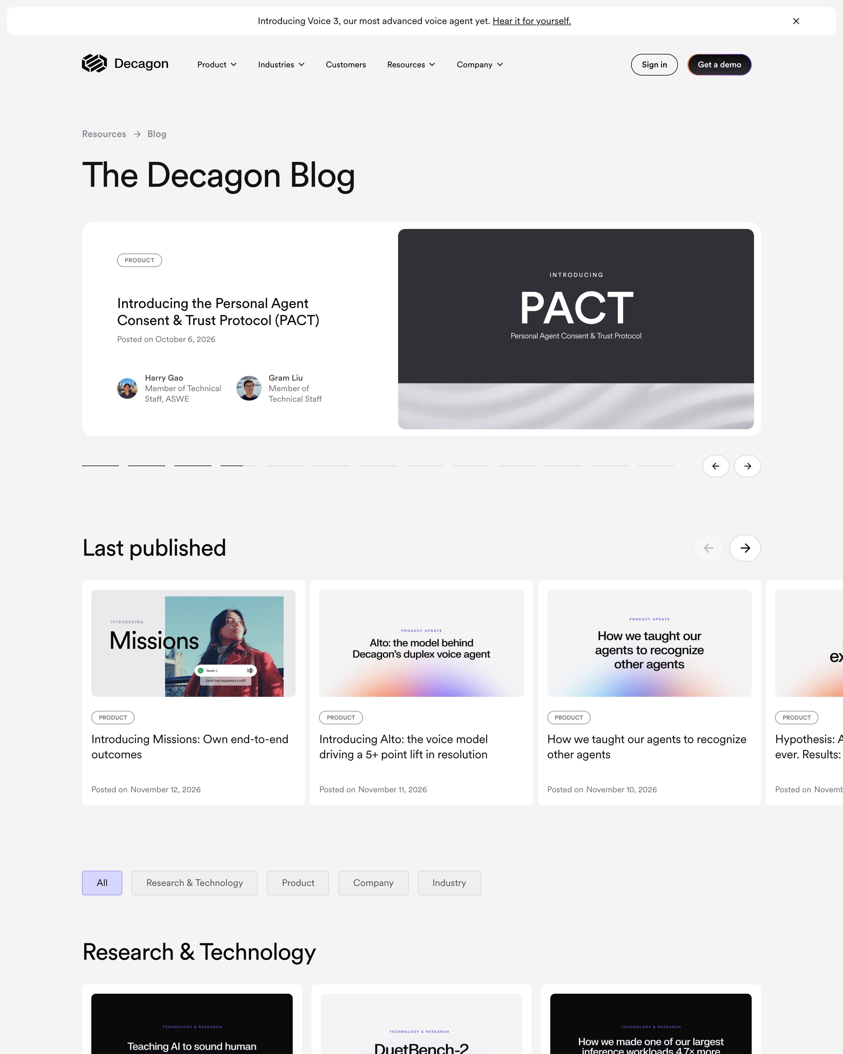
A featured-post carousel with a segmented progress bar opens the blog, followed by a "Last published" row and category pills. Each category then gets nine cards and a "Show more" button. Covers are mostly typographic, the post title set on a soft violet gradient or dark panel, an easy system to copy.
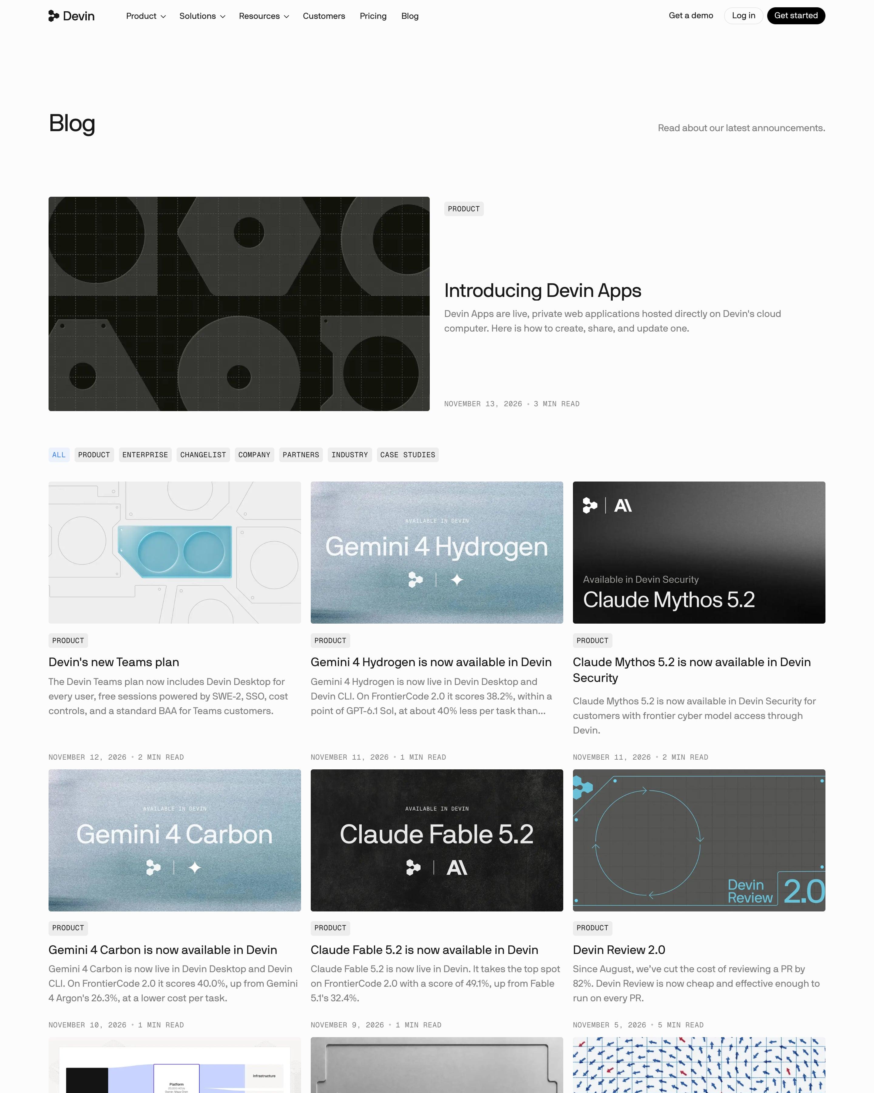
The newest post, "Introducing Devin Apps", gets a wide dark cover of geometric cut-outs, then a three-column grid under monospace category chips like PRODUCT and CHANGELIST. Covers mix grainy blue gradients, black panels and an embossed metal "Security 2.0" plate. Dates and read times sit in small monospace caps under each excerpt, ending in a "Show more posts" button.
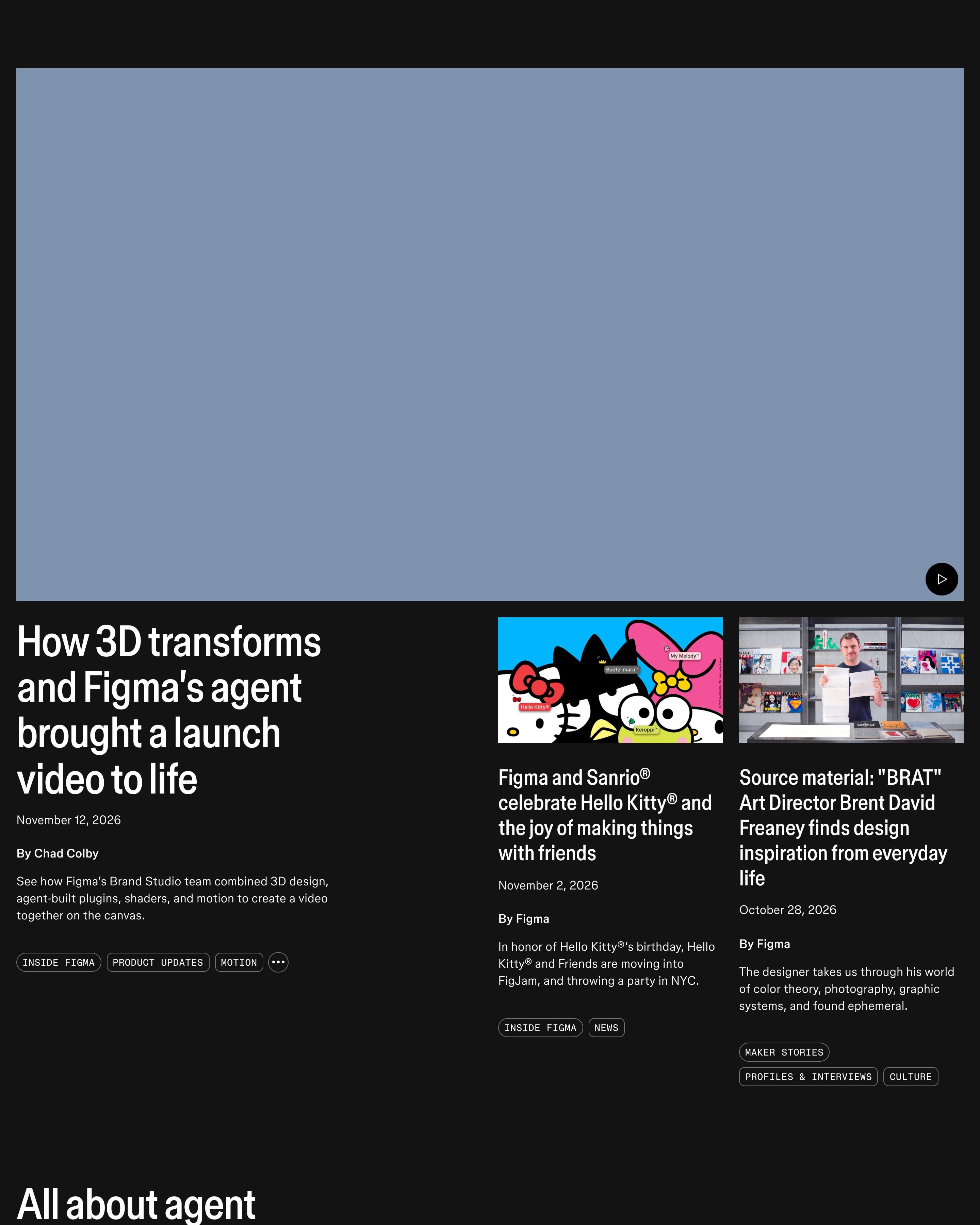
A black page lets each post's artwork carry the colour: a large lead story with two smaller ones beside it, then rows of three under headings like 'All about agent' and 'Meet the makers'. A big centred quote from the CEO breaks up the grid, and the newsletter sign-up appears twice.
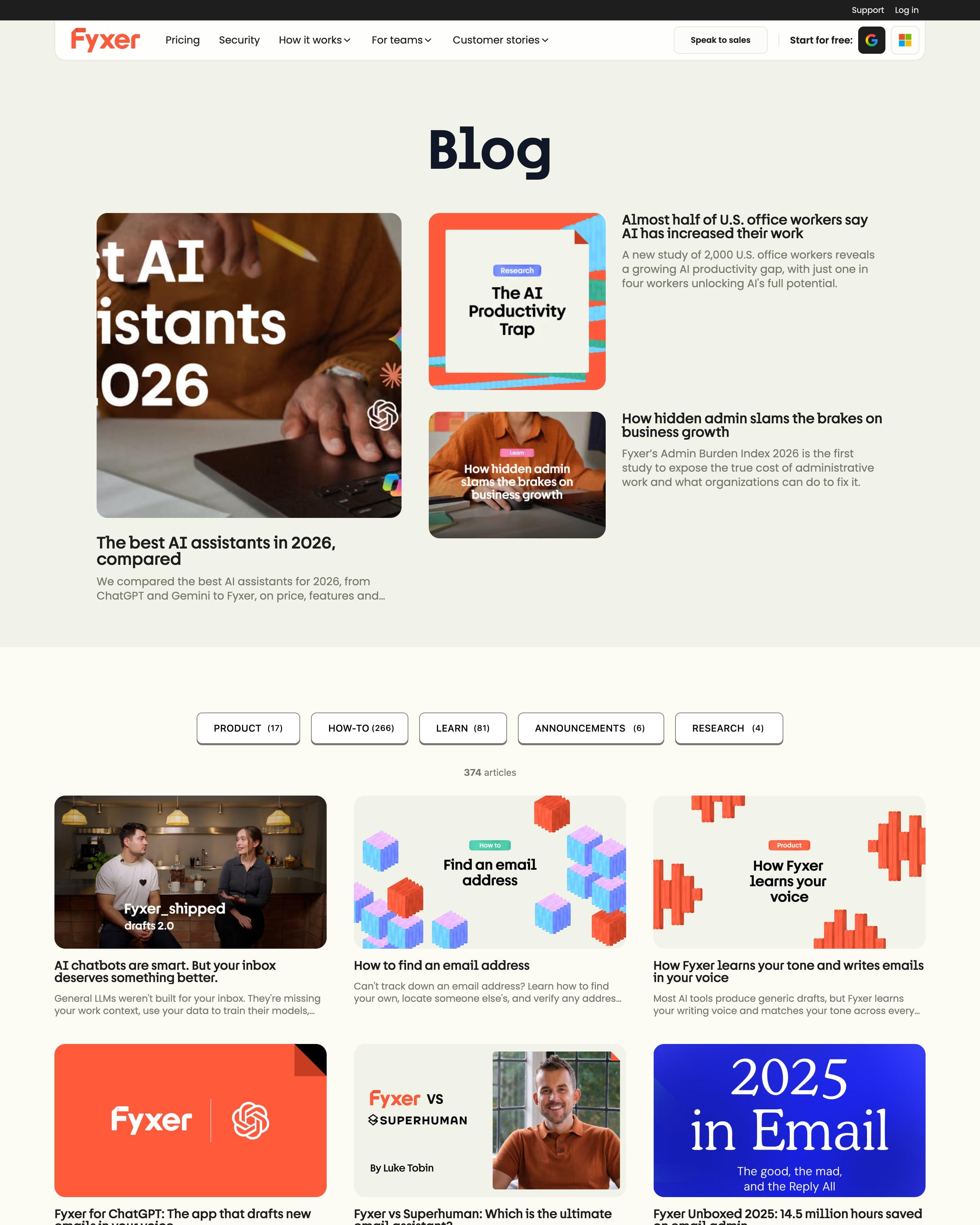
A big "Blog" heading opens on one featured post with two smaller ones stacked beside it. Category pills carry counts, HOW-TO (266) against PRODUCT (17), over a three-column grid of 374 articles. Covers mix studio photos, isometric orange and lilac blocks and the folded-corner card shape, all on the site's warm beige, with numbered pagination running to 42 pages.
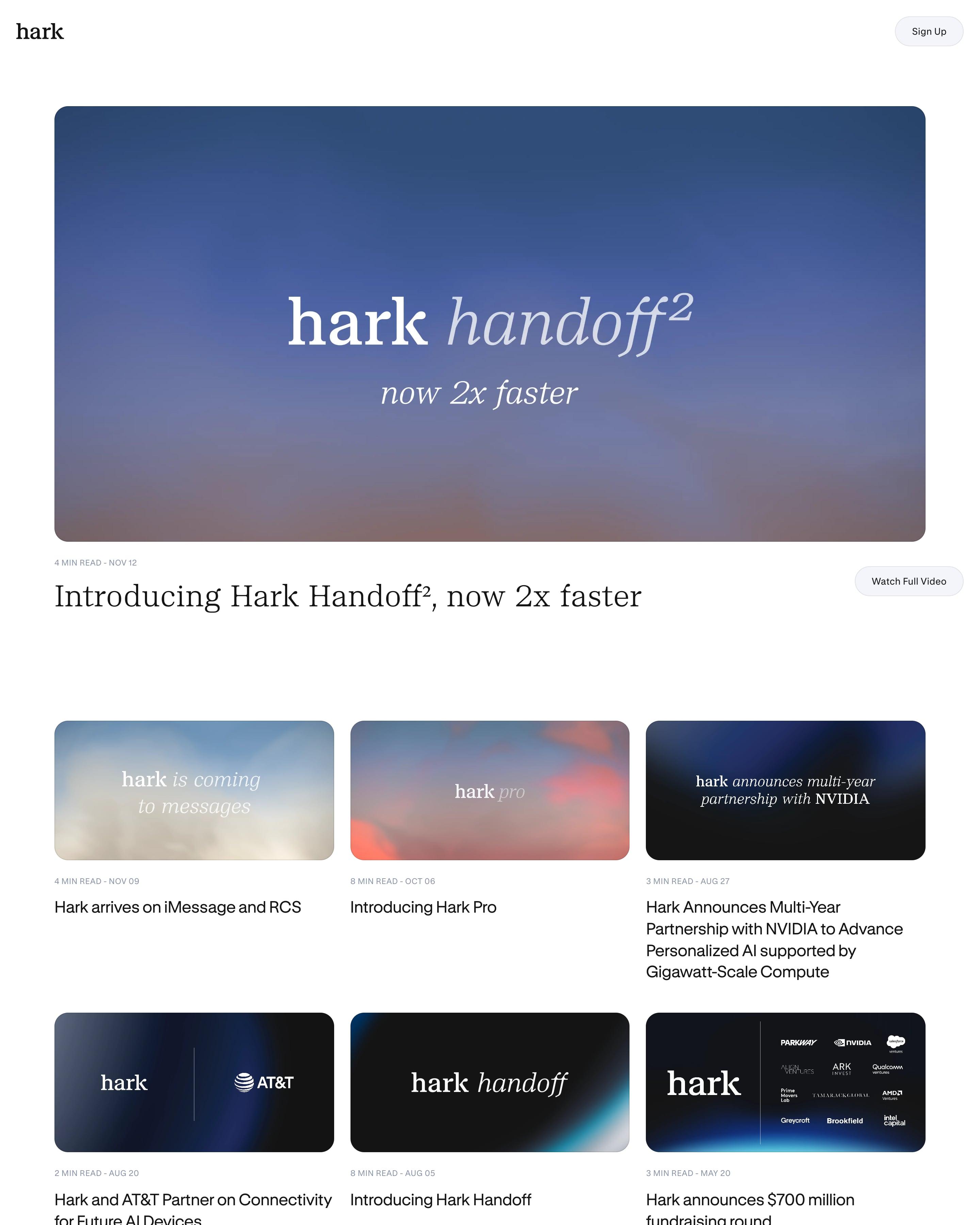
Each cover is built the same way (the hark wordmark and a short phrase on a sky gradient or dark panel), so the six-card grid reads as one set. The lead post gets a wide version with read time and a "Watch Full Video" button. Templated covers like these are easy to copy.
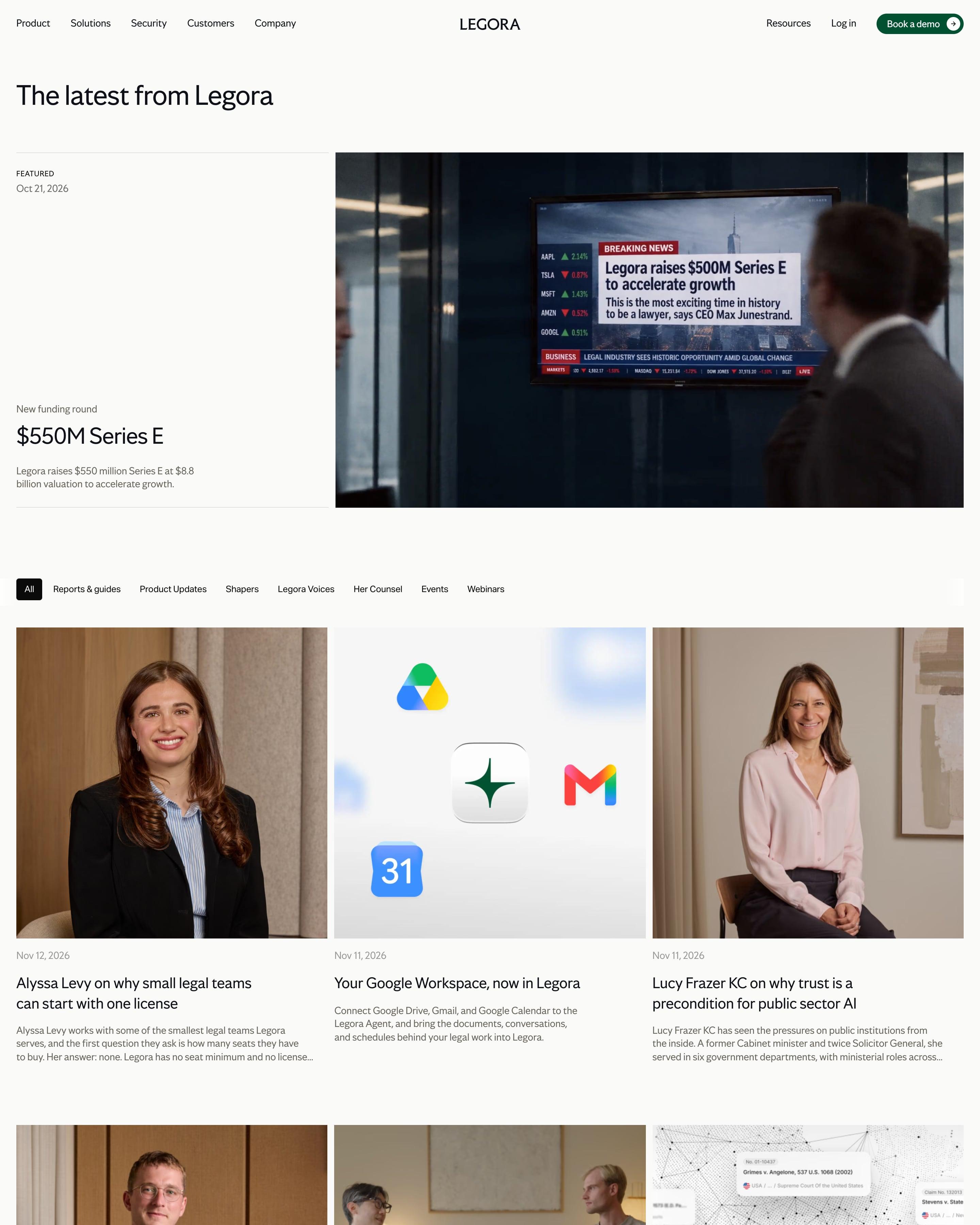
A wide photo of a TV news report on the funding round fills the featured slot, beside a text column with date and summary. Category tabs lead into two rows of portrait-led cards, then a ruled "More stories" list with photos on the right. Worth copying: the switch from grid to list partway down.
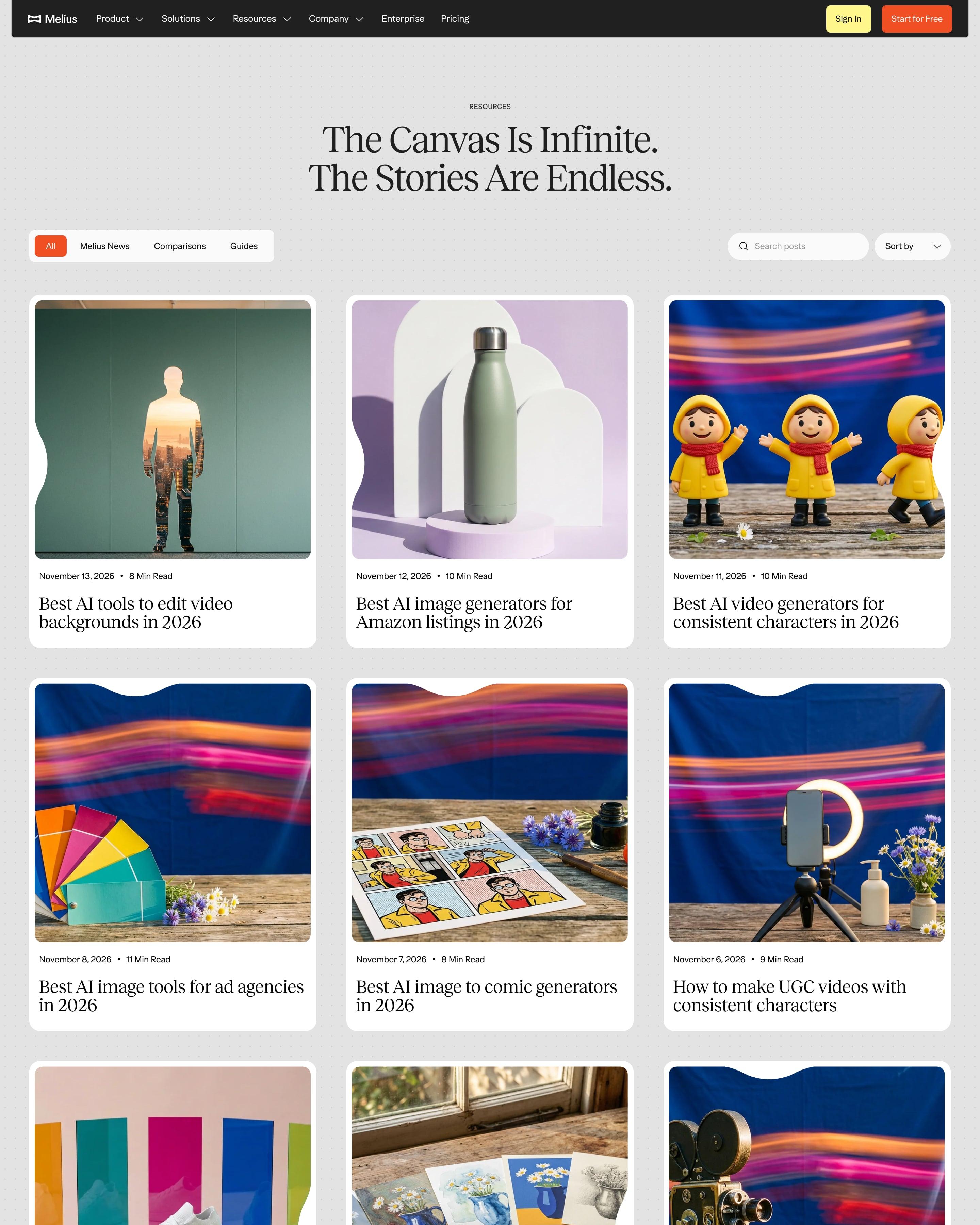
Under the serif "The Canvas Is Infinite. The Stories Are Endless." runs a three-column grid of white cards on dotted grey, each cover cropped with a wavy notch cut into one edge. The AI-made covers share one still-life look: rustic wooden tables, cobalt backdrops, poppies and light-streak blur. Tabs, a search field and a Sort by menu sit above, and "Showing 45 of 68 articles" closes the grid.
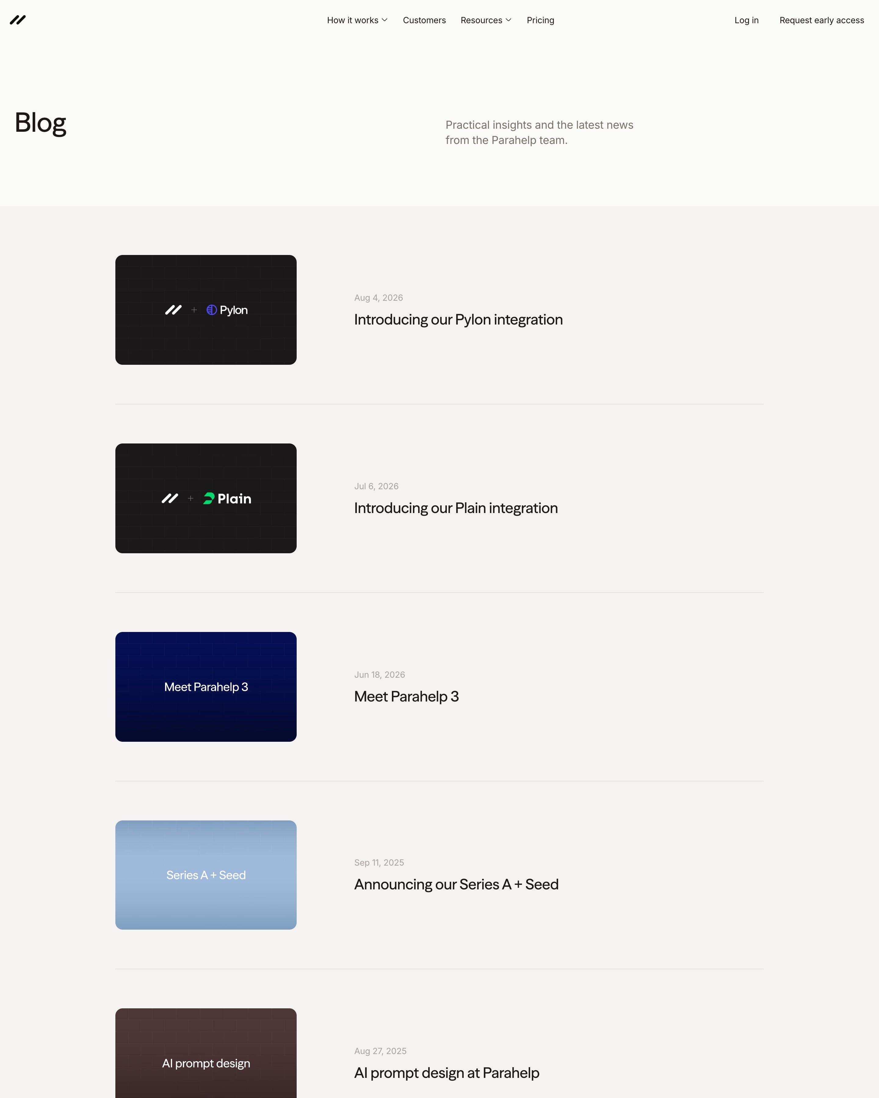
Five posts sit in a single column, each a row with a flat-colour thumbnail on the left and the date and title on the right. The thumbnails carry only a logo pair or a short title in white. That thumbnail system, and the black early-access band at the end, are simple to reuse.
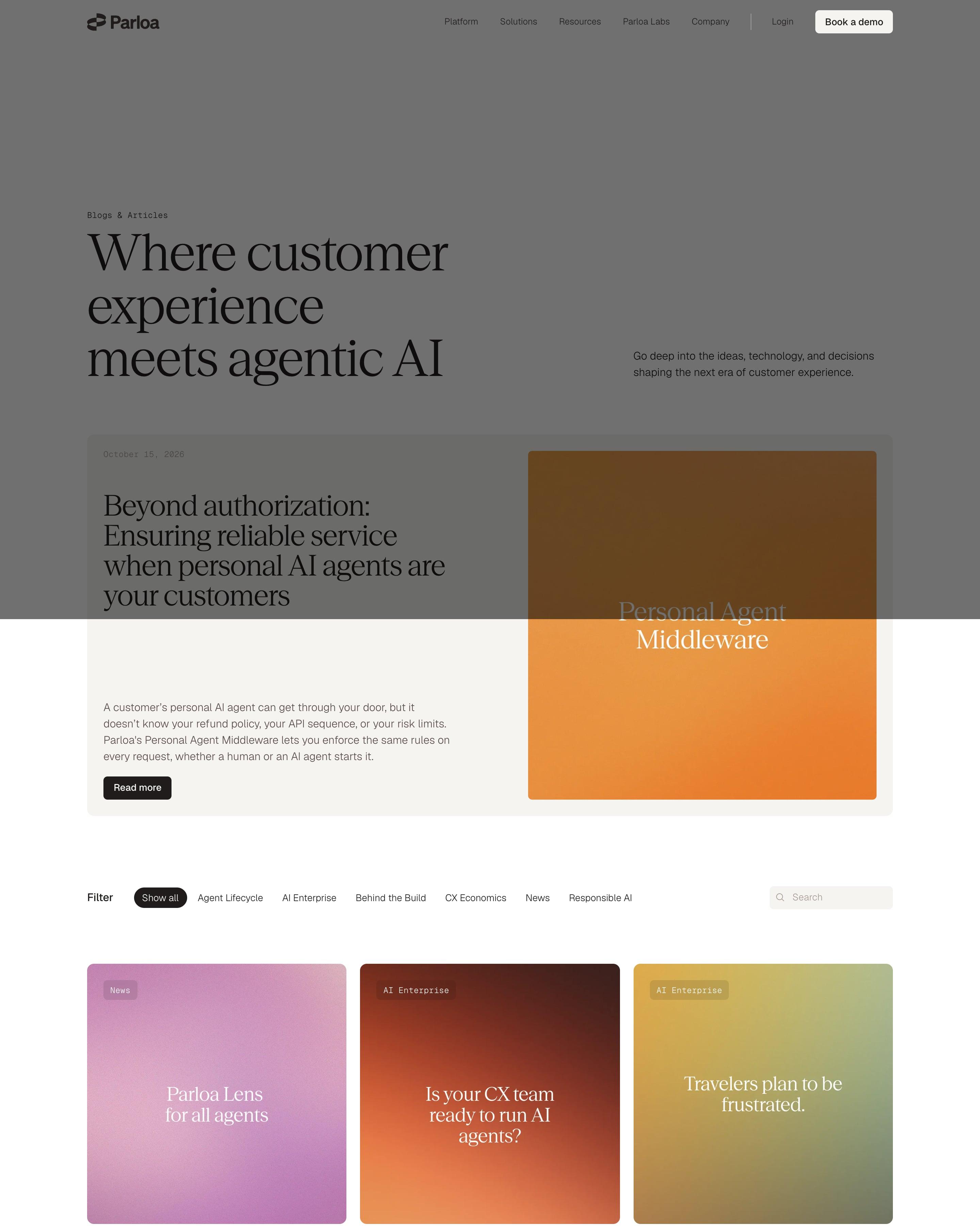
Article covers repeat the customer-page system: square blurred gradients in pink, rust, olive and blue, with the post title set in the brand serif where a logo would go. The WAVE Summit posts break the pattern with big serif type and monospace dates on a dotted orange field. A featured post sits in a beige split card, and an orange-gradient demo form closes the page.
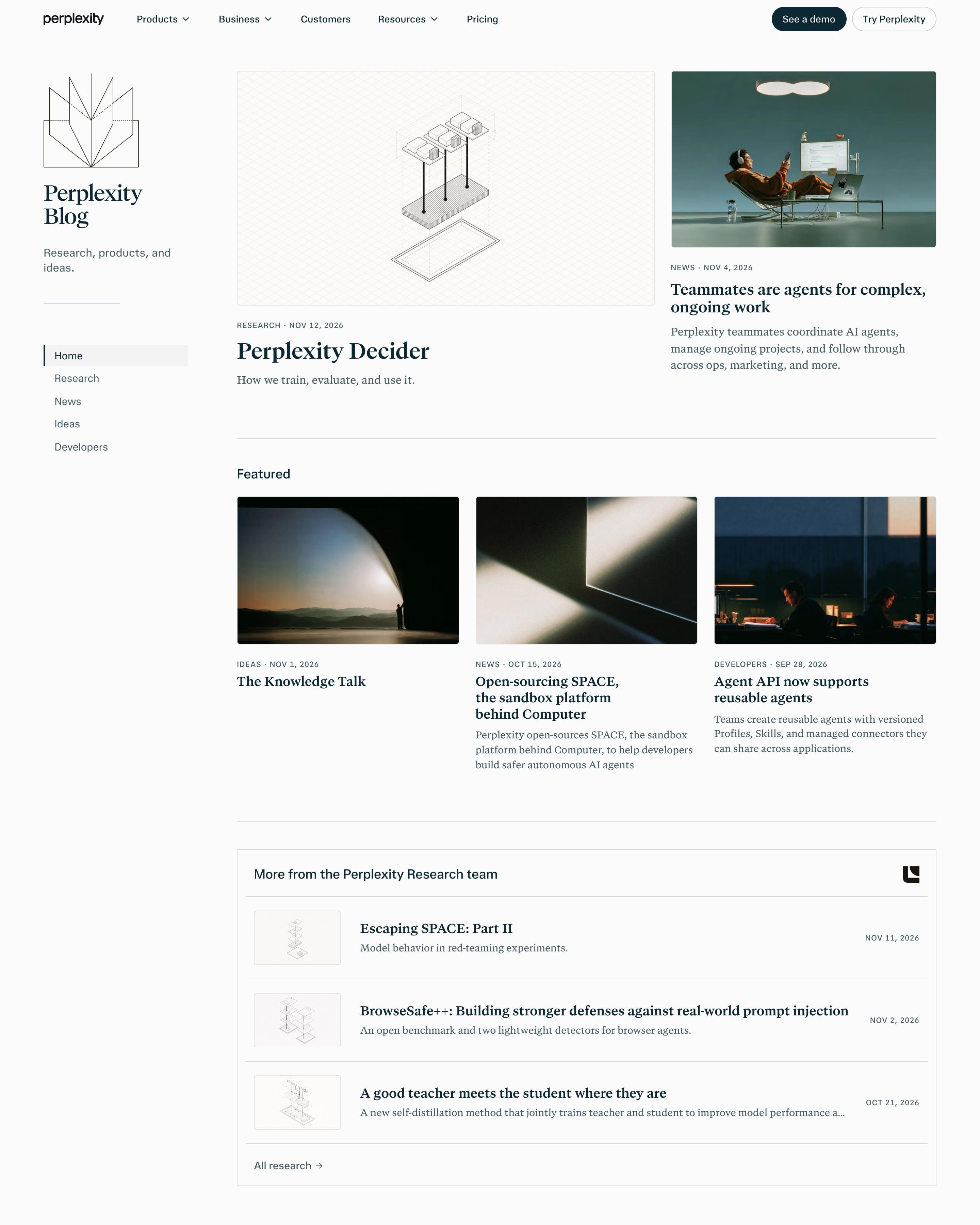
A left rail holds a line-drawn book icon, "Perplexity Blog" in serif and a five-item category menu, while the main column does the work. Research posts get isometric line drawings on graph paper; news and ideas get moody dark photos. Worth copying: the boxed "More from the Perplexity Research team" list, which gives research its own shelf inside the general feed.
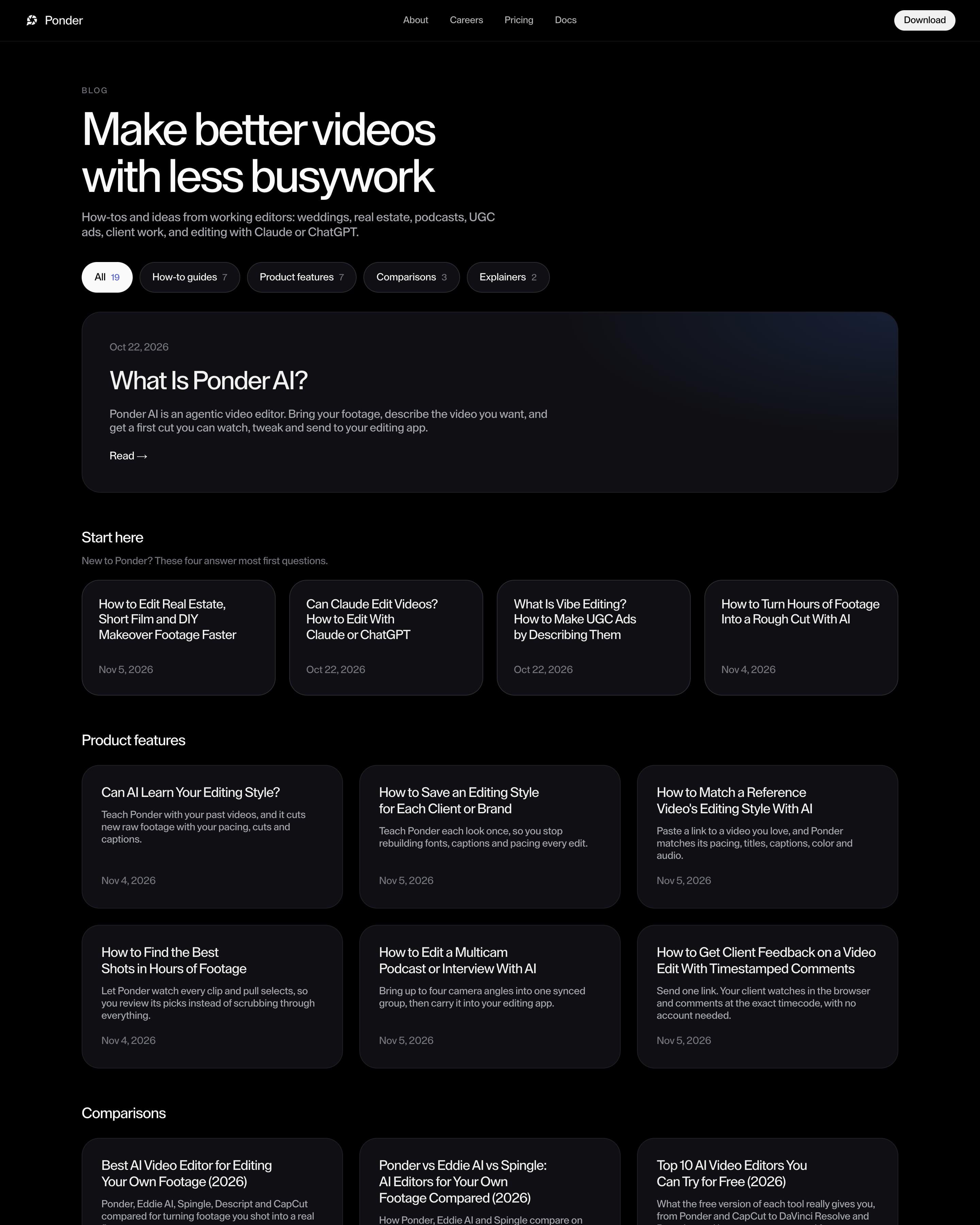
"Make better videos with less busywork" heads a black blog whose pill filters carry counts: All 19, How-to guides 7, Product features 7, Comparisons 3, Explainers 2. A wide featured card for "What Is Ponder AI?" glows faint blue in one corner, then a "Start here" row of four cards and a grid per category, all text-only with dates. A blue-tinted "Try now for free" banner sits above the footer.
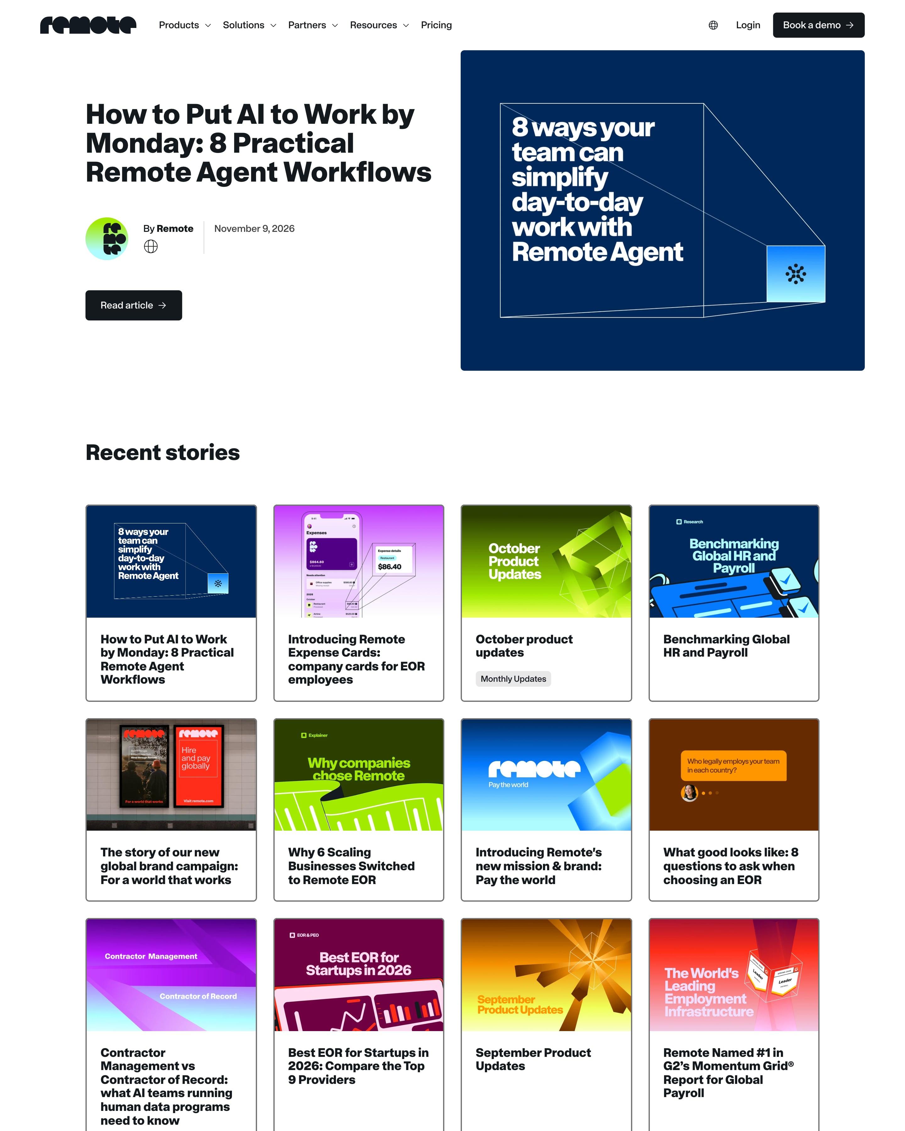
The latest post leads with a navy cover and big white type, then "Recent stories" fills a four-column grid of bordered cards. Every cover is a bold colour block in lime, magenta, orange or navy with its headline set into the image, so the archive reads like a poster wall. Numbered pagination runs to 27 pages above a lime-to-aqua newsletter box.
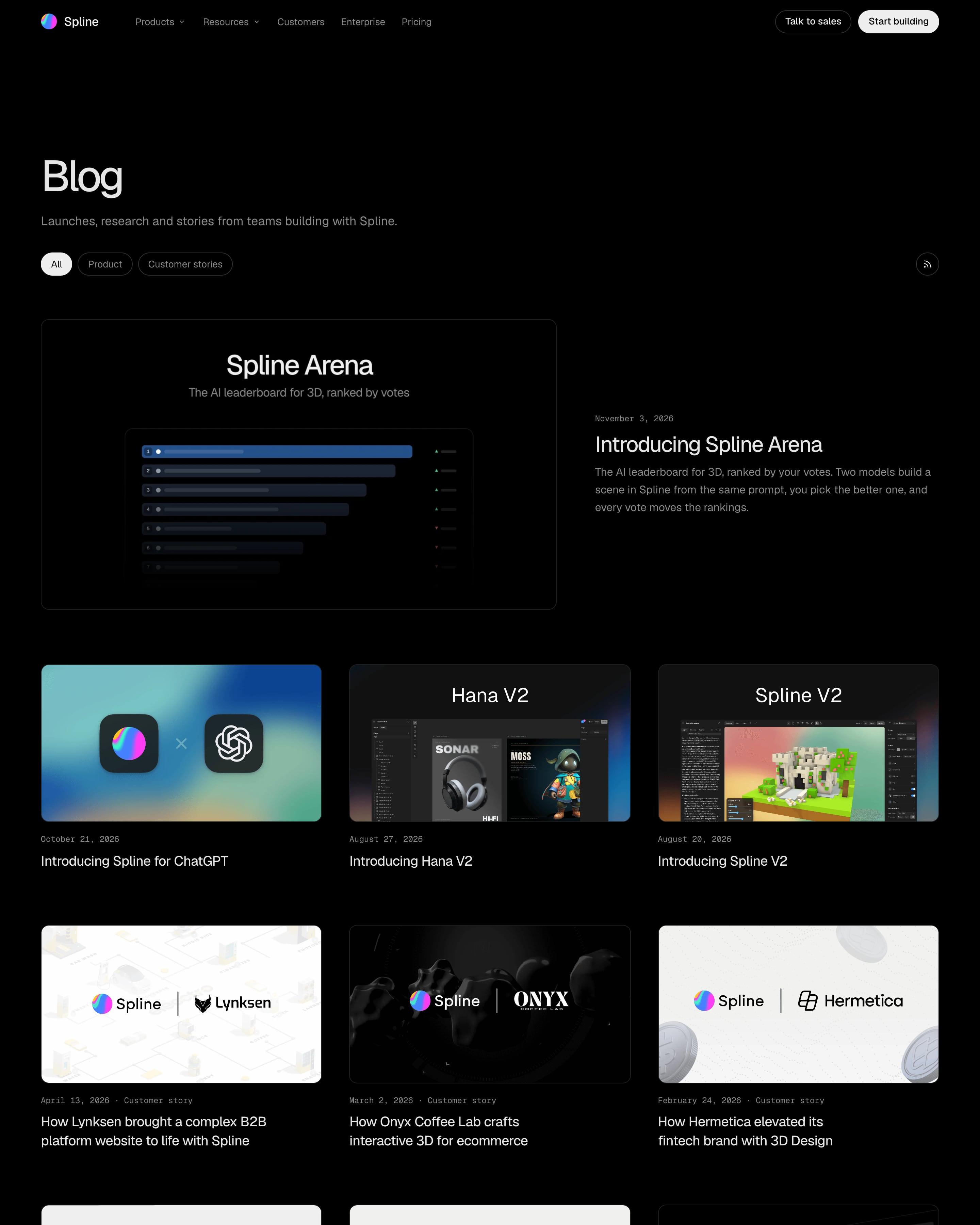
Pills for All, Product and Customer stories plus an RSS button sit above one large featured post, then a three-column grid of image cards with small date lines. Customer stories share one cover format, the Spline logo beside the client's, so they stand apart from product launches; that pairing is worth copying.
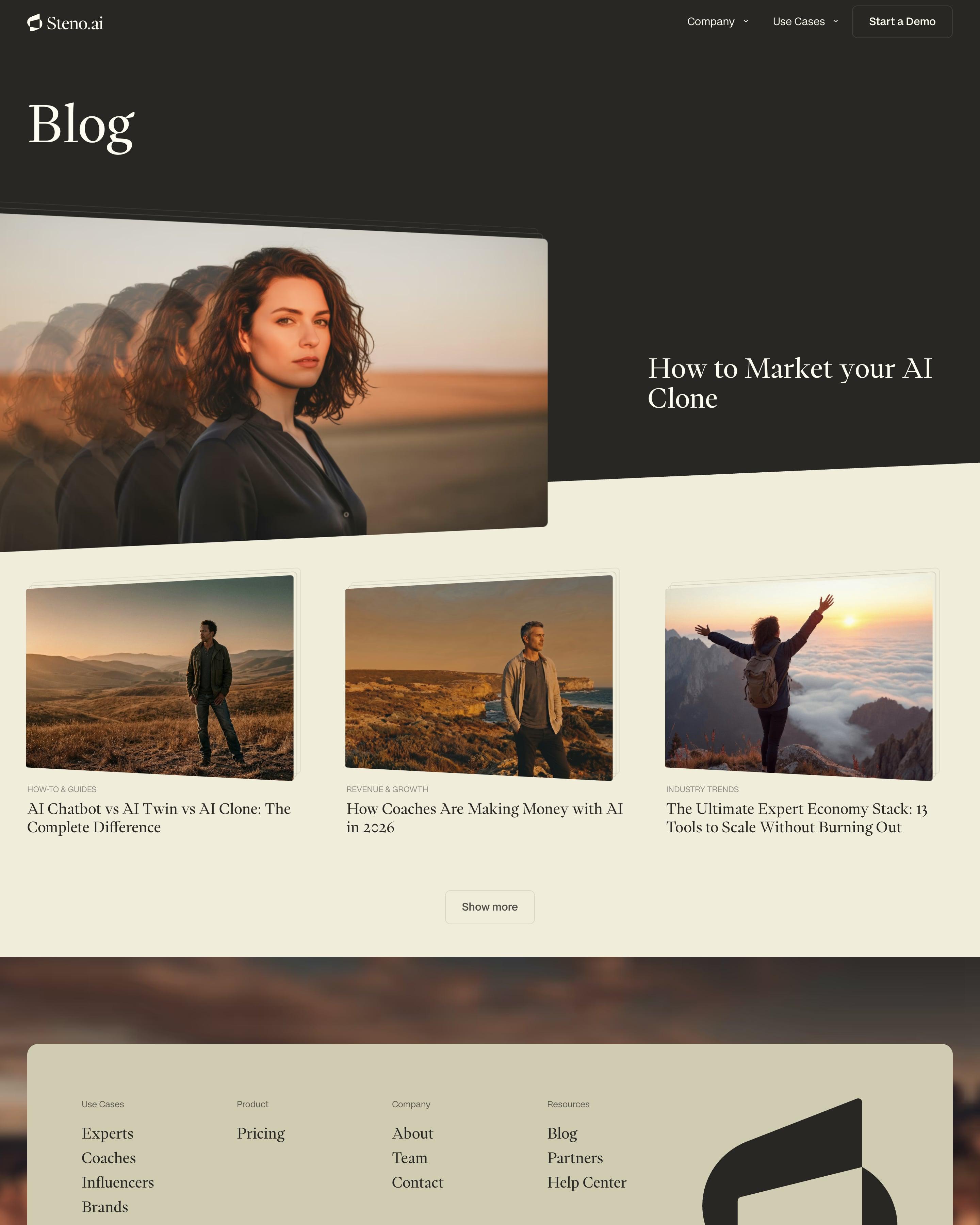
Short and dark at the top: a big serif "Blog" and a featured post whose portrait repeats in fading copies, a visual pun on AI clones. Three cards follow on cream, each photo slightly tilted with stacked paper edges behind it and a small uppercase category like "REVENUE & GROWTH". A single "Show more" button stands in for pagination.
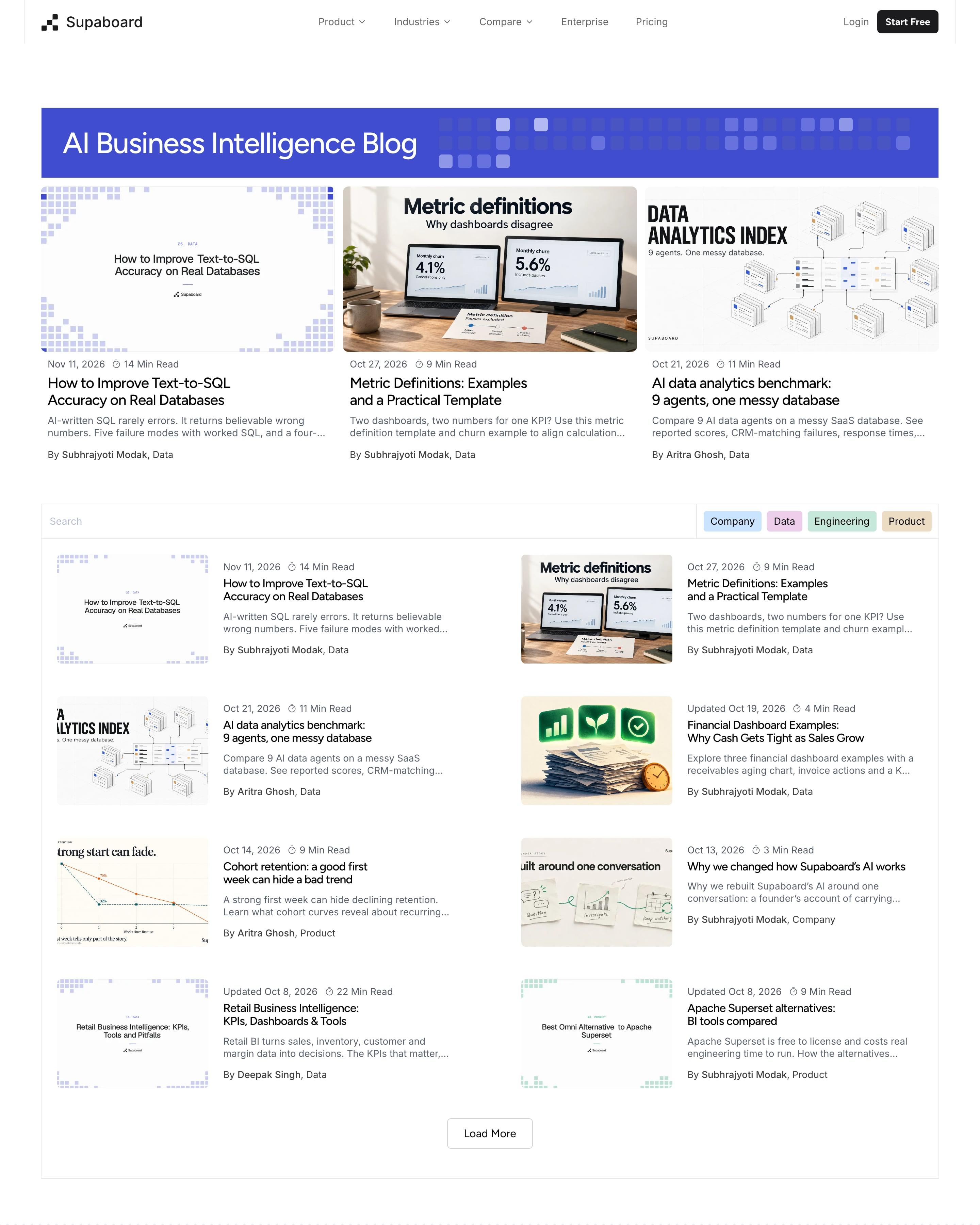
A blue title bar dotted with pixel squares heads the page, above three featured posts with read times and author lines. The part to copy: a search field and colour-coded category pills (Company, Data, Engineering, Product) sharing one row. Posts then list in two columns of thumbnail-and-text rows, with a Load More button.
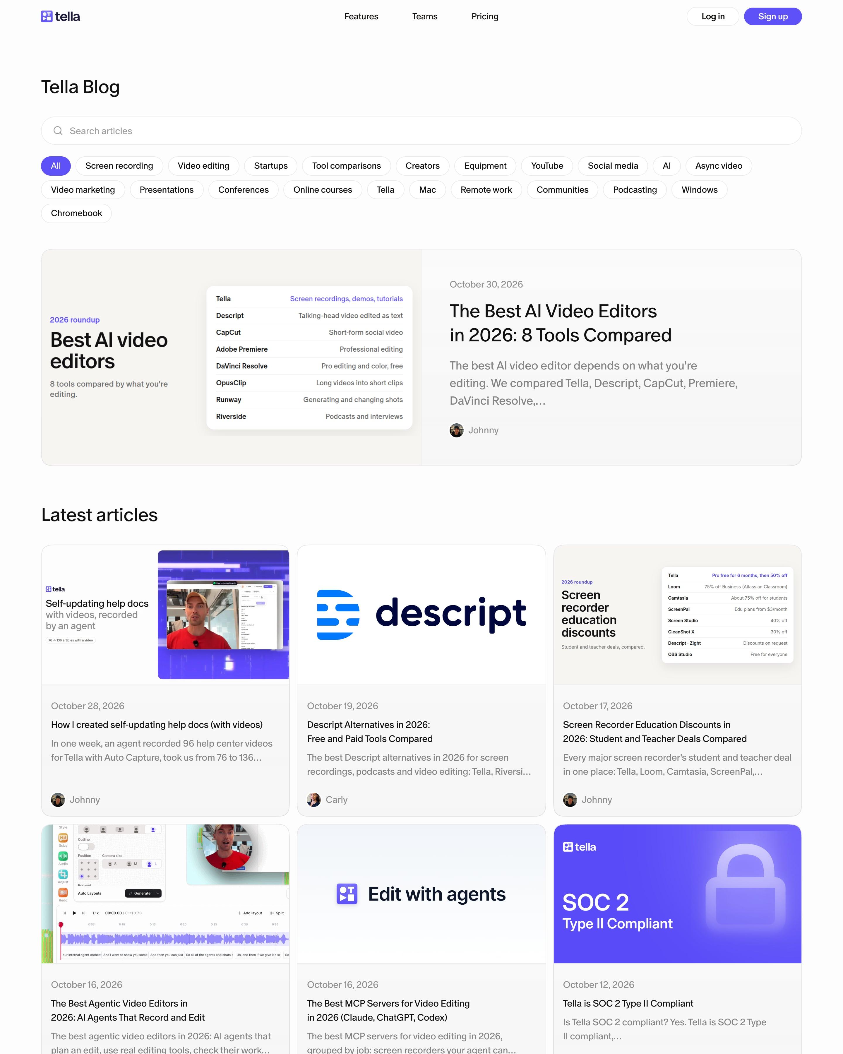
A search bar and two rows of topic pills, from Screen recording to Chromebook, sit above a featured "Best AI video editors" card whose cover is a small comparison table. The grid below uses Tella UI screenshots and simple type covers like "Edit with agents" and a violet SOC 2 badge. Worth copying: turning a roundup's cover into the table it summarises.
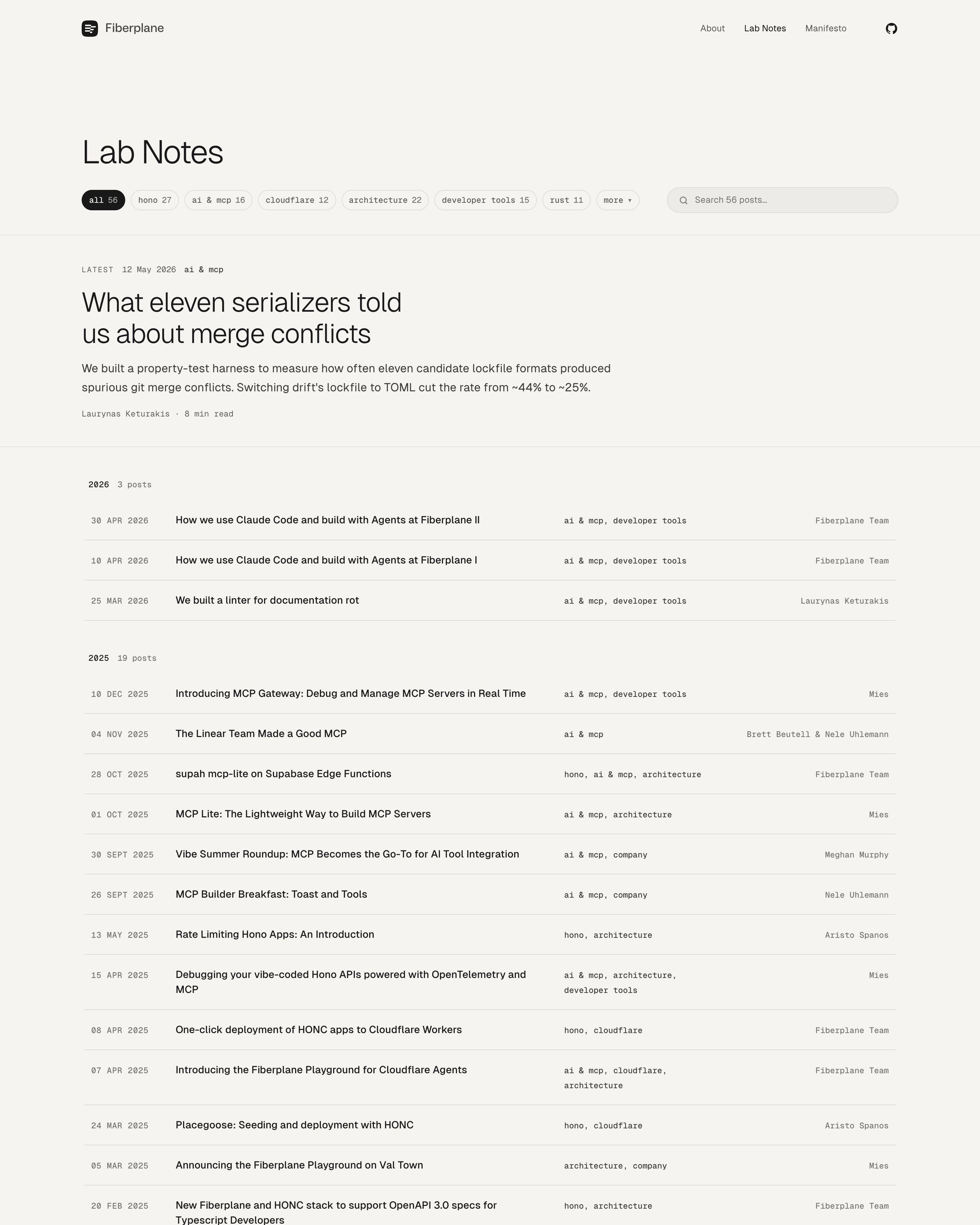
Tag pills with post counts, like "hono 27", sit beside a search field. The latest post leads as large text with no image, its summary stating a result (~44% to ~25%). Below, the archive is grouped under year headings with their own counts, a simple structure worth copying for a technical blog.
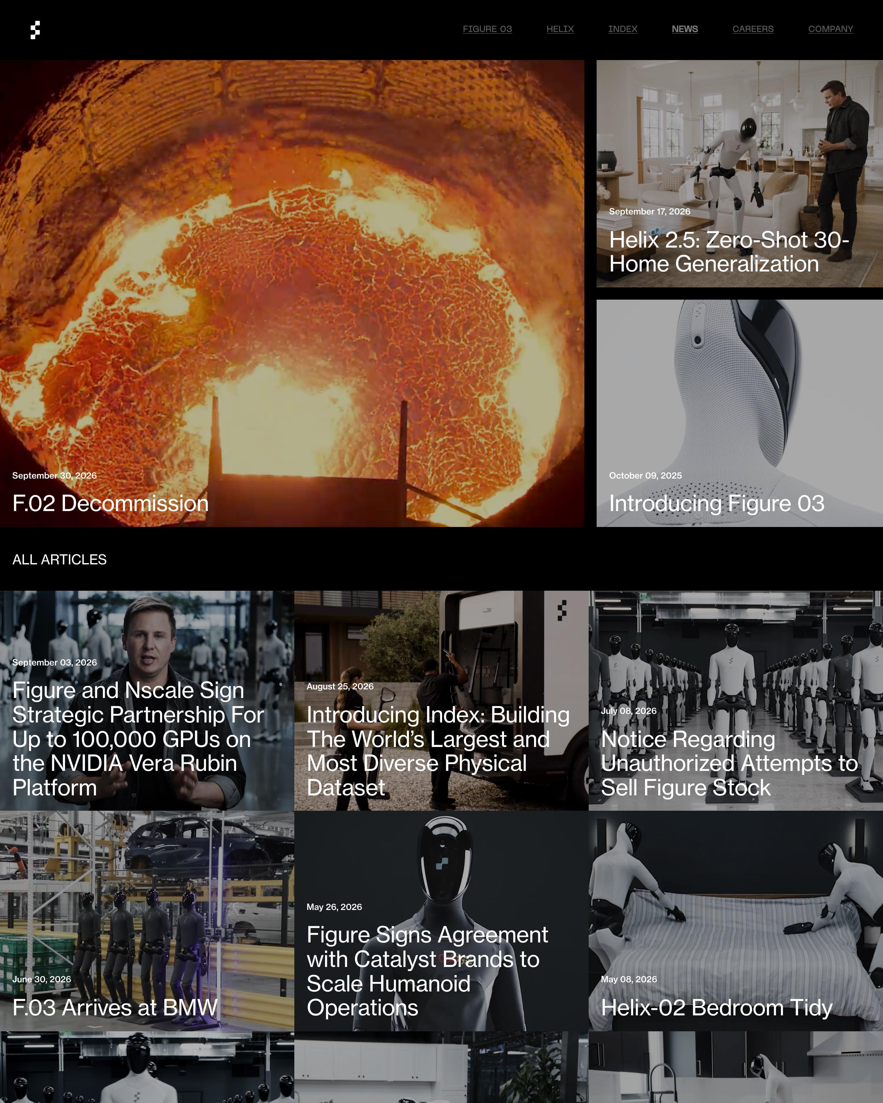
On a black page, the lead post fills a large tile showing a furnace glowing orange, with two more stacked beside it. Below "All articles", a tight three-column grid of photos carries only a date and a white title on each, with no excerpts or tags. Borrow those title-on-photo tiles.
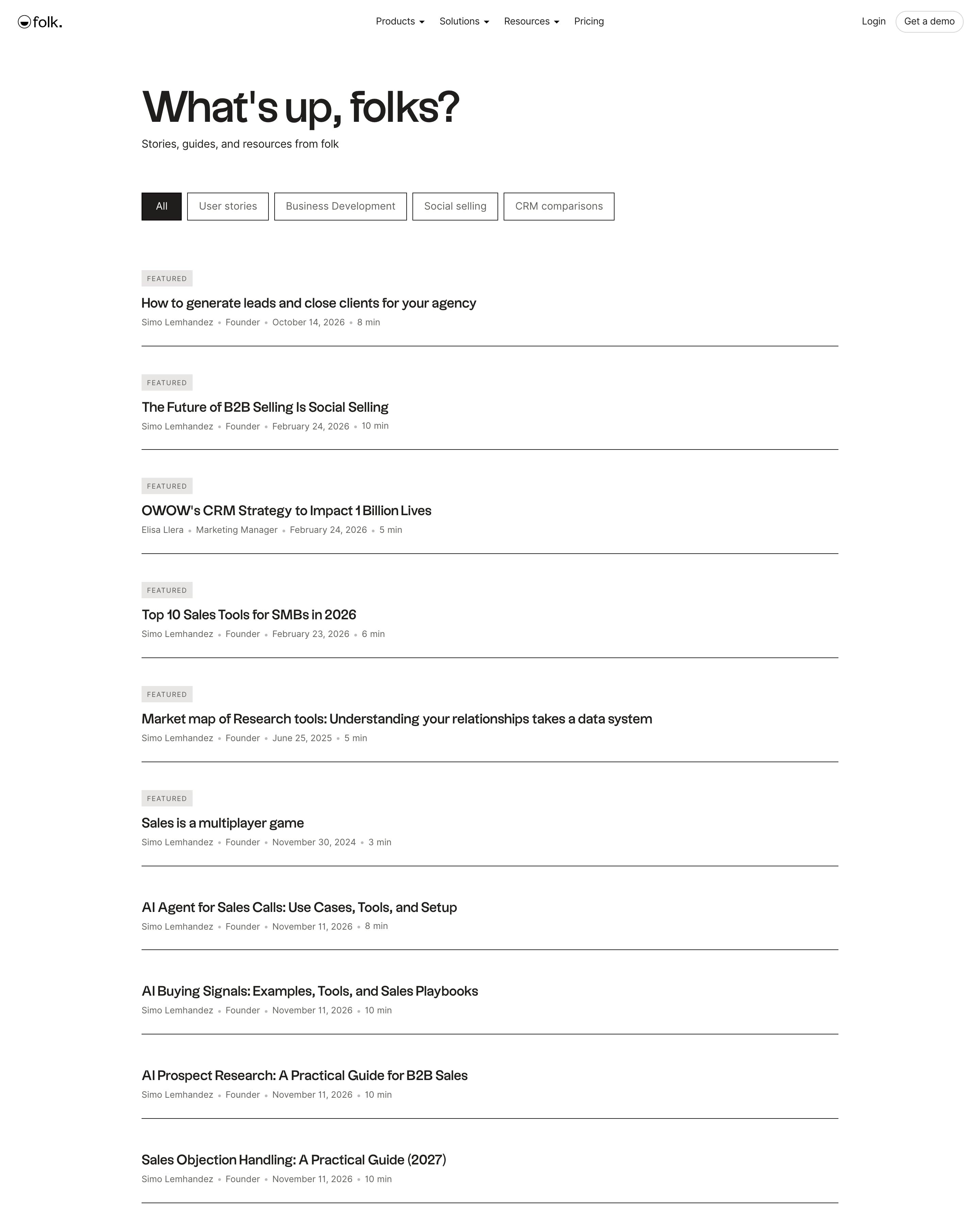
Posts run as one text column with no thumbnails, each showing title, author, role, date and read time between thin black rules. Outlined category buttons filter the list, and the top posts carry a small "Featured" label. It's a good model for a blog index that reads like a table of contents.
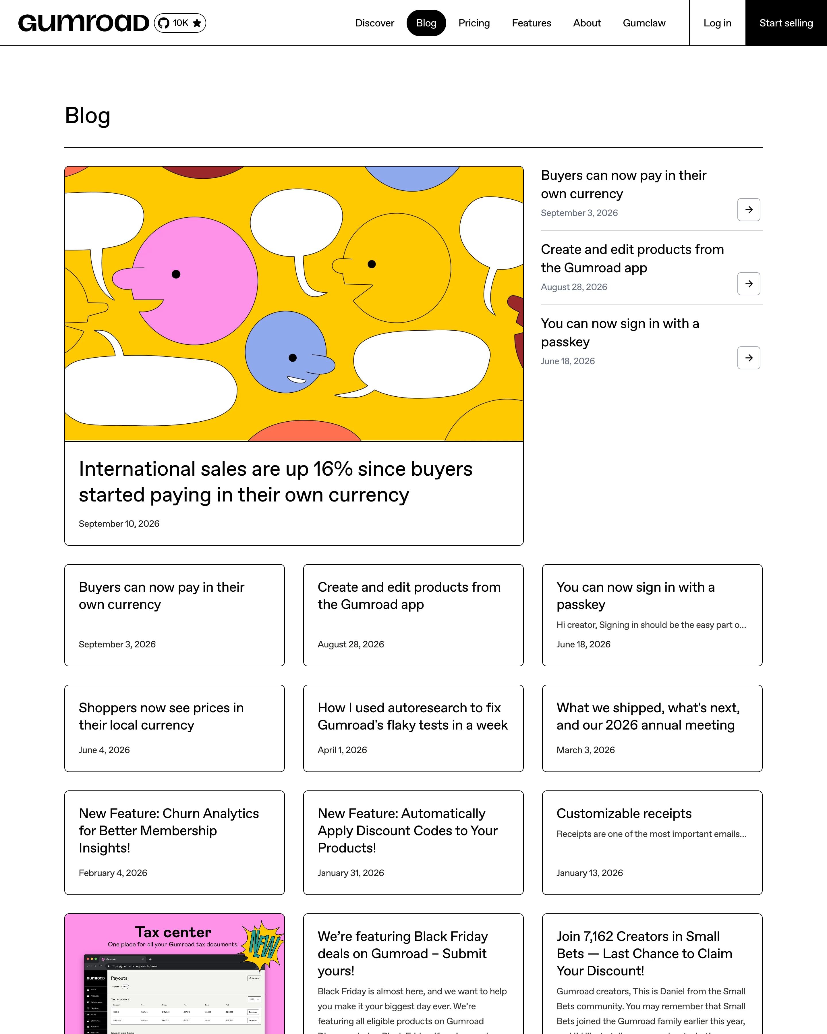
A drawn cover of faces and speech bubbles marks the lead post, with three recent posts and arrow buttons beside it. The rest is a three-column grid of bordered cards, mostly text only, with an image card now and then. Worth copying: text-only cards, so not every post needs a cover.
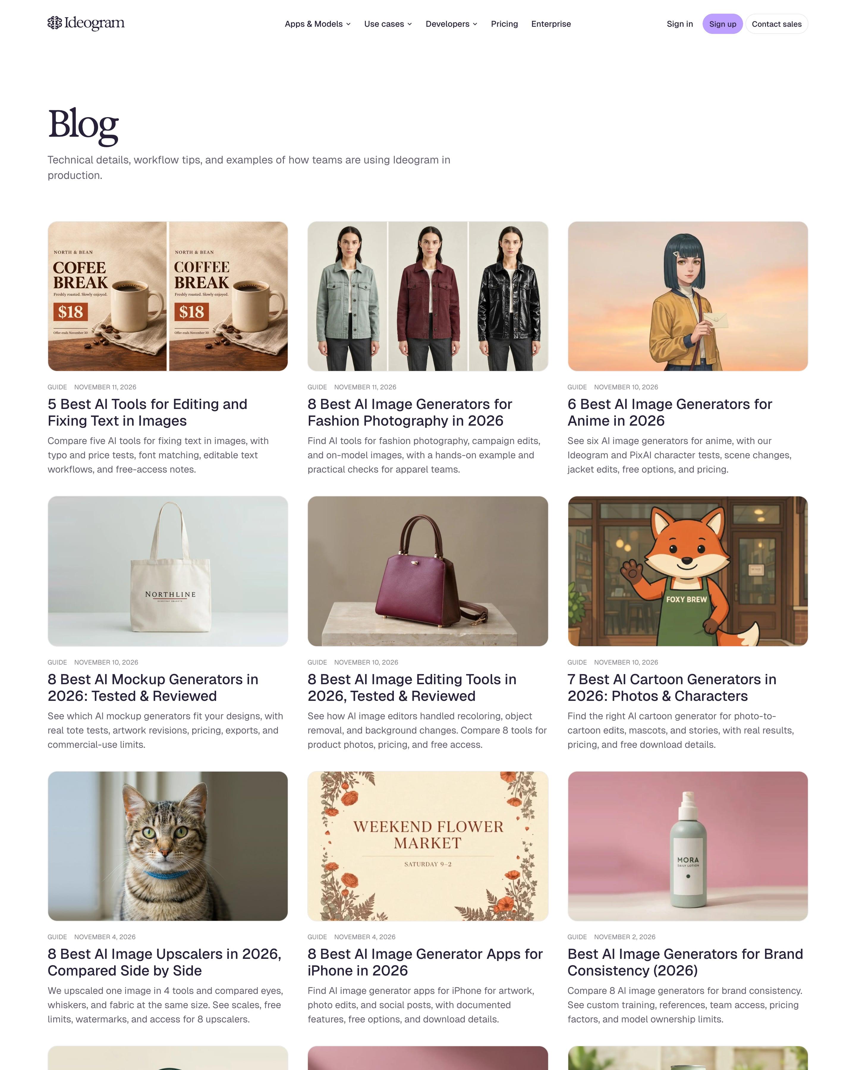
A serif "Blog" heading and one-line intro open onto a plain three-column grid of rounded cards, each cover made with Ideogram: a tote bag, a coffee poster, a fox mascot, a Bangkok postcard. Every card carries a small GUIDE, BLOG or CASE STUDY label with date, a two-line headline and a three-line summary. The generated covers double as product samples, so the archive reads as a gallery too.
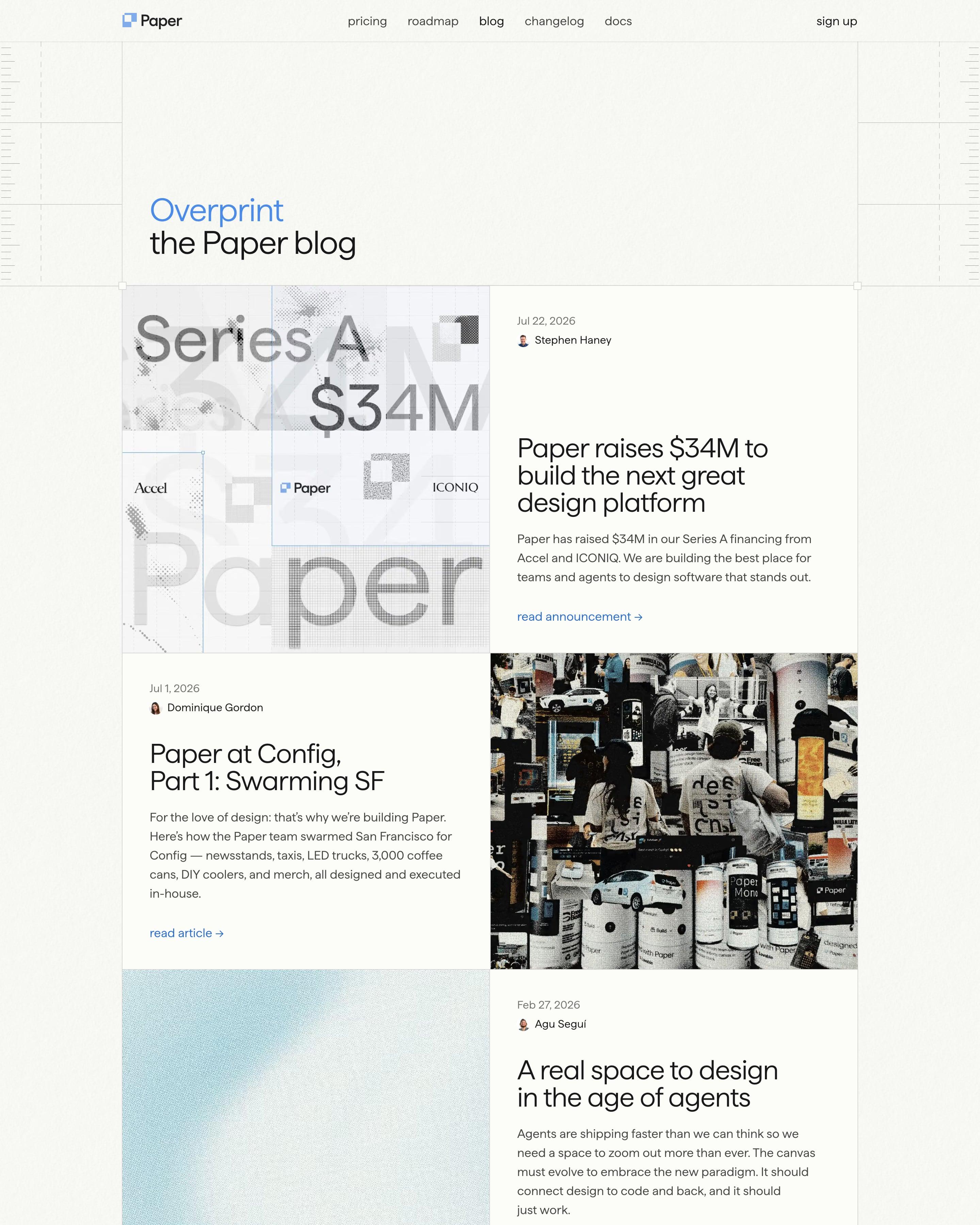
The blog gets its own name, "Overprint", set in blue above "the Paper blog". Posts run as a zigzag, each row pairing a large halftone or photo image with date, authors, title and summary, swapping sides as you scroll. Small square handles at the corners echo selection boxes on a design canvas.
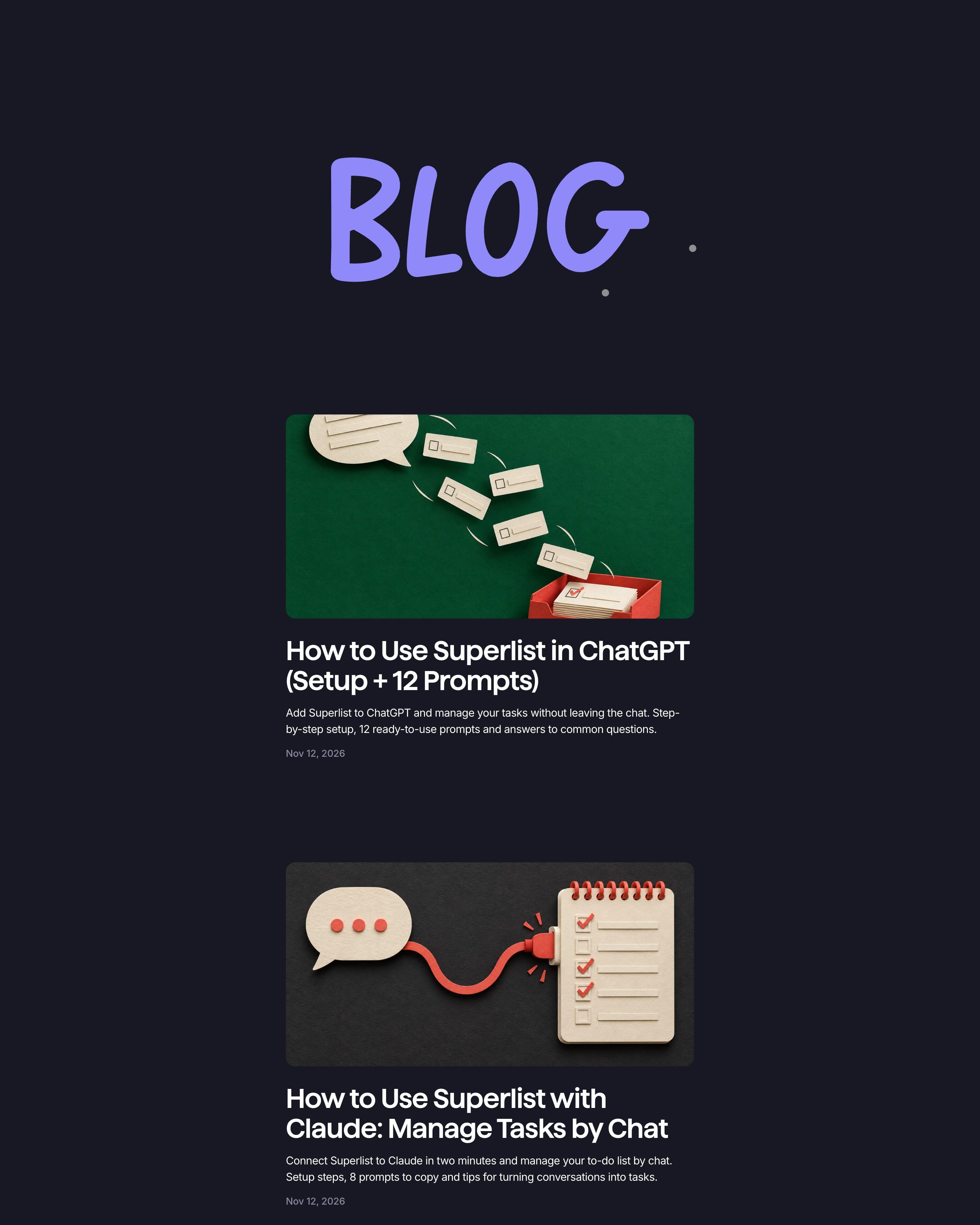
A hand-lettered purple 'BLOG' heads a single centred column of posts, each with a paper-craft cover photo (cut-paper speech bubbles, a checklist), a bold title, a summary and a date. Those covers are what to copy, giving every post one handmade look; a red Load more button closes the list.
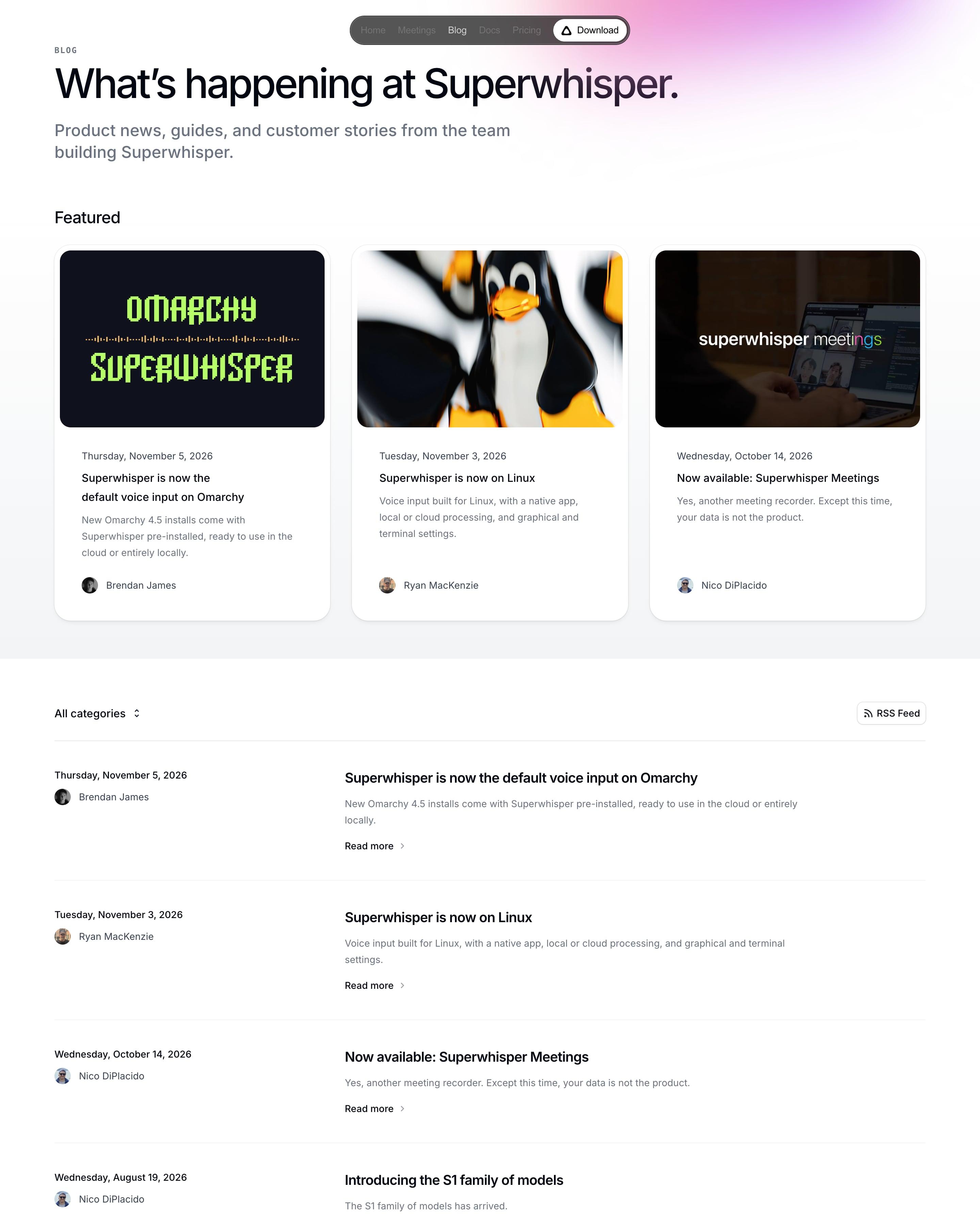
Three featured cards with image or pixel-type covers sit above a plain list. The row layout is the thing to copy: full weekday date and author on the left; title, summary and 'Read more' on the right. An 'All categories' dropdown, an RSS button and numbered pages finish it.
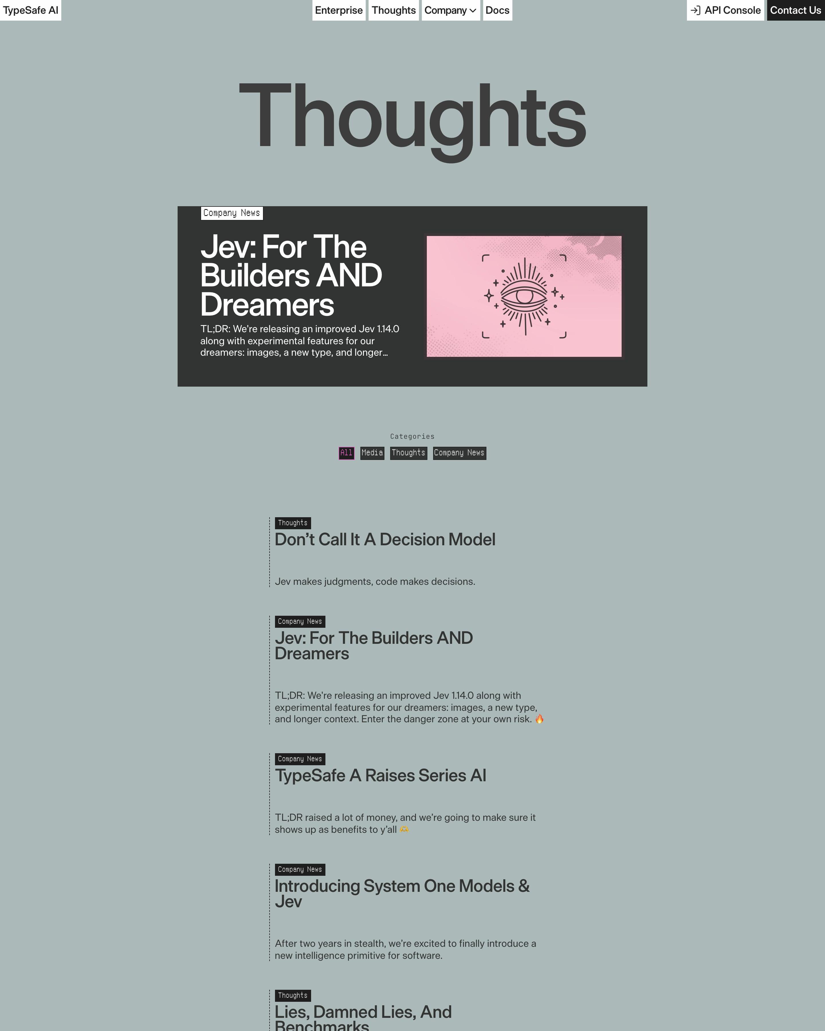
"Thoughts" sits big on a flat sage-grey page over one featured post in a charcoal box with a pink sketched eye graphic. The rest is a narrow single column of posts, each marked by a dotted left rule, a tiny black monospace tag (Thoughts, Media, Company News) and a one-line summary. With no thumbnails, headlines like "Lies, Damned Lies, And Benchmarks" carry the page.
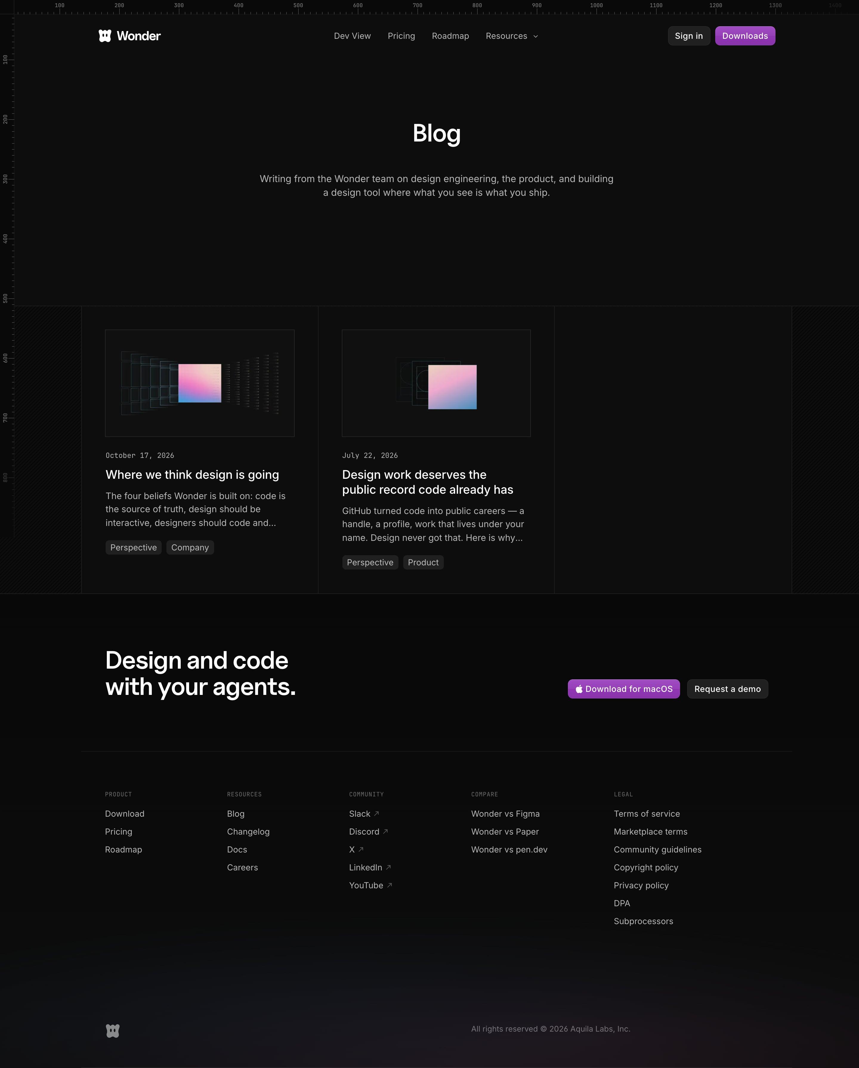
Just two posts sit in the bordered grid, each with a monospaced date, two tag pills and a small abstract cover: a gradient square inside receding wireframe frames. The empty third cell is kept rather than stretched. The intro promises writing on "building a design tool where what you see is what you ship", and the page ends on the same download banner as the homepage.
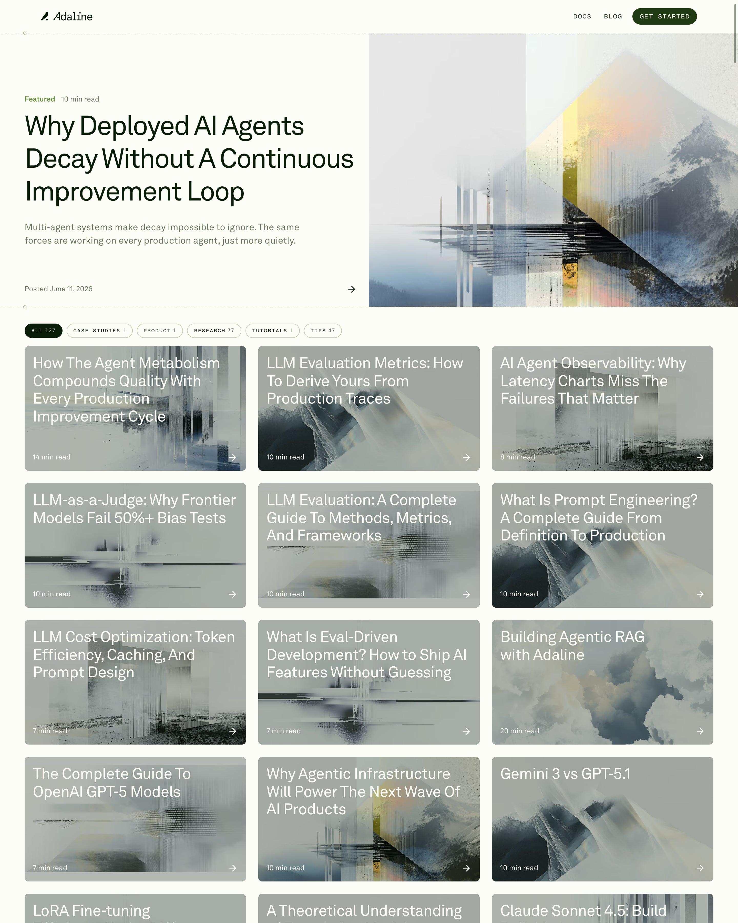
The featured post, "Why Deployed AI Agents Decay Without A Continuous Improvement Loop", gets a split hero with a glitchy mountain artwork, framed by dashed rules. Monospace pill filters show counts (All 127, Research 77, Tips 47). Every card puts its title in large white type straight over a muted grey-blue abstract image, with read time and an arrow at the bottom, then a single "Load more" pill.
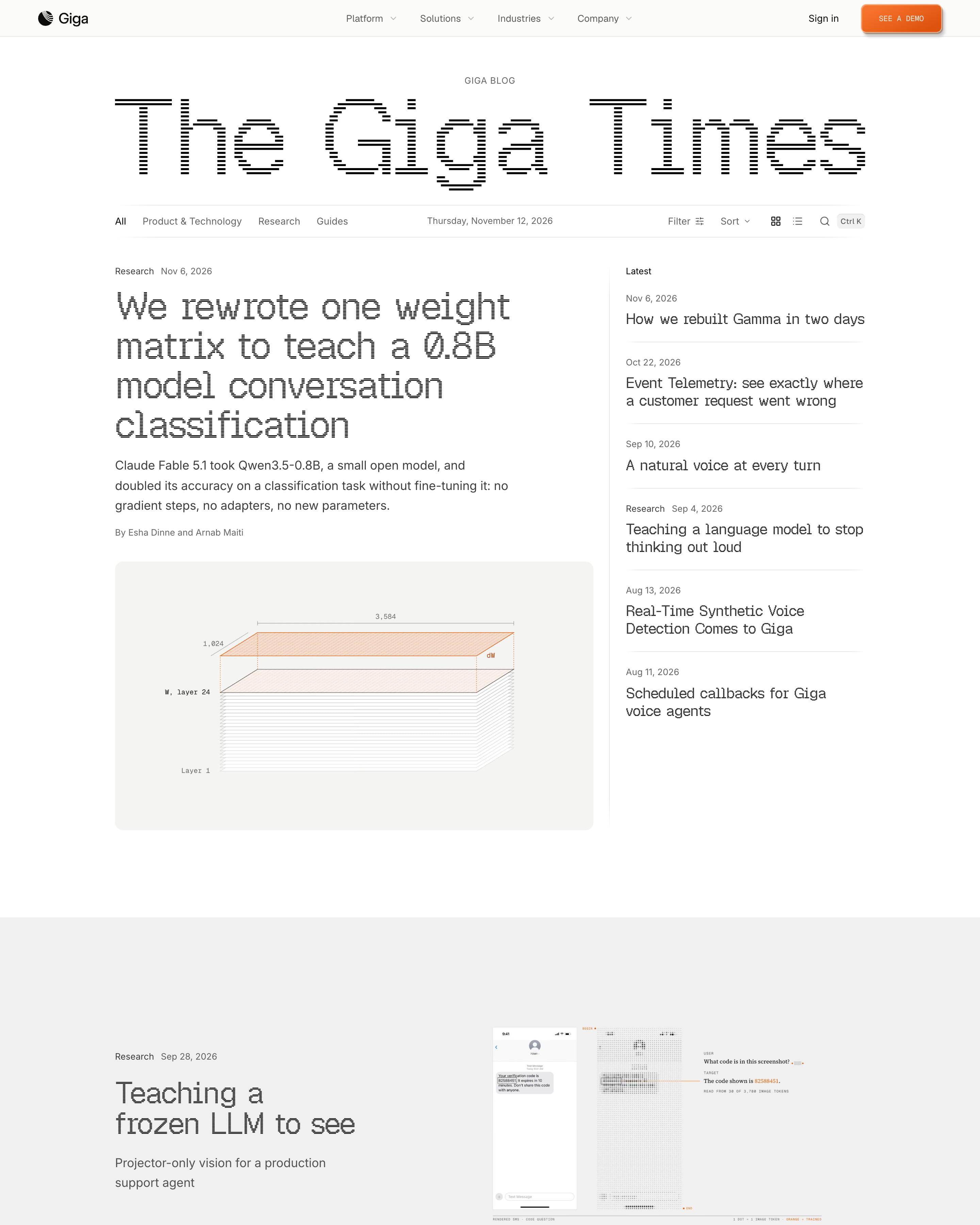
A newspaper masthead, "The Giga Times", with a dateline opens the page, above category tabs, filter, sort and a grid/list switch. Full-width film bands with a "Play the film" button break up the story lists, and guides are grouped by topic. That newspaper framing is easy to borrow.
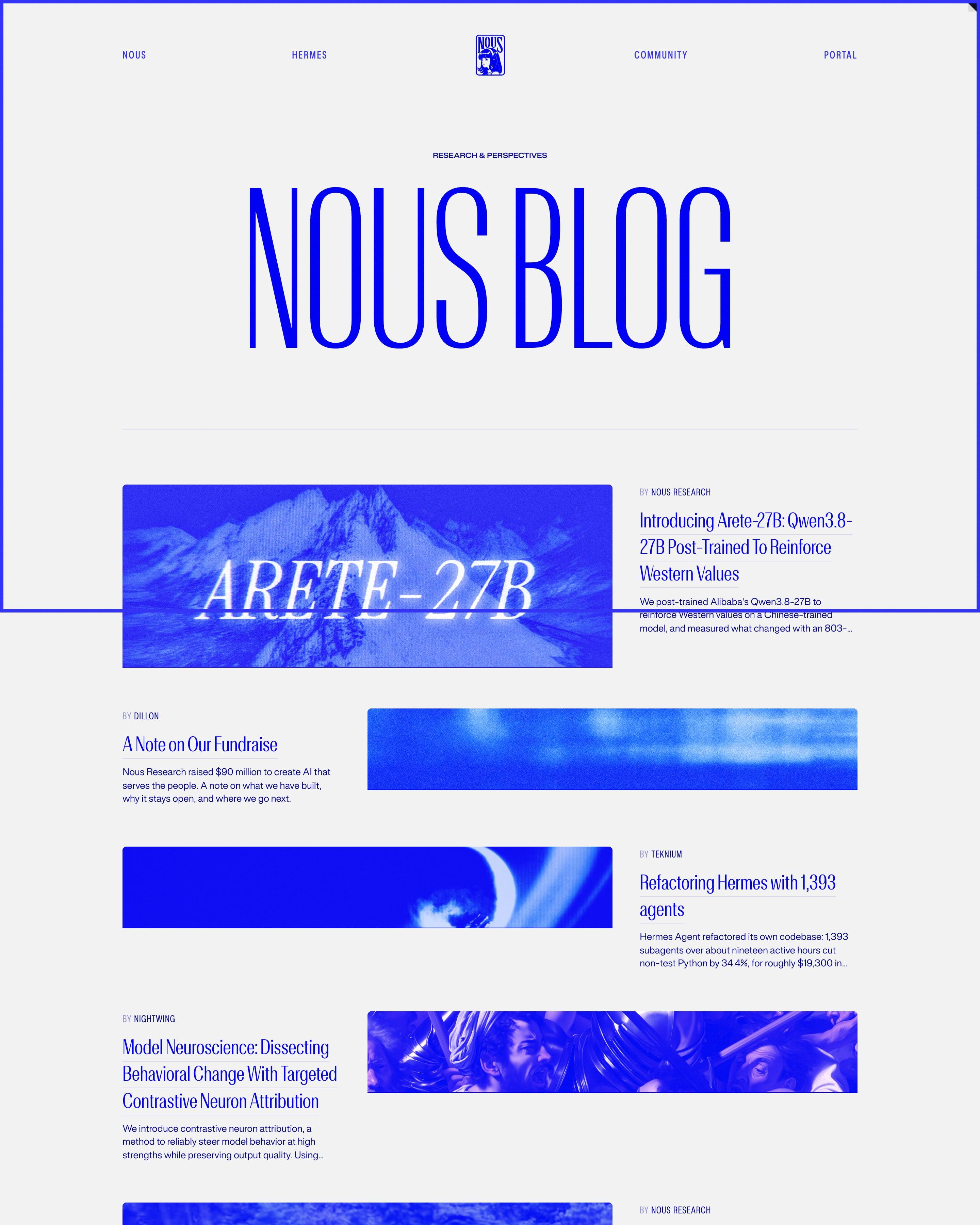
"NOUS BLOG" repeats the homepage's huge condensed headline, then five featured posts alternate image left and right, each a wide blue-tinted banner with bylines like "BY TEKNIUM". The archive is a three-column text table: title in condensed blue, excerpt, author. Every image is pushed into the same blue, even photographs, so research papers and essays read as one publication.
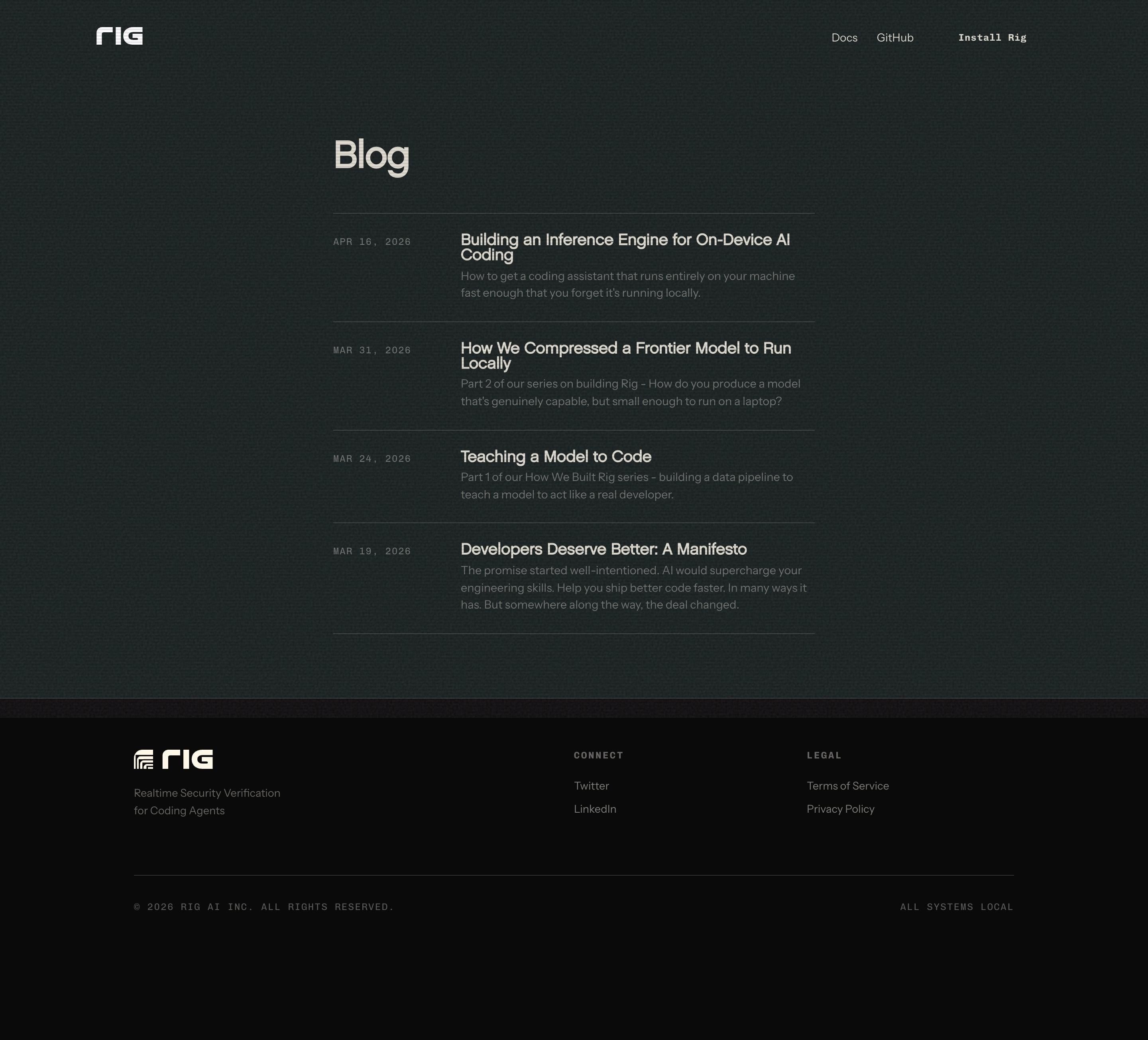
A plain index on a dark, slightly grainy background: "Blog" in large off-white type, then four posts in a narrow column with mono dates on the left and bold titles over grey summaries on the right, split by hairlines. Two posts are labelled as parts of a "How We Built Rig" series. The footer ends on a mono "ALL SYSTEMS LOCAL" status line.















































































By page type
Frequently asked questions
Easy to scan: a featured post, clear categories, cards with dates and authors, and a reason to subscribe.
Each page is opened at 1440 pixels wide, like a laptop, and scrolled from top to bottom so every image and section loads. Cookie banners, chat bubbles and popups are left out, and the whole page is saved as one image.