
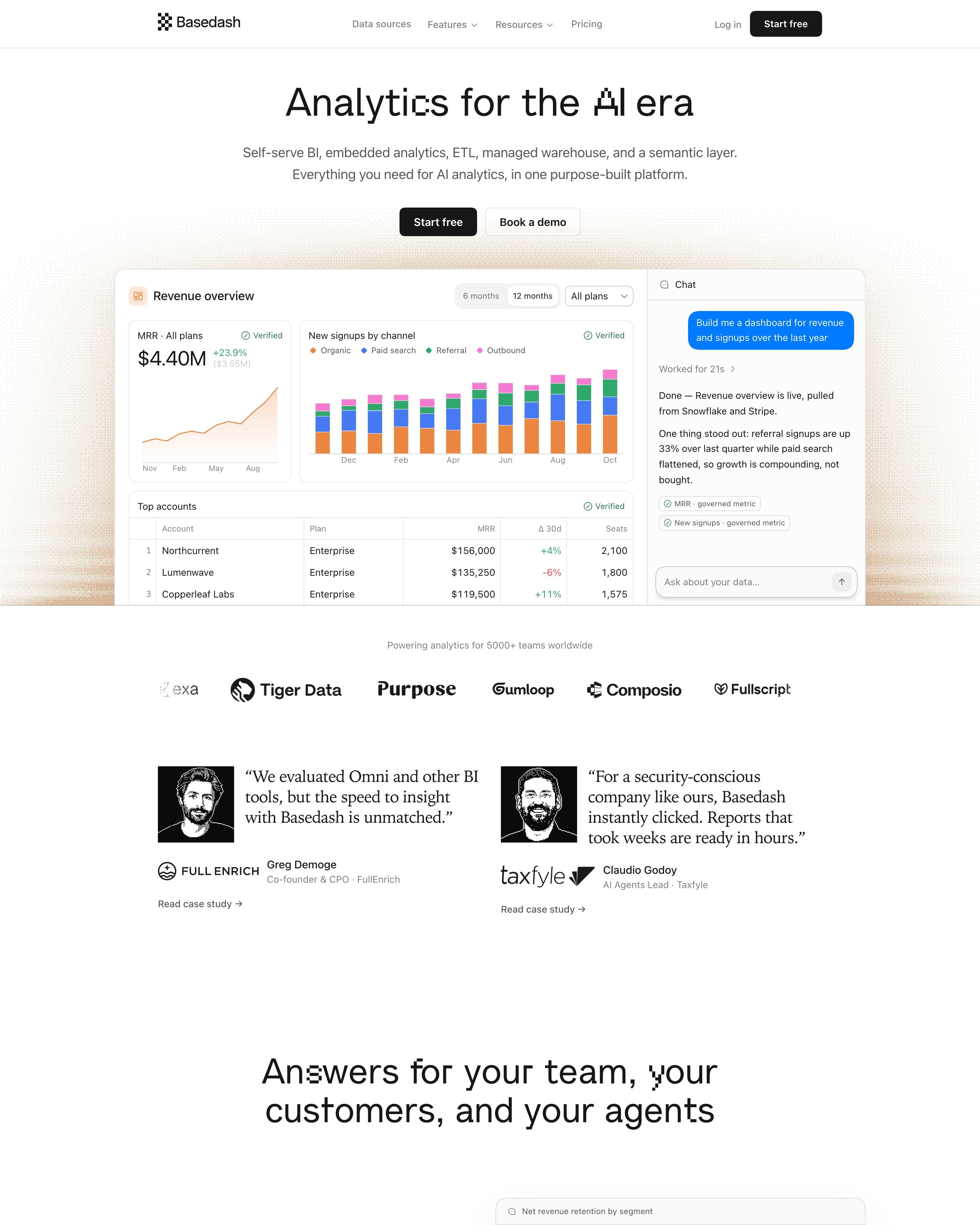

"Analytics for the AI era" sits over a full dashboard mock with an MRR chart, stacked bars and a chat panel answering "Build me a dashboard". Feature sections alternate copy and floating UI cards, each under a small orange eyebrow label. Worth copying: customer quotes in a serif face beside black-and-white engraved portraits, which give a plain grey-and-white page some character.
11 examples from SaaS companies
Best Black and White Website Examples
Sites that work in black, white and greys, with colour left out or kept to a single accent, so type and layout carry the design. Here are 11 SaaS websites that do it well, each shot as the whole page, with what stands out on each.
- Dark or light
- 3 dark, 8 light
- of 11 pages
- Heading fonts
- Inter
- Inter 3, GT Walsheim 1, WF Visual Sans 1, Inter Display 1
- Built with
- Next.js
- Next.js 5, Framer 2, Astro 1, Hugo 1
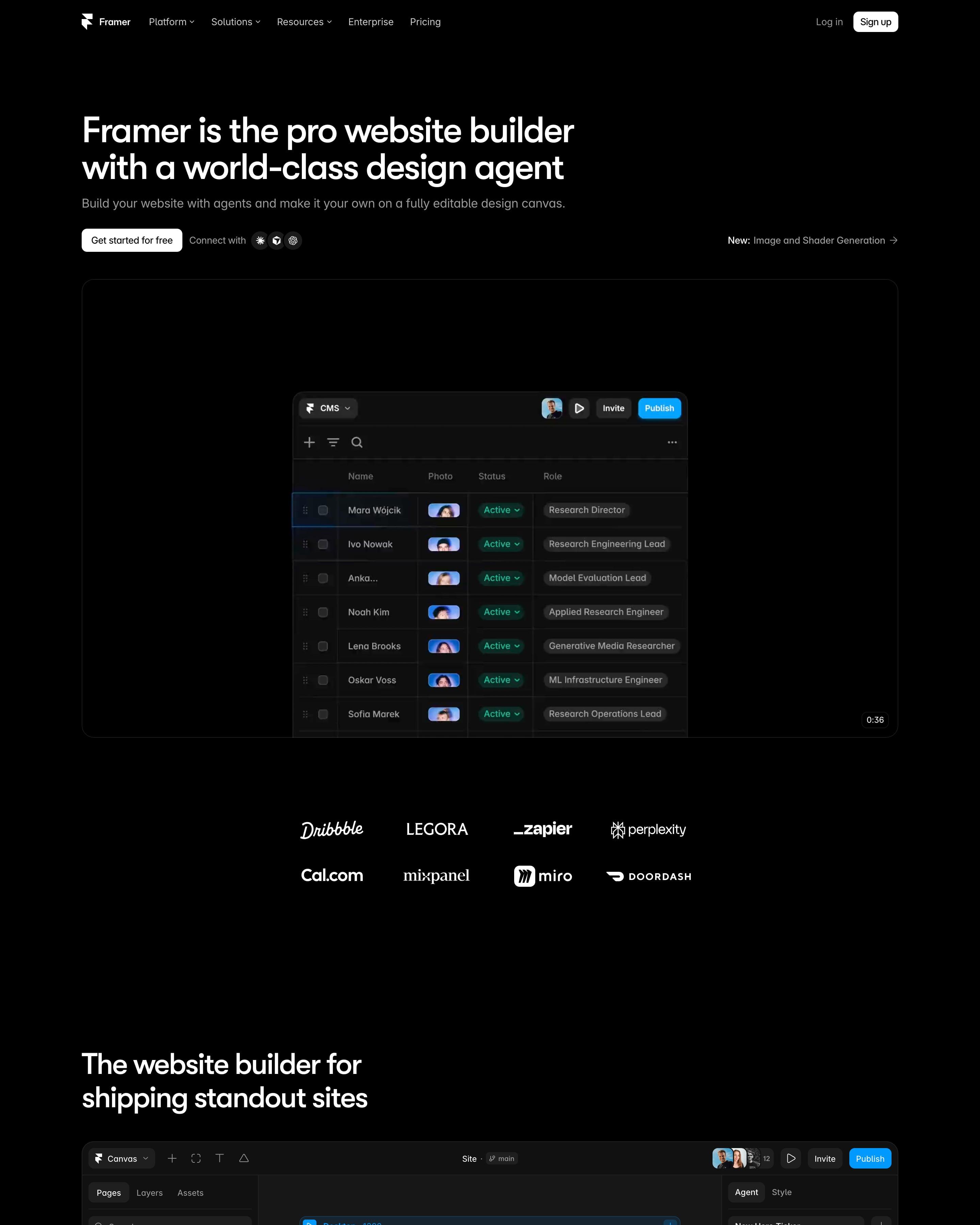
"Framer is the pro website builder with a world-class design agent" sits left on pure black above a canvas frame labelled InteractivePointSphere, a dot sphere selected in a purple box. A full editor screenshot follows, then "Not just vibes, a full platform" as a bordered bento of Performance, CMS, SEO, Hosting and Analytics tiles. The page ends on a prompt box with preset chips like "Build startup site".
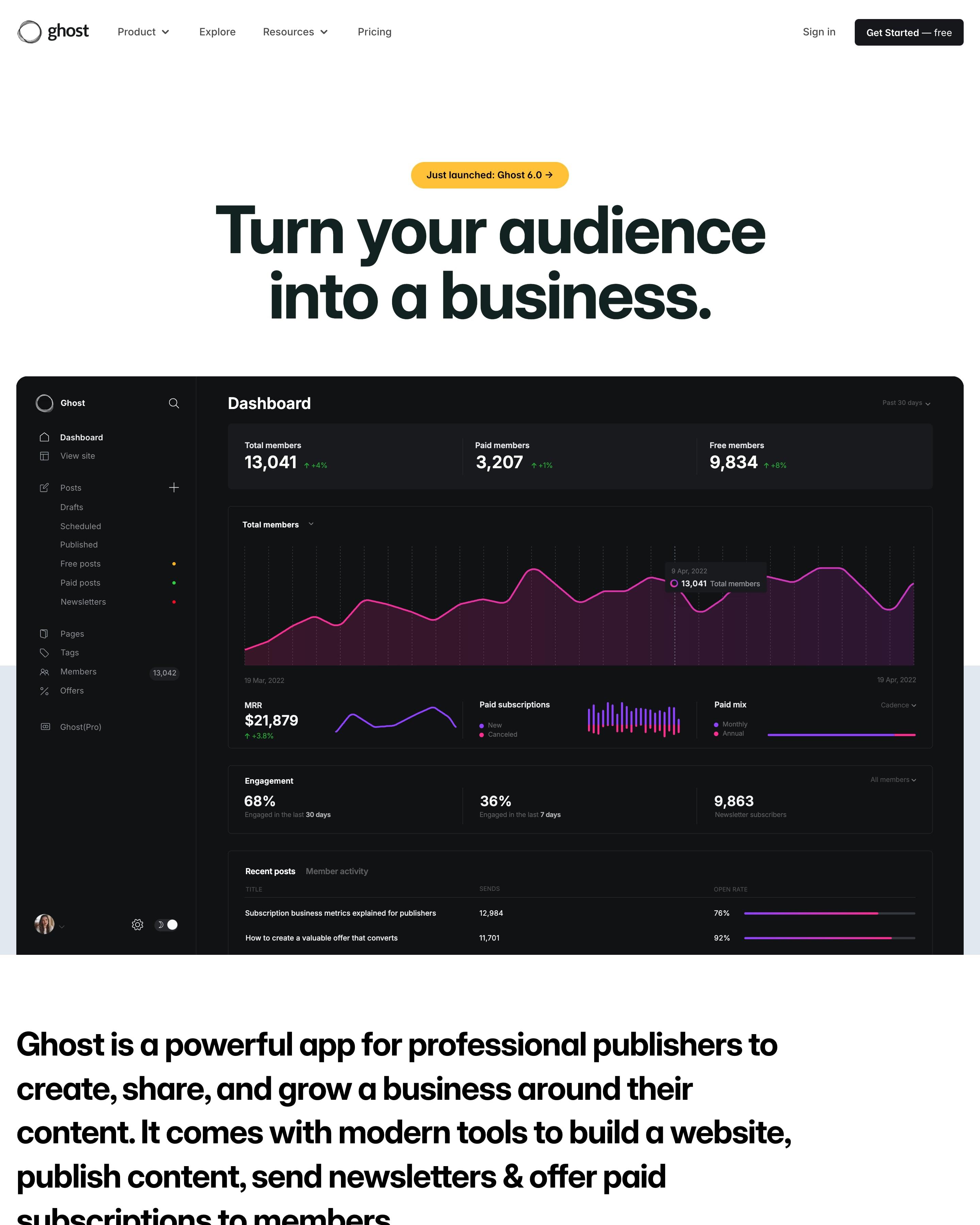
A dark dashboard screenshot sits right under the headline, and the page then switches between white and navy sections. Proof comes as a revenue figure, $100,000,000+, above rows of publication cards sorted into Publishers, Creators and Businesses. The closing call to action counts last week's new publications, a detail worth borrowing.
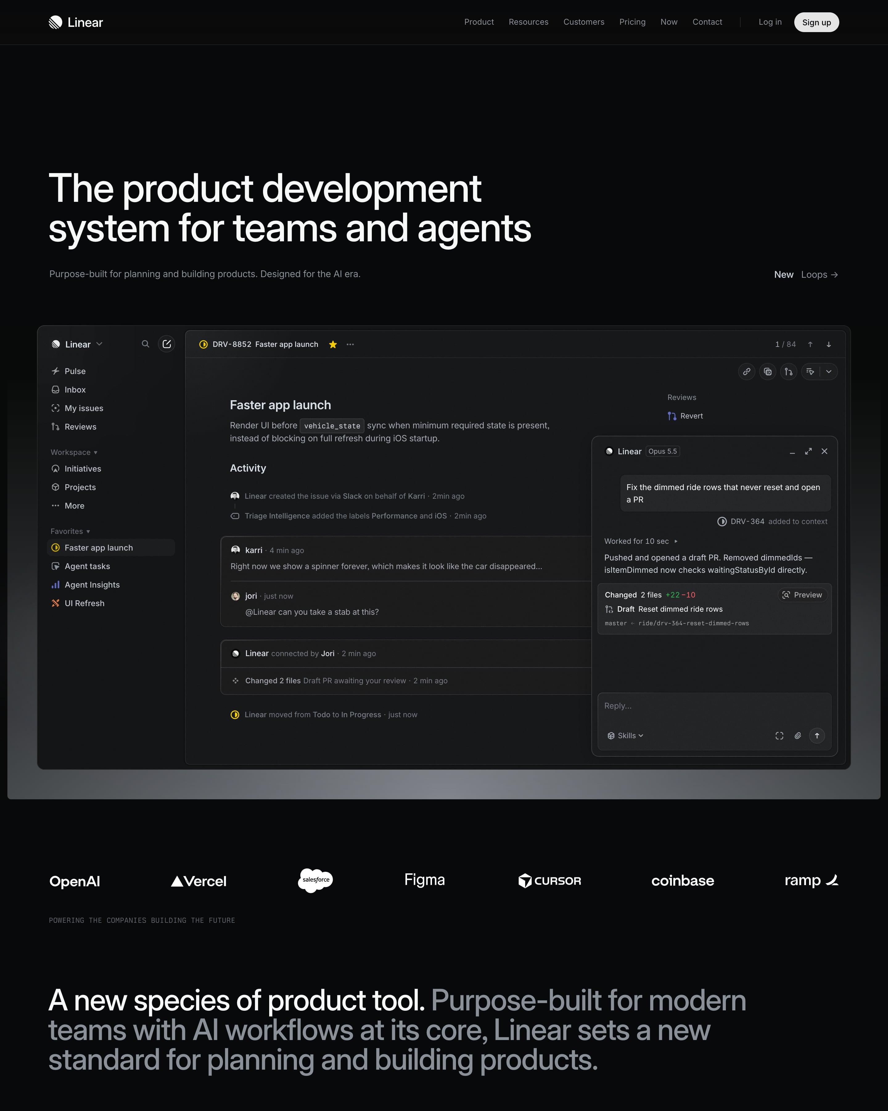
A near-black canvas opens on a full app window: an issue, with an agent chat panel docked beside it. Below a logo strip, four product sections share one pattern of heading left, text right and dimmed interface underneath. Worth copying: the lime quote card that breaks the greyscale near the end.
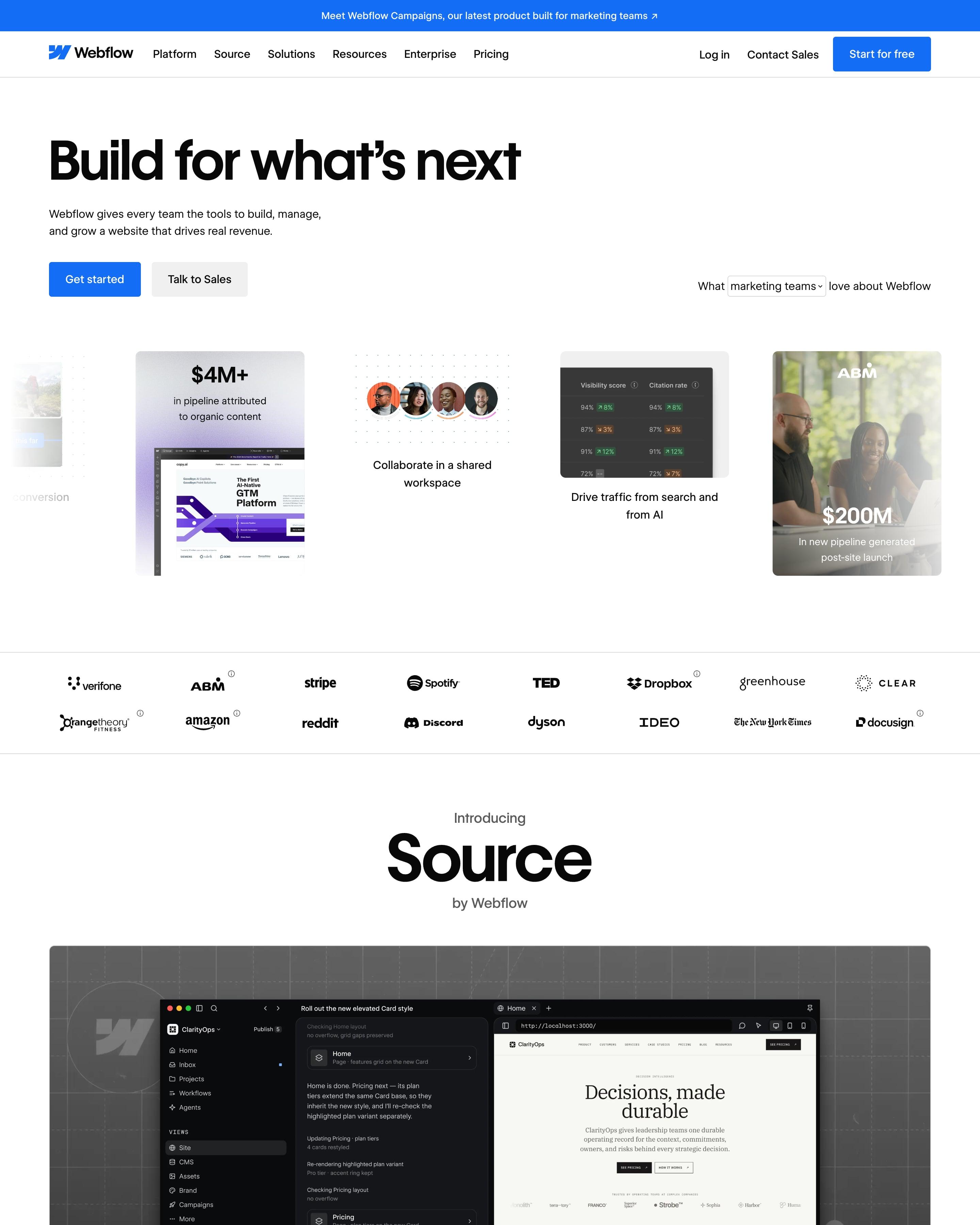
Beside the hero buttons, "What marketing teams love about Webflow" puts the audience in a dropdown over a carousel of mixed cards like "$4M+ in pipeline". Customer stories come as tall portrait cards with one result and a quote, and a tilted ribbon of #MadeinWebflow sites ends the page. Copy that audience dropdown.
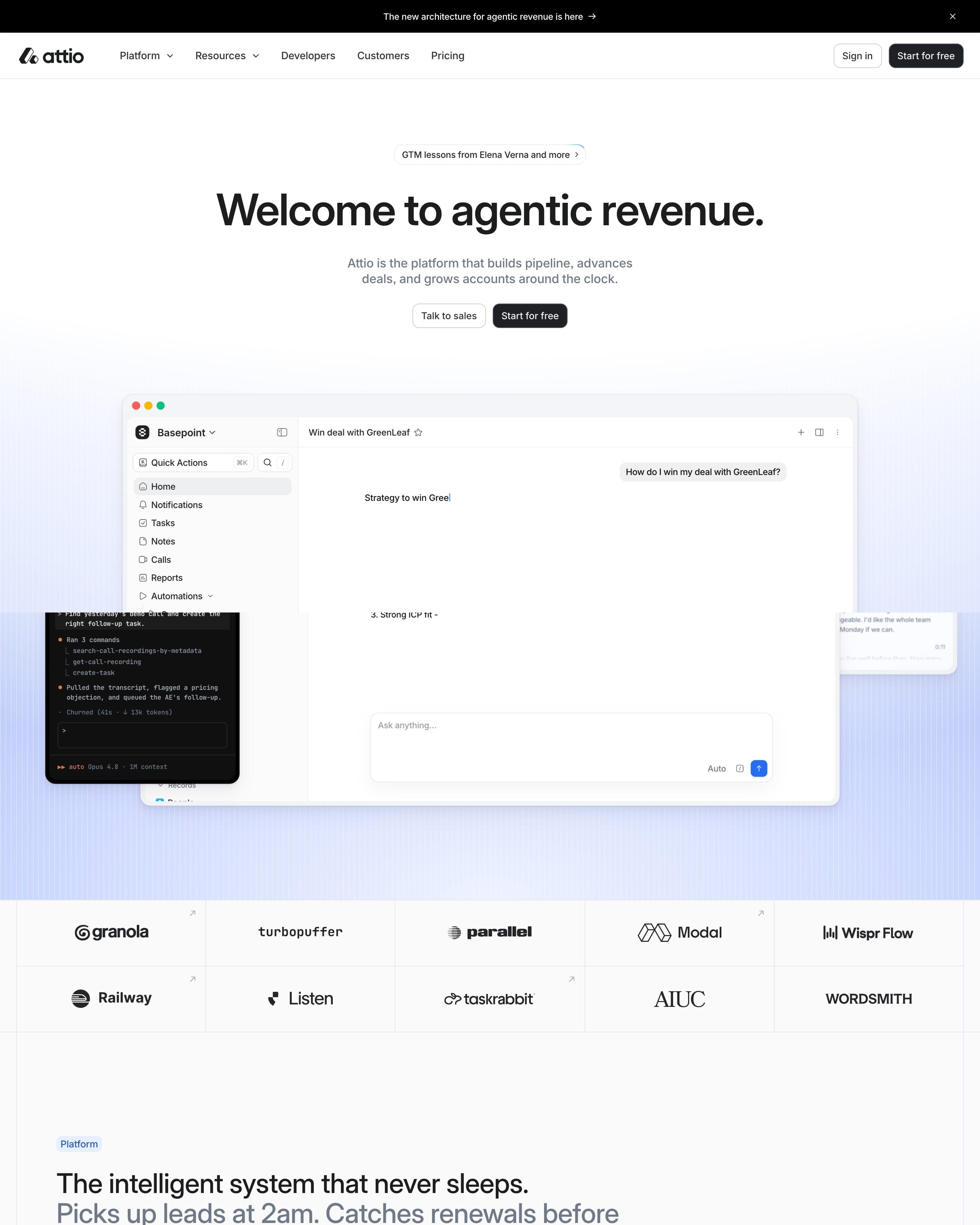
The hero centres its headline above the app's own AI chat window, with a bordered grid of ten customer logos below. Product screens then scroll past a sticky menu of five stages, from Build pipeline to Retain and expand. Reuse that menu, and the black "Universal Context" band with its glowing horizon.
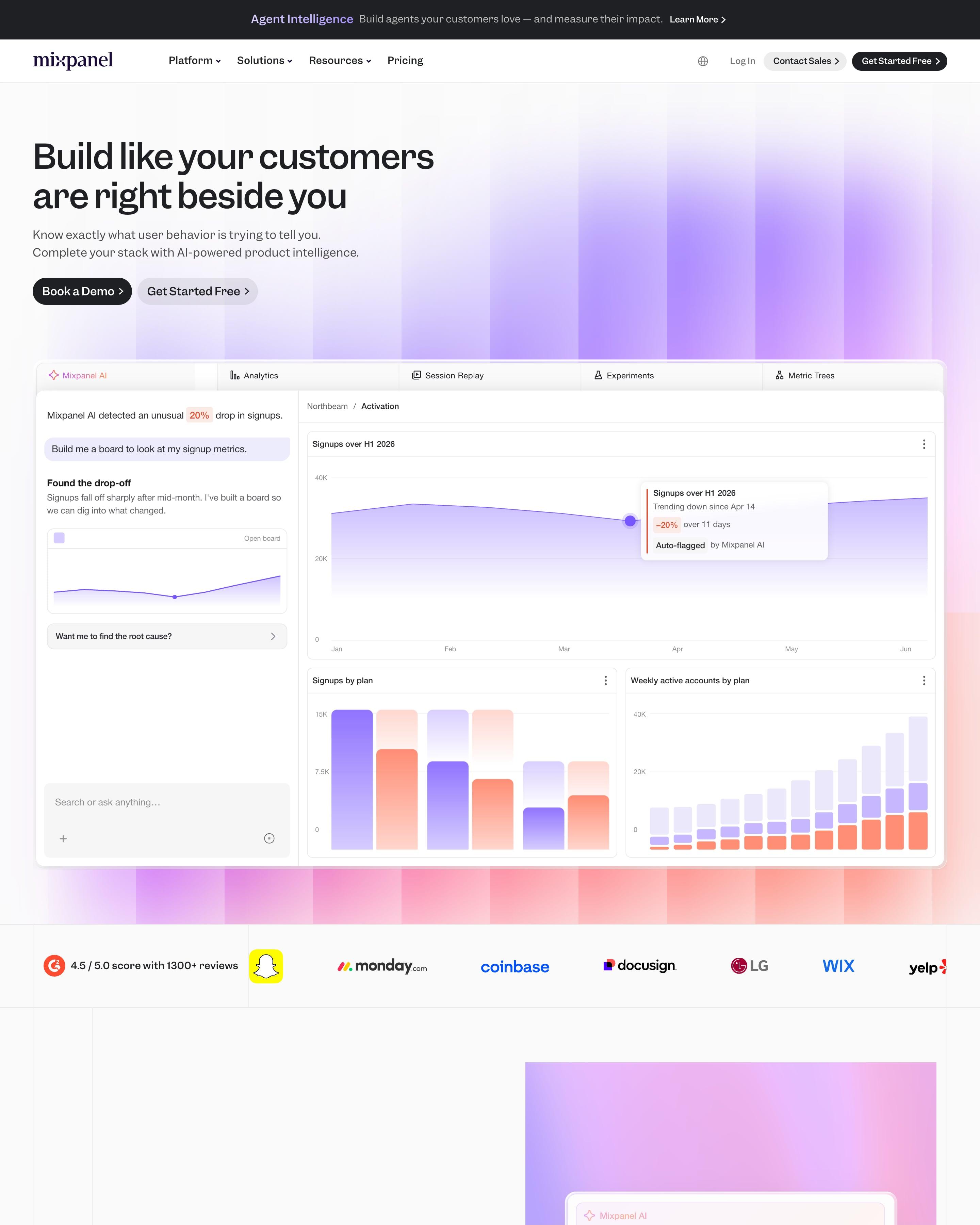
Blurred violet columns glow behind the headline, above a tabbed product panel in which an AI assistant spots a 20% drop in sign-ups. Five features follow, each with a screen on its own gradient, from violet through blue and green to orange. That colour per feature is the idea to take.
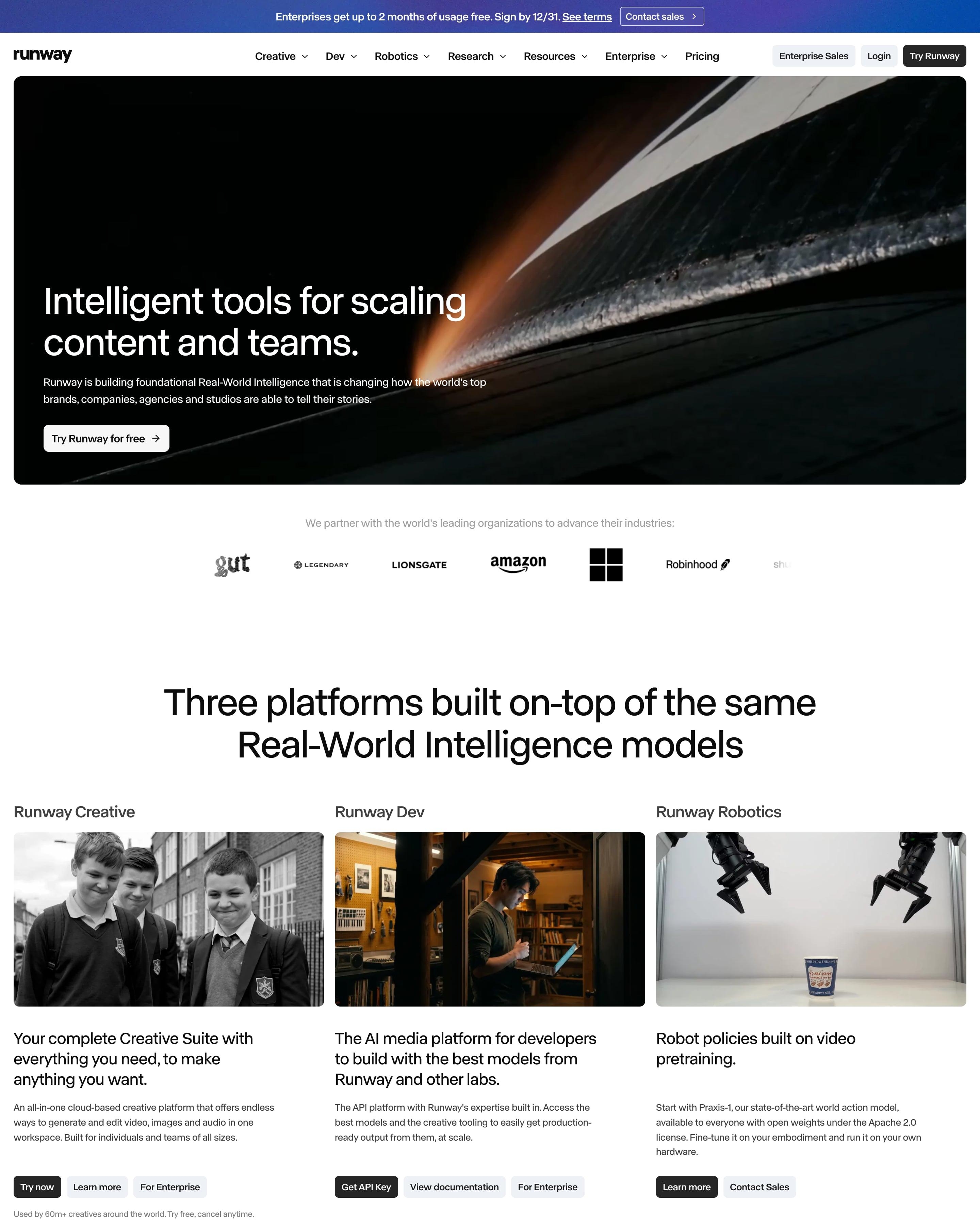
A rounded frame holds the white headline, over a dark close-up with a streak of orange light. Under a logo row, three columns present Creative, Dev and Robotics, each with a photo, a short pitch and its own buttons. Worth copying: buttons matched to each audience, like "Get API Key" for Dev.
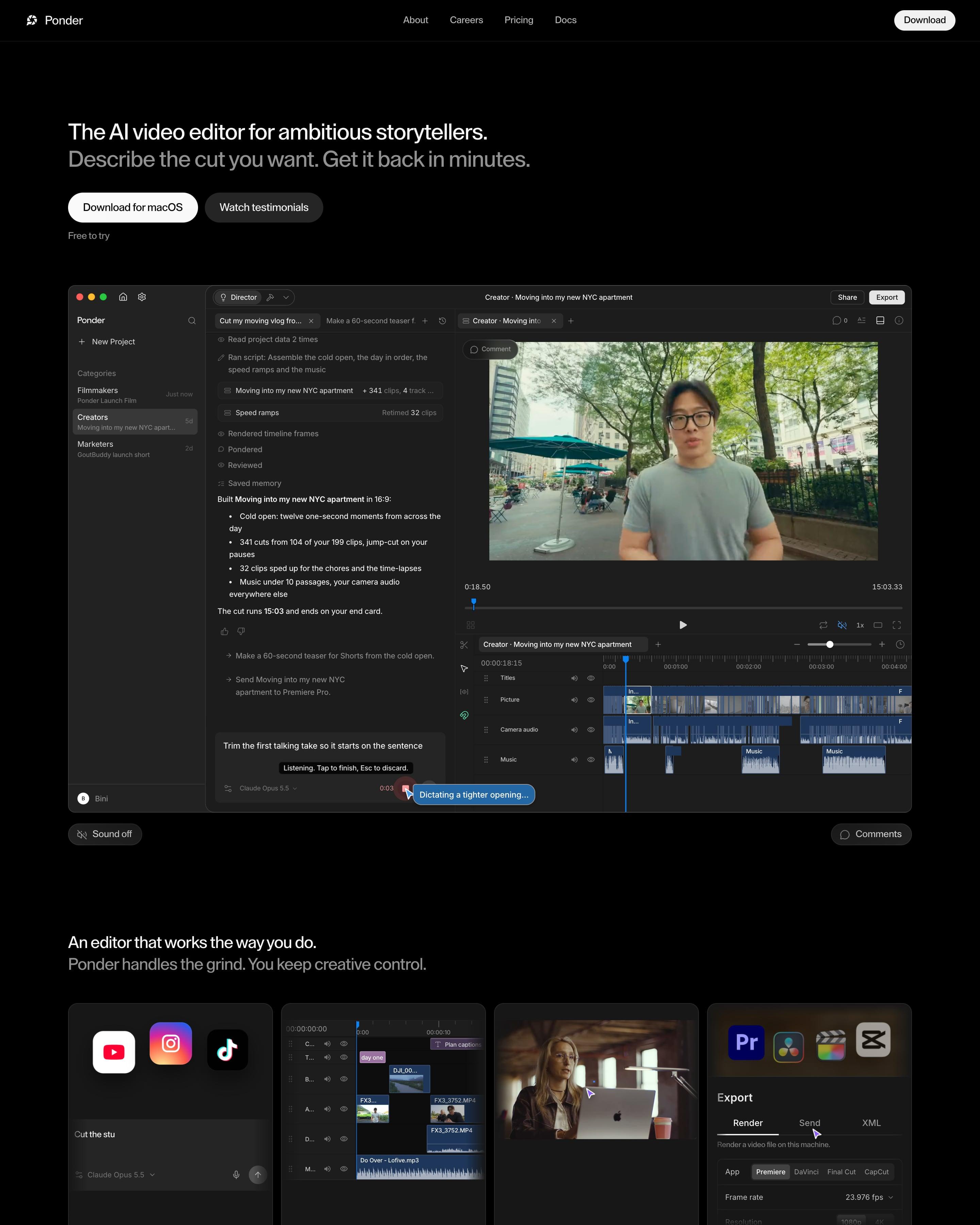
Black page, white sans headline "The AI video editor for ambitious storytellers." over an app screenshot pairing the agent's chat log, "341 cuts from 104 of your 199 clips", with a timeline. Four dark cards run from style learning to export into Premiere, DaVinci, Final Cut or CapCut, and numbered steps go from Import to Finish. A grey particle cloud frames "Let your ideas flow. Ponder it."
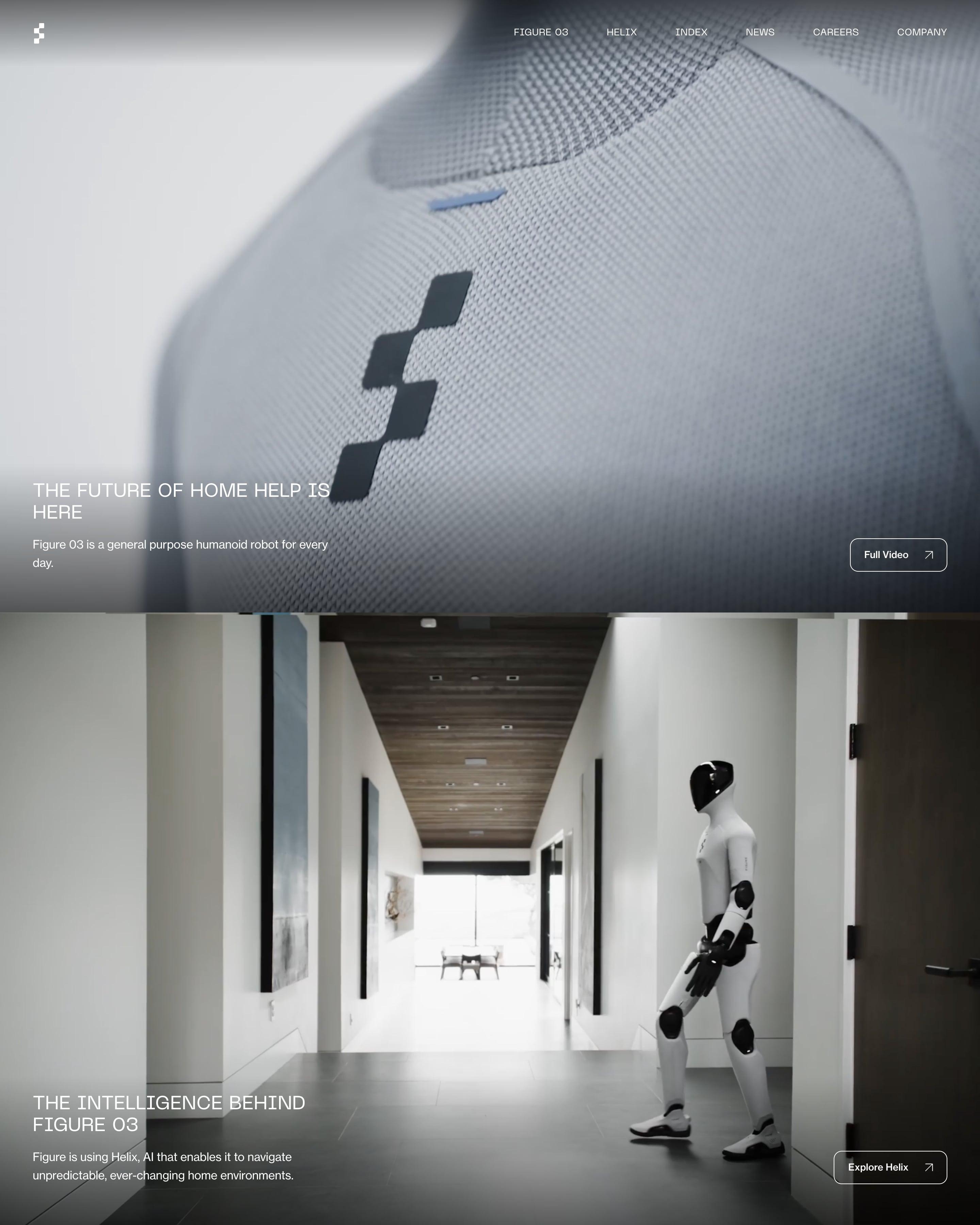
Four full-screen photos of the robot fill the page, including a close-up of its knit chest and a walk down a home hallway. Each panel keeps its text small and low: an uppercase headline, one sentence and an outlined button. Copy the footer's large numbered menu, 01 to 06, set beside a newsletter sign-up.
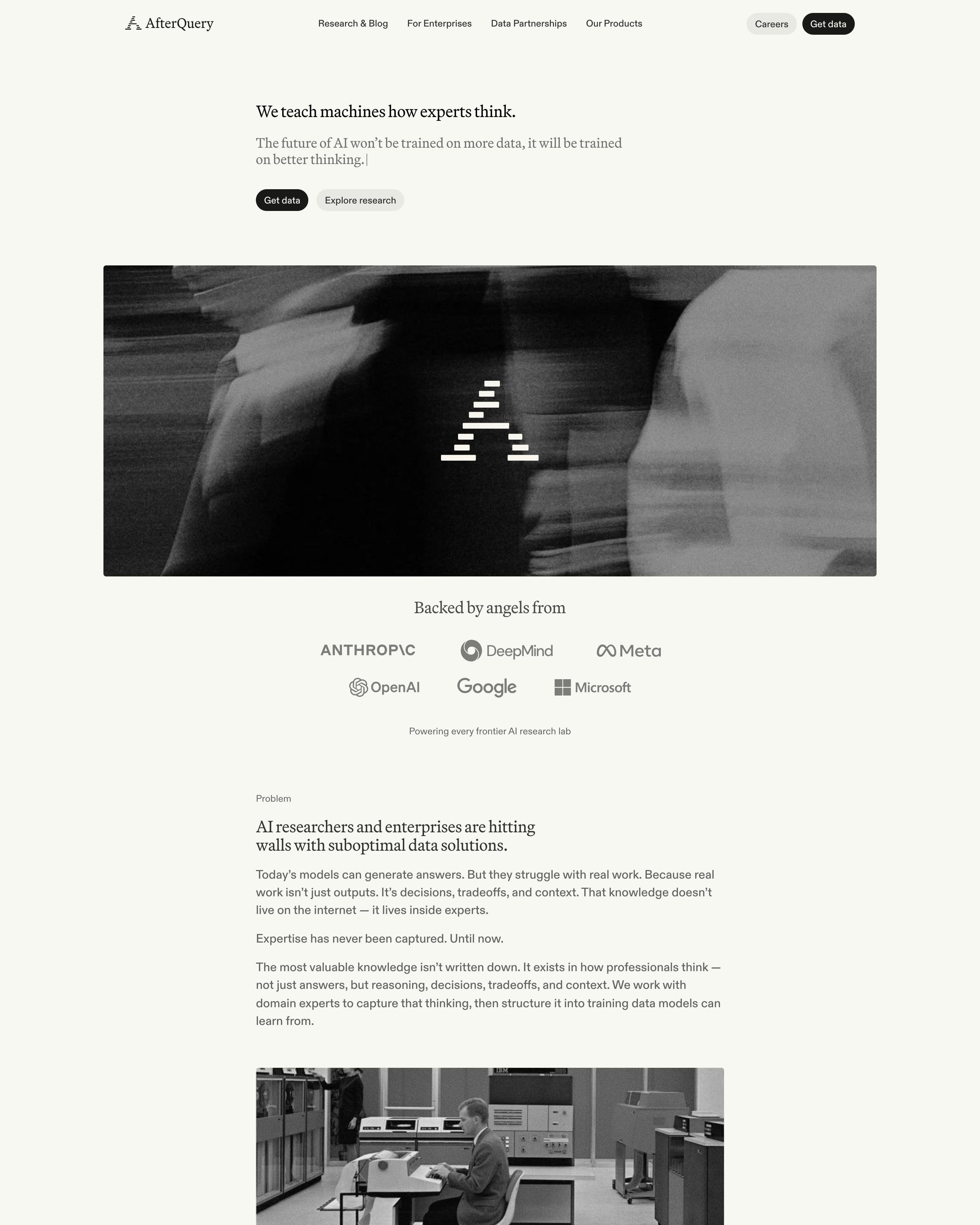
A serif headline and subline, ending in a text cursor, sit above a wide motion-blurred black-and-white photo stamped with the stepped logo. The rest stays greyscale too: a "Backed by angels from" logo row, an archival computer-room photo, dithered icons. Worth copying: colour saved for the grainy research card images and the careers banner.










How to design a black and white website
Without colour, typography, spacing and photography do all the work. It reads as confident and editorial, and it lets the product's own colours stand out when they appear.
- Pick a typeface with character for headings: it carries the brand when colour doesn't.
- Use greys sparingly and on purpose, for secondary text and borders, not as a third and fourth colour.
- If you add one accent, keep it to links or the main button so it means something.
Frequently asked questions
Sites that work in black, white and greys, with colour left out or kept to a single accent, so type and layout carry the design. Without colour, typography, spacing and photography do all the work. It reads as confident and editorial, and it lets the product's own colours stand out when they appear.
Not when the type and layout are strong. The examples here use big headings, generous spacing and sharp product shots, so the lack of colour reads as a choice, not an omission.
Each page is opened at 1440 pixels wide, like a laptop, and scrolled from top to bottom so every image and section loads. Cookie banners, chat bubbles and popups are left out, and the whole page is saved as one image.