
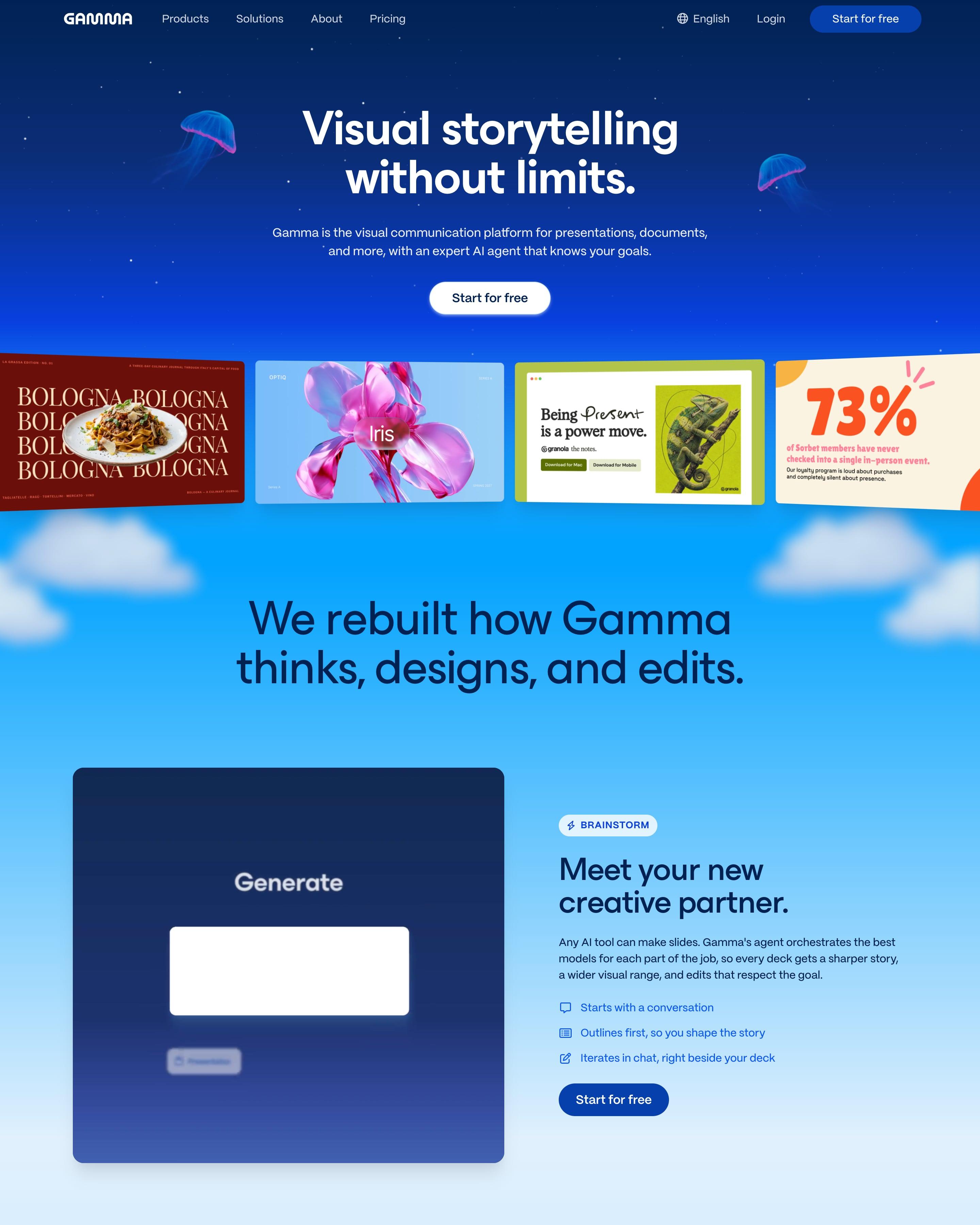

Glowing jellyfish flank the headline in a night-blue sky, and further down the sky turns to day over clouds and green hills. Four sample designs, from a food magazine page to a 73% stat slide, sit under the button. Borrow the portrait carousel of customer leaders, each labelled with company, name and title.
6 examples from SaaS companies
Best Illustration Website Examples
Sites that lead with illustration: drawn characters, abstract shapes and diagrams instead of, or next to, product screenshots. Here are 6 SaaS websites that do it well, each shot as the whole page, with what stands out on each.
- Dark or light
- 0 dark, 6 light
- of 6 pages
- Heading fonts
- ESBuild
- ESBuild 1, NotionInter 1, Roobert 1, ABC Favorit 1
- Built with
- Next.js
- Next.js 4, Framer 1
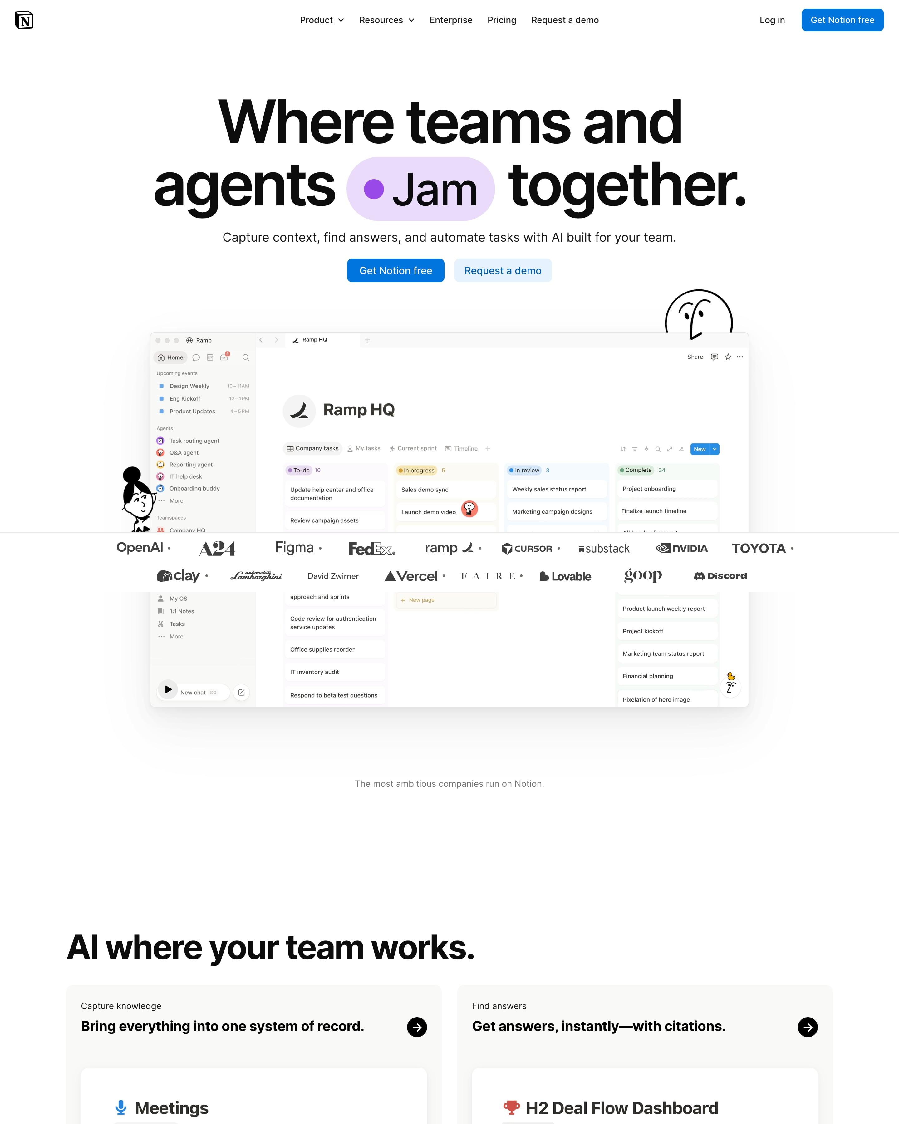
"Where teams and agents Think together." wraps "Think" in a blue pill inside the headline, and Notion's line-drawn characters peek around the Ramp HQ workspace screenshot. "AI where your team works." is a bento of three app scenes (Meetings, H2 Deal Flow Dashboard, Coding Agent) and five small use-case cards. Worth copying: testimonial cards tinted red, blue and yellow for Cursor, Faire and Ramp.
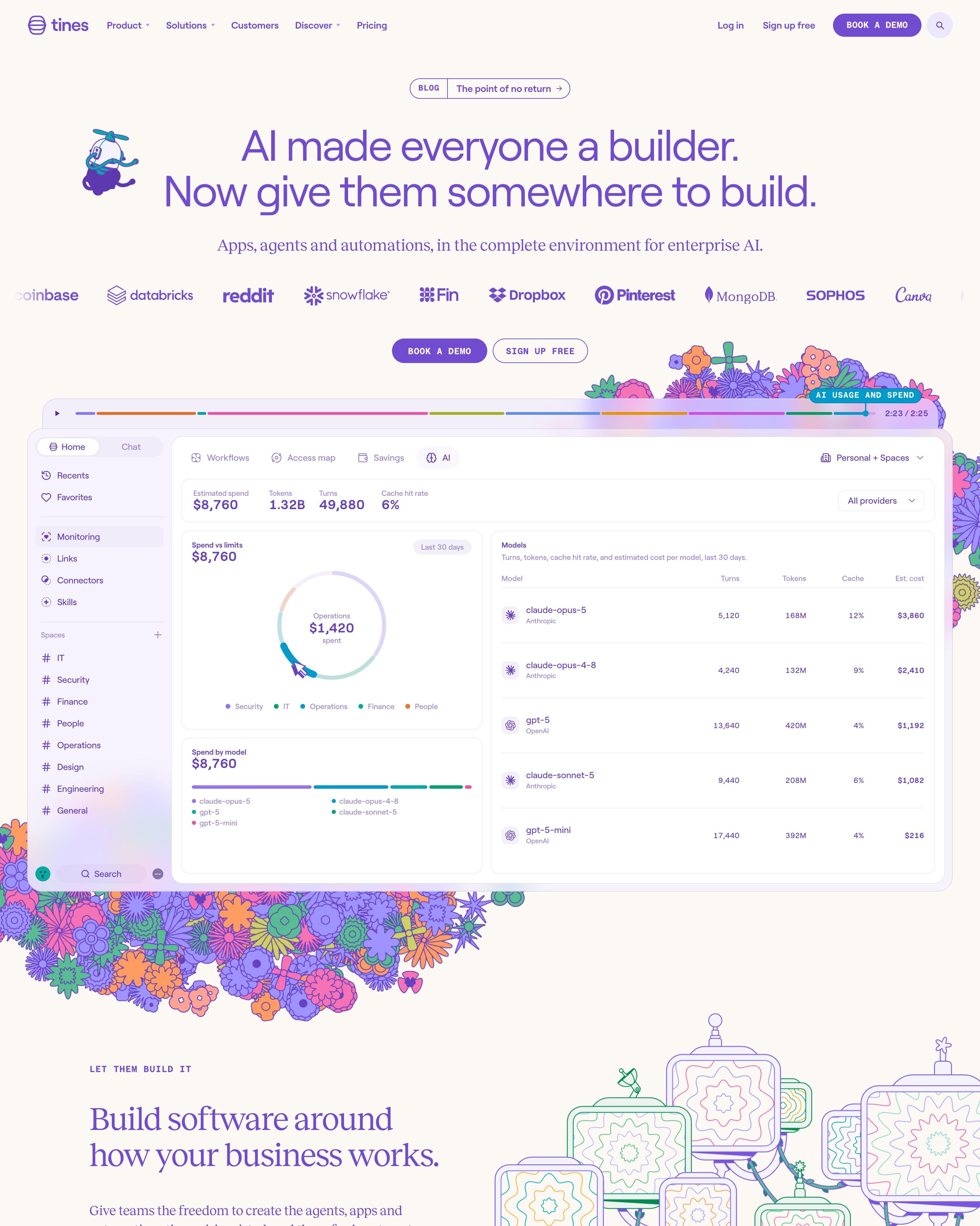
Folk-style flower drawings spill around the product screenshot, and a small propeller-hat mascot floats by the purple headline. The detail to borrow is the video-style timeline bar above the screenshot. Pastel cards with coloured outlines then split the platform into Build, Deploy and Operationalize and into six teams, before a giant lavender 'Start today'.
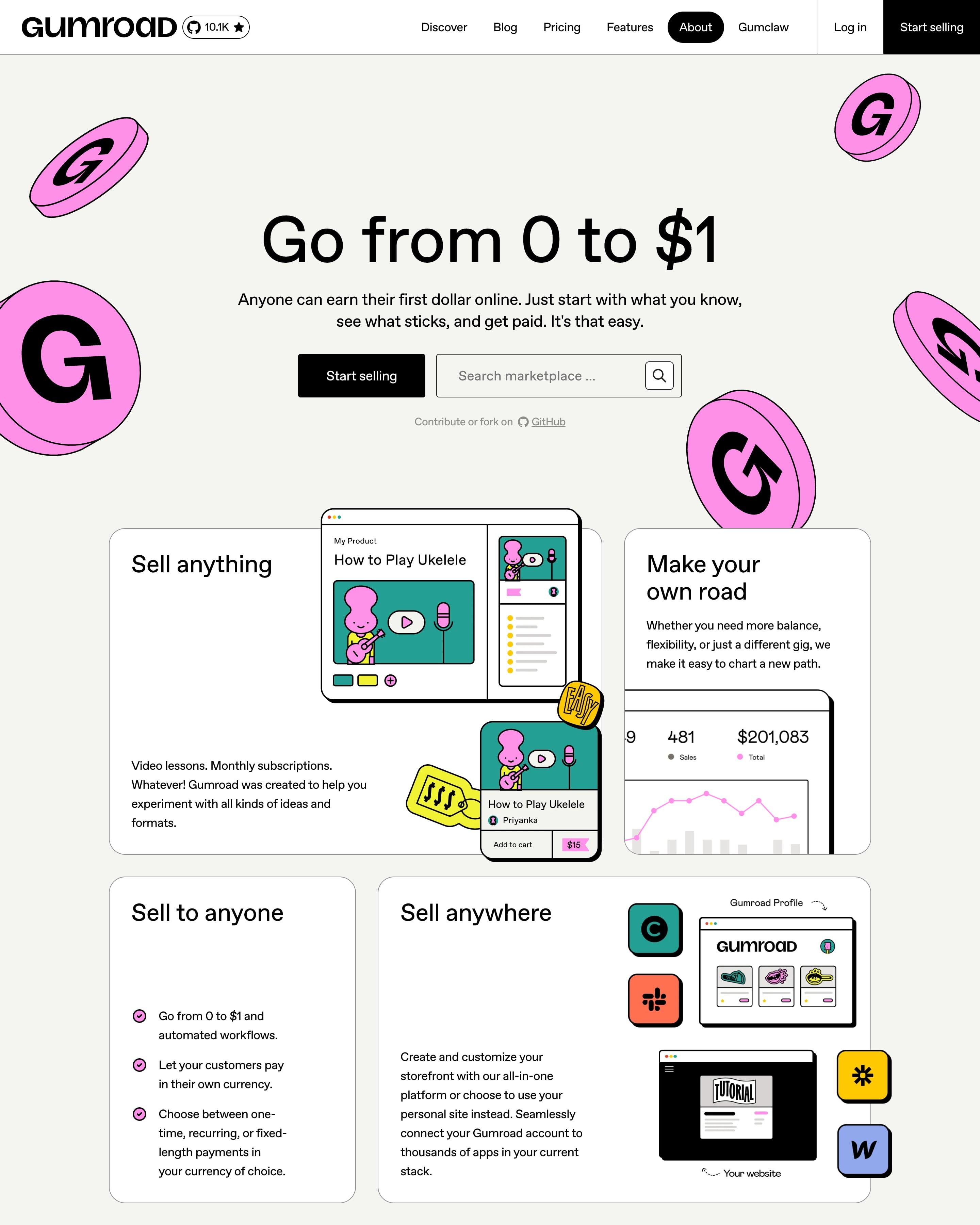
Pink G coins float around the hero, where a black Start selling button sits beside a marketplace search. Bordered cards of different sizes mix product UI with drawn characters, and a yellow loop diagram sums up the approach. One huge number, $2,004,370 earned by creators last week, is the proof worth copying.
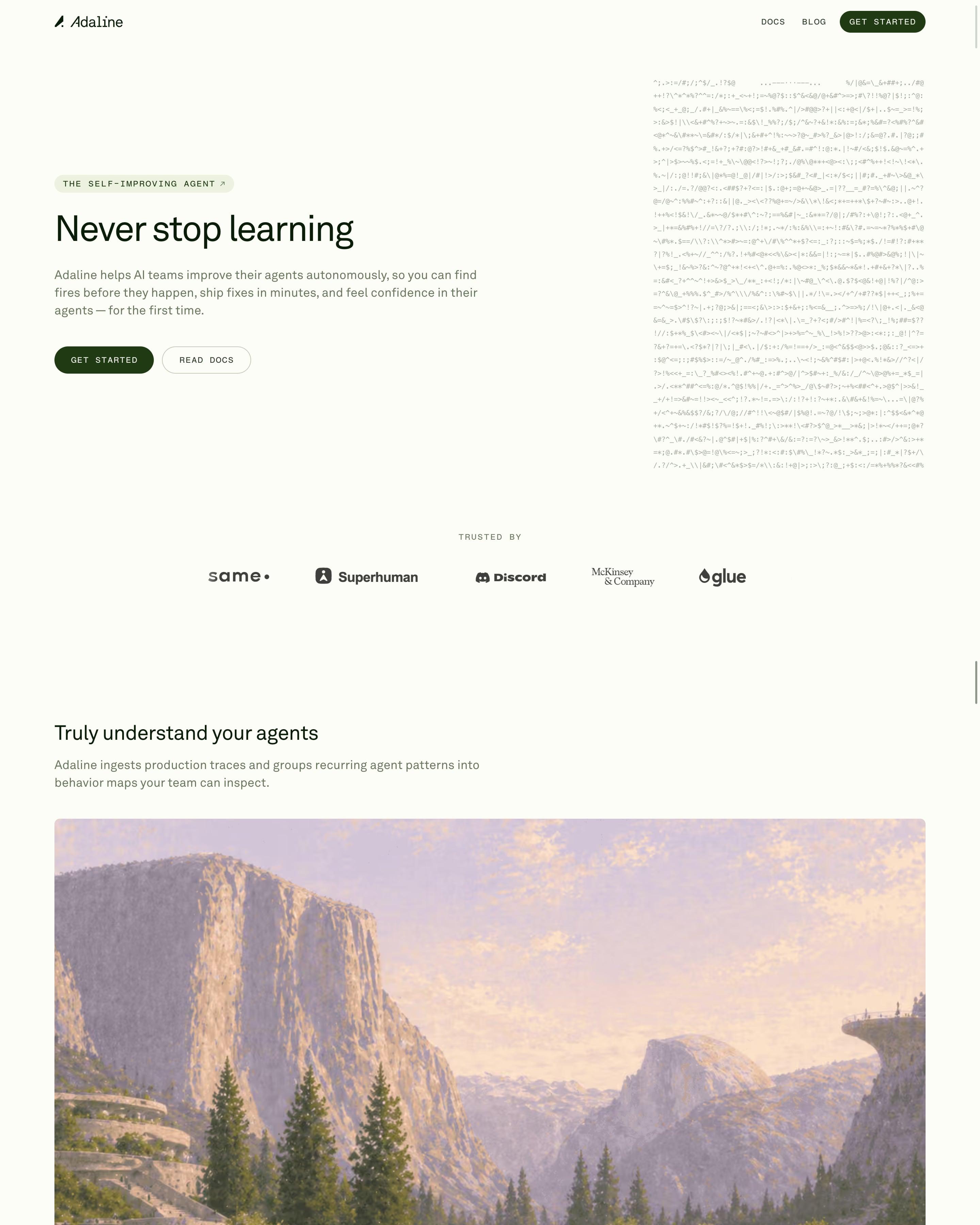
"Never stop learning" sits beside a block of drifting ASCII characters, with monospace caps buttons in deep forest green. Each feature, like "Evals that write themselves", gets one full-width painted landscape in lilac and peach instead of a product shot. Grey-green testimonial tiles with play buttons lead to a dark "Ship Once. Improve Forever." serif panel with a Trace, Behaviors, Evals & Data, Improve loop.
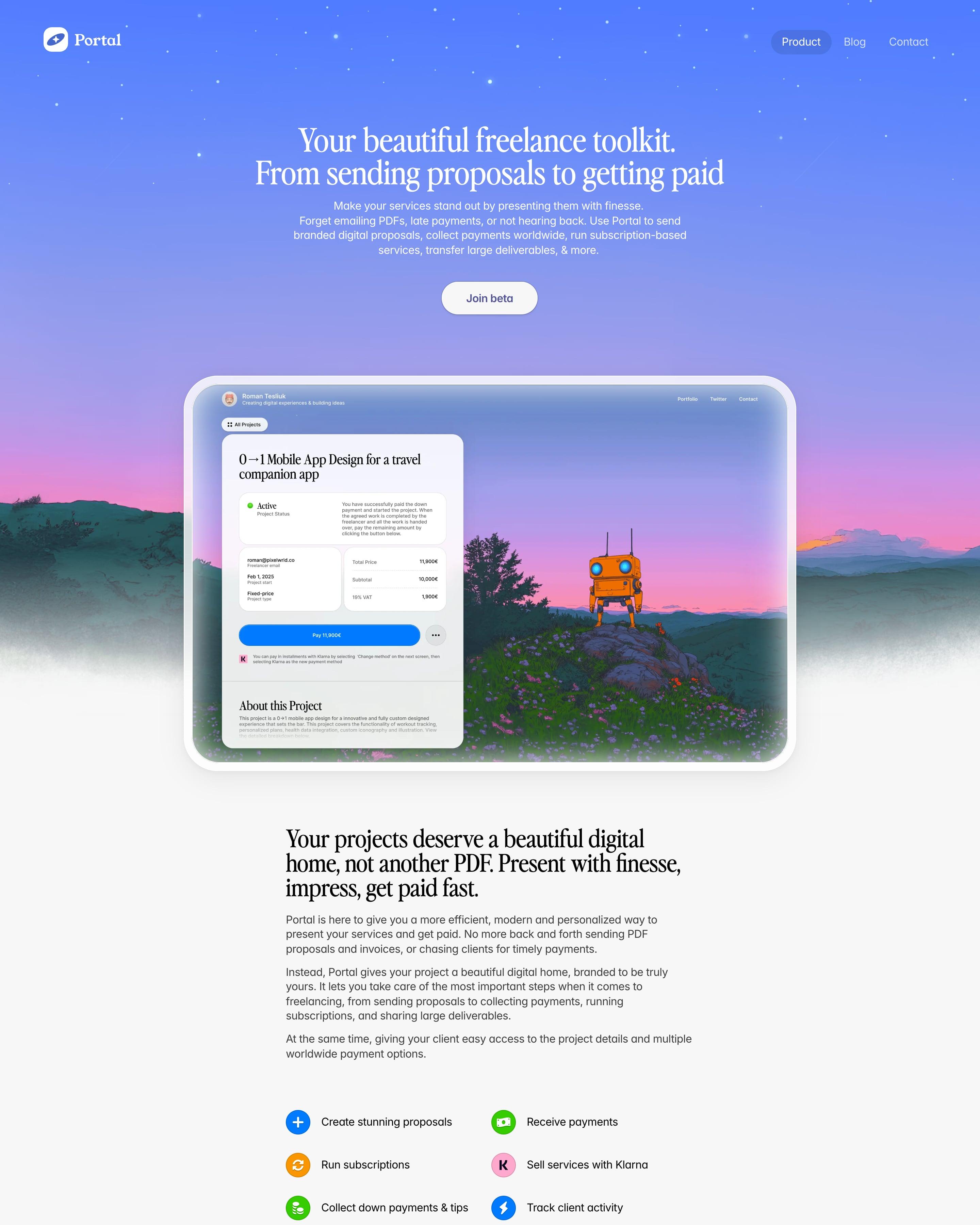
A periwinkle-to-pink starry sky over painted mountains and an orange robot frames the serif "Your beautiful freelance toolkit. From sending proposals to getting paid". Below, a narrow light column mixes serif statements, colourful icon lists and tilted UI cards: a "New Payment Received" toast, a signature field and a 3D blue Pay key. Pricing is a blue "1%" badge, then a slightly rotated founder memo signed "With love, Roman".





How to design a illustration website
Illustration gives a product a personality that screenshots can't: characters, abstract shapes and diagrams that explain an idea or set a tone.
- Commission one consistent style and use it everywhere, from the hero to empty states.
- Use illustration to explain (how something works, what a feature does), not only to fill space.
- Mix in real product screenshots, so visitors still see what they'd be buying.
Frequently asked questions
Sites that lead with illustration: drawn characters, abstract shapes and diagrams instead of, or next to, product screenshots. Illustration gives a product a personality that screenshots can't: characters, abstract shapes and diagrams that explain an idea or set a tone.
Most of the examples here use both: illustration for ideas and mood, screenshots for features. Pure illustration works best when the product itself is simple or hard to show.
Each page is opened at 1440 pixels wide, like a laptop, and scrolled from top to bottom so every image and section loads. Cookie banners, chat bubbles and popups are left out, and the whole page is saved as one image.