
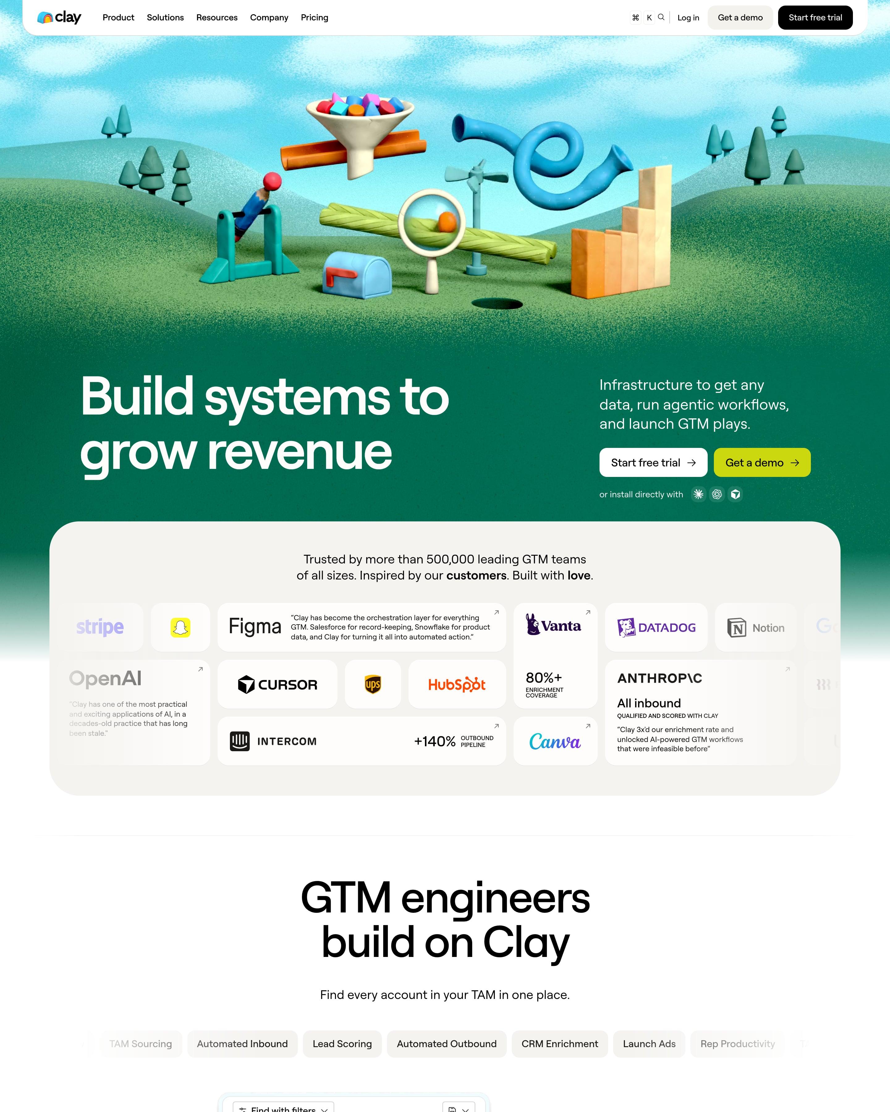

A 3D clay scene of a funnel, pipes and a magnifying glass on green hills opens the page, and the footer sits in a ball pit. Between them, proof is a bento of logos, quotes and stats. Each pastel feature card is colour-coded from label to button, a system worth copying.
7 examples from SaaS companies
Best 3D Website Examples
Sites with 3D renders and scenes: objects, product mockups and worlds modelled in three dimensions, some of them interactive. Here are 7 SaaS websites that do it well, each shot as the whole page, with what stands out on each.
- Dark or light
- 3 dark, 4 light
- of 7 pages
- Heading fonts
- Roobert
- Roobert 1, Mark Pro 1, Inter 1, Domaine 1
- Built with
- Next.js
- Next.js 5, Webflow 1, Framer 1
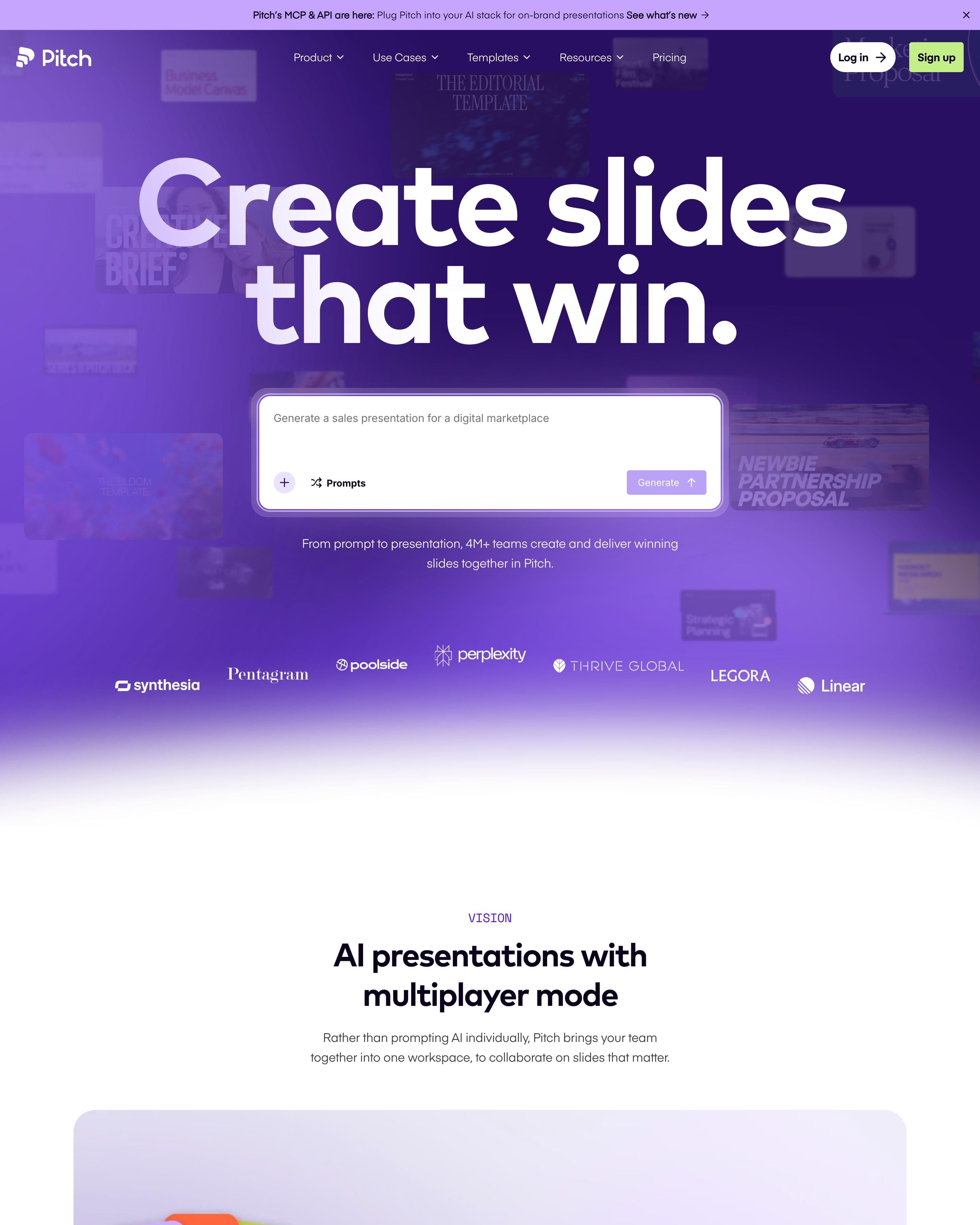
Dimmed template covers drift behind a giant white headline and prompt box on violet. Proof comes as a wall of quote cards around "Trusted by 4M+ teams", then a bento grid of seven tools. The template index is the part to borrow: huge faded category names, one lit up with its templates beside it.
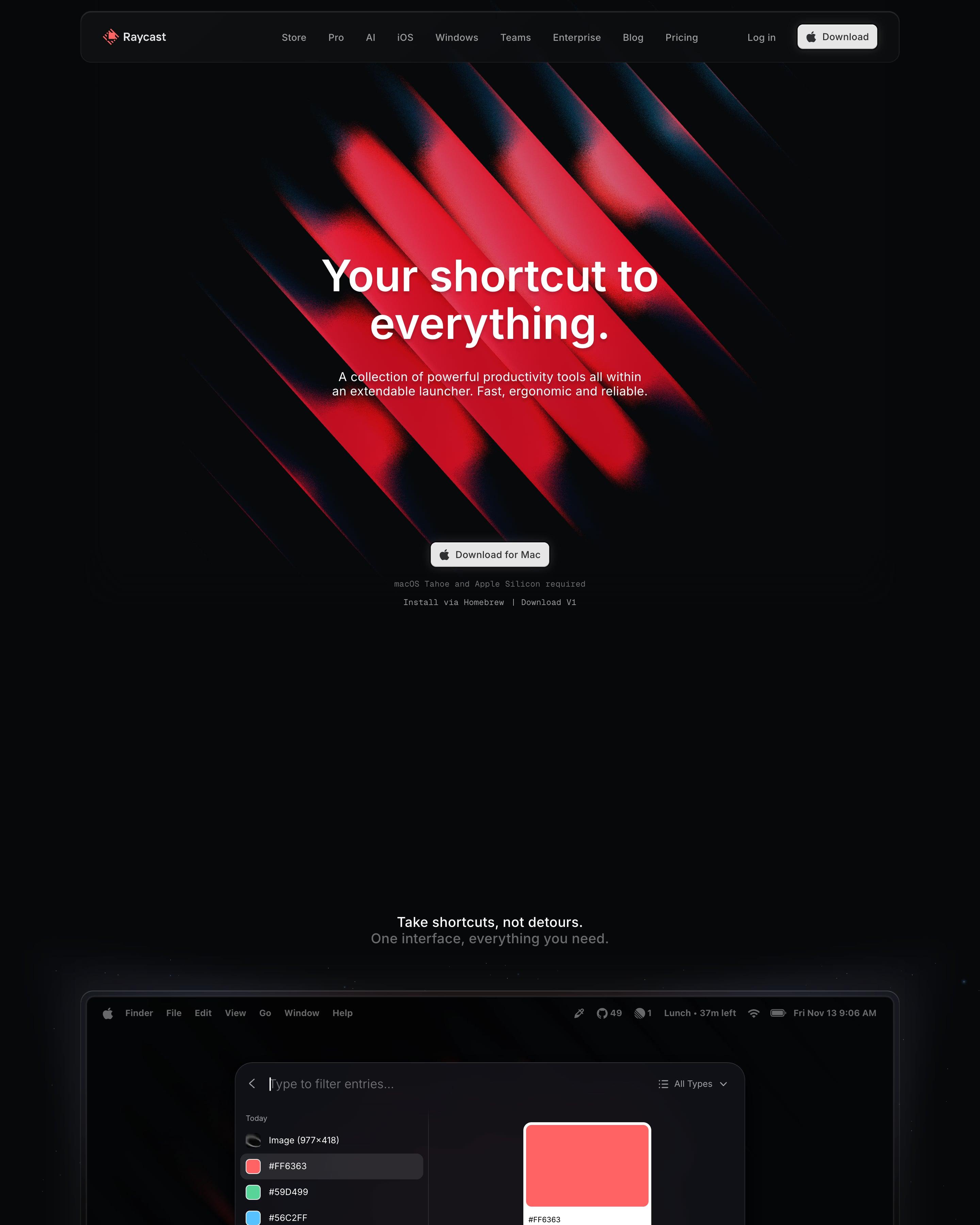
Red diagonal beams glow on black behind the hero, and the next section shows the launcher window on a Mac desktop. Extensions follow in a tabbed carousel, shortcuts in a tile grid, and 3D renders of blocks and a keyboard sit near the end. Worth borrowing: the real product window straight after the hero.
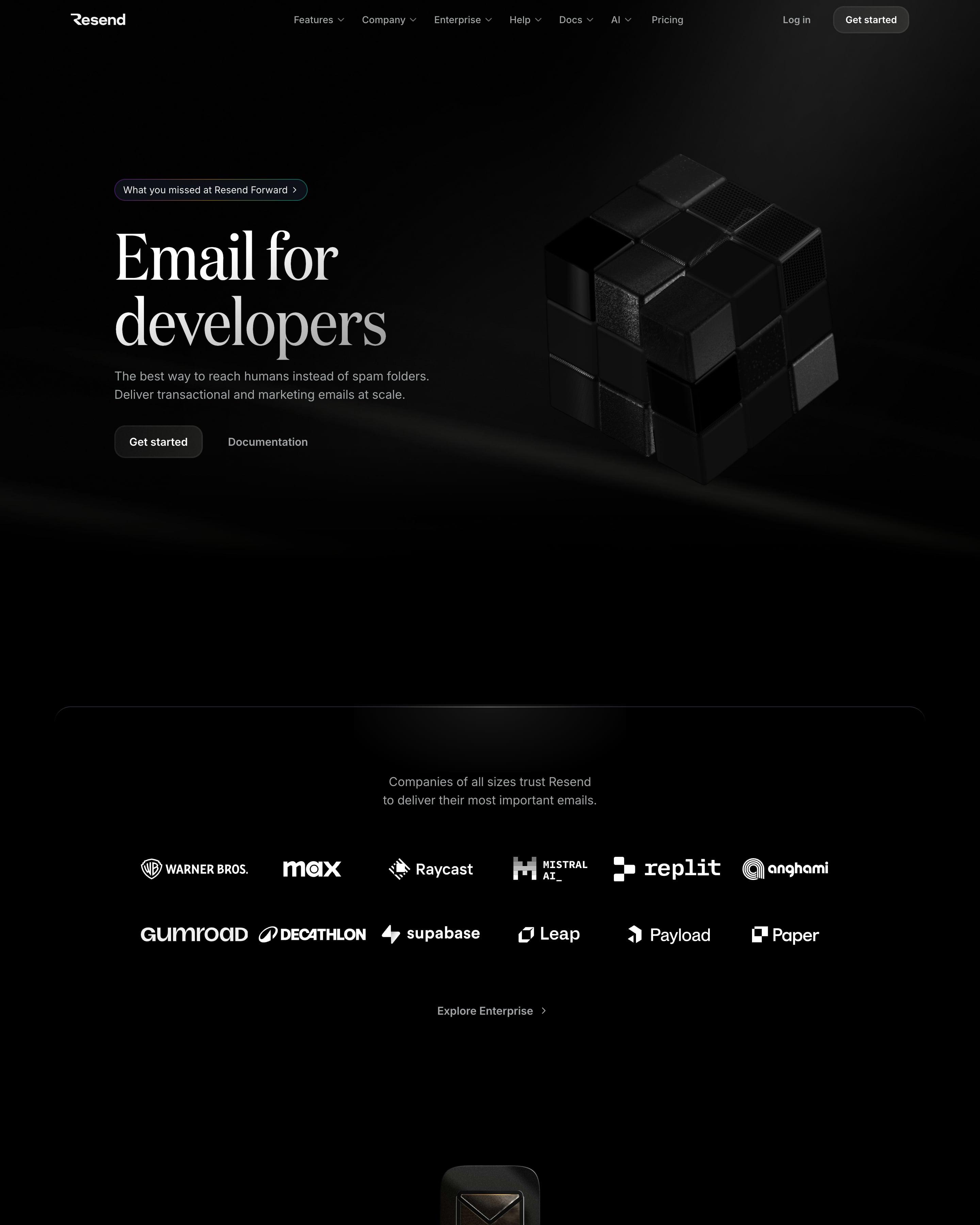
A black hero sets a large serif headline beside a dark 3D cube. Most sections open with a glossy 3D icon, then show real product UI: a code sample with language tabs, an email editor and an analytics dashboard. Worth copying: the logo wall straight after the hero and the code-first integration block.
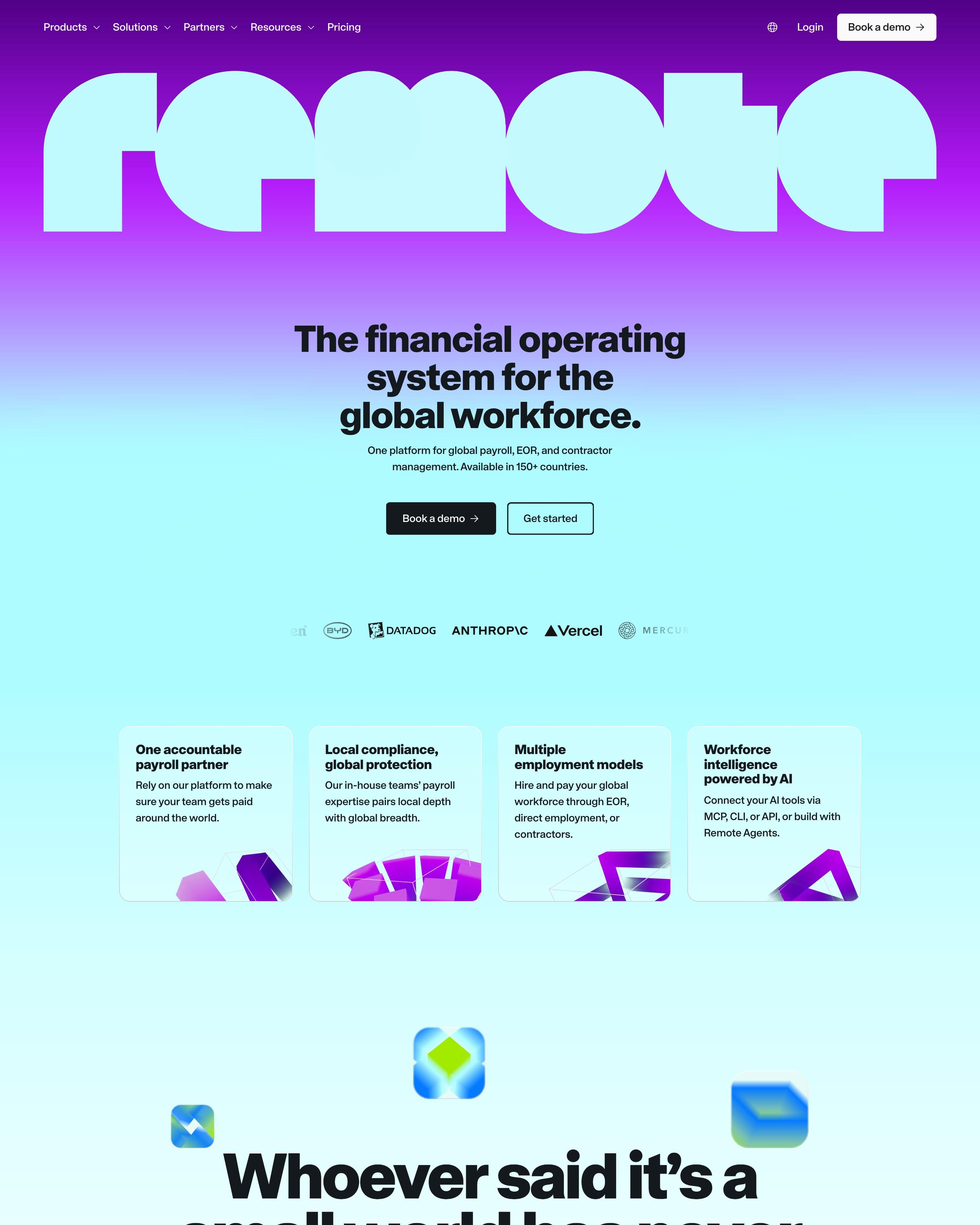
The wordmark runs edge to edge across a purple-to-aqua gradient, above a centred headline in a heavy grotesque. Product cards carry bright mini UI shots of payslips in USD, BRL and EUR, and stats like 150+ and 99% climb a stepped line graphic on lime. Worth copying: "Whoever said it's a small world has never paid a global team." set huge among floating 3D app icons.
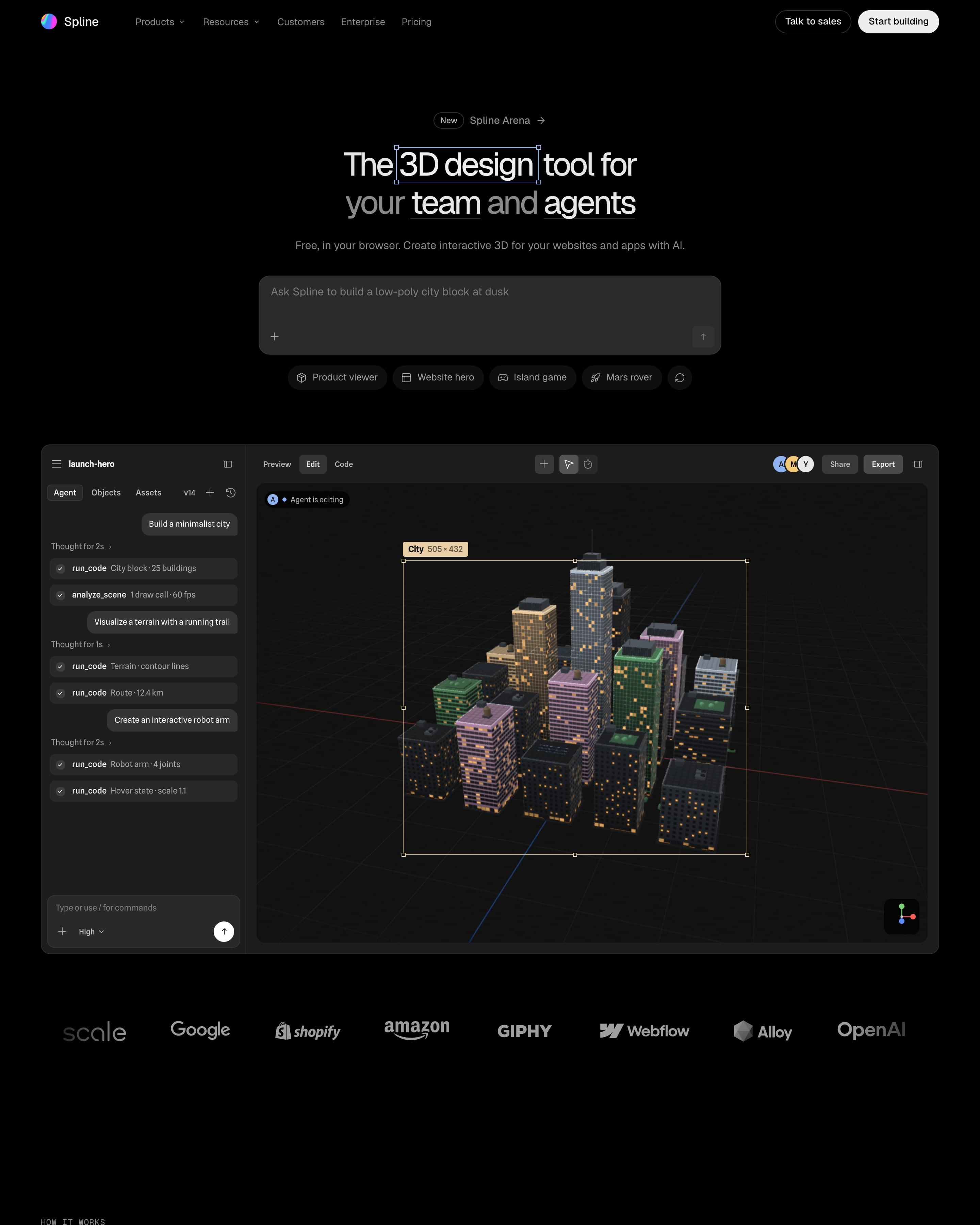
On a black page, a prompt box with example chips sits above a live editor where an agent builds a 3D city block. A carousel of finished scenes, a Mars rover among them, shows results, and three customer quotes sit in plain cards near the end. The hero shows the prompt and its output together.
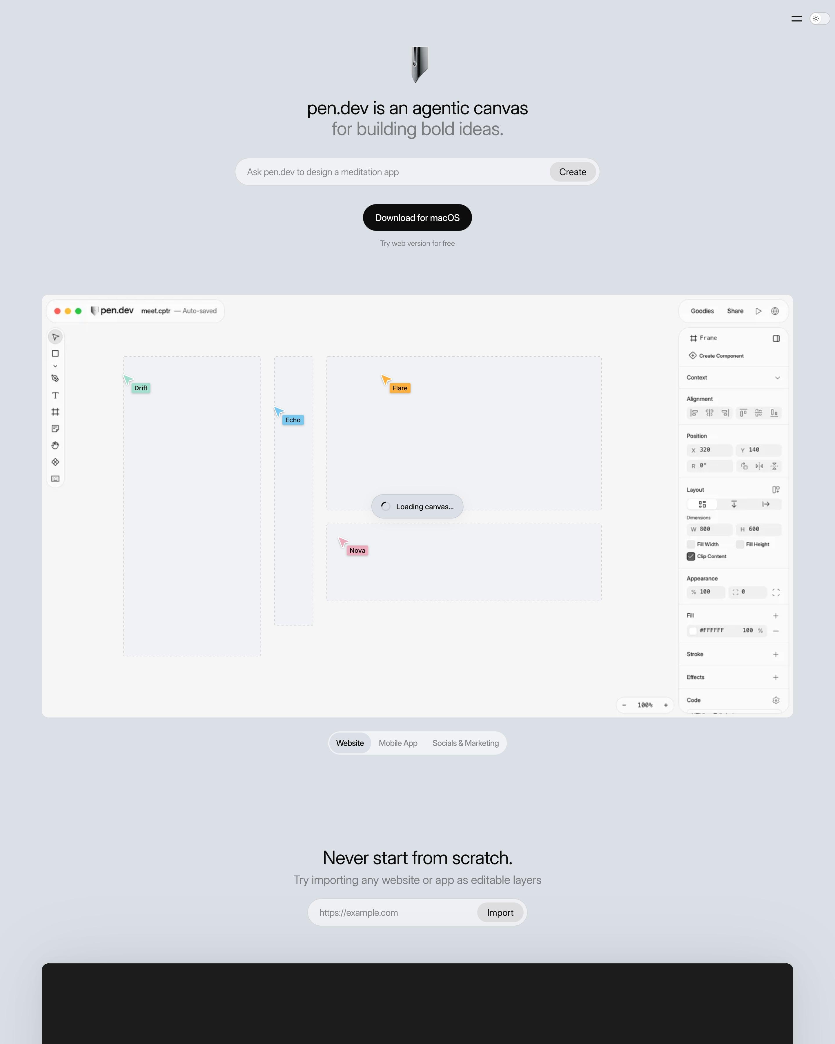
No navigation bar, just a pen-nib icon, a two-line headline with the second line in grey, and a prompt box to design "a website for a coffee shop in San Francisco". Agent cursors carry names like Drift, Nova, Kant and Sartre. Dozens of feature tiles each hold one chrome 3D object, from a command key to a Figma logo, ending on "This list goes on and on and on...".






How to design a 3d website
3D renders and scenes make a product or idea tangible: objects to look at, worlds to explore, sometimes something to drag and spin.
- Use one 3D style and lighting setup across the site, so the renders look like a set.
- Have a still image ready for slow devices, and keep the page usable while a scene loads.
- Let 3D support the message (the product, the data, the idea), not just decorate empty space.
Frequently asked questions
Sites with 3D renders and scenes: objects, product mockups and worlds modelled in three dimensions, some of them interactive. 3D renders and scenes make a product or idea tangible: objects to look at, worlds to explore, sometimes something to drag and spin.
They can: interactive scenes use WebGL or WebGPU and load more than an image. Most sites here use rendered images or video for the heavy parts and keep live 3D to one hero or demo.
Each page is opened at 1440 pixels wide, like a laptop, and scrolled from top to bottom so every image and section loads. Cookie banners, chat bubbles and popups are left out, and the whole page is saved as one image.