
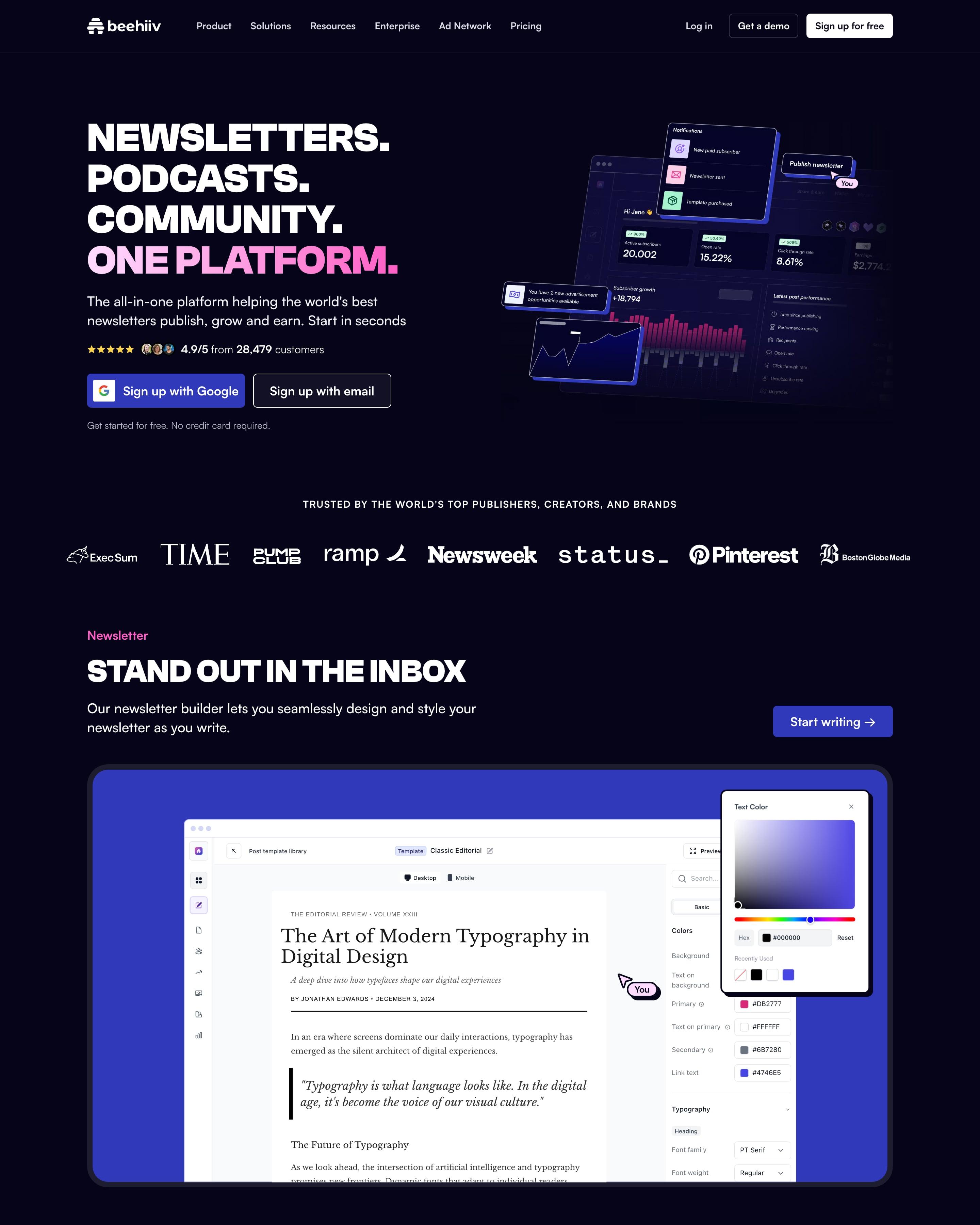

Stacked uppercase lines on dark navy end in a pink "ONE PLATFORM.", over a 4.9/5 rating from 28,479 customers and beside a tilted purple dashboard. Feature screenshots then sit in blue, lilac and hot-pink frames. The "I am a…" and "I want to…" rows of role and goal buttons are the idea to take.
18 examples from SaaS companies
Best Dark Mode Website Examples
Sites that open on a dark canvas: light text on near-black, with colour kept for accents, product shots and glows. Here are 18 SaaS websites that do it well, each shot as the whole page, with what stands out on each.
- Dark or light
- 16 dark, 2 light
- of 18 pages
- Heading fonts
- Inter
- Inter 4, Geist 2, Clash Grotesk 1, GT Walsheim 1
- Built with
- Next.js
- Next.js 12, Framer 2
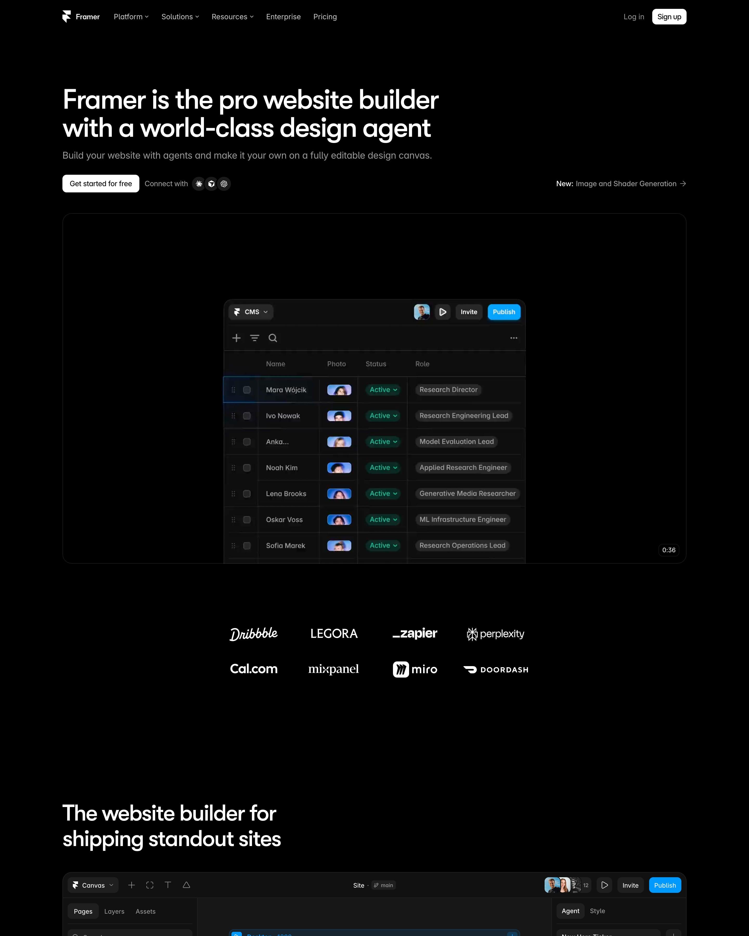
"Framer is the pro website builder with a world-class design agent" sits left on pure black above a canvas frame labelled InteractivePointSphere, a dot sphere selected in a purple box. A full editor screenshot follows, then "Not just vibes, a full platform" as a bordered bento of Performance, CMS, SEO, Hosting and Analytics tiles. The page ends on a prompt box with preset chips like "Build startup site".
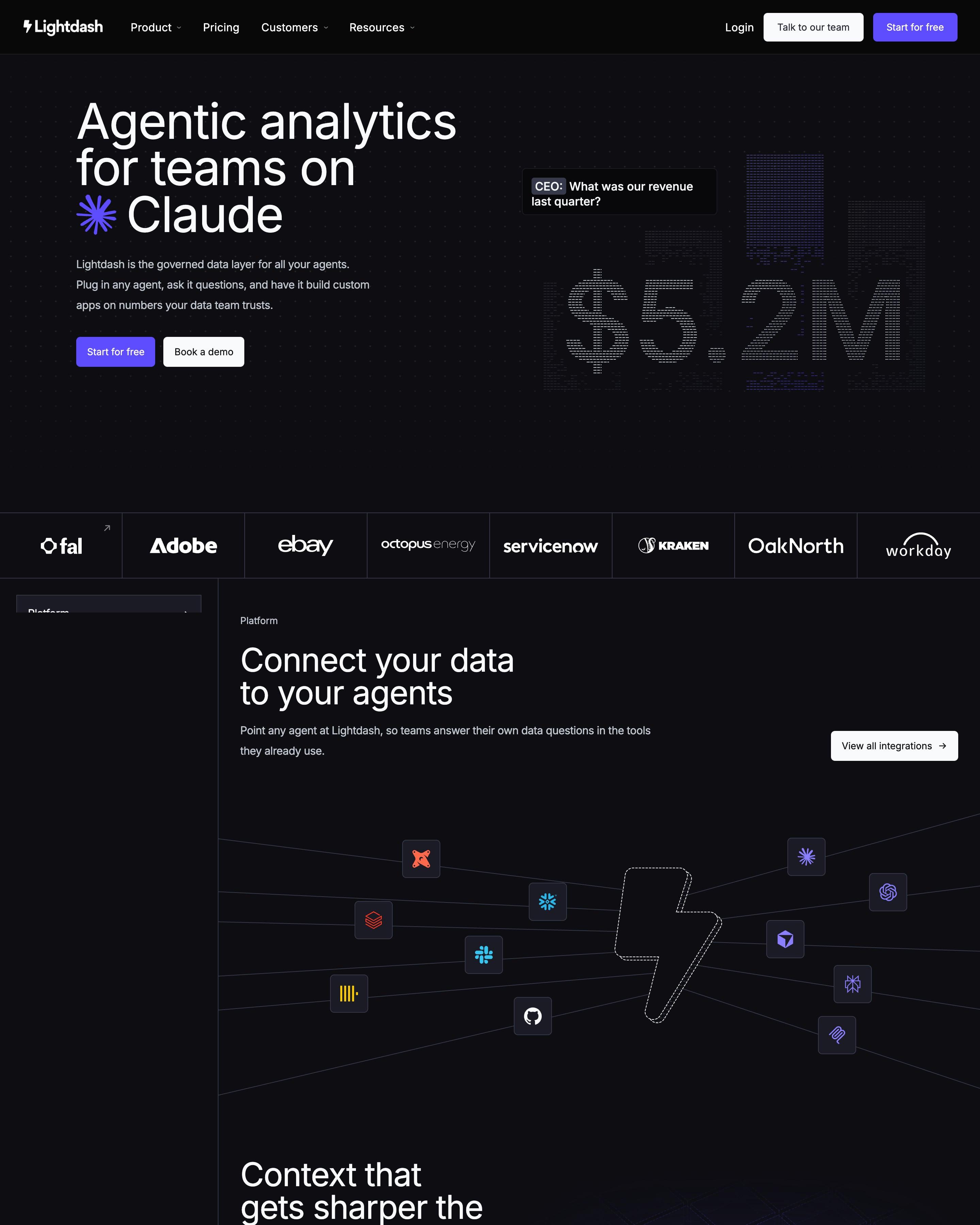
The dark hero answers "What was our revenue last quarter?" with $5.2M drawn in rows of dashes. Sections then pass between near-black and white through a pixelated edge, a transition worth copying. Quotes are tabbed by customer logo beside a violet-tinted portrait, and Looker, Power BI and Tableau each get a migration diagram.
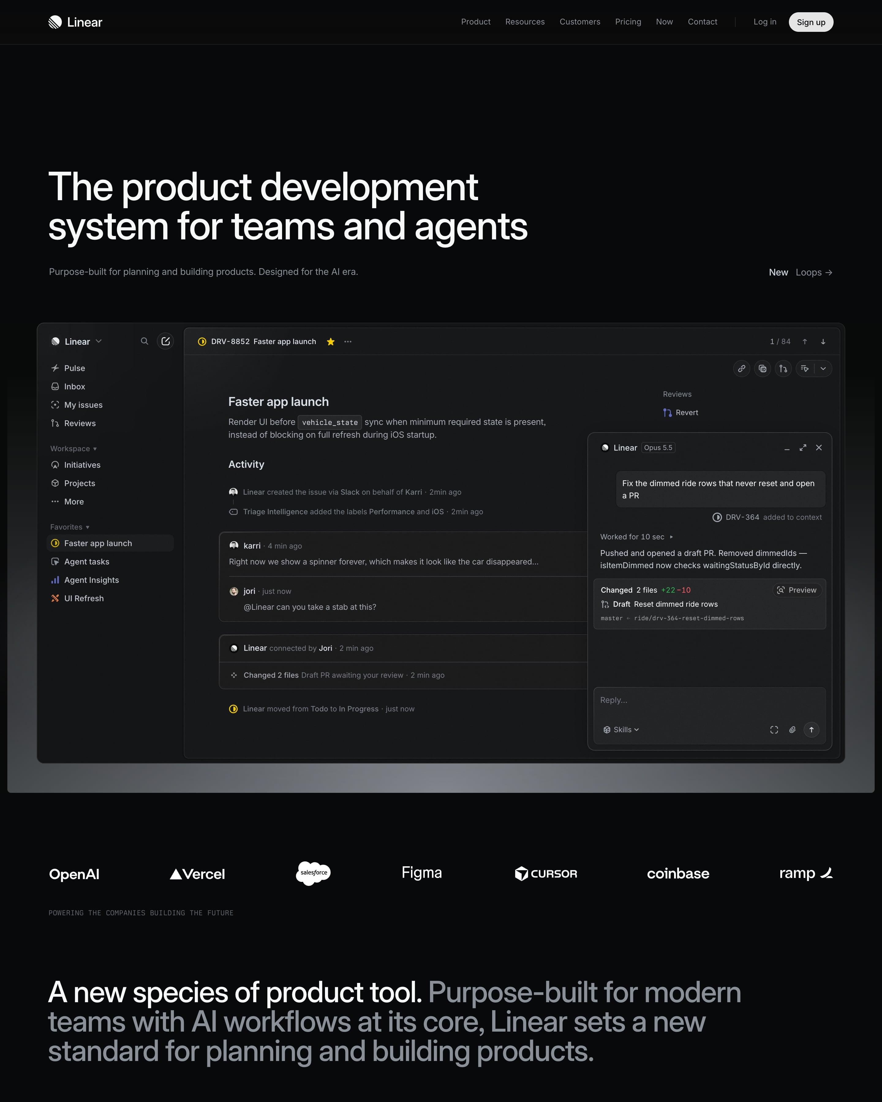
A near-black canvas opens on a full app window: an issue, with an agent chat panel docked beside it. Below a logo strip, four product sections share one pattern of heading left, text right and dimmed interface underneath. Worth copying: the lime quote card that breaks the greyscale near the end.
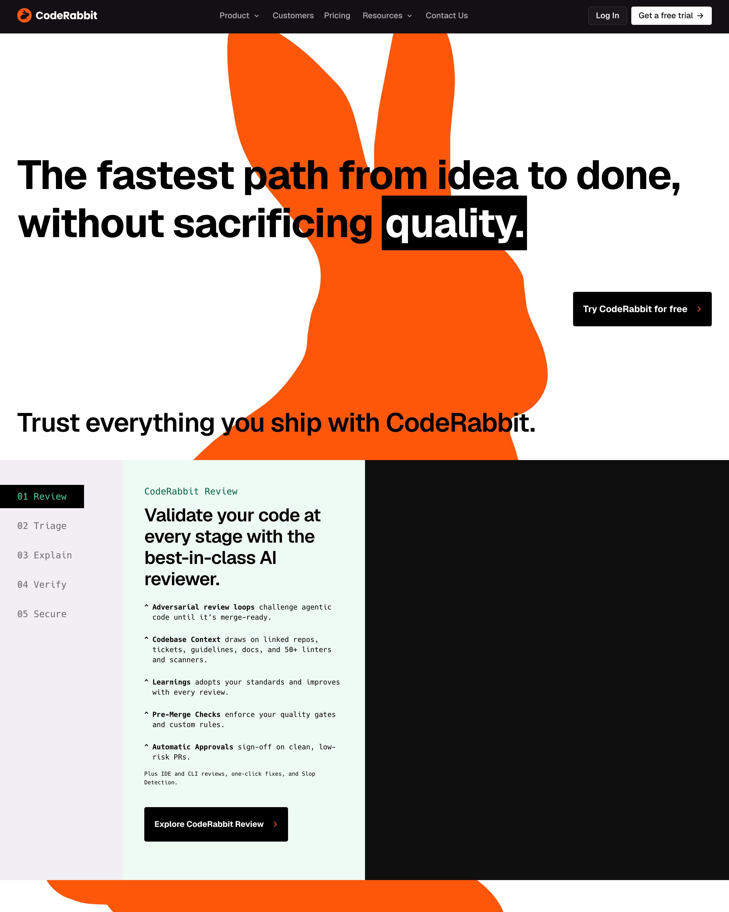
An orange rabbit silhouette rises behind the black headline, with "quality." set in a black highlight box. Product tabs use monospaced labels from "01 Review" to "05 Secure", and a mocked Slack channel shows the agent tracing a Datadog alert back to a Terraform change. Worth copying: the "Why CodeRabbit" row, where the middle card goes solid orange between two dark fur-textured panels.
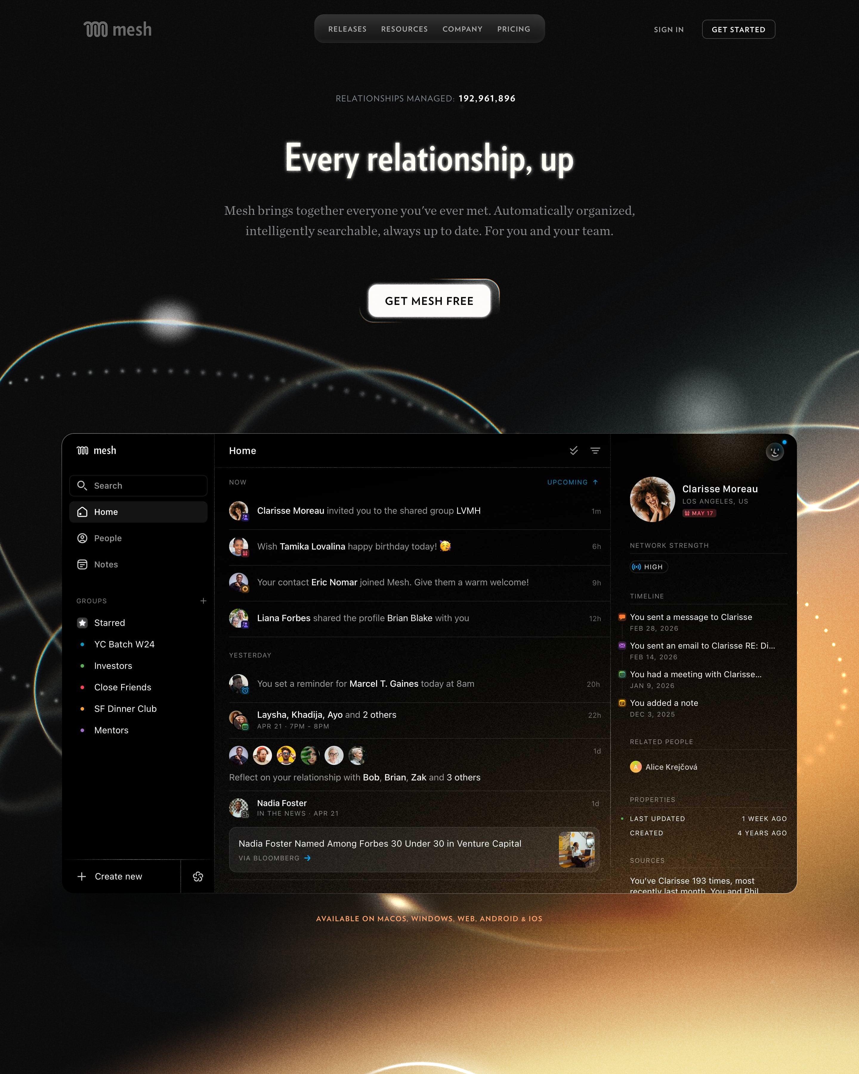
Above the headline, a counter reads "Relationships managed: 192,961,896", and golden light flares glow behind most sections on black. Lift the team section's constellation, where avatars are linked like stars. Proof then floats portraits and App Store icons around one heading, above press logos and three award laurels.
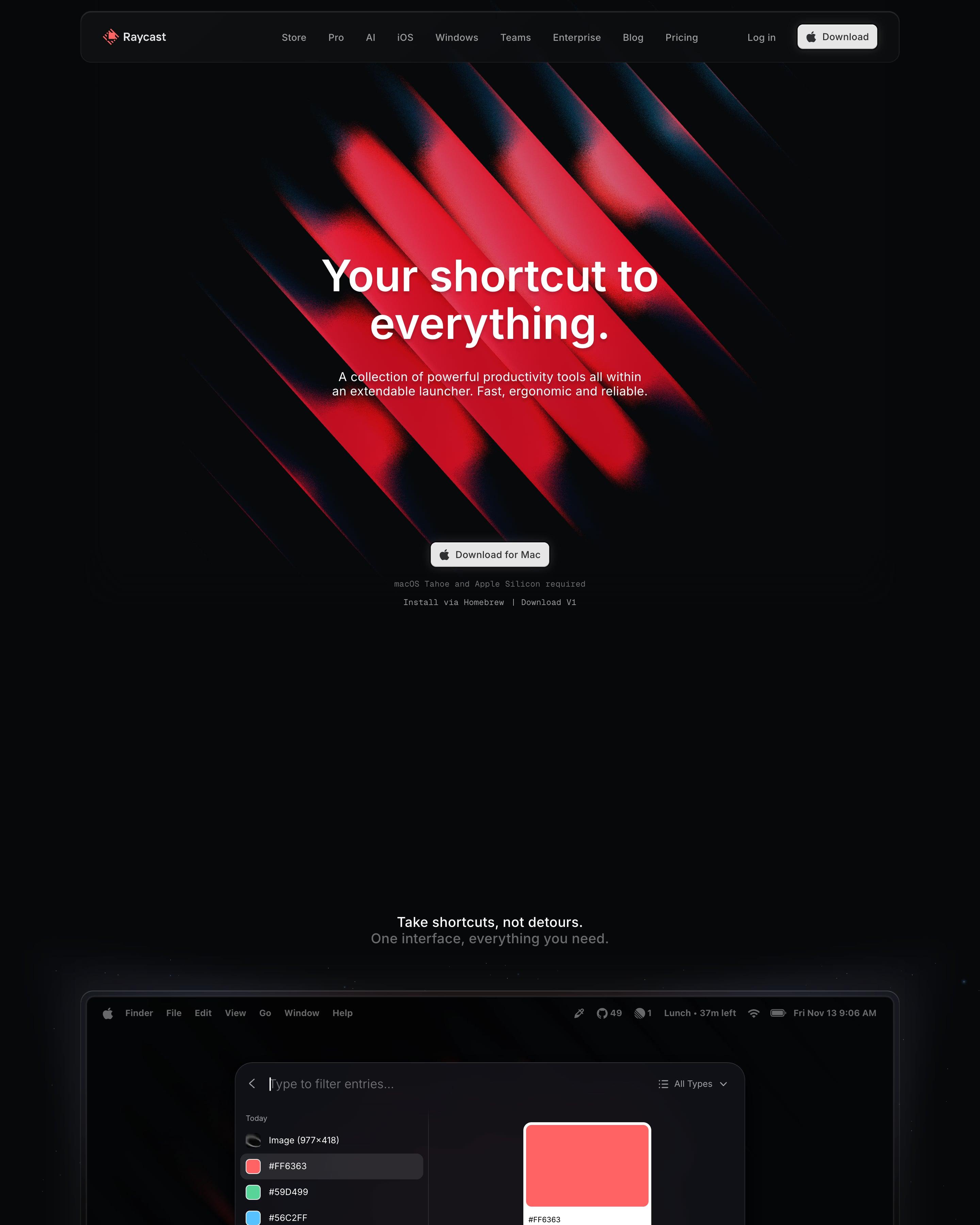
Red diagonal beams glow on black behind the hero, and the next section shows the launcher window on a Mac desktop. Extensions follow in a tabbed carousel, shortcuts in a tile grid, and 3D renders of blocks and a keyboard sit near the end. Worth borrowing: the real product window straight after the hero.
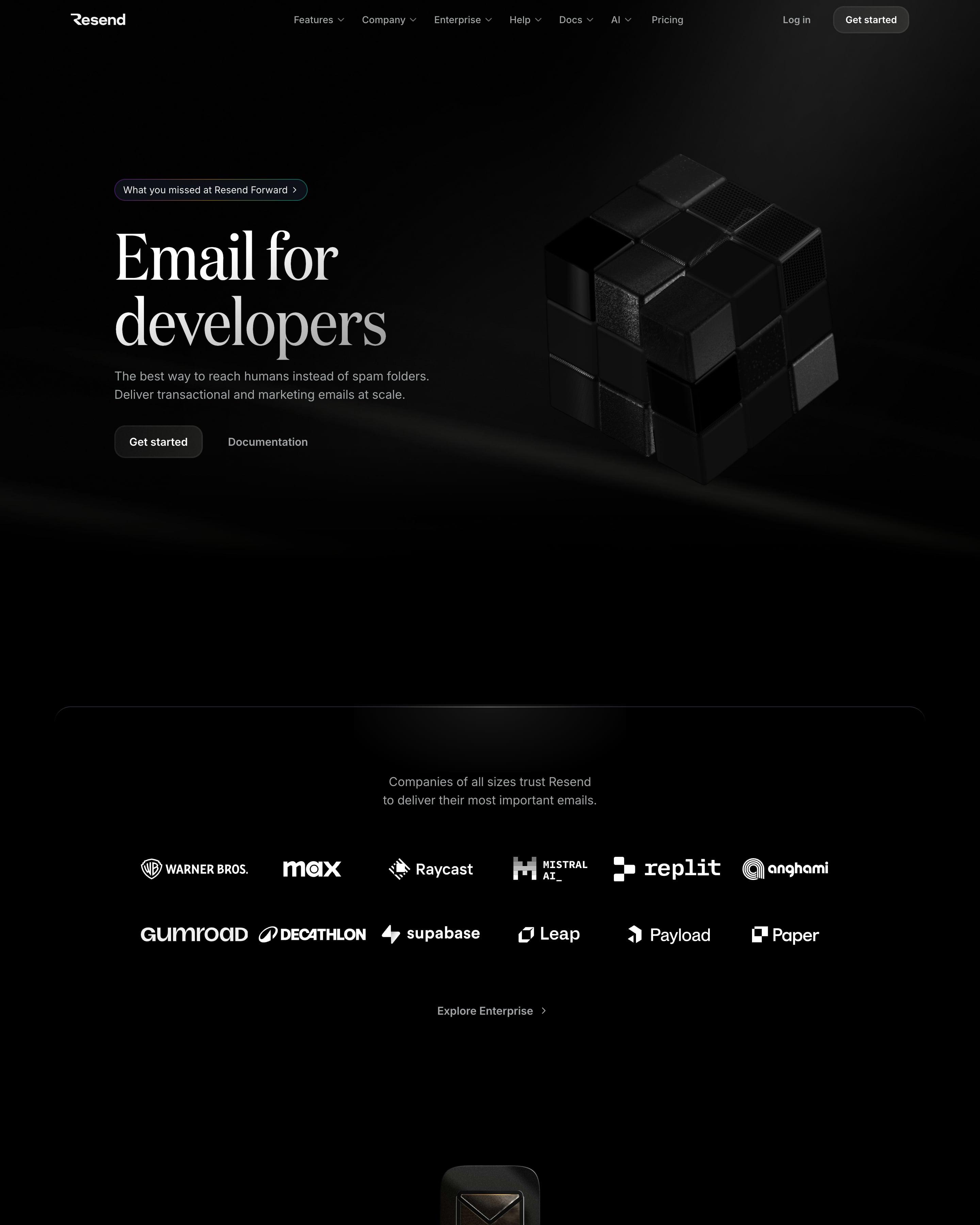
A black hero sets a large serif headline beside a dark 3D cube. Most sections open with a glossy 3D icon, then show real product UI: a code sample with language tabs, an email editor and an analytics dashboard. Worth copying: the logo wall straight after the hero and the code-first integration block.
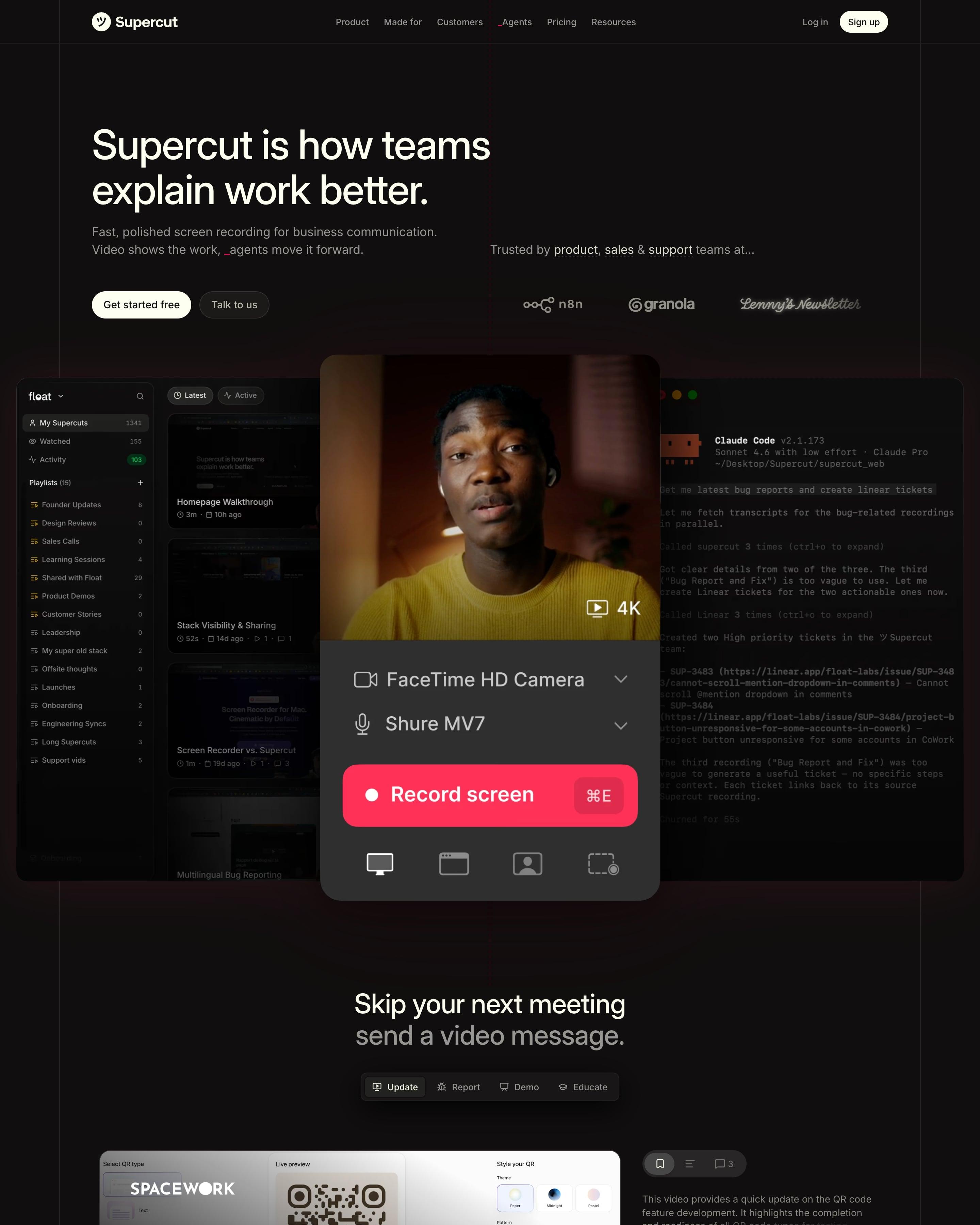
A near-black page laid on visible column lines opens on a recorder panel, with a red "Record screen" button and ⌘E shortcut, in front of a video library and a Claude Code terminal. Sections share one rhythm: two-tone headline in white then grey, short copy, a small red pill CTA, then a full-width demo. Worth copying: the transcript with filler words struck through in red.
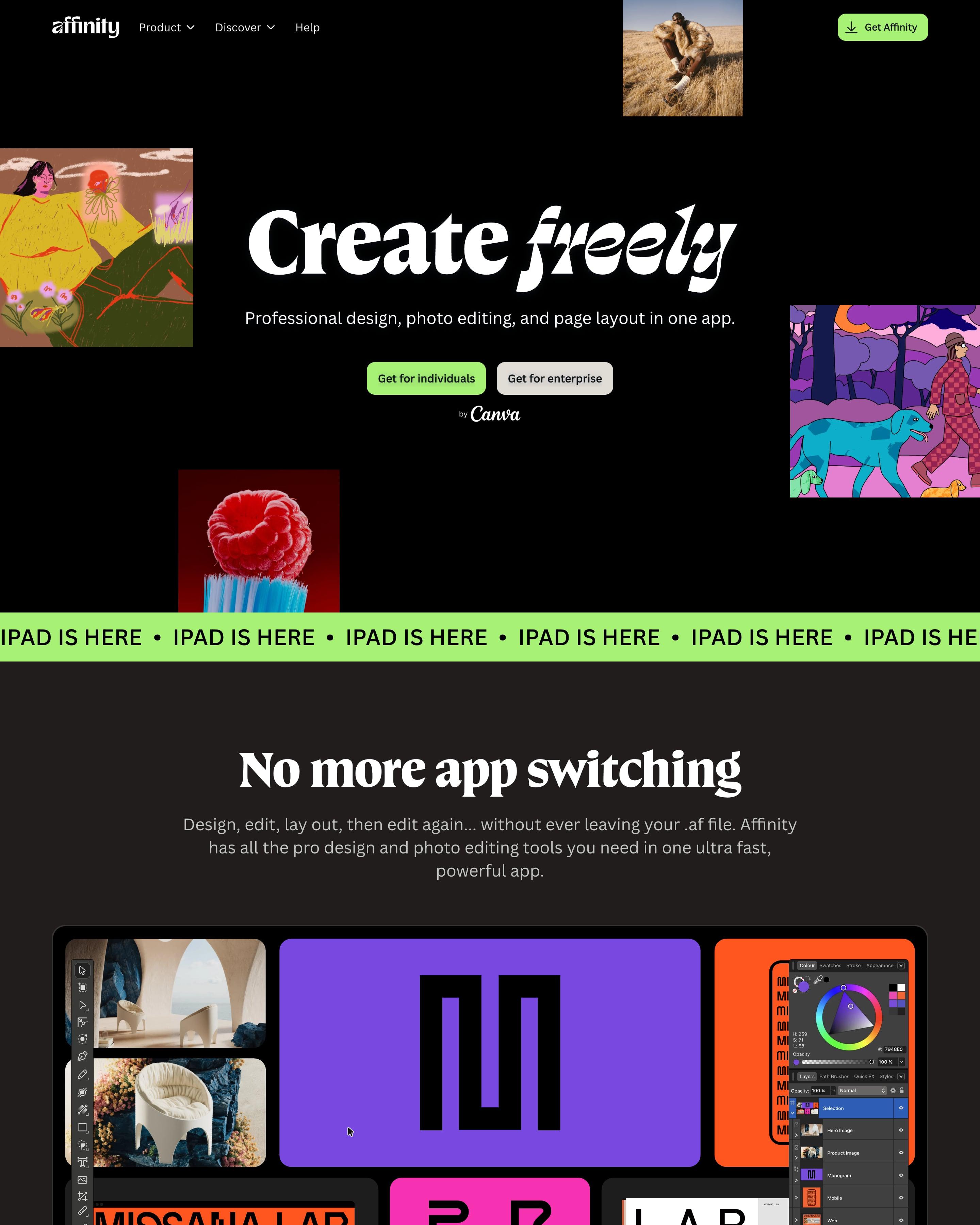
A black hero sets "Create freely" in a heavy serif with a swashed italic, ringed by tilted artwork tiles, then a lime "IPAD IS HERE" ticker runs across the page. Sections switch between near-black and charcoal, with big serif quotes behind lime quote marks and a "Zero bucks given" download row for Mac, Windows and iPad. Worth copying: the footer wordmark drawn with live Bézier handles and a named collaborator cursor.
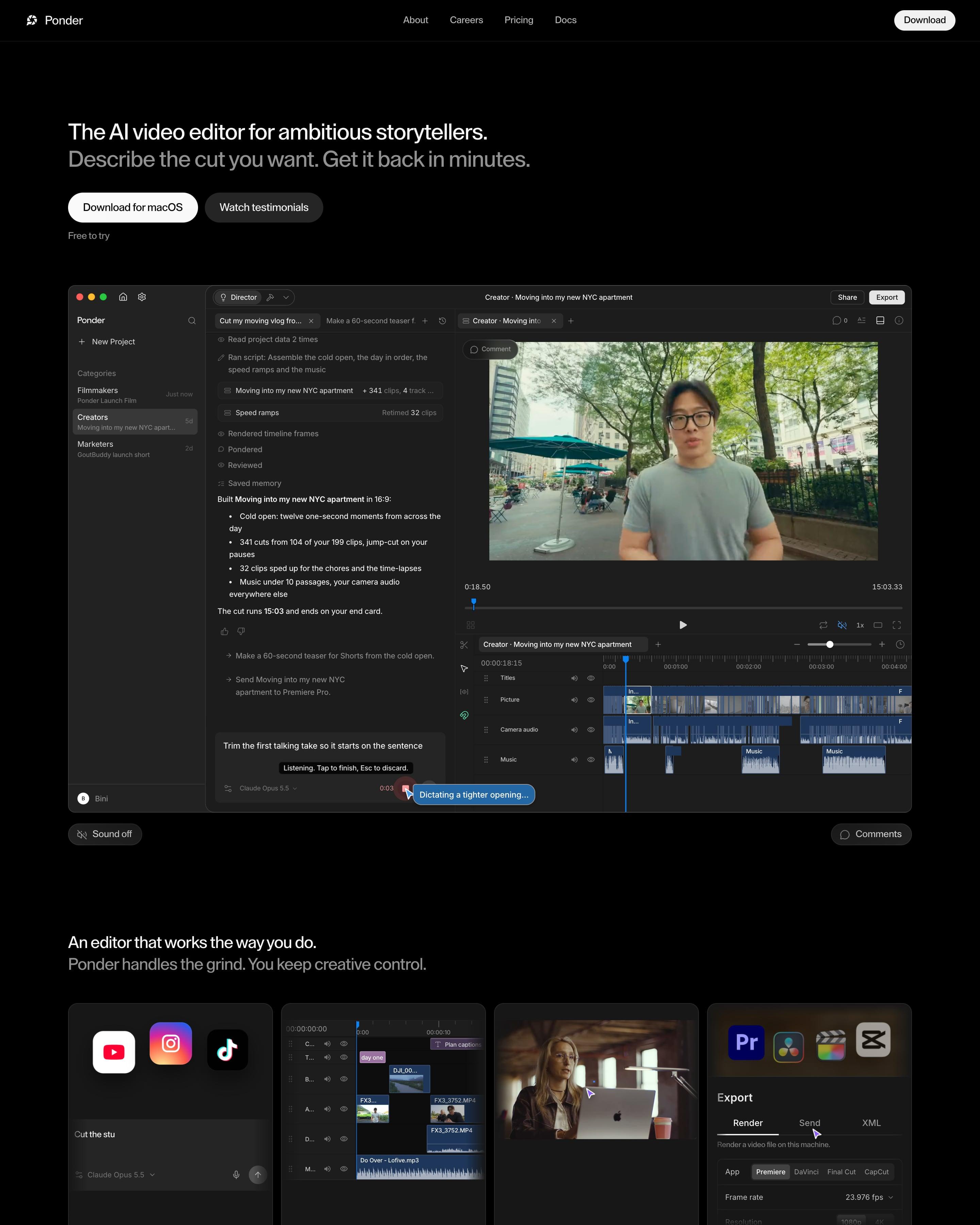
Black page, white sans headline "The AI video editor for ambitious storytellers." over an app screenshot pairing the agent's chat log, "341 cuts from 104 of your 199 clips", with a timeline. Four dark cards run from style learning to export into Premiere, DaVinci, Final Cut or CapCut, and numbered steps go from Import to Finish. A grey particle cloud frames "Let your ideas flow. Ponder it."
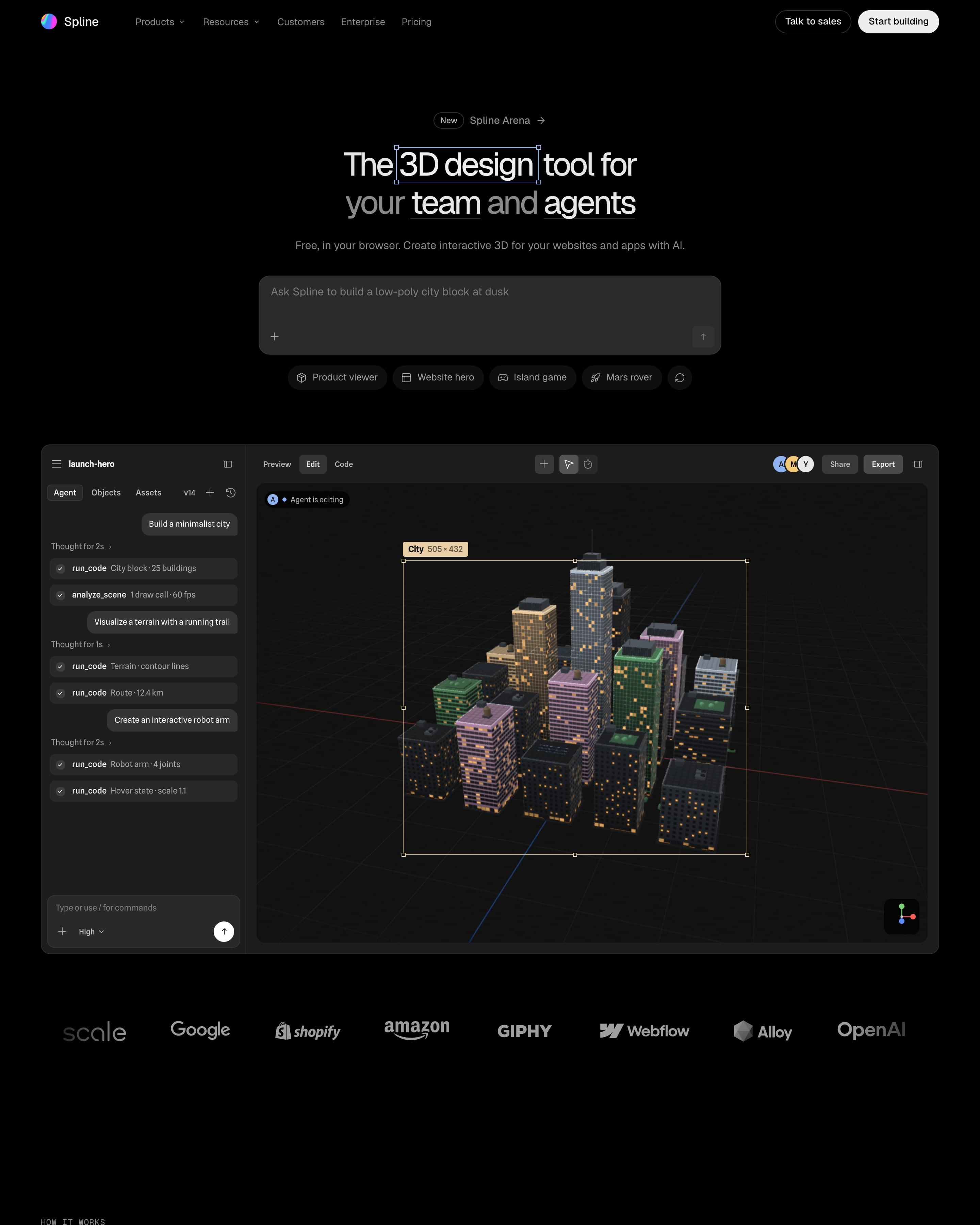
On a black page, a prompt box with example chips sits above a live editor where an agent builds a 3D city block. A carousel of finished scenes, a Mars rover among them, shows results, and three customer quotes sit in plain cards near the end. The hero shows the prompt and its output together.
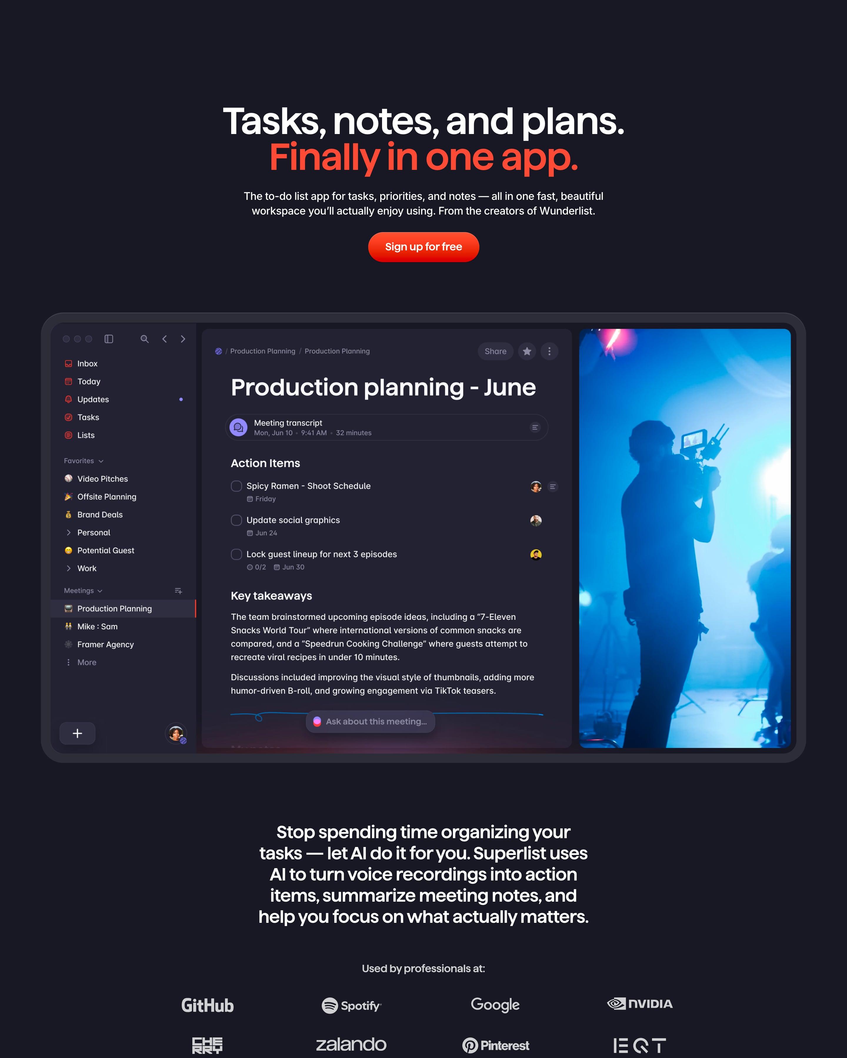
On a dark navy canvas, the headline's second line and the sign-up button are red-orange, with the full app window below. Feature tiles in saturated blue, red and purple hold app screens, and hand-drawn doodles top each heading. One to copy: a fading stack of feature names in large type instead of a grid.
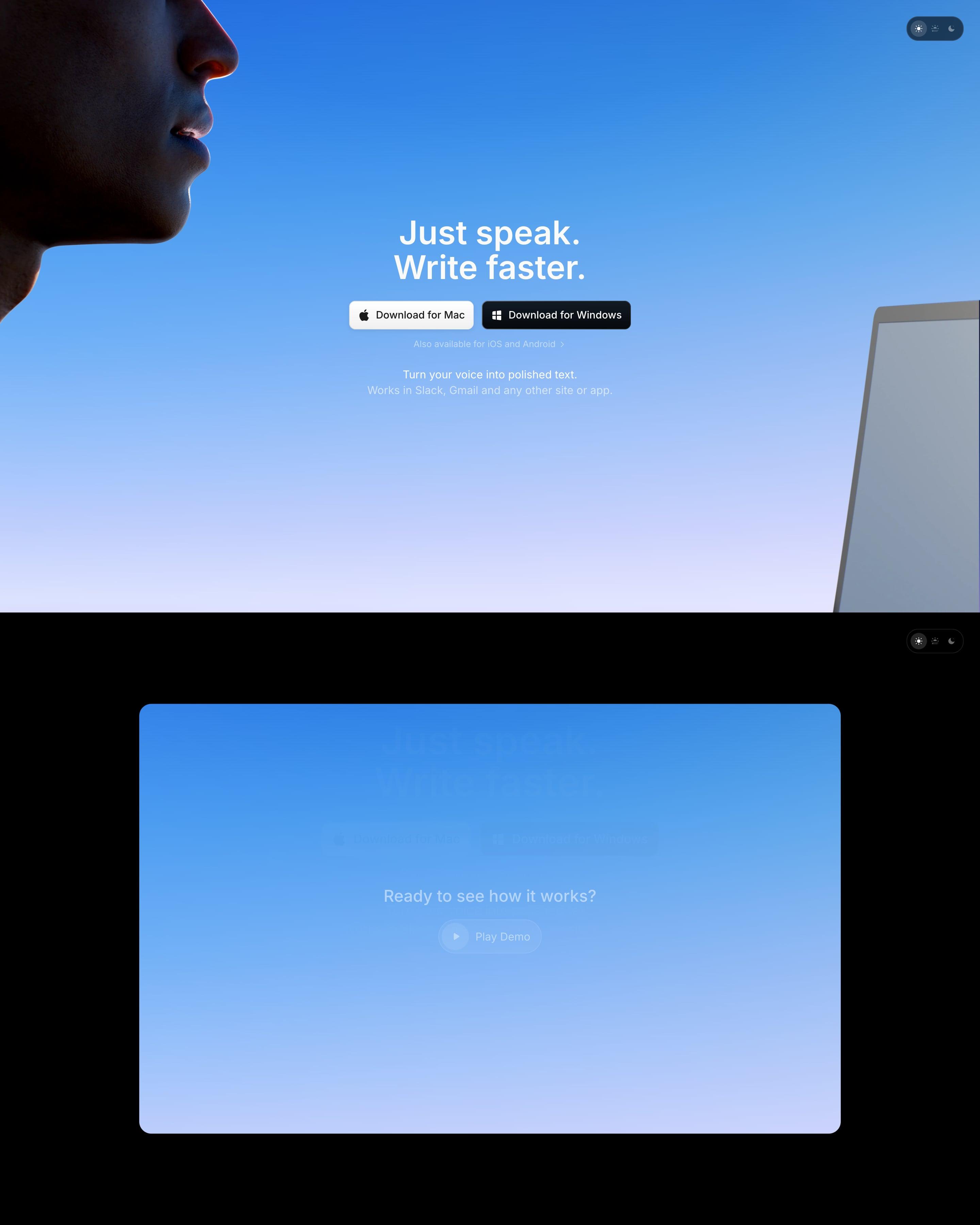
A face in profile fills the top-left corner of a blue-to-lilac sky, with the headline and Mac and Windows buttons centred. Below, on black, a blue video card builds up while scrolling, a keyboard has app icons for keys, and reviews sit in a stacked deck. The app-icon keyboard is the idea to lift.
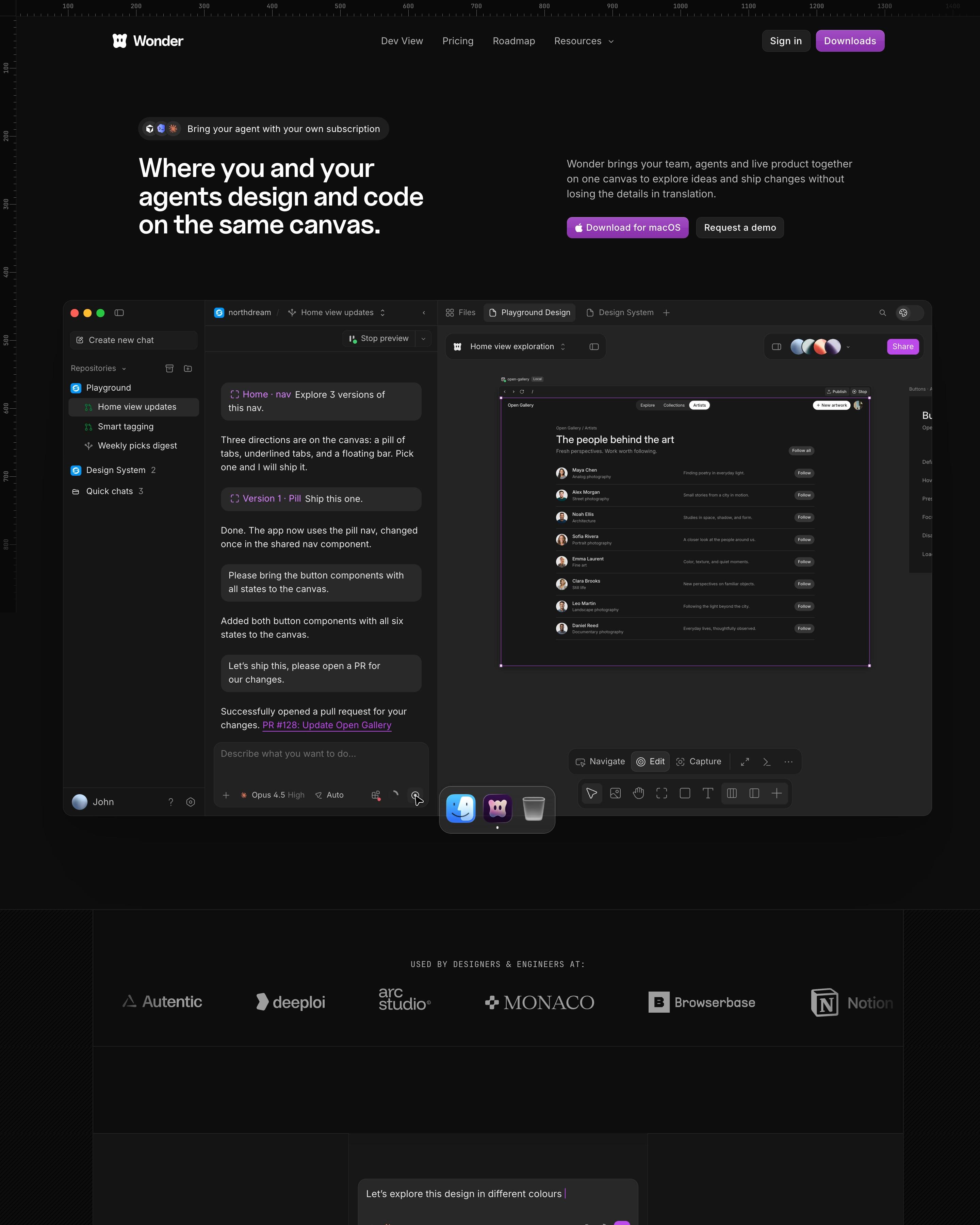
Ruler ticks run along the top and left edges, so the near-black page reads like the canvas the product is. The hero app shot shows a chat with an agent beside a gallery design, ending in "PR #128: Update Open Gallery". Purple is saved for the download buttons and one glow. Worth copying: three handwritten words, Measurements, Gradients and Grid layouts, floating over the roadmap banner.
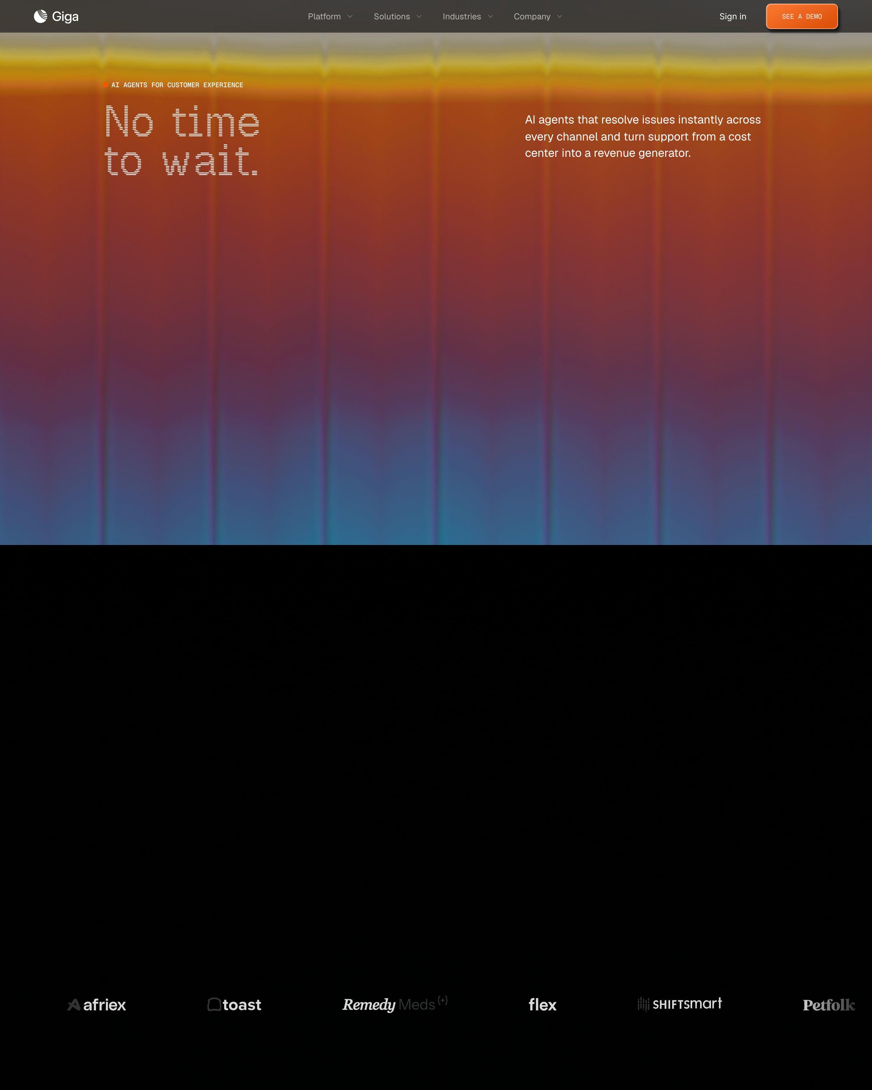
A blurred orange-to-blue gradient fills the hero behind the monospaced line 'No time to wait.' Further down, a support chat plays out step by step as the page scrolls, from 'waiting' to 'working', with each step listed beside it. A DoorDash story pairs a photo with a short quote.
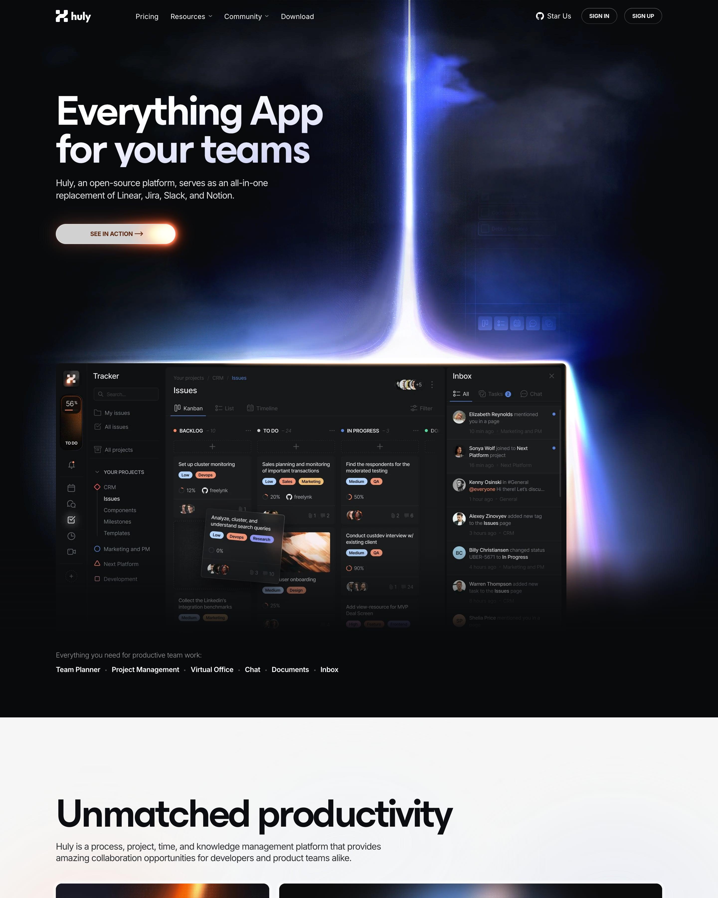
A beam of light drops onto the hero's dark product screenshot, and the glow returns on the edges of later product frames. Dark and white sections alternate, with features in bento grids of dark tiles and a document editor shown with collaborator cursors. The glowing screenshot edges are the detail to borrow.
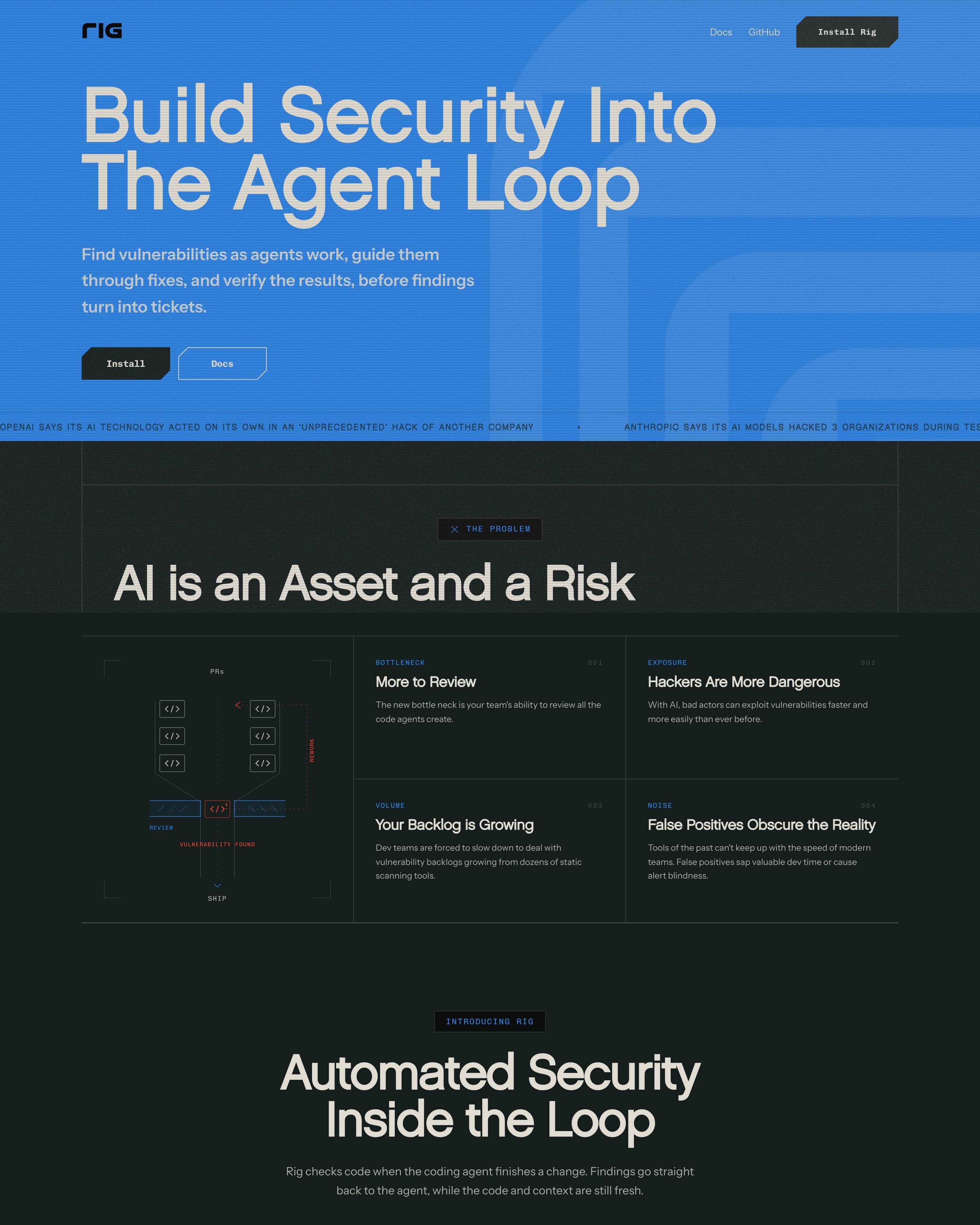
"Build Security Into The Agent Loop" fills a bright blue hero with clipped-corner buttons and a ticker of AI hacking headlines. The rest runs on near-black with thin rule grids, mono labels like "THE PROBLEM", and a code editor beside an agent chat stepping through Hook, Check, Fix, Recheck. The SQL injection before-and-after cards and a blue wireframe terrain behind "Ship Confidently" are worth borrowing.

















How to design a dark mode website
A dark canvas makes screenshots, code and glowing accents stand out, which is why developer tools, AI products and design tools use it so often. It also sets a mood before a word is read.
- Use a near-black, not pure black, and lift cards and sections a shade or two above it so the layout keeps its depth.
- Keep body text off-white and a little dimmer than headings: pure white on black glares in long paragraphs.
- Save colour for one or two accents and the product itself, so the call to action is the brightest thing on the screen.
Frequently asked questions
Sites that open on a dark canvas: light text on near-black, with colour kept for accents, product shots and glows. A dark canvas makes screenshots, code and glowing accents stand out, which is why developer tools, AI products and design tools use it so often. It also sets a mood before a word is read.
It suits products people use in dark interfaces already (code editors, terminals, design and video tools) and brands that want a premium, technical feel. Long-form reading pages, such as docs and blogs, are often kept light even on dark sites.
Each page is opened at 1440 pixels wide, like a laptop, and scrolled from top to bottom so every image and section loads. Cookie banners, chat bubbles and popups are left out, and the whole page is saved as one image.