
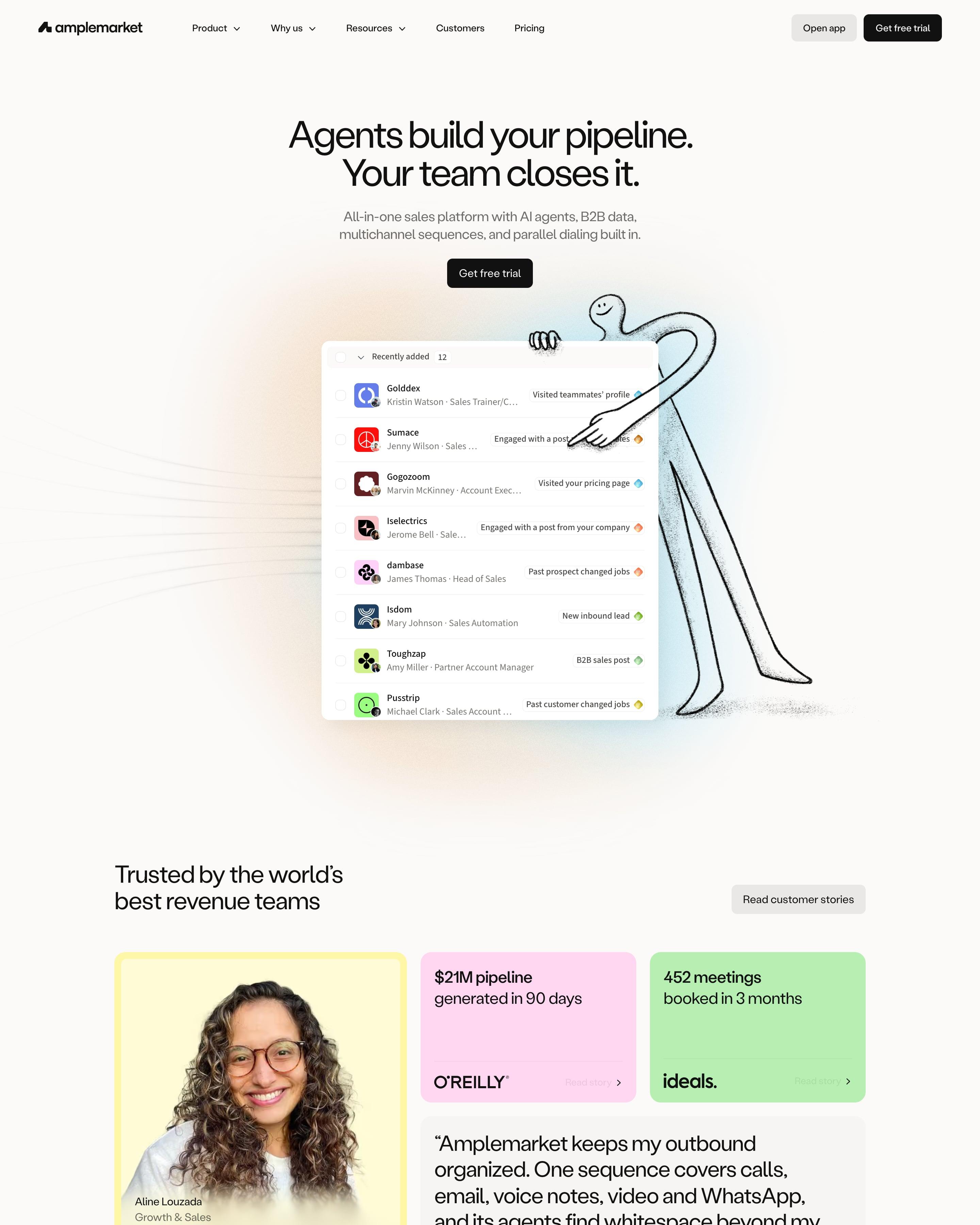

A thin hand-drawn figure leans on the hero's lead list, beside the line "Agents build your pipeline. Your team closes it." Each product area, from Duo Intelligence to Optimization, repeats one module: small caps label, headline with two stats, a soft gradient panel holding the app, then feature cards. Worth copying: proof that pairs photo quotes with flat yellow, pink and green stat tiles like "$21M pipeline generated in 90 days".
6 examples from SaaS companies
Best Pastel Website Examples
Sites in soft pastel colours: light, low-contrast palettes that feel calm and friendly. Here are 6 SaaS websites that do it well, each shot as the whole page, with what stands out on each.
- Dark or light
- 0 dark, 6 light
- of 6 pages
- Heading fonts
- Labil Grotesk
- Labil Grotesk 1, Reckless 1, Roobert 1, Britti Sans 1
- Built with
- Webflow
- Webflow 3, Next.js 2
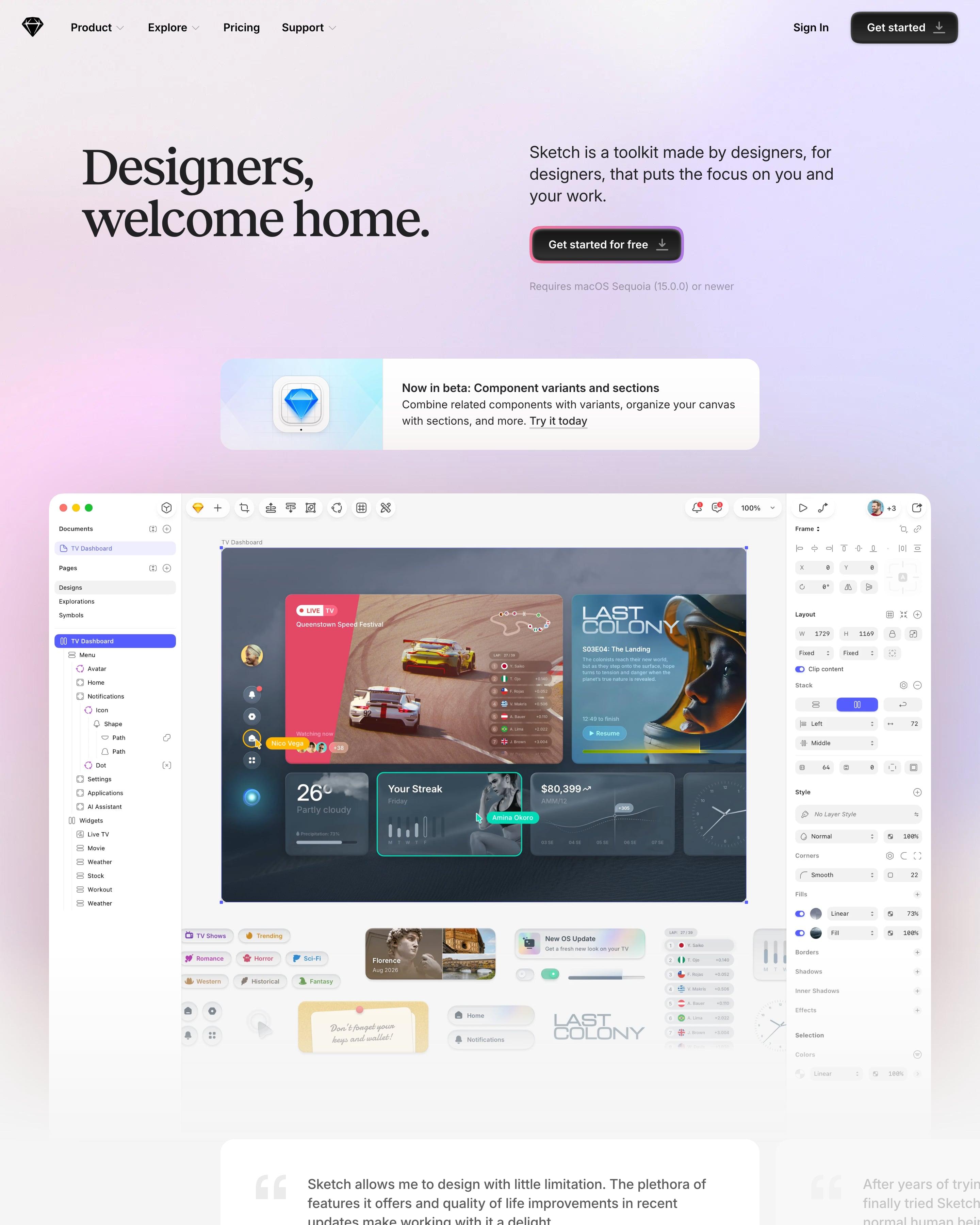
"Designers, welcome home." sits in a heavy serif over a pink-to-lavender haze, beside a black CTA wrapped in a gradient ring. Each section (Design, Prototype, Collaborate) gets a small coloured pill, a big serif headline and a bento grid mixing black, white and pastel cards. One card worth copying is "No shady pricing", drawn as a receipt that crosses out Dark Patterns and Hidden Costs.
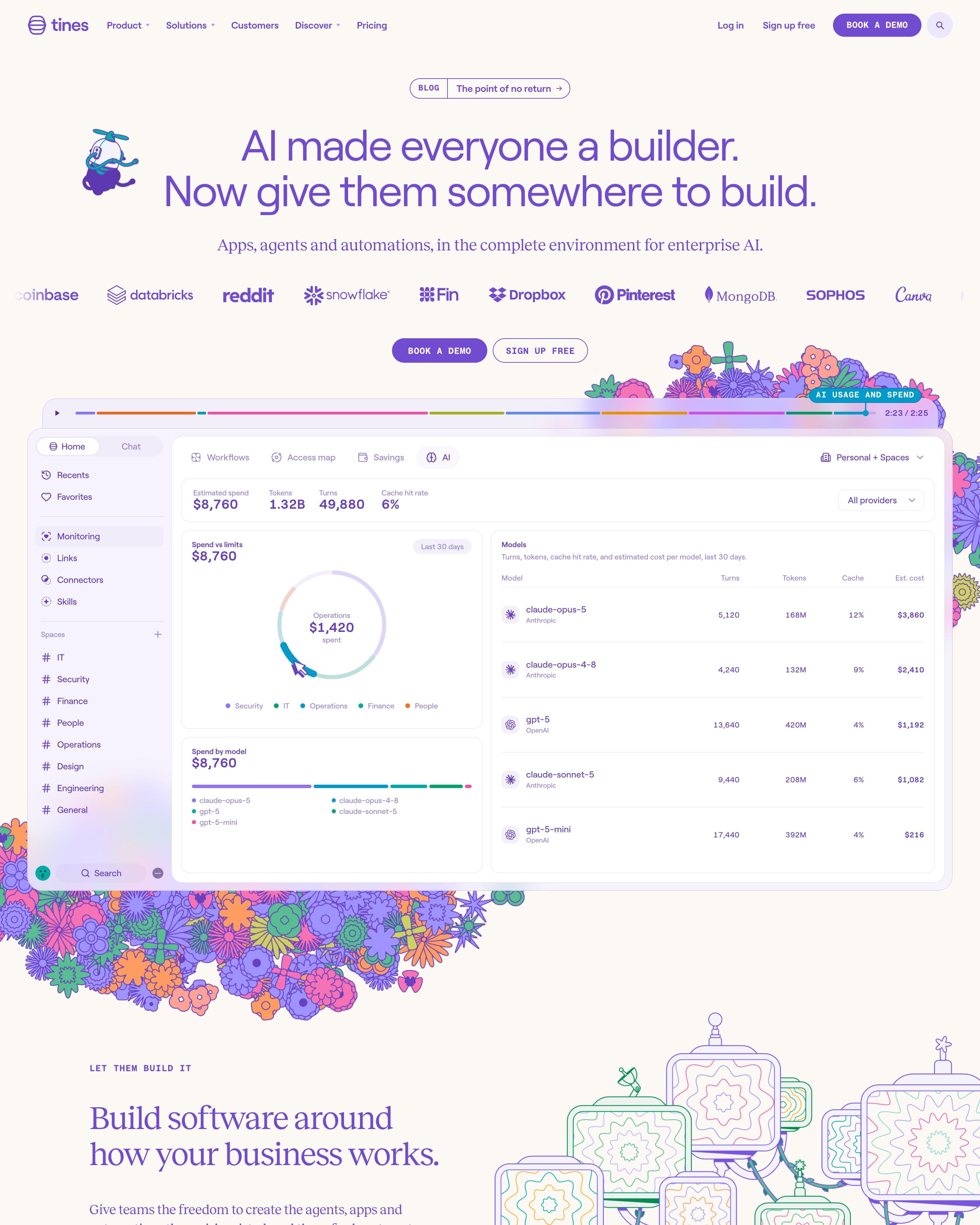
Folk-style flower drawings spill around the product screenshot, and a small propeller-hat mascot floats by the purple headline. The detail to borrow is the video-style timeline bar above the screenshot. Pastel cards with coloured outlines then split the platform into Build, Deploy and Operationalize and into six teams, before a giant lavender 'Start today'.
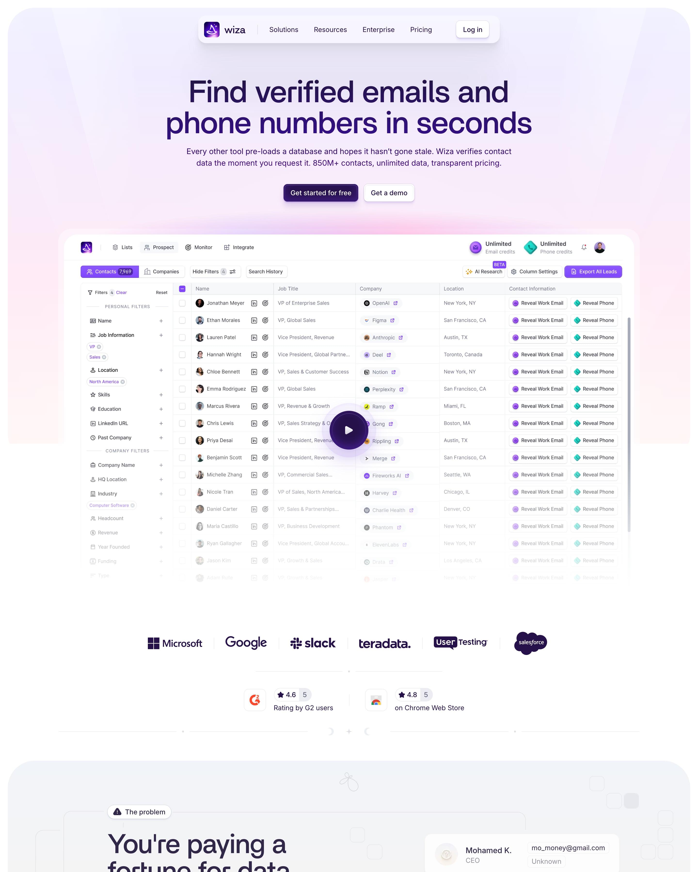
Soft lavender, pink and mint washes fill a stack of rounded panels, opening on the product's contact table with a Reveal button for every email and phone. Headings keep up a magic theme ('waving a magic wand', 'works like a charm'), and a running theme like that is worth borrowing.
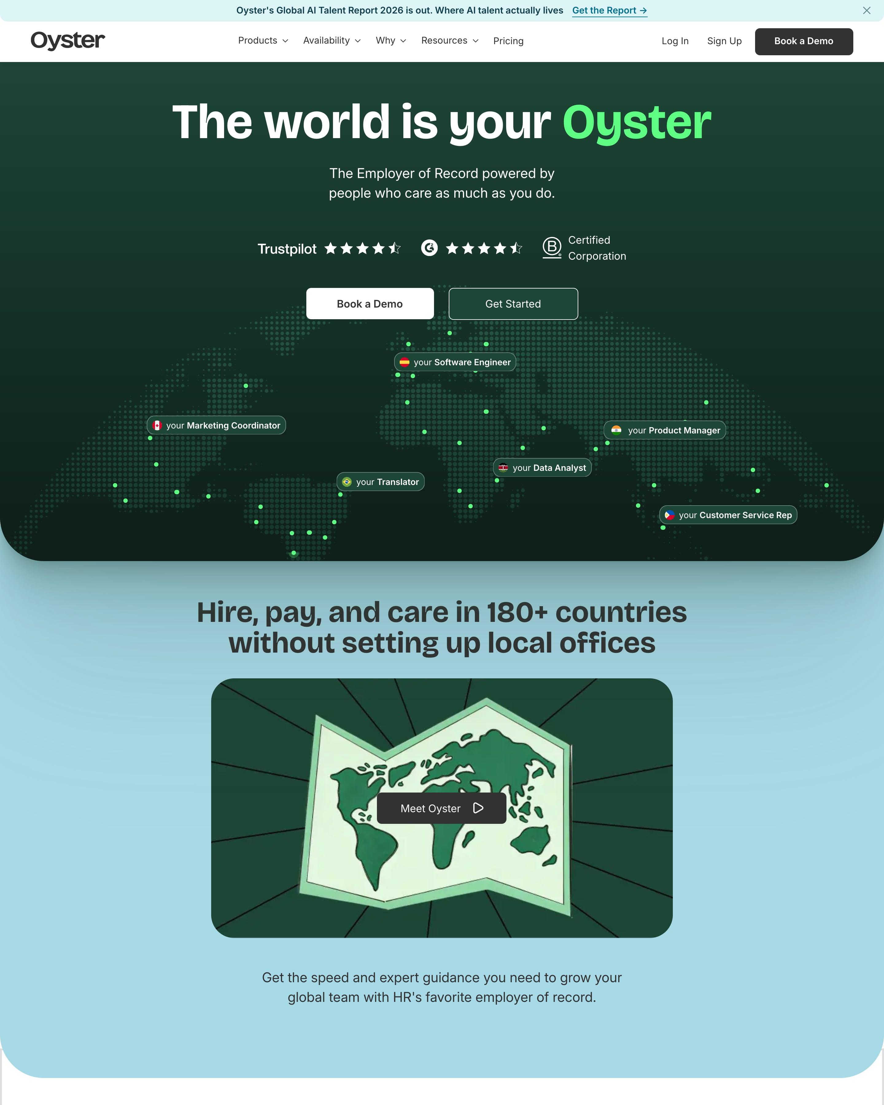
A dotted world map spreads across the dark green hero, with flag-tagged pills such as "your Software Engineer" placed over countries. Pink, blue, green and lilac cards then stack up while scrolling, each pairing a promise like "Expert guidance" with a photo. The job-title pills on the map are the touch to steal.
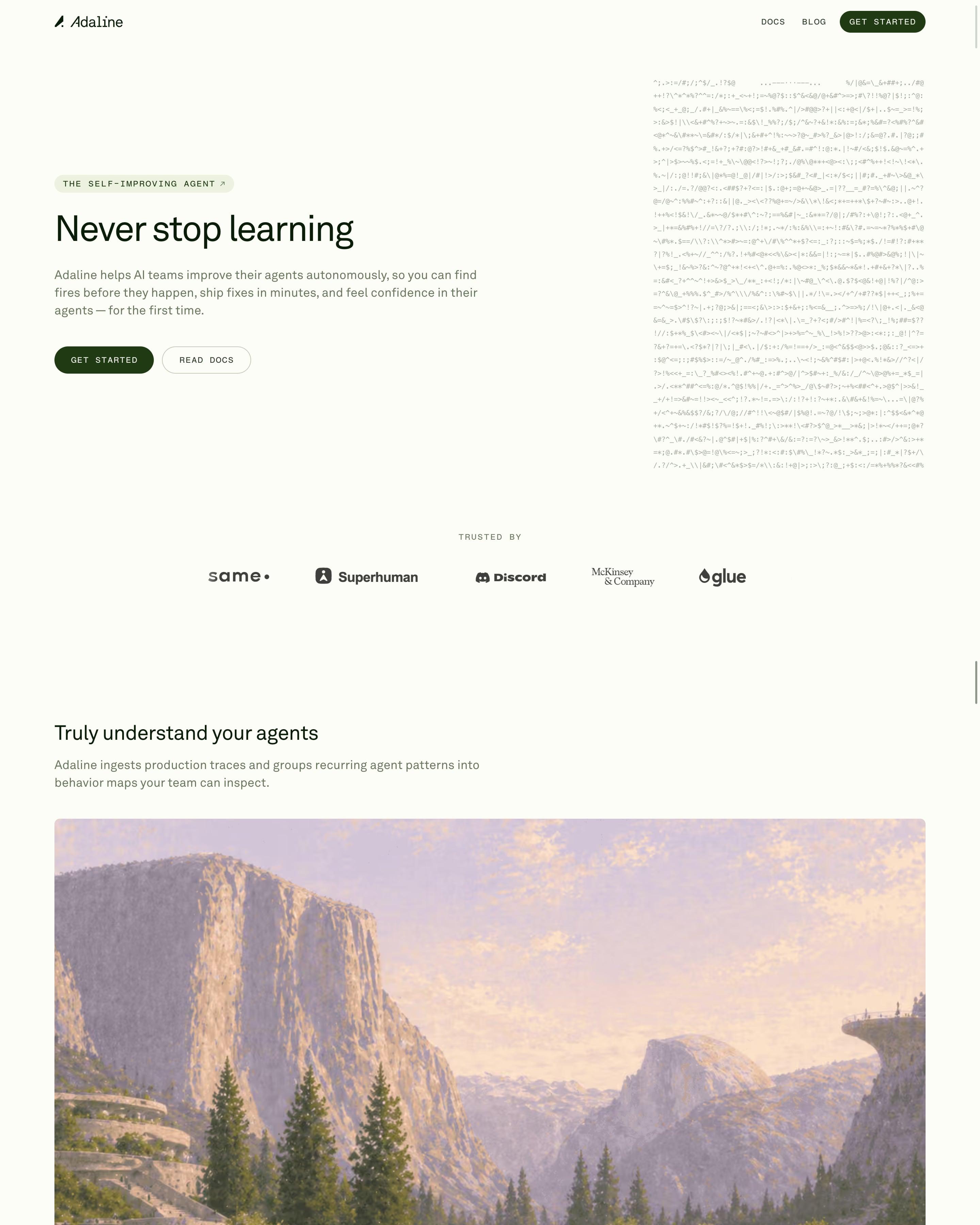
"Never stop learning" sits beside a block of drifting ASCII characters, with monospace caps buttons in deep forest green. Each feature, like "Evals that write themselves", gets one full-width painted landscape in lilac and peach instead of a product shot. Grey-green testimonial tiles with play buttons lead to a dark "Ship Once. Improve Forever." serif panel with a Trace, Behaviors, Evals & Data, Improve loop.





How to design a pastel website
Soft pastel palettes feel calm and friendly. They work for products that want to seem approachable: note-taking, scheduling, HR, wellbeing.
- Pair pastels with a strong dark text colour: light colours need firm type to stay readable.
- Use one saturated accent for buttons, since a pastel button can disappear on a pastel page.
- Keep the number of pastels small, so the page reads as gentle rather than washed out.
Frequently asked questions
Sites in soft pastel colours: light, low-contrast palettes that feel calm and friendly. Soft pastel palettes feel calm and friendly. They work for products that want to seem approachable: note-taking, scheduling, HR, wellbeing.
They can, especially for tools used every day by whole teams. The examples here pair pastel backgrounds with crisp type and product screenshots, so they stay professional.
Each page is opened at 1440 pixels wide, like a laptop, and scrolled from top to bottom so every image and section loads. Cookie banners, chat bubbles and popups are left out, and the whole page is saved as one image.