
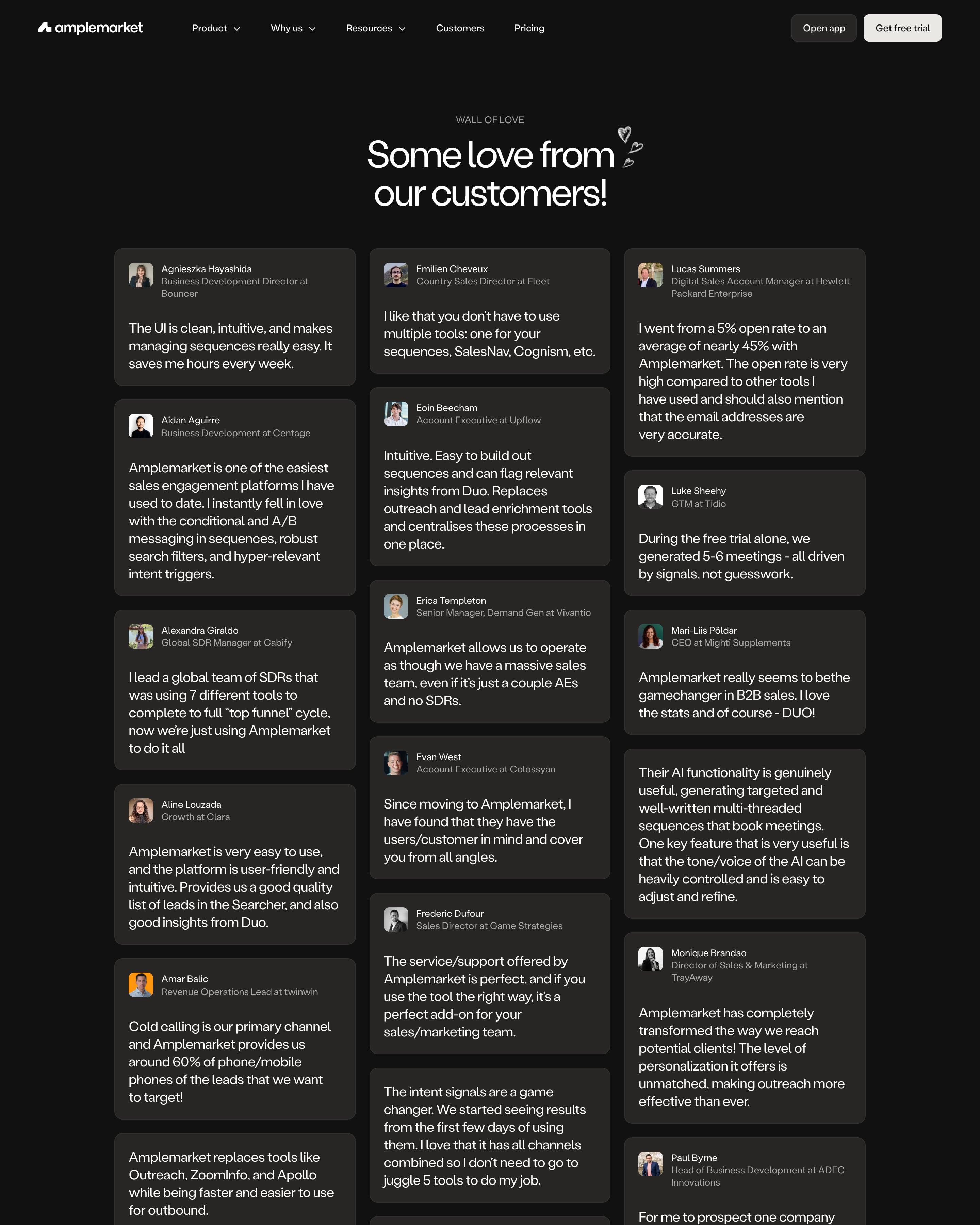

A three-column masonry of dark cards, each with avatar, name, title and employer in small grey type above the quote in larger white text. No logos, stars or filters, just dozens of reviews like "We're at 50 demo requests in one week". Worth copying: the hand-drawn heart beside "Some love from our customers!", which softens a wall of text.
10 examples
Best SaaS Testimonial Page Examples
Pages that do nothing but show what customers say: walls of love, review pages and tweet walls, from SaaS companies with great websites.
- Dark or light
- 1 dark, 9 light
- of 10 pages
- Heading fonts
- Inter
- Inter 3, Labil Grotesk 1, Clash Grotesk 1, Plus Jakarta Sans 1
- Built with
- Next.js
- Next.js 4, Webflow 2, Astro 1, Hugo 1
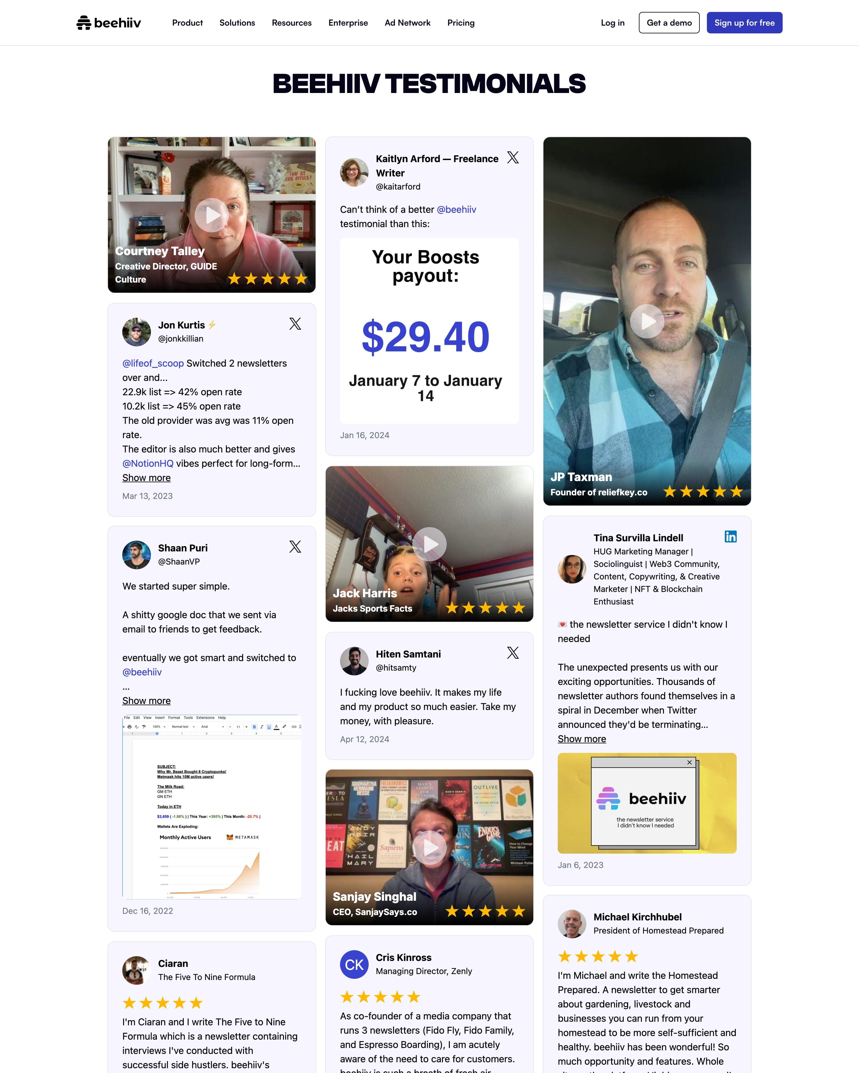
A single heading opens a three-column wall mixing video clips, Google reviews, and posts from X and LinkedIn, some with screenshots like a $29.40 payout. Text cards carry the source's logo and a date. The video cards, with name, role and stars over the frame, are the ones to copy.
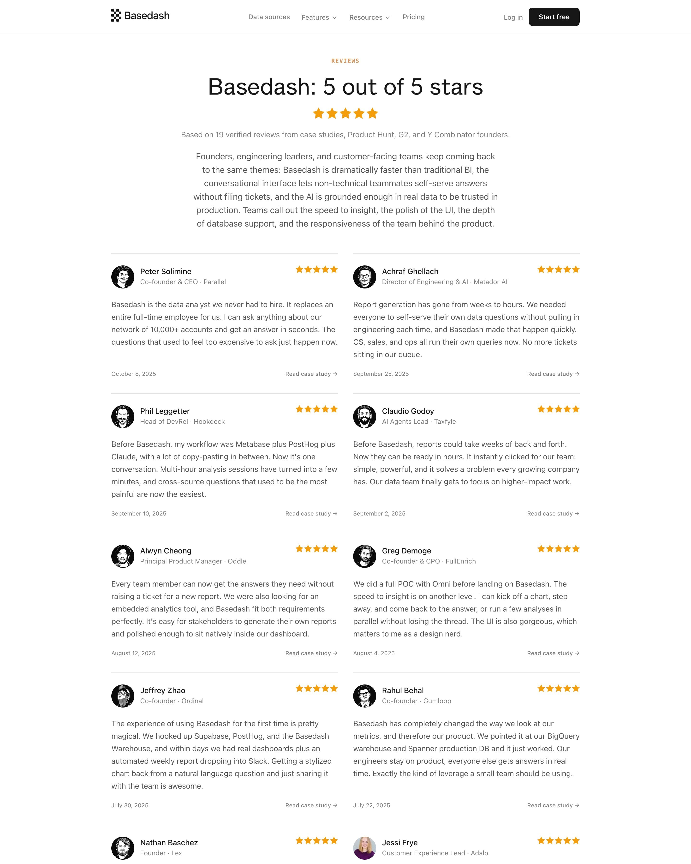
"Basedash: 5 out of 5 stars" sits over a row of orange stars, a line on where the 19 reviews came from and a paragraph summing up the themes. Reviews run in two columns divided by hairlines, each with avatar, role, stars, date and a "Read case study" link. Dates going back to 2021 make it read like a real record rather than a curated wall.
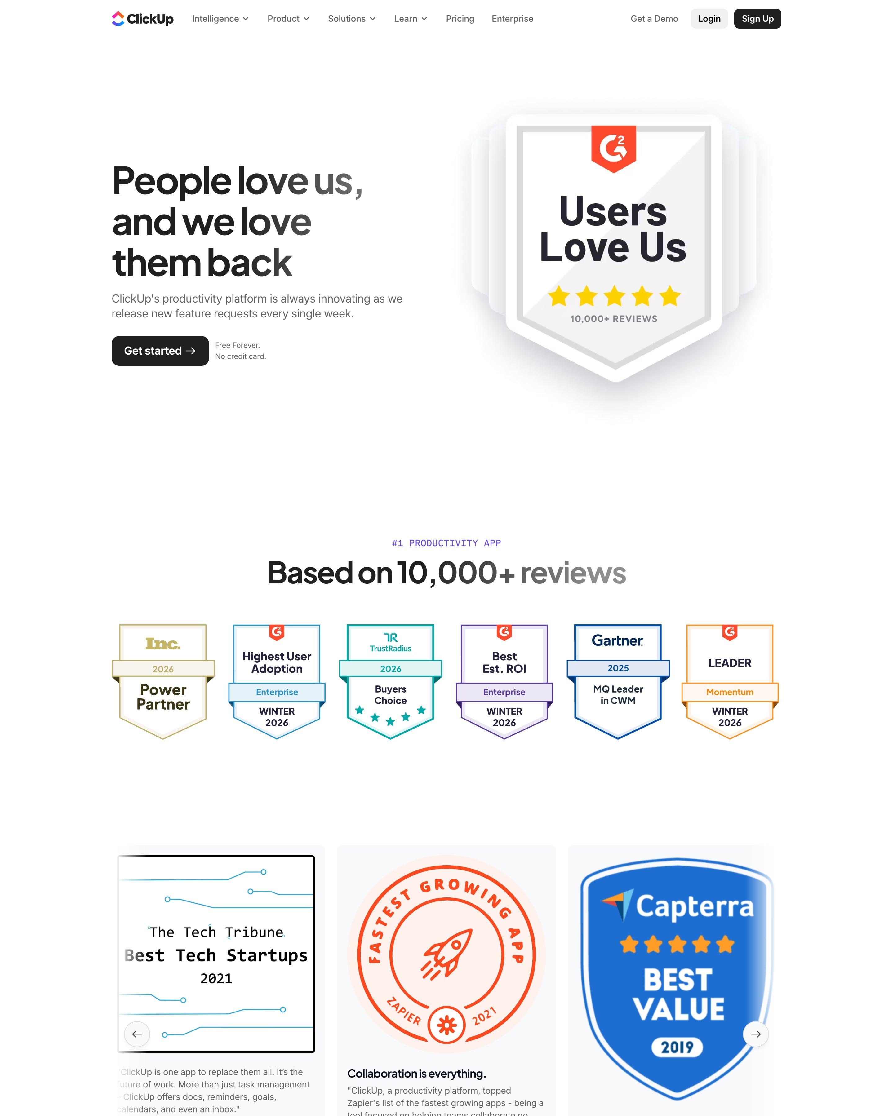
A big G2 "Users Love Us" shield, stacked like a deck of cards, sits beside "People love us, and we love them back". Six award badges line up under "Based on 10,000+ reviews". The "User stories" wall then runs three columns of long, unedited posts, each tagged with a small Twitter, Facebook or ClickUp icon to show where it came from.
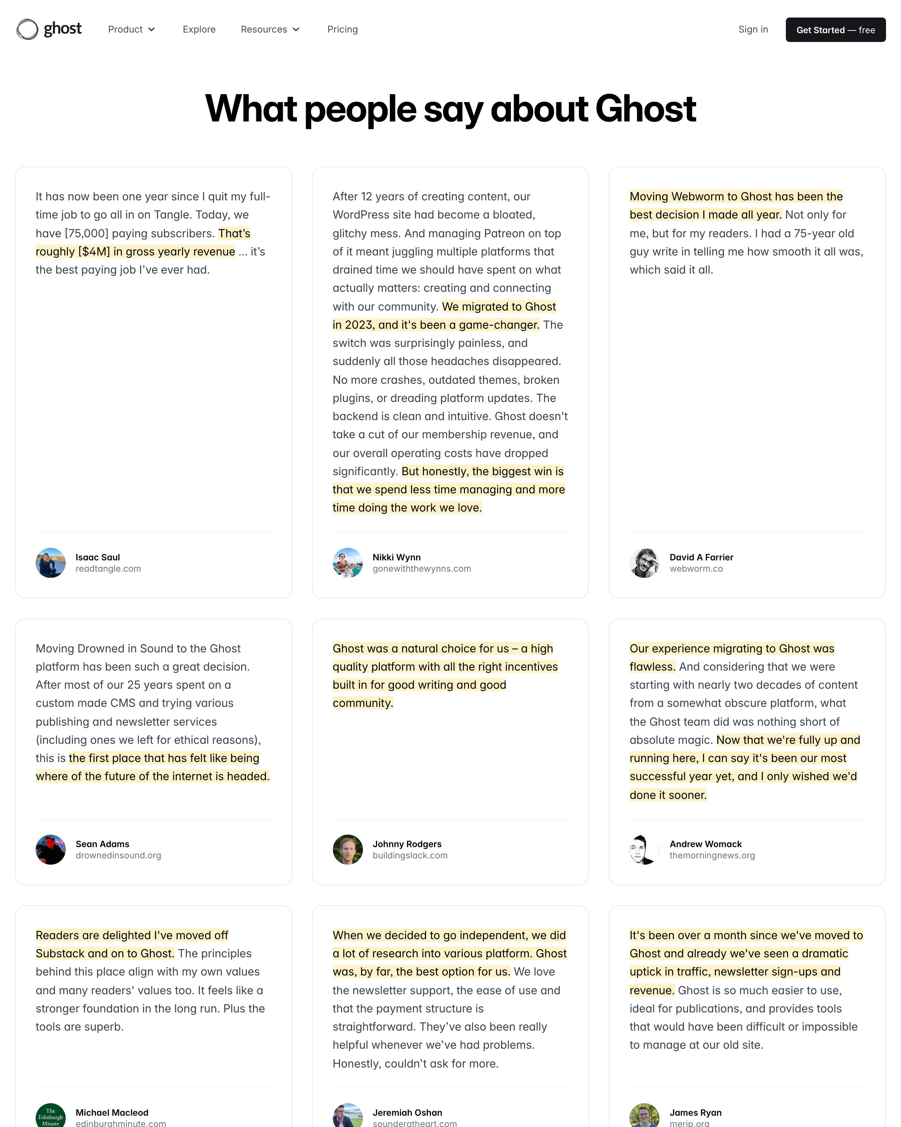
Just one heading sits over a three-column wall of bordered quote cards, with no filters or intro text. In each quote the key lines are highlighted in yellow, and each card closes with the author's photo and name. The yellow highlights are the trick to lift for any long run of testimonials.
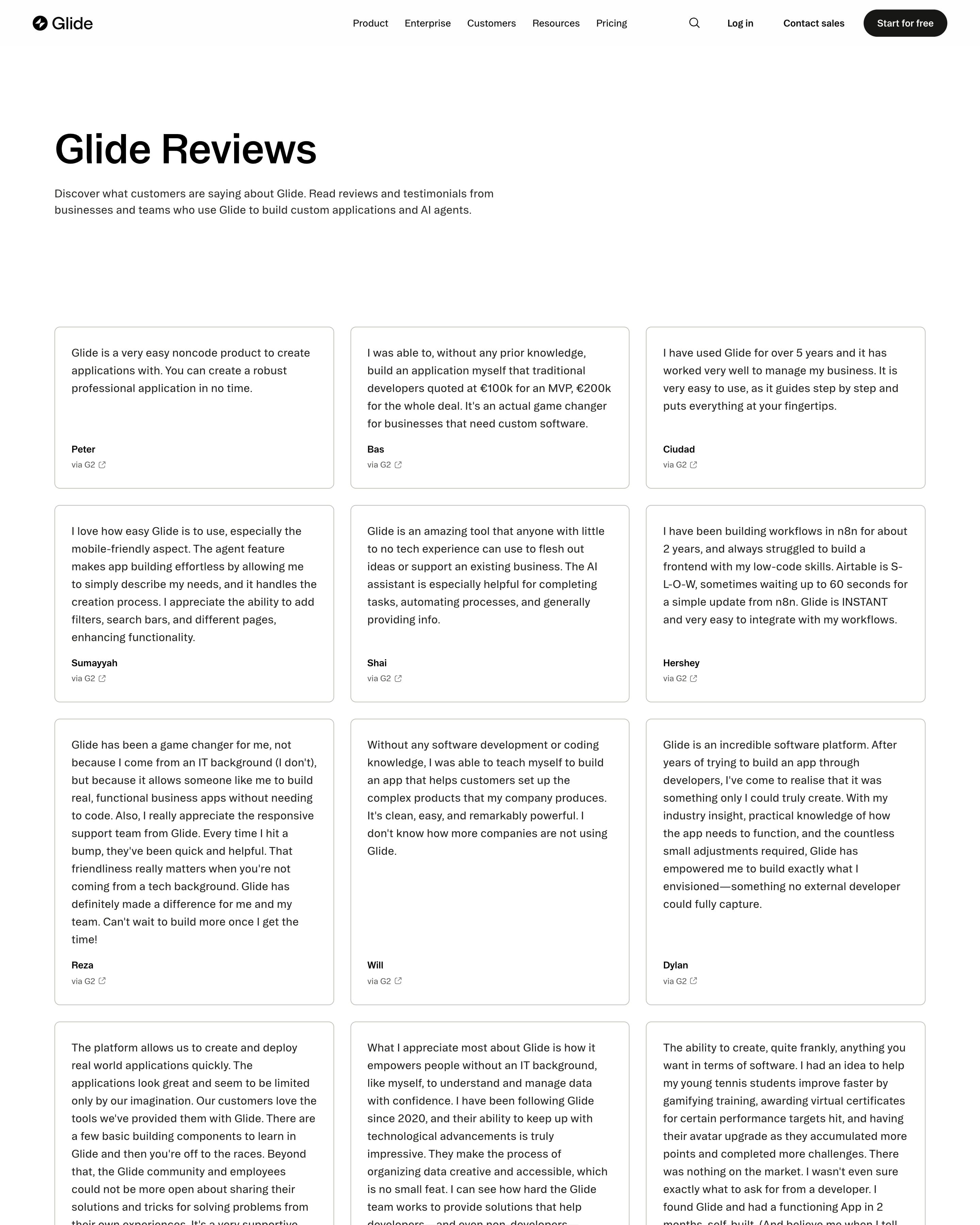
"Glide Reviews" is just a headline, one sentence and a three-column wall of bordered cards. Each card holds a full G2 review in plain text with a first name and a "via G2" link, and cards stretch to fit, from one line to fifteen. With no stars, photos or logos, the sheer volume does the persuading.
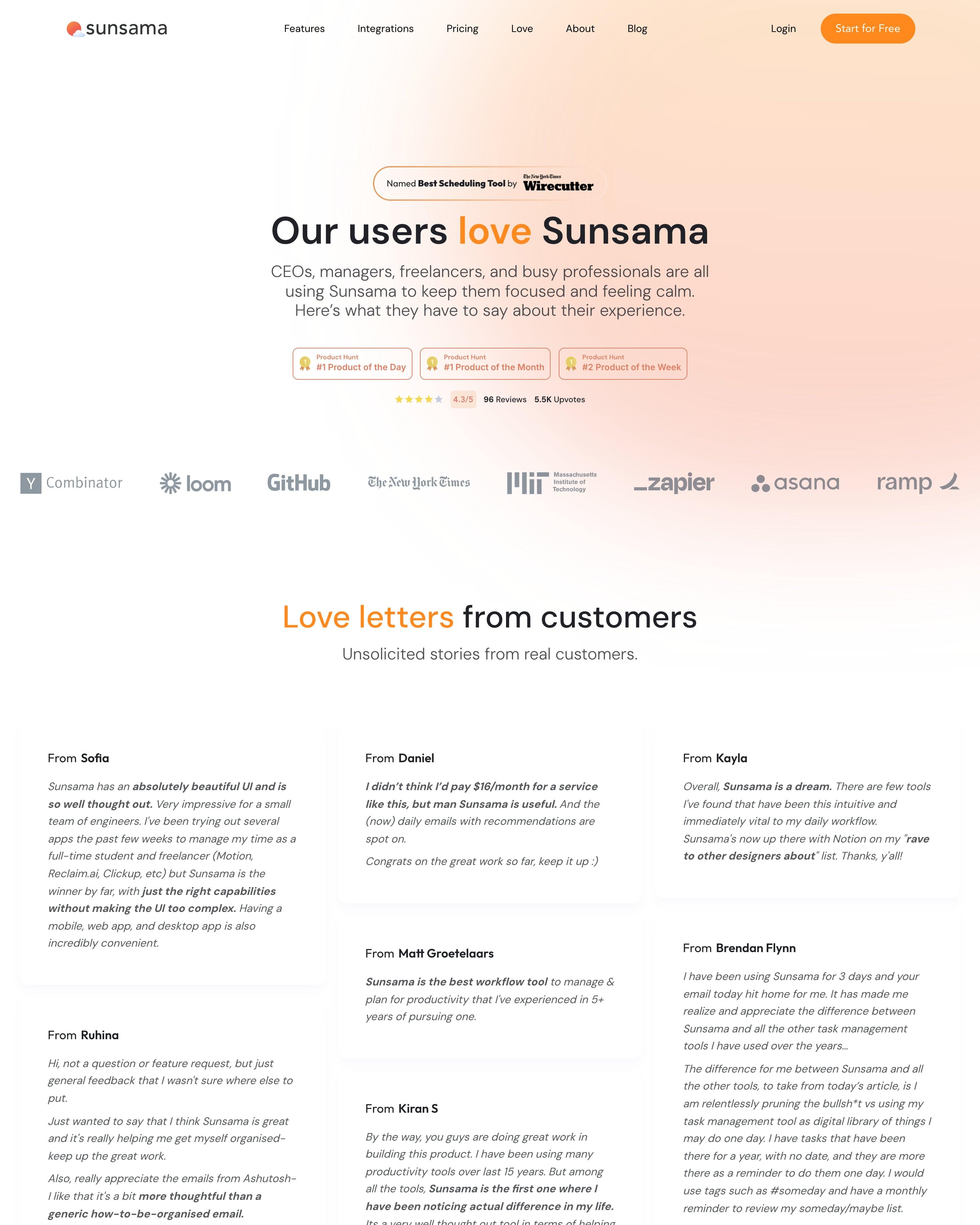
"Love letters from customers" is a three-column masonry of emails, each card headed "From Sofia" or "From Daniel" and set in italics. The key phrase in each is bolded, such as "absolutely beautiful UI", so a skim still lands the point. Three Product Hunt badges and a Wirecutter pill sit under "Our users love Sunsama", with "love" in orange.
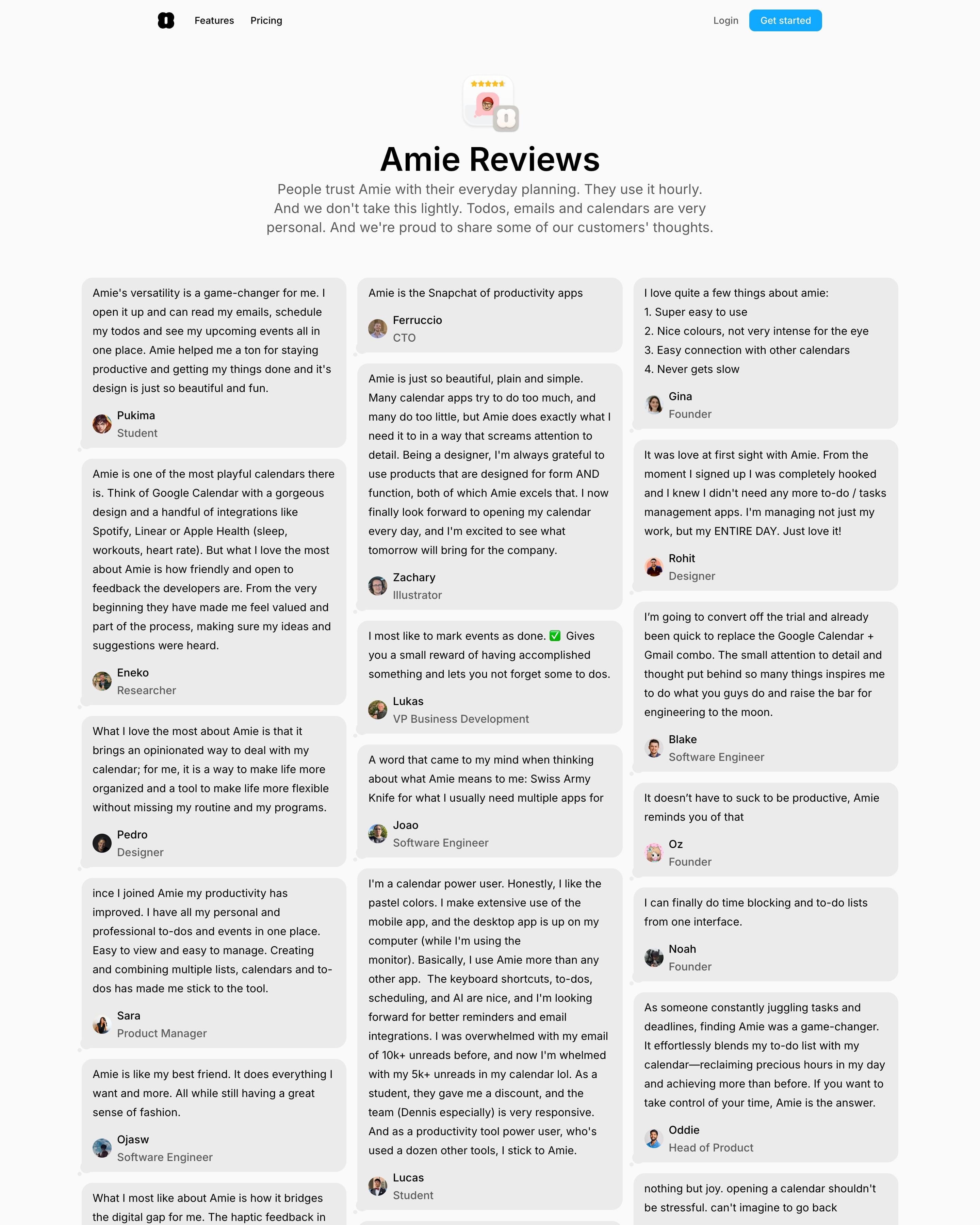
Quotes fill a three-column masonry wall of grey cards drawn as chat bubbles, each with a tiny tail, an avatar, a first name and a role. The cards carry no ratings or company logos. Borrow the bubble shape for any review wall.
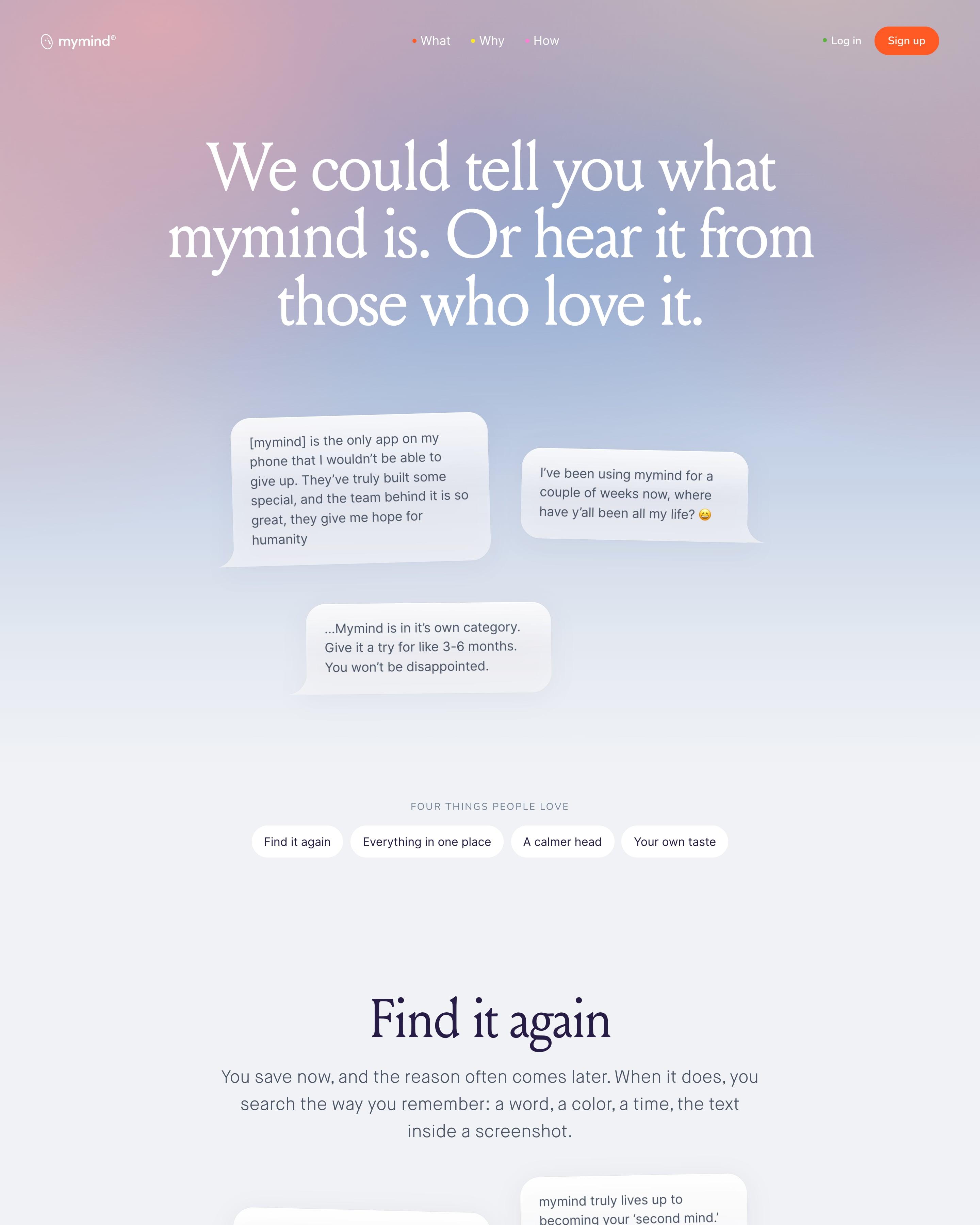
Reviews appear as tilted chat bubbles, with no names or photos, below a serif headline on a pastel pink-to-blue wash. They are sorted into four themes, such as "Find it again" and "A calmer head", each closed by an italic summary. Grouping by theme, rather than one long wall, is the thing to copy.
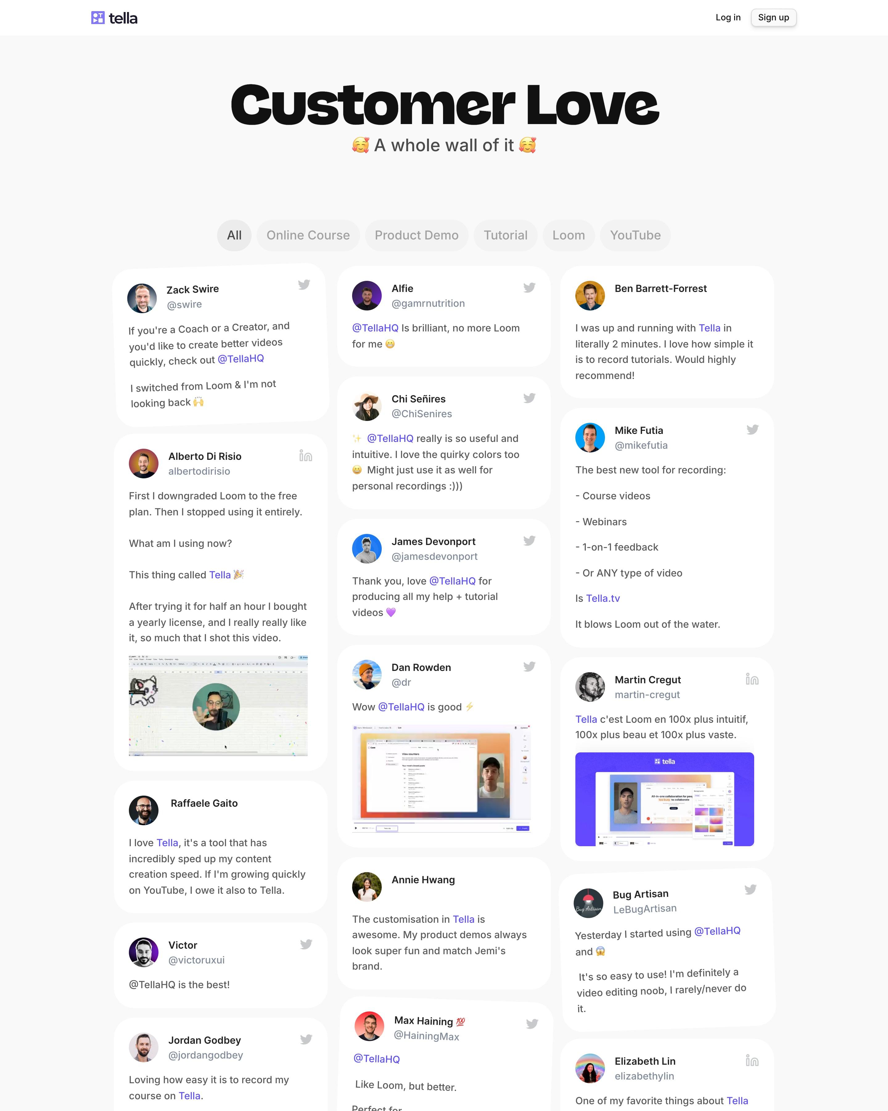
"Customer Love" is set in a heavy extended display face, with "A whole wall of it" below. Three masonry columns hold tweets and LinkedIn posts as white cards with avatars, handles and the odd video screenshot, and the page ends on a sky-photo CTA between rainbow stripes. Worth copying: filter pills by use case, from Online Course to Loom, so switchers find their peers.









By page type
Frequently asked questions
Lots of real quotes from named people, with their faces and companies, often taken from social media, laid out so a visitor can scan dozens in seconds.
Each page is opened at 1440 pixels wide, like a laptop, and scrolled from top to bottom so every image and section loads. Cookie banners, chat bubbles and popups are left out, and the whole page is saved as one image.