Comparison Pages for SaaS: Versus and Alternatives Pages, 13 Examples
Versus, alternatives and switch pages catch buyers who already know the category and are choosing between tools. The highest-intent pages a SaaS site can own.
Impact
High
Effort
Medium
Time to results
Weeks
Budget
None needed
Team
Marketing
Tools for this growth idea
WebflowA CMS collection with one page per competitor
ClaudeDraft each comparison; a person checks every claim
FigmaDesign the side-by-side table and screenshots
Google AnalyticsCompare signups per comparison page
Why comparison pages convert better than almost anything else you publish
A comparison search is a buying signal. Someone typing "Asana alternatives" or "Pipedrive vs folk" already knows the category, has probably used one tool, and is deciding where to spend money. You aren't creating demand. You're showing up at the moment a decision gets made.
The numbers match. Grow and Convert pulled six months of data from 95 client articles, each ranking for a different keyword: 123,000 organic pageviews and 4,687 product conversions (trials, demo requests, sales form fills). Alternatives keywords converted at 8.43%, "vs." keywords at 5.45%, and core category keywords at 4.85%. Comparison terms came out as the highest-converting keyword type they had measured (study).
There's a second reason to build them: someone will write these pages anyway. If you don't publish "Pipedrive alternative" or "[your brand] vs [rival]", G2, a listicle or your competitor will, and they'll decide how the comparison reads. A page you own is your one chance to frame the choice: which criteria matter, who each tool is for, and what switching takes.
The best public numbers come from PostHog, which has maintained about 90 comparison and roundup pages for five years. In its words, the content drove 700k pageviews and 25k+ signups; almost half of those readers signed up within 24 hours, and about three quarters within 30 days. Its 2025 numbers, by page type (PostHog's guide):
Head-to-head (PostHog vs X): 30k+ readers, 3,000+ later signed up, about 10%.
Alternatives and "best X tools" roundups: 100k+ readers, 4,000+ signups, about 4%.
Every other blog post: 250k+ readers, 6,000+ signups, about 2.5%.
Head-to-heads get the fewest readers and convert four times better than the blog. Roundups bring the reach.
The four page types, and which to build first
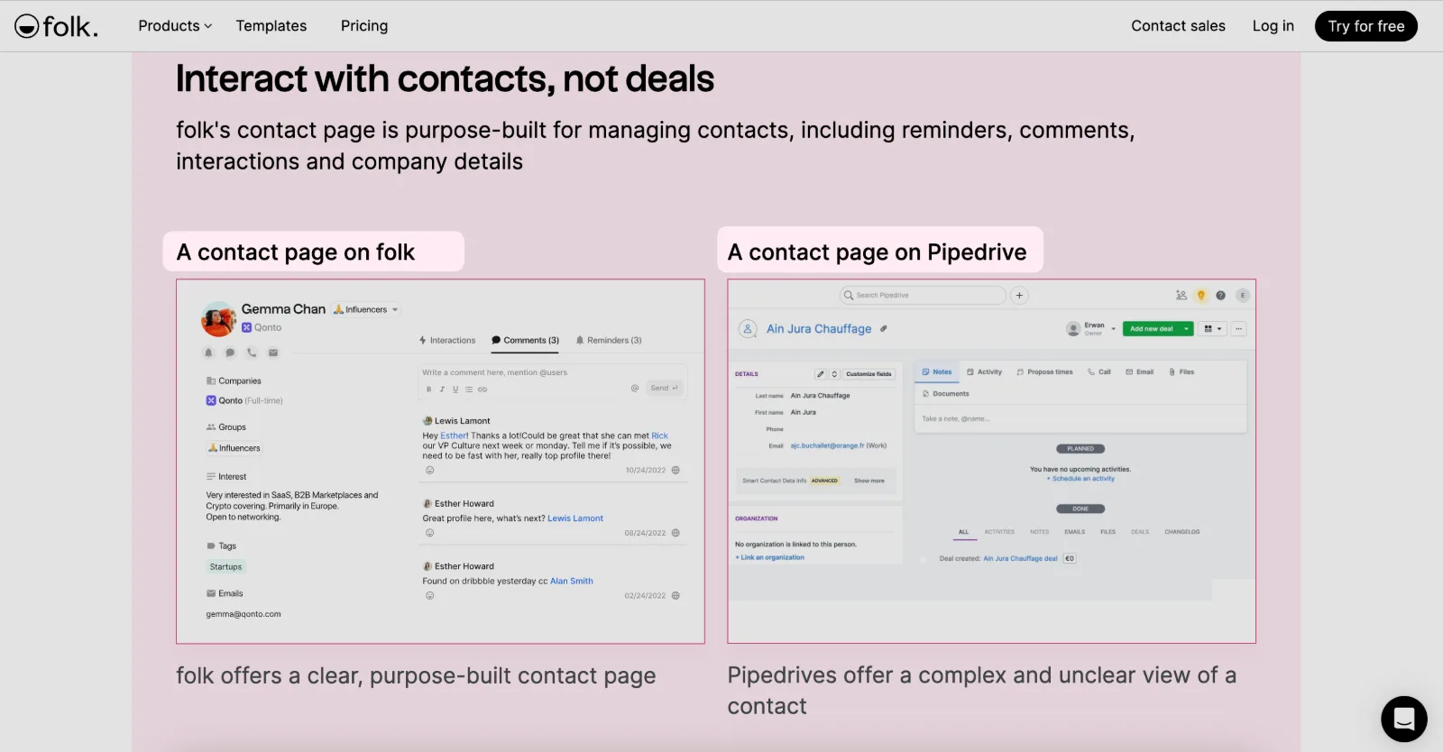
"[Competitor] alternative" pages. Pitched at people leaving a specific tool. Usually the highest-converting type. Folk's Pipedrive alternative page is a good model: it names the frustration (deals over relationships) and answers it section by section.
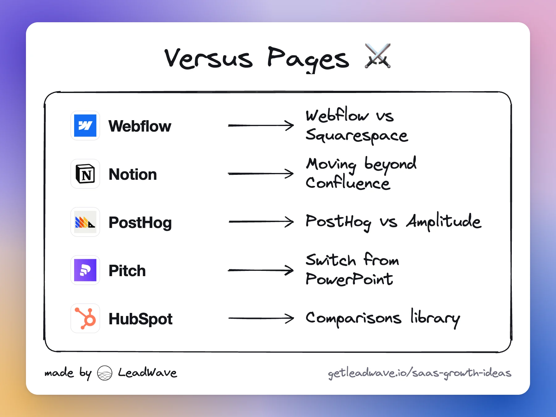
"[You] vs [competitor]" pages. One rival, side by side. Best for the 2–3 tools you meet most in sales calls. Webflow runs a whole set (/vs/squarespace, /vs/wordpress).
"[Your brand] alternatives" pages. The page people find when they're about to leave *you*. PostHog publishes The most popular PostHog alternatives and covers Amplitude, Mixpanel, FullStory and others. It sounds risky, but that search happens either way. Owning the result lets you say who each rival suits and why most teams stay.
Where to start: list the competitors your sales team hears most and the ones prospects mention in demo forms. Build an alternative page and a vs page for the top 3, then the hub. Add your own alternatives page once you have real brand search volume.
Comparison pages examples
WebflowWebflow vs Squarespace pages
A /vs/ series (Squarespace, WordPress) that pitches Webflow as "the visual alternative" to each platform. Short, URL-clean and aimed at people outgrowing a website builder.
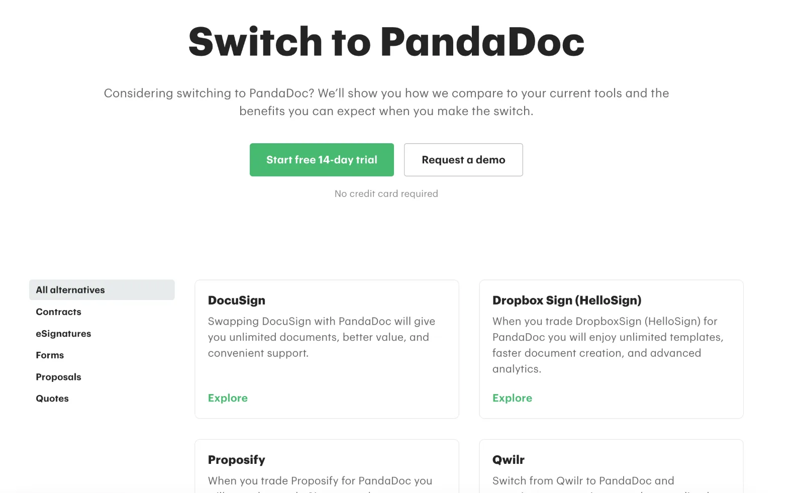
A switch page with the title "Switch to Notion". It opens with one contrast ("Confluence fragments, Notion connects"), then covers adoption, AI, customer proof and a Q&A for teams planning the move.
A long, dated comparison with a "When to choose PostHog vs Amplitude" section that says Amplitude is the better pick for marketing-led teams that need attribution modeling. The candor is the conversion device. Published in May 2022, it still brings a few hundred readers a month.
Better than most content. PostHog says comparison content brought it 25k+ signups since 2021; in 2025 about 10% of readers of its head-to-head pages signed up, 4% of alternatives and roundup readers, and 2.5% of readers of its other blog posts.
A landing page that compares your product with a named competitor ("X vs Y") or presents it as an alternative to one ("X alternative"). It targets people choosing between tools, so it converts better than most content.
Usually yes, once people search for it. That search happens either way. Publishing a fair page lets you frame who each alternative suits and why most teams stay.
Comparing products by name is common practice, but claims must be truthful and current. Date your pages, link sources such as the competitor's pricing page, and avoid claims you can't back up.
Alternatives pages for your biggest competitors first. They usually have more search volume and convert better, then add vs pages for the rivals you meet most in sales.
Start with 3 to 6 for the competitors you actually lose deals to, plus a hub. Only scale to dozens when each page has real, specific differences to show.
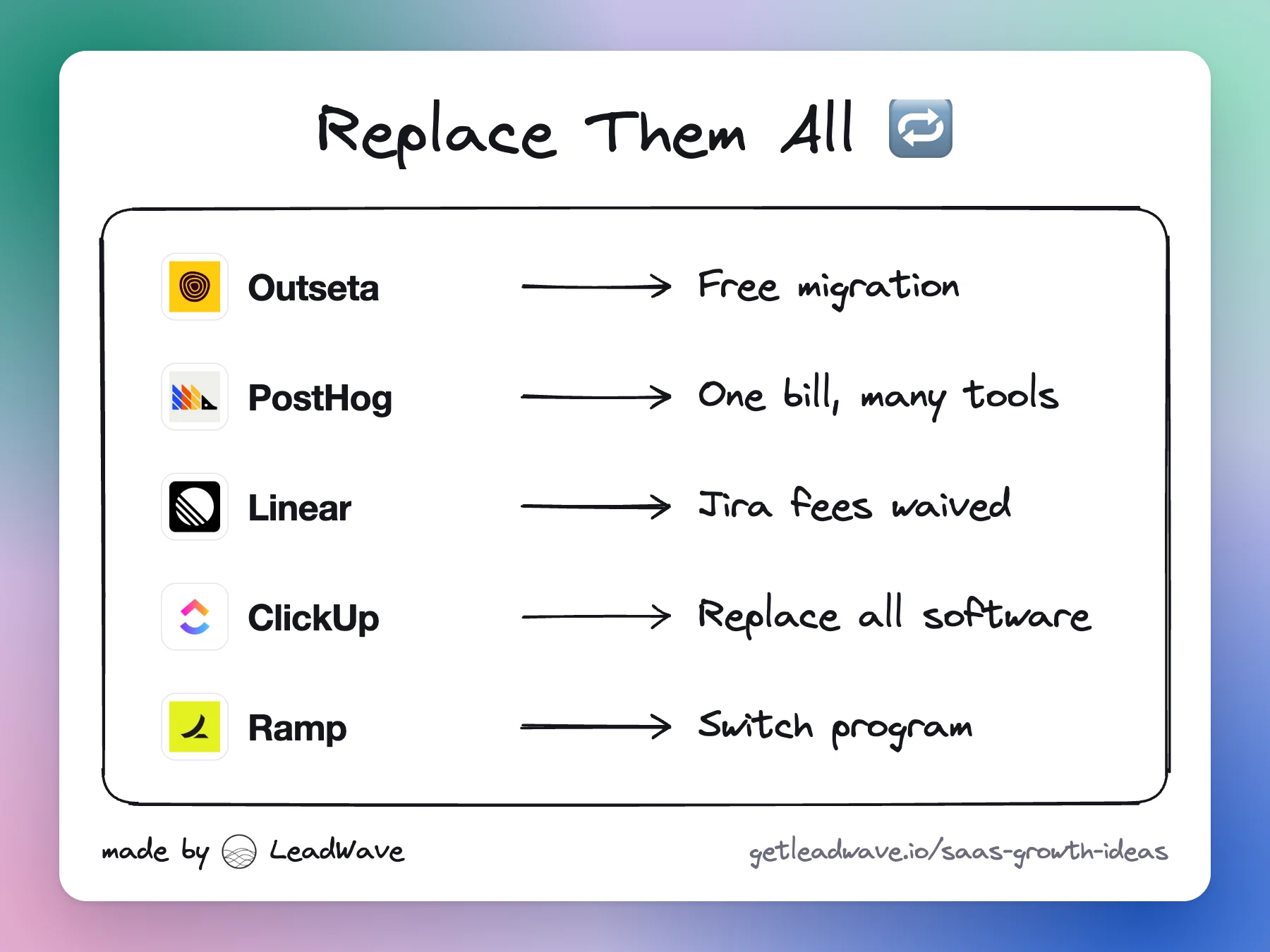
Make switching cheaper than staying: position as the one tool that replaces several, migrate customers for free, and cover what's left on a rival's contract.
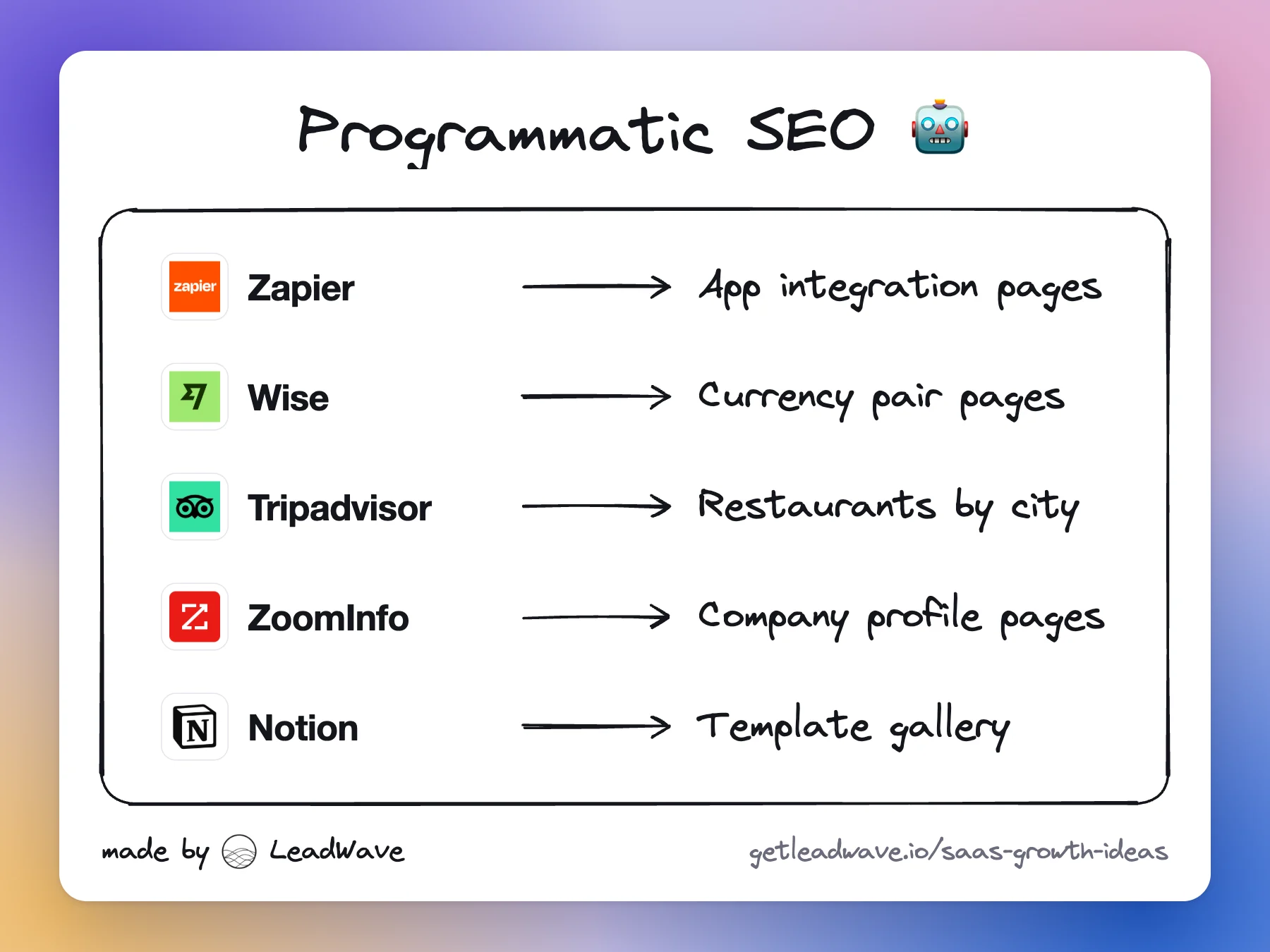
One template plus a dataset makes thousands of pages, each answering one search. It works when each page has data nobody else has, and fails when it doesn't.
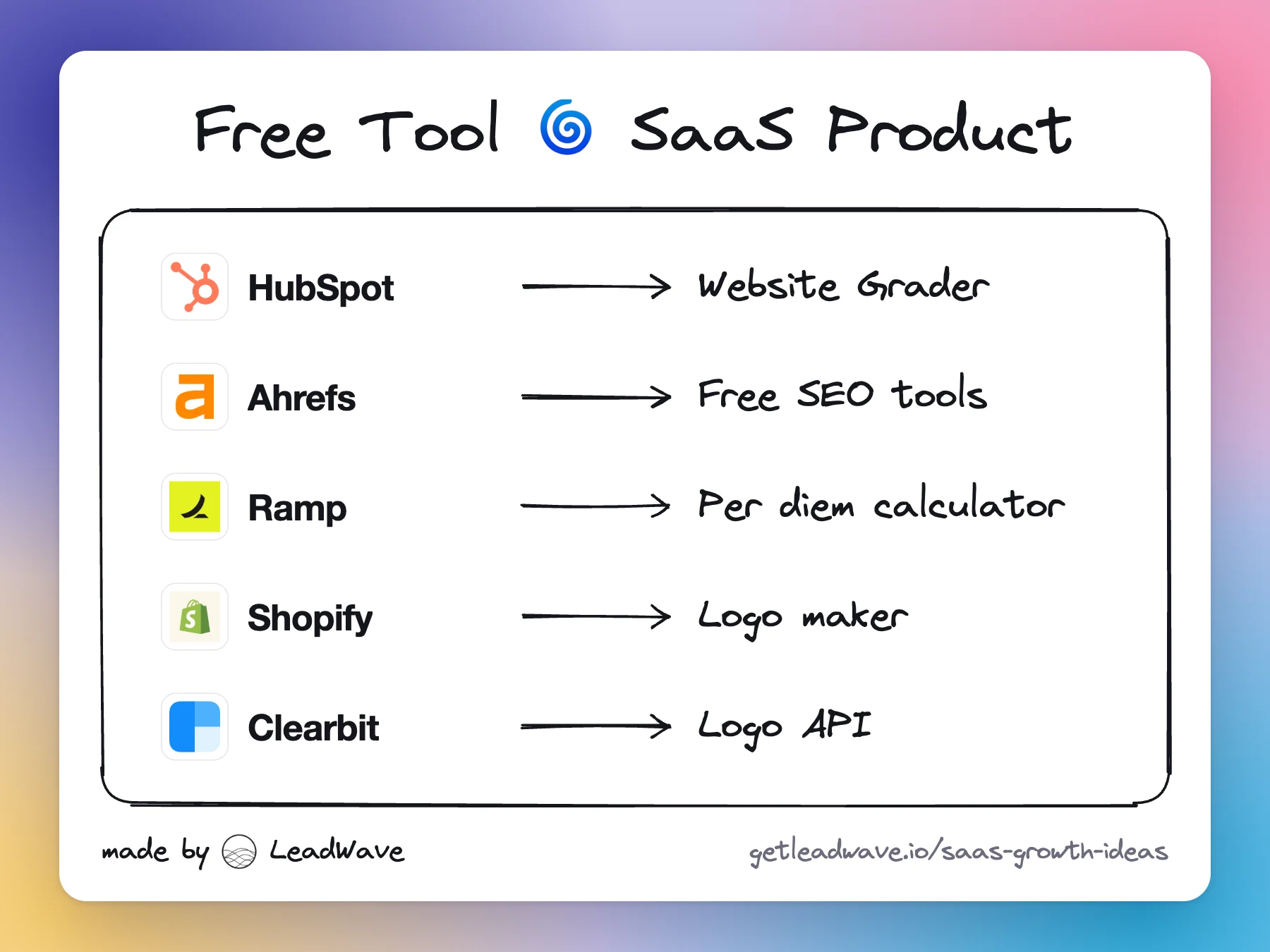
Build a small free tool that does one job your buyers already search for. It ranks, earns links, collects leads and shows off the paid product in seconds.