

Why a few words on a button move numbers
The button is where a visitor decides. The page makes the case; the button answers the last two questions: what do I get, and what will it cost me? "Submit", "Sign up" and "Book a demo" answer the second badly (a form, a sales call) and the first not at all.
The classic tests point the same way. Michael Aagaard of ContentVerve published these in March 2013 (ContentVerve, archived):
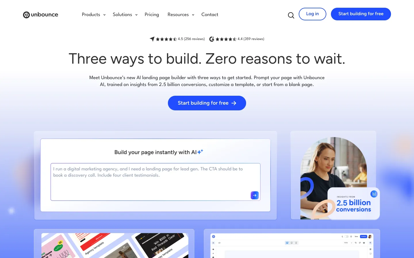
- "Start your free 30 day trial" → "Start my free 30 day trial" on an Unbounce PPC landing page: +90% click-through to the payment page over three weeks. Flipping "My" to "Your" on another site cost 24.91%.
- "Order Information and Prices" → "Get Information and Prices": +14.79%. "Order" says what you must do; "Get" says what you receive.
- "Get Membership" → "Find Your Gym & Get Membership" for a gym chain: +213.16%. The button named the next real step.
Copyhackers saw the same in 2014 on Dressipi, a fashion site: "Sign up now" → "Show me outfits I'll love" lifted clicks on the button by 123.9% (Copyhackers).
Be honest about this evidence. These are single tests from 2013–2014, one site each, sample sizes unpublished, and most measure clicks rather than paying customers. They show what to test, not the lift you'll get.
Low commitment wins: "Get started" and "Talk to sales" vs "Book a demo"
"Book a demo" asks for a form, a slot in your calendar and a salesperson. Most buyers would rather not. In Gartner's surveys of B2B buyers, 75% preferred a rep-free experience (771 buyers, late 2022), 61% in 2024 (632 buyers) and 67% in 2025 (646 buyers, published March 2026) (Gartner).
Two SaaS companies have shared what happened when they lowered the ask on their homepage (HubSpot):
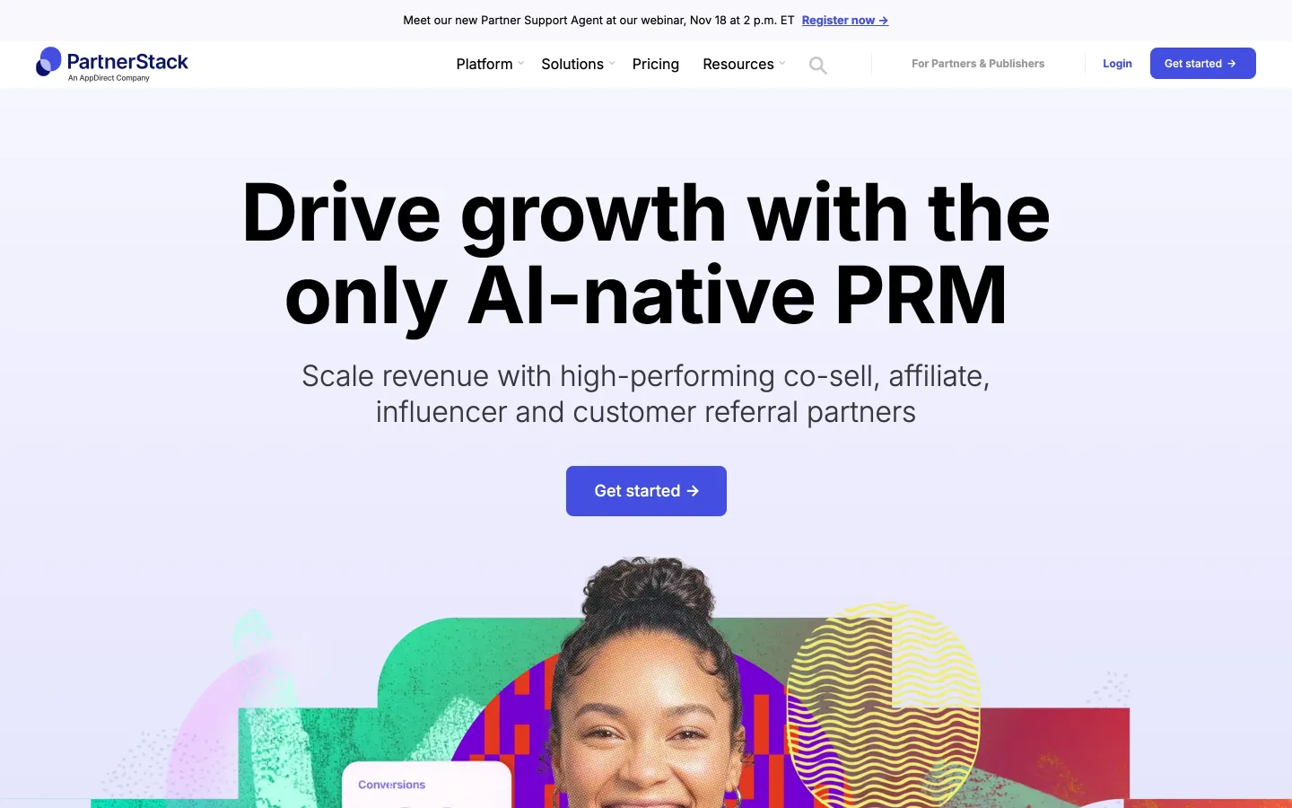
- PartnerStack: "Book a Demo" → "Get Started", conversion 6.66% → 14.09%. Joe Kevens, its director of demand gen, put it this way: "Get Started" feels like helping customers solve their problem; "Book a Demo" feels like pulling them into a sales cycle.
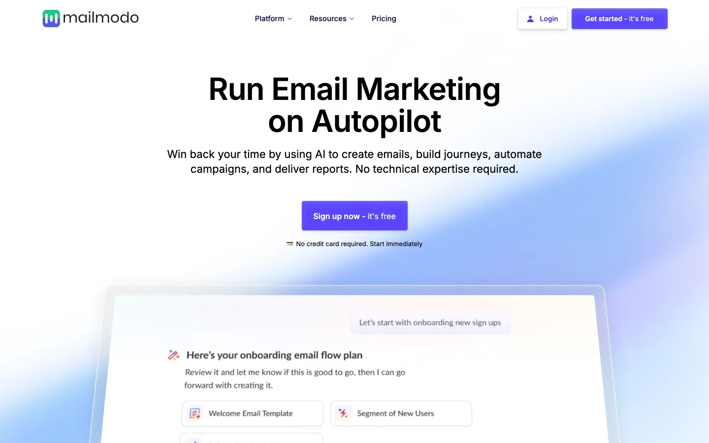
- Mailmodo: "Book a demo" → "Talk to a Human", conversion 0.29% → 0.61%.
Sales buttons sit on a ladder of commitment, heaviest first: "Book a demo" (a meeting), "Contact sales" (a form), "Talk to sales" (a conversation), "See a demo" or "Take a tour" (look on your own). "Take a tour" is the most common label for interactive demos (28%) and, in vendor Navattic's data, the best performer (Navattic).
One warning. "Get started" works when it really starts something. Nielsen Norman Group watched users click "Get Started" to *learn* about a service, land in a signup quiz, and lose trust (NN/g, 2017). If the button opens a sales form, as PartnerStack's does today, keep the form short and say what happens next.
What 22 top SaaS homepages say (Nov 14, 2026)
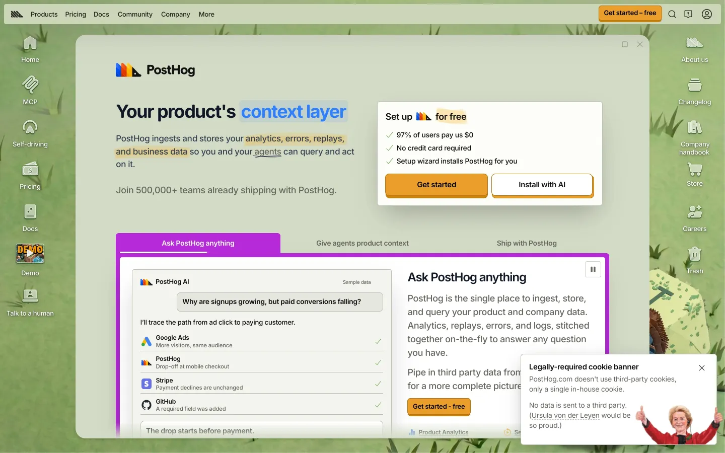
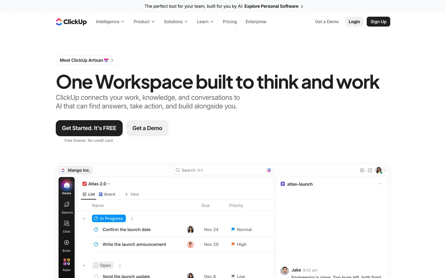
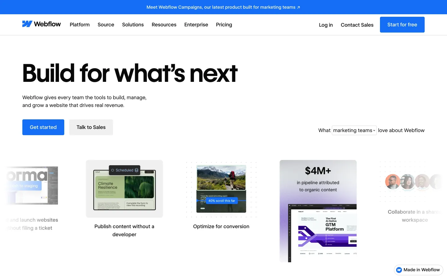
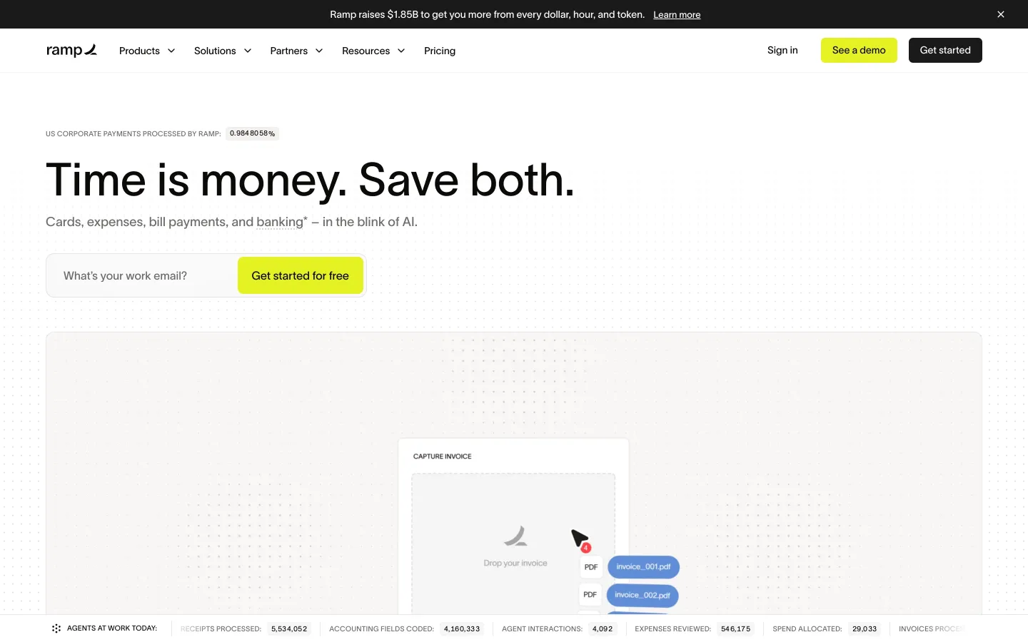
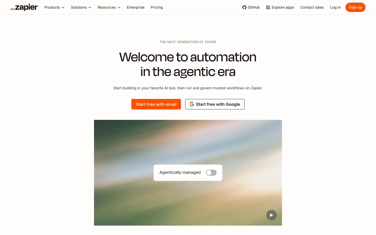
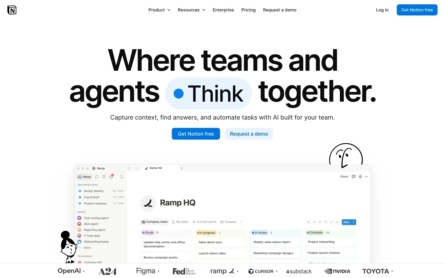
We read the button labels on the homepages of Airtable, Attio, Calendly, ClickUp, Dropbox, Figma, HubSpot, Intercom, Linear, Loom, Mailchimp, Miro, monday.com, Notion, PostHog, Ramp, Slack, Stripe, Vercel, Webflow, Zapier and Zoom on November 14, 2026:
- Two paths is the norm. 21 of 22 show a self-serve button and a sales one. Only Loom shows just self-serve.
- "Get started" is the default self-serve verb (15 of 22). "Sign up" appears on 9, mostly as the small link next to "Log in".
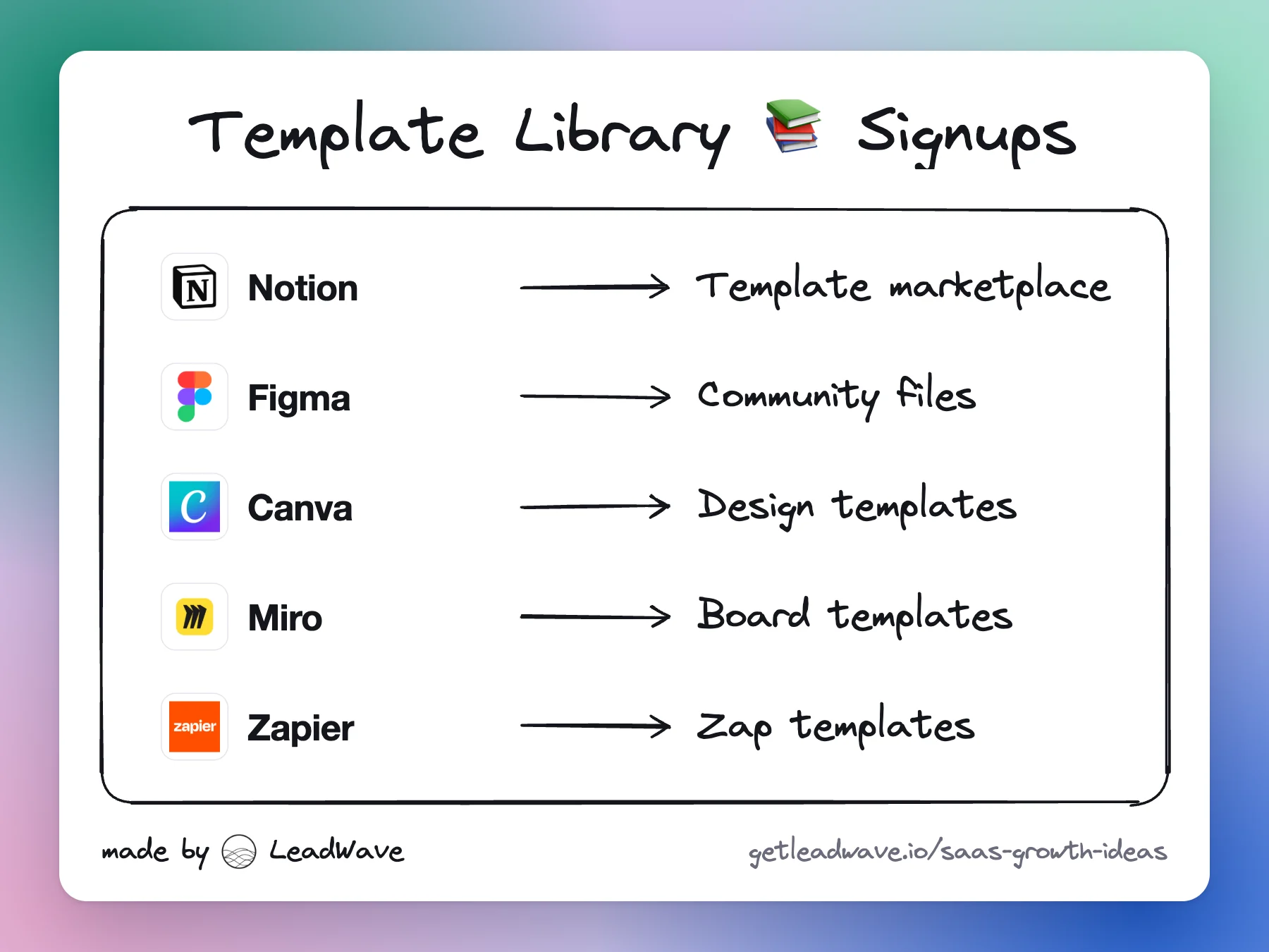
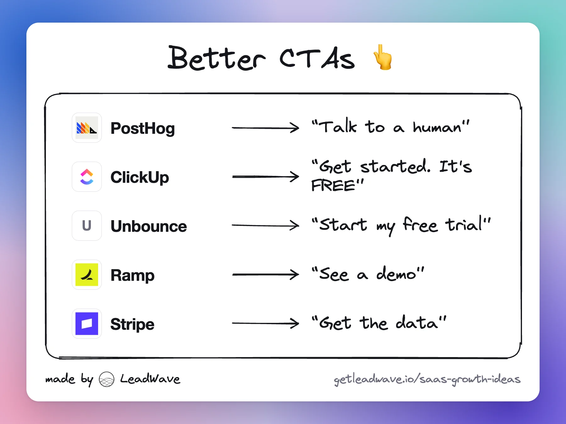
- At least 16 of 22 put "free" in the self-serve label: "Get Notion free", "Start for free", "Try Dropbox free", "Sign Up Free", "Get started. It's FREE".
- "Contact sales" is still the most common sales label (15). 7 use "Talk to sales" or, at PostHog, "Talk to a human". Of 13 demo buttons, 5 ask for a meeting ("Book demo", "Request a demo") and 6 use lighter verbs ("See a demo", "Watch demo").
- None uses first person, despite the most famous button test. Unbounce, where it ran, still says "Start my free trial".
- Risk reducers sit under the button on Calendly, ClickUp, Intercom, monday.com and PostHog: "No credit card required", "Free forever".
Big brands' labels aren't proof of what converts best; their name does much of the work. Borrow the vocabulary, then test on your own traffic. (Labels as they appear in each page's HTML; Miro's signup button renders in the browser, so its label isn't counted.)
How to write the button
- Lead with what they get. "Get the data", "Show me outfits I'll love". Avoid effort words: Submit, Order, Register. The label should finish the sentence "I want to…" in the visitor's voice.
- Try first person. "Start my free trial" reads as the visitor's own choice. Famous, but old and single-site: test it.
- Say "free" when it is. Free pulls harder than cheap: in Shampanier, Mazar and Ariely's experiments, cutting two chocolates' prices by one cent, so the cheaper one became free, swung choices toward the free one (Marketing Science, 2007).
- Name the next real step. "Deploy now" (Vercel) or "Start free with Google" (Zapier) says exactly what the click does.
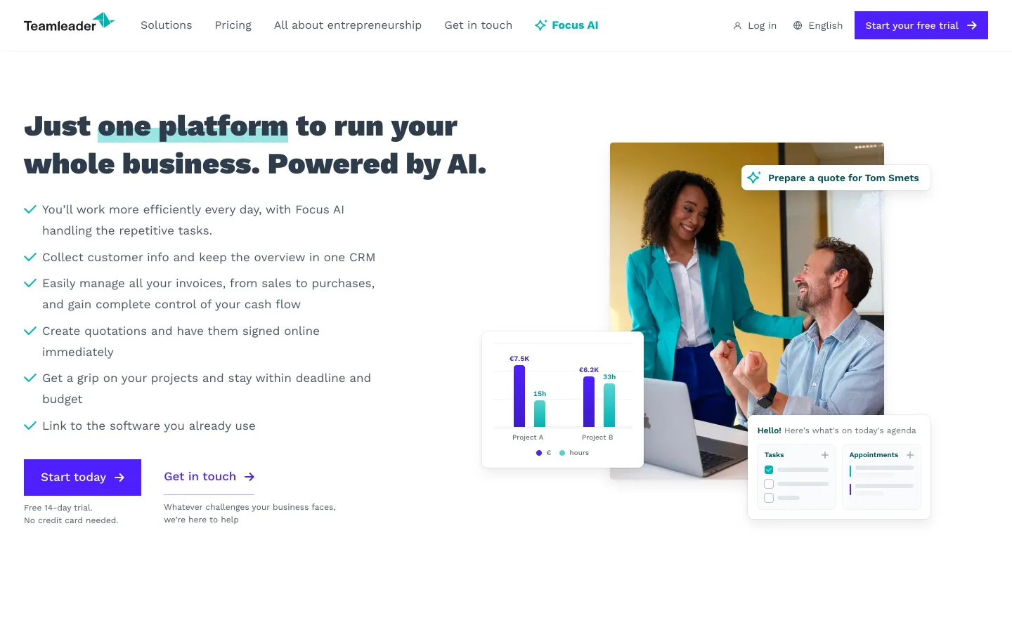
- Answer the last doubt under the button. Card, contract, time, setup. Teamleader got 12.5% more trial signups after adding a no-credit-card note (VWO).
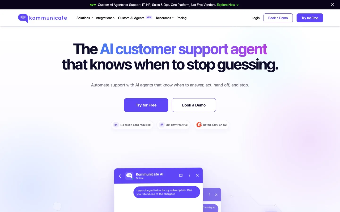
- Remove steps from the button. Kommunicate deleted the email field next to "Try for Free" and got 25.53% more clicks (VWO).
- Match the visitor. HubSpot compared 330,000+ CTAs over six months and found personalized ones (by visitor stage, location, device or source) converted 202% better than basic ones. That's its own observational data, not a controlled test (HubSpot).
Match the CTA to the page
- Homepage: a self-serve button ("Start for free") as the primary, a human one ("Talk to sales") as the secondary. Repeat both at the end.
- Pricing page: one button per plan: "Start free" on free, "Start my trial" on paid, "Talk to sales" on enterprise.
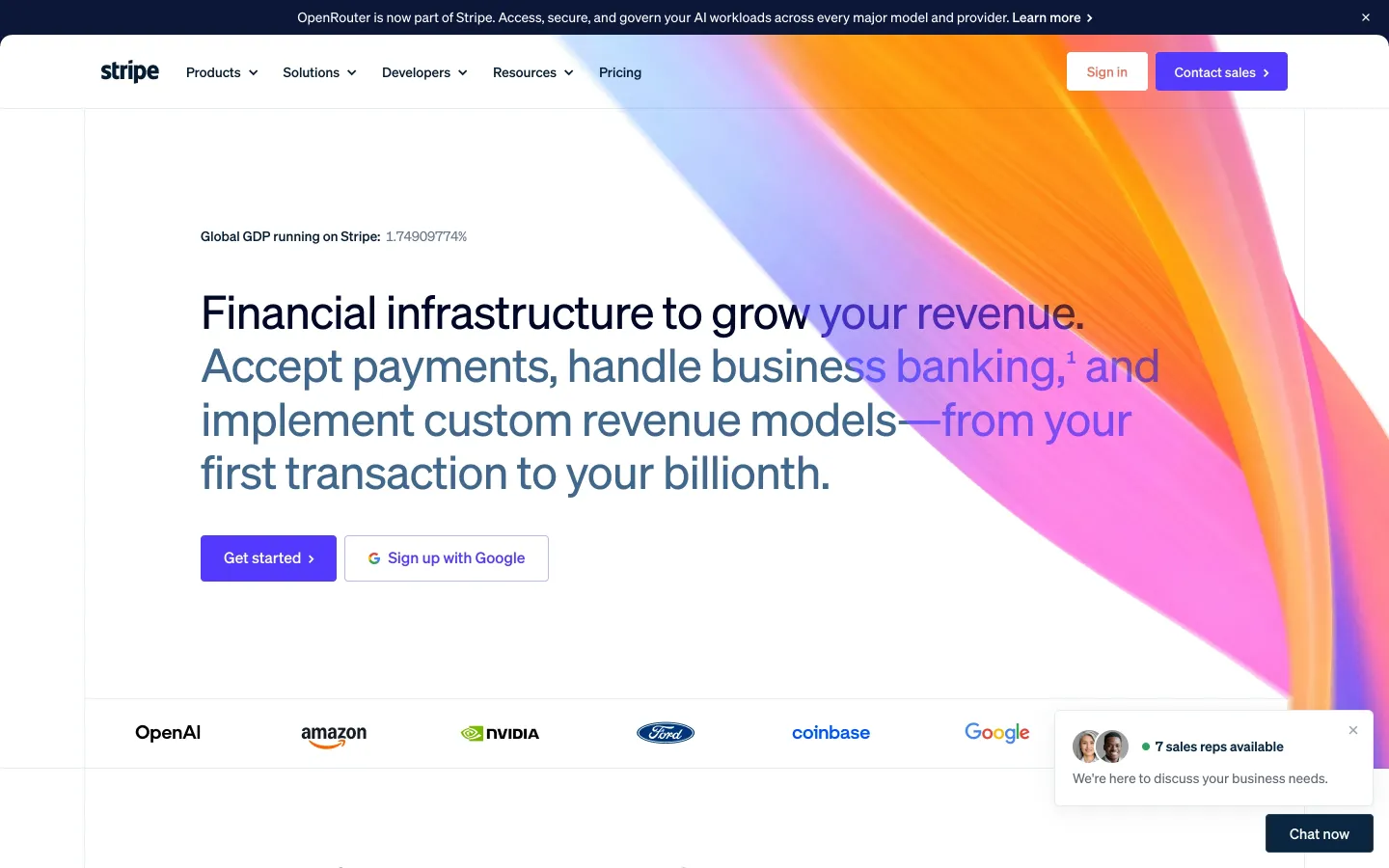
- Blog posts: a how-to reader isn't ready for a trial. Offer the next useful thing tied to the post: the template, the checklist, the dataset. Stripe promotes its SaaS benchmark report with "Get the data", not "Download".
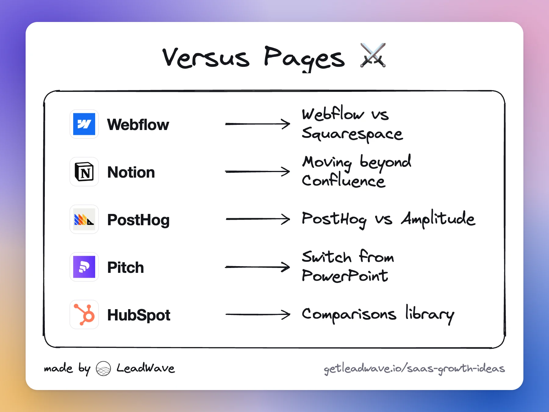
- Comparison pages: "Start free" or "Import from X" (comparison pages).
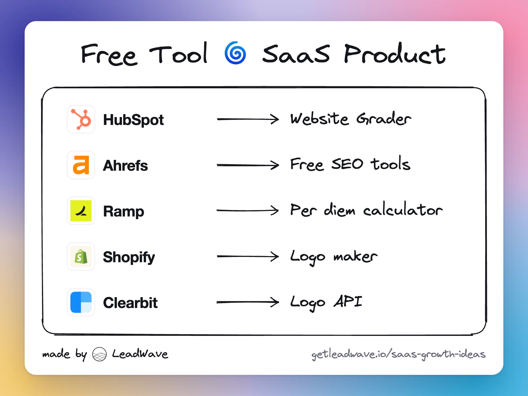
- Free tools: the tool is the CTA; signup comes after the result (free tools).
- Emails: one main CTA, worded like the page it opens.
Placement follows complexity. Aagaard's rule of thumb: simple offers convert with the button above the fold; complex ones need the case made first. In one of Aagaard's tests, a long page with the button at the very bottom beat the above-the-fold version by 304%, though other things changed too. The safe pattern: a button in the first screen, and the same button after each section that could convince.
The "Get the data — it's free" pattern
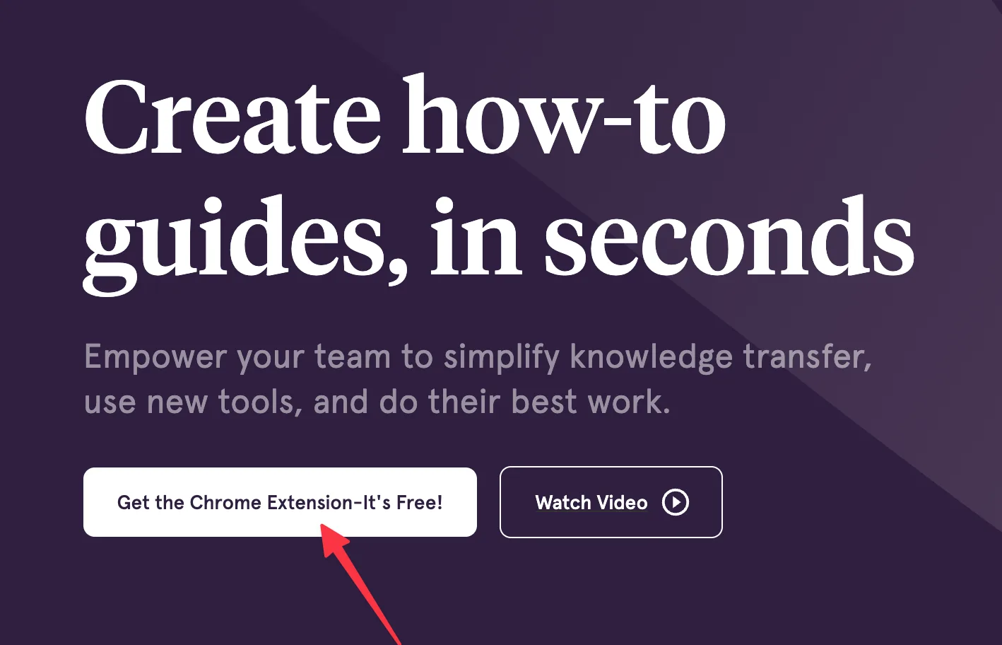
When the product is data or content, the CTA can be the value plus the price: "Get the data — it's free". It stacks the rules above: a getting verb, the thing itself, zero price, no salesperson. ClickUp ("Get started. It's FREE"), Webflow ("Get started — it's free") and Mailmodo ("Sign up now - it's free") use the same shape.
- Use one wording everywhere. The same promise on landing pages, blog posts and emails teaches readers what the button means. A SaaS company list and every post that points to it can share one CTA.
- Keep the promise. If "free" leads to a card form or a paywall after the email, you've traded trust for one click.
Test it yourself, and judge by customers
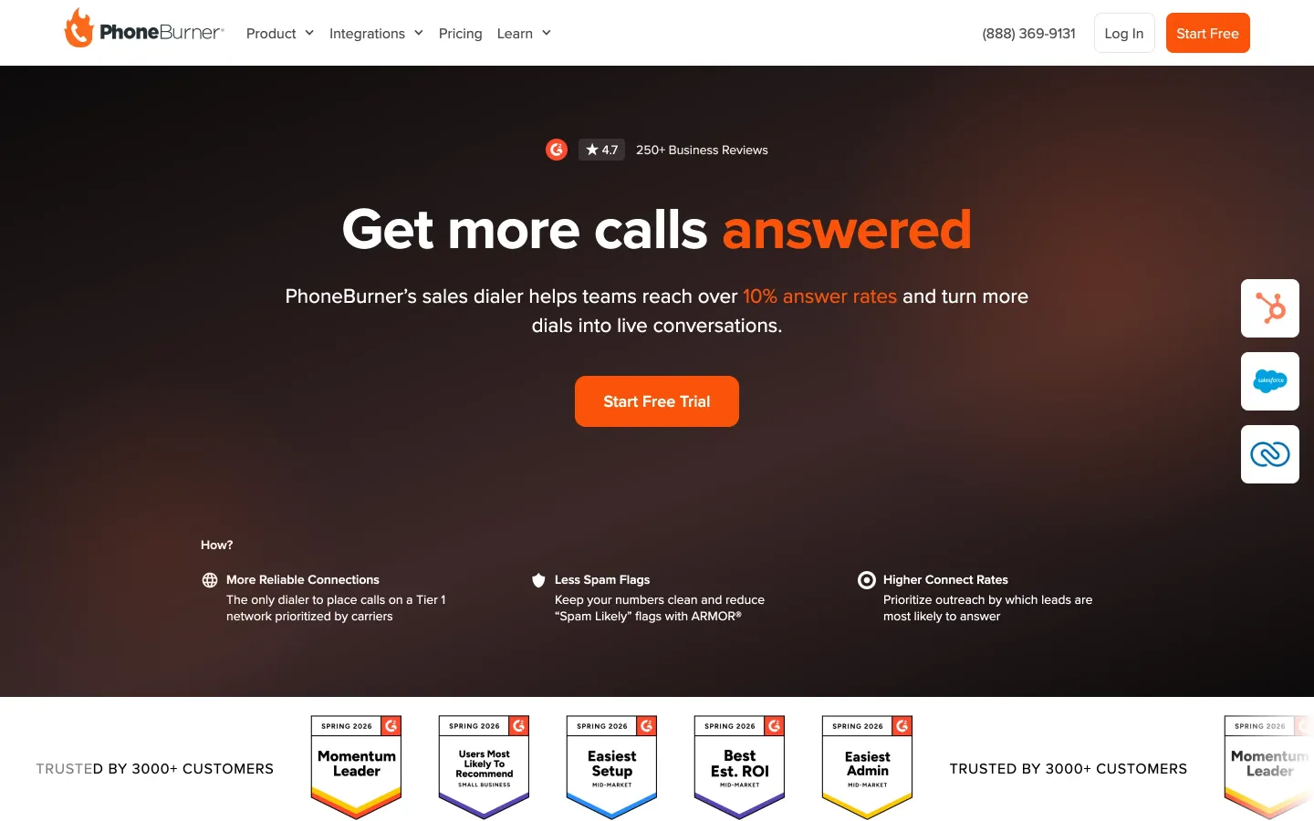
A button lift is not a revenue lift. PhoneBurner's "Start Free Trial - No Card Required" brought 239% more new users than a card-up-front "Try 7 Days for Free" funnel, yet only 22% of no-card signups paid against 73% with a card, so the card funnel made 35% more paying customers. PhoneBurner still chose no card, because those customers churned at about half the rate (PhoneBurner). The flows differed too, not just the copy.
So: change one thing, pick a page with real traffic, work out the sample size before you start, run whole weeks, and keep a change only if activated signups, meetings held or paid accounts go up.